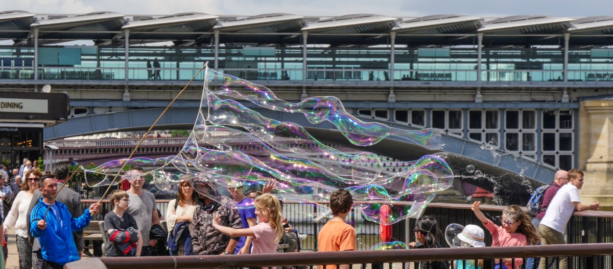
Light in All its Glory

18/09/17

Light is probably the most important thing when taking an image. You obviously need an image taking device of some sort, but this can be as simple as a piece of photosensitive paper or a pinhole camera, but light is essential. Complete darkness, although almost never present, makes it impossible to see or obtain an image. My father was a professional photographer, taking colour film images for sale for books and magazines long before the days of stock photography. He always used to say that the light you needed depended on what the photo was for. He would often avoid midday sun – too harsh, but might also avoid the evening light as the golden colour cast, while very attractive, was not what he was looking for. This was well before the days of being able to remove a colour cast by digital manipulation.

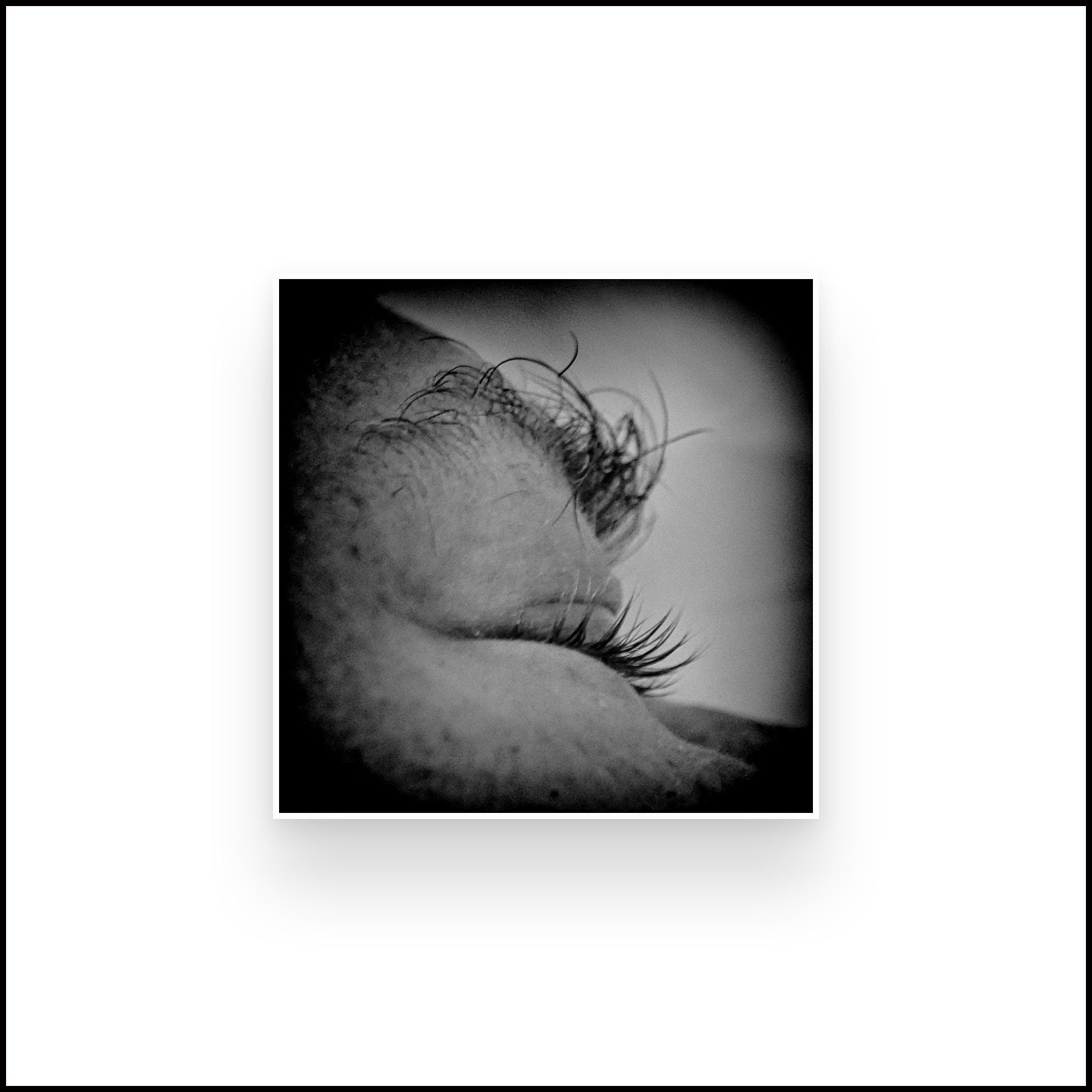
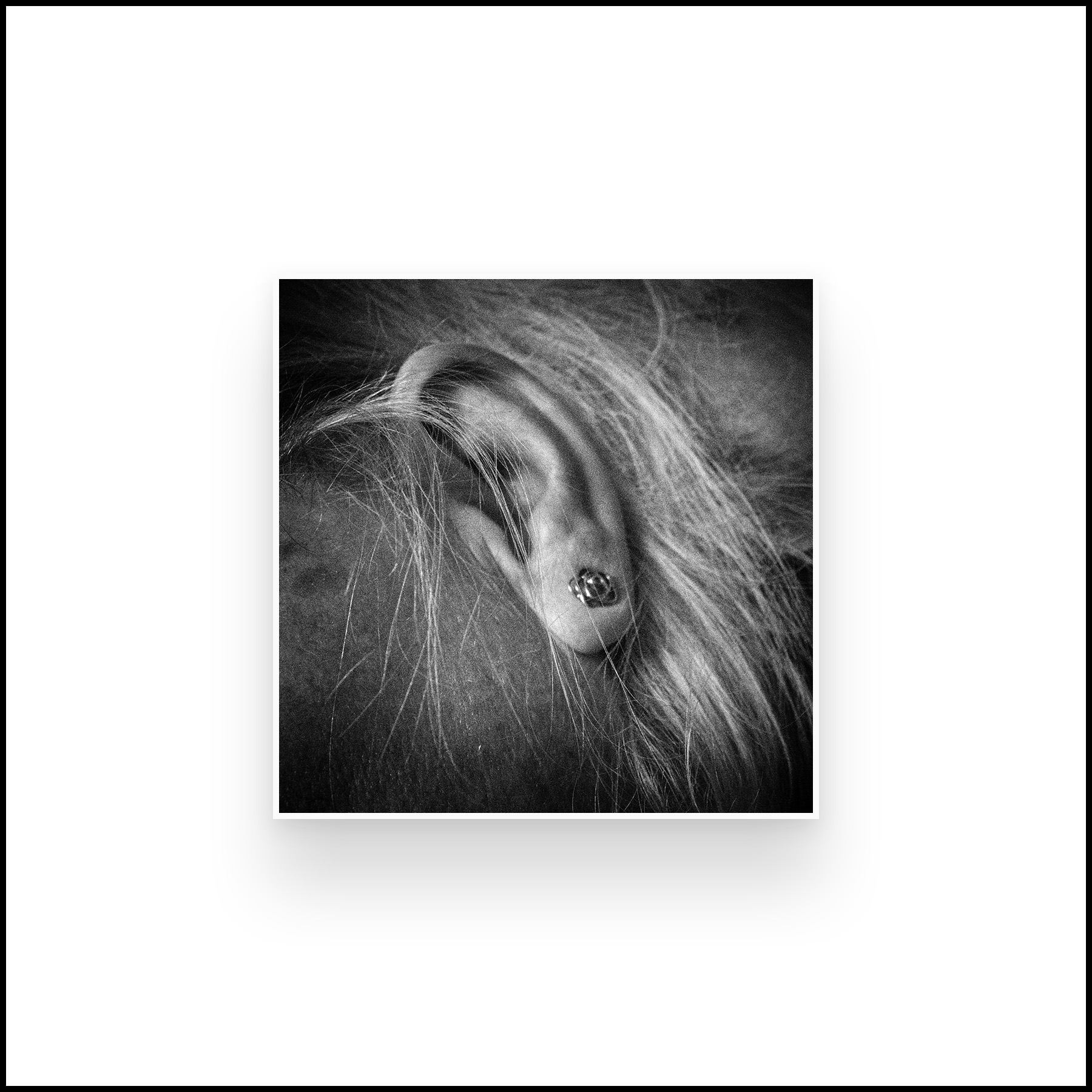
Sally Mann in an interview with Chinese Photography Magazine said ‘the light in the South is so different from the North, where you have this crisp and clear light. There is no mystery in that light. Everything is revealed in the Northern light. You have to live in the South to understand the difference. In summer, the quality of the air and light are so layered, complex, and mysterious, especially in the late afternoon. I was able to catch the quality of that light in a lot of the photos…….and also the refulgence or the reflection when light and water interact. There is no coating on the lens of my old camera, which permits a much softer and more luminous light. I am less interested in the facts of a picture than in the feelings. The facts don’t have to be absolutely sharp. I can get information across by appealing to viewer’s emotions’ (American Suburb X, 2013). Her images in the Southern Landscape series reflect this philosophy. They are not clear, sharp and flat but you feel you are looking into the images rather than at them. Sometimes only part of the image is visible, the remainder clouded in mist. The focus is variable – leaving you peering though the murk, wondering and imagining what might be there. I find myself blinking in a hope to see more clearly, to try and see what Mann saw on that day, at that particular time, at that moment. My favourite, much desired image, (simply identified by the year 1998) is very simple. A patch of light, surrounded by trees over grass, or possibly water. I keep changing my mind.

A completely different use of light is shown in the images of Schmidt. He said ‘I prefer black and white photography because it guarantees the viewer a maximum amount of neutrality within the limits of the medium. It reduces and neutralizes the coloured world to a finely nuanced range of greys, thus precluding an individual way of seeing (personal colour tastes) by the viewer. This means that the viewer is able to form an objective opinion about the image from a neutral standpoint independent of his subjective colour perception. He is thus not emotionally distracted. In order to achieve a maximum of objectivity and thus create a photograph which possesses credibility and authenticity as a document (factual information), I prefer to work with neutral diffused light, i.e. to produce an image without noticeable shadows. The viewer must allow the objects portrayed in the photograph to take their effect upon him without being distracted by shadows or other mood effects. In this context, it is essential that the viewer should be able to recognize the depicted objects clearly and in relation to each other.’ (American Suburb X, 2010). Schmidt’s images are very different from those of Mann. They are clear, without obvious emotional content, explicitly showing the subject. As he said – you can recognise the subject easily and therefore make your own judgements on the content, rather than trying to interpret Schmidt’s thoughts and feelings. The images are relatively emotion free, (I do not think that any image can ever be completely devoid of emotional reading) and therefore what you see can become very personal. In his obituary for the Guardian, Delahaye said’ His language is a language of precision and his tool is the most simple one: a small, 35mm camera, and a few rolls of films. His pictures look simple at first glance, and their anti-sentimentality, their refusal of all the tricks of the usual seduction, their concision and their clarity, give them great efficiency. They show what they show but they manage to retain an opacity, a mystery, and they become a support for our imagination’ (O’Hagan, 2014).

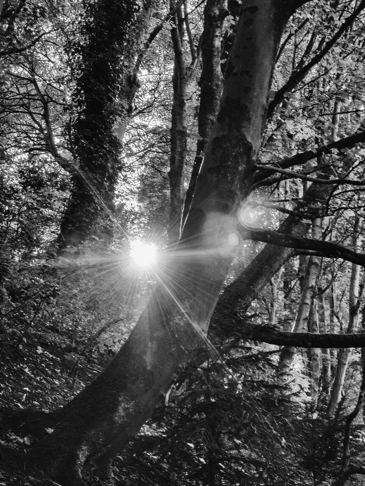
Atget, much earlier on in the development of photography, was very aware of the effects of light and varied his technique over time, initially using the relatively neutral light at midday to produce images that give information about the ‘facts’ while images from later in his career are very different ‘Atget’s late photographs, however, are frequently marked by subjective light and deep shadows. Often made early in the morning, these pictures—such as Parc de Sceaux—use light and shadow to create a mood rather than to describe a place; they mark the apex of Atget’s formal and expressive investigations of the medium.’ (Nga.gov,2017).

All these examples are of photographers who usually took monochrome images where it is often easier to see changes in light intensity, together with the effect of the direction of the light. A further layer of complexity is added in when using colour as the temperature of the light varies as well as it’s apparent quality. Light in the morning and evening is warmer, and may be very red at sunrise and sunset, while it is a more neutral colour at midday. The following table from Cambridge in Colour (Cambridgeincolour.com,2017) helpfully summarises the effects of light throughout the day.

Time of Day   Contrast Colors Direction of Sun
1. Midday Highest Neutral White Near Vertical
2. Evening & Morning High Slightly Warm Mid to Low
3. Golden Hour & Sunrise/Sunset Medium Warm to Fiery Near Horizontal
4. Twilight, Dawn & Dusk Low Cool Pastel Below Horizon

References

AMERICAN SUBURB X. (2010). MICHAEL SCHMIDT: “Thoughts About My Way of Working” (1979) | #ASX. [online] Available at: http://www.americansuburbx.com/2010/10/michael-schmidt-thoughts-about-my-way-of-working-1979.html [Accessed 15 Sep. 2017].

AMERICAN SUBURB X. (2013). INTERVIEW: Sally Mann – “The Touch of an Angel” (2010) – ASX | Photography & Culture. [online] Available at: http://www.americansuburbx.com/2013/01/interview-sally-mann-the-touch-of-an-angel-2010.html [Accessed 15 Sep. 2017].

Cambridgeincolour.com. (2017). Making the Most of Natural Light in Photography. [online] Available at: http://www.cambridgeincolour.com/tutorials/natural-light-photography.htm [Accessed 17 Sep. 2017].

Nga.gov. (2017). Atget: The Art of Documentary Photography. [online] Available at: https://www.nga.gov/feature/atget/work.shtm [Accessed 15 Sep. 2017].

O’Hagan, S. (2014). Michael Schmidt obituary. [online] the Guardian. Available at: https://www.theguardian.com/artanddesign/2014/may/28/michael-schmidt [Accessed 17 Sep. 2017].


Summary week ending 15/09/17

Photos:

  • Went to Glasgow and took a series of photos while walking along the Clyde
  • Experimented more with taking selfies
  • Amusing pics of dog in motorbike sidecar.

I have continued to think about:

  • concept of selfies and how they are used. My son is very strongly of the idea that they must have context to mean anything. Overall I agree, but in practice difficult to do.
  • difficulty in managing areas of extreme differences between light and dark in one image
  • Kate Davis and feminism in photos. Feminism and the female gaze seems to be a common thread in my reading at present. Is it possible/probable that we have gone too far? I think that there may be less of an issue now than when i was young – however it is probably just more subtle and hidden.

Blog:

  • working on Part 4
  • wrote up about Kate Davis

Reading:

  • Graham Clarke – The Photograph. I am having great difficulty with the concepts here, (even on the 2nd time through) partly in understanding the whole issue about critical thinking and its importance, partly because of the language used – coming from a science rather than an arts background. Need to find a primer!
  • Stereoscope – the yearly magazine from the Arts and Photography students at St.Andrews University. Images, writings intercut with images from the universities Special Collection photographic Archives. It is interesting to see the sort of images that are taken by students – not just those that are picked as major upcomingt alents by BJP, Foam or Lenswork. Work often muted – very much about people rather than places. The one that stood out for me was Tom Oldridge. keep an eye out for his name
  • Lensculture – several interesting articles this week

Nudes Never Wear Glasses

An Exhibition at Stills Gallery, Edinburgh by Kate Davis

12/09/17

Kate Davis is an artist with a wide range of skills including drawing, photography and film making, all of which are used in her solo exhibition at Stills Gallery in Edinburgh. She is a feminist and uses many archival images to engage her audience with her ideas. Her website says ‘Davis’ artwork is an attempt to reconsider what certain histories could look, sound and feel like. This has often involved responding to the aesthetic and political ambiguities of historical art works and their reception.’ (Katedavisartist.co.uk, 2017).

The exhibition consists of a space that is divided up by brick walls, which themselves are part of the experience. These are hung with images developed from found photographs that are subversive and also amusing. The first is a nude statue with added glasses.  You then enter a space which shows two alternating films, ‘Charity’ and ‘Weight’, and on searching further past another wall more images. The exhibition is accompanied by an essay by Laureen Dyer Amazeen who says ‘As I reflect back on her use of bricks throughout the installation, the brick can be seen of fundamental value. Foundations are built, brick by brick. Metaphorically, the excerpts, references, extracts, snippets of recorded everyday experiences are the bricks though (from) which she builds a premise, a dwelling – a place in the world.’ (Dyer Amazeen, 2017).

untitled
©Kate Davis Image taken and posted with permission of Stills Gallery

Writing for MAP magazine Victoria Horne comments Visitors to Nudes Never Wear Glasses are welcomed by a found photograph of a classical nude statue, to which Davis has added the eponymous glasses, crudely scratched onto the surface. This act of détournement re-presents Spence’s words as visual prank: playfully exposing the contradictions between body and intellect, femininity and rationality, that have underpinned modern art and its institutions. That the statue is clearly located in a pedagogical studio environment adds weight to this critique, intimating by association the educational logic that prohibited women artists from entering the classroom, while glorifying abstract femininity within. The photograph thus establishes key feminist themes that characterise much of Davis’ output, preparing visitors for the witty archival retrievals to follow.’ (Horne, 2017).

‘Weight’ uses a BBC documentary on Barbara Hepworth as a starting point and looks at the perceived roles of woman and how they can be balanced against the intense life of being an artist – or can they? Which is more valuable? Again, in MAP, Horne describes it as ‘Adhering to the leisurely pace and formal conventions of the BBC documentary format, Davis comically undermines this familiar style from the outset. Against the dated sounds of folksy guitar music, Weight’s opening title sequence ambiguously locates the study in ‘1961 or thereabouts’. At the same time a platter of dramatically staged potato peelings revolves on a turnstile, further alerting the audience to the strange reversals to come……One of Weight’s key contributions is to highlight the uneven appreciation of domestic care work in comparison with the solitary, creative pursuits of the artist.’ (Horne, 2016).

untitled-3
©Kate Davis Image taken and posted with permission of Stills Gallery

‘Weight’ is available to see on BBC iPlayer at:

http://www.bbc.co.uk/programmes/articles/4wkNLQBpFhTC8yXyxlZYqJD/weight-by-kate-davis

‘Charity’ is a newly produced film that talks about the work of women in bringing up children, specifically in breastfeeding. It recently won the Margaret Tait award. On receipt of the award Davis said ‘Working with the moving image has become an increasingly important part of my practice in recent years and the Margaret Tait Award will be invaluable in enabling me to realise my most ambitious and experimental moving image work to date. Inspired by the ways in which Margaret Tait’s films invite us to contemplate fundamental emotions and everyday activities that are often overlooked, I propose to investigate how the essential, but largely invisible and unpaid, processes we employ to care for others and ourselves can inform both the subject of my film and the way it is made’ (Glasgow Film Festival, 2016). The film intersperses archival images of painting and statues of breastfeeding women throughout the ages with pictures of ordinary household practices such as washing up. I found it fascinating but difficult to decipher whether it was talking about mothers breastfeeding their own children or wet nurses doing a job. Clearly that was at least part of the point – is looking after your own child a job, should you have a contract and join a union – or is it an expected part of being a woman?

untitled-4
©Kate Davis Image taken and posted with permission of Stills Gallery

When you turn and leave the exhibition the last image you are confronted with is another altered image. This time of a man, a Minuteman, which has been altered to look as though he is breastfeeding. A final comment on roles – and possible role reversal in the present age.

untitled-2
©Kate Davis image taken and posted with permission of Stills Gallery

This is a powerful exhibition, although it does warrant close study. I initially went with my daughter who was too impatient to sit though the films and left wondering what it was about. I then returned with more time to sit and think.  This made me realise that so often I just rush though an exhibition – taking in the highlights, missing the subtleties. The use of found and then altered images pointed up how we should/can/might change our viewpoint in life, thinking about gender stereotypes, women as housewives not intellectuals or artists, men as soldiers not carers. It also reminded me of the use of walls, to divide things, to hide things, to separate people. I was recently at Hadrian’s Wall, built by the Romans to separate civilised land from the wild North. One of the exhibitions in Tullie House Museum, Carlisle looked at the theme of walls in present day society (Tullie House, 2017). This exhibition is about walls between men and women, between traditional roles and expanded or reversed roles but a wall remains a wall until it is totally removed.

References

BBC. (2014). BBC Arts – Weight by Kate Davis – BBC Arts. [online] Available at: http://www.bbc.co.uk/programmes/articles/4wkNLQBpFhTC8yXyxlZYqJD/weight-by-kate-davis [Accessed 11 Sep. 2017].

Dyer Amazeen, L. (2017). Nudes Never Wear Glasses.

Glasgow Film Festival (2016). Artist Kate Davis Announced as Winner of 2061/17 Margaret Tait Award.

Horne, V. (2016). The Weight of History | MAP Magazine. [online] Mapmagazine.co.uk. Available at: http://mapmagazine.co.uk/9935/weight-history/ [Accessed 11 Sep. 2017].

Horne, V. (2017). Nudes Never Wear Glasses | MAP Magazine. [online] Mapmagazine.co.uk. Available at: http://mapmagazine.co.uk/9991/nudes-never-wear-glasses/ [Accessed 11 Sep. 2017].

Katedavisartist.co.uk. (2017). About: Kate Davis. [online] Available at: http://katedavisartist.co.uk/about/ [Accessed 11 Sep. 2017].

Stills.org. (2017). Kate Davis: ‘Nudes Never Wear Glasses’ | Stills Gallery. [online] Available at: http://www.stills.org/exhibition/current-exhibition/kate-davis-nudes-never-wear-glasses [Accessed 11 Sep. 2017]

Tullie House (2017). Tullie House Museum & Art Gallery | Art – History – Nature of Carlisle, Cumbria. [online] Tulliehouse.co.uk. Available at: http://www.tulliehouse.co.uk/ [Accessed 12 Sep. 2017].

Summary – week ending 08/09/17

Visited Cultybraggan Prisoner of War Camp near Crieff:
           Opportunities for monochrome/vintage conversions with graphic images
            Problems with very light sky versus dark buildings
Started thinking about selfies and how to explore them:
            Research into academic work
            Practical trials
            ?use of selfie stick
Exhibitions visited:
            Kate Davis at Stills – subversive work on female roles 
            Roger Felton images of Crimea war – compare with Perfect Chemistry exhibition 
Blog:
            Finished response to tutor report on assignment 3
            Looked at work of Parr and Reas
Reading:
            BJP October issue:
Trevor Appleton’s work on people using the portrait combined with images of what is important to them. This is the same idea I want to work on around the response of parents to being given the information that their child is autistic. Watch out for the book.

Response to Tutor Comments for Assignment 3

08/09/17

Assignment Comments:

Tutor comments are  in blue (main points only copied here), my responses in black

Looking at your final series, I felt they all worked well together except for the final picture. I understand why you included it but the scale is quite different from the other pictures. The other pictures are about the photographer as subject, whereas this final picture is about how the camera frames the view, producing a rectilinear ‘slice’ of a ‘scene’ from the vantage point of the photographer.

On thinking about this further I agree that the final image is ‘out of kilter’ with the other images. I originally put it in because I liked it and I was pleased with the effect – but it is more about the camera than the people – while the rest of the images are definitely about the people. It needs to come out of the series for final presentation.

The prints were of sufficient quality for assessment. They appear a touch lighter than your screen images but this is probably due to the difference in viewing conditions. Backlit always looks a little different than paper. If you wanted to adjust this, I would start by looking at the brightness to which you calibrate your monitor.

I was aware they were a little lighter than the screen, but was not sure which was better, my screen brightness is difficult to adjust, and the room it is in gets a lot of light falling on the screen, so that maybe part of the issue. I do calibrate the screen vis a Spyder 3 – but possibly not often enough, so this is something to watch out for.

Despite your card backed and padded envelopes, the prints still arrived with a bent corner.

Something to watch out for – I previously used a clam shell box for final prints – so need to consider this again.

The research section appears to be going well on your blog. One thing I would suggest is to add dates to the posts as this makes it much easier for me to work out what is new and what isn’t.

Taken on board from now. This makes sense as easier to follow, and updates to a post can be separately dated.

It’s not completely clear from your exhibition write ups if you are attending these independently or as part of group study visits.

All my exhibition visits have been solo (or with family).  Need to look for more opportunities for group study visits, so far, by sheer bad luck, all the ones up North have been while I was either away, or at work. However, there is a study group that meets in Glasgow – so that may be a possibility.

A good next step might be to start writing a diary every time you go out and shoot, or whenever you think about photographs. Try to pick out from that what you find interesting and stick with it

Interestingly, I had already started doing this, as I was finding that I was not keeping track of what I was doing, thinking or reading. An extension of this would to add a brief weekly summary to my blog, with key points.

Suggested Reading/Viewing – Parr and Reas

 Martin Parr.

I was already aware of the work of Martin Parr and his exploration of Britain in images as well as other areas. I took this opportunity to have a further look at his extensive oeuvre via his website and came across three pieces of work that are particularly relevant to my assignment on the decisive moment.

  1. Milan Fashion Week; here Parr takes images of the crowd’s extensive use of devices, mainly mobile phones, while at the event. Sometimes it is clear that they are photographing the scene, other times taking selfies, other times they are just looking at their phone, maybe texting or using social media. In this group of images, few of the protagonists appear to be engaged with the event, which either says something about the event, or, more likely, about the perceived importance of social media and your engagement with it, and therefore how it often ‘takes over’ peoples time and thought processes.
  2. Too Much Photography: this article from Parr’s blog talks about the present use of photography by just about everyone, everywhere they go. He says, ‘Now mobile phone cameras and digital photography mean that the entire visit is documented. From the moment the tourist enters the site, everyone has to be photographed in front of every feature of note. Now it is almost impossible for me to shoot a photo where someone is NOT taking a picture or posing for one. ……. My theory is that the act of photographing ourselves at tourist sites becomes so important because it makes us feel reassured that we are a part of the recognisable world’ (Martinparr.com, 2012). I tend to agree with his thoughts here, but would extend it to saying that we feel that we are part of the world and that this fact must be recorded, but, as Parr asks – what happens to the images, and who looks at them. I am aware that personally I shoot thousands of ‘useless’ images that don’t contribute in any valued way to the world, or even to my remembrance of it. Less would definitely be more.
  3. The Selfie Stick: again from Parr’s blog, he talks about the ubiquity of the use and availability of selfie sticks to take images of yourself, or the family, in front of tourist attractions. This doesn’t seem to have taken off to the same degree in Scotland (possibly because we are more often holding umbrellas). I think I prefer this trend to the trend of just taking a selfie at arm’s length, which could be anywhere and talks only about ones own self.

Many of the images he shows are quirky, full of humour and with a somewhat sideways take on modern society. The point he makes is enhanced by the use of series of images which clarify visually the trends shown.

Paul Reas.          

Paul Reas is a new name to me.  He is a social documentary photographer who uses colour images to show British culture and is considered to be in the same genre of British photographers as Martin Parr.  His book ‘I can Help’ documents the consumer culture, while ‘Flogging a Dead Horse’ (1993)’ presents a nationwide survey of the emergence of the ‘heritage industry’: museums and theme parks such as Beamish Open  Air Museum that offered a nostalgic and often commercialised version of the past in the wake of the collapse of heavy manufacturing and industry’ (Shutter Hub, 2013). The image ‘Flogging a Dead Horse, Man with a Movie Camera’ shows a man in a smart outfit looking intently though his camera. It would be interesting to know his thoughts, and whether he had ever worked in the type of industry he was photographing.  In an article about the series by The British Council – Visual Arts it is described as ‘The tourist of the nineties, with camcorder and auto-focus camera, expects a ‘hands-on’ experience. But the trouble with Heritage Culture is that the safe inconsequential history it markets doesn’t educate, it only sedates its audience. Heritage is meretricious history that never challenges the present. Consumerist history: history for a disposable income. Like a steam train, it takes you on a pleasant ride to nowhere, and then back to where you started.‘ (Visualarts.britshcouncil.org, 1994).

Man With Movie Camera  © Paul Reas
Man With Movie Camera © Paul Reas

Image posted with kind permission of Paul Reas

Reas’s images are gritty and do not feel as slick as those of Parr, they are not as ‘amusing’ but they do get under your skin in the same way, giving an ironic take on the culture we live in and how it is influenced by the need to seek out pleasures and record them, even if those recordings never reach the light of a photograph album.

References:

Martinparr.com. (2012). Too Much Photography | Martin Parr. [online] Available at: https://www.martinparr.com/2012/too-much-photography/ [Accessed 5 Sep. 2017].

Shutter Hub. (2013). Paul Reas – Day Dreaming About The Good Times? on the Shutter Hub Blog. [online] Available at: https://shutterhub.org.uk/blog/paul-reas-day-dreaming-about-the-good-times [Accessed 8 Sep. 2017].

Visualarts.britishcouncil.org. (1994). BEAMISH OPEN AIR MUSEUM ‘THE NORTHERN EXPERIENCE’, Paul Reas | Portfolios | Collection | British Council – Visual Arts. [online] Available at: http://visualarts.britishcouncil.org/collection/portfolios/flogging-a-dead-horse/object/beamish-open-air-museum-the-northern-experience-reas-1992-flogging-a-dead-horse-p6174/view/portfolio/initial/a/page/1 [Accessed 8 Sep. 2017].

Creatures and Creations

Creatures and Creations (Waddesdon Manor,2017) is an exhibition showing at Waddesdon Manor which is the home of the Rothchilds in England. It showcases work by two creatives that is based on insects, birds and animals that are linked in that their scientific name shares the Latin version of Rothschild – Rothschildi. Many of the Rothschild family have had a keen interest in the natural world, and one in particular, Walter, 2nd Lord Rothschild was a famed naturalist who collected insects from childhood and later developed a natural history museum at Tring, near Waddesdon Manor.  His fame led to many newly discovered specimens being named after him. The present exhibition shows work by Platon H and Mary Katrantzou.

Platon H (born Platon Alexis Hadjimichalis) is an artist and a civil servant. He started with drawing and painting, moved through making heavily textured creations on to digital art. The art works shown at Waddesdon are abstract digital colleges inspired by the feather and wings from the insects and birds in the Rothschild collection. In an interview, he says ‘No artist has just a single source of inspiration. Moreover, nature is not always the basis of my work. My compositions are the result of many factors. Nature lies at the root of my inspiration, but the resulting composition is the product of different inspirations, closely tied to my history and upbringing. I see forms in nature that enable me to combine them with abstract art. I do this inspired by different artists and art movements from the 1960s and 1970s  ……. I have not considered this, nor do I want to break away from the subtle geometry, as you put it. My eyes and my aesthetics as a child had a rough time being immersed in architecture and archaeology… The geometry found in nature, ultimately, highlights my work. Of special interest in this respect is the fractal theory of nature. Without intending to, I construct my pieces using fractal features.’ (Liapi, 2017).

Images used with kind permission of Platon H.

Mary Katrantzou is a fashion designer who has worked with textiles to produce highly coloured fantastic pieces of clothing, which have brought her fame in the fashion world. In Vogue, …. says about her work ‘a great print designer, and a Greek one, at that—which is good’ and quotes Katrantzou saying ‘she was also triggered by the words of a girlfriend who happened to remark, “Your work is so psychedelic!” She’d not seen her many-layered digital compositions that way before, but it led her to search out the trippy graphics of late-’60s and early-’70s music posters’. (Mower, 2016). Here she showcases three couture dresses and the images she has based them on, all of which are inspired by the insects from the Rothschild collection.

Images used with kind permission of Mary Katrantzou

The exhibition is full of colour, set off against the original specimens collected by Rothchild on loan from the Tring Natural History Museum. It is fascinating to see how the same starting point can lead two artists in completely different ways, one towards a highly regimented fractal designs and the other to freely flowing and exotic prints made into stunning pieces of artwork that masquerade as dresses. Both are highly detailed, in the exhibition the prints are shown at a similar size, which emphasises the contrast between the two bodies of work. Both resonate for me, the patterns of Platon H are soothing and repetitive, almost mesmerizing to look at for any length of time while the stunning vibrancy of Katrantzou’s work has the opposite effect.

References

Liapi, Z. (2017). Interview by Zinovia-Christina Liapi – Texts – Hadjimichalis, Official website – SOCOS –. [online] Platon-socos.com. Available at: http://www.platon-socos.com/texts/interview-by-zinoviachristina-liapi/ [Accessed 30 Aug. 2017].

Mower, S. (2016). Mary Katrantzou Spring 2017 Ready-to-Wear Fashion Show. [online] Vogue. Available at: http://www.vogue.com/fashion-shows/spring-2017-ready-to-wear/mary-katrantzou [Accessed 31 Aug. 2017].

Waddesdon Manor. (2017). Creatures & Creations – Waddesdon Manor. [online] Available at: https://waddesdon.org.uk/whats-on/creatures-and-creations-platon-katrantzou-exhibition/ [Accessed 1 Sep. 2017].


Self Critique on Assignment 3

Self assessment and criticism is an area I find particularly difficult. This is probably not because I am over confident, but because I tend to be very negative about my own work. This makes it difficult to write down the thoughts and also difficult to be objective.

Assessment criteria points

Demonstration of technical and visual skills – Materials, techniques, observational
skills, visual awareness, design and compositional skills. (40%)
I think I produced reasonable images for this assignment. I found it hard to keep to the topic, and, because it was a specific idea, some of the images , especially those that didn’t make the final cut, had major flaws, such as depth of field or focus. I was concentrating on what was happening and didn’t always remember to think about the practical issues such as the best camera settings. It would have been helpful to think in advance about the best way to show them, for example, would it be best to have the whole image in focus, or better to just focus on the person taking the image and have the background (their subject) out of focus. I made a considered decision to only have the person on the side of the image and to show the background as a large part as I felt it made the concept more ‘real’.

Quality of outcome – Content, application of knowledge , presentation of work in a
coherent manner, discernment, conceptualisation of thoughts, communication of
ideas. (20%)
Having got the spark of an idea for this I feel I thought it through, weighing up the possibilities, and logically explaining my thought processes. This was easier to present on-line with the additional images that showed the progression of thoughts. Next time it might be better to add these images into the printed explanatory essay as will as the final chosen images. I feel that I communicated my concept in both the descriptive essay and the images.

Creativity — Imagination, experimentation, invention. (20%)
I experimented with several possibilities for this assignment before settling in the final one. I also experimented with colour versus monochrome. It’s is difficult to see how imagination comes into this – unless it is about imagining the concept in the first place. This was a ‘sideways’ take on the concept of the decisive moment – thinking about other peoples moment and trying to put myself into their place. It has made me think of several other pieces of work that would be interesting to do as a follow up including the work on selfies and possibly asking other people why they were interested in that place/photography at that time (also – what they did with their images ?post them on line,?print them or what. This would open up the possibility of contrasting their thoughts with mine.

Context – Reflection, research, critical thinking. (20%)
My research on this assignment was too limited. It was about the concept of selfies and how they were used – but then I moved away from this as an idea. I am sure there have been other studies on my eventual idea but I am not aware of them, and not sure how/where to access them.


How to Read a Photograph

Some thoughts jotted down while reading the book

Focus in book is on the historical greats. Most now deceased although some not

  • Need to know the background of the photographer to understand the image
    • Where from
    • Interests
    • What else they have done in the past (or are doing now)
      • Andre Kertesz, moved to Paris after a stint ion the Great War. Apolitical and interested in people. Lived where popular culture was important for photography and of great interest, therefore published.
  • What is photographed changes over time, but also will often reappear
    • But – this may not be for the same reasons
      • Atget – rag pickers and rubbish, street scenes with the emphasis on people as opposed to Krull where the emphasis is on the equipment
      • Cartier-Bresson – transit camps pre-echoes the pictures of refugee camps at Calais. Photographer as a witness
    • Photographers and writers often work together to produce a book.
      • Sometimes one is the driving force e.g. An illustrated story versus a photobook with additional words
        • Brassai and Morand – Paris de Nuit
        • Godwin and Hughes – Remains of Elmet
  • Need to understand the wider art context of the era images were made.
    • An idea, thought or feeling versus straightforward documentation of an event
    • May be staged
    • Or only minimal parts shown enough to tell the story
      • Bravo and his idea of the invisible and showing states of mind
      • Moriyamo street scenes similar intent now
        • Understanding and meaning of image does not remain static, will change with the viewer and over time
  • War photography may tell stories about people that are not always the soldiers
    • Reportage with stories
    • Immediacy
    • Story may be more important than the technique
      • Capa – feeling not focus
  • What is the person in the photo saying?
    • Do we have their words recorded?
    • Do we imagine it?
    • Do you need the words or do the objects tell the story?
      • Lange versus Rothstein
  • Photographs as montages
    • People placed against a background – constructed images
    • Pictures placed side by side
  • Information by inference
    • Shahn
    • Farm security administration
  • Relationship between the photographer’s art and their take on religion
    • Minor White and Zen – the indifference of the camera
  • Interesting note that lots of photographers initially trained as something else
    • Why? Why not start out as photographers
      • Seymour (Chim) a pianist
      • Ansel Adams also a pianist
      • Winograd a weather forecaster
  • Use of night photos
    • High contrast, graphic detail
    • Use areas of excitement e.g. Movies, fairgrounds
    • Allows focus on the idea of a place rather than the detail
      • Faurer
      • Bovis
  • Put personal anxieties into pictures
    • Think about communities and how do they affect you
    • Community versus exclusion
    • Are you an insider or outside them?
      • Winograd
      • Arbus and the strange people
  • Use of words in images
    • May be factual but also ironic
    • Give meaning/ explanation of time or place
    • Often tiny but critical
    • Over time became more deliberate as photographers aware of importance of sign and symbolism
      • Eggleston
      • Adams
      • Friedlander
  •  Japanese photographers – images without text
    • The pictures alone are enough
    • Witnesses to history, recording but possibly / probably not making a difference
    • Atmosphere rather than detail
    • But maybe need explanation of thought processes
  • Topography
    • Use of transit landscapes
    • How important is where an image is taken rather than what it is?
    • Use of colour
      • Meyerowitz
      • Shore

Overall impression:

Knowing the history and background of the photographer may change your understanding of the image

Things go in circles over time, however, while the types of images may be similar, the reasoning behind them may be very different

Look carefully as a tiny detail may change the entire meaning

Each generation builds on the previous therefore the more you look and study images from different eras the more you can understand the present thoughts.

Compare with Photography as a Contemporary Art by Cotton (Cotton, 2015) where the focus is on the style of photography rather than the individuals and their personalities. Both approaches are useful.

Think about the purpose of the image: as art, to instruct, to give information, advertisement, propaganda

Would have been interesting if went on to cover more of the recent photographers in a similar style.

References

Cotton, C. (2015). The photograph as contemporary art. London: Thames & Hudson.

Jeffrey, I. (2008). How to read a photograph. London: Thames & Hudson.


The Decisive Moment – or Not?

The decisive moment as a photographic meme comes from the book ‘The Decisive Moment’ by Henri Cartier-Bresson (Cartier-Bresson, 1852) where, in his introduction he quotes Cardinal de Retz ‘There is nothing in this world that does not have a decisive moment and the masterpiece of good ruling is to know and seize this moment’ (De Retz, 1717).  Cartier-Bresson describes this as ‘the simultaneous recognition, in a fraction of a second, of the significance of an event as well as of a precise organisation of forms which give that event its proper expression’. Interestingly, the book, in its original French printing was called ‘Images à la Sauvette’ meaning images on the run which gives a different emphasis – focusing on the photographer’s actions rather than the moment captured.

The phase and the book have both been discussed repeatedly, by photographers, critics and others with a variety of thoughts on the subject. O’Hagen, in a review of a second edition said ‘For me, what is interesting about the republishing of The Decisive Moment is that it has happened too late. The book is now a historical artefact. It cements an idea of photography that is no longer current but continues to exist as an unquestioned yardstick in the public eye: black and white, acutely observational, meticulously composed, charming. Colour and conceptualism may as well not have happened, so enduring is this model of photography outside the world of contemporary photography itself’ (O’Hagen, 2014). Zouhair Ghazzal said ‘Granted that the decisive moment is more of a cliché than a reality, even for its own creator, it still has the status of a myth with too much of an unconscious impact on photojournalism to be dismissed too easily ……. The decisive moment is therefore that infinitely small and unique moment in time which cannot be repeated, and that only the photographic lens can capture.’ (Ghazzal, 2014) and then he goes on to suggest that in modern cities there is no centre and no individuality that would allow the camera (or presumably the photographer) to capture a decisive moment. In an extensive article, the psychologist John Suler dissects what it takes to make a decisive moment – summarised in a series of 10 rules the final one of which is ‘The DM photo is a product of a unique set of technical, cognitive, and emotional skills developed from extensive training and experience in photography, as well as from a psychological knowledge of people’ (Suler, 2013).

The theme that the decisive moment is no longer relevant is suggested in the review by Colin Pantall of the photobook ‘The Present’ by Paul Graham when he says ‘what he wants us to see is the antithesis of the decisive moment and the spectacle of the urban experience. Instead we get a very contemporary contingency, a street with moments so decisively indecisive that we don’t really know what we are looking at or looking for……. He is not so much showing us something as posing a question; what do we look at when we look at a photograph?’ (Pantall, 2012).  Writing in Black and White Photography Magazine Alex Schneideman argues that ‘street photography… characterised by chance and the interplay between humanity and the built environment is attractive in concept, but not always worthy of the attention it receives…. it has become a gentle pastime that can be successful by its own standards without delving beneath the surface’ (Schneideman, 2017) implying that there has been something lost in the ongoing urge to simply take photographs in the street without focusing on an underlying concept.

Decisive means settling an issue; producing a definite result and having or showing the ability to make decisions quickly and effectively, while moment means a very brief period of time and an appropriate time for doing something; an opportunity or a particular stage in the development of something or in a course of events (Oxford Dictionaries, English,2017).  If you look momentarily outside the field of photography this is discussed in crime novels ‘What is an event, actually? Blinking is an event, going to the toilet is an event, sitting in a café is an event, thinking a thought is an event too. All the things we do and all the things that happen, are events.’ (Horst,2011), autobiography Life isn’t a matter of milestones, but of moments’. (Rose Kennedy, 1974) and music (Pink Floyd, 1973)

Ticking away the moments that make up a dull day
You fritter and waste the hours in an offhand way.
Kicking around on a piece of ground in your home town
Waiting for someone or something to show you the way.

Tired of lying in the sunshine staying home to watch the rain.
You are young and life is long and there is time to kill today.
And then one day you find ten years have got behind you.
No one told you when to run, you missed the starting gun.

So you run and you run to catch up with the sun but it’s sinking
Racing around to come up behind you again.
The sun is the same in a relative way but you’re older,
Shorter of breath and one day closer to death.

Every year is getting shorter never seem to find the time.
Plans that either come to naught or half a page of scribbled lines
Hanging on in quiet desperation is the English way
The time is gone, the song is over,
Thought I’d something more to say.

Thought I’d something more to say –I think this is the important idea that comes out of all the above. A moment in time, all still photography is capturing a moment in time, it may be very short, a millisecond or less, freezing a frame to capture the beat of a hummingbird’s wing or a falling drop, or several days as in the photography of Wesely, or when capturing the movement of the stars at night. The meme of the decisive moment carries with it connotations of black and white street images with an aura of the past, a romanticised view of time gone by and expert photographers swinging Leica’s from their hips to catch a sudden event. Is it still relevant? Yes, but maybe not if you only think of it that way. What is important is saying something about where you are in your moment, your time and what is happening in your space in the world!

Is the decisive moment the image that I began these thoughts with or is it the ending one, where the only person watching is me?

untitled-20

References

Cartier-Bresson, H. (1952). The decisive moment. Göttingen: Steidl.

De Retz (1717). Memoires.

Ghazzal, Z. (2004). The indecisiveness of the decisive moment. [online] Zouhairghazzal.com. Available at: http://zouhairghazzal.com/photos/aleppo/cartier-bresson.htm [Accessed 5 Aug. 2017].

Horst, J. (2011). Dregs.

Kennedy, R. (1974). Times to remember. New York: Doubleday.

O’Byrne, R. (2001). H. Cartier-Bresson: l’amour tout court. [online] Vimeo. Available at: https://vimeo.com/106009378 [Accessed 24 Jul. 2017].

O’Hagan, S. (2014). Cartier-Bresson’s classic is back -but his Decisive Moment has passed. [online] the Guardian. Available at: https://www.theguardian.com/artanddesign/2014/dec/23/henri-cartier-bresson-the-decisive-moment-reissued-photography [Accessed 4 Aug. 2017].

Oxford Dictionaries | English. (2017). [online] Available at: https://en.oxforddictionaries.com/definition/decisive [Accessed 5 Aug. 2017].

Pantall, C. (2012). photo-eye Book Reviews: The Present. [online] Blog.photoeye.com. Available at: http://blog.photoeye.com/2012/05/photo-eye-book-reviews-present.html [Accessed 5 Aug. 2017].

Pink Floyd (1973). Time (The Dark Side of the Moon). Harvest Records.

Schneideman, A. (2017). Thinking Photography. Black and White, (February), pp.62-65.

Suler, J. (2017). Photographic Psychology: The Decisive Moment. [online] Truecenterpublishing.com. Available at: http://truecenterpublishing.com/photopsy/decisive_moment.htm [Accessed 4 Aug. 2017].


Thoughts for July

I have been following, with some bemusement, several posts both on the OCA EYV mail thread and on the OCA year 1 Facebook page. There seems to be a small number of very vocal people who are clearly dissatisfied with the thoughts behind the course and the marking system. The problems could be summarised as:

  • I don’t feel I get enough support
  • I don’t like being told what to do
  • I don’t like the type of photography we are being asked to look at – too artsy, not beautiful, too much meaning, not enough meaning!
  • I’m not learning how to make better (read prettier) pictures
  • It’s too hard
  • It’s too much theory

Some of the above are obviously mutually contradictory.

I am not in the above camp – but I do wonder how much these vocal people reflect the general perceptions of a distance learning environment and some of the inevitable difficulties that occur. I have had the dubious advantage of working in a profession where I have always had to do a lot of self-directed study to keep up with any new developments, and was aware how hard this can be before starting the course. I am also studying for personal interest, that’s not to say that a long-term goal of making images that are good enough to attract attention and maybe even sell is out of the question!

I also am very aware that I actually signed up to do an Arts degree (and hope to be able to finish it). In any degree course there is bound to be a lot of ‘theoretical’ work, both reading and writing, and you are going to come across a range of works, some of which you will like and some of which you may hate or despise. I also think that it is likely that my tastes and specific interests will change as I see more different images and also as I read more about the thoughts and aspirations of the individual photographers. Certainly, I have already come across several artists that I would never have found before, and at least one that, on initial viewing, I could not see any value in, but whom I now really appreciate, and go back to.

I admit I am struggling to find enough time to do as much as I would like to. This is partly because I keep getting distracted and would spend an untenable amount of time following side paths, which, while fascinating, does detract from time available from doing the actual course work.

I also keep changing my mind about how to approach some of the assignments. I would probably find a little more hands on guidance or discussion helpful here, and should probably benefit from attending the study days when they are near enough or joining a local (ish) study group. Maybe a way forward would be to get up courage to post some of my images on the appropriate thread on the OCA website to ask for comments.

The issue about tutor support is a significant one. The tutor I have for EYV has not had any contact with me other than responding after my assignments, however that response has been extensive and very helpful, commenting on both my photography and my research, with several suggestions about how to take it further and appropriate links. Interestingly he has given some diametrically opposite advice from the tutor I had some years ago for TAOP. My previous tutor directed that every image should be labelled with all the image data, this one said not, commenting that you would only look at this if the photograph was intrinsically boring! (Although it can be interesting to know how someone else has reached the effect they have achieved).

Over the last month I have done a fairly large amount of personal photography that doesn’t directly feed into the course requirements. We have been away on holiday on a tour of Northern England and been to several events to do with the Romans and also to a very large military re-enactment. I have been able to use some of the confidence I developed in taking portraits for assignment 2 to good use here, and have, I think, made more interesting images of these events than I would have previously.

I have also made a small photobook for our wedding anniversary using 3 inch square close-up monochrome images of ears, fingers etc, which I would probably not thought of doing before the course. This is something I may well develop for future work and have wondered about using for the final assignment, my initial plan had to do some images around the environmental impact of the forestry commission and logging in Scotland.

So this is where I am at the moment. Trying not to get too diverted. Considering what to take forward. Generally happy that I am slowly improving.