How to Read a Photograph

Some thoughts jotted down while reading the book

Focus in book is on the historical greats. Most now deceased although some not

  • Need to know the background of the photographer to understand the image
    • Where from
    • Interests
    • What else they have done in the past (or are doing now)
      • Andre Kertesz, moved to Paris after a stint ion the Great War. Apolitical and interested in people. Lived where popular culture was important for photography and of great interest, therefore published.
  • What is photographed changes over time, but also will often reappear
    • But – this may not be for the same reasons
      • Atget – rag pickers and rubbish, street scenes with the emphasis on people as opposed to Krull where the emphasis is on the equipment
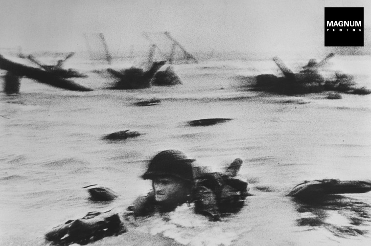
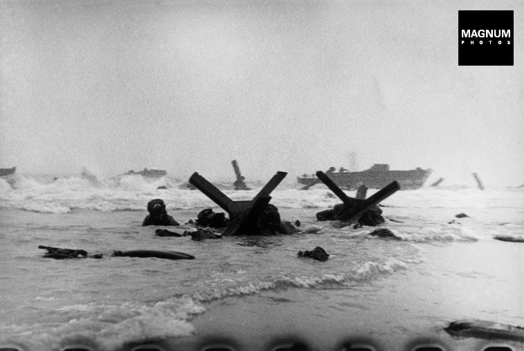
      • Cartier-Bresson – transit camps pre-echoes the pictures of refugee camps at Calais. Photographer as a witness
    • Photographers and writers often work together to produce a book.
      • Sometimes one is the driving force e.g. An illustrated story versus a photobook with additional words
        • Brassai and Morand – Paris de Nuit
        • Godwin and Hughes – Remains of Elmet
  • Need to understand the wider art context of the era images were made.
    • An idea, thought or feeling versus straightforward documentation of an event
    • May be staged
    • Or only minimal parts shown enough to tell the story
      • Bravo and his idea of the invisible and showing states of mind
      • Moriyamo street scenes similar intent now
        • Understanding and meaning of image does not remain static, will change with the viewer and over time
  • War photography may tell stories about people that are not always the soldiers
    • Reportage with stories
    • Immediacy
    • Story may be more important than the technique
      • Capa – feeling not focus
  • What is the person in the photo saying?
    • Do we have their words recorded?
    • Do we imagine it?
    • Do you need the words or do the objects tell the story?
      • Lange versus Rothstein
  • Photographs as montages
    • People placed against a background – constructed images
    • Pictures placed side by side
  • Information by inference
    • Shahn
    • Farm security administration
  • Relationship between the photographer’s art and their take on religion
    • Minor White and Zen – the indifference of the camera
  • Interesting note that lots of photographers initially trained as something else
    • Why? Why not start out as photographers
      • Seymour (Chim) a pianist
      • Ansel Adams also a pianist
      • Winograd a weather forecaster
  • Use of night photos
    • High contrast, graphic detail
    • Use areas of excitement e.g. Movies, fairgrounds
    • Allows focus on the idea of a place rather than the detail
      • Faurer
      • Bovis
  • Put personal anxieties into pictures
    • Think about communities and how do they affect you
    • Community versus exclusion
    • Are you an insider or outside them?
      • Winograd
      • Arbus and the strange people
  • Use of words in images
    • May be factual but also ironic
    • Give meaning/ explanation of time or place
    • Often tiny but critical
    • Over time became more deliberate as photographers aware of importance of sign and symbolism
      • Eggleston
      • Adams
      • Friedlander
  •  Japanese photographers – images without text
    • The pictures alone are enough
    • Witnesses to history, recording but possibly / probably not making a difference
    • Atmosphere rather than detail
    • But maybe need explanation of thought processes
  • Topography
    • Use of transit landscapes
    • How important is where an image is taken rather than what it is?
    • Use of colour
      • Meyerowitz
      • Shore

Overall impression:

Knowing the history and background of the photographer may change your understanding of the image

Things go in circles over time, however, while the types of images may be similar, the reasoning behind them may be very different

Look carefully as a tiny detail may change the entire meaning

Each generation builds on the previous therefore the more you look and study images from different eras the more you can understand the present thoughts.

Compare with Photography as a Contemporary Art by Cotton (Cotton, 2015) where the focus is on the style of photography rather than the individuals and their personalities. Both approaches are useful.

Think about the purpose of the image: as art, to instruct, to give information, advertisement, propaganda

Would have been interesting if went on to cover more of the recent photographers in a similar style.

References

Cotton, C. (2015). The photograph as contemporary art. London: Thames & Hudson.

Jeffrey, I. (2008). How to read a photograph. London: Thames & Hudson.


A Durational Space

Capa, Sugimoto and Woodman

PAR121453_Social_Media_Watermark(1)

Robert Capa’s image of a soldier in the Normandy landings is gritty and full of movement blur but is shows a man in a desperate hurry, at risk if life. It also focuses the attention on his face and the determination shown by him. Other images, while fascinating and often actually giving more information about the event, such as this one, do not have the immediacy or drive shown in the most well-known image.

PAR121452_Social_Media_Watermark(1)

Images courtesy of Magnum Photos.

It is difficult to know whether this movement blur was deliberate, done as an accident or simply occurred in the processing, whichever one, it is very effective.

Hiroshi Sugimoto is a Japanese photographer who has experimented extensively with the use of time in his photography. He tends to work producing series of images. He says “the vision comes first……imagine the way I photograph the things…… bringing my camera into a movie theatre……I opened my shutter when the movie begins…… I leave my camera open……when the ending credit shows up I close my shutter…… the interior of the theatre shows in the white light coming out of the screen.     ……the people were in the theatre but they all disappeared…… the movie theatre…… holds the emptiness” (Sugimoto, 2009). The images are eerie and beautiful with the cinema walls illuminated by the light from the screen.

 Sugimoto has also taken a series of images concentrating on light. He found that when he was processing photographs he was plagued with random bouts of static which he calls ‘the demons in the darkroom’ (Sugimoto, 2011). He went on to deliberately generate static electricity and shoot the resultant flashes of light, man-made lightning. He then printed these images at an enormous size to form an exhibition which I was lucky enough to see in Edinburgh several years ago. The images are sharp white on a deep, velvety black, simple in appearance but they draw the eye in and you find yourself following the path of the discharge around the image.

Michael Wesely takes the concept of long duration photography to an extreme, photographing buildings being renovated, such as the Museum of Modern Art in New York, with the camera running for months or still life images of flowers slowly dying. The pictures of the buildings show layers and layers of lines as there is slow progress, they look somewhat like a pen and ink drawing of an artist’s conception of the building, but they appear more ‘real’ and obviously they are. Some of the images can be viewed at:

http://www.graphicine.com/unusually-long-exposure-photographs-by-michael-wesely/ (accessed 24/06/17)

http://itchyi.squarespace.com/thelatest/2010/7/20/the-longest-photographic-exposures-in-history.html (accessed 24/06/17).

Wesely says “”the lines in the sky put our existence, us, our planet into context with the Dance of the Universe, which coexists on an entirely different time scale [from us] …. The moment is fading, all that remains is the permanent overlapping of movements of all kinds, political or personal. The technologies of our times fuel this fire of restless ‘Online-Existence’. One day computers won’t have an on- or off-button anymore. We will always be online.” (Klenke, 2010).

A fascinating variant on this is when he takes long exposure, 5 minutes, images of people In the Museum of Modern Art, New York, looking at the even longer exposure images of the renovation works of the actual building. The people are visible, but look like ghosts.Other images are in colour, some are surprisingly delicate, others, mainly the flowers from ‘Stilleben’ are intensely coloured, almost violent, shocking given that they are showing the death of the flower..

 In the introduction to a recent book, Time Works, Harten describe these as ‘decidedly distinct traces of specific processes …… take on the form of a delicate, diaphanous mist …… like transparent gossamer made up of innumerable moments’ and also ‘what we experience in Michael Wesely’s photographs is the …… transitory visibility of the long since invisible’. (Wesely and Harten, 2010).This is the complete antithesis of the ‘decisive moment’. The images may appear dreamlike, often abstract, but are actually the opposite, time rules as absolute. Time held still.

An alternative view of time is used in the film Chungking Express where the opening scene uses a blurred movement to catch the attention of the viewer. This gives a sense of urgency to the film, and has drawn me in enough that I will watch the rest. The colours are intense, it is difficult at times to make out what you are seeing, and the scene feels immensely pressured, the opposite of the sense stillness captured by Wesely.

Francesca Woodman’s (1958-81) images are highly charged and often, but not always, personal.  Berger defines art as either private or public, but her work spans both, ‘intensely private photographs for public consumption……Woodman regularly appeared naked within the frame, her body contorted, her flesh blurred—at once visible and intangible. Each image feels viscerally revealing of something, or someone, beyond the frame—something public photographs can’t do.’ (Christoph, 2015). Her suicide, age 22, inevitably alters people’s perception of her work, partly by the simple fact that there is a limited oeuvre, not all of which has ever been published, but also because there is a temptation to read everything she has done in that context, rather than as early work of a woman who might, given the time, have gone on in a totally different direction.

Much of her work is monochrome, with stark tonal contrasts, showing images that are partially blurred, a jumping person in apparently derelict room ‘Untitled, Rome, 1977-78’, or showing only part of the person ‘Seven Cloudy Days, Rome 1977-78’. Other images use wildly contrasting juxtapositions of people and items such as in the Eel series, where a blurred person lies next to the sharply focused bowl of eels.

Badger says ‘she clearly sought to escape the strictures of the single image and still, frozen photographic stasis. And in her off-kilter compositions and constant roulades of wispy, swirling flight, she appears to hammer at the boundaries of the photographic frame itself’ and ‘Woodman’s oeuvre seems to have informed by the apparently inconsolable thought (for her) that society’s cards are irrevocably stacked against her sex. That no matter how hard she might try to escape constriction by gender, only in her art could she be free,’. (Badger, 2017. I wonder whether, if she had been working now, her work would have been less ‘constricted’ in this way bur equally how her view has led the way for the wide variety of female photographers today, many of whom take images of women and also how it feeds into the ongoing discussion about whether (or not) females perceive other females differently from male photographers and therefore make images that are fundamentally different. (Jansen, 2017).

In the context of thinking about the impact of blur on the emotional reading of the image it is clear that in Woodman’s work it is crucially important, in a similar way (although in a very different setting) to the Capa image on Normandy Beach. I find her images often disturbing, often beautiful, at times mesmerising and I am left wondering what she might have produced in an unknown future. She was born just after me, into a very different life, but I am unsure if I would have ever understood her and her thought processes.

References

Badger, G. (2017). Gerry Badger  Francesca Woodman. [online] Gerrybadger.com. Available at: http://www.gerrybadger.com/francesca-woodman/ [Accessed 30 Jun. 2017].

Christoph, S. (2015). FRANCESCA WOODMAN. [online] Brooklynrail.org. Available at: http://brooklynrail.org/2015/03/artseen/francesca-woodman-mar15 [Accessed 30 Jun. 2017].

JANSEN, C. (2017). GIRL ON GIRL. [S.l.]: LAURENCE KING PUBLISHING.

Klenke, S. (2010). The Longest Photographic Exposures in History – The Latest – itchy i. [online] Itchyi.squarespace.com. Available at: http://itchyi.squarespace.com/thelatest/2010/7/20/the-longest-photographic-exposures-in-history.html [Accessed 24 Jun. 2017].

Pro.magnumphotos.com. (2017). Magnum Photos. [online] Available at: http://pro.magnumphotos.com/C.aspx?VP3=SearchResult_VPage [Accessed 24 Jun. 2017].

Sugimoto, H. (2009). Contacts vol 2: Hiroshi Sugimoto. [online] YouTube. Available at: https://m.youtube.com/watch?v=mcbEgEv2kUw [Accessed 24 Jun. 2017].

Sugimoto, H. (2011). Hiroshi Sugimoto, Nature of light ; [Izu Photo Museum, Shizuoka, Japan ; October 26, 2009 – March 16, 2010]. Shizuoka, Japan: Izu Photo Museum.

Townsend, C. and Woodman, G. (2016). Francesca Woodman. London: Phaidon.

Wax, R. (2014). Unusually Long Exposure Photographs by Michael Wesely | Graphicine. [online] Graphicine.com. Available at: http://www.graphicine.com/unusually-long-exposure-photographs-by-michael-wesely/ [Accessed 24 Jun. 2017].

Wesely, M. and Harten, J. (2010). Time works. Munchen: Schirmer/Mosel.


Tillmans and Moriyama

Two exhibitions at the Tate Modern.

Wolfgang Tillmans

Wolfgang Tillmans’s exhibition at the Tate Modern is vast, consisting of 14 rooms which have ‘been specially configured by Tillmans as a personal response to the present moment’ (booklet accompanying the exhibition). It shows a range of images from all his work since 2003.  The Tate says in describing it ‘This is Wolfgang Tillmans’s first ever exhibition at Tate Modern and brings together works in an exciting variety of media – photographs, of course, but also video, digital slide projections, publications, curatorial projects and recorded music – all staged by the artist in characteristically innovative style.’ (Tate, 2017) and “He’s not a prophet, but he sees where things might go because he has an eye for the world,” said Chris Dercon, director of the Volksbuhne Berlin and co-curator of Tate Modern’s Wolfgang Tillmans: 2017 show (Smyth, 2017).

I found it overwhelming in the number of images shown and oddly underwhelming in my emotional response to them. My thoughts could be summed up as interesting but cold. Some of the individual images were compelling such as the image of his studio with a portrait of a man hung above all the chaos. An image made by ‘passing monochromatically exposed photographic paper though a dirty photo-developing machine’ (Tate Modern, 2017) was surprisingly reminiscent of an EEG (a tracing of brain waves) – an odd conjunction of patterns, the EEG describing life and thought while the image by Tillmans showing ‘the potential of the photographic processes……to be used as a form of self-expression’ (Tate Modern, 2017).  Other images I found fascinating were some of the portraits such as ‘Anders pulling splinter from his foot, 2005’ and the images of a curled piece of photographic paper ‘paper drop Prinzessinnenstrasse 2014’. The final room dealt with borders and their fluidity, especially the contrast between the simple border between sea and sky versus the shipwreck caused by refugees. In the present moment of shifting borders with Brexit and hardening borders in the USA this is an important political statement, and, of course, much of Tillmans’s work should be looked at in a political context.

In a review for The Guardian Laura Cumming says ‘Tillmans’s eye is empathetic, pensive and patient, but always determinedly indeterminate. He is as far from Cartier-Bresson’s decisive moment as can be. He doesn’t go in for metaphor or simile; he doesn’t try to sum anything up, nail it down or catch it by the tail. He wonders at the beauty of a pear glowing in late afternoon sun as much as viscosity of the plastic bag from which it came. He homes in on the inner seams of discarded jeans. Even when photographing a momentous starry night he can’t help noticing the camera’s own distortions. Not every star in that sky is natural………. The inconsequential is made tangible, permanent.’ (Cumming, 2017) and in a further review by O’Hagen, Tillmans says “For a long time in Britain, “there was a deep suspicion of my work. People saw me as a commercial artist trying to get into the art world, and the work was dismissed as shallow or somehow lightweight. There are still many misconceptions about what I do – that my images are random and everyday, when they are actually neither. They are, in fact, the opposite. They are calls to attentiveness” O’Hagen says ’his photography has been marked by its shifts in style and by his determination to avoid the traditional. His exhibitions can appear wilfully haphazard both in terms of their seemingly unrelated subject matter – portrait next to still life next to abstraction next to landscape – and his eschewal of the accepted norms of the gallery show’ (O’Hagen, 2017).

On Tillmans website http://tillmans.co.uk/book-downloads you can access several catalogues and books of his work that are less expansive and more focused, I found these more accessible, possibly I was suffering from overload in the exhibition.

Daido Moriyama

Moriyama’s images are on show at the Tate Modern as one of the Artists Room Collections, which are travelling collections jointly owned by Tate and the National Galleries of Scotland. There are a relatively small number of images on display which concentrate on his monochrome photographs of the intense life occurring in cities shown as large panels.

Moriyama (born 1938) is famous for his street photography, which show bold and gritty details, often close-up. He has published many photobooks which are very detailed and intense, usually with full-bleed images, these are mainly monochrome however there are several colour images, tending to be cleaner, which punctuate the intensity of the flow. ‘Daido Moriyama’s art is a far, far cry from any formal academic quality…. blurred, blotched and saturated…. his photography becomes an autobiography, a means of expressing personal experiences’ (Remy and Moriyama, 2012). A recent one ‘Daido Tokyo’ focuses on Shinjuku. He says, ‘many pose the question “Why Shinjuku?” ….. I answered on impulse …… the truth is “because it was there” ….. light and shade, obverse and reverse, truth and falsehood: each accompanies the other’ (Moriyama, 2016).

Moriyama explained how he used photography to convey his subjective experience: “By taking photo after photo, I come closer to … the fragmentary nature of the world and my own personal sense of time” ………. Moriyama’s approach included re-photographing images, working without a viewfinder and embracing printing errors. The resulting photographs are blurred, scratched and grainy. By pushing the medium to the limits of legibility Moriyama attempted to go “to the end of photography”. (Moriyama, 2012).

Phaidon’s publication Daido Moriyama gives a series of his images with accompanying explanatory text by Nishii. He quotes Moriyama as saying ‘one of photography’s essential qualities is its amateurism, and another its anonymity’ (Nishii, 2012). The text about each image describes where and when it was taken, and gives some thoughts about what might have been going though Moriyama’s mind, and how the image links in to the style of photography prevalent at the time the image was taken. While these side-notes are fascinating I found that they detracted from the impact of the images as I ended up looking at them from a technical and historical point of view rather than an emotional or aesthetic one. The mass effect of looking at the original photobooks is lost.

I was fascinated by this exhibition as I am interested in Japanese photographers and the marked differences in style from European and American photography although I suspect this is an over-generalisation. Unlike the Tillmans exhibition I found the images full of emotion, warm and sometimes amusing. It felt as though Moriyama was really engaged with his subject, involved rather than simply observing, that he knew the people, in reality as this is street photography, it is likely that many of the images were of strangers.


Comparing the work of two photographers there are multiple similarities: both have a huge oeuvre, both take images of almost anything, from close details of parts of people (I noted very similar images of the back of a man’s neck in the Tillmans exhibition and in Moriyama’s Remix) via more formal portraits to pictures of street rubbish and both produce photobooks as a primary way of showing their work. Tillmans concentrates mainly on colour and Moriyama on monochrome. However, when looking at the images on the same day, and then exploring a wider number of images several days afterward there is a very different feel. Tillmans images seem to be making ‘a point’, often political and usually fascinating while Moriyama’s are simply what he sees, telling an intimate story about a place.

References

Cumming, L. (2017). Wolfgang Tillmans: 2017; Eduardo Paolozzi –  review from the chaos of time. [online] the Guardian. Available at: https://www.theguardian.com/artanddesign/2017/feb/19/wolfgang-tillmans-2017-review-tate-modern-eduardo-paolozzi-whitechapel-gallery [Accessed 12 Jun. 2017].

Moriyama, D. (2012). Daido Moriyama. [online] Tate. Available at: http://www.tate.org.uk/visit/tate-modern/display/media-networks/daido-moriyama [Accessed 12 Jun. 2017].

Moriyama, D. (2016). Daido Tokyo. Paris: Fondation Cartier pour l’art contemporain.

Nishii,K. (2012). Daido Moriyama. New York: Phaidon

O’Hagan, S. (2017). Wolfgang Tillmans: ‘I was hit by a realisation  – all I believed in was threatened’. [online] the Guardian. Available at: https://www.theguardian.com/artanddesign/2017/feb/13/wolfgang-tillmans-photographer-interview-tate-modern [Accessed 12 Jun. 2017].

Remy, P. and Moriyama, D. (2012). Daido Moriyama – remix.: Edition Mennour.

Smyth, D. (2017). Wolfgang Tillmans: 2017 opens at London’s Tate Modern. [online] British Journal of Photography. Available at: http://www.bjp-online.com/2017/02/wolfgang-tillmans-2017-opens-at-londons-tate-modern/ [Accessed 12 Jun. 2017].

Tate Modern (2017). Wolfgang Tillmans, 2017.

Tate. (2017). Wolfgang Tillmans: 2017. [online] Available at: http://www.tate.org.uk/whats-on/tate-modern/exhibition/wolfgang-tillmans-2017 [Accessed 12 Jun. 2017].

Tillmans, W. (2017). home. [online] Tillmans.co.uk. Available at: http://tillmans.co.uk/ [Accessed 12 Jun. 2017].


Fay Godwin and Catherine Hyland

Deep Depth of Field.

Project 2 : Lenswork

Fay Godwin (1931-2005) is famously known for her landscape images, but she started out as a portrait photographer. It was only when she separated from her husband that she chose a change of direction. She developed a formidable body of landscape work and published several books which contain both images and words, some written by her and some done in collaboration with other writers, such as her book Remains of Elmet: A Pennine Sequence, where the images go alongside poems by Ted Hughes. Her book ‘The Edge of the Land’ contains a series of stunning images of Britain’s coast together with essays talking about the vast range of people she met while taking these images and giving their personal stories. (Godwin, 1995).

Godwin said (quoted in an article in Amateur Photographer), “I’ve been called a Romantic photographer and I hate it, it sounds slushy and my work is not slushy. I’m a documentary photographer, my work is about reality, but that shouldn’t mean I can’t be creative.” (Clark, 2010). In her final interview with David Corfield she said “I don’t get wrapped up in technique and the like. I have a simple rule and that is to spend as much time in the location as possible. You can’t expect to take a definitive image in half an hour. It takes days, often years. And in fact, I don’t believe there is such a thing as a definitive picture of something. The land is a living, breathing thing and light changes its character every second of every day. That’s why I love it so much.” (Corfield, 2004)

One of her books ‘Our Forbidden Land’ (Godwin, 1990) is credited with helping change the English Law on public access. She was outspoken and had a deep love and care for the environment together with an abiding interest in the people she met while researching the areas she would photograph.

Margaret Drabble talks about Godwin in the Guardian and says ‘Her photographs of lochs and glens and standing stones with solitary sheep are hauntingly memorable. They have a Wordsworthian timelessness, a sense of the Wordsworthian sublime. Her imagination, like his, was attracted by the barren, the grand and the bleak. These archetypal landscapes are probably the most enduring tributes to her great talent, and they are enduring in every sense – she catches the spirits of places that have been worn and weathered, deserted and abandoned, and yet still speak to us.  (Drabble 2011)

Her photography is monochrome, with a deep depth of field and are very crisp. You are in the landscape she photographs and it surrounds you. The images imply scents and sounds. Her photographs of the groynes at Pett Level in East Sussex instantly reminded me of the similar ones on the beach of my childhood in West Sussex.

Day8056-2-Edit-3
Groynes, Pagham Beach, West Sussex – In homage to Fay Godwin

Catherine Hyland also uses deep depth of field in her recent series of images taken in China and Mongolia, Universal Experience, where she pictures the effects people have had on a vast and barren environment. In an interview, she says “The aim is to shine a light on both the strange and sublime nature of these spaces, Giant Buddhas that exist in small desolate villages in rural China, and expansive mountainscapes with barely any visitors. Whether it’s sites of historical importance or natural splendour each is approached with a heightened awareness of its significance as a place of beauty and grandeur. Landscape is seen primarily as a cultural construct and only secondarily as a natural phenomenon.”. (Brewer,2017).

On her website (Catherinehyland.co.uk) you can see her images depicting ‘The attempts to control and manage the landscape are both a part of this overcoming of the past, and also an attempt to transform nature into a theme park for contemporary consumption. Implicit in this attempt is the idea that the earthquakes, the landslides, the famines, invasions and the floods are a thing of a great and colourful past. They are part of a history that has been transformed into nostalgia. But…… there might be an underlying anxiety to this enclosed world…. a reminder that the land does not pay heed to humanity’s wishes. It can and it will bite back no matter how much we try to tame it. The only question is when’.

Her images are colourful, clear and massive. You overlook the area and I find them overwhelming, even though many show people, themselves enjoying the view. Here the depth of field leads your eye outward, to the infinite distance and beyond.

References:

Brewer, J. (2017). Catherine Hyland explores the vast, yet eerily barren tourist destinations of China and Mongolia. [online] It’s Nice That. Available at: http://www.itsnicethat.com/articles/catherine-hyland-universal-experience-photographs-160217 [Accessed 16 May 2017].

Catherinehyland.co.uk. (2017). Catherine Hyland. [online] Available at: http://catherinehyland.co.uk/universal.html [Accessed 16 May 2017].

Clark, D. (2010). Fay Godwin 1931-2005 – Iconic Photographer – Amateur Photographer. [online] Amateur Photographer. Available at: http://www.amateurphotographer.co.uk/technique/fay-godwin-1931-2005-iconic-photographer-18907 [Accessed 15 May 2017].

Corfield, D. (2004). No Man’s Land – Fay Godwin’s last interview. [online] ePHOTOzine. Available at: https://www.ephotozine.com/article/no-man-s-land—fay-godwin-s-last-interview-67 [Accessed 16 May 2017].

Drabble, M. (2011). Margaret Drabble on Fay Godwin. [online] the Guardian. Available at: https://www.theguardian.com/artanddesign/2011/jan/08/margaret-drabble-fay-godwin [Accessed 15 May 2017].

Godwin, F. (1990). Our forbidden land. London: J. Cape.

Godwin, F. (1995). The edge of the land. London: Cape.

Press, S. (2017). Catherine Hyland’s Universal Experience. [online] Ignant.com. Available at: https://www.ignant.com/2017/03/03/catherine-hylands-universal-experience/ [Accessed 16 May 2017].


Mona Kuhn and Saul Leiter

Shallow Depth of Field in Photography.

Project 2: Lenswork

Mona Kuhn was born in 1969 in Brazil of German parents. She was given her first camera age 12 and has been taking photographs ever since.  She is a well-known photographer whose main interest lies in images of people, often nude. In an interview related to her exhibition Acido Dorado, Kuhn says ‘I see the body as a residence to our emotions, our soul, our inner selves. Gauguin has a wonderful painting titled “Where Do We Come From? What Are We? Where Are We Going?” from 1897. I think it summarises a question we all have, but one that I decided to use as basis to my source of inspiration. I photograph the human in us, without shame, without regret, free and timeless………I start my creative process by imagining colors. I don’t know why, but coloration comes to me first. From there I tie in emotion, then location and last the people’ (Arciniegas, 2014).

David Campany (Campany, 2014) says, when talking about a later body of work – Private ‘At times Mona Kuhn takes the challenge head on, making views of crystal clarity in which light and land are one.  At other times she prefers a wide aperture and a shallow depth of field for her photographs…… Early mornings, early evenings and the moments of respite offered by shadows and sequestered interiors.’

Balthazar
Balthazar © Mona Kuhn

Evidence is a series that portrays nudes taken in a naturist camp in France. There are 55 images, mainly of young, beautiful people (Balthazar) where much, or sometimes all of the image is taken at a shallow depth of field, forcing the eye to initially concentrate on a single person or a small detail. The people are often glancing sideways, looking out of the page or across it. Few seem to be engaged directly with the photographer, but equally they are aware of her, maybe she is not important to them, or, they are so comfortable with her presence they are ignoring her. In describing the images Baldwin says, ‘the overarching accomplishment here is that the photographer has managed to balance complicated layers of relationships, of sitter to sitter, of sitter to self, of model to photographer; ……to establish a complex set of ambiguities played out in an apparently egalitarian, if not an outrightly utopian society.’ (Kuhn and Baldwin, 2007) The images appear to follow the story of a day, from a brilliant, and soft-focus, sunrise though daytime activities to night-time quietude and languor. There is the occasional relief from all the youth and beauty, an old man staring into space (Mon Frere), a room with only a chair in partial focus (An Absence) and these are the images I am drawn to. The images that are completely out of focus (Reflecting) are edgy and uncomfortable, leaving you wondering what is happening, what has happened and what might come next. The story is only partly told. Imagination is free.

Reflecting
Reflecting © Mona Kuhn


Saul Leiter is another photographer who often uses a shallow depth of field.to draw attention to a specific point such as in Carol Brown (1958 for Harper’s Bazaar) or Walking (c. 1948) and to ‘create great swathes of colour’ (Pill, 2017) for example, Taxi (1957) or Through Boards (1957).

Taxi_Leiter
Taxi © Saul Leiter Estate

In the introduction to Saul Leiter (Leiter and Kozloff, 2008) Kozloff says ‘far from being a traditionalist, he is in the forefront of photographic innovators, daring for his time……..he considers what lies underneath, is off to the side, or gets in the way of his nominal subject………One notices his enjoyment of the downy texture or foamy substance when selected passages are out of focus.’

Andrew Dickson, in a review for the Guardian, said ‘Many photographs hover on the boundaries of abstraction, planes canting towards each other than cavorting away again; often they are riddles that never quite resolve…….Leiter uses mirrors and windows to tease the eye, piling half-glimpsed images on top of each other – the sharp white of a woman’s shawl imprinting itself on to the palm-leaf design of a shop dummy’s dress, or, as in Reflection (1958), a chiming collision of reflected faces caught in glazing. Just as frequently, condensation, rain or snow films and fogs the frame. Often what we most want to see is held tantalisingly out of reach (Dickson, 2016).

Carol Brown_Leiter
Carol Brown © Saul Leiter Estate

Roberta Smith wrote ‘Mr. Leiter was a photographer less of people than of perception itself. His painter’s instincts served him well in his emphasis on surface, spatial ambiguity and a lush, carefully calibrated palette. But the abstract allure of his work doesn’t rely on soft focus, a persistent, often irritating photographic ploy, or the stark isolation of details, in the manner of Aaron Siskind or early Harry Callahan. Instead, Mr. Leiter captured the passing illusions of everyday life with a precision that might almost seem scientific, if it weren’t so poetically resonant and visually layered.’ (Smith, 2005).

Leiter himself said ‘But I believe there is such a thing as a search for beauty – a delight in the nice things in the world. And I don’t think one should have to apologise for it.” (In No Great Hurry, 13 Lesions in Life from Saul Leiter, 2012).

Leiter’s images are sometimes soft, sometimes acidly clear and always alluring. His early images were black and white but he embraced the use of colour very early on. He was not well-known in his early life and is only recently being lauded. His images draw you in, there is mystery but you are part of it rather than standing outside looking in. These are images that I would hang on my wall and dream over.

Images posted with permission of and thanks to Mona Kuhn and the Saul Leiter Foundation

References:

Arciniegas, T. (2014). An Interview with Mona Kuhn ahead of her London Show at Flowers Gallery. [online] Losarciniegas.blogspot.co.uk. Available at: http://losarciniegas.blogspot.co.uk/2014/11/an-interview-with-mona-kuhn-ahead-of.html [Accessed 13 May 2017].

Campany, D. (2014). MONA KUHN. [online] Monakuhn.com. Available at: http://www.monakuhn.com/pages/view/campany/ [Accessed 13 May 2017].

Dickson, A. (2016). Made in Manhattan: how Saul Leiter found beauty in Gotham’s glass and grime. [online] the Guardian. Available at: https://www.theguardian.com/artanddesign/2016/jan/15/made-in-manhattan-how-saul-leiter-found-beauty-in-gothams-glass-and-grime [Accessed 13 May 2017].

In No Great Hurry, 13 Lesions in Life from Saul Leiter. (2012). [DVD] Tomas Leach

Kuhn, M. and Baldwin, G. (2007). Evidence. Gottingen: Steidl, p.9.

Leiter, S. and Kozloff, M. (2008). Saul Leiter. New York: Thames & Hudson.

Pill, S. (2017). Light, Form and Soul. Black and White, February, pp.38-45.

Smith, R. (2005). Art in Review; Saul Leiter. [online] Query.nytimes.com. Available at: http://query.nytimes.com/gst/fullpage.html?res=9901E3D81330F933A05751C1A9639C8B63 [Accessed 13 May 2017].

Thomas Ruff – Jpegs


Thomas Ruff’s photobook Jpeg (Ruff and Simpson, 2009) consists of images that he has both taken and found on the web which he then enlarged which ‘exaggerates the pixel patterns until they become sublime geometric displays of color.’ (David Zwirner Books, 2009)). Ruff says, ‘the Jpeg idea, in which a pixelated square is ugly, but if you present it in the right context it can become beautiful’ (Benedictus, 2009).

Campany discusses Ruff’s work in the context of the history of art and photography.

Found images have been used since 1920’s as a way of making sense of a culture with an unending amount of information.  Campany points out that all images come from archives, some obvious, some less so and that within those archives there are layers of systems from the internet itself, the specific archives that are accessed, the more limited archive of the collector (Ruff) and on down to the archive of the viewer’s memory. These archives are arranged in grids, which with Ruff comes from his preference for working in series, the meaning of the image then comes at least partly from its place in that series.

Campany also discusses that all images seen now are digitised (even those printed in books) and therefore the pixel has replaced the grain of a film. Grain, with its random nature became ‘a sign of the virtuous materiality of the image’ while pixels are ‘grid-like, mechanic and repetitive ….  a technological limit (David Campany 2008). He feels that Ruff images force us to look back and forward between figuration and abstraction leading to pictures with a sense of drama.

In contrast Colberg discusses the meaning or rather the possible lack of meaning behind the images. He says Ruff stands as one of the ‘most creative and inventive photographers of our time’ (jmcolberg.com, 2009). Colberg notes the extreme beauty of the images, especially when printed in book format but feels that the concept of the images relies on the technique, rather than anything else, and notes that Ruff simply describes how they were made starting from lost images of the 9/11 attack. He goes on to say that beauty in and of itself can be appreciated, ‘maybe sometimes, the medium is the message’.

References

Benedictus, L. (2009). Thomas Ruff’s best shot: ‘Pixellated images can be beautiful. I took this in Japan – through a hotel curtain’. [online] the Guardian. Available at: https://www.theguardian.com/artanddesign/2009/jun/11/my-best-shot-thomas-ruff [Accessed 21 Apr. 2017].

David Campany. (2008). Thomas Ruff: Aesthetic of the Pixel – David Campany. [online] Available at: http://davidcampany.com/thomas-ruff-the-aesthetics-of-the-pixel/ [Accessed 21 Apr. 2017].

David Zwirner Books. (2009). David Zwirner Books · Thomas Ruff: jpegs. [online] Available at: https://davidzwirnerbooks.com/product/thomas-ruff-jpegs [Accessed 21 Apr. 2017].

Jmcolberg.com. (2009). Conscientious | Review: jpegs by Thomas Ruff. [online] Available at: http://jmcolberg.com/weblog/2009/04/review_jpegs_by_thomas_ruff/ [Accessed 21 Apr. 2017].

Ruff, T. and Simpson, B. (2009). Jpegs. New York: Aperture.

There is a Grandeur in This View of Life

American Photographs

Walker Evans

One of the most well-known photographic exhibitions and subsequent book is American Photographs by Walker Evans. The original exhibition was displayed in the Museum of Modern Art, New York in 1938 and the book (Evans, Kirstein and Meister, 2012) is now on its fifth edition which was produced for the seventy -fifth anniversary of the exhibition in 2012.

In the accompanying essay by Lincoln Kirsten (Kirstein, 1938) Evans’ work is described as ‘straight photography… in the rigorous directness of its way of looking’ and ‘Evans work has…. intention, logic, continuity, climax, sense and perfection’.

The book consists of 87 images divided into two sections. The images are presented without titles, other than lists at the end of each section. There is no obvious order to the images but the original 1938 edition contained the statement – The reproductions presented in this book are intended to be looked at in their given sequence. The images do not show famous buildings, although those that still exist may well now be described as ‘this is the house, church, or view that Evans shot’. The people are also not famous, no actors or film stars, no politicians but are now some very recognisable, such as Image 14 – Alabama Cotton Tennant Farmer Wife. When you look at the images, slowly, in order, the overwhelming thought is ‘this is (was) America, this is (was) the depression, these are the American people’.

Meister (Meister, 2012) discusses the difficulties inherent in making new prints for the book, sourcing appropriate starting images and the use of modern duotone techniques to produce an accurate reflection of the original exhibition. Marth, who notes ‘The book, unlike an exhibition, can become a permanent venue for the photograph.’ (Marth, 2015) takes a more detailed look at this, comparing the technologies involved in all the editions. Evans was heavily involved in the design of the original book, which was then printed using the letterpress halftone process which limits the amount of detail available in the print. Some of the images for the initial edition were reworked by hand to improve the details visible. The present, fifth, edition is very similar to the first edition in size, design and sequencing, and uses a variety of sources including original prints and scanned negatives however the reproductions are ‘far superior in their beauty…. suggests Evans’s original silver prints better than ever before’. (Marth, 2015)

A recent lecture by Zoe Druik (Documentary and the Politics of Authenticity, 2016) talks about the beginning of the documentary movement and its description by Grierson (1892-1972) as ‘the creative treatment of actuality’ and places the work of Walker Evans in this context. She compares his work with the work of photographers and filmmakers of the Mass Observation Group in the United Kingdom who also looked at how ordinary people lived and what their problems were. She also looked at the influence of the work of August Sander and the similarities of his series ‘People of the 20th Century’ with Walkers portraiture, including the use of generic titles and little sentimentality or pathos rather factual representations.

If you consider the role of documentary photography and the present perceived need for objectivity, which was not necessarily originally thought of as important, for example in the film Nanook of the North (Flaherty, 1922), this  leads to the present practice of non-alteration of images to show the ‘truth’. This concept is interesting as there is always a choice of which images to show, what is documentation and what is propaganda. This is dependent on the control of the images – state or private, and the historical status- winners or losers. At the beginning of the book American Photographs there is a disclaimer ‘The responsibility for the selection of the pictures used in this book has rested with the author, and the choice has been determined by his opinion:  therefore they are presented without sponsorship or connection with the policies, aesthetic or political, of any of the institutions, publications or government agencies for which some of this work has been done’ (Evans, Kirstein and Meister,2012) so Evans was clearly very aware of these issues and the possible readings of his work by a public with a varying degree of photographic literacy.

Overall the book is a fascinating record of America in the Depression, which reminded me that ‘there is a grandeur in this view of life’ (Darwin, 1859).

References

Darwin, C. (1925). The origin of species.

Documentary and the Politics of Authenticity. (2016). [Online video] Vancouver: Vancouver Art Gallery (vanartgallery.bc.ca/videos).

Evans, W. and Kirstein, L. (2012). American photographs. New York: Museum of Modern Art, pp.191 – 200.

Evans, W., Kirstein, L. and Meister, S. (2012). American photographs. New York: Museum of Modern Art, pp.201 -204.

Marth, E. (2015). Eric Marth – Printing American Photographs – Walker Evans. [online] Ahornmagazine.com. Available at: http://www.ahornmagazine.com/issue_9/essay_evans_marth/essay_evans_marth.html [Accessed 15 Apr. 2017].

Nanook of the North. (1922). Flaherty.