Context and Understanding

03/11/17

The essay by Terry Barrett discusses the context within which we view images and how this is important to understanding them. He posits three types of context.

  1. The Internal Context: where you look at the actual image and the information given there. This can be considered by the denotations – what is actually there, for example, a car or a bicycle, and the connotations – what is implied – in this case travel or movement. When looking at the internal context you also need to be mindful of the fact that the photographer has chosen that exact framing, and taken the image at that exact time.
  2. The Original Context: where you need to know the history of the image, what has happened before, is the image a copy, has it been taken in homage, what was happening in the world at the time. Barrett talks about the Nick Ut press photo of Vietnamese girl and another example would be the Capa photo of soldiers landing in Normandy. The more that is known or researched about the time, place, historical context and theories of art about that particular period the more that can be understood from any image. It is also helpful to know what was in the photographer’s mind when the image was taken (diary notes, interviews) although memory and distance in time will affect the accuracy of this data.
  3. The External Context: This is where and how the image is shown, together with what information is given alongside it. Barrett describes the fascinating story of the use of the image of people in a café by Doisneau. The same image can illustrate very different stories depending on the attached words or where it is shown, magazine, press article, book, gallery wall. Any accompanying text can give a series of very different meaning to it, so it it imperative to know the text source, the photographer themselves, a curator who is interpreting the image, possibly in a historical context or someone who is using the image in a different context to make a point – possibly political.

When all the contexts are considered it may well change ones understanding of the image itself.

References:

Barrett, T. (1986). Teaching about Photography: Photographs and Contexts.  Available at: http://terrybarrettosu.com/wp-content/uploads/2017/08/B_PhotAndCont_97.pdf

Summary week ending 27/10/17

29/10/17

Photography:

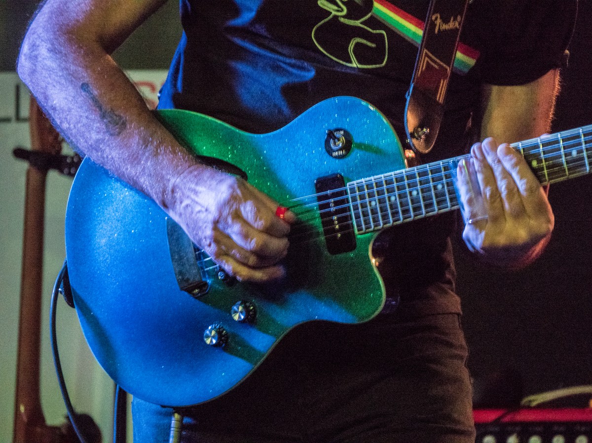
  • Gigs images at Moody and Maas – moderately successful given that the light was very dim and all had to be handheld

Reading:

  • Stephen Shore – The Nature of photography – found his way of splitting up looking at images into the physical level, the depictive level and the mental level a helpful way of conceptualizing what I am thinking about with an image
  • Photoworks 22 – Women – some of this I find too theoretical, too far away from my practice –
    • but really enjoyed Francesca Catastini – The Modern Spirit is Vivisective,
    • also the work by Diana Matar – Evidence – talking about the importance of absence.

Thinking:

  • Still about how to show sensory differences in visual terms.

St Andrews Photography Festival

This

27/01/17

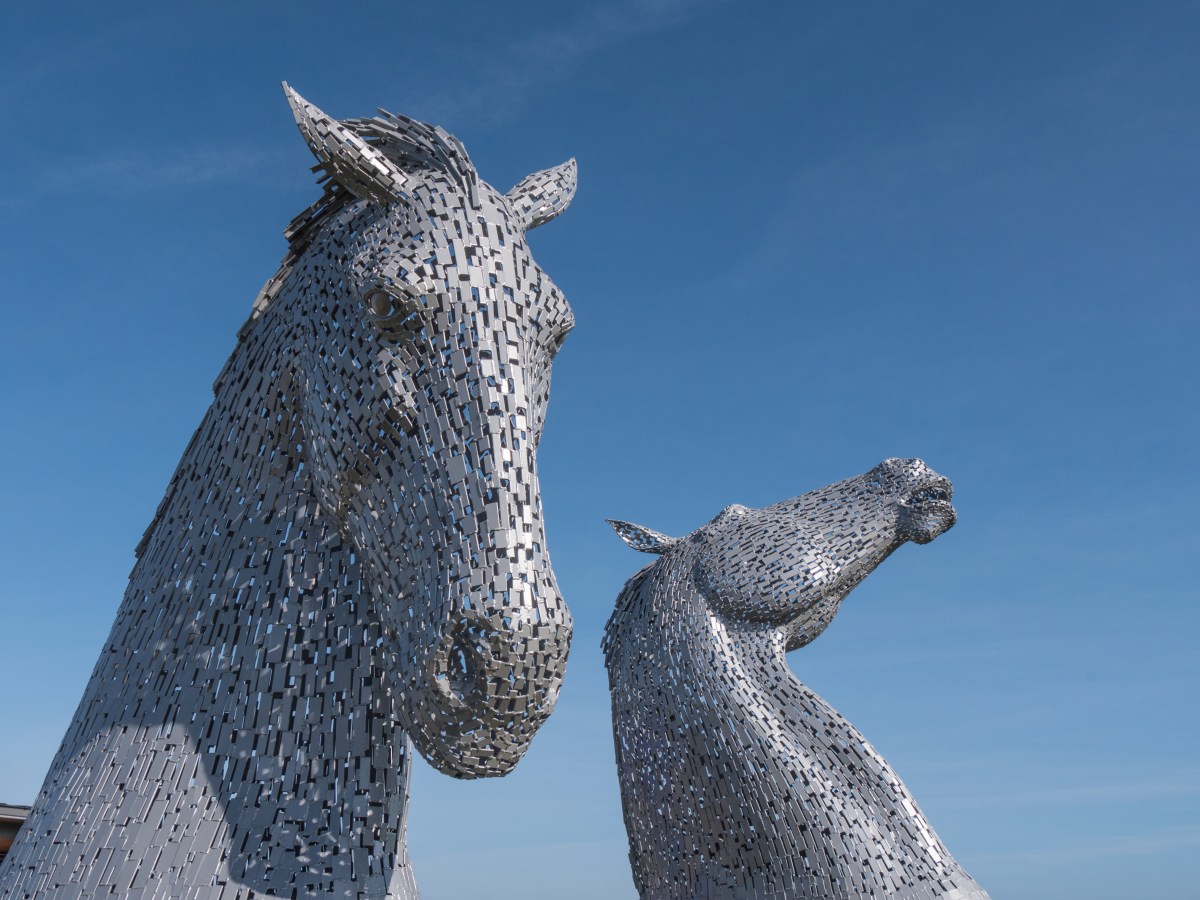
I had the opportunity of visiting the St Andrew’s Photography Festival at the end of September. Unfortunately, I didn’t manage to attend any of the workshops, as I would have liked to go to either (or both) of the collodion workshops or the one on tintypes. I did, however, manage to walk around the outdoor displays and also visit some of the exhibitions. The exhibition was overlooked by a ‘small’ scale copy of the sculptures of the Falkirk kelpies, only small relative to the original kelpies, even these towered over me.

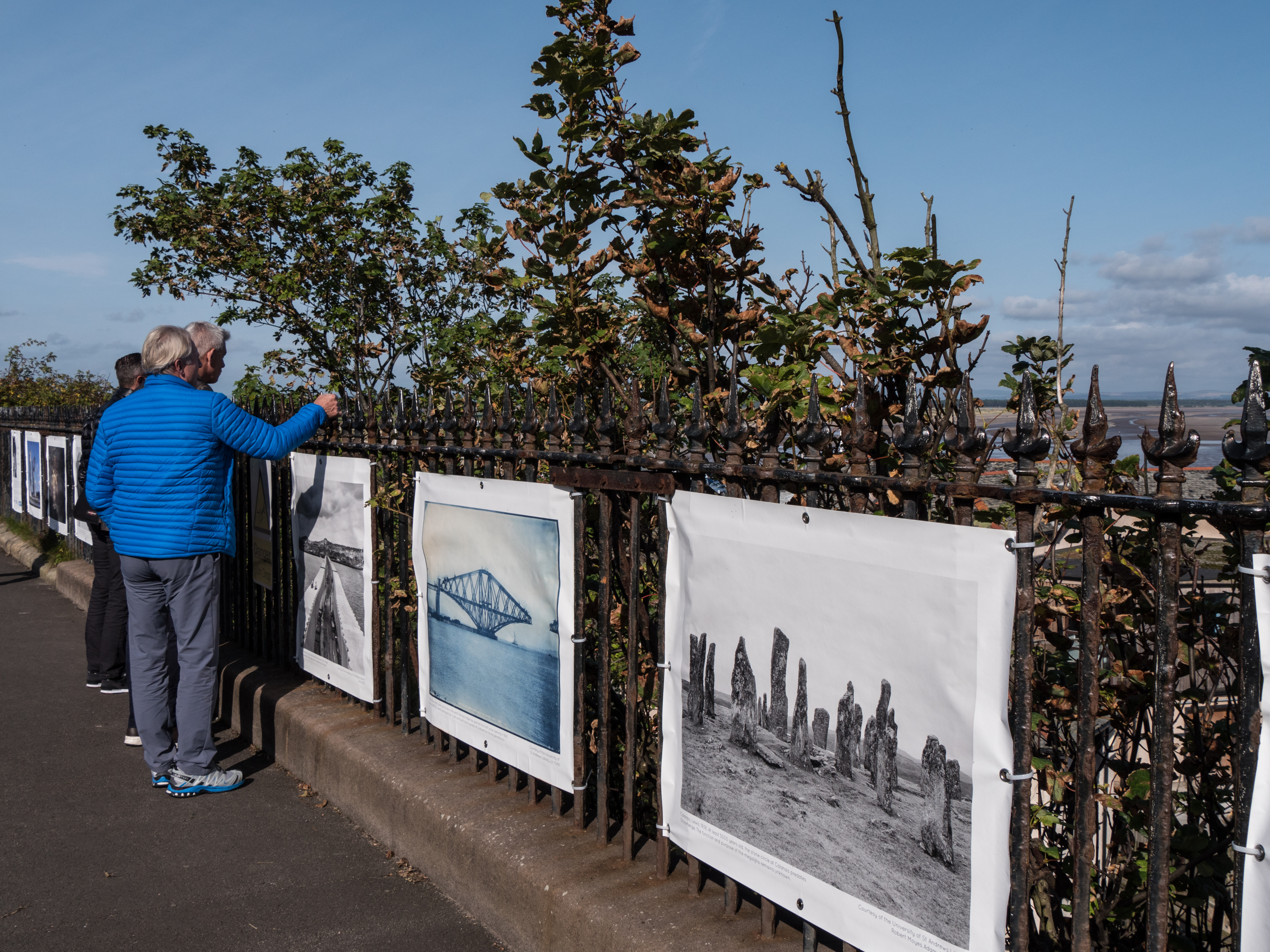
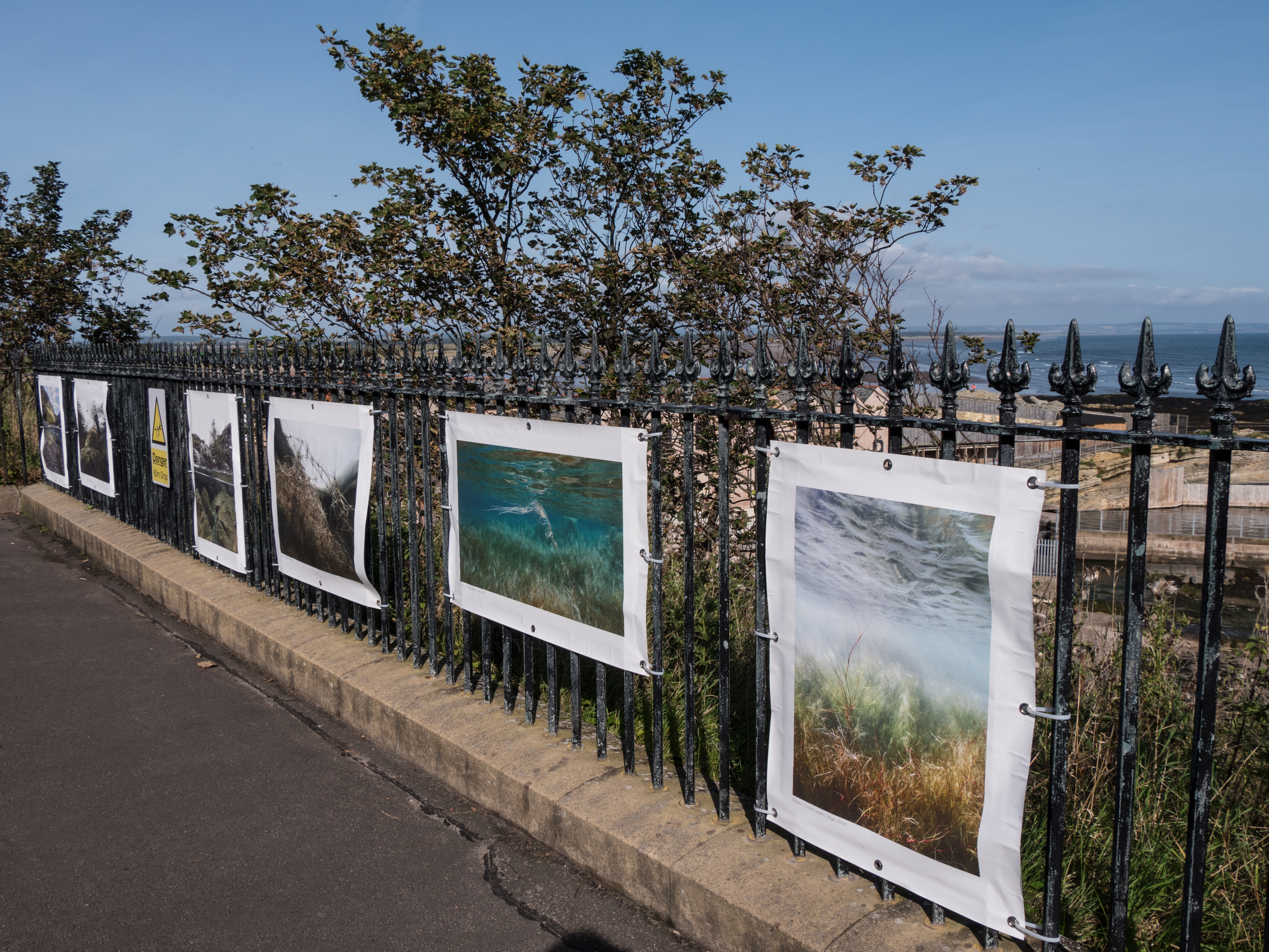
There were several displays of large posters of photographs shown on the railings both along the sea-front (The Scores) and also in front of one of the churches in town. These were interesting displays, partly for the images themselves, but also because of the reactions of the people in St. Andrews on the day I was there. I assume they were mostly tourists, there to look at the castle, cathedral ruins or play golf. Many were travelling in large groups with leaders discussing the sites. Very few were looking at the images displayed, rather leaning over them to look at the scenery. If I had thought more about this at the time it would have been interesting to have asked them if anyone was aware of the posters and what they thought of them (hindsight is a wonderful thing).

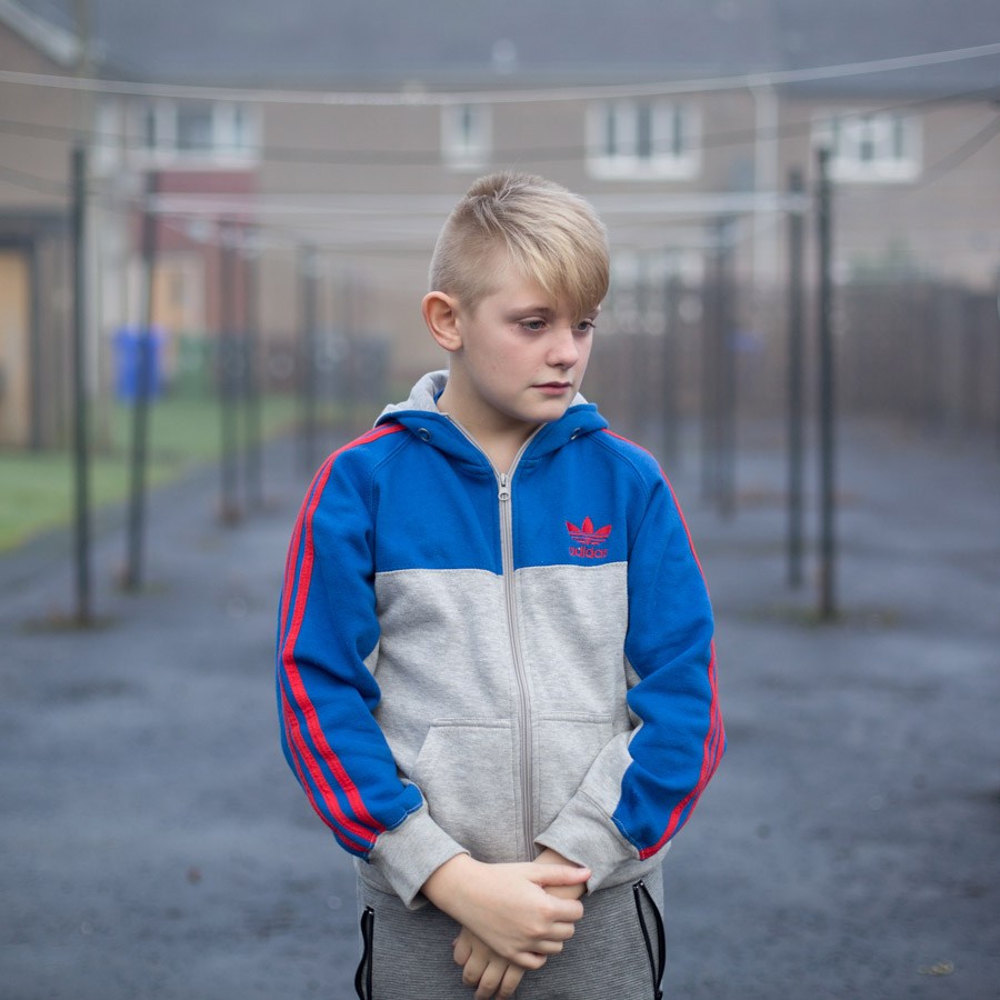
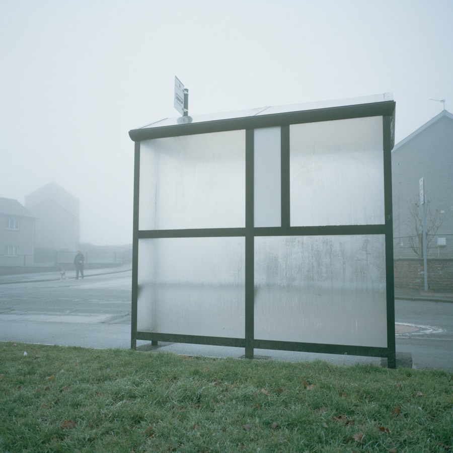
The poster exhibition that caught my eye was ‘In This Place’ by Margaret Mitchell, which has now been widely exhibited and won several awards including for the RPS and Lensculture. The work looks at images of her family set against the background of housing estate life in parts of Stirling that are waiting for regeneration.

These images of urban family life in a desolate area that might have been anywhere in Europe contrasted strongly with both some of the other, more traditionally beautiful images on show and the stunning coastal backdrop.

untitled-2

A further series of posters were of the various exhibitions that have been put on by Stills Gallery in Edinburgh over the last 40 Years. It is their 40th Anniversary this year. This showed the wide range of types of exhibitions that have been around in Scotland, but also possibly the general Scottish lack of reverence for the more cultural aspects of life, along with the need for fast food.

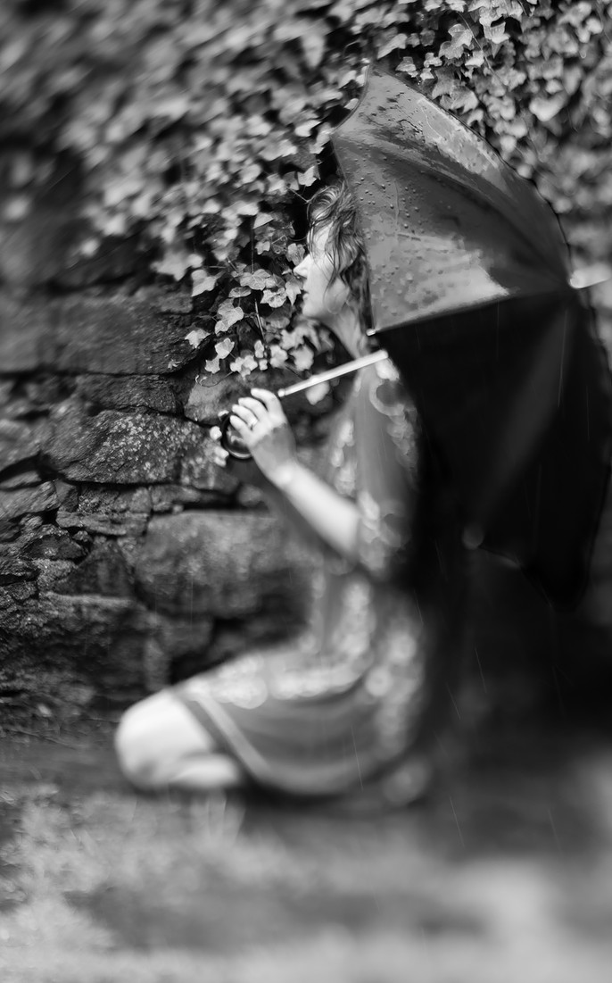
There were also many indoor exhibitions, not all of which I managed to see. Two that stood out for me were Heidi Blanksma and Hannah Laycock. Heidi won the photography competition with the image ‘Feel the Rain’, described as having a ‘Julia Margaret Cameron sort of feel‘ (Standrewsphotograpghyfestival.com, 2017).

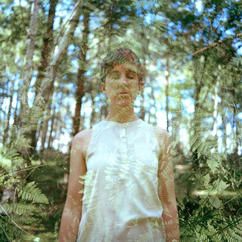
Hannah Laycock produced a fascinating piece of work ‘Awakenings’ in which she describes photographically her feelings about her own struggle with MS. I found this especially interesting as it links into my own project on showing the feelings of people with autism in images. This also reminds me of some of the images in ‘The Final Project‘ by Jo Spence, although her images were overlaid using actual transparencies rather that what I presume is Photoshop here.  I assume the reference is deliberate – although the idea of disappearing and melding into nature is clearly evocative of losing yourself physically.

Awakenings
© Hannah Laycock , image courtesy of Hannah Laycock

Overall the festival (what I managed to see of it) was interesting with a wide range of photographic styles on show, and several potentially valuable workshops , which I will try to attend next year if available. I am not sure about the use of the outdoor presentations – I assume the idea is to bring photography and the festival to the attention of the multiplicity of people who visit St Andrews in the summer – but I wonder how successful that was, although if it only engaged the minds of a few who had never thought of photography as an art form, rather than a quick family snapshot or something for social media, it will have been a useful exercise.

References:

Hannah Laycock. (2017). Awakenings – Hannah Laycock. [online] Available at: https://hannahlaycock.com/awakenings/ [Accessed 27 Oct. 2017].

Margaret Mitchell Photography. (2017). In This Place – Margaret Mitchell Photography. [online] Available at: http://margaretmitchell.co.uk/projects/in-this-place/ [Accessed 27 Oct. 2017].

Photographer in Aberdeenshire | Stonehaven | Blankcanvas Photography. (2017). Photographer in Aberdeenshire | Stonehaven | Blankcanvas Photography. [online] Available at: https://www.blankcanvasphotography.co.uk/about-contact [Accessed 27 Oct. 2017].

Spence, J. and Lee, L. (2013). Jo Spence: The Final Project. London: Ridinghouse.

Standrewsphotographyfestival.com. (2017). St Andrews Photography Festival. [online] Available at: http://standrewsphotographyfestival.com/ [Accessed 27 Oct. 2017].

Outside – inside, is it a fantasy? (Assignment 4)

23/10/17

The Brief: Take one of the exercises on daylight, artificial light or studio light and use it to create a set of between 6 – 10 images with a linking theme.

For this assignment I chose to use artificial light as this is not a field I have explored before and I felt it would be a good test of development of skills.  I thought about several possibilities of exploring this.

  1. Street scenes at night:

    This gave me the options of more general shots, such as the lit town hall, or more specific ones like the exterior of the local pub.

  2. Gigs:

    This definitely was a possibility, as the light is very interesting, all of the above images are as shot on the same night without a change in the white balance.

  3. Car lights at night (road shots with extended times).
  4. Fireworks (wrong time of year).

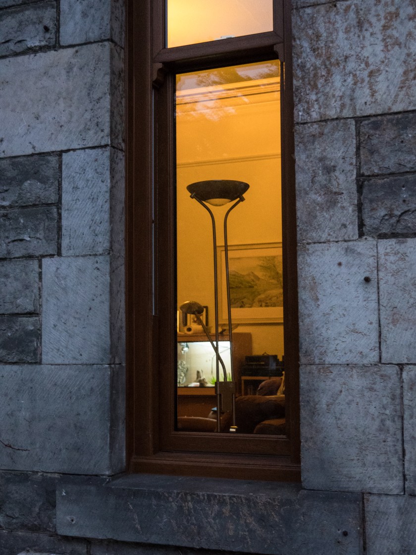
However, I was walking home one evening and this was the view though my window.

House window.

I found this an interesting view and decided to explore the concept of looking through the window.

Research:

a. When I started thinking about the concept of lit windows I remembered a painting I had seen at the Glasgow Gallery of Modern Art many years ago. Avril Paton is a Glasgow based artist who painted a series of images of Glasgow tenement flats from the outside, often with lit windows, looking in on the life inside. In these images the light is usually warm and intimate.

https://avrilpaton.co.uk/portfolios/glasgow

b. Rut Blees Luxemburg’s image of tower blocks give a similar feeling, and utilise similar colours, concentrating on golds and browns. Images can be seen in the Guardian article below. ‘Towering Inferno’ is an example of this, but although the colours are warm, the images are massive, and give an overview of the flats, not similar to the more intimate views I was looking for in my series.

https://www.theguardian.com/society/gallery/2009/mar/09/rut-blees-luxemburg-photography

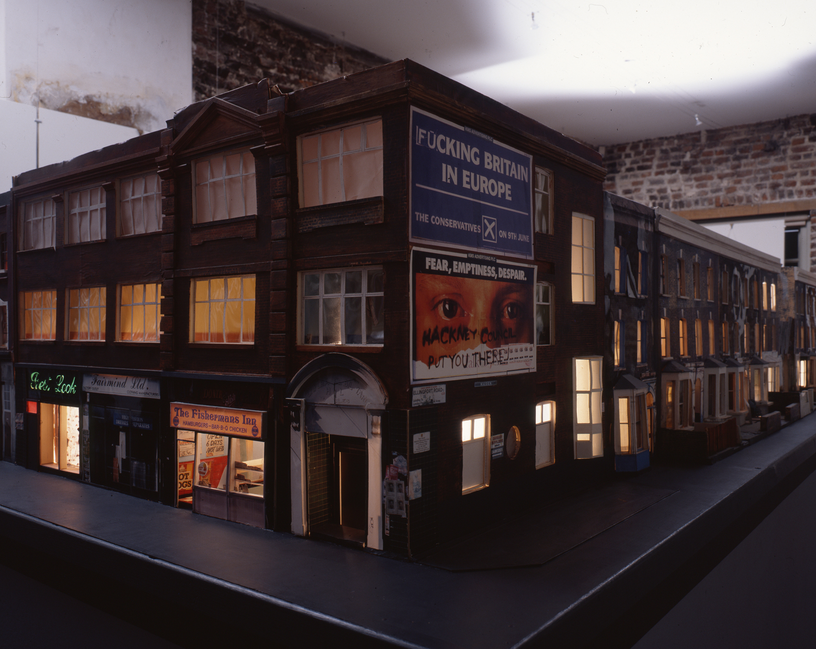
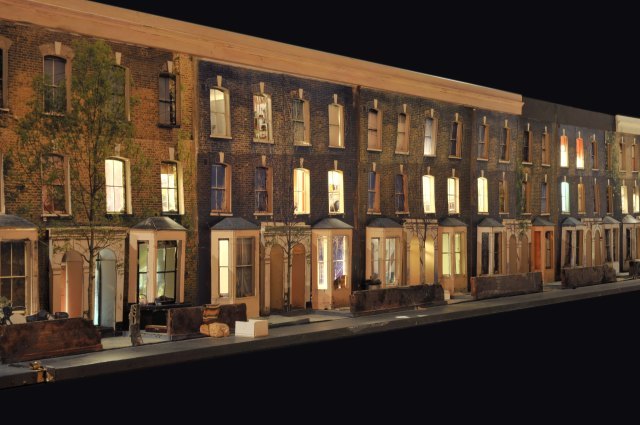
c. Todd Hunter has explored the concept of home at length in several series of works, one of which ‘The Ghetto‘, is a 3D model of the street he lived in, with colour transparencies place within the doors and window, lit from within. You have to walk along the model to look into the rooms.

There is also a series of other images taken within the rooms of people who lived (and often still do) on that street. These images and the display had been taken in response to an article in a local newspaper which described the area as ‘a blot on the landscape‘ (Tomhunter.org, 2017).

sp 2777 001
Ghetto 6 © Tom Hunter, with permission from Tom Hunter.

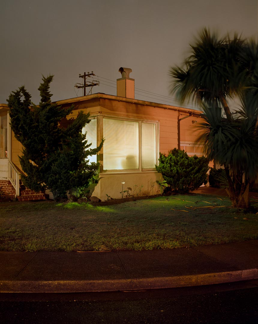
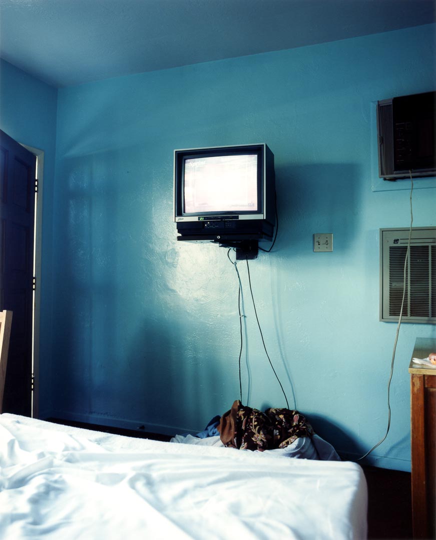
d. Todd Hido has also utilised artificial light, taking both outdoor images of houses at night and inside images. Like Tom Hunter, these are not beautiful in the traditional sense, but tell you a lot about the lives of people living in modern America, however these rely on the rooms themselves to tell the story, not the people within the rooms. I felt this was more in line with my idea.

The Process:

I took a long series of images at a cottage we were staying in in the country in Dumfries and Galloway. It was well away from any town, and the only light in the evening came from the lights in the cottage itself. I took some of the images handheld, with the ISO set to 6400, and the rest of the images using a tripod with the ISO at 800. I used a fully manual mode throughout. I have discovered that using manual settings slows me down and makes me think more about what I am focusing on and which bit of the image I want to have exposed in most.. It was not easy to use the tripod outside as the ground around the cottage is very uneven, and it was tricky to get a stable and straight image, so some of the ‘better’ shots were actually handheld, in spite of the high ISO. A more stable tripod would have helped here.

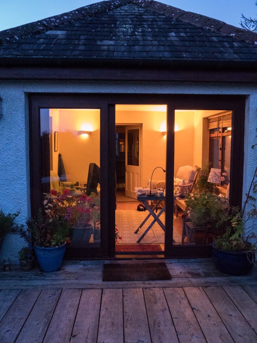
Images were taken from outside, looking at and through the windows, and inside. I did not ‘tidy up’ in advance of taking the images as I was looking to show the contrast between the outside images, where you could imagine almost anything, and the inside reality.

The images were processed in Lightroom CC, with minimal changes. I did not alter the white balance as it feels accurate for the lighting conditions and what I wanted to show.

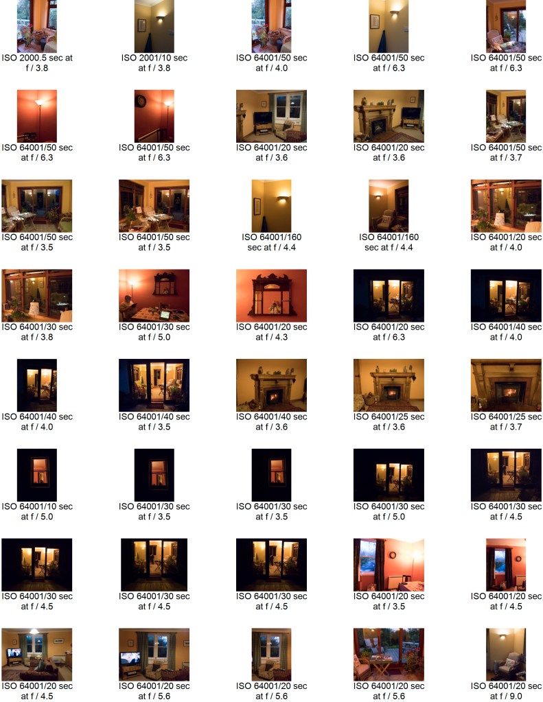
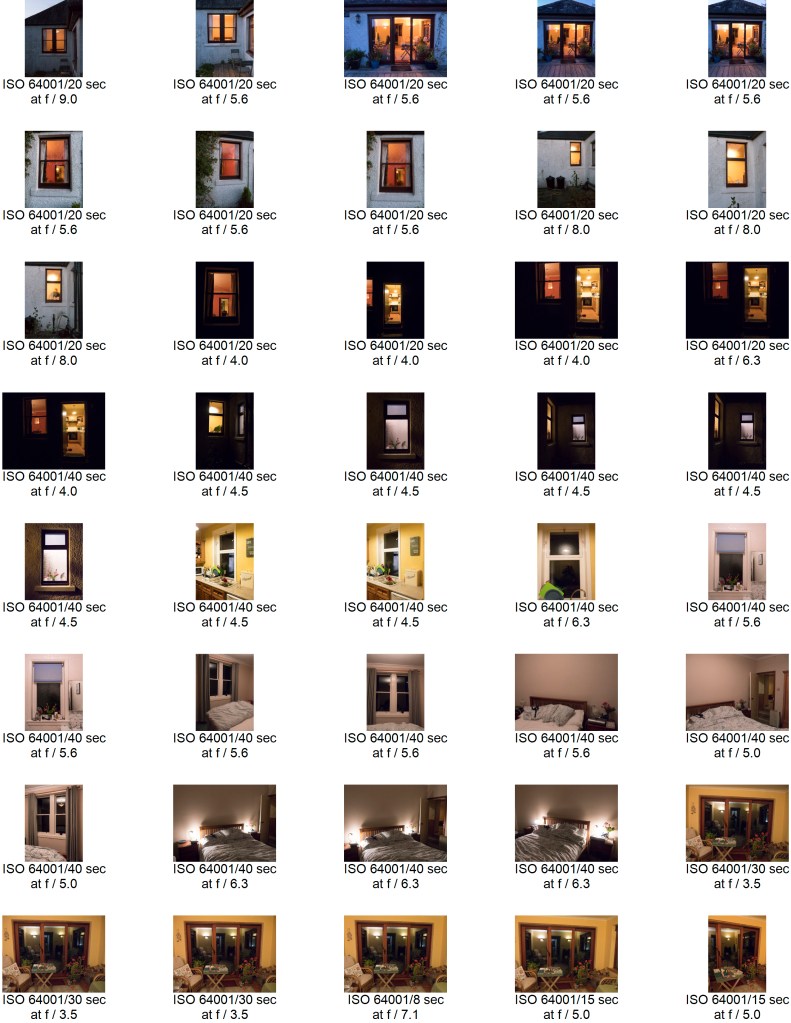
Contact Sheets:

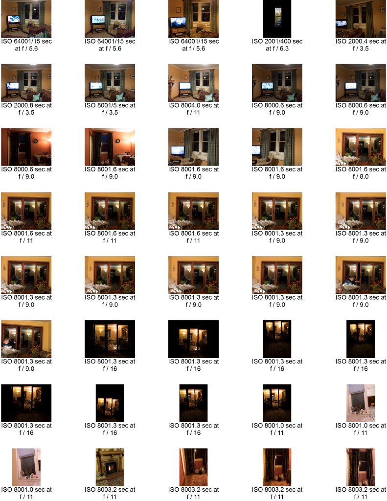
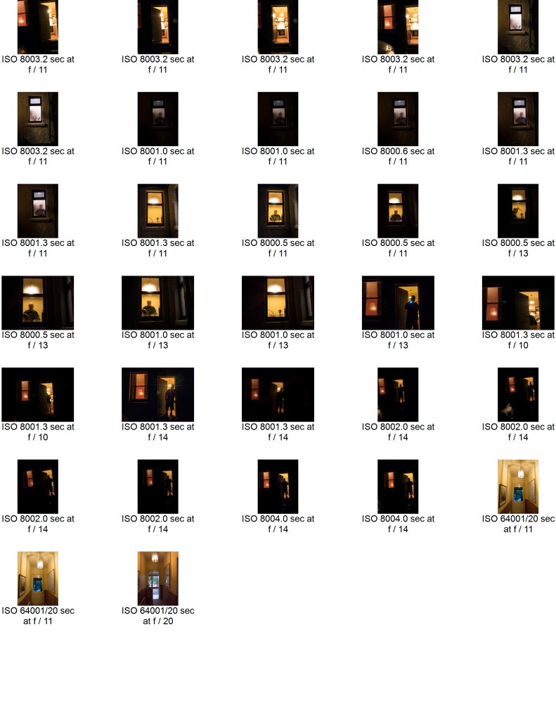
Initial contact sheet for all the images:

Selected images marked with exposure, aperture and ISO:

I spent some time thinking about how, and which images to choose. I was not sure whether to stay with a given orientation or whether to mix between landscape and portrait. Most of them were portrait due to the nature of the windows so I chose to go with these, – but some of the individual images were more pleasing as landscape.

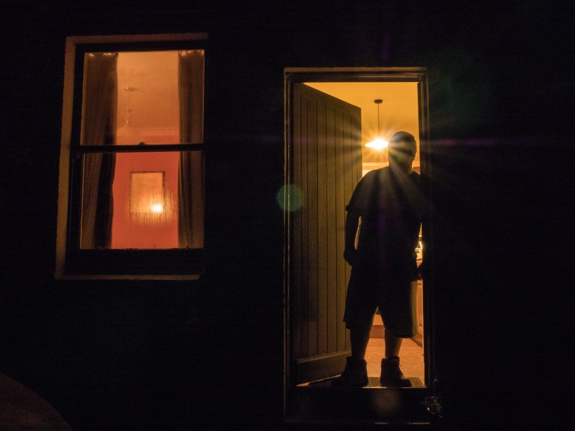
I also took some images that showed a person, and although they were interesting felt that this distracted from the overall idea of the set. The other possibility was pictures taken later in the evening, where the outside of the cottage was effectively black, and only the windows showed. This image combines both those ideas.

With people.jpg

Final Images:

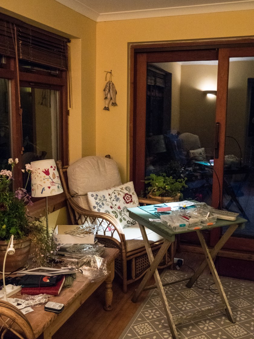
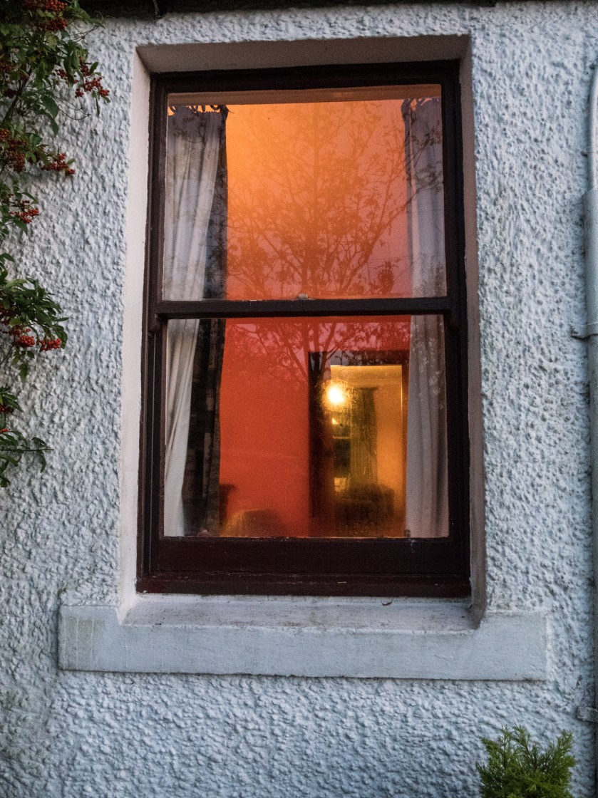
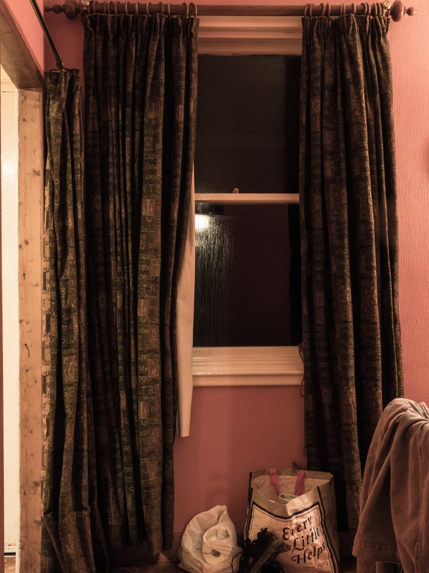
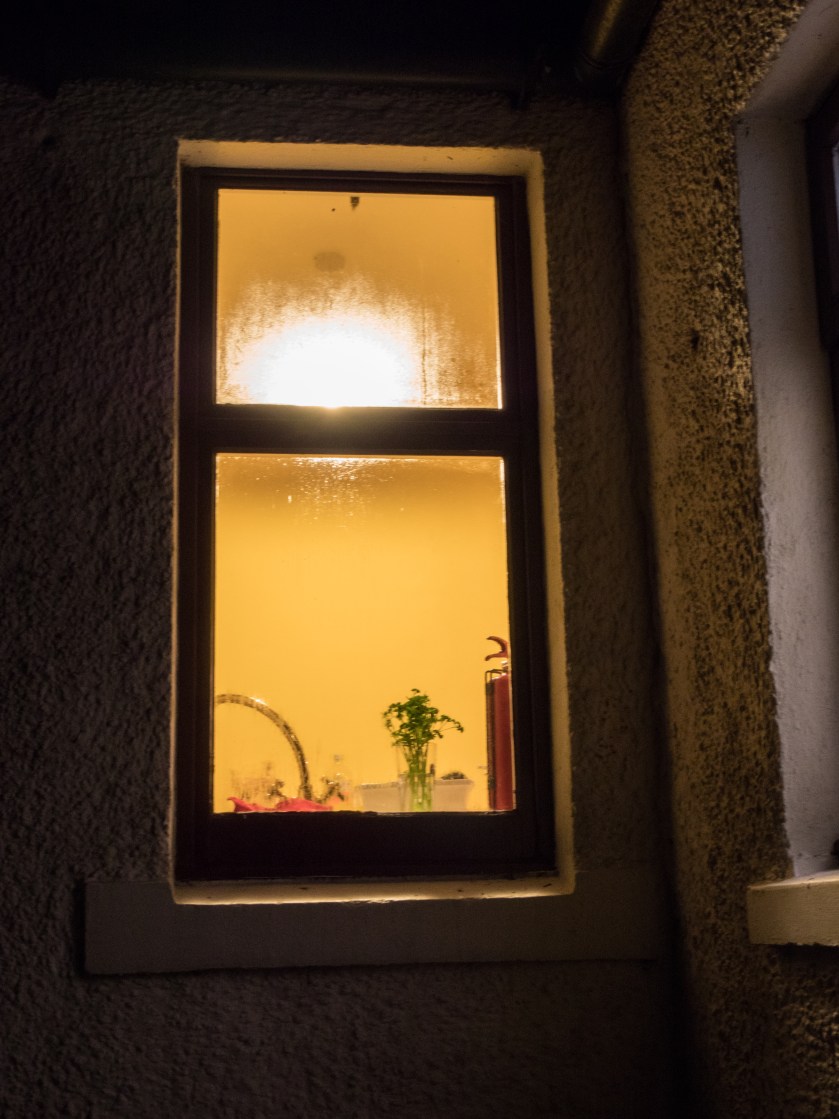
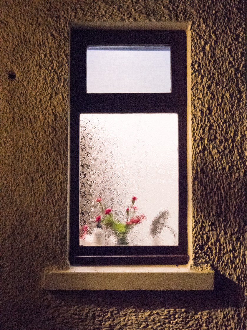
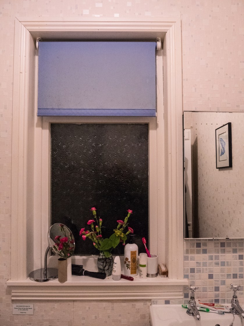
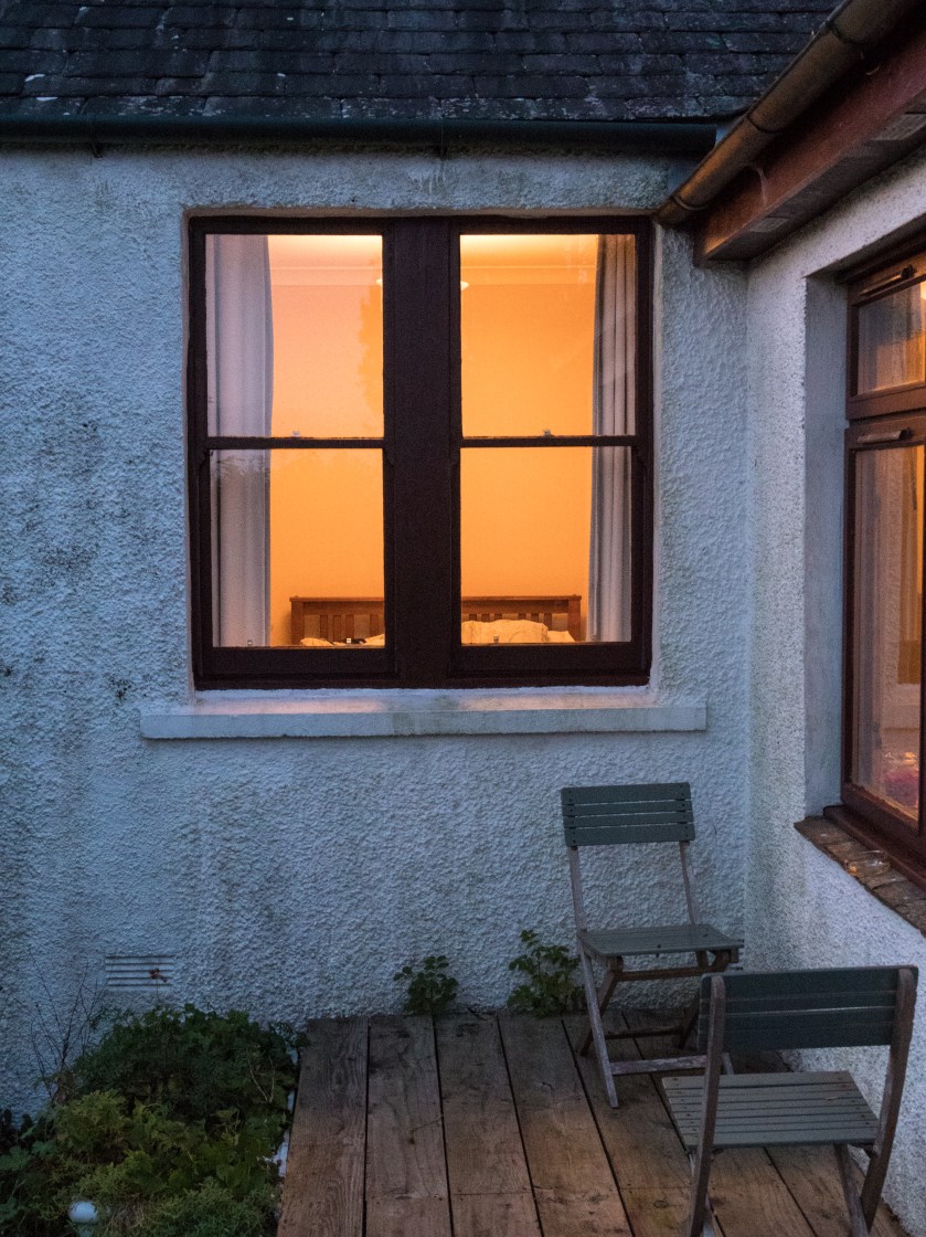
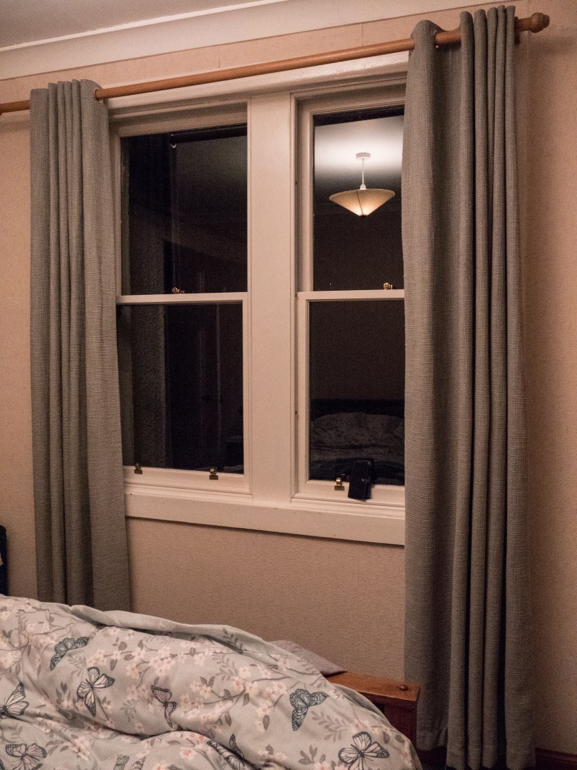
Sunroom - outsideSunroom - insideLivingroom -outsideLivingroom - insideKitchen - outsideKitchen - insideBathroom -outsideBathroom - insideBedroom - outsideBedroom - inside

Summary:

My idea here was to show the difference between what you see, and therefore can imagine, when looking from outside of a picturesque country cottage to what is actually happening inside the same rooms. Fantasy versus reality. I chose not to show any people in this set of images, leaving them quite stark and factual.  Overall, I am fairly pleased with the set. In some of the images the inside light is very bright, and might benefit from more post processing – but the significant contrasts were there, and in this case, I did not wish to ‘play’ with the truth any more than minimally.

References

Paton, A. (2017). [online] Avrilpaton.co.uk. Available at: https://avrilpaton.co.uk/portfolios/glasgow [Accessed 23 Oct. 2017].

the Guardian. (2009). Photographer Rut Blees Luxemburg explores the public spaces of cities. [online] Available at: https://www.theguardian.com/society/gallery/2009/mar/09/rut-blees-luxemburg-photography [Accessed 23 Oct. 2017].

Toddhido.com. (2017). House Hunting. [online] Available at: http://www.toddhido.com/househunting.html [Accessed 23 Oct. 2017].

Tomhunter.org. (2017). The Ghetto Series | Tom Hunter. [online] Available at: http://www.tomhunter.org/the-ghetto-series/ [Accessed 23 Oct. 2017].


Weeks (3) ending 20/10/17

20/10/17

Not a very productive 3 weeks!

Photography;

  • more images of the cottage by artificial light
  • lots of attempts at studio work for exercise 4.4 – with variable success

Reading:

  • Stephen Shore – The Nature of Photographs, interesting and easy to follow
  • Leibesleid – Rut Blees Luxemberg – fascinating images especially when read alongside the prose poem accompaniment.
  • The photographic Image in Digital Culture – Martin Lister – complex arguments about what is an image when it is made up of pixels and electrons in the ether.  Does how the image is made matter? Is it the vision or the actual print that is important – how does it effect indexicality.

Thinking:

  • How do I portray autism in images –
    • can I use items from the ADOS (diagnostic) kit – looking at imaginative versus concrete thinking
    • how do you show  altered sensation?- overlay sensory organ with something else – or is that too obvious
  • About light and its role in photography – Todd v Luxemberg v Shintaro
  • From Notes – quote by Robert Frank ‘Tell them to make work that is close to their heart. It seems to me that no-one can expect more than this’ (Notes, Autumn-Winter 2016, p 18).

Attended the Study Day in Glasgow – needs a write up.

The Beauty of Artificial Light

13/10/17

Images taken by artificial light have a different quality from those taken by natural light, however, that does not mean that they are all similar or that the colour palates or feelings invoked by those images are limited. The four photographers discussed below show a range of images taken at night or in the evening without the use of flash. Google searches of the images give an overview of the colours and contrasts between them.

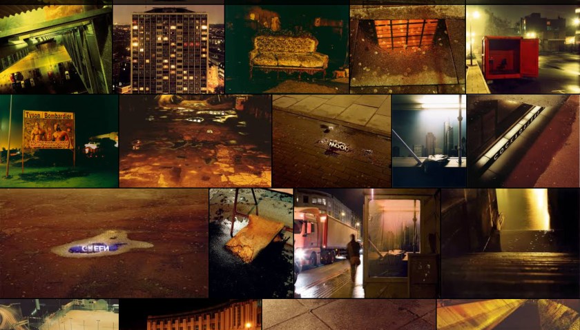
Rut Blees Luxemburg (born 1967) has taken images at night with a medium format camera. These are very considered images. She says she will wander the streets and only take a few images a month. In the series ‘Leibesleid’ the images are intimate, of small, rarely considered areas, the edge of a street, a corner with writing on a wall, steps going down into water. She says, in an interview with Campany ‘space that allows for a moment of repose…… the quieter things are the more significant the sound’ (Campany, 2006).  The images are presented in a book along with writings by Alexander Garcia Düittmann which while not describing the them, rather talk to them as in a conversation with a lover. Luxemburg has also done a further series of images on a much grander scale, also at night, of the city and the tower blocks. An example is the image ‘Towering Inferno’ – a tower block at night looking straight into the windows from another tower. The colour palate of both series is very limited, golden yellows with browns, never quite absolute blacks. They are full of life, even though the people are not present, they have just stepped out of sight. A recent interview for Photoworks says ‘One can also think about the city as a ‘character’ in these photograph, one that’s alluring, open, glowing even… yet also ambiguously wet, slippery and dark.’ (Photoworks, 2017).

A simple google search for her images produced this, showing the limited colour palate and the coherence of her images:

untitled-98

There is a shocking contrast here between the alluring golds and the harsh red and black that was seen in the recent images of the Grenfell Tower fire. Life versus death pointed up by the colours without even the need for the stories.

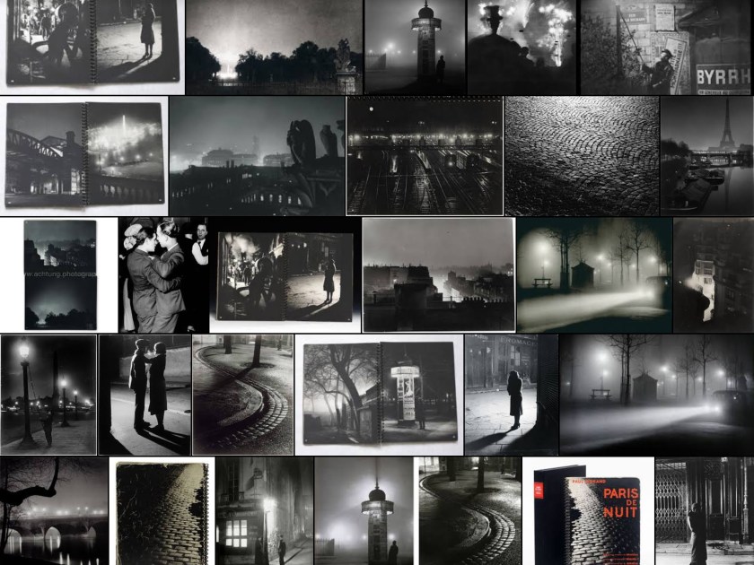
Brassaï (1899 – 1984) was fascinated by night scenes and some of his most famous work is shown in ‘Paris de Nuit’. These are very different, often spacious scenes, not intimate even though they often show people as well as the places. The light is harsh and clean.

untitled-99

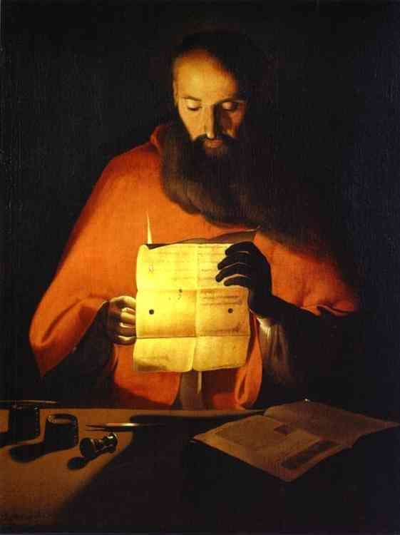
He is quoted as being influenced by the painter Georges de la Tour (1593 – 1652), who painted many pictures of people by candlelight. Interestingly de la Tour also mainly used a golden/brown warm colour palate. It would be interesting to know what colours the Brassaï images would have been if he had had the opportunity of using colour rather than black and white.

Georges_de_La_Tour_(atelier)_Saint_Jerome_lisant_Musee_Lorrain
Georges de la Tour (public domain)

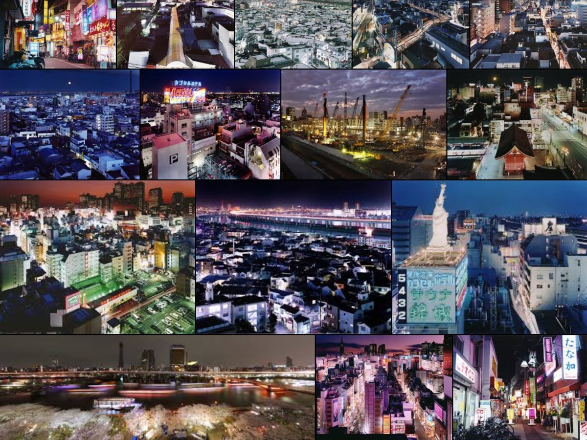
Sato Shintaro’s (born 1980) images of Tokyo ‘Night Life’ are startling in their intensity, using highly saturated colour to show the neon signs and the vibrancy possible in artificial light. All colours are present. The images are fascinating, the city is shown as a place that is busy, alive and challenging but confusing. However, he has also taken a series of images ‘Tokyo Twilight Zone’ with more limited colour palates, red/green, blue/white. These are much softer, calmer, less confusing. It is hard to visualise that they are the same place as the other images.

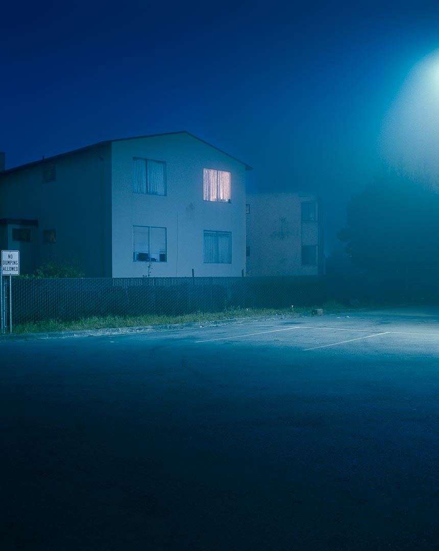
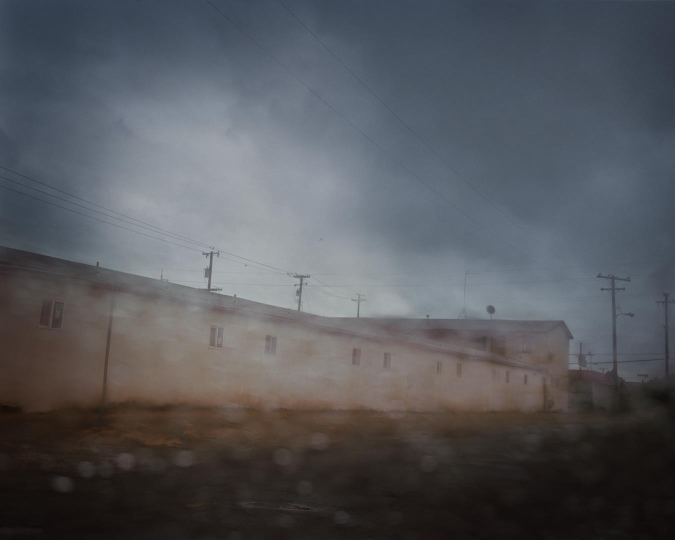
Todd Hido (born 1968) is another photographer who has utilised artificial light in his night images of houses, shown in his book ‘House Hunting’. He describes finding one of the houses ‘I couldn’t even see across the street. I remember coming out of the flatlands and hitting this fog and it was just the most surreal and creepy neighborhood I’d ever seen. It had all the right combinations. I remember seeing that for the first time and just being blown away by it all … that sort of changed everything’ (Berton, 2006). The images of these houses at night have muted colours, greys and browns, mysterious, lacking in detail. They could be anyone’s house and are only identified by numbers not place names, often in a single colour palate. They are not dissimilar to his daytime images shown in ‘A Road Divided’, which are misty, often partially defocused evocative images. His style remains recognisable at all times of day.

References

Berton, J. (2006). Todd Hido and the ‘Art of Darkness’ (2006) | #ASX. [online] AMERICAN SUBURB X. Available at: http://www.americansuburbx.com/2009/09/theory-todd-hido-art-of-darkness.html [Accessed 10 Oct. 2017].

Blees Luxemburg, R. and Garcia Düttmann, A. (2000). Liebeslied. UK: Black Dog Pub.

Campany, D. (2006). UNION. [online] Union-gallery.com. Available at: http://www.union-gallery.com/content.php?page_id=653 [Accessed 10 Oct. 2017].

Google.co.uk. (2017). brassai paris de nuit – Google Search. [online] Available at: https://www.google.co.uk/search?q=brassai paris de nuit [Accessed 13 Oct. 2017].

Google.co.uk. (2017). rut blees luxemburg liebeslied – Google Search. [online] Available at: https://www.google.co.uk/search?q=rut blees luxemburg liebeslied [Accessed 10 Oct. 2017].

Google.co.uk. (2017). sato shintaro – Google Search. [online] Available at: https://www.google.co.uk/search?q=sato shintaro [Accessed 13 Oct. 2017].

Hido, T. (2002). House hunting. Tucson, Ariz: Nazareli.

Hido, T. (2010). A Road Divided. Nazareli.

Photoworks. (2017). Jerwood/Photoworks Awards Mentor: Rut Blees Luxemburg | Photoworks. [online] Available at: https://photoworks.org.uk/interview-rut/ [Accessed 13 Oct. 2017].

Sato-shintaro.com. (2017). Sato Shintaro Photo Gallery. [online] Available at: http://sato-shintaro.com/m/ [Accessed 10 Oct. 2017].

Toddhido.com. (2017). Todd Hido. [online] Available at: http://www.toddhido.com/homes.html [Accessed 10 Oct. 2017].

Edinburgh Exhibitions

09/10/17

Edinburgh Galleries have just had two exhibitions of old photographs.

The National Portrait Gallery is showing ‘A Perfect Chemistry’, the works of Hill and Adamson

https://www.nationalgalleries.org/exhibition/perfect-chemistry-photographs-hill-and-adamson

while the Queens Gallery has ‘Shadows of War’ on Roger Fenton and his Crimea images.

https://www.royalcollection.org.uk/collection/themes/exhibitions/shadows-of-war/the-queens-gallery-palace-of-holyroodhouse

A Perfect Chemistry.

David Octavius Hill (1802 – 1870) and Robert Adamson (1821 – 1848) are one of the most famous couples in photographic history. It all started, as it often does in Scotland, with an argument. In this case an argument within the church. In May 1843 there was a massive schism in the Church of Scotland where 400 ministers broke away to form the Free Church of Scotland, where they could choose their own path and the people had more say. There was a dramatic walk out from the General Assembly and a march though the New Town of Edinburgh which ended with the signing of the Deed of Demission several days later. Hill, who was at that point primarily a landscape painter, watched the march and decided to mark the gravity of the occasion with a painting of all the ministers involved. He started by making oil sketches but rapidly realised that this was an impossible task so looked for an alternative way. At this point he was introduced to Adamson, who was already an expert in the use of the new photographic method – the calotype. And so, it began.

Talbot’s image process, the calotype, was patented in England, but those patent rights did not extend to Scotland, so the Scottish images makers were free to experiment with it, and take large numbers of images. John Adamson, Robert Adamson’s older brother, altered the process to use potassium bromide rather than iodide as a fixative, but also introduced a lengthy washing to the prints. Both Adamsons became highly proficient in the making of calotypes which was shown by the vast number of images eventually produced.

Hill and Adamson did go on to make images of all the ministers which Hill eventually combined into a massive painting. The photographic images are redolent of the times, serious faced men, often leaning on books, looking sombrely out at the world. There are no women in this series as, of course, women could not be ministers in that era. The positioning of the men is at least partly to do with the demands of the calotype process, where, even when the sun was shining, the exposure could take up to several minutes, smiling would have been impossible, but would also have been thought inappropriate for an image of a man of the church.

After taking the images of the ministers, the partnership continued, photographing the great and good of Edinburgh society, by now including women, landscapes, building projects showing Edinburgh old and new and even at least one nude portrait. Many of the images were taken in Greyfriars Cemetery, cemeteries were a popular and romantic destination even then, and many were certainly influenced by the Romantic works of Sir Walter Scott, with people dressing to portray characters from his books. They also took images of military characters, such as drummers and soldiers from the 92nd Gordon Highlanders, which again Hill combined into a massive painting of people under Edinburgh Castle. One of the ventures of the duo was to capture images of the Newhaven fisherfolk, men, women and children. This is probably one of the first examples of photographic typology extant. The images are not snapshots, but carefully composed, often using the tools of the trade as props to allow for the extended time of image taking, but also using stands and clamps to hold people still. These were often taken out of the final image or ‘painted’ over. They had planned to produce a book of these images but this never materialised.

                Images by Hill and Adamson, courtesy of the National Galleries of Scotland.

Their partnership was short, only four years, as Adamson died at 26 and Hill did not continue with the photographic work after his death, returning instead to painting and producing lithographs. However their work had a profound effect on the popularity and use of photography in Scotland, and still remains a massive achievement.

The exhibition was fascinating, accompanied by an audio recording explaining the history of the images and an extensive catalogue (Lyden, 2017). I found the images of the people surprisingly moving given that they had to sit for such a long period and they were clearly staged. They give a real sense of the people and places. The faces are the same as those you see in Edinburgh today, only the dress has changed.

Shadows of War

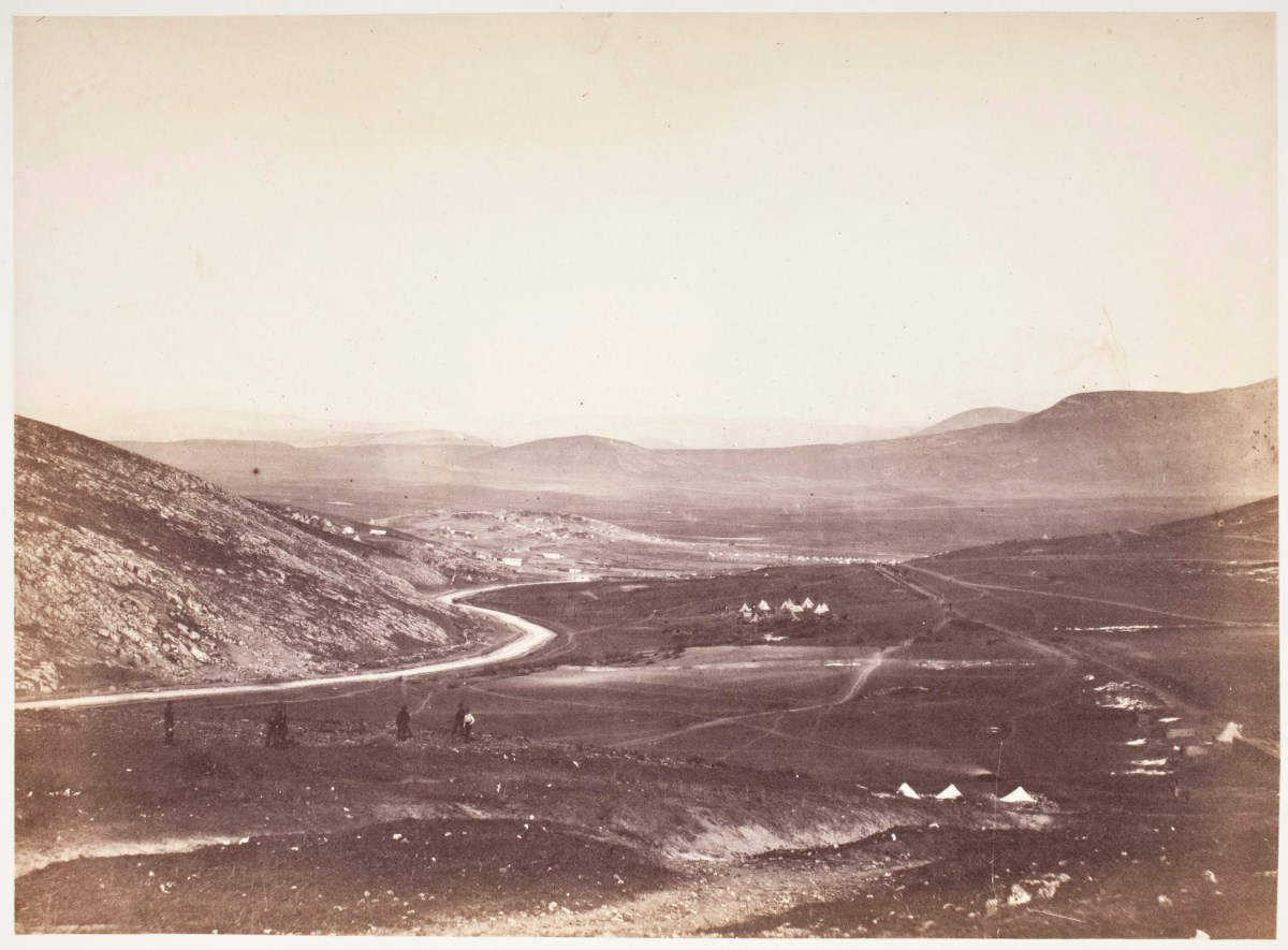
Roger Fenton (1819 – 1869) was a London based photographer who was commissioned to travel to the Crimea to take a series of images of the generals and other important figures there and to bring them back for the artist Thomas Barker to form a large oil painting depicting them all meeting. A meeting that could never have happened in reality. The war in Crimea, known then as the Russian War ran from 1853-55. Fenton travelled there in March 1855, leaving in June 1855 and was neither the first or the last photographer there, however his pictures were well advertised and shown around the country on his return to England and he is considered to be one of the first war photographers. He travelled to the Crimea with two assistants, his portable darkroom (a shed on wheels) and 700 plates which he prepared as needed, and brought back about 360 images.

                                               Images by Roger Fenton (public domain)

The exhibition shows many of his images together with others of the Crimean War, including its aftermath and the fall of Sevastopol, by which time Fenton had left the area. As with all photographers of that time many of the issues were staged, and some were ‘touched up’ with details before the final prints were made. He has been criticised as only showing the images that the authorities wanted the public to see, but in reality, many of his images are bleak in the extreme. He shows the chaos of the railways, the squalor of the camps as well as the set piece portraits of the generals that he was commissioned to take. Several are instantly recognisable – ‘The Valley of the Shadow of Death’ with its cannonballs (even if they were placed there) is an iconic picture of a war-torn environment, while his haunting picture ‘Lord Balgonie’ has been suggested to be the first image of a soldier suffering from shell-shock.

                                    Images by Roger Fenton (public domain)

The exhibition is accompanied by a comprehensive book (Fenton, Gordon and Pearson, 2017) with large plates and an historical overview together with an audio soundtrack about the images, this soundtrack is enhanced by Prince Harry talking about his own experiences of war and also by Don McCullin speaking about the difficulties of shooting pictures in those situations and the ethics of what can and what cannot be taken, how sometimes all you can do is bear witness.

At this stage one cannot know how many of his images were truly real, certainly at that time photographs were thought to show the absolute truth, although they could be altered and staged then as much as they can be now. They are possibly less overtly full of death than more recent war images, however they do show the aftermath of battle. It would have been nigh on impossible to take images in the middle of a firefight using collodion plates and long exposures. They are not ‘pretty’ or ‘romantic’ images – a world away from those of Hill and Adamson.

References

Fenton, R., Gordon, S. and Pearson, L. (2017). Shadows of war.

Lyden, A. (2017). A Perfect Chemistry.

Nationalgalleries.org. (2017). A Perfect Chemistry | Photographs by Hill and Adamson. [online] Available at: https://www.nationalgalleries.org/exhibition/perfect-chemistry-photographs-hill-and-adamson [Accessed 30 Sep. 2017].

Shadows of War (2017). Shadows of War: Roger Fentons Photographs of the Crimea, 1855. [online] Royalcollection.org.uk. Available at: https://www.royalcollection.org.uk/collection/themes/exhibitions/shadows-of-war/the-queens-gallery-palace-of-holyroodhouse [Accessed 9 Oct. 2017].
Summary week ending 29/09/17

Photography

  • sheep being loaded into a truck
  • indoor and outside images, night and day of cottage – thinking about light
  • boys and their toys ( guns and tanks)

Thinking

  • mainly about effects of light and night versus day. 
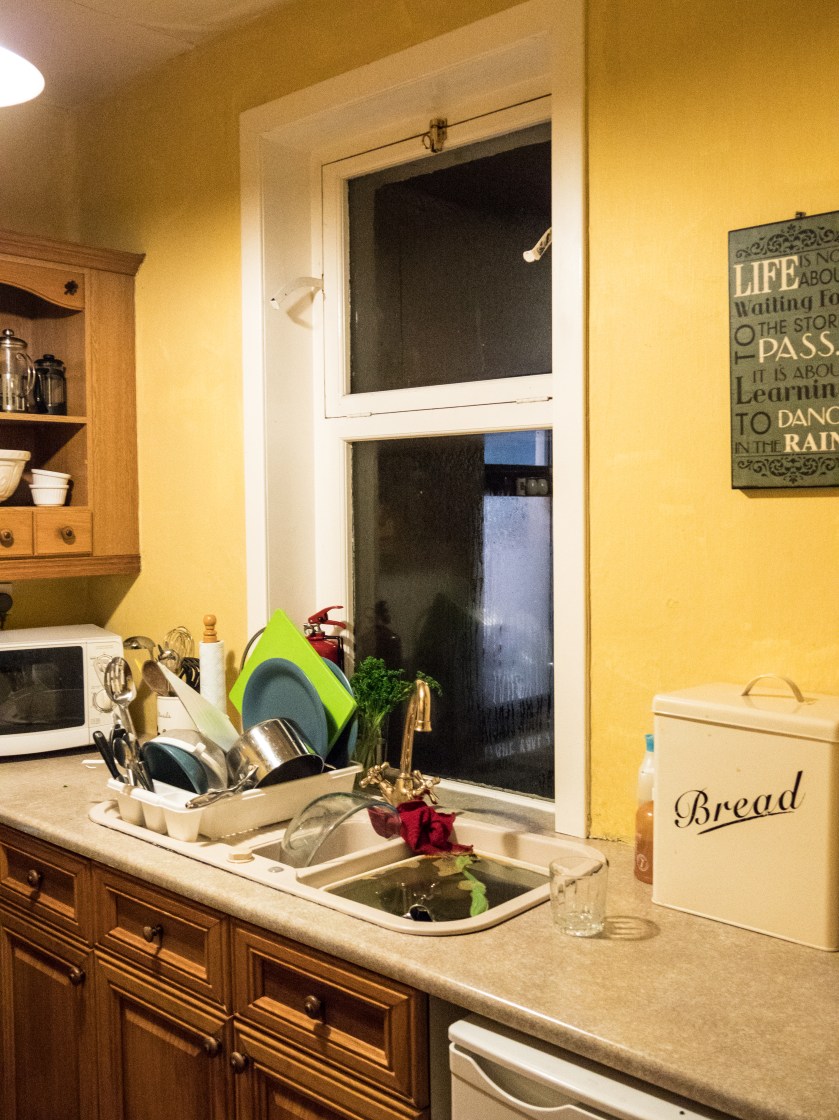
  • planning for assignment 4 – inside/outside views of cottage though the windows
  • ways of looking – someone commented on OCA website that it was just as much plagiarism o copy other peoples views as to use their words without proper citations 

Reading

  • SSHoP – interesting article about self portraiture, also about Carla van de Putelaar
  • Roger Fenton -related to Crimea war images
  • Hill and Adamson  – Edinburgh exhibition 

Visited the St Andrews Photography Festival – several interesting things there, especially the external images – most people completely ignoring them, leaning on them  – needs a detailed write up.


A Way of Looking

30/0 9/17

Recently I have been thinking a great deal about the art of looking, and it is indeed an art. It is far to easy to glance at an image, whether it is a photograph, a painting or even a sculpture and think ‘oh, I get it, that’s a man, house, apple or a dog.’ What is not easy is to understand what went into the making of the image and even less easy to consider what it means to the artist or what it might mean to another person.
I have also been thinking about the need (or not) of understanding the ‘theory’ of art and its place in the world we inhabit in the 21st century, which is certainly very different from its place in earlier centuries when it was often mainly the purview of the rich or the important, or part of the religious/spiritual world.
Last week I had a ‘lightbulb moment’, call it an epiphany if you will. I would not treat someone for a disorder without carefully examining them, listening to their past and present symptoms, researching the possible range of treatments and thinking carefully about all the options. Why should I not treat art with the same care and consideration?

There are two parallel strands to this. One is about learning how to take the best images I can, which talk, at least to myself, but hopefully also to others, about what is important to me and my view of the world. This does mean being open and allowing others the opportunity of seeing myself, my thoughts. The other strand is doing other artists (I am considering photographers in the main) the courtesy of thinking carefully about their worlds. This means learning about the present themes in all art, being open to areas that I find difficult but also learning how to speak about art in a way that others can understand.

In a recent article about her work, Carla van de Puttelaar talks about the need to study the entire oeuvre of an artist you wish to emulate. Her images resonate with the velvety smoothness of the Dutch Old Masters, translated for modern eyes. In the same journal (SSHOP 30th Anniversary Edition II), images by Romina Ressia also echo that era, with present day emblems such as popcorn substituted for the objects that would have had meaning in an earlier century. It is clear that both photographers have studied the earlier artists intensively, the images immediately brought Rembrandt and the other Flemish artists to my mind, while the modern twists gave them an edge. They are not copies but re-interpretations. The types are as relevant now as they were in the 17th  century, only the look on the faces of the women has changed, less submissive, more in control of their lives and their choices.

To write a meaningful critique of an artist you need to understand them, their history and their influences together with knowing how the type of work they are making fits within the time / era of their work. Is it art, documentary, protest, or portrait? Who was it made for? Is it straight or subversive (and if so why)? Over and above that you need to look, and allow time for your own interpretations to become clear. It is too simple (and something I am aware I am guilty of) to just reflect on what the guru’s say. That may give you a lead in and inform your thinking, but will not substitute for personal opinions together with imaginative thought.

Summary:
Look – with your mind
Think – with your brain
Write – with your personal voice

Summary week ending 22/09/17

Not a very productive week.

Photos:

Very  limited outside of EYV

  • did take some occasional selfies – but not impressed with them
  • didn’t have my camera with me when I went out today – so experimented with some indoor lighting on my phone

Blog:

  • Managed to both do the images and the write up for exercise 4.2. Found this interesting as even though the day was cloudy got some interesting shots using diffused light.

Reading:

  • Finished BJP September copy – interesting piece of work by Sanne de Wilde on ‘The Island of the Colour Blind’ which fits into my thoughts on photos of people / parents of people with autism.
  • still reading Clarke the photograph however had a lightbulb moment about the need for understanding the theory behind the work – I would not treat anyone without understanding the disorder and how the medicine or therapy was likely to work – so a similar thought process is required here. Having come to that mental agreement I am actually finding the theory easier!