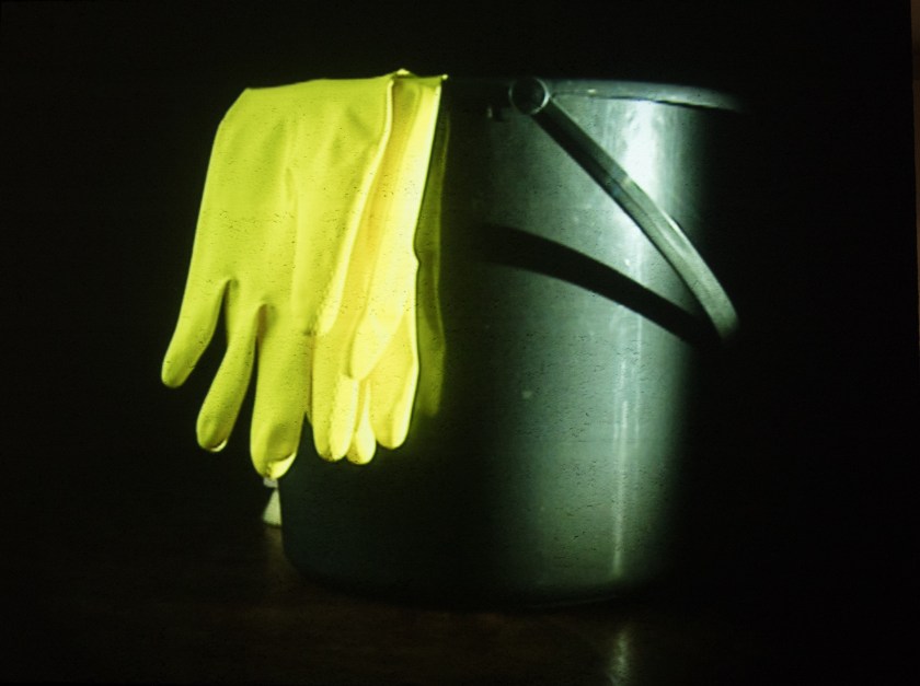
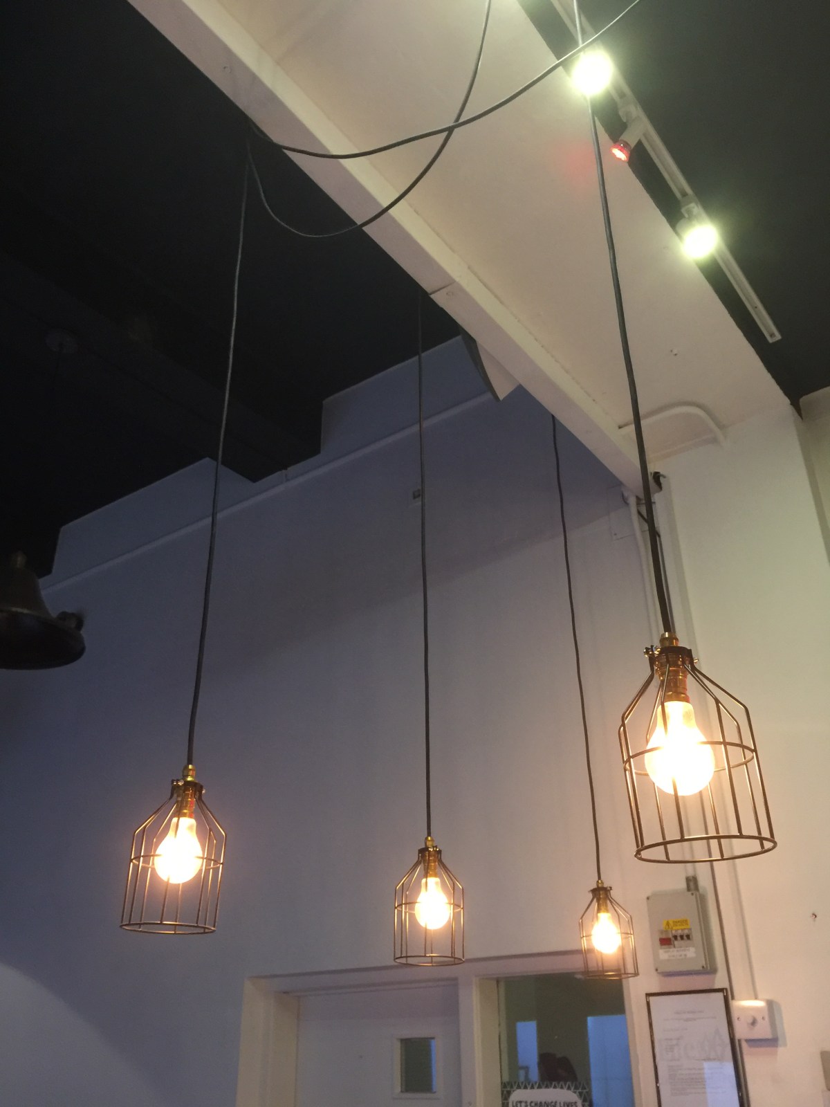
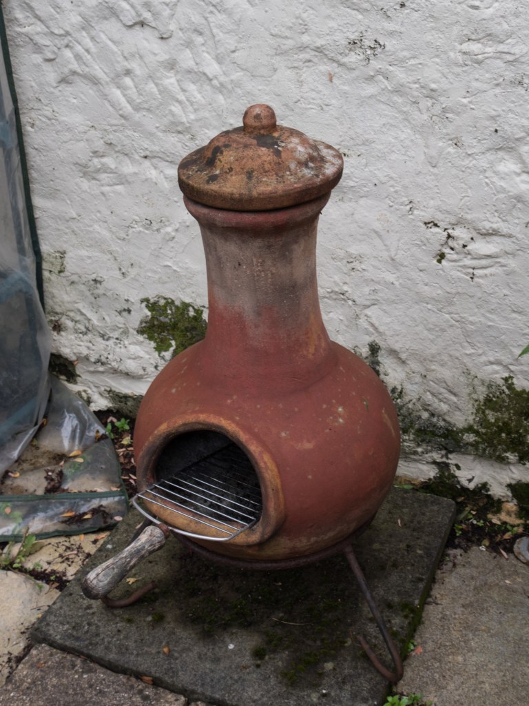
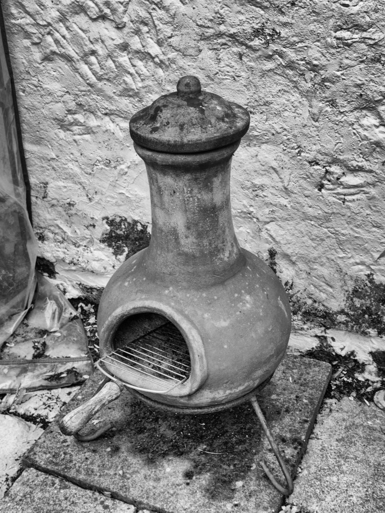
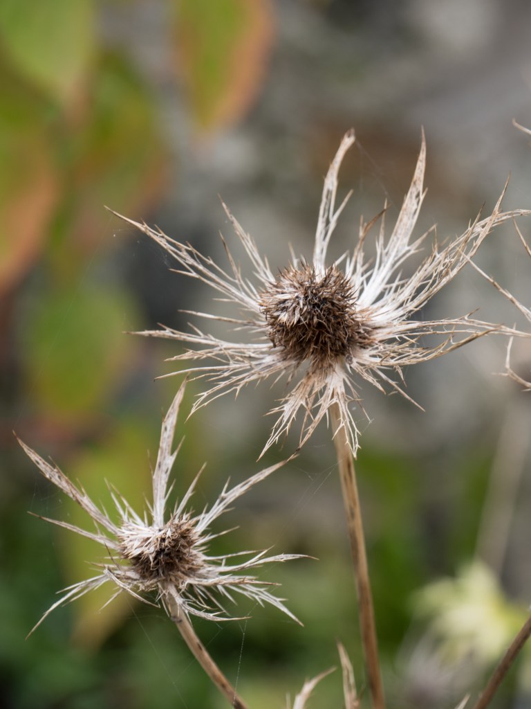
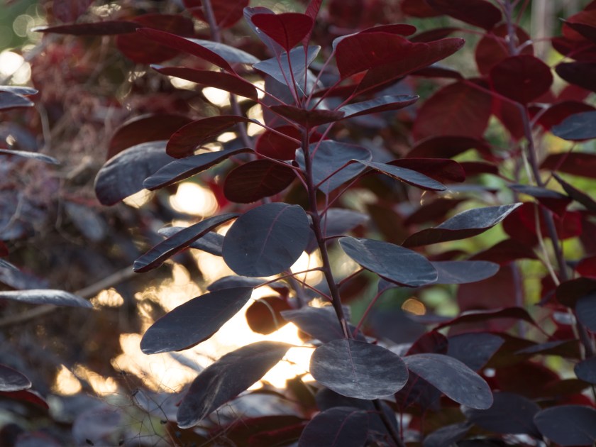
indoor and outside images, night and day of cottage – thinking about light
boys and their toys ( guns and tanks)
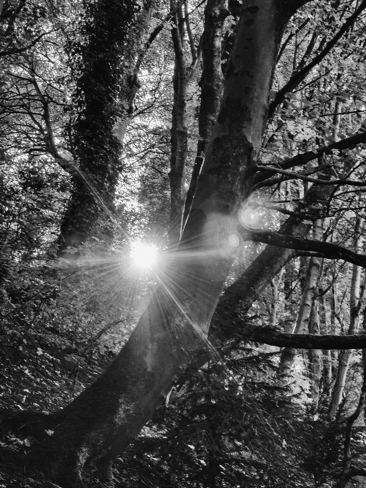
Thinking
mainly about effects of light and night versus day.
planning for assignment 4 – inside/outside views of cottage though the windows
ways of looking – someone commented on OCA website that it was just as much plagiarism o copy other peoples views as to use their words without proper citations
Reading
SSHoP – interesting article about self portraiture, also about Carla van de Putelaar
Roger Fenton -related to Crimea war images
Hill and Adamson – Edinburgh exhibition
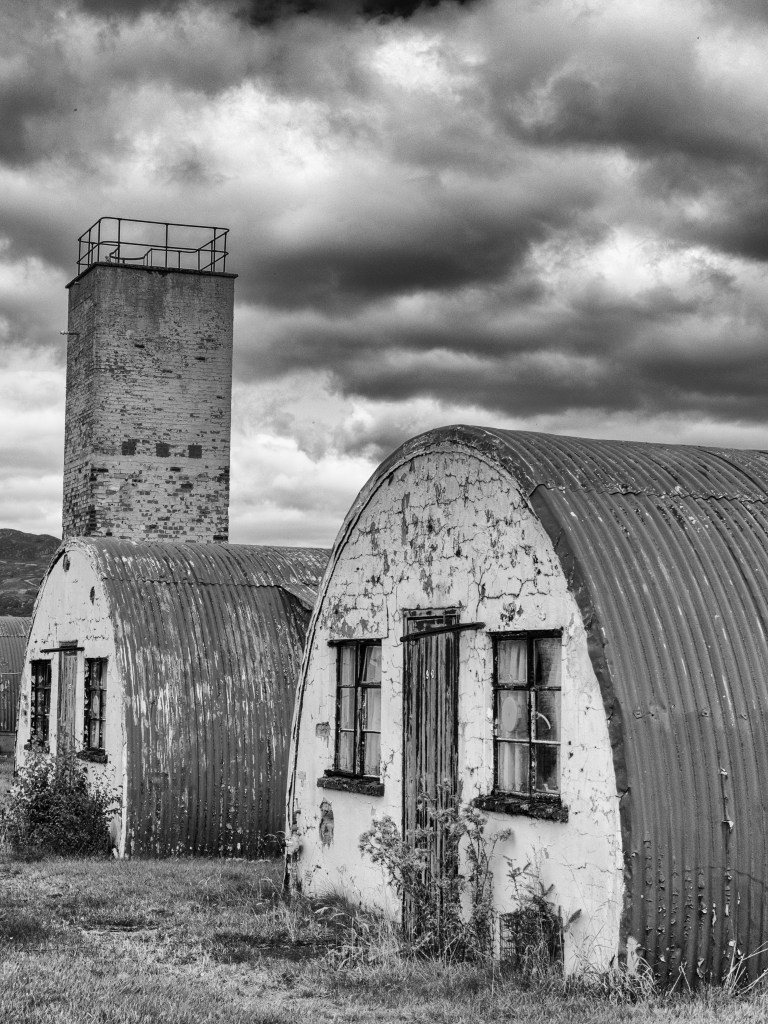
Visited the St Andrews Photography Festival – several interesting things there, especially the external images – most people completely ignoring them, leaning on them – needs a detailed write up.
Recently I have been thinking a great deal about the art of looking, and it is indeed an art. It is far to easy to glance at an image, whether it is a photograph, a painting or even a sculpture and think ‘oh, I get it, that’s a man, house, apple or a dog.’ What is not easy is to understand what went into the making of the image and even less easy to consider what it means to the artist or what it might mean to another person.
I have also been thinking about the need (or not) of understanding the ‘theory’ of art and its place in the world we inhabit in the 21st century, which is certainly very different from its place in earlier centuries when it was often mainly the purview of the rich or the important, or part of the religious/spiritual world.
Last week I had a ‘lightbulb moment’, call it an epiphany if you will. I would not treat someone for a disorder without carefully examining them, listening to their past and present symptoms, researching the possible range of treatments and thinking carefully about all the options. Why should I not treat art with the same care and consideration?
There are two parallel strands to this. One is about learning how to take the best images I can, which talk, at least to myself, but hopefully also to others, about what is important to me and my view of the world. This does mean being open and allowing others the opportunity of seeing myself, my thoughts. The other strand is doing other artists (I am considering photographers in the main) the courtesy of thinking carefully about their worlds. This means learning about the present themes in all art, being open to areas that I find difficult but also learning how to speak about art in a way that others can understand.
In a recent article about her work, Carla van de Puttelaar talks about the need to study the entire oeuvre of an artist you wish to emulate. Her images resonate with the velvety smoothness of the Dutch Old Masters, translated for modern eyes. In the same journal (SSHOP 30th Anniversary Edition II), images by Romina Ressia also echo that era, with present day emblems such as popcorn substituted for the objects that would have had meaning in an earlier century. It is clear that both photographers have studied the earlier artists intensively, the images immediately brought Rembrandt and the other Flemish artists to my mind, while the modern twists gave them an edge. They are not copies but re-interpretations. The types are as relevant now as they were in the 17th century, only the look on the faces of the women has changed, less submissive, more in control of their lives and their choices.
To write a meaningful critique of an artist you need to understand them, their history and their influences together with knowing how the type of work they are making fits within the time / era of their work. Is it art, documentary, protest, or portrait? Who was it made for? Is it straight or subversive (and if so why)? Over and above that you need to look, and allow time for your own interpretations to become clear. It is too simple (and something I am aware I am guilty of) to just reflect on what the guru’s say. That may give you a lead in and inform your thinking, but will not substitute for personal opinions together with imaginative thought.
Summary:
Look – with your mind
Think – with your brain
Write – with your personal voice
did take some occasional selfies – but not impressed with them
didn’t have my camera with me when I went out today – so experimented with some indoor lighting on my phone
Blog:
Managed to both do the images and the write up for exercise 4.2. Found this interesting as even though the day was cloudy got some interesting shots using diffused light.
Reading:
Finished BJP September copy – interesting piece of work by Sanne de Wilde on ‘The Island of the Colour Blind’ which fits into my thoughts on photos of people / parents of people with autism.
still reading Clarke the photograph however had a lightbulb moment about the need for understanding the theory behind the work – I would not treat anyone without understanding the disorder and how the medicine or therapy was likely to work – so a similar thought process is required here. Having come to that mental agreement I am actually finding the theory easier!
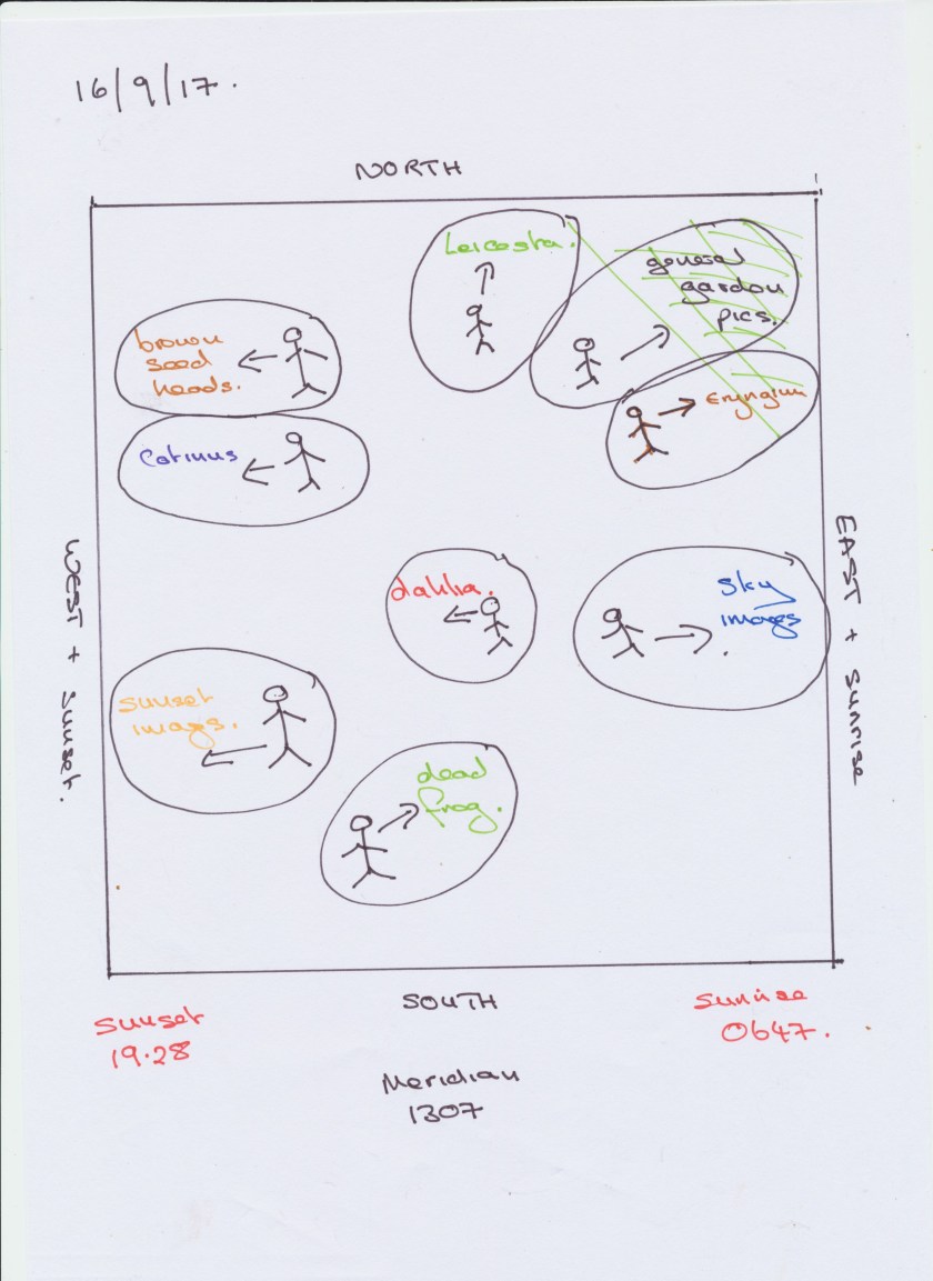
Brief: Take a sequence of shots over a day, getting a good range of times. Examine the quality of light. Add shots to learning log with an explanation and thoughts.
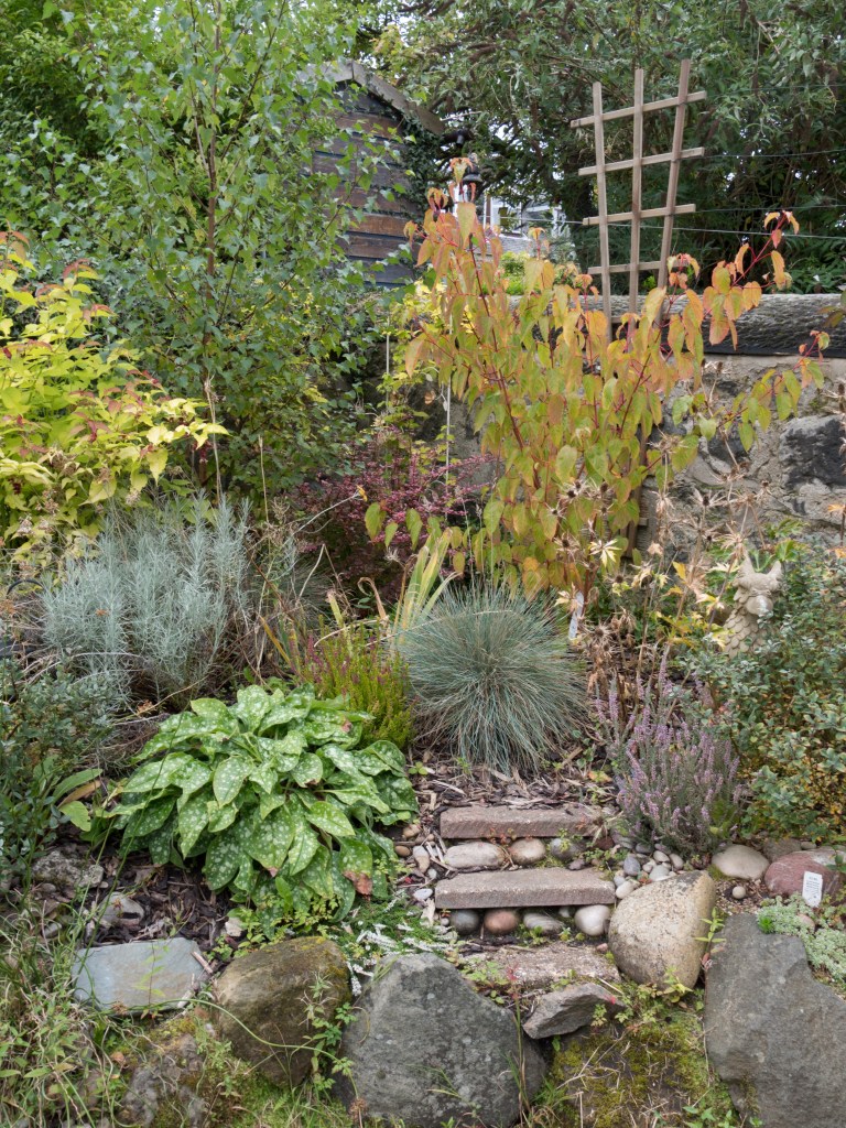
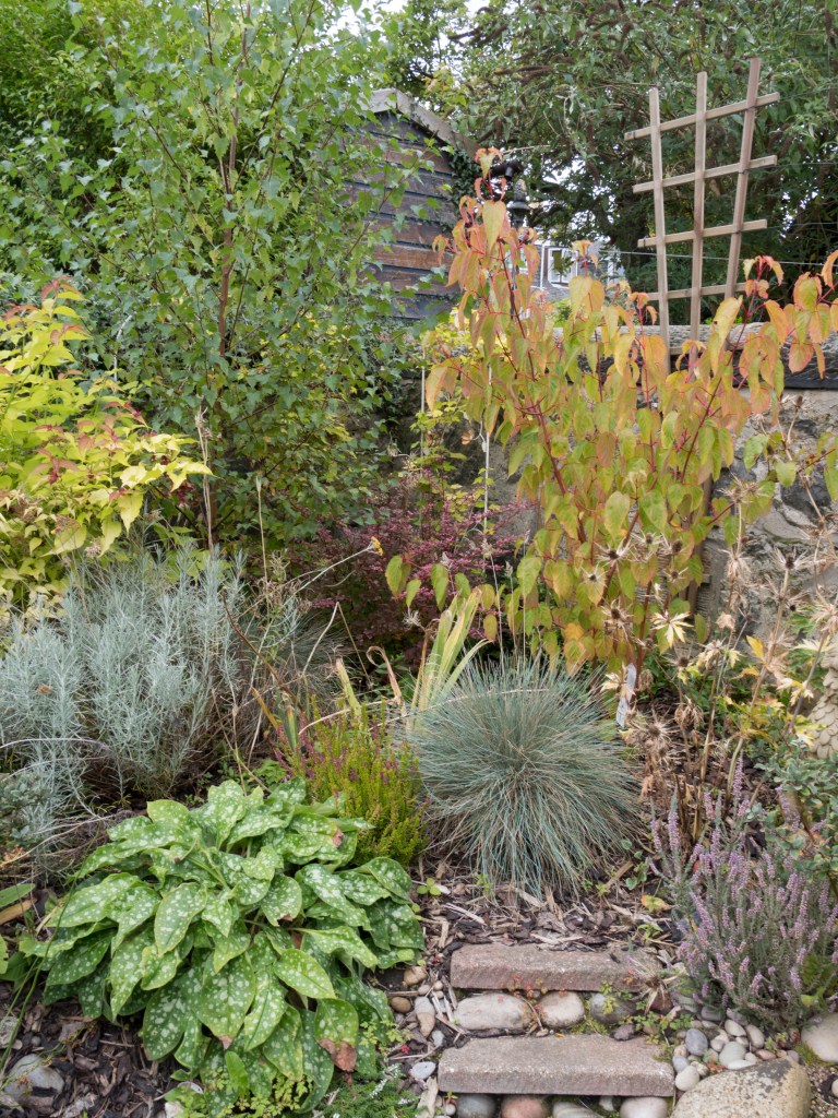
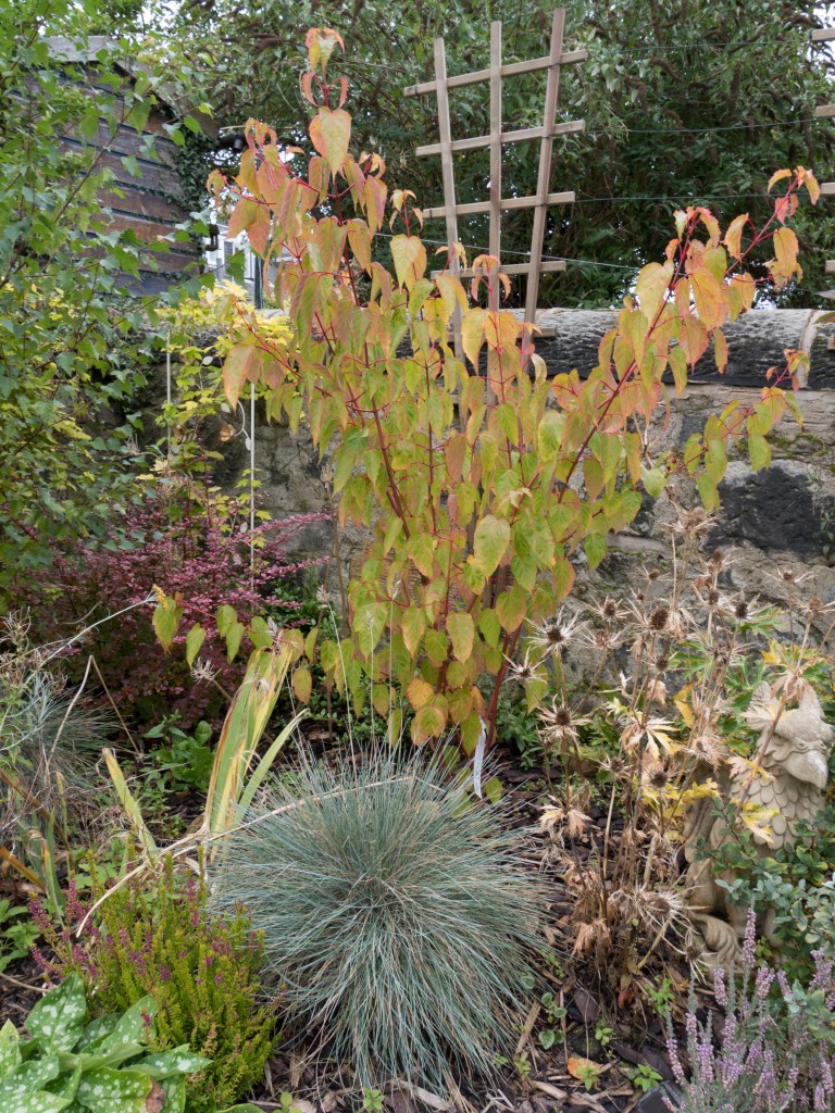
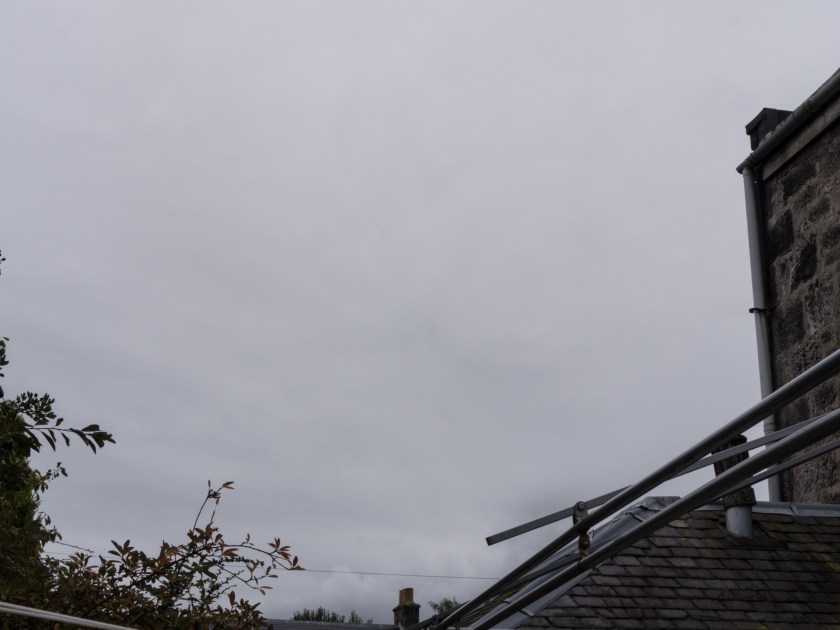
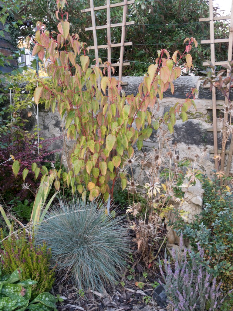
I decided to take the images in my back garden. This was to allow me to take a range of shots over the day from the same viewpoint, and also to look for any areas that were lit up well at any specific time of day. I choose last Saturday when I was in most of the day and initially the day seemed promising, with a good weather forecast and an interesting light. Unfortunately as it developed it clouded over and the majority of the day was heavily overcast, with some rain showers and only a brief, startling, glimpse of sunlight. I decided to take the images at 2 hourly intervals from sunrise to sunset. I had to be out at the midpoint, however, have substituted in images taken today when the weather conditions are very similar. I chose to take images of:
a group of plants in the northeast corner of the garden
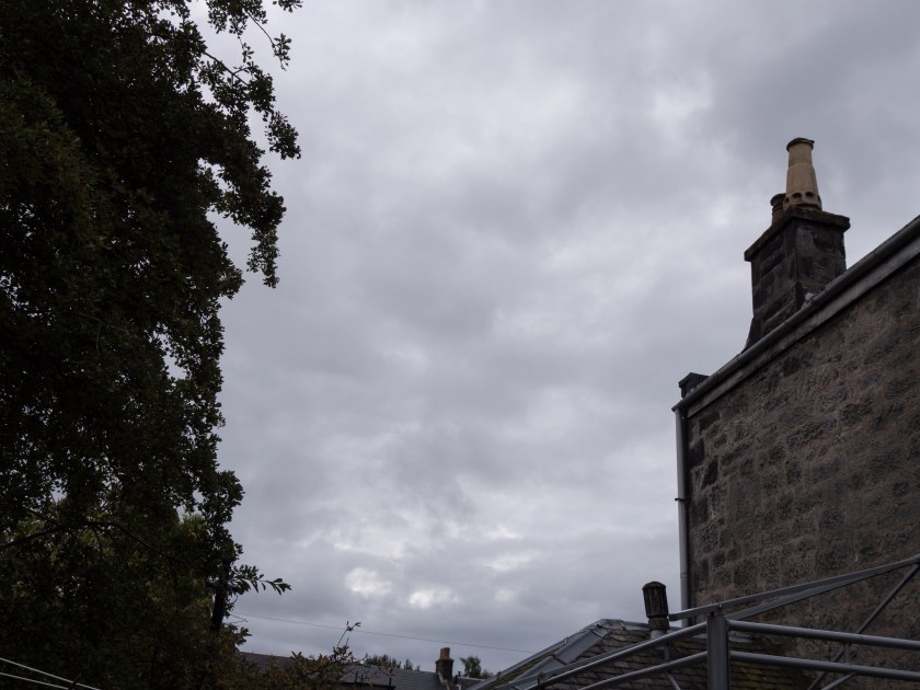
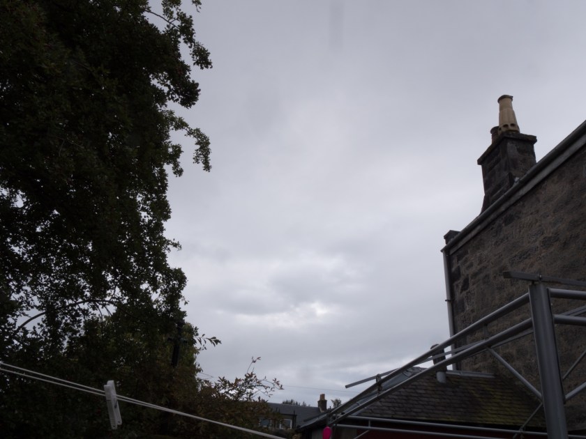
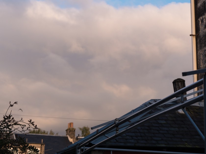
the sky looking towards the east
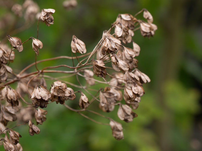
plants or other areas that showed well in the available light.
Plan of Images with direction of shot marked.
All images were taken with the camera set to manual, with settings based on the internal lightmeter and histogram. I took brief notes throughout the day. In this instance I am posting the images with metadata to show how much the light intensity varied throughout the day. I have not changed the white balance at all in processing.
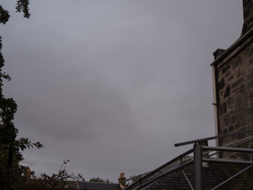
0700 (Sunrise was at 0647 so I was slightly late):
1/10 sec, f/3.4, ISO 200
taken at 0702
1/160 sec, f/9.0, ISO 200
taken at 0707
The sun was only just coming up. The light was very pale and still quite grey. My eyes interpreted it as a reasonable degree of light, I was seeing in colour, and walking outside easily so I was surprised at the amount I had to open up the camera settings to take the images. If I had been guessing I would have completely underexposed the images. The image of the flower bed is still quite blue in spite of the early hour (no hint of gold yet).
0900:
1/30 sec, f/7.1, ISO 200,
Taken at 0856
1/640 sec, f/7.1, ISO 200,
taken at 0857
1/30 sec, f/8, ISO 200, taken at 0903
1/50 sec, f/6.3, ISO 200, taken at 0901
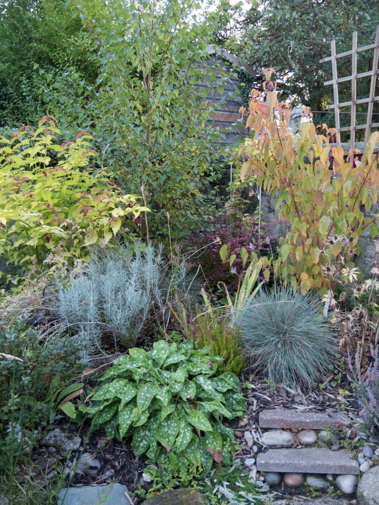
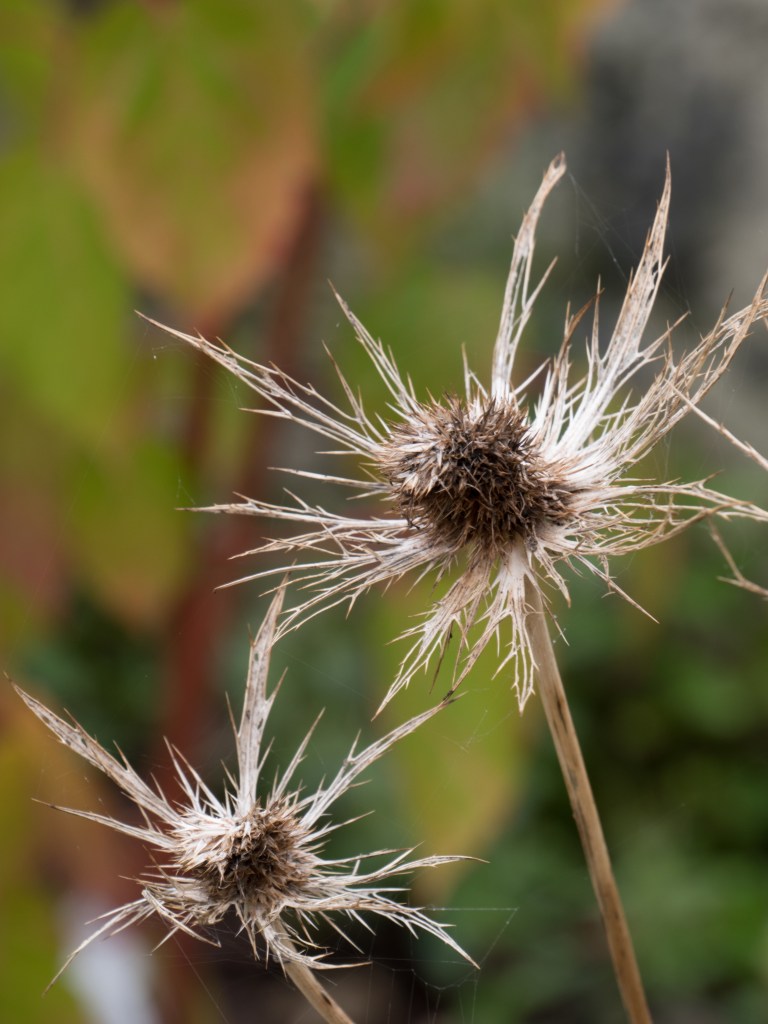
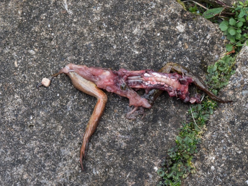
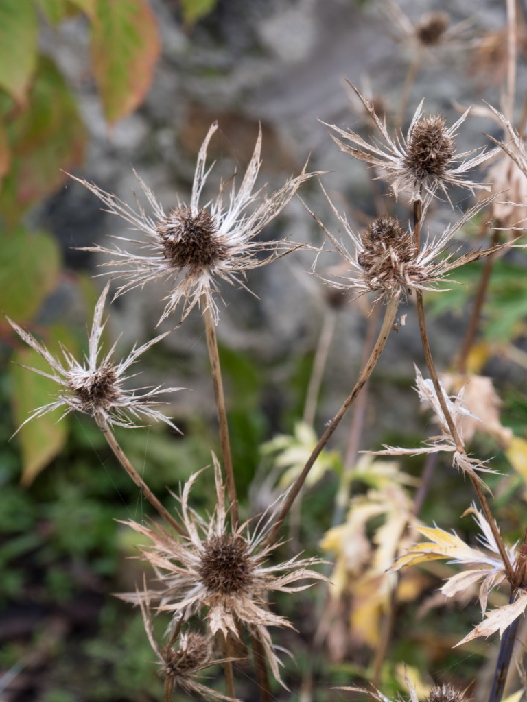
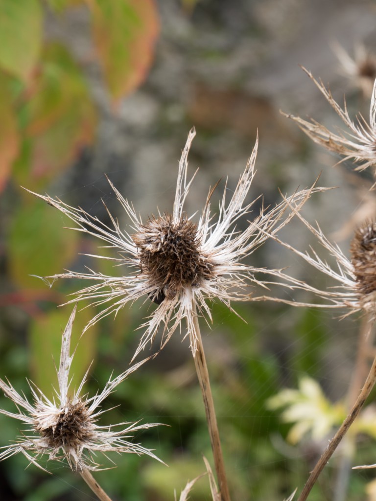
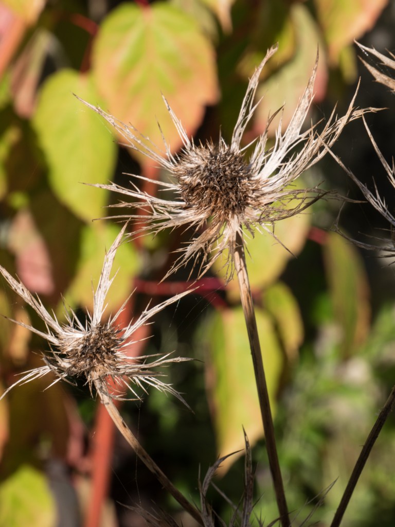
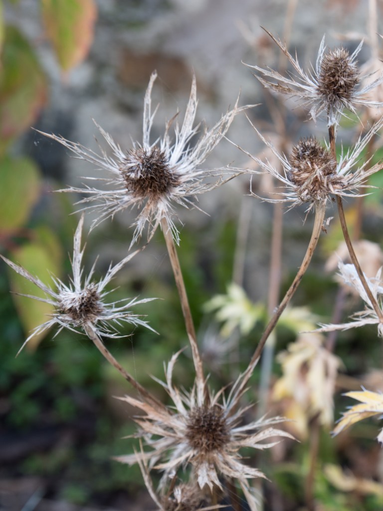
It was now completely clouded over with no shadows at all. The light was very flat, but on looking at the images definitely showing a much warmer tinge than the earlier images. I thought this would give some interesting details images, as not confused by excess shadow. I feel this worked well with the plant (Eryngium). The (slightly gory) dead frog could probably have benefitted from shadow to give a more 3-dimensional effect.
1100:
1/30 sec, f/8, ISO 200, taken at 1103
1/100 sec, f/20, ISO 200, taken at 1104
1/50 sec, f/7.1, ISO 200, taken at 1105
1/50 sec, f/7.1, ISO 200, taken at 1106
The light is now fairly constant, very similar to 2 hours previously according to the camera, although my eyes had thought it was lighter, but grayer. It remains neutral and the flower head close-ups are successful and clear. The two flower images are at an identical exposure even though they were taken at opposite sides of the garden. The light is coming from nearly overhead and is very diffuse because of the dense cloud cover.
1300 (Meridian at 1307, taken 2 days later to fill in the sequence, weather very similar):
1/40 sec, f/9, ISO 200, taken at 1300
1/100 sec, f/18, ISO 200, takem ay 1301
1/40 sec, f/9, ISO200, taken at 1300
1/100 sec, f/7.1, ISO 200, taken at 1302
1/100 sec, f/7.1, ISO 200, Taken at 1302
1/100 sec, f/7.1, ISO 200, Taken at 1302
The sun is now at the meridian, that is, as close to overhead as you get in Scotland in September. It is still very cloudy with a diffuse light. The slightly warm tinge of the earlier images has completely gone. The images look very flat but maintain a good level of detail which is brought out in the monochrome conversion. The bright green leaves (Leicestra) show well, but the red flowers are less sucessful.
1500:
1/50 sec, f/9, ISO 200, taken at 1500
125/ sec, f/18, ISO 200, taken at 1502
1/60 sec, f/5.4, ISO 200, Taken at 1503
1/400 sec, f/5.4, ISO 200, Taken at 1502
Still very cloudy and a diffuse light but the flowers from the corner are needing considerably more exposure than the Dahlia in the centre of the garden where there is no restriction to the light. There was no obvious change to my eye!
1700:
1/160 sec, f/11, ISO 200, taken at 1705
1/160 sec, f/18, ISO200, taken at1707
1/160 sec, f/11, ISO 200, taken ta 1702
And it has suddenly done very sunny (only lasted about 30 minutes). A complete change of light. The light is now quite harsh and very directional. I deliberately left in the shadow of me taking the garden image to show how sharp edged and dense the shadows were. The light is starting to turn more golden again. It has moved around to the west so the Eryngium (spiky flower) is in full sun and difficult to pick out against the background leaves. All the detail of the plants has been blended together by the brightness. This is not a good use of this beautiful light.
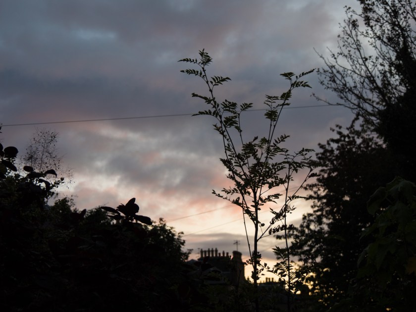
1900:
1/13 sec, f/6.3, ISO 200 , taken at 1859
1/125 sec, f/8, ISO 200, taken at 1901
1/13 sec, f/6.3, ISO 200, taken at 1859
1/31 sec, f/5.4, ISO 200, taken at 1900
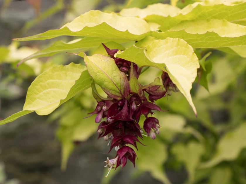
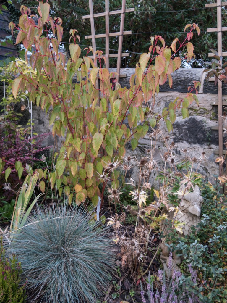
The sun has gone into the clouds again, but is definitely going down. there is a definite redness in the sky. The light is very diffuse, and not as golden on the plants as I would have expected, but gives an interesting effect looking though the leaves of the Cotinus ‘Royal Purple’. There is good detail back in the Eryngium as it is no longer in harsh sunlight.
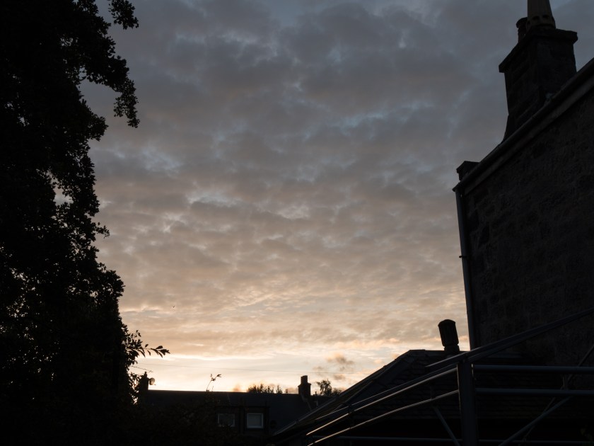
1930, (sunset at 1928, final set of images of the day):
1/6 sec, f/3.7, ISO 200, taken at 1927
1/40 sec, f/4.4, ISO 200, taken at 1929
1/125 sec, f/4.4, ISO 200, Taken at 1928
The daylight has virtually gone and the settings are very similar to the first ones of the day. The light quality is still diffuse, the golden tinge of earlier has almost gone, Oddly enough the sunset in the west mirrors the sunrise in the east.
Notes as taken on day:
Learning points:
do not rely on the eye, it is a very poor lightmeter.
the diffuse light under the dense cloud cover actually made for some very interesting close-up images as there was no distracting shadow.
the very sunny and harsh light in the afternoon needed a more considered approach. My shadow interfered with the fairly close image, so a more distant one would have been better.
the day followed a clear pattern about the colour of the light, pastel, golden, neutral, golden, pastel.
think about the light and how it will impact on your planned images. Different times of day may suit some types of images better than others.
Light is probably the most important thing when taking an image. You obviously need an image taking device of some sort, but this can be as simple as a piece of photosensitive paper or a pinhole camera, but light is essential. Complete darkness, although almost never present, makes it impossible to see or obtain an image. My father was a professional photographer, taking colour film images for sale for books and magazines long before the days of stock photography. He always used to say that the light you needed depended on what the photo was for. He would often avoid midday sun – too harsh, but might also avoid the evening light as the golden colour cast, while very attractive, was not what he was looking for. This was well before the days of being able to remove a colour cast by digital manipulation.
Sally Mann in an interview with Chinese Photography Magazine said ‘the light in the South is so different from the North, where you have this crisp and clear light. There is no mystery in that light. Everything is revealed in the Northern light. You have to live in the South to understand the difference. In summer, the quality of the air and light are so layered, complex, and mysterious, especially in the late afternoon. I was able to catch the quality of that light in a lot of the photos…….and also the refulgence or the reflection when light and water interact. There is no coating on the lens of my old camera, which permits a much softer and more luminous light. I am less interested in the facts of a picture than in the feelings. The facts don’t have to be absolutely sharp. I can get information across by appealing to viewer’s emotions’ (American Suburb X, 2013). Her images in the Southern Landscape series reflect this philosophy. They are not clear, sharp and flat but you feel you are looking into the images rather than at them. Sometimes only part of the image is visible, the remainder clouded in mist. The focus is variable – leaving you peering though the murk, wondering and imagining what might be there. I find myself blinking in a hope to see more clearly, to try and see what Mann saw on that day, at that particular time, at that moment. My favourite, much desired image, (simply identified by the year 1998) is very simple. A patch of light, surrounded by trees over grass, or possibly water. I keep changing my mind.
A completely different use of light is shown in the images of Schmidt. He said ‘I prefer black and white photography because it guarantees the viewer a maximum amount of neutrality within the limits of the medium. It reduces and neutralizes the coloured world to a finely nuanced range of greys, thus precluding an individual way of seeing (personal colour tastes) by the viewer. This means that the viewer is able to form an objective opinion about the image from a neutral standpoint independent of his subjective colour perception. He is thus not emotionally distracted. In order to achieve a maximum of objectivity and thus create a photograph which possesses credibility and authenticity as a document (factual information), I prefer to work with neutral diffused light, i.e. to produce an image without noticeable shadows. The viewer must allow the objects portrayed in the photograph to take their effect upon him without being distracted by shadows or other mood effects. In this context, it is essential that the viewer should be able to recognize the depicted objects clearly and in relation to each other.’ (American Suburb X, 2010). Schmidt’s images are very different from those of Mann. They are clear, without obvious emotional content, explicitly showing the subject. As he said – you can recognise the subject easily and therefore make your own judgements on the content, rather than trying to interpret Schmidt’s thoughts and feelings. The images are relatively emotion free, (I do not think that any image can ever be completely devoid of emotional reading) and therefore what you see can become very personal. In his obituary for the Guardian, Delahaye said’ His language is a language of precision and his tool is the most simple one: a small, 35mm camera, and a few rolls of films. His pictures look simple at first glance, and their anti-sentimentality, their refusal of all the tricks of the usual seduction, their concision and their clarity, give them great efficiency. They show what they show but they manage to retain an opacity, a mystery, and they become a support for our imagination’ (O’Hagan, 2014).
Atget, much earlier on in the development of photography, was very aware of the effects of light and varied his technique over time, initially using the relatively neutral light at midday to produce images that give information about the ‘facts’ while images from later in his career are very different ‘Atget’s late photographs, however, are frequently marked by subjective light and deep shadows. Often made early in the morning, these pictures—such as Parc de Sceaux—use light and shadow to create a mood rather than to describe a place; they mark the apex of Atget’s formal and expressive investigations of the medium.’ (Nga.gov,2017).
All these examples are of photographers who usually took monochrome images where it is often easier to see changes in light intensity, together with the effect of the direction of the light. A further layer of complexity is added in when using colour as the temperature of the light varies as well as it’s apparent quality. Light in the morning and evening is warmer, and may be very red at sunrise and sunset, while it is a more neutral colour at midday. The following table from Cambridge in Colour (Cambridgeincolour.com,2017) helpfully summarises the effects of light throughout the day.
Went to Glasgow and took a series of photos while walking along the Clyde
Experimented more with taking selfies
Amusing pics of dog in motorbike sidecar.
I have continued to think about:
concept of selfies and how they are used. My son is very strongly of the idea that they must have context to mean anything. Overall I agree, but in practice difficult to do.
difficulty in managing areas of extreme differences between light and dark in one image
Kate Davis and feminism in photos. Feminism and the female gaze seems to be a common thread in my reading at present. Is it possible/probable that we have gone too far? I think that there may be less of an issue now than when i was young – however it is probably just more subtle and hidden.
Blog:
working on Part 4
wrote up about Kate Davis
Reading:
Graham Clarke – The Photograph. I am having great difficulty with the concepts here, (even on the 2nd time through) partly in understanding the whole issue about critical thinking and its importance, partly because of the language used – coming from a science rather than an arts background. Need to find a primer!
Stereoscope – the yearly magazine from the Arts and Photography students at St.Andrews University. Images, writings intercut with images from the universities Special Collection photographic Archives. It is interesting to see the sort of images that are taken by students – not just those that are picked as major upcomingt alents by BJP, Foam or Lenswork. Work often muted – very much about people rather than places. The one that stood out for me was Tom Oldridge. keep an eye out for his name
Lensculture – several interesting articles this week
The Yellow River – beautiful images that have resonance with the work of Catherine Hyland in Universal Experience. Small people inhbaiting vastlandscapes. Muted colours.
An Exhibition at Stills Gallery, Edinburgh by Kate Davis
12/09/17
Kate Davis is an artist with a wide range of skills including drawing, photography and film making, all of which are used in her solo exhibition at Stills Gallery in Edinburgh. She is a feminist and uses many archival images to engage her audience with her ideas. Her website says ‘Davis’ artwork is an attempt to reconsider what certain histories could look, sound and feel like. This has often involved responding to the aesthetic and political ambiguities of historical art works and their reception.’ (Katedavisartist.co.uk, 2017).
The exhibition consists of a space that is divided up by brick walls, which themselves are part of the experience. These are hung with images developed from found photographs that are subversive and also amusing. The first is a nude statue with added glasses. You then enter a space which shows two alternating films, ‘Charity’ and ‘Weight’, and on searching further past another wall more images. The exhibition is accompanied by an essay by Laureen Dyer Amazeen who says ‘As I reflect back on her use of bricks throughout the installation, the brick can be seen of fundamental value. Foundations are built, brick by brick. Metaphorically, the excerpts, references, extracts, snippets of recorded everyday experiences are the bricks though (from) which she builds a premise, a dwelling – a place in the world.’ (Dyer Amazeen, 2017).
Writing for MAP magazine Victoria Horne comments ‘Visitors to Nudes Never Wear Glasses are welcomed by a found photograph of a classical nude statue, to which Davis has added the eponymous glasses, crudely scratched onto the surface. This act of détournement re-presents Spence’s words as visual prank: playfully exposing the contradictions between body and intellect, femininity and rationality, that have underpinned modern art and its institutions. That the statue is clearly located in a pedagogical studio environment adds weight to this critique, intimating by association the educational logic that prohibited women artists from entering the classroom, while glorifying abstract femininity within. The photograph thus establishes key feminist themes that characterise much of Davis’ output, preparing visitors for the witty archival retrievals to follow.’ (Horne, 2017).
‘Weight’ uses a BBC documentary on Barbara Hepworth as a starting point and looks at the perceived roles of woman and how they can be balanced against the intense life of being an artist – or can they? Which is more valuable? Again, in MAP, Horne describes it as ‘Adhering to the leisurely pace and formal conventions of the BBC documentary format, Davis comically undermines this familiar style from the outset. Against the dated sounds of folksy guitar music, Weight’s opening title sequence ambiguously locates the study in ‘1961 or thereabouts’. At the same time a platter of dramatically staged potato peelings revolves on a turnstile, further alerting the audience to the strange reversals to come……One of Weight’s key contributions is to highlight the uneven appreciation of domestic care work in comparison with the solitary, creative pursuits of the artist.’ (Horne, 2016).
‘Charity’ is a newly produced film that talks about the work of women in bringing up children, specifically in breastfeeding. It recently won the Margaret Tait award. On receipt of the award Davis said ‘Working with the moving image has become an increasingly important part of my practice in recent years and the Margaret Tait Award will be invaluable in enabling me to realise my most ambitious and experimental moving image work to date. Inspired by the ways in which Margaret Tait’s films invite us to contemplate fundamental emotions and everyday activities that are often overlooked, I propose to investigate how the essential, but largely invisible and unpaid, processes we employ to care for others and ourselves can inform both the subject of my film and the way it is made’ (Glasgow Film Festival, 2016). The film intersperses archival images of painting and statues of breastfeeding women throughout the ages with pictures of ordinary household practices such as washing up. I found it fascinating but difficult to decipher whether it was talking about mothers breastfeeding their own children or wet nurses doing a job. Clearly that was at least part of the point – is looking after your own child a job, should you have a contract and join a union – or is it an expected part of being a woman?
When you turn and leave the exhibition the last image you are confronted with is another altered image. This time of a man, a Minuteman, which has been altered to look as though he is breastfeeding. A final comment on roles – and possible role reversal in the present age.
This is a powerful exhibition, although it does warrant close study. I initially went with my daughter who was too impatient to sit though the films and left wondering what it was about. I then returned with more time to sit and think. This made me realise that so often I just rush though an exhibition – taking in the highlights, missing the subtleties. The use of found and then altered images pointed up how we should/can/might change our viewpoint in life, thinking about gender stereotypes, women as housewives not intellectuals or artists, men as soldiers not carers. It also reminded me of the use of walls, to divide things, to hide things, to separate people. I was recently at Hadrian’s Wall, built by the Romans to separate civilised land from the wild North. One of the exhibitions in Tullie House Museum, Carlisle looked at the theme of walls in present day society (Tullie House, 2017). This exhibition is about walls between men and women, between traditional roles and expanded or reversed roles but a wall remains a wall until it is totally removed.
Tullie House (2017). Tullie House Museum & Art Gallery | Art – History – Nature of Carlisle, Cumbria. [online] Tulliehouse.co.uk. Available at: http://www.tulliehouse.co.uk/ [Accessed 12 Sep. 2017].
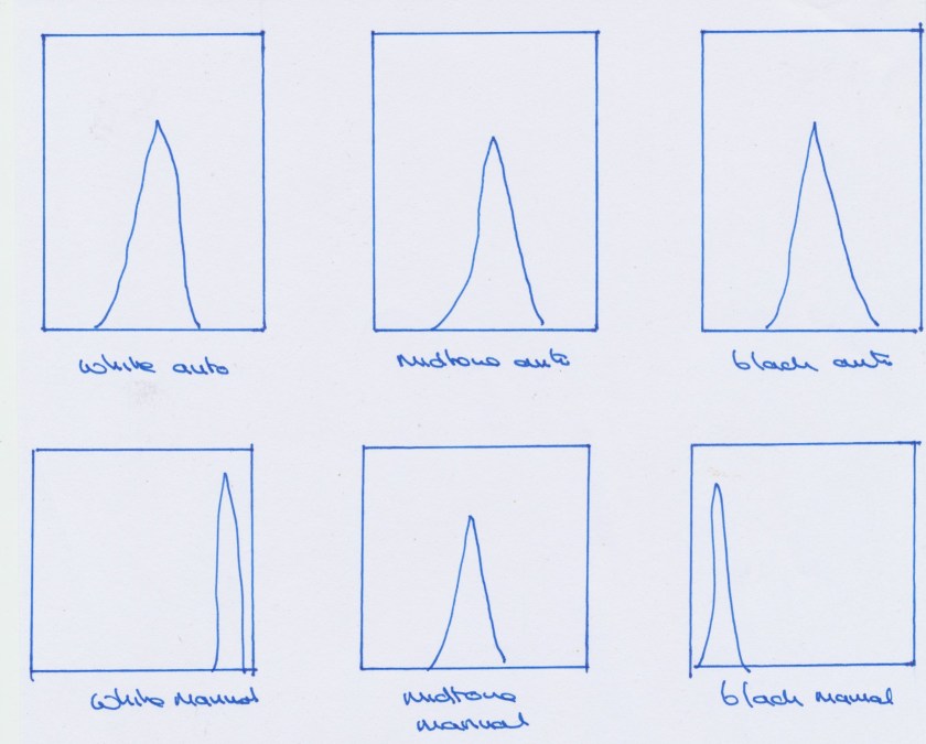
This exercise took me a lot longer and was much more frustrating than I expected it to be, mostly because of camera issues.
The first set of images were easy to take. I used the ‘intelligent’ auto setting. As my midtone was tan coloured I changed them all to monochrome to make the point more obvious. The images are almost identical except where the camera has picked up minimal differences in shading.
White auto, 1/125, f/5
midtone auto, 1/125, f/4.1
black auto, 1/6, f/4,1
I then went on to the manual pictures. The first problem I had was that my camera had set itself back to auto ISO, so kept making compensations in the ISO. the next issue was that my camera showed the histogram as it thought the scene was, so persisted in keeping it in the middle range even when I changed either exposure or aperture. This left me guessing wildly as to the amount of exposure compensation to use, and I kept getting it wrong. I generally guessed much more than it actually was. I eventually gave up, and found the camera manual and from there found a way to alter what the histogram showed so that it showed what my setting would give. That made it much easier, and it will be left like that. I had rarely used full manual before, and this was not an issue in aperture or shutter modes.
white manual 1/13, f/7.1
midtone manual 1/6, f/14
black manual, 1/13 f/5.0
There is now a very clear difference between the images. What I should have done was looked at either the shutter speed or the aperture in the auto images and kept this identical in the manual images as this would have made the amount of change in the settings clearer. By the time I realised this there was a significant change in the light (the sun had come out) so the settings would have been altered by another factor.
The histograms (once I had altered the camera settings) show a clear difference, as do the ones that show on Lightroom.
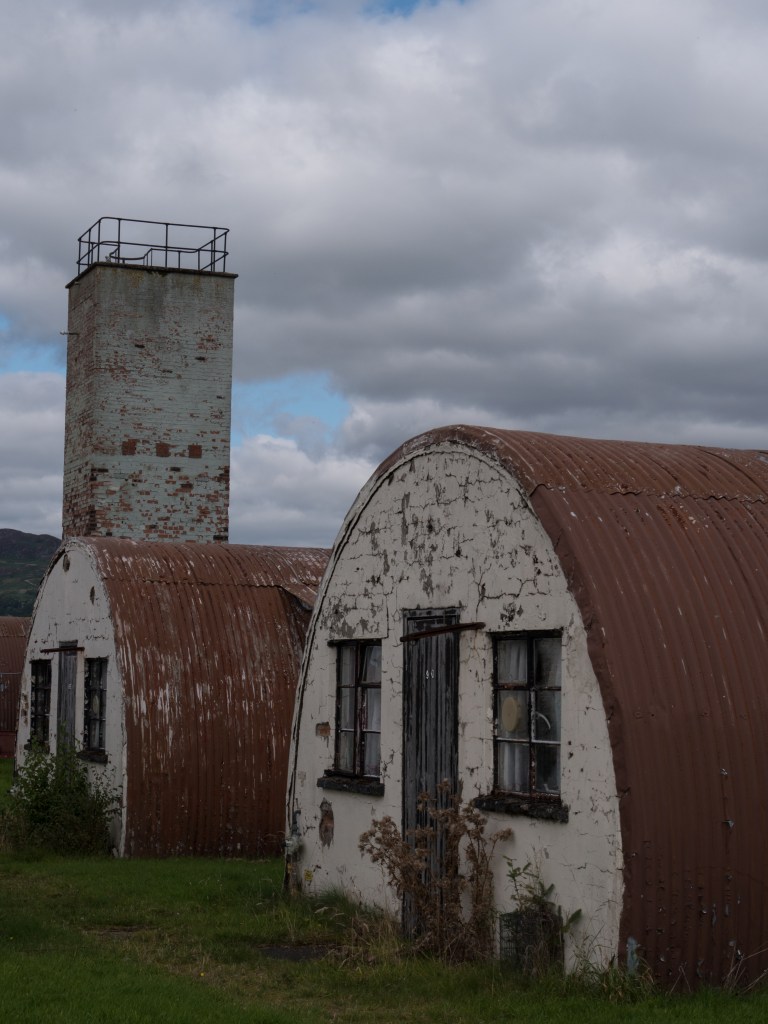
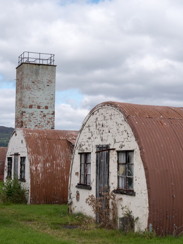
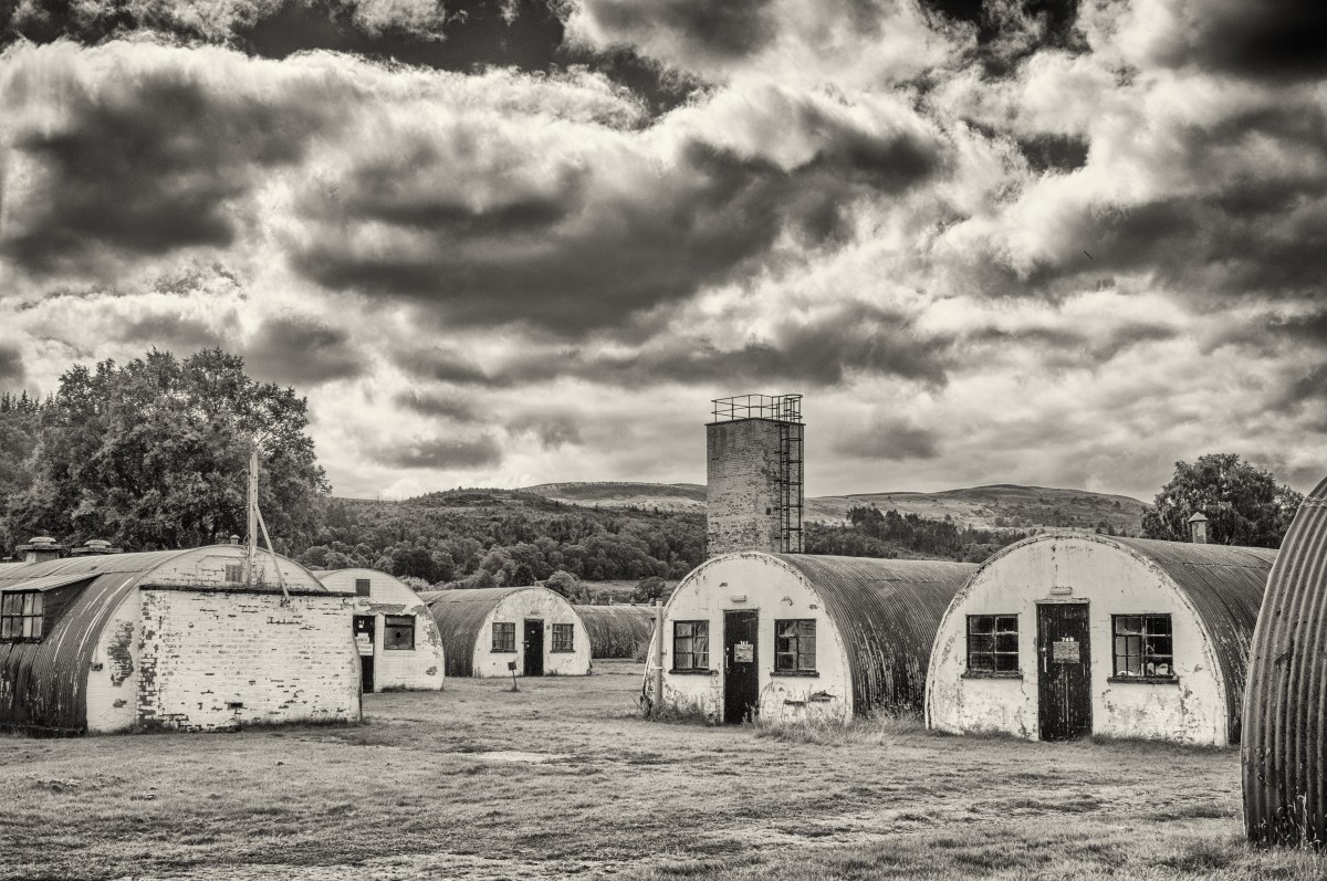
The way a camera automatically measures light is something I was already aware of and was very pertinent to a recent day out. I was at an old prisoner-of-war camp. The day was mainly overcast but bright so there was a lot of very white cloudy sky, and the buildings were mainly dark. I could either expose for the sky, leaving me with too dark ground or vice versa. I opted for a middle way, shooting in RAW, and then altered the images in Lightroom, as even doing that the sky often ended up very white. The range of light was not coped with well by the camera’s meter, and was one of the occasions an incident light meter would have been helpful.
As shot, the camera overcompensated for the light sky and the white (ish ) walls
Altered in Lightroom with the exposure increased and the highlights brought down
Monochrome conversion, to emphasise the sky and the grittyness of the buildings.
This wasn’t my ‘best’ shot of the day but it dramatically demonstrates the problem, and also the changes that can be made in post-processing.
Learning points:
read the camera manual when you are having problems
check the settings are what you think they are, and that they haven’t somehow reverted back to the auto ones
be very aware of the impact that one very bright area can have on the meter, especially if it is in the centre.
Visited Cultybraggan Prisoner of War Camp near Crieff: Opportunities for monochrome/vintage conversions with graphic images Problems with very light sky versus dark buildings Started thinking about selfies and how to explore them: Research into academic work Practical trials ?use of selfie stick Exhibitions visited: Kate Davis at Stills – subversive work on female roles Roger Felton images of Crimea war – compare with Perfect Chemistry exhibition Blog: Finished response to tutor report on assignment 3 Looked at work of Parr and Reas Reading: BJP October issue: Trevor Appleton’s work on people using the portrait combined with images of what is important to them. This is the same idea I want to work on around the response of parents to being given the information that their child is autistic. Watch out for the book.
Tutor comments are in blue (main points only copied here), my responses in black
Looking at your final series, I felt they all worked well together except for the final picture. I understand why you included it but the scale is quite different from the other pictures. The other pictures are about the photographer as subject, whereas this final picture is about how the camera frames the view, producing a rectilinear ‘slice’ of a ‘scene’ from the vantage point of the photographer.
On thinking about this further I agree that the final image is ‘out of kilter’ with the other images. I originally put it in because I liked it and I was pleased with the effect – but it is more about the camera than the people – while the rest of the images are definitely about the people. It needs to come out of the series for final presentation.
The prints were of sufficient quality for assessment. They appear a touch lighter than your screen images but this is probably due to the difference in viewing conditions. Backlit always looks a little different than paper. If you wanted to adjust this, I would start by looking at the brightness to which you calibrate your monitor.
I was aware they were a little lighter than the screen, but was not sure which was better, my screen brightness is difficult to adjust, and the room it is in gets a lot of light falling on the screen, so that maybe part of the issue. I do calibrate the screen vis a Spyder 3 – but possibly not often enough, so this is something to watch out for.
Despite your card backed and padded envelopes, the prints still arrived with a bent corner.
Something to watch out for – I previously used a clam shell box for final prints – so need to consider this again.
The research section appears to be going well on your blog. One thing I would suggest is to add dates to the posts as this makes it much easier for me to work out what is new and what isn’t.
Taken on board from now. This makes sense as easier to follow, and updates to a post can be separately dated.
It’s not completely clear from your exhibition write ups if you are attending these independently or as part of group study visits.
All my exhibition visits have been solo (or with family). Need to look for more opportunities for group study visits, so far, by sheer bad luck, all the ones up North have been while I was either away, or at work. However, there is a study group that meets in Glasgow – so that may be a possibility.
A good next step might be to start writing a diary every time you go out and shoot, or whenever you think about photographs. Try to pick out from that what you find interesting and stick with it
Interestingly, I had already started doing this, as I was finding that I was not keeping track of what I was doing, thinking or reading. An extension of this would to add a brief weekly summary to my blog, with key points.
Suggested Reading/Viewing – Parr and Reas
Martin Parr.
I was already aware of the work of Martin Parr and his exploration of Britain in images as well as other areas. I took this opportunity to have a further look at his extensive oeuvre via his website and came across three pieces of work that are particularly relevant to my assignment on the decisive moment.
Milan Fashion Week; here Parr takes images of the crowd’s extensive use of devices, mainly mobile phones, while at the event. Sometimes it is clear that they are photographing the scene, other times taking selfies, other times they are just looking at their phone, maybe texting or using social media. In this group of images, few of the protagonists appear to be engaged with the event, which either says something about the event, or, more likely, about the perceived importance of social media and your engagement with it, and therefore how it often ‘takes over’ peoples time and thought processes.
Too Much Photography: this article from Parr’s blog talks about the present use of photography by just about everyone, everywhere they go. He says, ‘Now mobile phone cameras and digital photography mean that the entire visit is documented. From the moment the tourist enters the site, everyone has to be photographed in front of every feature of note. Now it is almost impossible for me to shoot a photo where someone is NOT taking a picture or posing for one. ……. My theory is that the act of photographing ourselves at tourist sites becomes so important because it makes us feel reassured that we are a part of the recognisable world’ (Martinparr.com, 2012). I tend to agree with his thoughts here, but would extend it to saying that we feel that we are part of the world and that this fact must be recorded, but, as Parr asks – what happens to the images, and who looks at them. I am aware that personally I shoot thousands of ‘useless’ images that don’t contribute in any valued way to the world, or even to my remembrance of it. Less would definitely be more.
The Selfie Stick: again from Parr’s blog, he talks about the ubiquity of the use and availability of selfie sticks to take images of yourself, or the family, in front of tourist attractions. This doesn’t seem to have taken off to the same degree in Scotland (possibly because we are more often holding umbrellas). I think I prefer this trend to the trend of just taking a selfie at arm’s length, which could be anywhere and talks only about ones own self.
Many of the images he shows are quirky, full of humour and with a somewhat sideways take on modern society. The point he makes is enhanced by the use of series of images which clarify visually the trends shown.
Paul Reas.
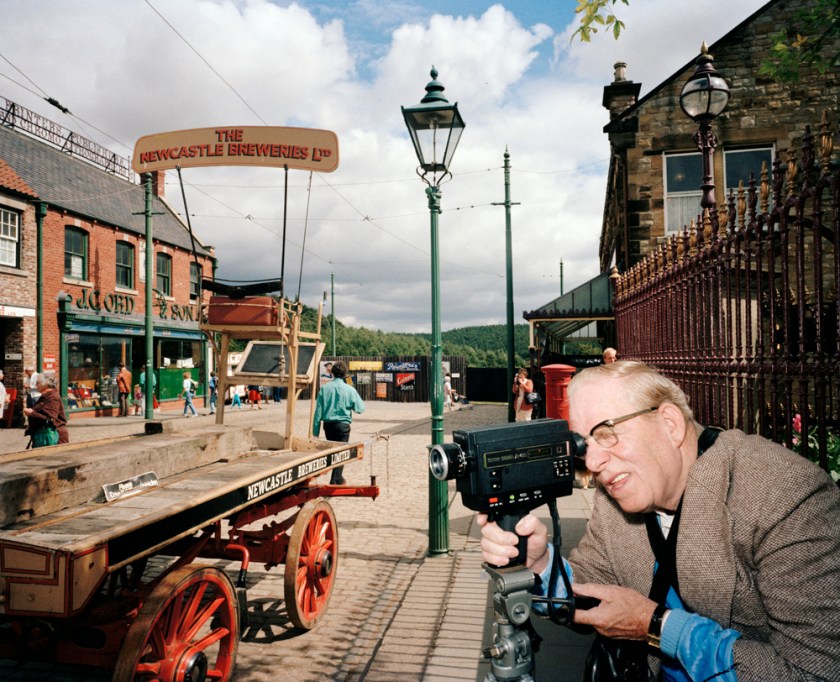
Paul Reas is a new name to me. He is a social documentary photographer who uses colour images to show British culture and is considered to be in the same genre of British photographers as Martin Parr. His book ‘I can Help’ documents the consumer culture, while ‘Flogging a Dead Horse’ (1993)’ presents a nationwide survey of the emergence of the ‘heritage industry’: museums and theme parks such as Beamish Open Air Museum that offered a nostalgic and often commercialised version of the past in the wake of the collapse of heavy manufacturing and industry’ (Shutter Hub, 2013). The image ‘Flogging a Dead Horse, Man with a Movie Camera’ shows a man in a smart outfit looking intently though his camera. It would be interesting to know his thoughts, and whether he had ever worked in the type of industry he was photographing. In an article about the series by The British Council – Visual Arts it is described as ‘The tourist of the nineties, with camcorder and auto-focus camera, expects a ‘hands-on’ experience. But the trouble with Heritage Culture is that the safe inconsequential history it markets doesn’t educate, it only sedates its audience. Heritage is meretricious history that never challenges the present. Consumerist history: history for a disposable income. Like a steam train, it takes you on a pleasant ride to nowhere, and then back to where you started.‘ (Visualarts.britshcouncil.org, 1994).
Reas’s images are gritty and do not feel as slick as those of Parr, they are not as ‘amusing’ but they do get under your skin in the same way, giving an ironic take on the culture we live in and how it is influenced by the need to seek out pleasures and record them, even if those recordings never reach the light of a photograph album.

")

")