Thomas Ruff – Jpegs


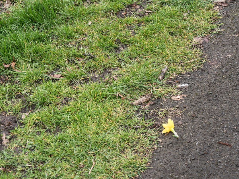
Thomas Ruff’s photobook Jpeg (Ruff and Simpson, 2009) consists of images that he has both taken and found on the web which he then enlarged which ‘exaggerates the pixel patterns until they become sublime geometric displays of color.’ (David Zwirner Books, 2009)). Ruff says, ‘the Jpeg idea, in which a pixelated square is ugly, but if you present it in the right context it can become beautiful’ (Benedictus, 2009).

Campany discusses Ruff’s work in the context of the history of art and photography.

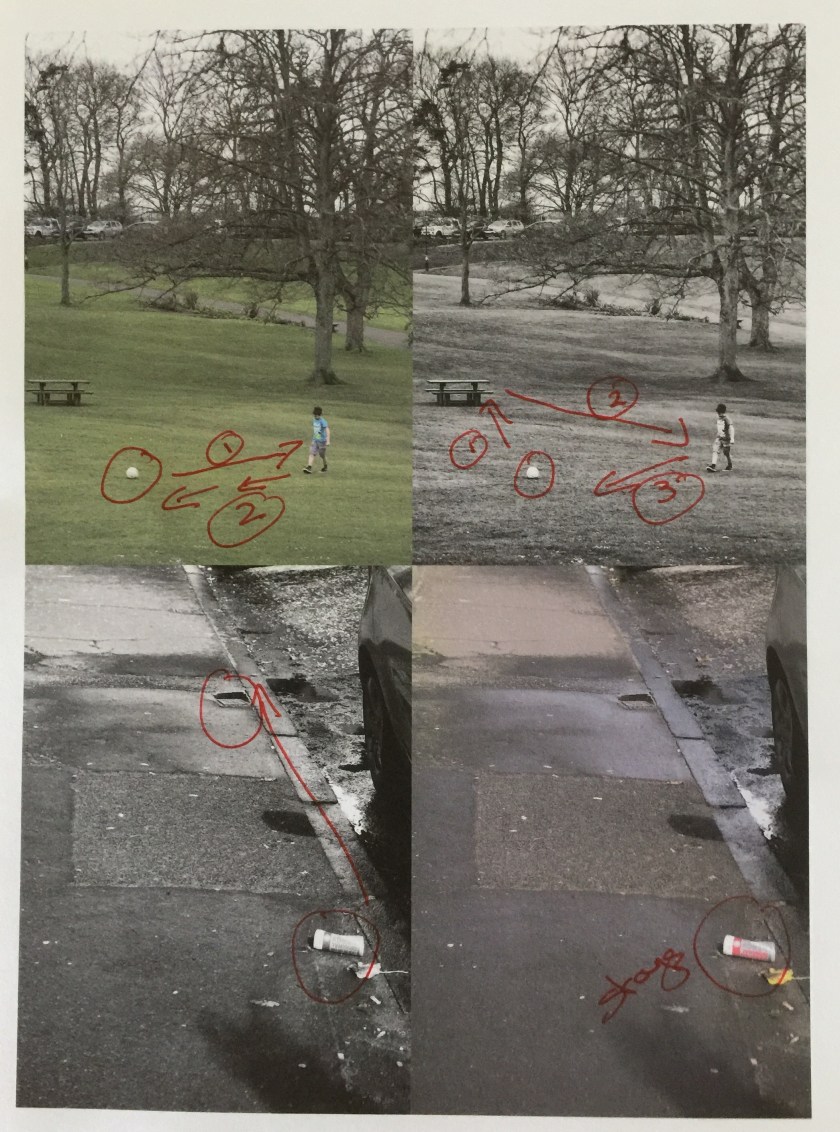
Found images have been used since 1920’s as a way of making sense of a culture with an unending amount of information.  Campany points out that all images come from archives, some obvious, some less so and that within those archives there are layers of systems from the internet itself, the specific archives that are accessed, the more limited archive of the collector (Ruff) and on down to the archive of the viewer’s memory. These archives are arranged in grids, which with Ruff comes from his preference for working in series, the meaning of the image then comes at least partly from its place in that series.

Campany also discusses that all images seen now are digitised (even those printed in books) and therefore the pixel has replaced the grain of a film. Grain, with its random nature became ‘a sign of the virtuous materiality of the image’ while pixels are ‘grid-like, mechanic and repetitive ….  a technological limit (David Campany 2008). He feels that Ruff images force us to look back and forward between figuration and abstraction leading to pictures with a sense of drama.

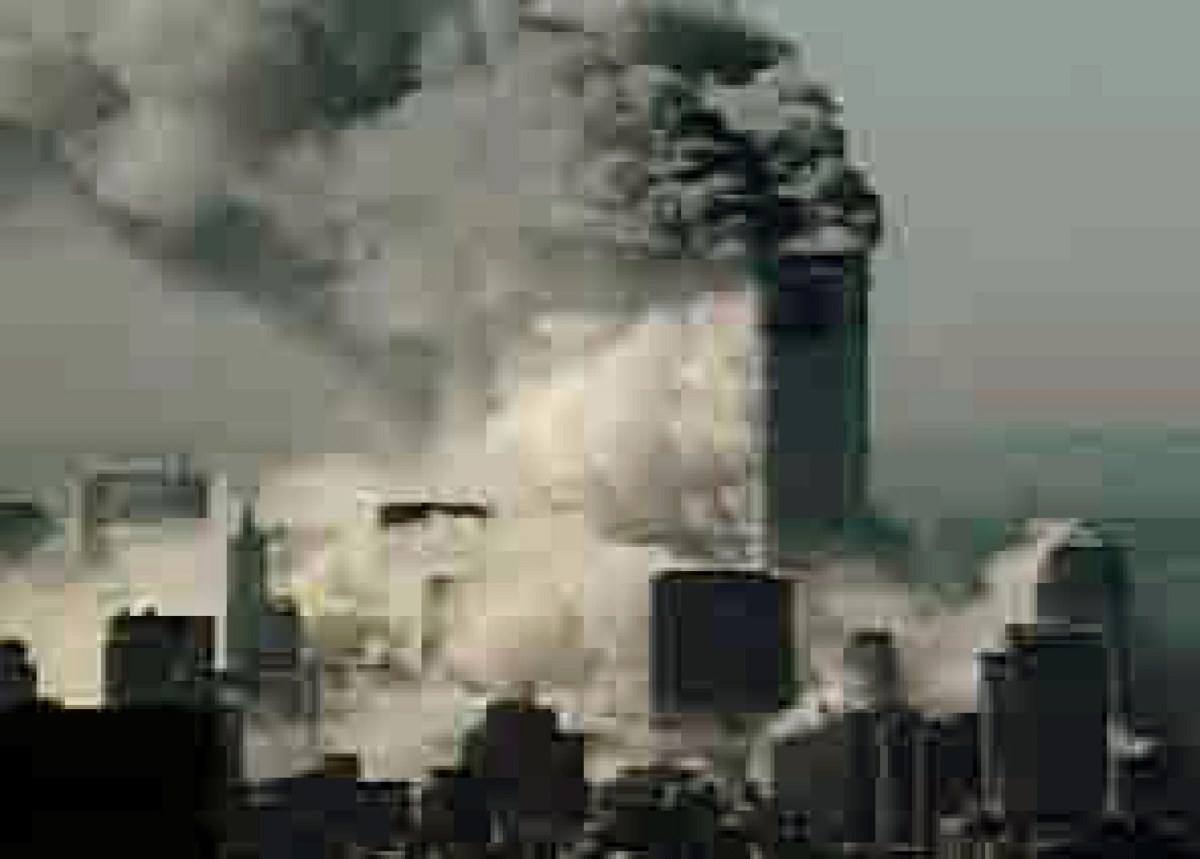
In contrast Colberg discusses the meaning or rather the possible lack of meaning behind the images. He says Ruff stands as one of the ‘most creative and inventive photographers of our time’ (jmcolberg.com, 2009). Colberg notes the extreme beauty of the images, especially when printed in book format but feels that the concept of the images relies on the technique, rather than anything else, and notes that Ruff simply describes how they were made starting from lost images of the 9/11 attack. He goes on to say that beauty in and of itself can be appreciated, ‘maybe sometimes, the medium is the message’.

References

Benedictus, L. (2009). Thomas Ruff’s best shot: ‘Pixellated images can be beautiful. I took this in Japan – through a hotel curtain’. [online] the Guardian. Available at: https://www.theguardian.com/artanddesign/2009/jun/11/my-best-shot-thomas-ruff [Accessed 21 Apr. 2017].

David Campany. (2008). Thomas Ruff: Aesthetic of the Pixel – David Campany. [online] Available at: http://davidcampany.com/thomas-ruff-the-aesthetics-of-the-pixel/ [Accessed 21 Apr. 2017].

David Zwirner Books. (2009). David Zwirner Books · Thomas Ruff: jpegs. [online] Available at: https://davidzwirnerbooks.com/product/thomas-ruff-jpegs [Accessed 21 Apr. 2017].

Jmcolberg.com. (2009). Conscientious | Review: jpegs by Thomas Ruff. [online] Available at: http://jmcolberg.com/weblog/2009/04/review_jpegs_by_thomas_ruff/ [Accessed 21 Apr. 2017].

Ruff, T. and Simpson, B. (2009). Jpegs. New York: Aperture.

Exercise 1.4 Frame

The exercise is to use the viewfinder grid of the camera to allow you to place the subject of the image in various parts of the frame, initially concentrating on the subject rather than the whole frame.

My cameras’ grid divides the area into 9 sections. I started slightly differently by standing in one spot and simply moving the viewfinder to move the subject of my image, in this case the large glasshouse, into each of the areas, not looking at the rest of the frame, while keeping everything else the same.

It is interesting how different the images are even with only a small shift of viewpoint. Even though I was focusing on the glasshouse when taking the image it only becomes the main part of the image when it is central, top, midle or lower areas and, even then, it is most prominent visually when inthe  absolute  centre  (middle line, centre image).  In the images where the glasshouse is at the top of the frame the large plants at the bottom are much more dominant, and when at the bottom the clouds become the focus of the image. The left and right images in this instance appear unbalanced. Overall the image I like most is the centre top, where the clouds play a major role and the glasshouse is subordinate, although I was not particularly aware of the clouds while photographing. This clearly demonstrates how important it is to be aware of the whole frame and not simply your object of main interest.

The main part of the exercise is to take a variety of images where the focus is on the composition and that make a set.

I chose to use images taken on evening walks in the park with similar although not identical lighting, , and made these into a composite image.

Composite evening 2

Top left: Pidgeon – 1/320 sec, f/5.6, ISO 640, focal length 140mm (~280mm)
Middle left: Statue – 1/640 sec, f/5.6, ISO 200, focal length 140mm (~ 280mm)
Bottom left: Tree – 1/200 sec, f/5.0, ISO 200, focal length 46mm (~92mm)
Top centre: Sun – 1/1600 sec, f/5.6, ISO 200, focal length 69mm (~138mm)
Bottom centre: Dog – 1/250 sec, f/5.6, ISO 200, focal length 21mm (~42mm)
Top right: Flower – 1/200 sec, f/5.6, ISO 800, focal length 92mm (~184mm)
Middle right: Bench – 1/250 sec, f/5.4, ISO 200, focal length 32mm (~68mm)
Bottom right: Shadows – 1/400 sec, f/5.4, ISO 200, focal length 30mm (~60mm)

I was trying to vary the position of the main part of the image as I have noticed that I tend to place main point of a picture either to the left or centrally, and very rarely to the right in the image. I am not sure whether this is part of my heritage and learning to read from left to right across the page, or because my vision from my left eye was much stronger than the right as a child. (I am still left eye dominant, although strongly right-handed). On looking at the images I find that the ones where the focus is on the left (the pigeon and the statue) tend to draw my eye directly to that area and I am less likely to look at the rest of the frame, while where the focus is on the right (tree in landscape and seated girl) I look to that area and then my eye automatically scans the rest of the image. The effect of the position of the main focus within the frame also depends on whether the image is in a portrait of landscape orientation.  I did not manage to take an image that I was satisfied with and which I felt fitted into this set that had the focal area in the top of the frame.

-1704_Exercise 1.4044044

This shows how the very dominant flags immediately draw the eye, which is then led down the flagpoles, however I am not sure whether this is because the focus of the image is at the top, or because of the effect of the lines  and the pattern they cause.

Cropping and Framing

Are they two separate things? I think so.

Framing is about choice making, what you choose to take in an image, where the edges are, do you add the whole of something or only part of it. Is the image complete in itself?

All these descisions are best made when the image is taken, although there may be times when you know you will change the image shape – for instance- the picture you visualise is a square format, but your camera only takes rectangles, or you want an very wide panorama, and need to take and join multiple shots. The important bit is that you have framed the image you want in your minds eye.

Cropping is about how you get to what you actually wanted once you have the image, a bit off here, or a bit off there.

But- cropping could be seen as taking an image that only shows part of the whole, part of a head, a suggestion of a window rather than the whole scene.

The definition of cropping from the Collins dictionary is ‘the trimming or masking of unwanted areas from a negative or a print’. – a verb, while framing is ‘the act of a person or a thing that frames’ – a noun. So cropping is something you do to an image, while framing is something that is!


Exercise 1.3 – Line

The first part of this exercise is to take several shots using lines to give a sense of depth (appear three-dimensional). A diagonal line into or across the image leads your eye along it and potentially out of the image. This commonly occurs when looking down paths or roads, but can also be simulated by a line of objects such as trees.

Carrnegie Stands Over Us
The combination of the paths and the lines of seats leads the eye directly to the statue. This is emphasised by its position in a gap between the trees, so giving a clear end point to the lines.

All these pictures are comfortable to view in contrast with the one shown below which leaves you subconsciously searching for something for your eye to rest on.

Trees and Shadows.
Here the line of trees lead the eye out of the picture, aided by the strong lines of the shadows. However there is nothing to focus on at the end of the line and this gives an uncomfortable feeling to the image.

The second part of this exercise is to take a number of shots to flatten the pictorial space, that is, to make an apparent two-dimensional image. One of the ways to do this is to look down on a subject, the other is to be parallel to it.

I found finding images for this difficult. One problem is that my eye is used to looking for texture and shadow to create a 3D effect, the other was purely practical, in that the area I live in has no tall buildings, and very little modern architecture to find obvious examples.

None of these images gives a very clear representation of a 2D pattern either because of cast shadows or reflections. The perpendicular or horizontal lines do not act to lead the eye out of the image, but simply make for a ‘pattern’.

This is an exercise I will revisit and look for alternative images that give a more absolute 2D, patterned effect, possibly following a visit to a larger metropolis.

Project 2: Exercise 1.2 – Point

This exercise involves looking at design via analysing the placement and use of single points within the frame.

Part 1: Take 2-3 images with a single point and evaluate the effect of that point.

 I started this exercise by simply taking a series of images where there was a point object in the picture. At this stage I was not looking to take particularly interesting images, but concentrating on some where the rest of the image was fairly bland so that the relationship of the point within the frame was obvious. In these images the point often became the most important part of the picture. I found that I have tended to take images where the point was in the lower half of the frame, possibly because I was framing the image about the point, not having it ‘accidentally appear. In each case I find my eye is drawn first to the point and then scans the rest of the image. Is this because I know what I am looking for, or is it universal?

Out of interest I then converted one image to monochrome to see if that altered the impact of the ‘point’. If anything, it made it even more compelling to the eye. The can remains the focus here, but a second ‘point’ object (the drain) in the upper half now also becomes important with the eye travelling along the kerbstones between the two points.

-1703_Point005005-Edit

Part 2: Take further pictures that include a point. Look for anywhere the point is not in relation to the frame. Look at how your eye moves around the image.

For this part of the exercise I looked though my recent pictures for ones that had a clear ‘point’ somewhere in the frame, and also went out today to deliberately look for others to expand on the theme.

In all of these images the ‘point’ object becomes an important part of the picture, leading the eye around it, or actually explaining the meaning. In all but one images the point is near the edge and either acts as a starting point for your eyes journey (the football and the waterfall), or its termination (the yellow flower and the bin). the image with the point in the centre is, in contrast, very static.

I also tried some of these images in monochrome. The ‘point’ took a very different role when deprived of the additional impact of a sudden burst of colour.

FullSizeRender(1)

Print at draft quality showing how the eye moves around the page and the difference of effect in monochrome and colour.

Overall I found this a very interesting exercise. I am not convinced I produced any startling pictures (!), but it has made me think more about composition and the role of a point object. This may alter my instant  attempts to avoid detritus in pictures and possibly try to actually use it instead.

Project 1: Exercise 1.1

Take 3 exposures from the same place without moving or changing the settings on the camera. Then look closely to examine for any differences and look closely at the histogram.

I deliberately chose a shaded spot in the garden when there was a cloudy sky and minimal wind to minimise external variations. The camera was set to program and the aperture, shutter speed and ISO remained constant (1/100 sec, f/4.7, ISO320). Capture time 03/04/17 at 12:11:13, 12:11:14 and12:11:16.

On visual inspection, even when enlarged to 3:1 I could not see any difference between the images, however on looking closely at the histograms there was a slight shift.

  • The luminosity increased slightly over the 3 images, the median shifting from 125 to 126 to128
  • The colours shifted from a marginal preponderance of blue to a slight increase in red.

The changes are so small that they needed very close examination of the histogram to be visible, but are present.

Image 1Image 2Image 3