Notes from Keith Arnatt

5/02/18

Notes:

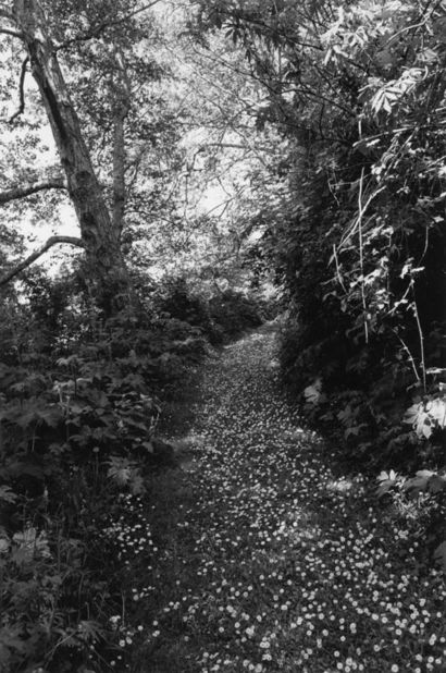
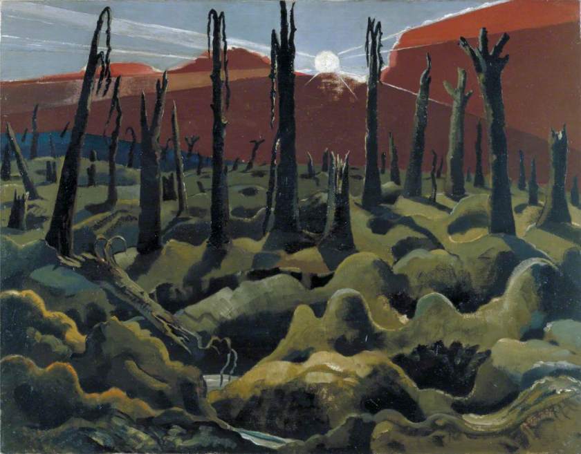
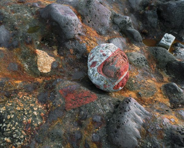
Arnatt was talking about his unsettled childhood – leading to difficult behaviour at school, (not thought of in a positive way). He developed an interest in art of the back of someone encouraging him to try for the local junior art school from age 13, he drew constantly then. He came across the work of Paul Nash as an art student (the image referenced above). Visited the Ashmolean in Oxford and became interested in landscape paintings. Moving to London he saw a wider range of paintings and explored more abstract work, he comments ‘became more visually aware’ and aware of idea of scale in images and that there are implications in what you are doing ‘a history and a future and a present’ – so where you are and where you are going becomes important. Notes how reading and exploring works of other artists (in all genres and places) becomes relevant to how you think leading to the thought that ‘Art is a tangible manifestation of ideas’ . It does matter what has been done – you may not be able to see it but could possibly see the ongoing effect (Earthplug and similar works). Eventually other people started making photographic documentation of his work so that people would know what he was doing – recording of ephemeral events. Then realised the importance of photographs – so what he did was with ‘the photograph in mind’ e.g. himself being buried (1969) ‘invisible art – art disappearing and the artist disappearing’ , also be aware that ‘your intentions and assumptions’ are not what occur to others. What narrative do other people impute to your work? Work on building boxes – all subtly different – made a collection of objects, you know they are different but may not perceive them differently. ‘Making works of art that depend on knowing runs against the kind of myth that works of art speak for themselves’. ‘Could the subject matter of art be about the difficulties of being an artist?’ – is that valid? He the developed an interest in photographing the people who visited Tintern Abbey – many people visiting there and taking the same images from the same spot – if you then photo them – how do people respond to the camera? Went on to series ‘Walking the Dog’ (associated with Sanders image of man with alsatian)- there was a behavioural element in taking the images – getting man and dog to comply at the same time – not knowing what would happen. ‘Things appear in image that you haven’t taken into account….editing process is the primary creative act’. – He became more uncomfortable with the idea of taking pictures of people and increasingly interested in landscape – so moved in that direction taking ‘documentary’ pictures of a place he lived, including the ‘tatty’ bits in an ‘area of outstanding natural beauty’ – myth versus documentation of an area – related to changes in the world as it is now. What people get from images will differ depending on their experience i.e. photographic experts, or people knowledgeable in art history versus amateurs or people in the pub. Does that matter? Are you (am I) taking images for myself, for the ‘expert’ or for the (probably mythical) average person? Is a photographer an artist?  Can photographers be ‘collectible’? Role of preconception – what you get might be very different from what you have planned. ‘I do something, then reflect on it and that might tell me where I want to go’. Used black and white because of reference to tradition of photographers from Walker etc, but colour references my interest in painting and important in some images eg golden light and red plastic (Miss Graces Lane) – the camera can transform eg rubbish to a fascinating image. (Howler’s Hill) – may, when looking at image in editing process, may find it references a historical painting – it is the accident in this that is interesting, less interesting when planned. Rubbish not equal to main preoccupation in ecological issues – but rather to what the image is pictorially – making pictures that are not chaotic out of chaos – ‘bring some kind of sense to it’.  – reference to still life = reference to notion of vanitas and mortality. I look for things that are not traditionally photographed ‘the marginal slices of life’ ‘looking at the overlooked’. What is acceptable to photograph? And in what context – eg forensic, medical might be acceptable while not in ‘art’ world. Could you look at medical photography as metaphors? Where your work is shown will give a different context to it – it may be understood differently in different places – may not be under your control – other than by choosing the gallery, venue etc. Reasons for making photographs are the same (?) as in making any other pictures – is this true? Is there a distinction between art and life – ‘life is what we make of it’ through language and vision. = ‘when I recognise as stage photographs I tend to have lost interest’. ‘Photograph of something out there in the world that is not staged – its the product of a vision’  ‘various ways of photographing… bring a degree of attention and control…. I like perversity and playing with it’ ‘is now-ness important…. Different from what you can do in painting or sculpture; ‘I like things that we don’t value or need much – the last piece of paper on a bog roll’  Start with nothing with painting – different you don’t have to make references to the outside world (although you do) – so many choices. Photo is a fragment – a fraction of a second .
Assignment 5 – Response to Tutor

05/02/18

Comments on assignment:

I had a long and wide-ranging discussion with my tutor David for assignment 5. I will try to summarise what I took from it here.

  • My title ‘Forestry in Scotland‘ was too broad.
    • Agreed! Am trying to think of something more descriptive that isn’t too wordy – that is the difficult bit.
  • Lighting is inconsistent
    • This is about having most of the shots in a fairly flat light, if not downright stormy while 2 images were taken in bright sunlight with vivid blue skies. I hadn’t even thought about this as a problem – but on looking at the series as a whole they do rather stand out and produce a jarring note. I do have some replacements already available – I hadn’t even considered using them as my brain went ‘sunlight- that’s better’ without thinking it though.
  • Looking at the final edit in detail
    • This was very helpful, and I have done as suggested – my wall is now covered with prints. I am definitely going to go and re-shoot a couple of the ones that I had originally discarded but fit better into the theme. There should not be a problem getting cloudy days in Scotland in winter.
  • How do you show changes in time and season?
    • This I’d something to think about further for an extended project – maybe mark a spot and re-shoot at monthly dates – showing the changes in the trees, which might be fairly subtle.

Overall the discussion was very helpful – and hopefully I will get an improved final edit. At the very least it gave me a lot to consider and made me think more clearly about what I was aiming for.

Suggested Reading:

Paul Nash – an artist I had not come across before – related to the work produced by Arnatt. Destruction, here in the context of a response to WWI. Dead trees and land. Interestingly, the present push for re-forestation in Scotland was a direct response to the lack of wood available for military uses in WWI. So his horror in some way translates into the trees of today, and to their use as a resource for the community.

Nash, Paul, 1889-1946; We Are Making a New World
©Estate of Paul Nash/ Imperial War Museum

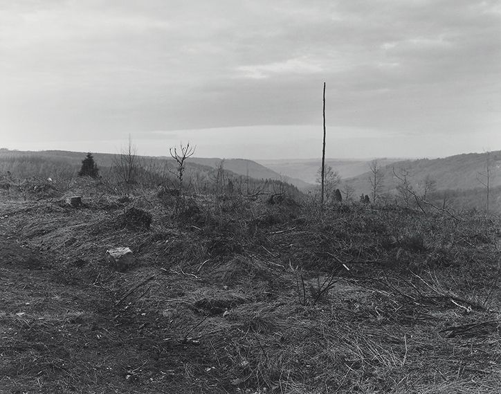
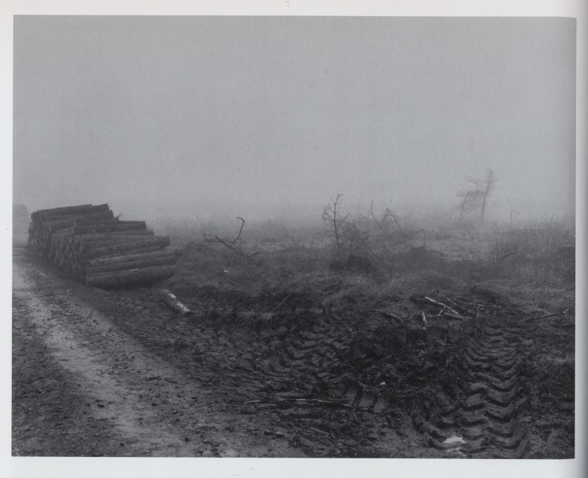
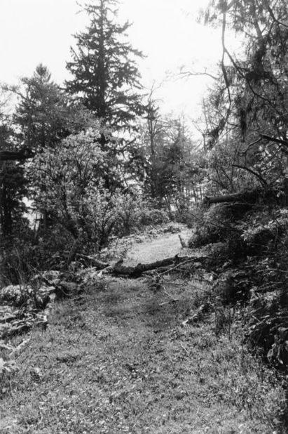
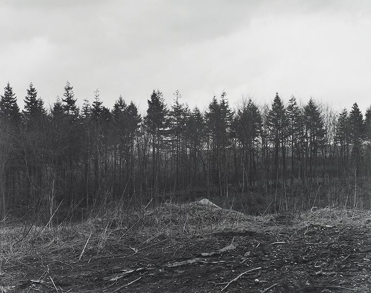
Images from Keith Arnatt – 2 of which are incredibly similar to some of the images I took for this assignment. If I had not taken them prior to seeing these I would have thought ~I would have been deliberately copying them. In reality it points up how the direct impact of forestry on the landscape leaves the same type of temporary destruction today as it did 30 years ago.

He also suggested a link to a fascinating and very long (2 and a half hours) audio interview with Keith Arnatt – this doesn’t finish – but cuts off mid sentence – so no concluding words of wisdom.

http://sounds.bl.uk/Arts-literature-and-performance/photography/021M-C0459X0036XX-0100V0

I took reams of notes  and was left with a lot of questions:

https://scottishzoe.blog/2018/02/12/notes-from-keith-arnatt/

Questions:

What narrative do other people impute to your work?

Could the subject matter of art be about the difficulties of being an artist?

Is the editing process actually the creative act?

Who are you taking the pictures for (and where are you displaying them)?

What is the role of preconception?

The photograph as an instant versus the painting/sculpture over time?

Does it matter what you photograph as long as you pay attention to it?

In reality all these questions are the ones that this degree is exporing, at one point or another. There are clearly no absolute right or wrong answers to any of them.  It is something to consider .
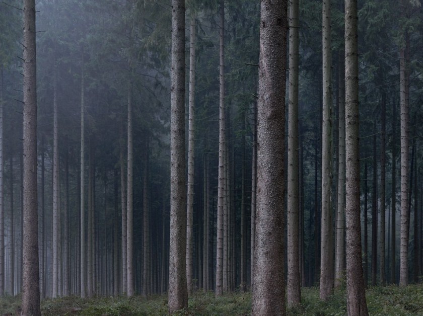
Michael Lange – another photographer I had not seen before. Some stunning images of deep in a forest, dark, minimal changes of tonality and colour. Lange started work as a photojournalist and has moved to fine art work. The images are redolent of the pine forest, not partially cut down, but what appears to be old wood. Again, these are the images I wished I could have taken to show the forest as it might be – although we have less major forests in Scotland than there are in Germany. His title – Landscapes of Memory – is relevant to the type of work I would like to move on to if I can extend this project.
Michael-Lange-photo-eye-wald-2016-954x714
© Michael Lange

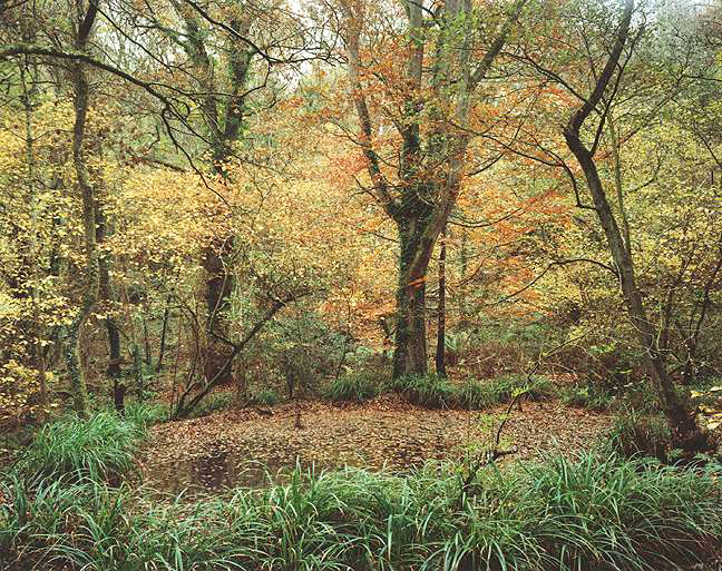
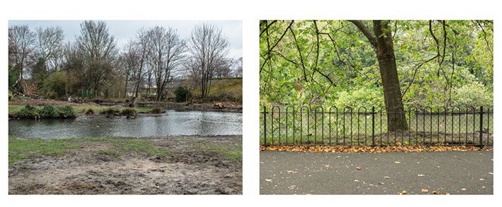
Jem Southam – is a photographer who is exploring how memory and knowledge changes how we respond to the places we see. He looks at the same place over different times, different seasons and over several years – showing how a place will echo the season.  There are more changes where he is taking images in the South West of England’s than there are in the pine woods in Scotland – but links into the idea of extending the project – possibly for the landscape module.

FS_9094
© Jem Southam

Bloomberg and Chanarin – only managed a very quick glance at their work – but will be perusing this in more detail at a later date.


Land Values – Paul Mortimer

02/02/18

Paul Mortimer’s degree show for the OCA was at the Dundas Art Gallery in Edinburgh.     He describes Land Values as his photographic investigation of how important land is in your life. The exhibition consists of three parts:

  • Engagement and play
  • Transformation and conservation
  • Environmental contribution

Engagement and play is a fascinating look at Mortimer’s own environment, comparing an area in Yorkshire where he grew up with the part of Glasgow he now lives in. Mortimer asks the question- are there similar places to play and grow in as a child nowadays to those he found in his own youth? His answer seems to be no – but why? In a conversation about this with Paul we wondered at length whether it was because of the lack of perceived safety outside at present, or was it because what was wanted now by young people was more ‘sophisticated‘ than the activities we engaged in as children.

water
© Paul Mortimer

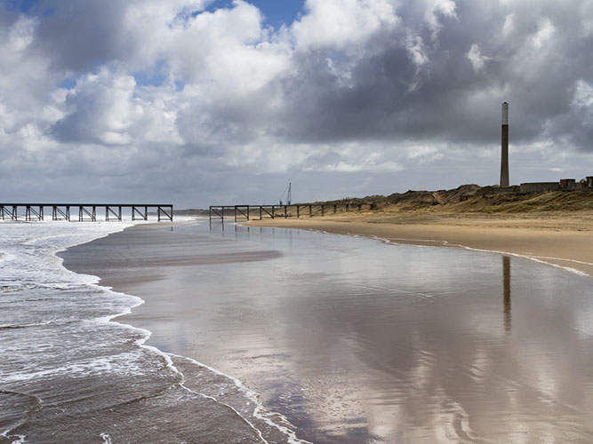
Transformation and conservation looks at the coastal area between Hartlepool and Sunderland where a piece of land that was used by the coal industry and heavily exploited has now been allowed to regenerate and is used for the almost opposite causes of recreation and tourism. The land still shows the traces of what was there before in the form of piers and fences, but is gradually returning to its natural state. These images are stunning, vibrantly coloured and reminiscent of the work of Fay Godwin and Sirkka-Liisa Konttinen.

durham coast-12
© Paul Mortimer

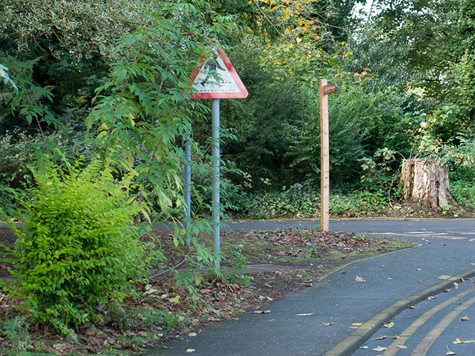
Environmental contribution looks at the role of trees in our present urban areas, these were taken within the grounds of a hospital within the city of Edinburgh and show some stunning examples of trees against the somewhat incongruous signs in the area. The site is being considered for redevelopment, at present the grounds form an informal park for the local people and are taken for granted. Will this change with the changing use of the site? Mortimer hopes to be able to continue this project as the site changes its use and to follow the environmental changes here.

astley trees-15
© Paul Mortimer

This is an interesting tripartite look at how we engage with the land. Do we value it for what use it is to us – or does land have an intrinsic value, that is more than just its monetary worth? Why do we go to places? How does memory effect what our understanding of a new place is and our visions for the future?

www.landvalues.co.uk


Assignment 5 – Photography is Simple – Initial Thoughts

28/12/17

Research

I started with the premise from Robert Adams essay ‘Truth in Landscape’.  ‘Our discouragement in the presence of beauty results, surely, from the way we have damaged the country, from what appears to be our inability now to stop, and from the fact that few of us can any longer hope to own a piece of undisturbed land’(Adams,1996).

When you think about images of forests they are broadly divided into two camps, with photographers who have celebrated the beauty, solitude and wonder of woodlands and those who have shown the devastation that mankind has performed. Some photographers have taken both types of images.

Marc Wendelski:

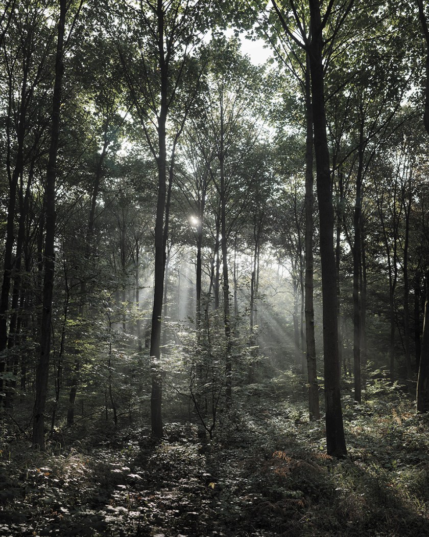
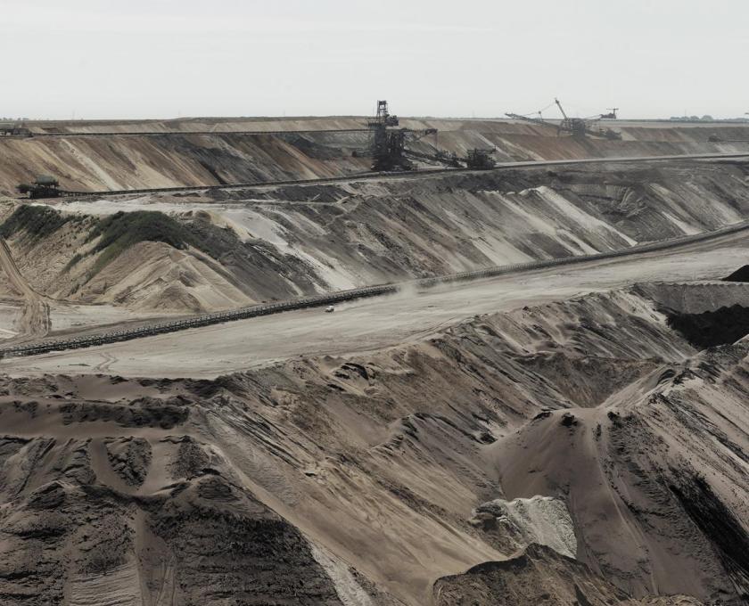
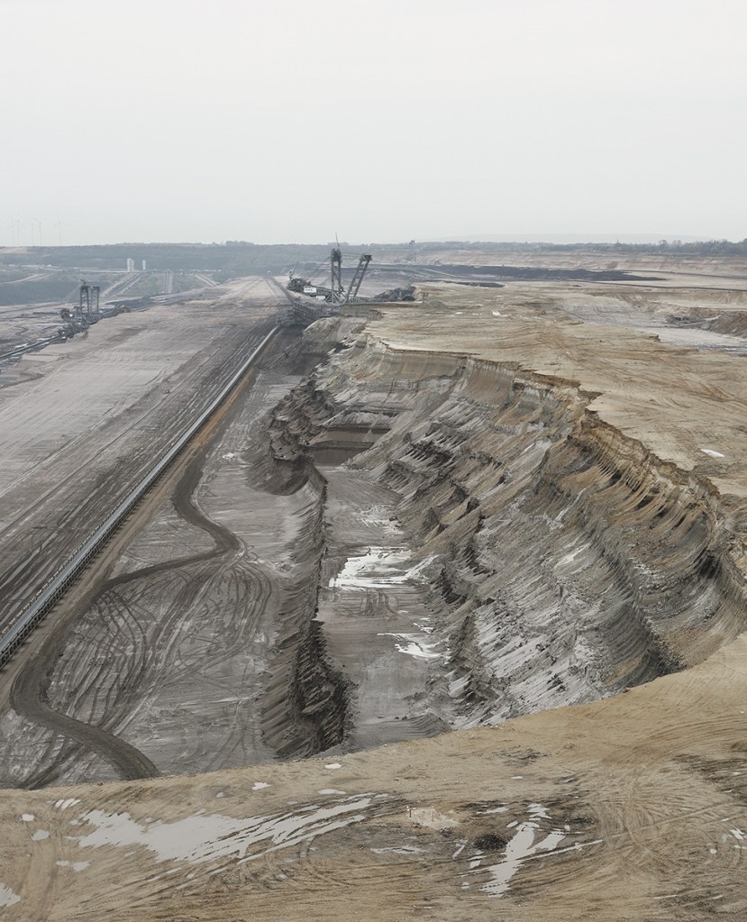
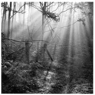
An example of this school of photography that concentrates on the damage we have done is the work of Wendelski who has taken a series of images in Germany based on the destruction of ancient forest during the process of open cast mining for brown coal and the activist that set up camps in the forest to protest this.

http://wendelski.be/?page_id=11

From this idyllic picture of sunlight though the trees

wendelski 1
© Marc Wendelski

to the destroyed countryside and swathes of mud

Joseph Koudelka:

A similar piece of work has been carried out by the Magnum photographer Koudelka. He has done a vast photographic report on the coal mining industry in the Black Triangle in Czechoslovakia. I was lucky enough to see this when it was on show in Edinburgh. The images are graphic, black and white, very sombre. In the Edinburgh exhibition relatively small individual images, approximately 1m x 30cms were laid out in a line, so you followed the trail of disaster around the room. The destruction here has been going on for much longer than the damage in Wendelski’s pictures in Germany but is startlingly similar.

https://pro.magnumphotos.com/C.aspx?VP3=SearchResult&ALID=2K7O3R1Z9ERT

Fay Godwin:

Godwin is particularly interesting in that her viewpoint and type of images she took changed over time. Her earlier work as shown in the ‘Secret Forest of Dean’ (Godwin, 1986) exemplified the beauty of a natural environment and how people could live in harmony with it, while in later work such as ‘Our Forbidden Land’ (Godwin, 1990) talks about how landowners limit access for their own use, and specifically, in reference to Scotland, talks about the environmental challenges caused by the widespread forestry work in the 70’s and 80’s, again many of her earlier pictures are simply beautiful.

Fence, Parkend Woods, Forest of Dean, 1985, Fay Godwin
Fay Godwin – Forest of Dean, 1985, (copyright now British Library)

Keith Arnatt:

Arnatt was also involved in the work about Dean Forest that was commissioned by Forestry Commission at the same time as that of Godwin. His work is difficult to track down, but the images I have seen ( in ‘I’m a Real Photographer‘)seem to fall more into the camp of the land is for use by industry, in contrast to Godwin’s more bucolic images (Arnatt, Hurn and Grafik, 2007).

Keith Arnatt - Dean Forest
© Keith Arnatt – Dean Forest

 and so we reach right around the circle to the original quote

Robert Adams:

Adams is the quintessential American photographer showing the beauty and wonder of the forest. A good example of his work is shown in the book ‘An Old Forest Road’ (Adams, 2017) which concentrates on barely visible paths in woodland, lit by seemingly random gleams of light. These pictures make you want to wander endlessly, exploring for no purpose other than to see the trees.

Interestingly, with the exception of Wendelski, all these images are in black and white. Some of this is because this was the accepted use when there were taken (Godwin and Arnatt) but some, like those of Adams are very recent. Is this because of the general idea that ‘art’ images should be in monochrome, because the more recent photographers are paying homage to the older ones, or simply because the colour green does not always print well? Certainly, monochrome does give some stunning images and shows the detail well. It also becomes difficult to tell simply by looking at an image of a forest when it was taken, this century or earlier. Monochrome tells the mythos of a forest well.

Practice

I started by taking images of forestry works when travelling around Scotland. Most have been taken close to me in Fife, but some were taken as far north as Fort William. In spite of this it is difficult to identify the place from the images and they become a generic series of Scottish forest images. The majority of the images were taken in the summer and early autumn, some taken in winter, again this is difficult to tell from the images, as although the light is different the dark green of the pine trees does not vary much across the year. This would not have been the case if I had been concentrating on deciduous trees.

I spent a considerable time deciding on whether to go with monochrome images, as was prevalent on the examples above, and discussed this at length with both my tutor, and the Scottish OCA group at our December meeting. Eventually I decided to use colour images, as some of them, such as the cut logs, stood out in colour and gave more information, and, even though the work was influenced by Godwin and Adams, I felt that colour was best for telling my own story.

References

Adams, R. (1996). Beauty in Photography. New York, NY: Aperture, p.14.

Adams, R. (2017). An Old Forest Road. Koln: Verlag der Buchhandlung Walter Konig.

Arnatt, K., Hurn, D. and Grafik, C. (2007). I’m a real photographer. London: Chris Boot, pp.38 – 41.

Godwin, F. (1986). The Secret Forest of Dean. [Bristol]: Redcliffe [for] Arnolfini [and the] Forestry Commission.

Godwin, F. (1990). Our Forbidden Land. London: Cape, pp.138 – 142.

Koudelka, J. (1992). Josef Koudelka: The Black Triangle • Magnum Photos. [online] Magnum Photos. Available at: https://www.magnumphotos.com/newsroom/environment/josef-koudelka-black-triangle/ [Accessed 8 Dec. 2017].

Wendelski, M. (2017). BEYOND THE FOREST | MARC WENDELSKI. [online] Wendelski.be. Available at: http://wendelski.be/?page_id=11 [Accessed 19 Dec. 2017].

Wendelski, M. (2017). Marc Wendelski | LensCulture. [online] LensCulture. Available at: https://www.lensculture.com/mwendelski [Accessed 19 Dec. 2017].

Photography as Information – Exercise 5.3

04/12/17

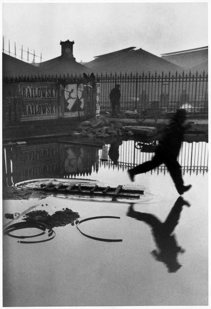
A picture contains a story, not always the whole story, but enough clues that you can infer or imagine what the artist was intending. A good story can be read several times, a magical one never looses its appeal.

decisive-moment-henri-cartier-bresson-1
© Cartier-Bresson

In the Cartier-Bresson image Behind the Gare Saint-Lazare the eye returns repeatedly to the point at which the foot almost, but not quite, touches the reflection below. Is he jumping or running? Where is he going? Is it a man in a hurry – or a boy playing? If you took the same image today was that a female figure? A hundred stories are possible.

81TNHg05SYL
© Ronko Kawauchi

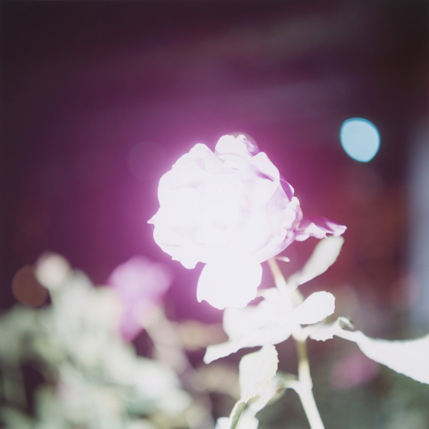
Illuminance – described as an ‘exploration of the extraordinary in the mundane’ (Aperture,2011) or ‘a mix of intimacy and deceptively casual observation’ (O’Hagan, 2011) is a photobook by Rinko Kawauchi. The cover shows a rose bright to the point where all colour and detail is lost, against a vibrant maroon background. It somehow retains the essence of a rose and allows the imagination to recreate any rose, with the luscious scent, and warmth of a garden in a summer evening. Technically, one could consider the image grossly overexposed, but it does not matter. The rose is still there.

d6059527a
© Hiroshi Sugimato

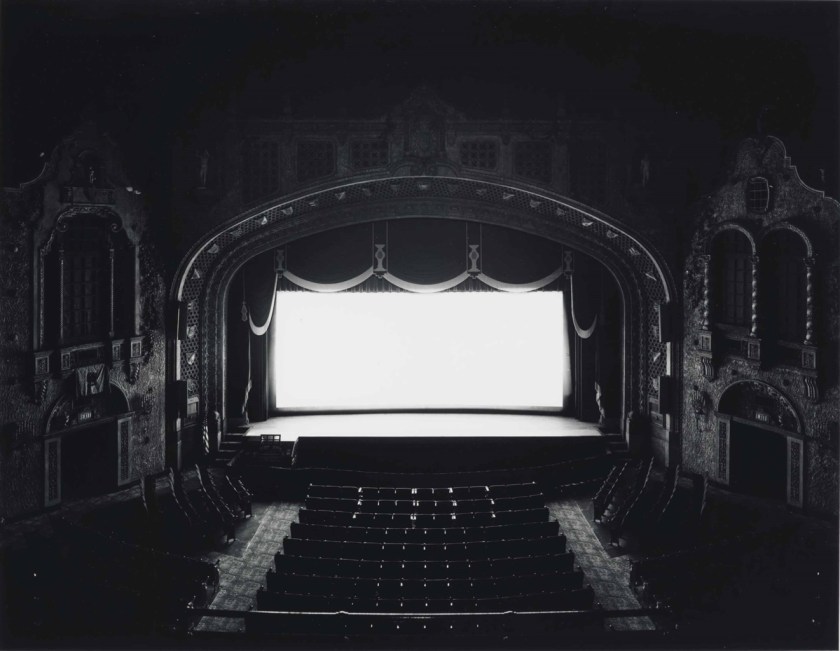
Hiroshima Sugimoto’s theatre images share the same aura of infinite possibilities. What film was playing? Who was watching it? Was I there?

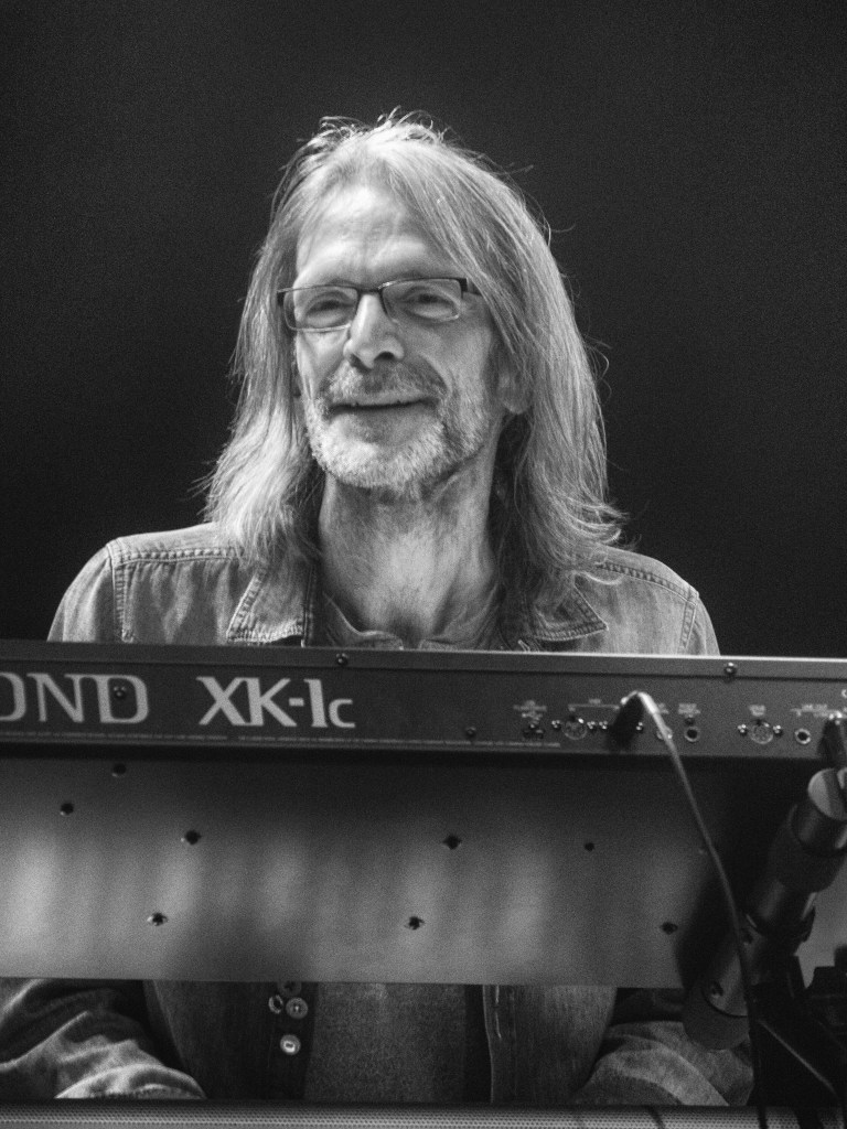
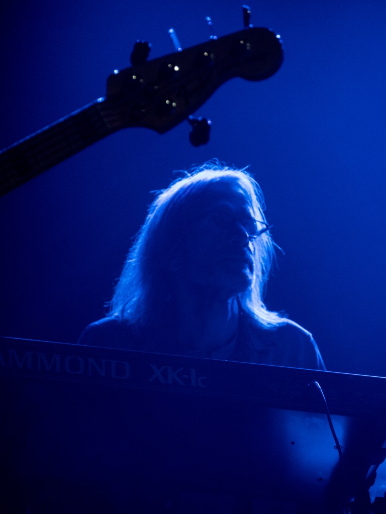
These two images were taken on the same night, at the same gig, of the same person, from the same vantage point. One shows the person as a portrait; the other implies his presence by the outline of light though his hair.  The information that I am at a rock gig is conveyed by both – but one gives the detail, the other the feeling. Which is ‘better’? Which carries more information? It depends what you are wanting from the image. I would print the colour one as a reminder of the night, but the monochrome one was wanted by the musician for his personal records.

References

Aperture.org. (2011). Illuminance. [online] Available at: https://aperture.org/shop/illuminance-rinko-kawauchi/ [Accessed 4 Dec. 2017].

O’Hagan, S. (2011). Photography books of the year 2011: a snapshot of Christmas gift ideas. [online] the Guardian. Available at: https://www.theguardian.com/artanddesign/2011/dec/13/photography-books-2011-christmas-gift [Accessed 4 Dec. 2017].


The ‘isms’ – 4 Exhibitions

27/11/17

I was recently in Newcastle and went to four exhibitions on broadly similar themes – the issues of racism, sexism and civil rights.

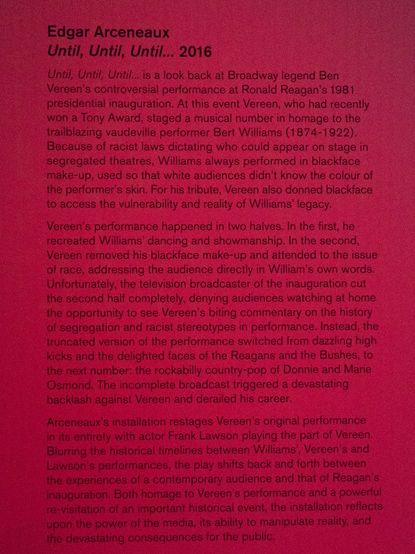
Starless Midnight and Until, Until, Until …. 2016

The Baltic Centre for Contemporary Art.

Starless Midnight is in homage to the work of Martin Luther King in his role as promoter of the Civil Rights movement and points up how, although there has been much progress, there is still so much more to do.  Nine artists are featured, all with their personal take on the ongoing issues, and is co-curated by Edgar Arceneaux. His video installation ‘Until, Until, Until …. 2016’ is also shown in the Baltic at present. This installation is a large-scale video presentation on a transparent screen though which you can see another screen showing a fractured vision of the original work. the gallery describes it as:

untitled

The scale of the installation – larger than life-size – and the interesting back story make a piece that is difficult to watch without an emotional reaction.

Two parts of the exhibition that I found particularly poignant were the works of Hinkle and the Gallery Tally.

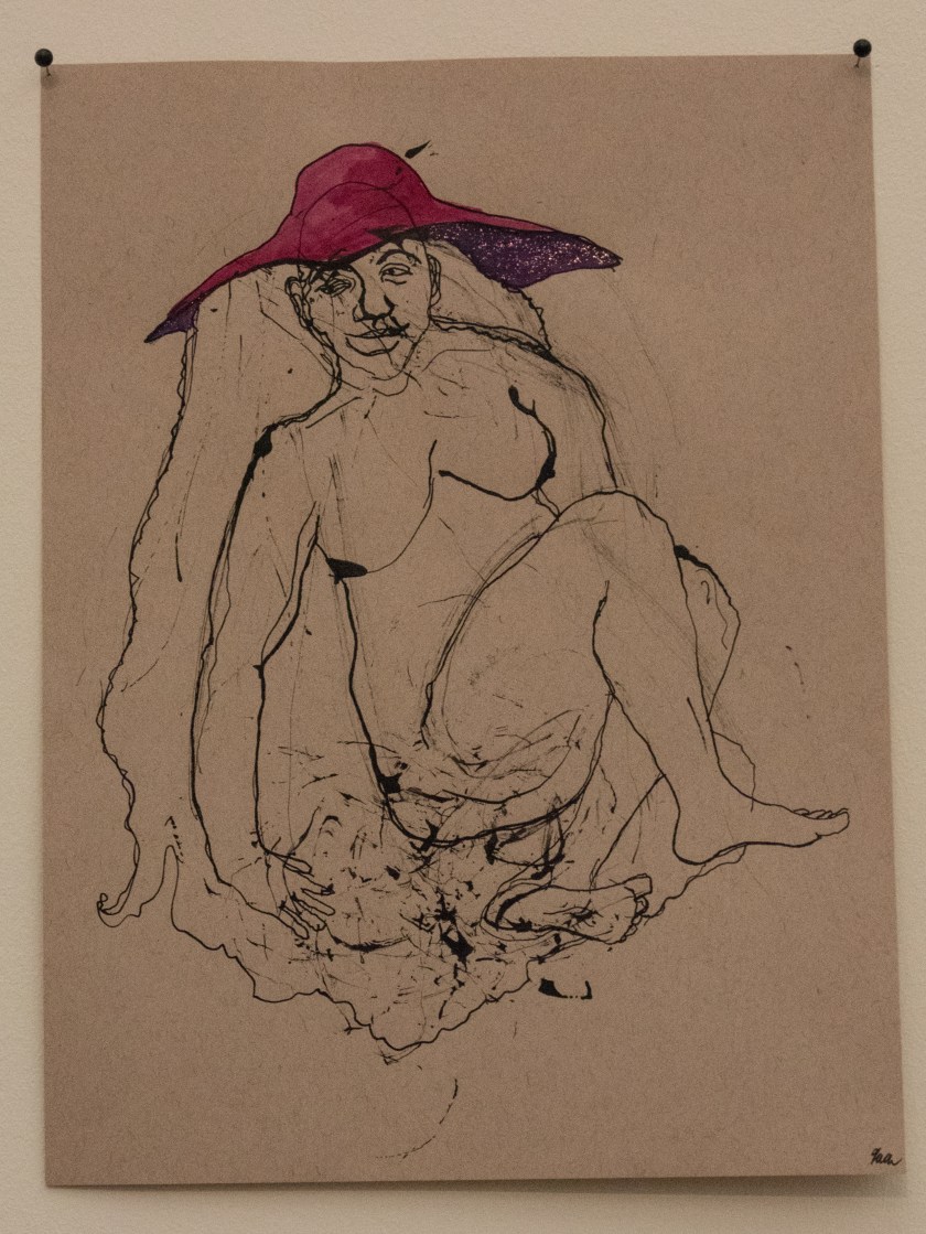
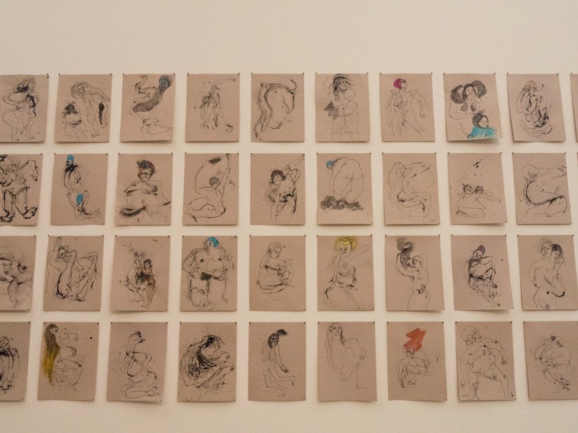
Kenyatta A.C. Hinkle shows a number of drawing from an ongoing series – ‘The Evanesced’ which looks at the multiplicity of Black women who have been erased from history, for instance by trafficking or murder.

untitled-2
© Kenyatta A.C. Hinkle – The Evanesced: Uproot

These images are shown along a wall, en masse, described as ‘un-portraits’. Unless you examine them carefully all the women look similar. It is easy to miss the fine detail that turn them to individual people. It was easy to miss the individual disappearances too.

untitled-9
© Kenyatta A.C. Hinkle – The Evanesced

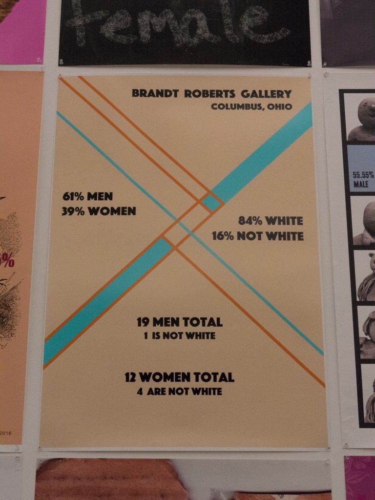
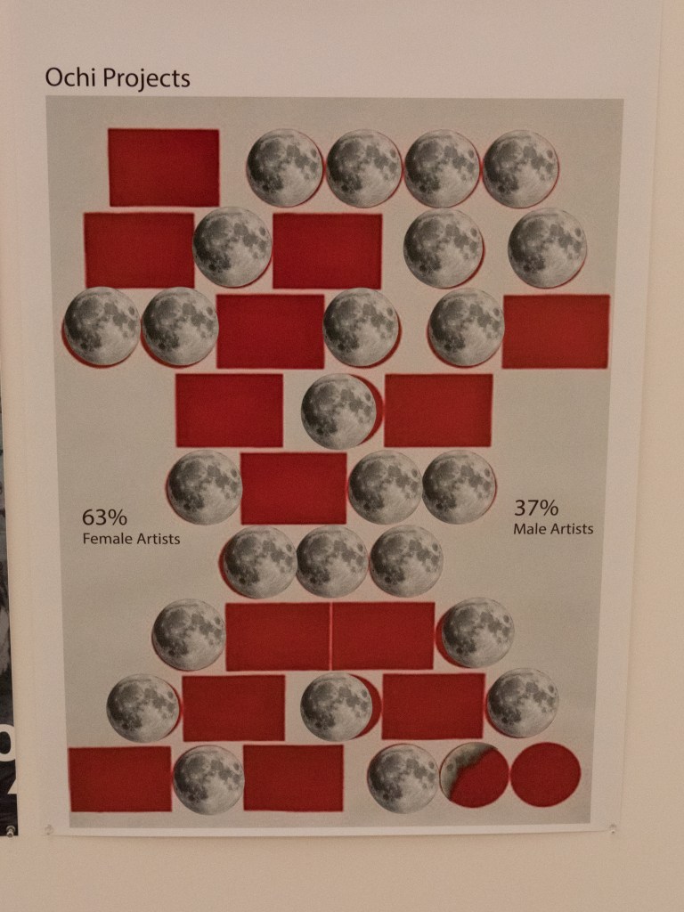
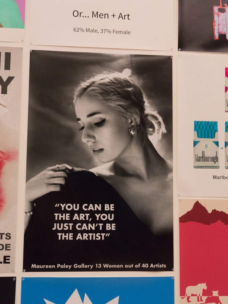
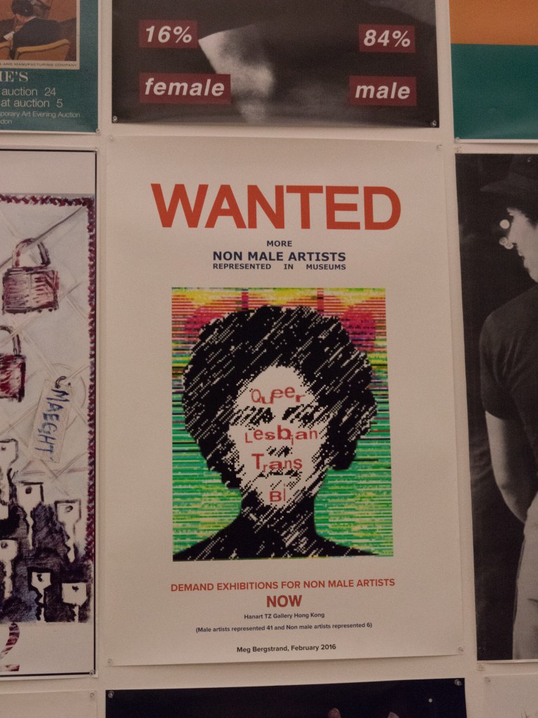
Michol Hebron presents the work from a collaborative project, Gallery Tally, where data is collected in the form of posters to show the representation of women in art galleries and museums. The posters are widely varied, and talk not only about the paucity of women artists on show, but also about the lack of work by other marginalised communities. The work by women photographers has been widely discussed recently for example in ‘Girl on Girl’ (Jansen, 2017) and the ‘Photoworks Annual 22 – Women’ – but it is shocking to realise that there is such a wide-ranging lack of equality ongoing in the wider art field. I only saw one (top right) where there were more females represented than males.

Posters from the Gallery Tally Project – attributions unavailable.

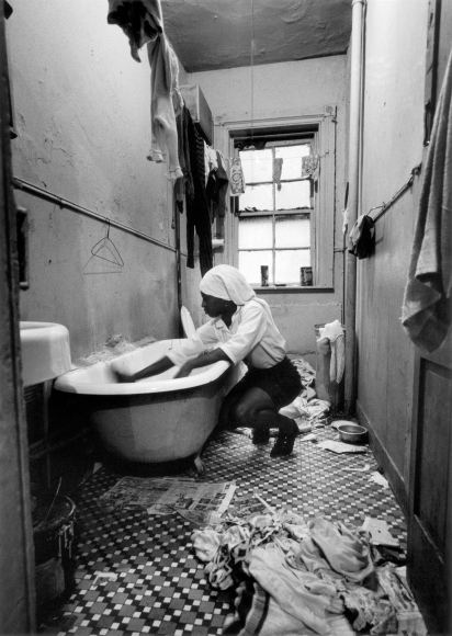
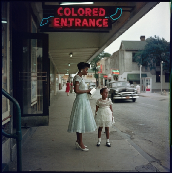
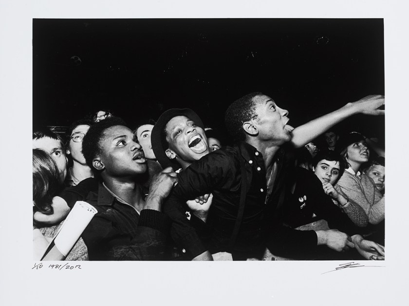
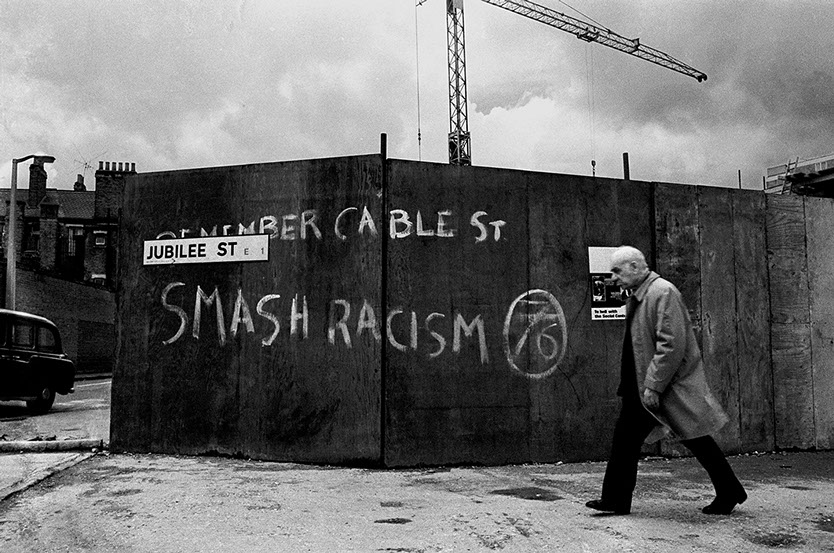
Gordon Parks – A Choice of Weapons and Syd Shelton – Rock Against Racism.

Side Gallery – Newcastle.

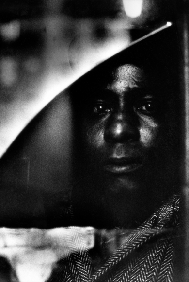
Gordon Parks (1912 – 2006) was an African-American photographer who said, ‘I chose my camera as a weapon against all the things I dislike about America – poverty, racism, discrimination’ (quoted in the exhibition information at the Side Gallery – Amber, 2017).  He initially worked for the Farm Security Administration and then went on to become a freelance photographer and film-maker, documenting the difficulties black people faced in the USA. This exhibition shows a selection of his work both in colour and black and white, together with the film on the Fonetenelle family, from Harlem, who lived in extreme poverty. The images are detailed, dark and claustrophobic, leaving nothing to the imagination, even brutal at times. The story is shocking, but similar scenes could be found today.

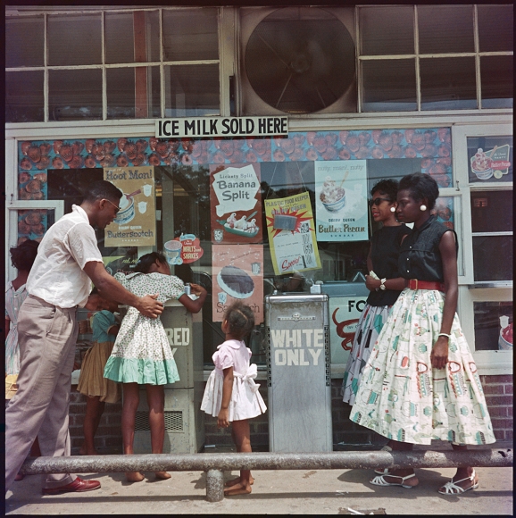
The coloured images are from a photo-essay published in Life entitled “The Restraints: Open and Hidden” and point up how the lives of black people were segregated from the those of the white Americans. They appear softer, even ‘charming’ until you look closely and read the signs. This is an interesting use of colour photography in an era when most images were still in monochrome. Colour images were only widely used from the 70’s when promoted by photographers such as William Eggleston and Joel Meyerowitz.

Syd Shelton (born 1947) was one of the prime photographers of the movement Rock Against Racism (RAR), which was developed by a collective of musicians, artists and activists to fight fascism and racism through music. There was a large exhibition shown in London at Autograph APB in 2015 and a small number of the images are shown in the Side Gallery. They are taken two decades on from the images of Gordon Parks but talk about the same issues of black versus white culture and perceived rights, this time in Britain rather than the USA. Shelton used his photography for a similar purpose ‘as a graphic argument …. a subjective witness’ (quoted in the exhibition information at the Side Gallery – Amber, 2017).

Although both the present exhibitions at the Side Gallery talk about the same issues, civil rights, racism and the abuse of power they come from a very different stance. Shelton was born in the UK and studied art at university before going on to become a photographer, working as a photojournalist. His images are from the outside, looking in, mainly of angry young people protesting on behalf of injustice in racism. Gordon Parks came from a poor farming family in the USA, he eventually ended up on the streets and taught himself photography, eventually working with the FSA, before becoming a photojournalist.  His images are from the inside, looking out, of the people themselves, and what they were going though at the time.

While both sets of images have a powerful impact Parks’s have a greater degree of empathy and emotion, less factual but more revealing.

References

Amber. (2017). Side Gallery – Amber. [online] Available at: http://www.amber-online.com/side-gallery/ [Accessed 3 Dec. 2017].

Jansen, C. (2017). Girl on girl : art and photography in the age of the female gaze. London: Laurence King.

Mill, B. (2017). Edgar Arceneaux :: BALTIC Centre for Contemporary Art.. [online] Balticmill.com. Available at: http://www.balticmill.com/whats-on/edgar-arceneaux [Accessed 3 Dec. 2017].

Mill, B. (2017). Starless Midnight :: BALTIC Centre for Contemporary Art.. [online] Balticmill.com. Available at: http://www.balticmill.com/whats-on/starless-midnight [Accessed 3 Dec. 2017].

Photoworks Team (2017). Photoworks Annual 22.


Exercise 5.2

10/11/17

213-024-LC-jpg-10297-600x483
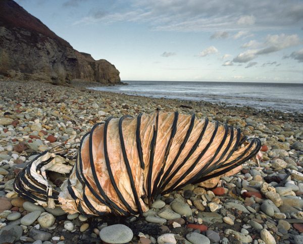
Hawthorn Hive, beached section of mine ventilation duct; bricks among boulders. Afternoon 2/12/99. © Sirkka- Liisa Konttinen, courtesy Amberside

This image is from the series ‘The Coal Coast’ by Sirkka-Liisa Konttinen. It was originally shown at the Baltic Centre for Contemporary Art in 2003, and published in book format as ‘The Coal Coast’. The image is taken on the east coast of England, in Durham, and shows a discarded section of mine duct on the beach, looking remarkably like an enormous snail shell. The rest of the beach is desolate and deserted. The Durham coast has had a long history of coal mining, and for many years the spoil heaps and the rubbish were simply dropped onto the beach, building the surface up several feet above its original level. The coal industry is now finished and the remnants on the beach are slowly being removed by both man and the sea. The broken mine duct stands as a metaphor for the destruction of the environment by man and the loss of a way of life. It is still visible, as it is both large and a good distance from the edge of the sea, however, over time, it too will vanish.

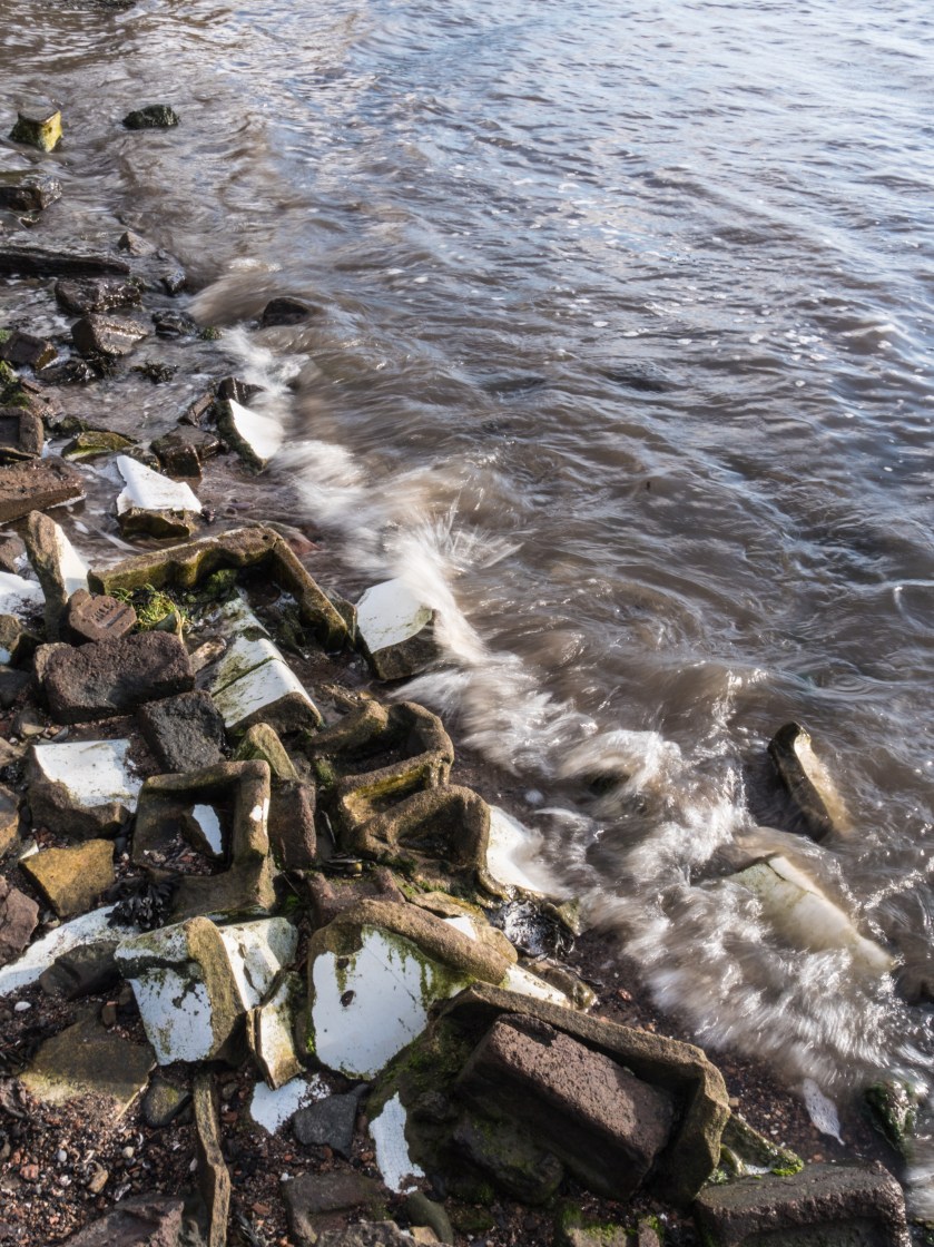
This image immediately reminded me of the similar history of mining along the Fife coast where I live. Much environmental destruction was wrought over the years, however the traces of that are now only visible to those who are aware of the history of the area and know what they are looking at. My image is made as a response partly to the internal context of the image – unexpected things seen on the beach, but mainly to the external context of the history of the area and the effect on the local population and job availability.

untitled-16
Sanitary-ware remnants, Torryburn Beach at high tide.

This image shows remnants of the broken down mine washrooms, that were left on the beach. The tide is high and gradually working at smoothing and polishing them. Eventually they will also disappear, or simply become unrecognisable. They stand, at present, as a reminder of times past, work lost, and also the loss of many lives in the mines that ran under the sea here.

 References:

Konttinen, S. (2003). The Coal Coast. Newcastle upon Tyne: AmberSide.


The Coal Coast

06/1/17

Title image copyright Sirkka-Liisa Konttinen

The Coal Coast is a body of work by Sirkka-Liisa Konttinen about the effect of the coal industry on the beaches of Durham. It was initially shown at the Baltic Centre for Contemporary Art in 2003, and developed further along with a film and shown again this year at the Side Gallery in Newcastle.

Images from that collection are available at:

http://www.amber-online.com/collection/the-coal-coast/

and there is a talk that was given at the opening of the Side exhibition available at:

http://www.amber-online.com/collection/coal-coast-talk/

Sirkka-Liisa Konttinen is a Finnish photographer who has worked in Britain since the 1960s. Her earlier work was all in black and white, mainly on the lives of people in the Newcastle area, however, she branched into colour for this series, using a medium format camera with colour negative film.

The Coal Coast describes the effect the coal mining industry has had on the environment. All the waste from it was simply dumped on the beaches, together with the ballast from the ships and the ash from the coal that had been burnt to provide energy for the operation. This effectively raised the levels of the beaches by several feet. Since the coal mining has stopped there has been an attempt to clean up the beaches, and the effect of removing some of the debris and letting the sea have more access has further removed some of it. Sirkka-Liisa Konttinen says ‘a redeeming thing is that the sea is taking back the man-made intrusion …. Maybe environmentally it will return’ and also describes how these sea changes impacted on her work, in that there were constant changes to the beach, how she would look for the time of day, light and tide combination that would show what she was interested in only, on some occasions, to return, and discover that the items had been washed away.

The images are often bleak: a dead bird, mine rubbish, a shoe half buried in the sand, but full of the most surprising colours, rust red, copper green with the intense blue of the sky. It is clear why she chose to use colour rather than monochrome to show this area. The series acts as a comment on the destructive powers of industry on nature, but also on the regeneration possible. The images themselves are sparse, definitely less is more, and benefit from repeated viewing. Some are reminiscent of the images of famous tourist areas, sea, sand and rock formations, so knowing the background to the images is crucial to understanding them.

The recent exhibition was accompanied by a film made by Sirkka-Liisa Konttinen and the Amber Collective, which is accompanied by music from the New York group So Percussion. It tells the story of a young miner, Billy, who died in the pits and the struggle to get his body out, interspersed with the images from the Coal Coast series and scenes of the moving waves, with sounds of the sea on the beach. It is both heart breaking and beautiful. The story is narrated by a former colleague of Billy, and even at this distance in time, the emotion in his voice is clear. The repeating and echoing music weaves in and out of the rushing of the waves. Overall a cathartic experience.

 References:

Konttinen, S. (2003). The Coal Coast. Newcastle upon Tyne: AmberSide.

Song for Billy. (2017). [HD video] Newcastle: Sitka-Luisa Konttinen.


St Andrews Photography Festival

This

27/01/17

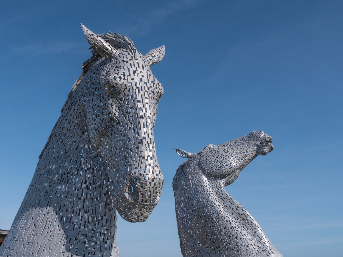
I had the opportunity of visiting the St Andrew’s Photography Festival at the end of September. Unfortunately, I didn’t manage to attend any of the workshops, as I would have liked to go to either (or both) of the collodion workshops or the one on tintypes. I did, however, manage to walk around the outdoor displays and also visit some of the exhibitions. The exhibition was overlooked by a ‘small’ scale copy of the sculptures of the Falkirk kelpies, only small relative to the original kelpies, even these towered over me.

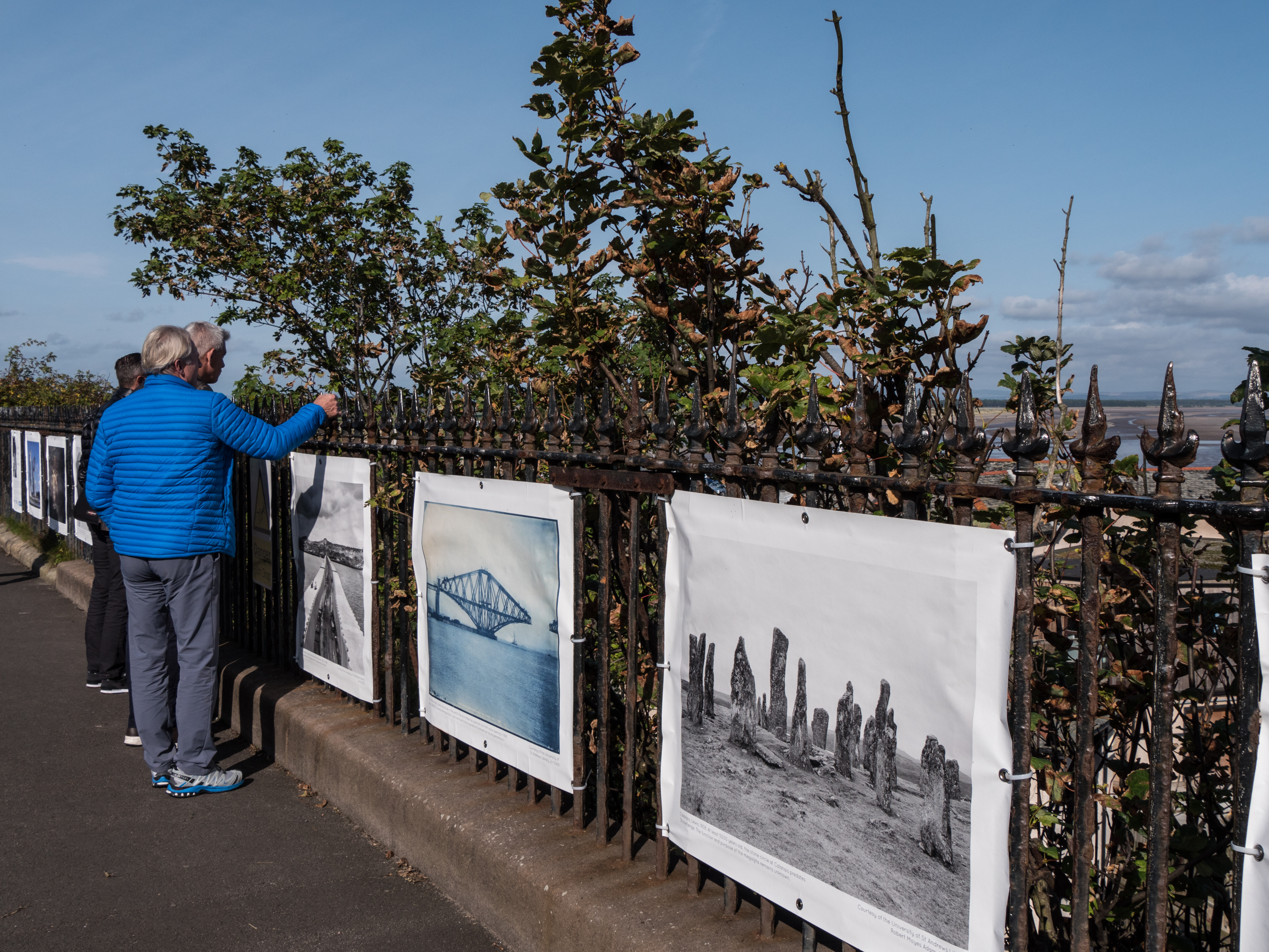
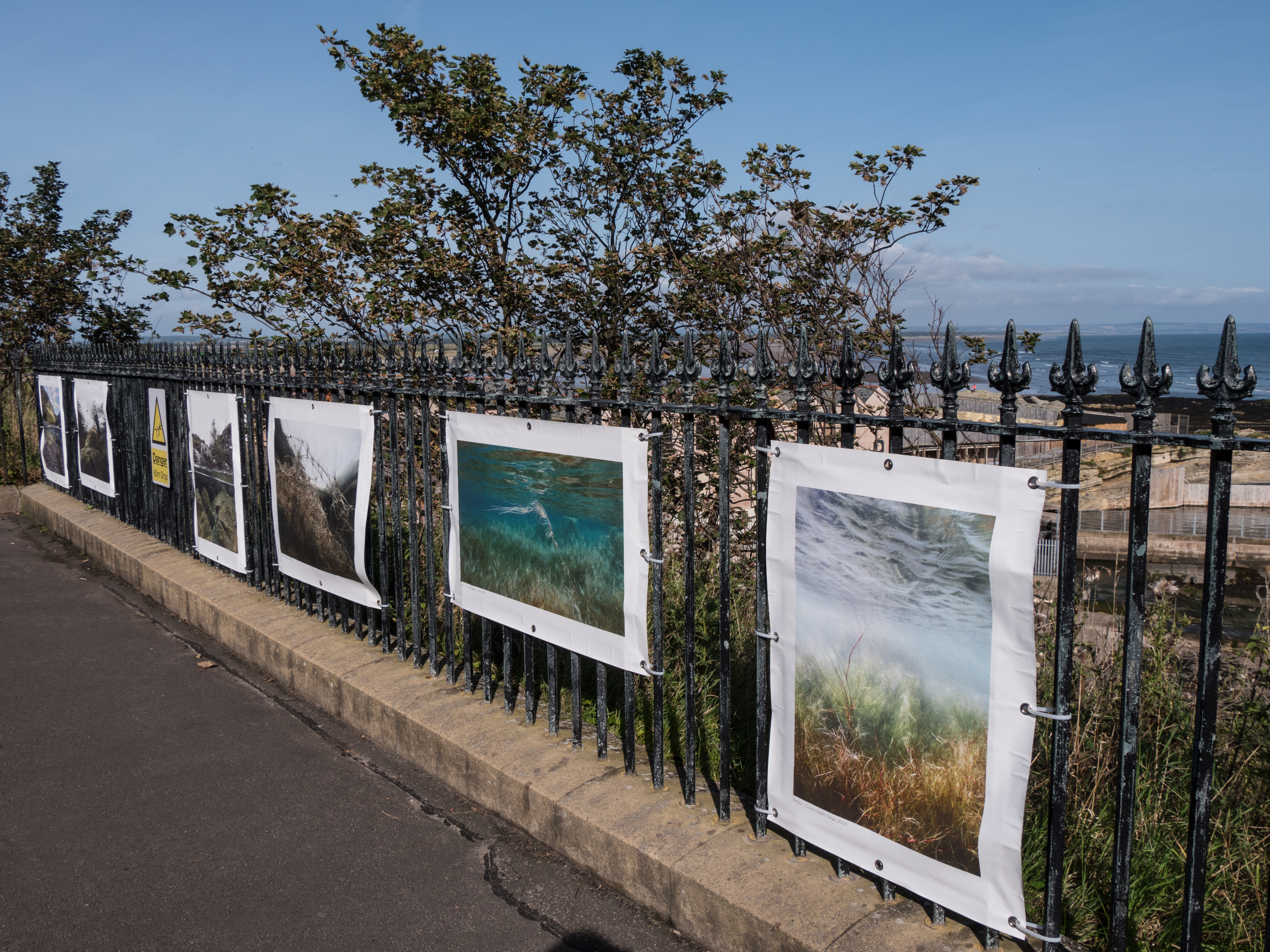
There were several displays of large posters of photographs shown on the railings both along the sea-front (The Scores) and also in front of one of the churches in town. These were interesting displays, partly for the images themselves, but also because of the reactions of the people in St. Andrews on the day I was there. I assume they were mostly tourists, there to look at the castle, cathedral ruins or play golf. Many were travelling in large groups with leaders discussing the sites. Very few were looking at the images displayed, rather leaning over them to look at the scenery. If I had thought more about this at the time it would have been interesting to have asked them if anyone was aware of the posters and what they thought of them (hindsight is a wonderful thing).

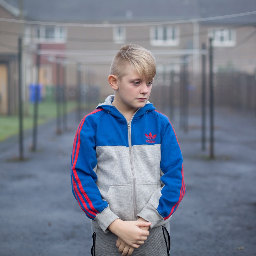
The poster exhibition that caught my eye was ‘In This Place’ by Margaret Mitchell, which has now been widely exhibited and won several awards including for the RPS and Lensculture. The work looks at images of her family set against the background of housing estate life in parts of Stirling that are waiting for regeneration.

These images of urban family life in a desolate area that might have been anywhere in Europe contrasted strongly with both some of the other, more traditionally beautiful images on show and the stunning coastal backdrop.

untitled-2

A further series of posters were of the various exhibitions that have been put on by Stills Gallery in Edinburgh over the last 40 Years. It is their 40th Anniversary this year. This showed the wide range of types of exhibitions that have been around in Scotland, but also possibly the general Scottish lack of reverence for the more cultural aspects of life, along with the need for fast food.

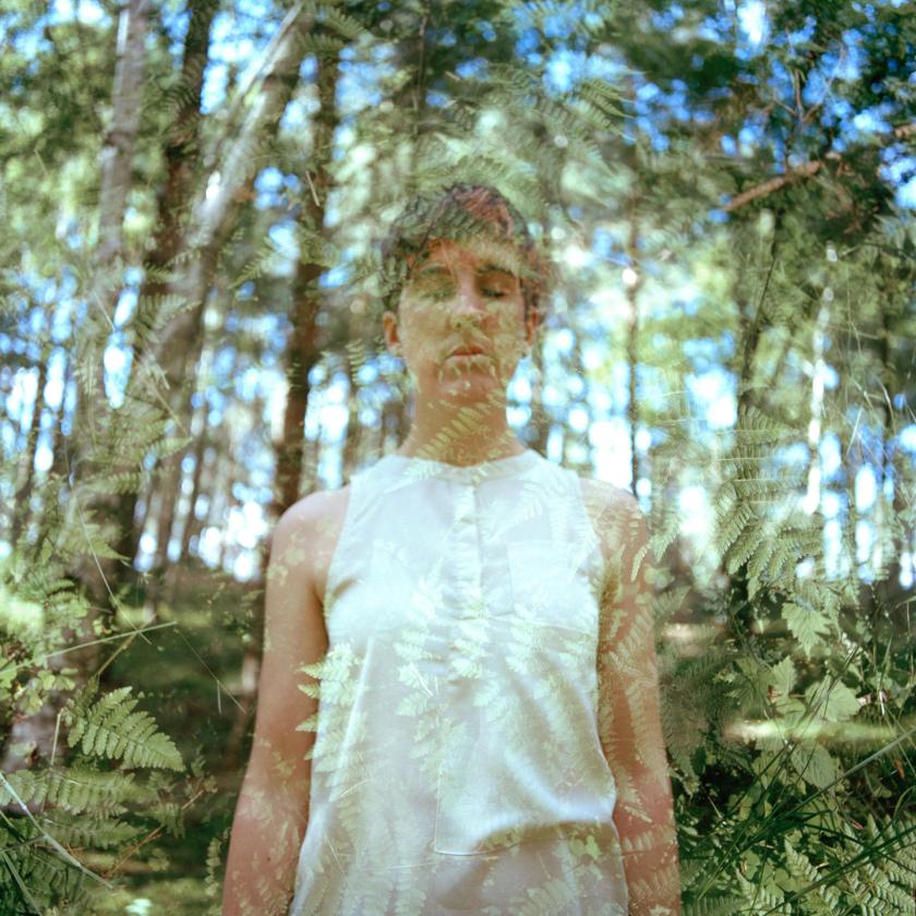
There were also many indoor exhibitions, not all of which I managed to see. Two that stood out for me were Heidi Blanksma and Hannah Laycock. Heidi won the photography competition with the image ‘Feel the Rain’, described as having a ‘Julia Margaret Cameron sort of feel‘ (Standrewsphotograpghyfestival.com, 2017).

Hannah Laycock produced a fascinating piece of work ‘Awakenings’ in which she describes photographically her feelings about her own struggle with MS. I found this especially interesting as it links into my own project on showing the feelings of people with autism in images. This also reminds me of some of the images in ‘The Final Project‘ by Jo Spence, although her images were overlaid using actual transparencies rather that what I presume is Photoshop here.  I assume the reference is deliberate – although the idea of disappearing and melding into nature is clearly evocative of losing yourself physically.

Awakenings
© Hannah Laycock , image courtesy of Hannah Laycock

Overall the festival (what I managed to see of it) was interesting with a wide range of photographic styles on show, and several potentially valuable workshops , which I will try to attend next year if available. I am not sure about the use of the outdoor presentations – I assume the idea is to bring photography and the festival to the attention of the multiplicity of people who visit St Andrews in the summer – but I wonder how successful that was, although if it only engaged the minds of a few who had never thought of photography as an art form, rather than a quick family snapshot or something for social media, it will have been a useful exercise.

References:

Hannah Laycock. (2017). Awakenings – Hannah Laycock. [online] Available at: https://hannahlaycock.com/awakenings/ [Accessed 27 Oct. 2017].

Margaret Mitchell Photography. (2017). In This Place – Margaret Mitchell Photography. [online] Available at: http://margaretmitchell.co.uk/projects/in-this-place/ [Accessed 27 Oct. 2017].

Photographer in Aberdeenshire | Stonehaven | Blankcanvas Photography. (2017). Photographer in Aberdeenshire | Stonehaven | Blankcanvas Photography. [online] Available at: https://www.blankcanvasphotography.co.uk/about-contact [Accessed 27 Oct. 2017].

Spence, J. and Lee, L. (2013). Jo Spence: The Final Project. London: Ridinghouse.

Standrewsphotographyfestival.com. (2017). St Andrews Photography Festival. [online] Available at: http://standrewsphotographyfestival.com/ [Accessed 27 Oct. 2017].

Outside – inside, is it a fantasy? (Assignment 4)

23/10/17

The Brief: Take one of the exercises on daylight, artificial light or studio light and use it to create a set of between 6 – 10 images with a linking theme.

For this assignment I chose to use artificial light as this is not a field I have explored before and I felt it would be a good test of development of skills.  I thought about several possibilities of exploring this.

  1. Street scenes at night:

    This gave me the options of more general shots, such as the lit town hall, or more specific ones like the exterior of the local pub.

  2. Gigs:

    This definitely was a possibility, as the light is very interesting, all of the above images are as shot on the same night without a change in the white balance.

  3. Car lights at night (road shots with extended times).
  4. Fireworks (wrong time of year).

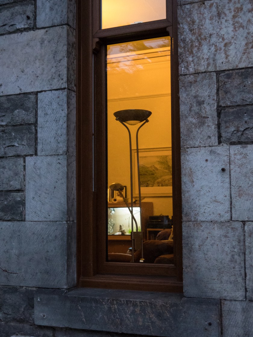
However, I was walking home one evening and this was the view though my window.

House window.

I found this an interesting view and decided to explore the concept of looking through the window.

Research:

a. When I started thinking about the concept of lit windows I remembered a painting I had seen at the Glasgow Gallery of Modern Art many years ago. Avril Paton is a Glasgow based artist who painted a series of images of Glasgow tenement flats from the outside, often with lit windows, looking in on the life inside. In these images the light is usually warm and intimate.

https://avrilpaton.co.uk/portfolios/glasgow

b. Rut Blees Luxemburg’s image of tower blocks give a similar feeling, and utilise similar colours, concentrating on golds and browns. Images can be seen in the Guardian article below. ‘Towering Inferno’ is an example of this, but although the colours are warm, the images are massive, and give an overview of the flats, not similar to the more intimate views I was looking for in my series.

https://www.theguardian.com/society/gallery/2009/mar/09/rut-blees-luxemburg-photography

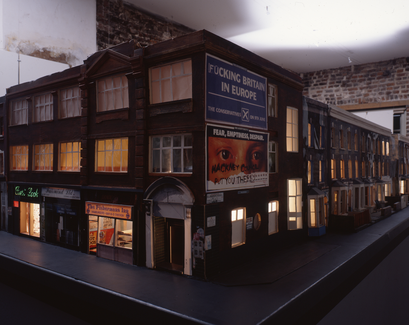
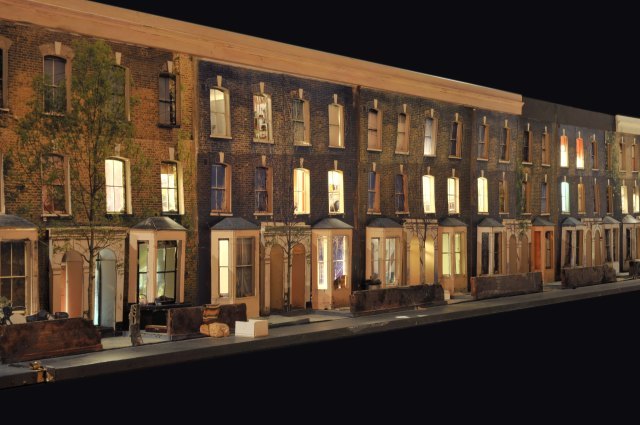
c. Todd Hunter has explored the concept of home at length in several series of works, one of which ‘The Ghetto‘, is a 3D model of the street he lived in, with colour transparencies place within the doors and window, lit from within. You have to walk along the model to look into the rooms.

There is also a series of other images taken within the rooms of people who lived (and often still do) on that street. These images and the display had been taken in response to an article in a local newspaper which described the area as ‘a blot on the landscape‘ (Tomhunter.org, 2017).

sp 2777 001
Ghetto 6 © Tom Hunter, with permission from Tom Hunter.

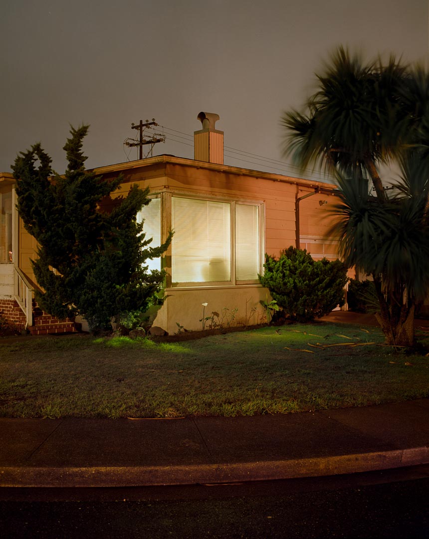
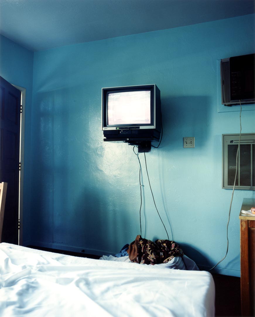
d. Todd Hido has also utilised artificial light, taking both outdoor images of houses at night and inside images. Like Tom Hunter, these are not beautiful in the traditional sense, but tell you a lot about the lives of people living in modern America, however these rely on the rooms themselves to tell the story, not the people within the rooms. I felt this was more in line with my idea.

The Process:

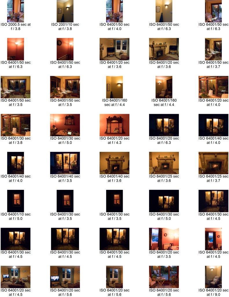
I took a long series of images at a cottage we were staying in in the country in Dumfries and Galloway. It was well away from any town, and the only light in the evening came from the lights in the cottage itself. I took some of the images handheld, with the ISO set to 6400, and the rest of the images using a tripod with the ISO at 800. I used a fully manual mode throughout. I have discovered that using manual settings slows me down and makes me think more about what I am focusing on and which bit of the image I want to have exposed in most.. It was not easy to use the tripod outside as the ground around the cottage is very uneven, and it was tricky to get a stable and straight image, so some of the ‘better’ shots were actually handheld, in spite of the high ISO. A more stable tripod would have helped here.

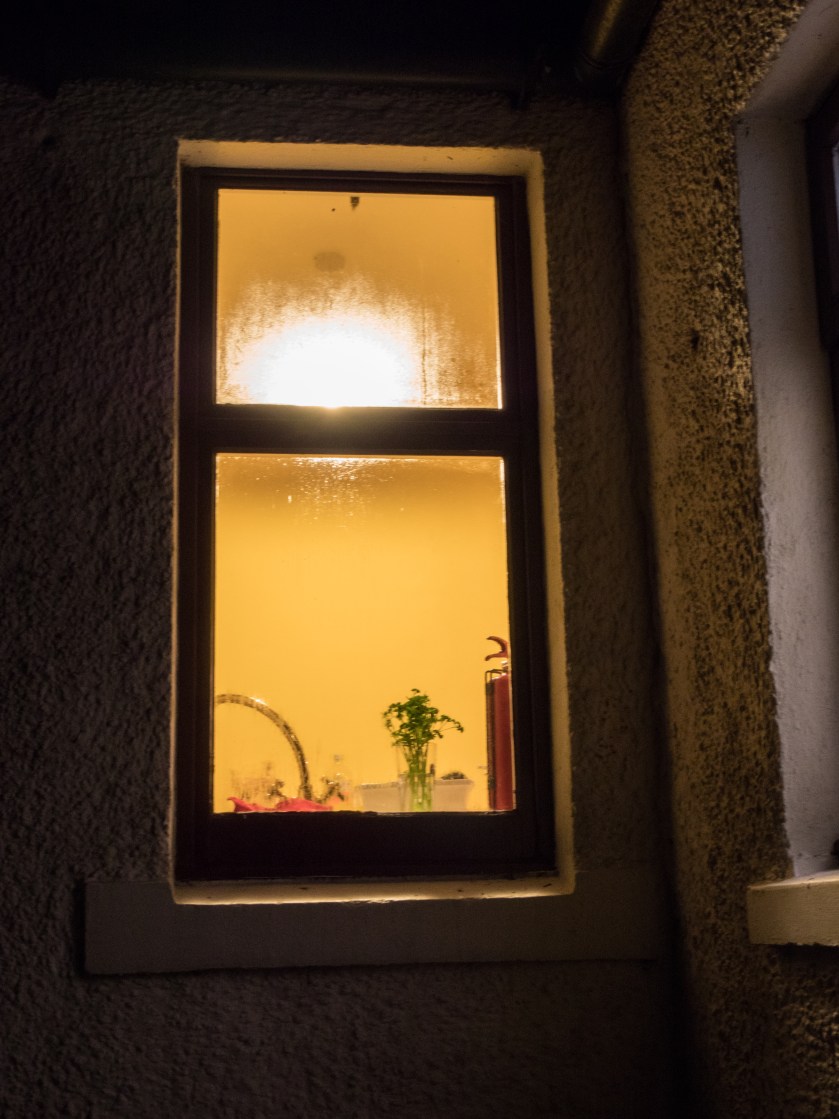
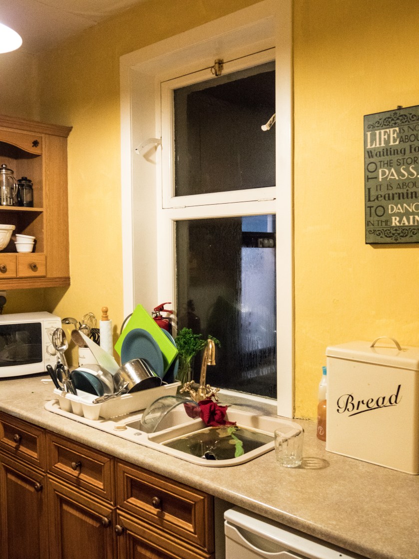
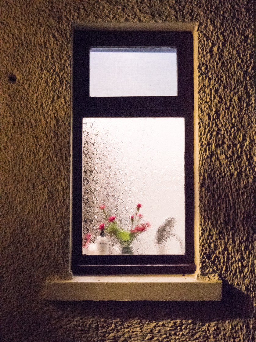
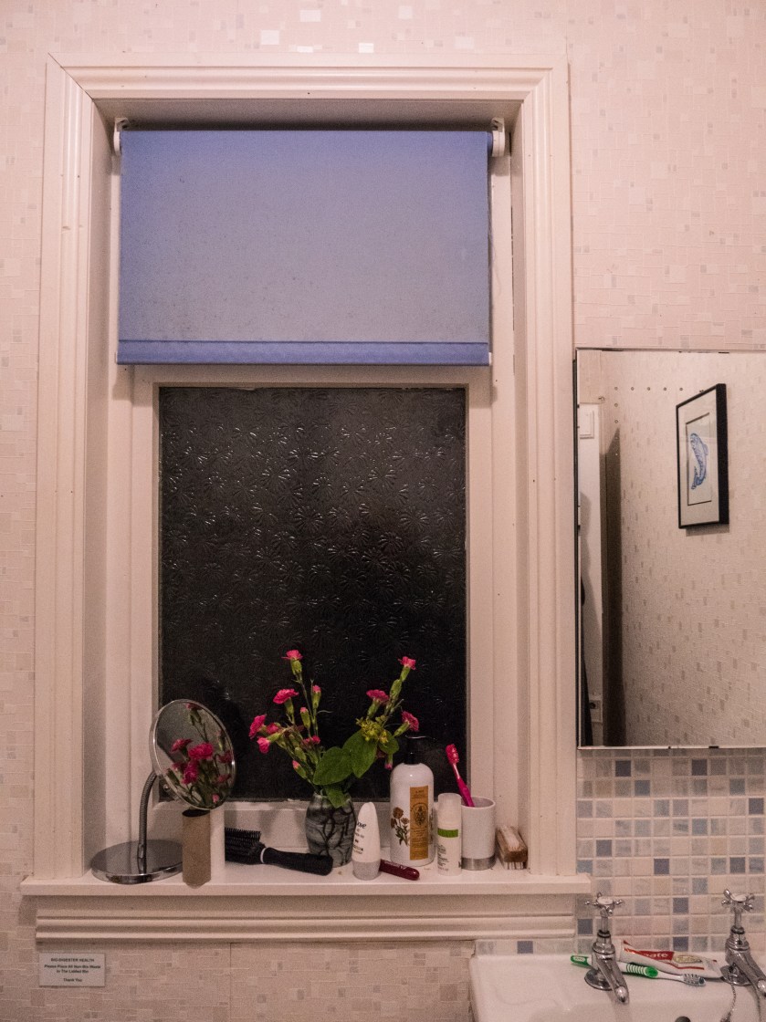
Images were taken from outside, looking at and through the windows, and inside. I did not ‘tidy up’ in advance of taking the images as I was looking to show the contrast between the outside images, where you could imagine almost anything, and the inside reality.

The images were processed in Lightroom CC, with minimal changes. I did not alter the white balance as it feels accurate for the lighting conditions and what I wanted to show.

Contact Sheets:

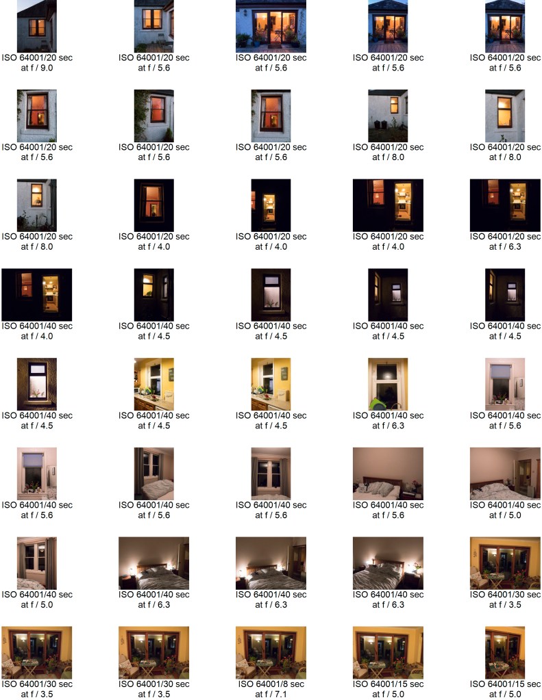
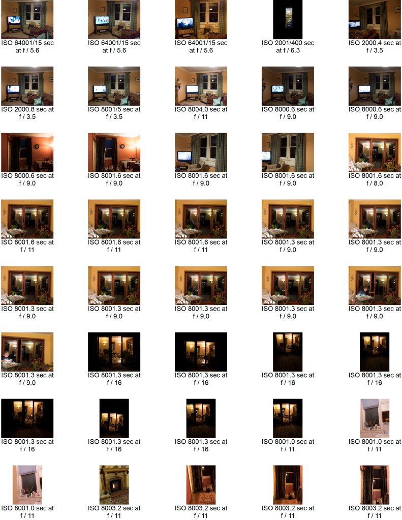
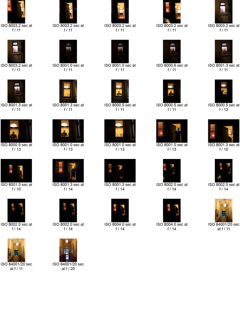
Initial contact sheet for all the images:

Selected images marked with exposure, aperture and ISO:

I spent some time thinking about how, and which images to choose. I was not sure whether to stay with a given orientation or whether to mix between landscape and portrait. Most of them were portrait due to the nature of the windows so I chose to go with these, – but some of the individual images were more pleasing as landscape.

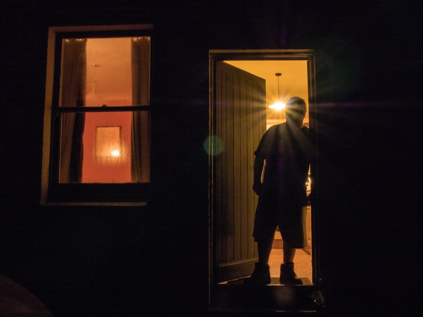
I also took some images that showed a person, and although they were interesting felt that this distracted from the overall idea of the set. The other possibility was pictures taken later in the evening, where the outside of the cottage was effectively black, and only the windows showed. This image combines both those ideas.

With people.jpg

Final Images:

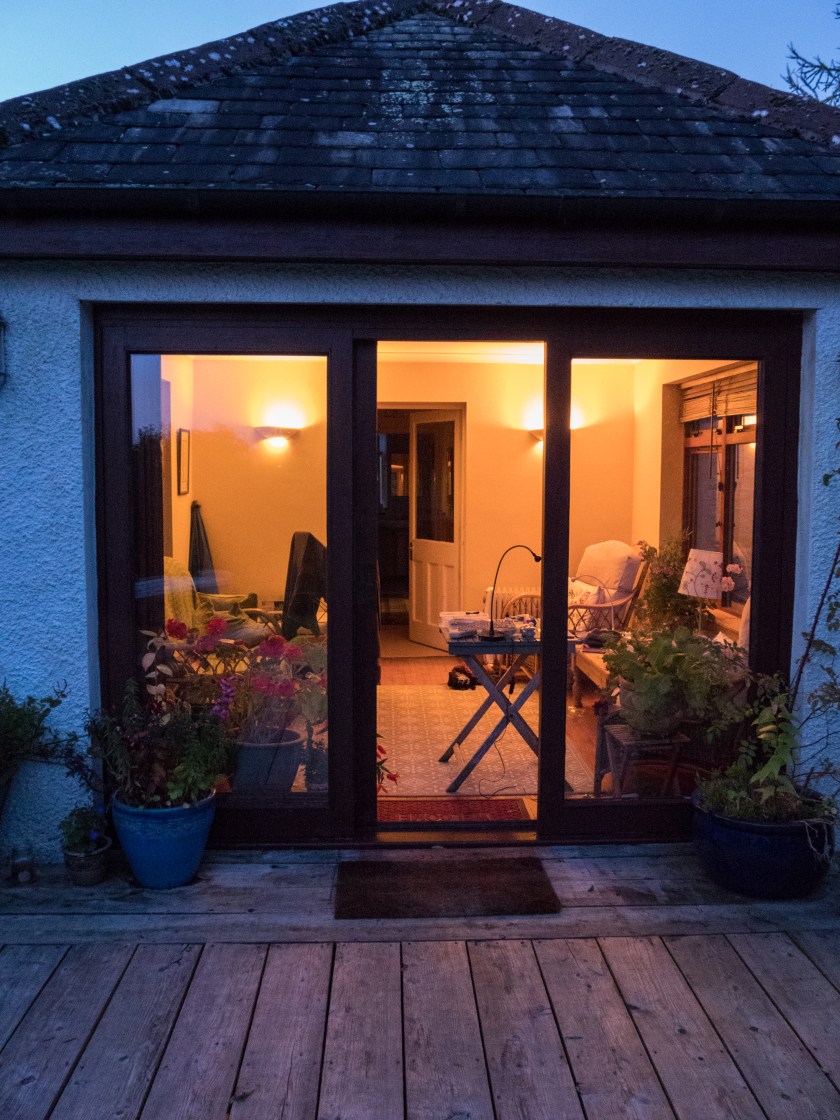
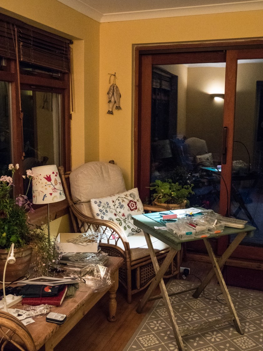
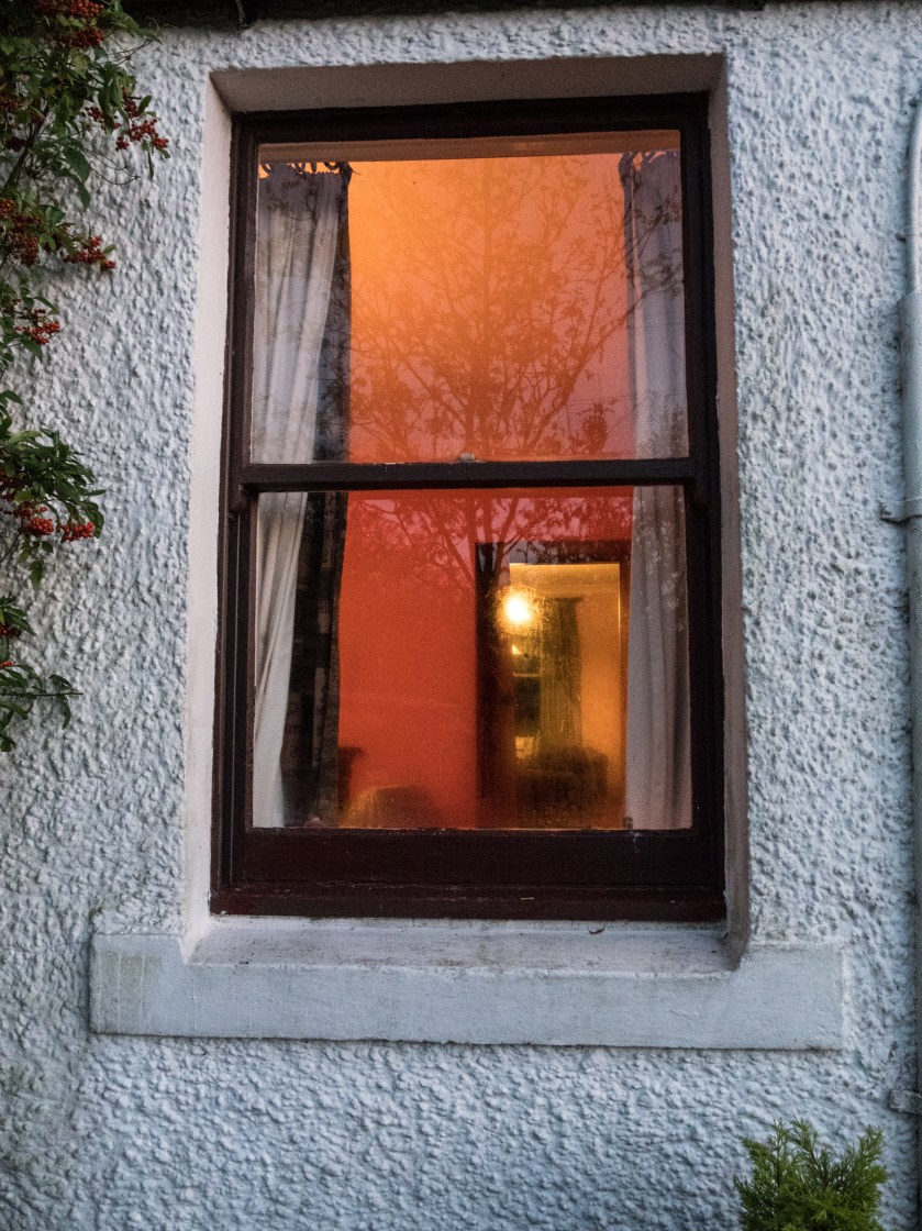
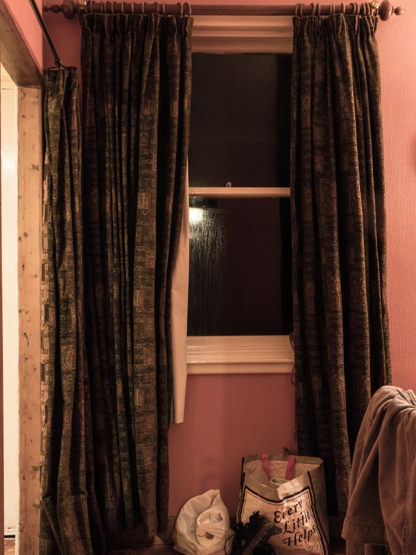
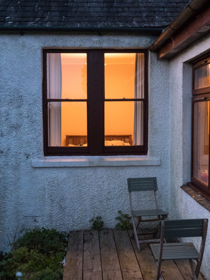
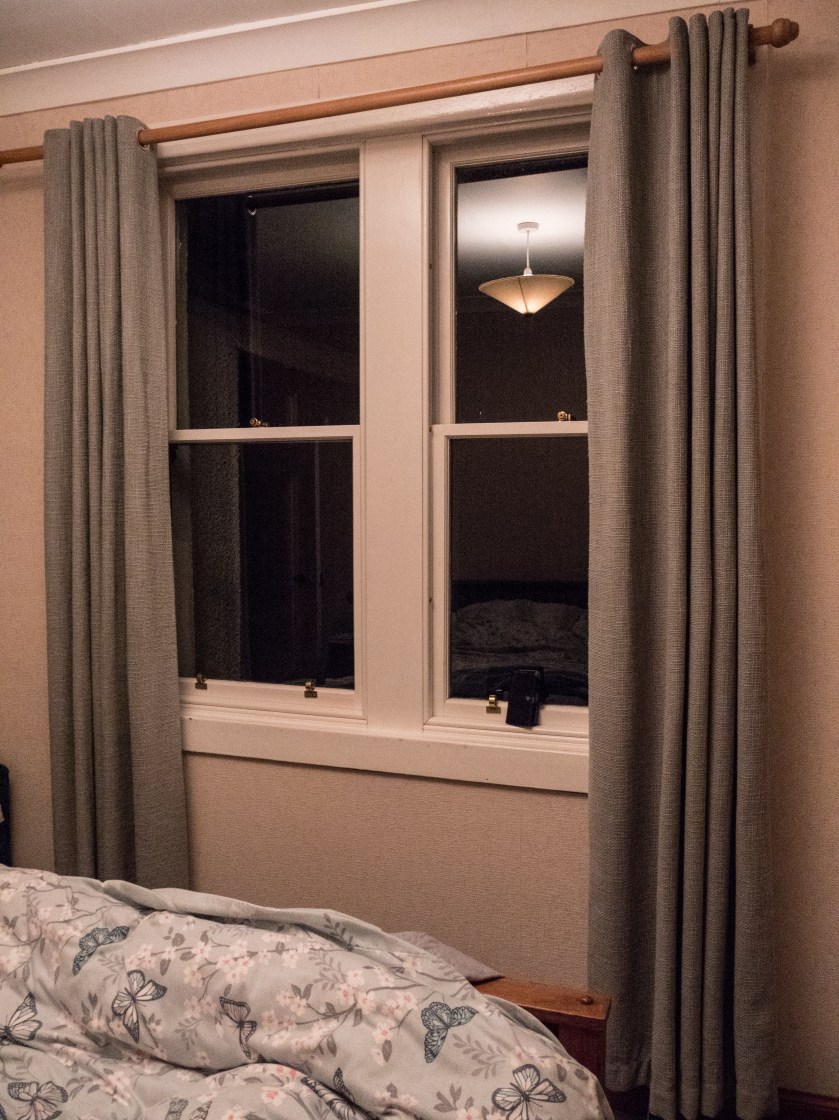
Sunroom - outsideSunroom - insideLivingroom -outsideLivingroom - insideKitchen - outsideKitchen - insideBathroom -outsideBathroom - insideBedroom - outsideBedroom - inside

Summary:

My idea here was to show the difference between what you see, and therefore can imagine, when looking from outside of a picturesque country cottage to what is actually happening inside the same rooms. Fantasy versus reality. I chose not to show any people in this set of images, leaving them quite stark and factual.  Overall, I am fairly pleased with the set. In some of the images the inside light is very bright, and might benefit from more post processing – but the significant contrasts were there, and in this case, I did not wish to ‘play’ with the truth any more than minimally.

References

Paton, A. (2017). [online] Avrilpaton.co.uk. Available at: https://avrilpaton.co.uk/portfolios/glasgow [Accessed 23 Oct. 2017].

the Guardian. (2009). Photographer Rut Blees Luxemburg explores the public spaces of cities. [online] Available at: https://www.theguardian.com/society/gallery/2009/mar/09/rut-blees-luxemburg-photography [Accessed 23 Oct. 2017].

Toddhido.com. (2017). House Hunting. [online] Available at: http://www.toddhido.com/househunting.html [Accessed 23 Oct. 2017].

Tomhunter.org. (2017). The Ghetto Series | Tom Hunter. [online] Available at: http://www.tomhunter.org/the-ghetto-series/ [Accessed 23 Oct. 2017].