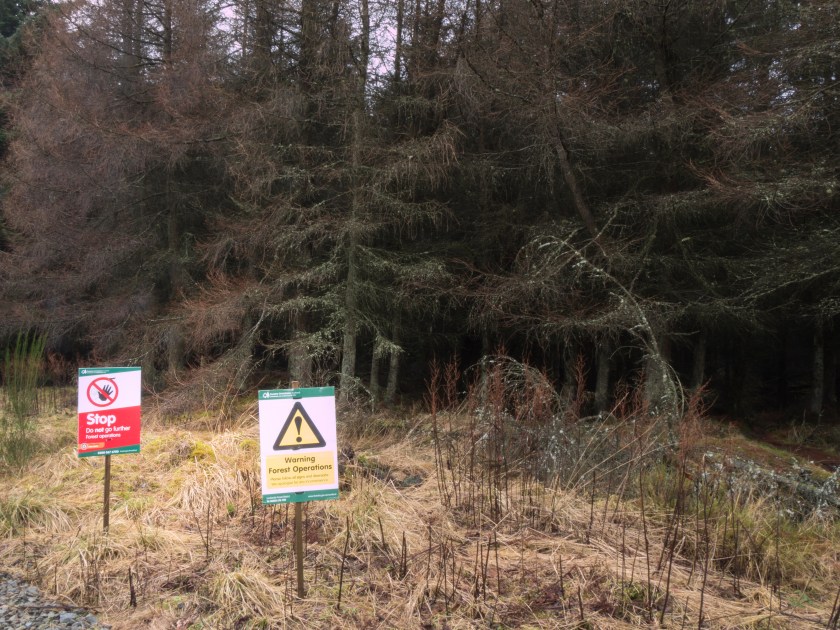
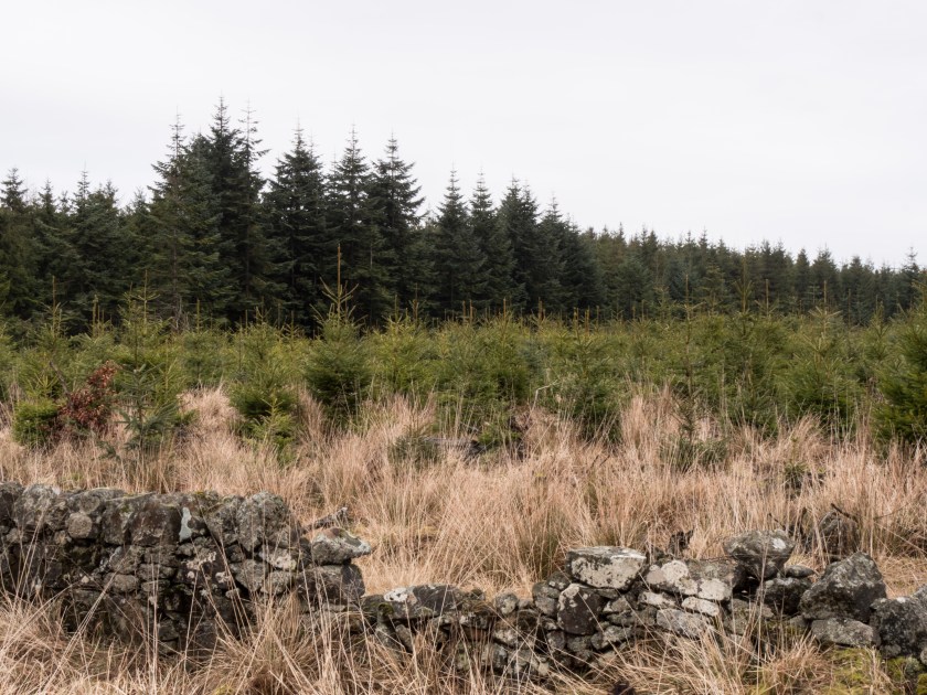
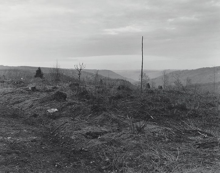
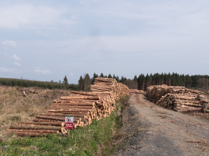
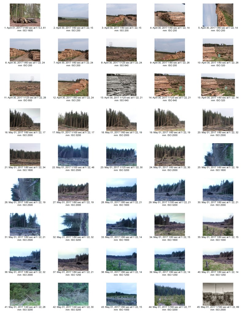
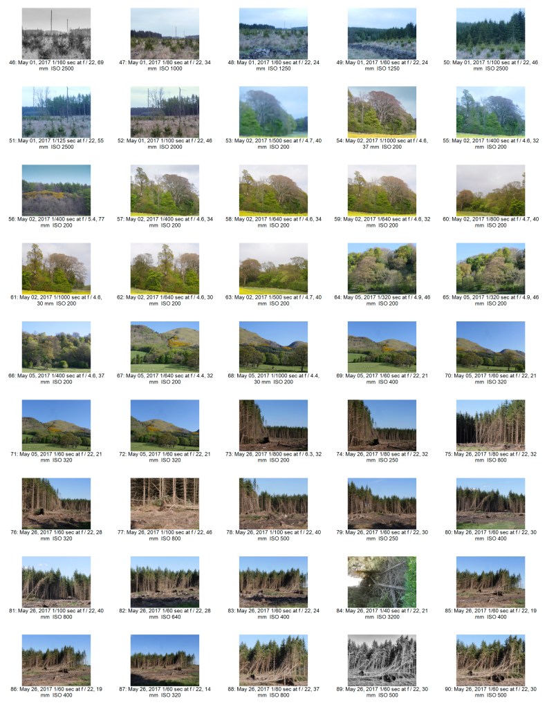
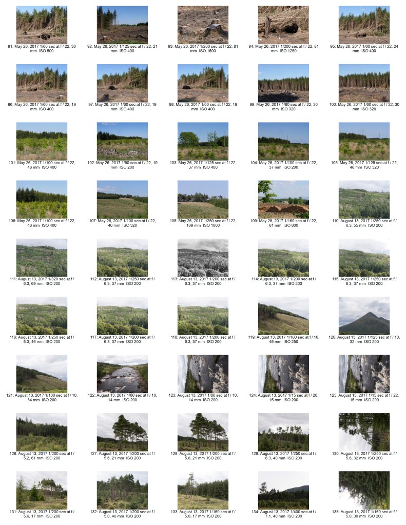
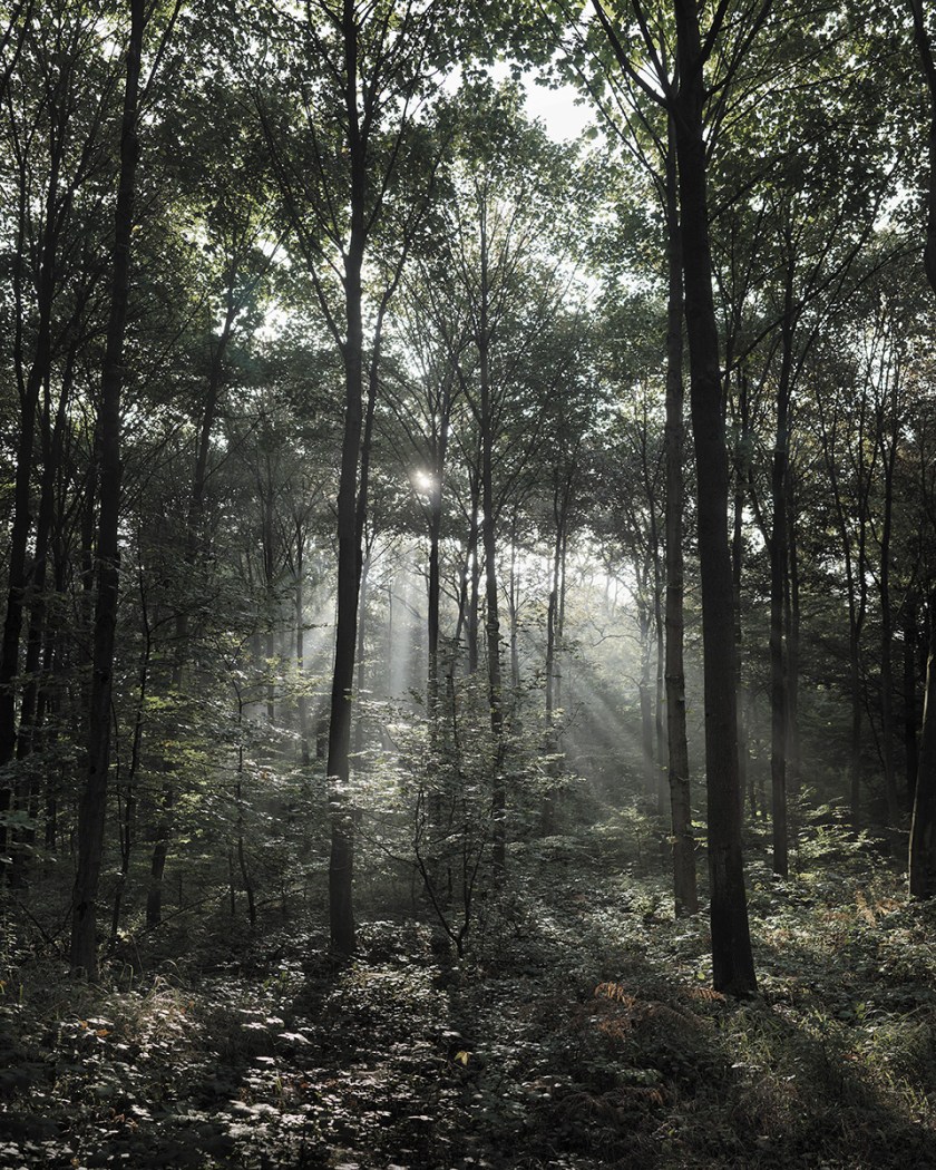
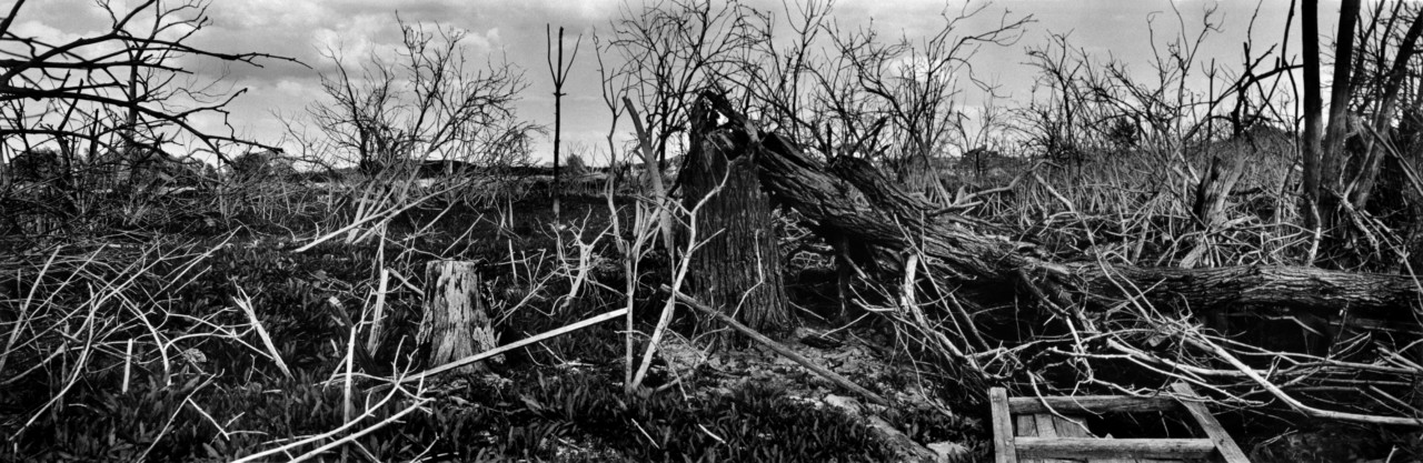
Following a long discussion with my tutor I printed off all the possible images for this assignment, stuck them up on the wall in my workspace, and ended up going out and re-shooting several of them. I also tightened up considerably on the theme, and made it into a story about a year in the logging process in our area. This fitted better with my original thoughts on what happens in Scotland as described in my original short essay, however it is ironic that even though one of the main stated purposes of the Scottish Forestry Commission is use of the land for recreation there is a strong emphasis on ‘Keep Out’.
I had a long and wide-ranging discussion with my tutor David for assignment 5. I will try to summarise what I took from it here.
My title ‘Forestry in Scotland‘ was too broad.
Agreed! Am trying to think of something more descriptive that isn’t too wordy – that is the difficult bit.
Lighting is inconsistent
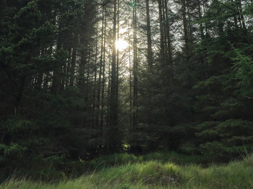
This is about having most of the shots in a fairly flat light, if not downright stormy while 2 images were taken in bright sunlight with vivid blue skies. I hadn’t even thought about this as a problem – but on looking at the series as a whole they do rather stand out and produce a jarring note. I do have some replacements already available – I hadn’t even considered using them as my brain went ‘sunlight- that’s better’ without thinking it though.
Looking at the final edit in detail
This was very helpful, and I have done as suggested – my wall is now covered with prints. I am definitely going to go and re-shoot a couple of the ones that I had originally discarded but fit better into the theme. There should not be a problem getting cloudy days in Scotland in winter.
How do you show changes in time and season?
This I’d something to think about further for an extended project – maybe mark a spot and re-shoot at monthly dates – showing the changes in the trees, which might be fairly subtle.
Overall the discussion was very helpful – and hopefully I will get an improved final edit. At the very least it gave me a lot to consider and made me think more clearly about what I was aiming for.
Suggested Reading:
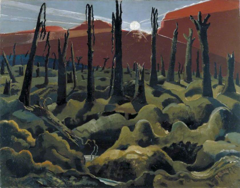
Paul Nash – an artist I had not come across before – related to the work produced by Arnatt. Destruction, here in the context of a response to WWI. Dead trees and land. Interestingly, the present push for re-forestation in Scotland was a direct response to the lack of wood available for military uses in WWI. So his horror in some way translates into the trees of today, and to their use as a resource for the community.
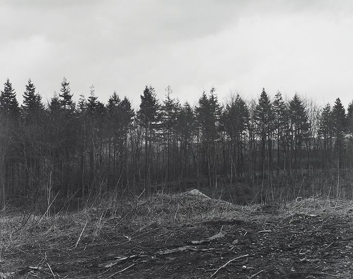
Images from Keith Arnatt – 2 of which are incredibly similar to some of the images I took for this assignment. If I had not taken them prior to seeing these I would have thought ~I would have been deliberately copying them. In reality it points up how the direct impact of forestry on the landscape leaves the same type of temporary destruction today as it did 30 years ago.
He also suggested a link to a fascinating and very long (2 and a half hours) audio interview with Keith Arnatt – this doesn’t finish – but cuts off mid sentence – so no concluding words of wisdom.
What narrative do other people impute to your work?
Could the subject matter of art be about the difficulties of being an artist?
Is the editing process actually the creative act?
Who are you taking the pictures for (and where are you displaying them)?
What is the role of preconception?
The photograph as an instant versus the painting/sculpture over time?
Does it matter what you photograph as long as you pay attention to it?
In reality all these questions are the ones that this degree is exporing, at one point or another. There are clearly no absolute right or wrong answers to any of them. It is something to consider .
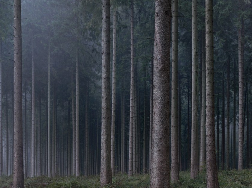
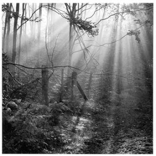
Michael Lange – another photographer I had not seen before. Some stunning images of deep in a forest, dark, minimal changes of tonality and colour. Lange started work as a photojournalist and has moved to fine art work. The images are redolent of the pine forest, not partially cut down, but what appears to be old wood. Again, these are the images I wished I could have taken to show the forest as it might be – although we have less major forests in Scotland than there are in Germany. His title – Landscapes of Memory – is relevant to the type of work I would like to move on to if I can extend this project.
Jem Southam – is a photographer who is exploring how memory and knowledge changes how we respond to the places we see. He looks at the same place over different times, different seasons and over several years – showing how a place will echo the season. There are more changes where he is taking images in the South West of England’s than there are in the pine woods in Scotland – but links into the idea of extending the project – possibly for the landscape module.
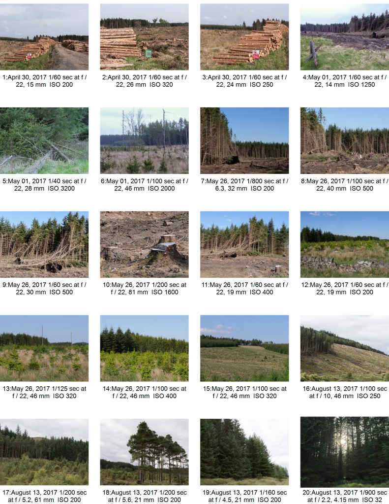
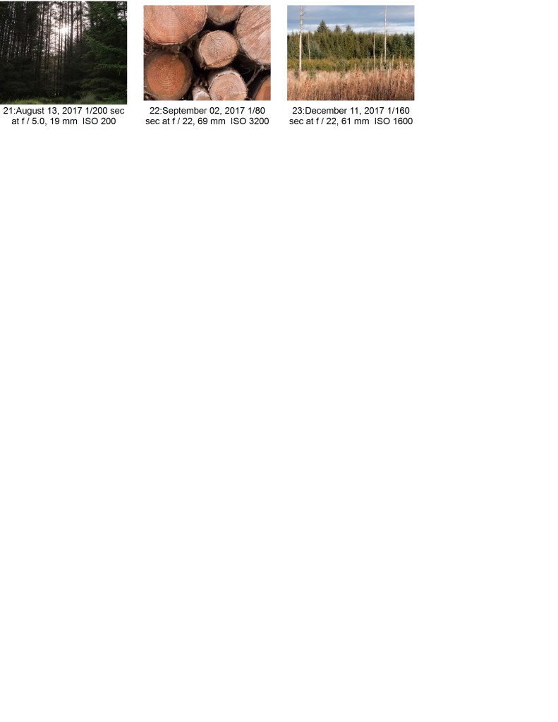
I feel that this was reasonable for my stage. The selected images are in focus, and correctly colour balanced. They show a range of details from close up to distant focus. I have tried to keep the design and composition straightforward and simple enough to show the point without overcomplication.
Quality of Outcome:
I think that I have communicated my idea about the forestry work in Scotland. It was difficult to keep it simple and within the confines of 10 images and a very short introductory paragraph. This would have been easier as a longer piece of work – and could have then included images of other woodlands.
Demonstration of Creativity:
I am not sure that there is a great deal of creativity in this! The idea is simple, taken from my surroundings.
Context:
I spent a reasonable amount of time reading around various other photographers work on woods, forests and the impact of man on the natural environment. Reading the websites on the National heritage of Scotland and the Forestry Commission Scotland , although not directly linked the photography, was especially useful as it made me aware of the historical implications of what I was seeing.
‘There were so many things a tree could do: add color, provide shade, drop fruit or become a children’s playground, a whole sky universe to climb and hang from; an architecture of food and pleasure, that was a tree’ (Bradbury, 1950).
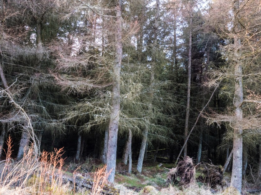
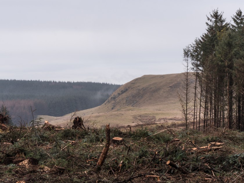
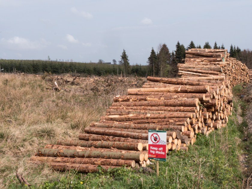
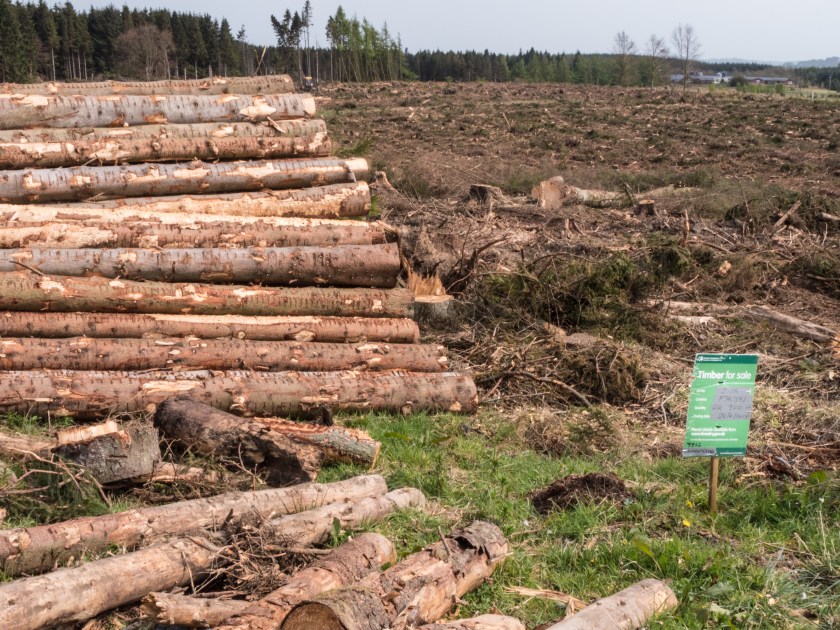
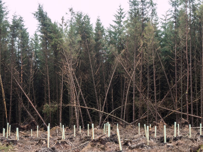
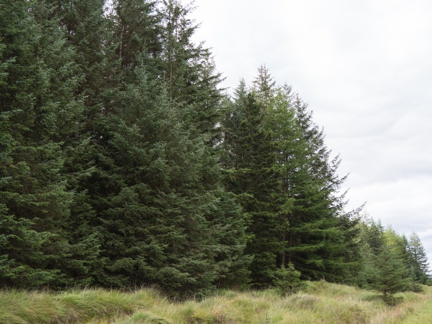
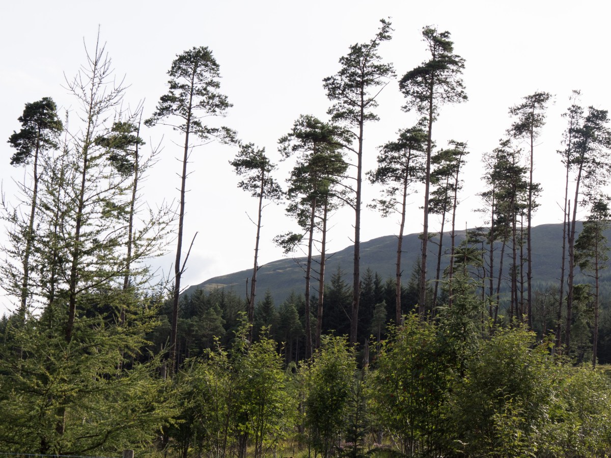
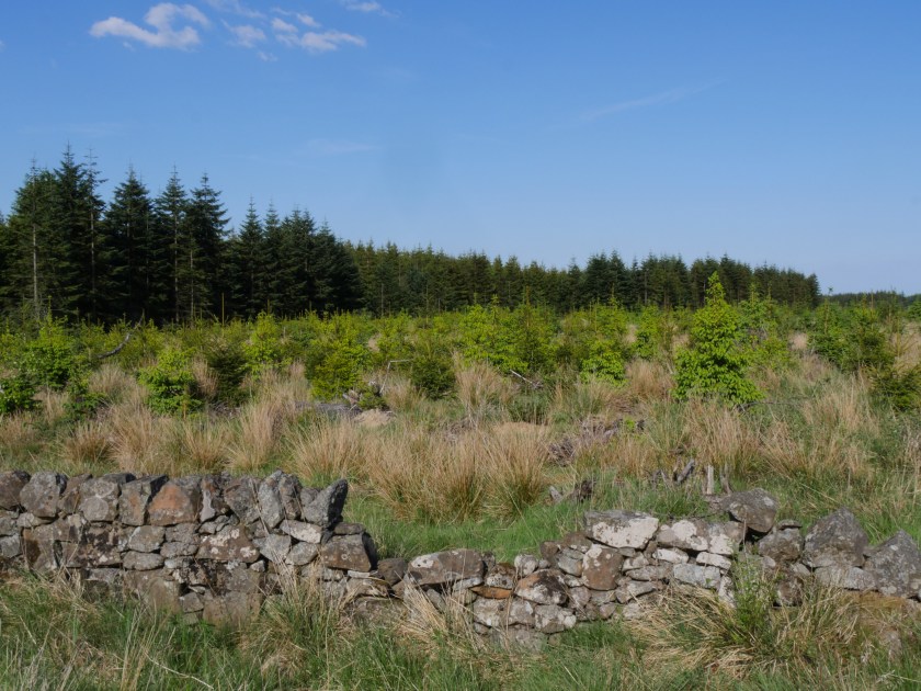
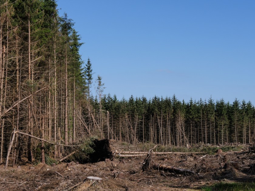
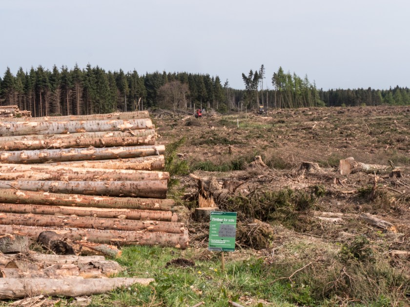
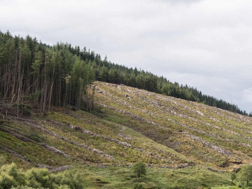
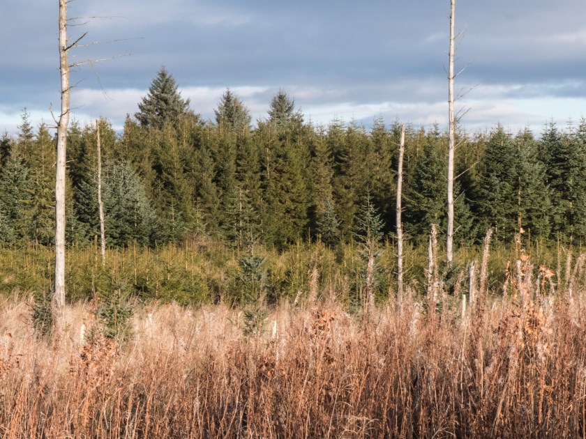
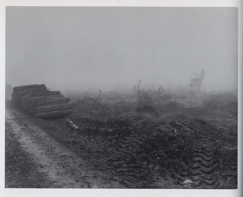
When most people think of Scotland they think of heavily wooded areas, either replete with ancient forests or full of forestry commission pines. In reality it is neither. At present only about 17% of the land area of Scotland is covered by trees, which, while lower than most other European countries, is a significant improvement from the 5% it was in 1919 when the Forestry Commission was started to increase the amount of timber available in Britain following shortages in World War 1. This initially led to the planting and harvesting of vast areas of soft wood, often non-native species, leaving desolate tracks, but since the 1980’s there has been a change towards planting of mixed species and use of the woodlands for a wide range of activities including timber production, biodiversity, carbon capture and social uses. (Nature.scot, 2017).
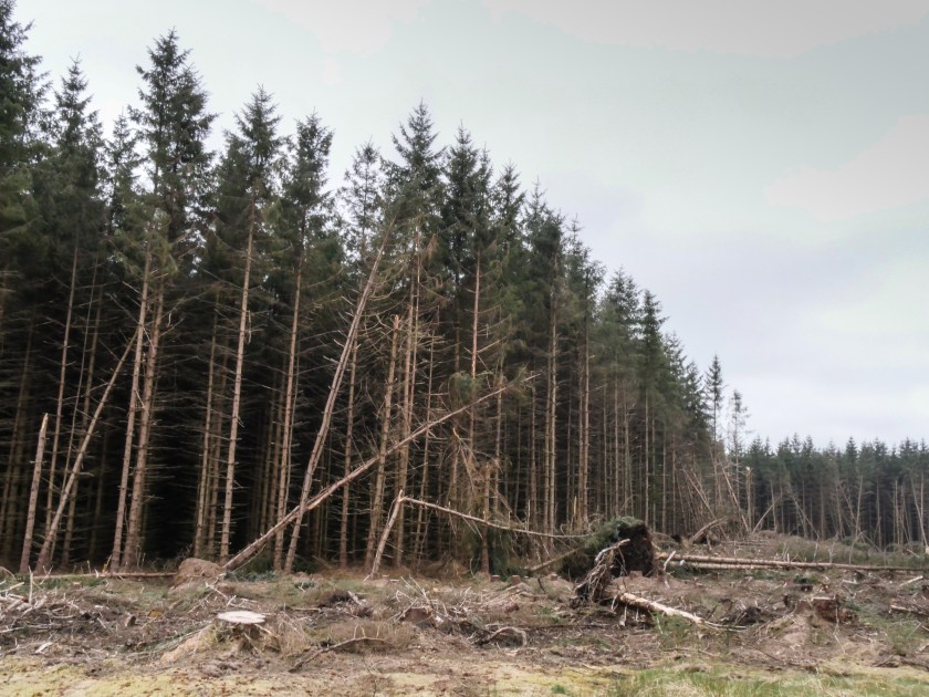
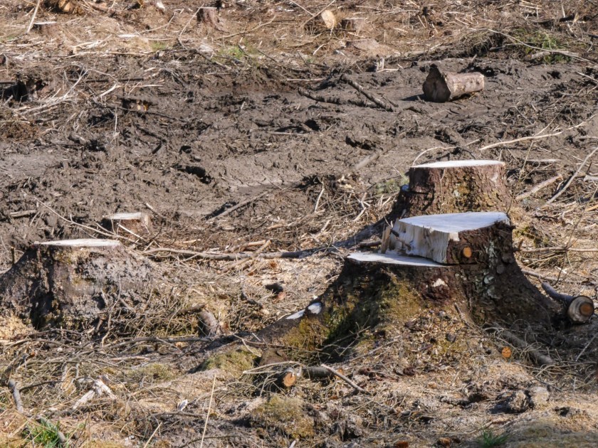
In Scotland most of the forested land remains under private ownership, but some is also owned by the government and managed by the Forestry Commission Scotland. (Scotland.forestry.gov.uk, 2017) There are complex planning agreements in place to make efficient use of the land that is suitable for forestry, as much of Scotland is too high and with too poor soil for tree plantations. There are still areas of land stripped of trees awaiting soil regeneration, and replanting and these look desolate and unwanted. Other areas are full of new growth and light.
This is the land I live in and travel though on a daily basis. It changes over the years but also remains eerily the same.
References
Bradbury, R. (1950). The Martian chronicles. New York: Doubleday.
I started with the premise from Robert Adams essay ‘Truth in Landscape’. ‘Our discouragement in the presence of beauty results, surely, from the way we have damaged the country, from what appears to be our inability now to stop, and from the fact that few of us can any longer hope to own a piece of undisturbed land’(Adams,1996).
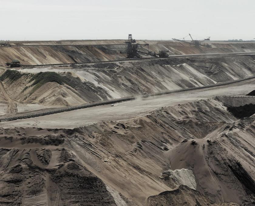
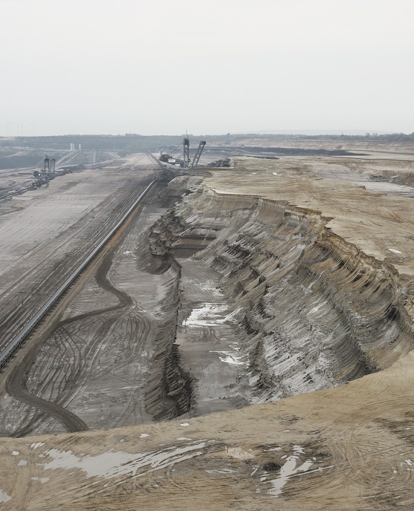
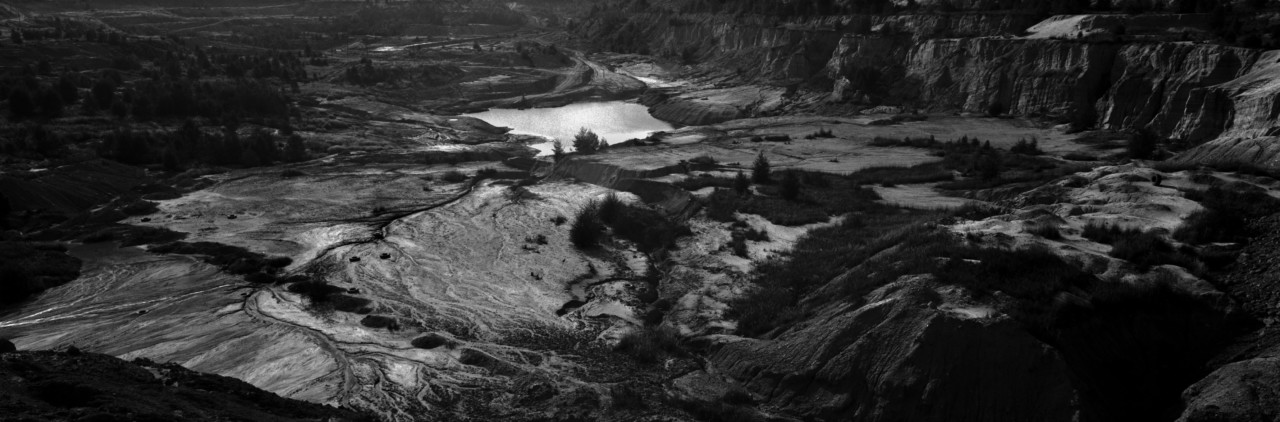
When you think about images of forests they are broadly divided into two camps, with photographers who have celebrated the beauty, solitude and wonder of woodlands and those who have shown the devastation that mankind has performed. Some photographers have taken both types of images.
Marc Wendelski:
An example of this school of photography that concentrates on the damage we have done is the work of Wendelski who has taken a series of images in Germany based on the destruction of ancient forest during the process of open cast mining for brown coal and the activist that set up camps in the forest to protest this.
A similar piece of work has been carried out by the Magnum photographer Koudelka. He has done a vast photographic report on the coal mining industry in the Black Triangle in Czechoslovakia. I was lucky enough to see this when it was on show in Edinburgh. The images are graphic, black and white, very sombre. In the Edinburgh exhibition relatively small individual images, approximately 1m x 30cms were laid out in a line, so you followed the trail of disaster around the room. The destruction here has been going on for much longer than the damage in Wendelski’s pictures in Germany but is startlingly similar.
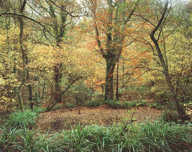
Godwin is particularly interesting in that her viewpoint and type of images she took changed over time. Her earlier work as shown in the ‘Secret Forest of Dean’ (Godwin, 1986) exemplified the beauty of a natural environment and how people could live in harmony with it, while in later work such as ‘Our Forbidden Land’ (Godwin, 1990) talks about how landowners limit access for their own use, and specifically, in reference to Scotland, talks about the environmental challenges caused by the widespread forestry work in the 70’s and 80’s, again many of her earlier pictures are simply beautiful.
Fay Godwin – Forest of Dean, 1985, (copyright now British Library)
Keith Arnatt:
Arnatt was also involved in the work about Dean Forest that was commissioned by Forestry Commission at the same time as that of Godwin. His work is difficult to track down, but the images I have seen ( in ‘I’m a Real Photographer‘)seem to fall more into the camp of the land is for use by industry, in contrast to Godwin’s more bucolic images (Arnatt, Hurn and Grafik, 2007).
and so we reach right around the circle to the original quote
Robert Adams:
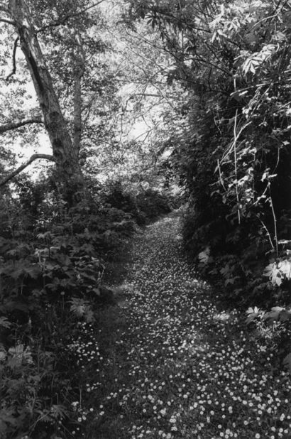
Adams is the quintessential American photographer showing the beauty and wonder of the forest. A good example of his work is shown in the book ‘An Old Forest Road’ (Adams, 2017) which concentrates on barely visible paths in woodland, lit by seemingly random gleams of light. These pictures make you want to wander endlessly, exploring for no purpose other than to see the trees.
Interestingly, with the exception of Wendelski, all these images are in black and white. Some of this is because this was the accepted use when there were taken (Godwin and Arnatt) but some, like those of Adams are very recent. Is this because of the general idea that ‘art’ images should be in monochrome, because the more recent photographers are paying homage to the older ones, or simply because the colour green does not always print well? Certainly, monochrome does give some stunning images and shows the detail well. It also becomes difficult to tell simply by looking at an image of a forest when it was taken, this century or earlier. Monochrome tells the mythos of a forest well.
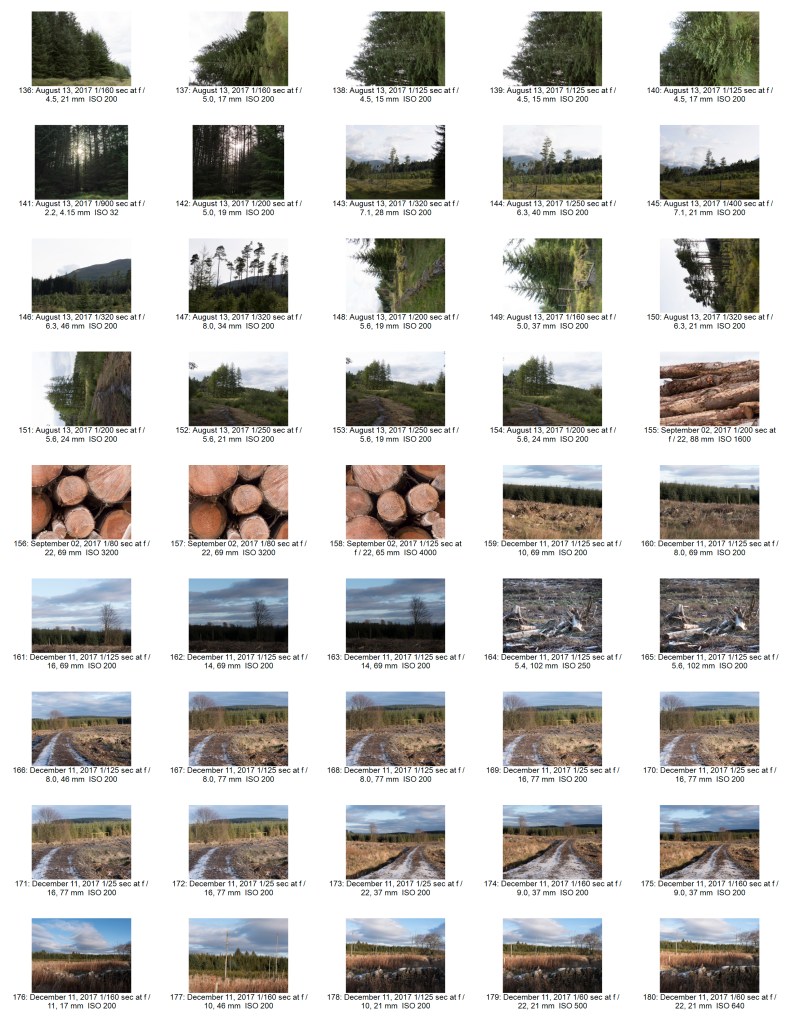
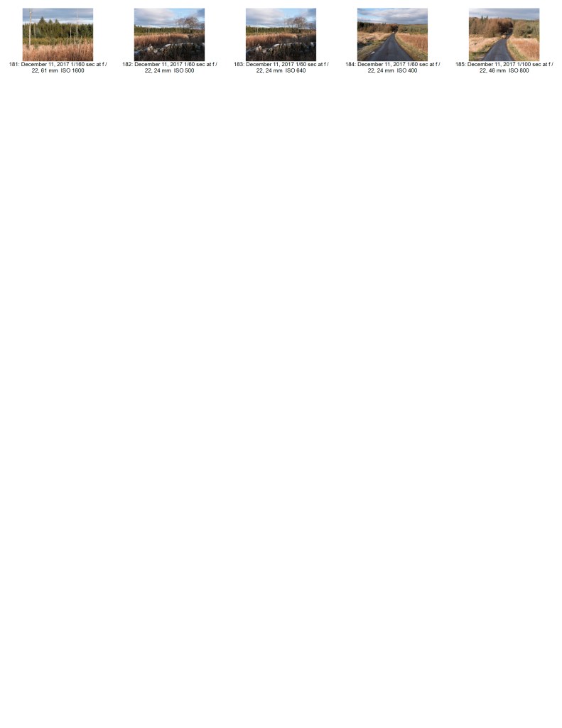
Practice
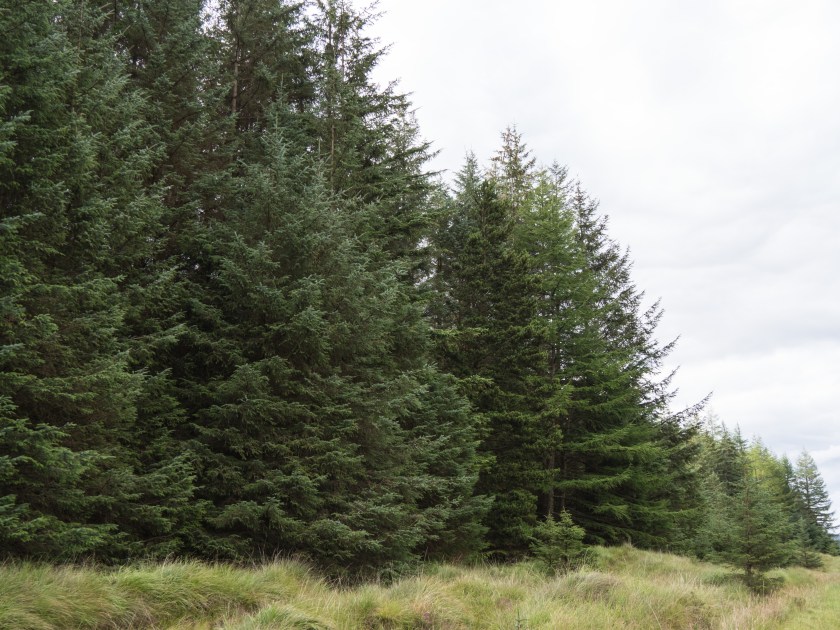
I started by taking images of forestry works when travelling around Scotland. Most have been taken close to me in Fife, but some were taken as far north as Fort William. In spite of this it is difficult to identify the place from the images and they become a generic series of Scottish forest images. The majority of the images were taken in the summer and early autumn, some taken in winter, again this is difficult to tell from the images, as although the light is different the dark green of the pine trees does not vary much across the year. This would not have been the case if I had been concentrating on deciduous trees.
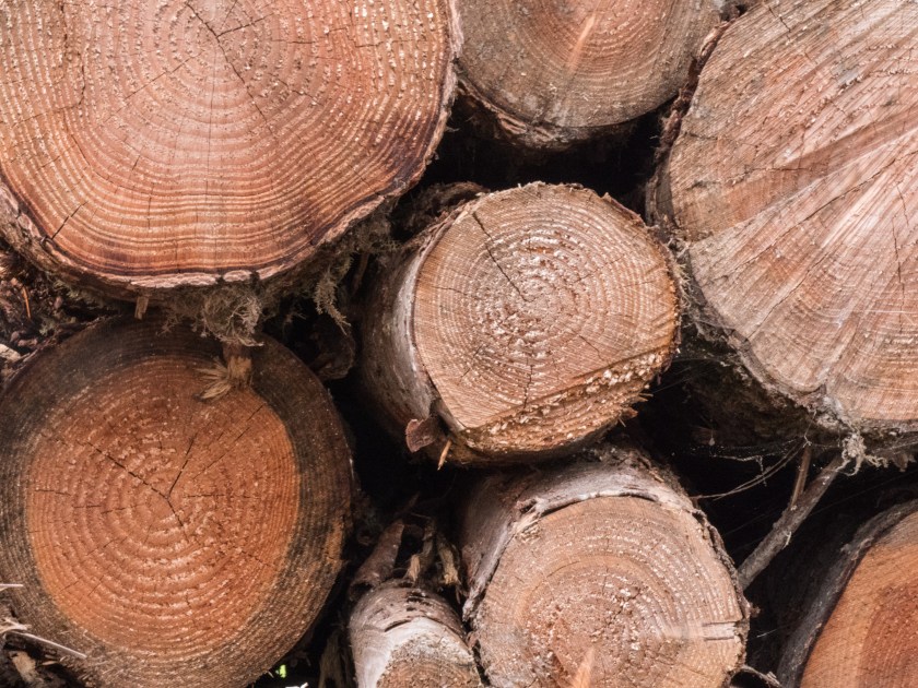
I spent a considerable time deciding on whether to go with monochrome images, as was prevalent on the examples above, and discussed this at length with both my tutor, and the Scottish OCA group at our December meeting. Eventually I decided to use colour images, as some of them, such as the cut logs, stood out in colour and gave more information, and, even though the work was influenced by Godwin and Adams, I felt that colour was best for telling my own story.
References
Adams, R. (1996). Beauty in Photography. New York, NY: Aperture, p.14.
Adams, R. (2017). An Old Forest Road. Koln: Verlag der Buchhandlung Walter Konig.
Arnatt, K., Hurn, D. and Grafik, C. (2007). I’m a real photographer. London: Chris Boot, pp.38 – 41.
Godwin, F. (1986). The Secret Forest of Dean. [Bristol]: Redcliffe [for] Arnolfini [and the] Forestry Commission.
Wendelski, M. (2017). BEYOND THE FOREST | MARC WENDELSKI. [online] Wendelski.be. Available at: http://wendelski.be/?page_id=11 [Accessed 19 Dec. 2017].
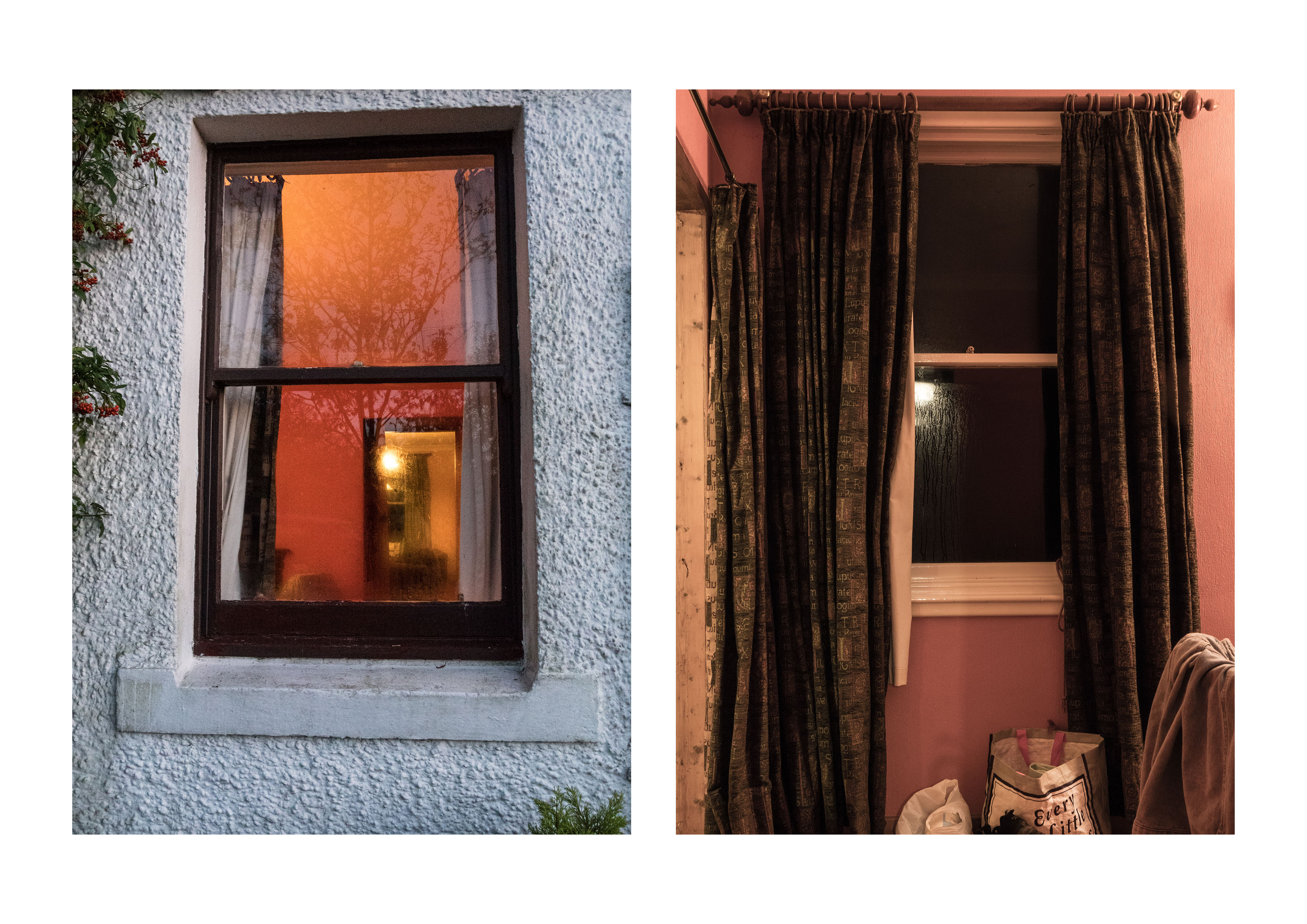
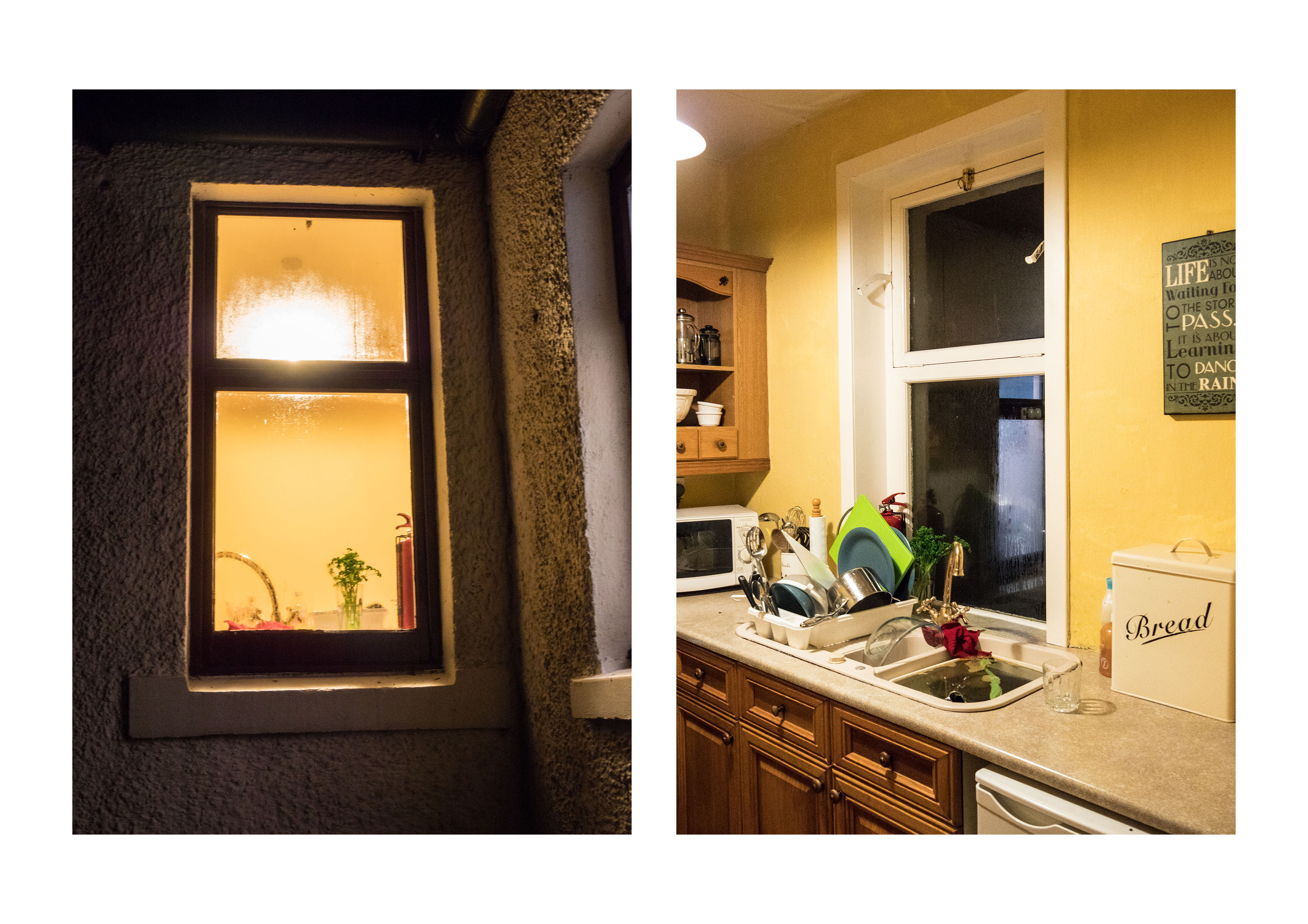
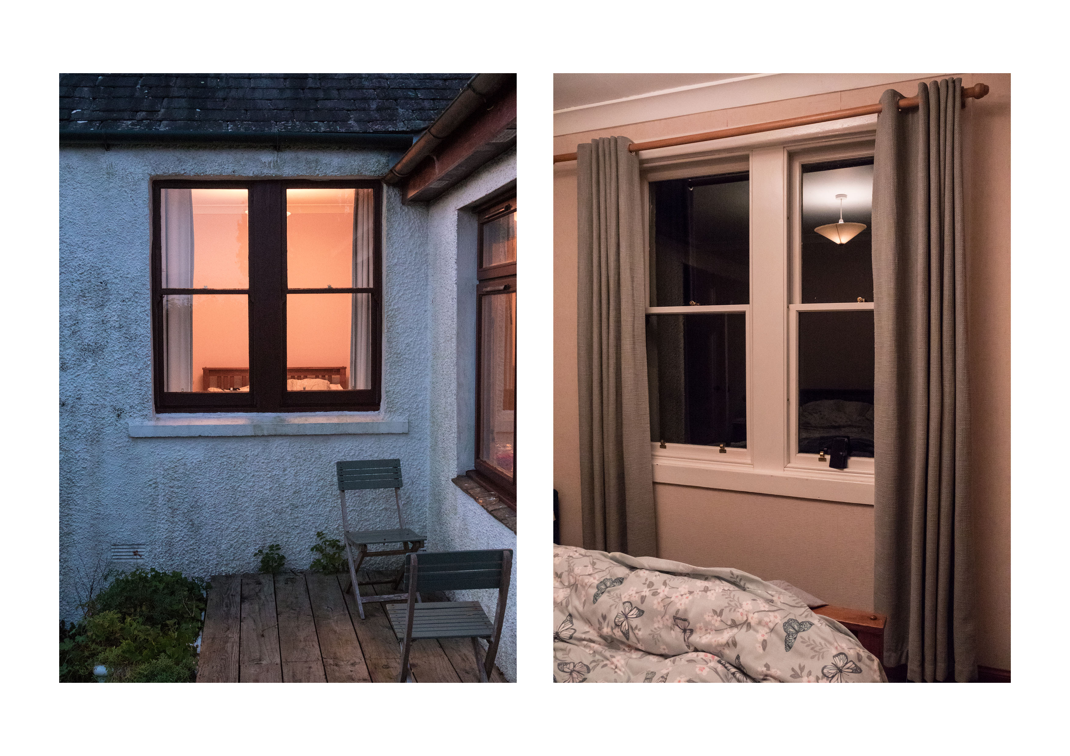
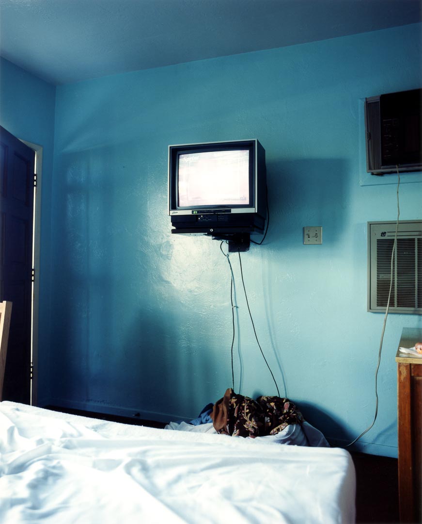
I agree that these are essentially diptychs – so have redone them in this format using photoshop to add as a pair. I have also cut down the number of images so that the pairs all work together. I also have adjusted the colour of the light slightly in one of the pairs to match (as suggested in our conversation). I think the light colour was different because the two bedroom images were taken at different times of day.
Hido’s work as voyeurism
This is something I hadn’t really considered but I agree it is a significant difference in the feeling of the work. I was aiming for the difference between the imagined possibilities of looking from outside versus the real life, with all its scruffy detail inside.
Tripod issues
Already resolved! However it was interesting that even without one , and with a modern camera that taking the images at ISO 64000 gave reasonable results.
‘with permission’
When possible, I like to ask for permission to use other people’s images even though in this context – critiquing the images it is fair usage. My main concern is that others may copy the images on inappropriately. There is an interesting story in the book by Barratt already discussed in this post:
I have been amazed by the number of people who have taken the time to answer my emails, and, on several occasions, enter into discussion about the images.
Being explicit
This assignmentwas specifically done in response to Exercise 4.3 – ‘the beauty of artificial light’
Shizuka Yomomizo is a Japanese photographer based in London who took a series of images where she asked, by means of a note, a group of strangers to allow her to photograph them standing in front of their window. She is being voyeuristic, but with the complicit knowledge of the people involved. There is a meeting of eyes, an awareness by both sides, mediated though two layers of glass, the window and the lens. They meet briefly and then part. There is a choice on both to engage or not.
The Brief: Take one of the exercises on daylight, artificial light or studio light and use it to create a set of between 6 – 10 images with a linking theme.
For this assignment I chose to use artificial light as this is not a field I have explored before and I felt it would be a good test of development of skills. I thought about several possibilities of exploring this.
Street scenes at night:
This gave me the options of more general shots, such as the lit town hall, or more specific ones like the exterior of the local pub.
Gigs:
This definitely was a possibility, as the light is very interesting, all of the above images are as shot on the same night without a change in the white balance.
Car lights at night (road shots with extended times).
Fireworks (wrong time of year).
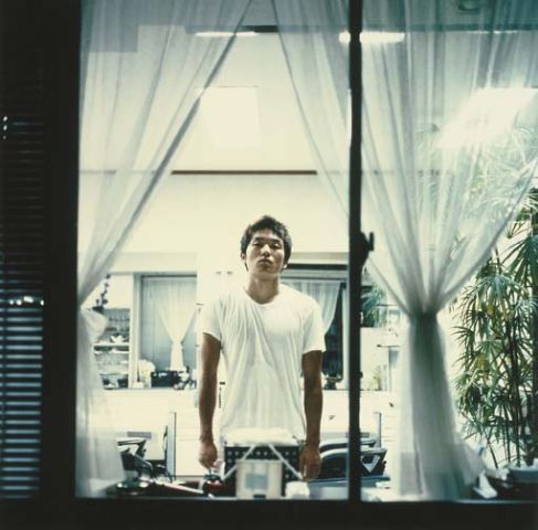
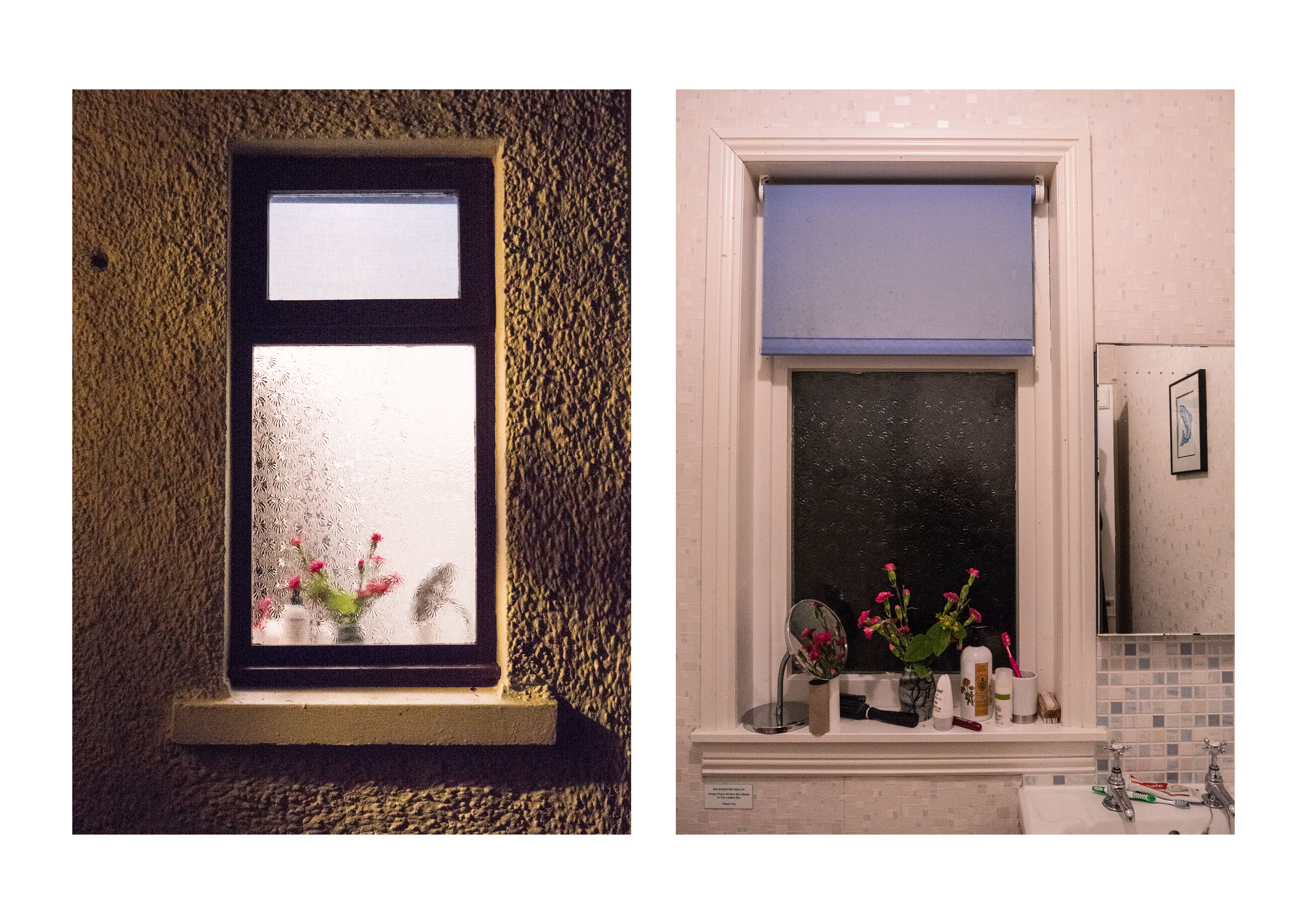
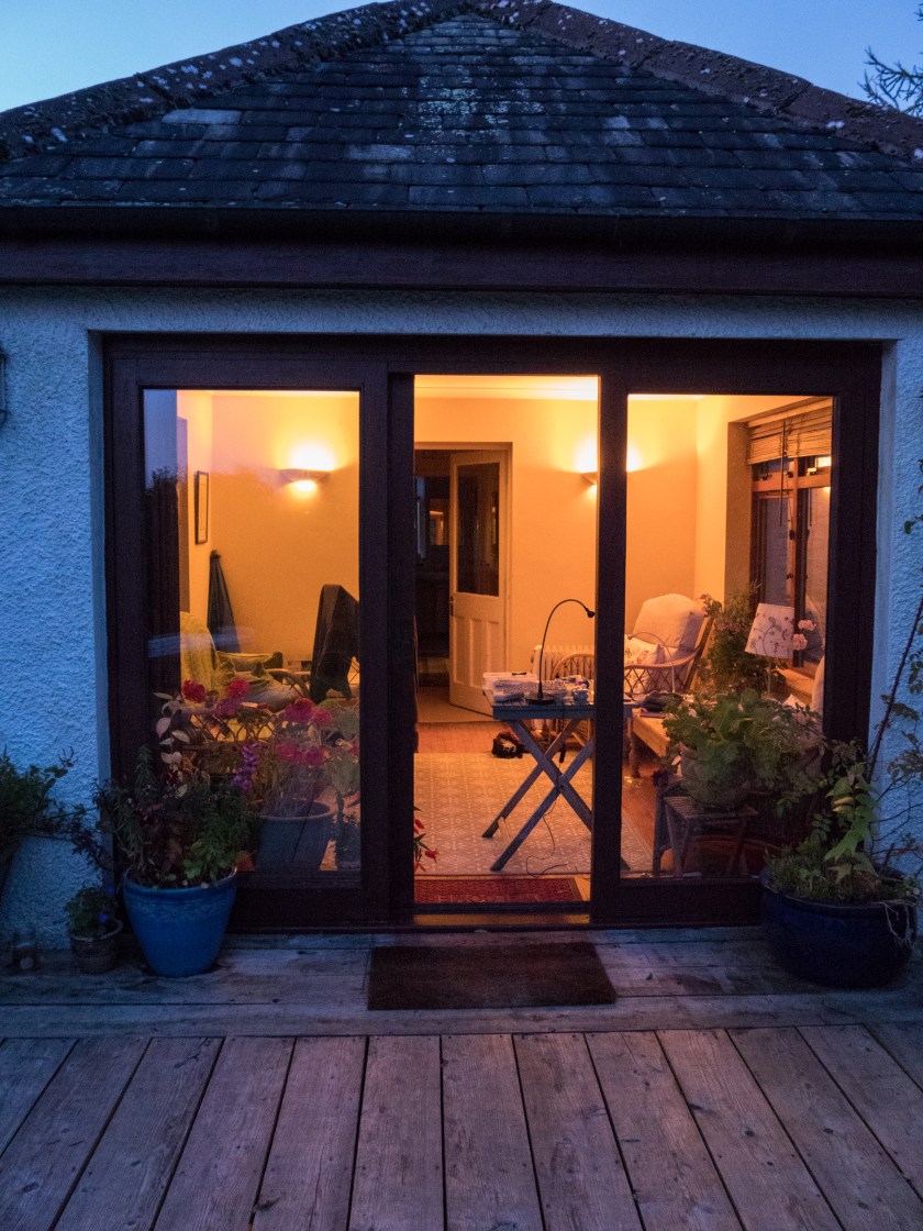
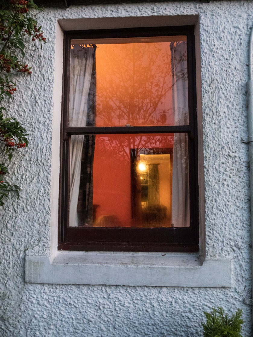
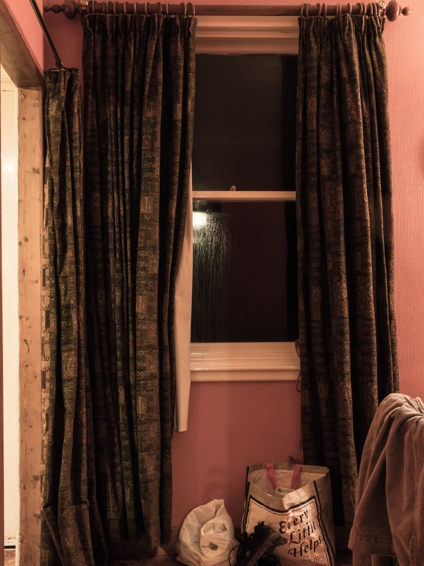
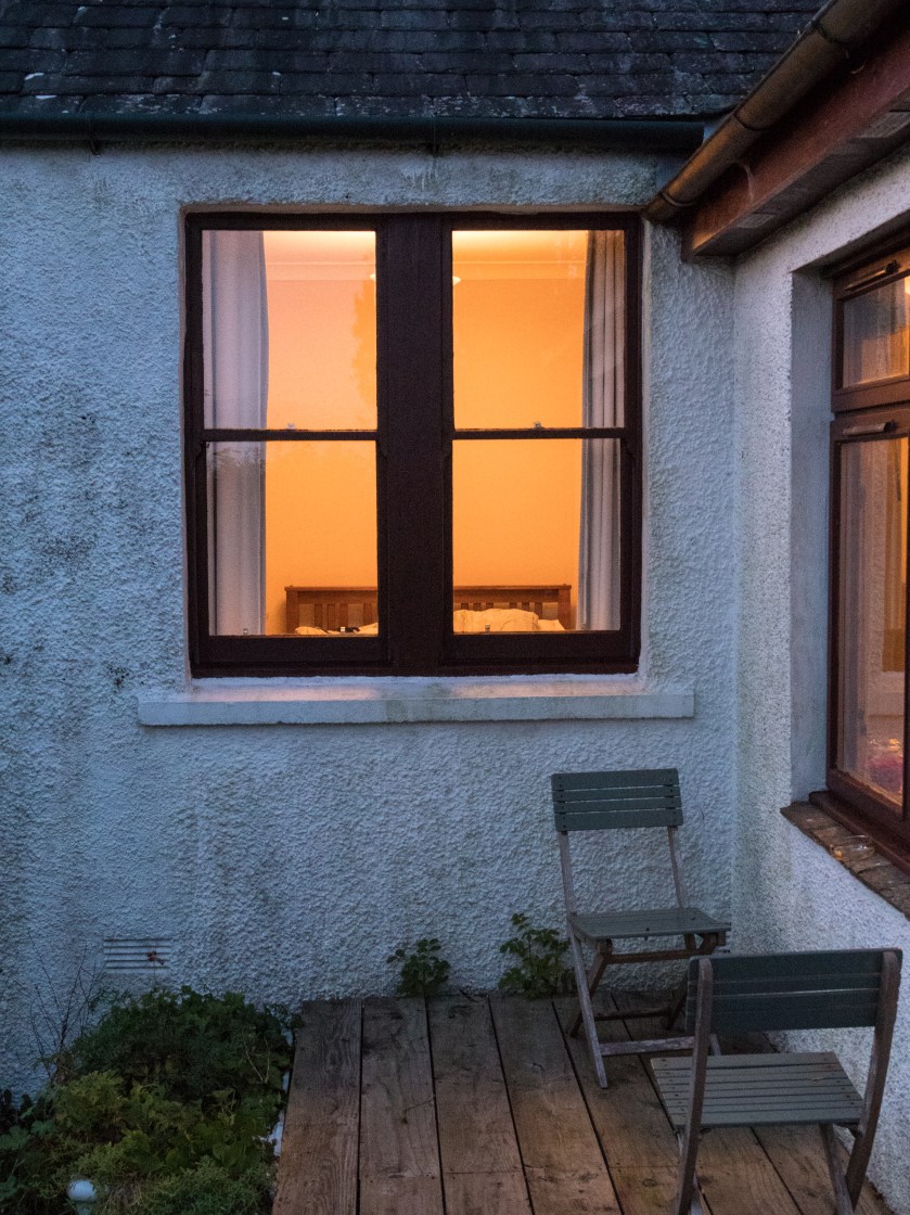
However, I was walking home one evening and this was the view though my window.
I found this an interesting view and decided to explore the concept of looking through the window.
Research:
a. When I started thinking about the concept of lit windows I remembered a painting I had seen at the Glasgow Gallery of Modern Art many years ago. Avril Paton is a Glasgow based artist who painted a series of images of Glasgow tenement flats from the outside, often with lit windows, looking in on the life inside. In these images the light is usually warm and intimate.
b. Rut Blees Luxemburg’s image of tower blocks give a similar feeling, and utilise similar colours, concentrating on golds and browns. Images can be seen in the Guardian article below. ‘Towering Inferno’ is an example of this, but although the colours are warm, the images are massive, and give an overview of the flats, not similar to the more intimate views I was looking for in my series.
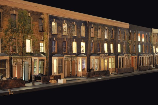
c. Todd Hunter has explored the concept of home at length in several series of works, one of which ‘The Ghetto‘, is a 3D model of the street he lived in, with colour transparencies place within the doors and window, lit from within. You have to walk along the model to look into the rooms.
There is also a series of other images taken within the rooms of people who lived (and often still do) on that street. These images and the display had been taken in response to an article in a local newspaper which described the area as ‘a blot on the landscape‘ (Tomhunter.org, 2017).
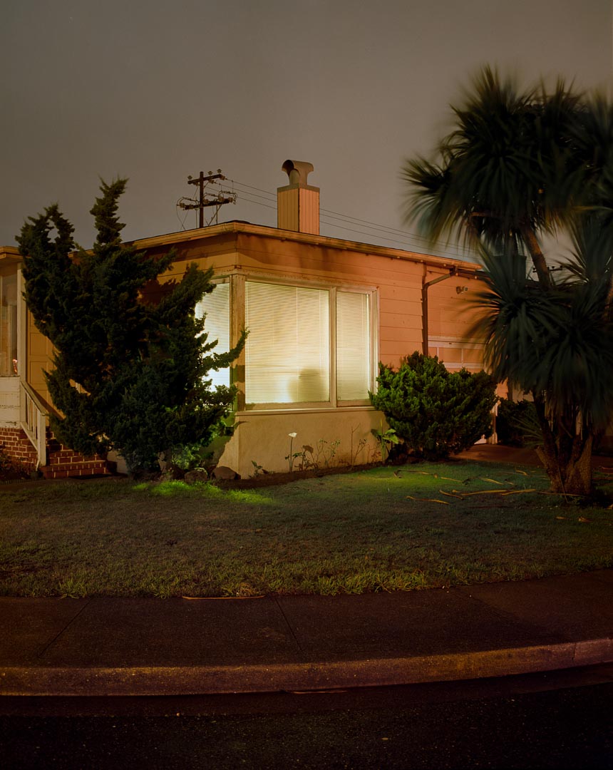
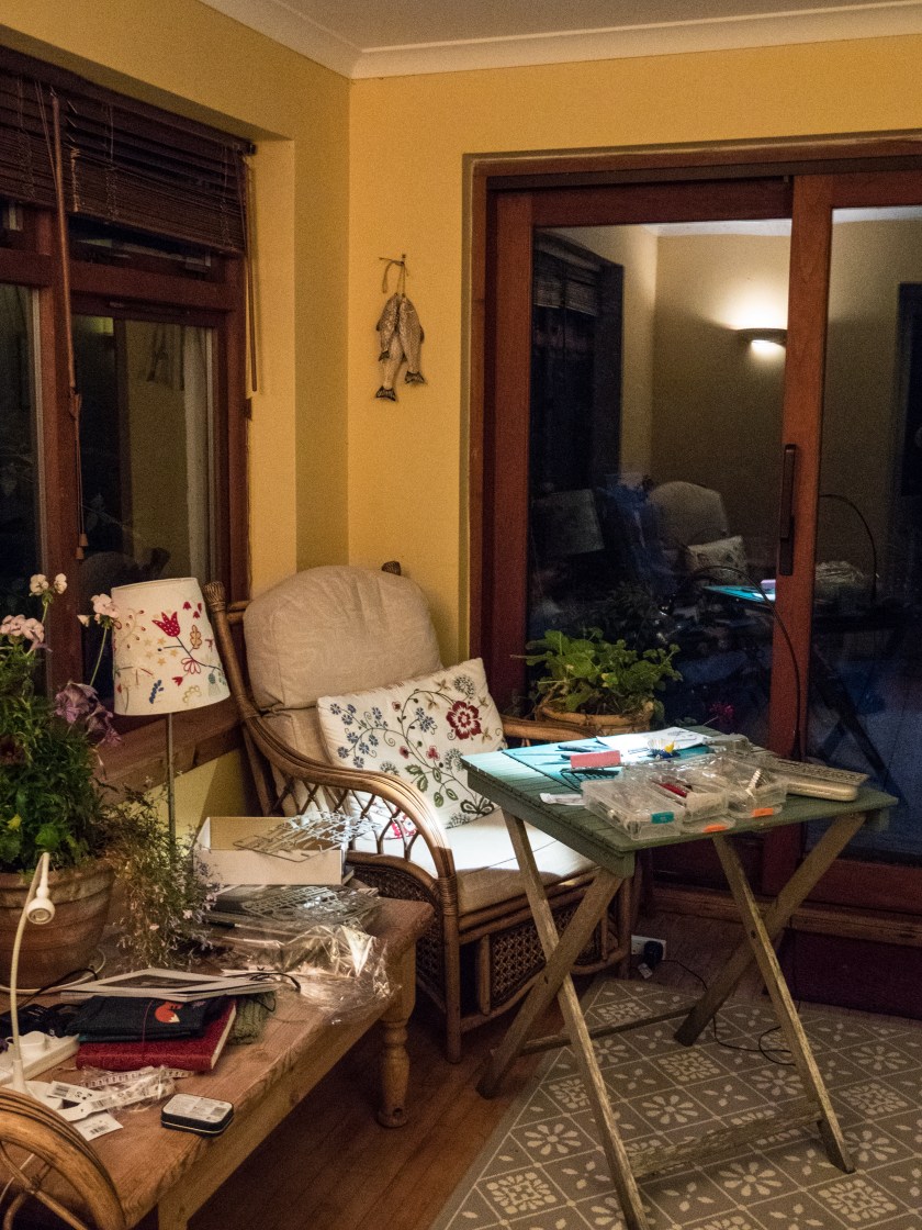
d. Todd Hido has also utilised artificial light, taking both outdoor images of houses at night and inside images. Like Tom Hunter, these are not beautiful in the traditional sense, but tell you a lot about the lives of people living in modern America, however these rely on the rooms themselves to tell the story, not the people within the rooms. I felt this was more in line with my idea.
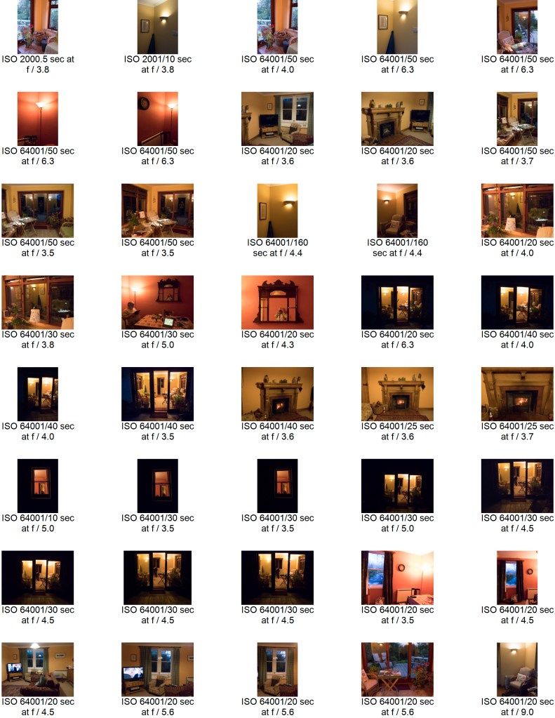
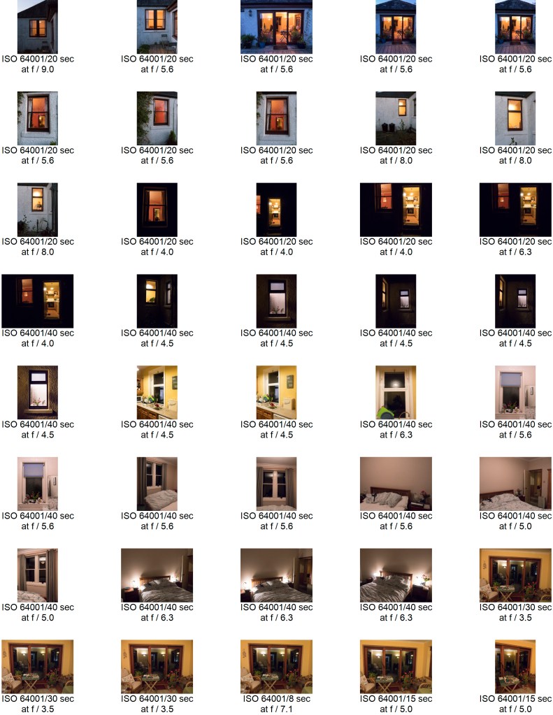
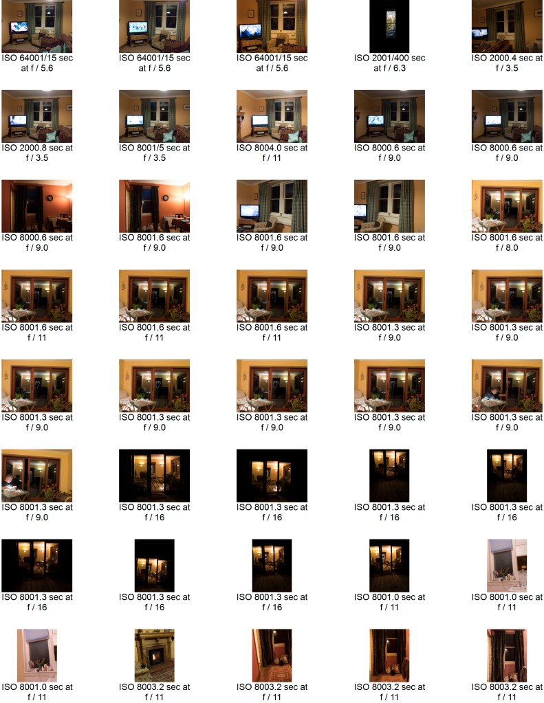
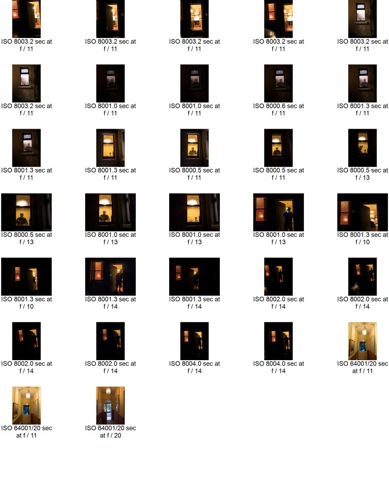
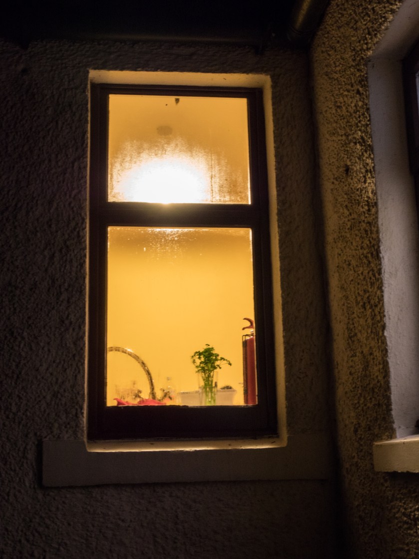
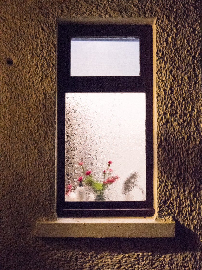
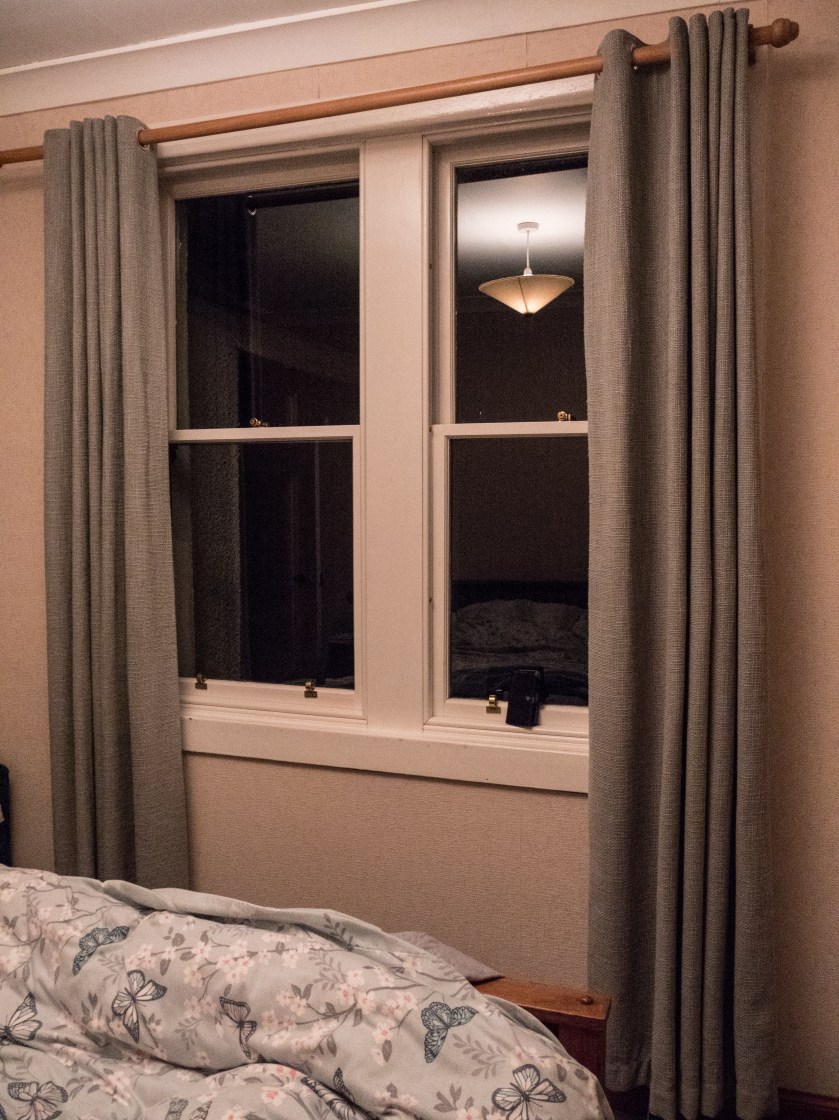
I took a long series of images at a cottage we were staying in in the country in Dumfries and Galloway. It was well away from any town, and the only light in the evening came from the lights in the cottage itself. I took some of the images handheld, with the ISO set to 6400, and the rest of the images using a tripod with the ISO at 800. I used a fully manual mode throughout. I have discovered that using manual settings slows me down and makes me think more about what I am focusing on and which bit of the image I want to have exposed in most.. It was not easy to use the tripod outside as the ground around the cottage is very uneven, and it was tricky to get a stable and straight image, so some of the ‘better’ shots were actually handheld, in spite of the high ISO. A more stable tripod would have helped here.
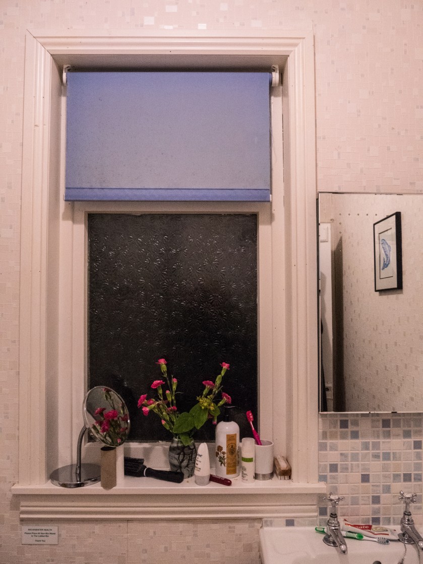
Images were taken from outside, looking at and through the windows, and inside. I did not ‘tidy up’ in advance of taking the images as I was looking to show the contrast between the outside images, where you could imagine almost anything, and the inside reality.
The images were processed in Lightroom CC, with minimal changes. I did not alter the white balance as it feels accurate for the lighting conditions and what I wanted to show.
Contact Sheets:
Initial contact sheet for all the images:
Selected images marked with exposure, aperture and ISO:
I spent some time thinking about how, and which images to choose. I was not sure whether to stay with a given orientation or whether to mix between landscape and portrait. Most of them were portrait due to the nature of the windows so I chose to go with these, – but some of the individual images were more pleasing as landscape.
I also took some images that showed a person, and although they were interesting felt that this distracted from the overall idea of the set. The other possibility was pictures taken later in the evening, where the outside of the cottage was effectively black, and only the windows showed. This image combines both those ideas.
Final Images:
Summary:
My idea here was to show the difference between what you see, and therefore can imagine, when looking from outside of a picturesque country cottage to what is actually happening inside the same rooms. Fantasy versus reality. I chose not to show any people in this set of images, leaving them quite stark and factual. Overall, I am fairly pleased with the set. In some of the images the inside light is very bright, and might benefit from more post processing – but the significant contrasts were there, and in this case, I did not wish to ‘play’ with the truth any more than minimally.
Tutor comments are in blue (main points only copied here), my responses in black
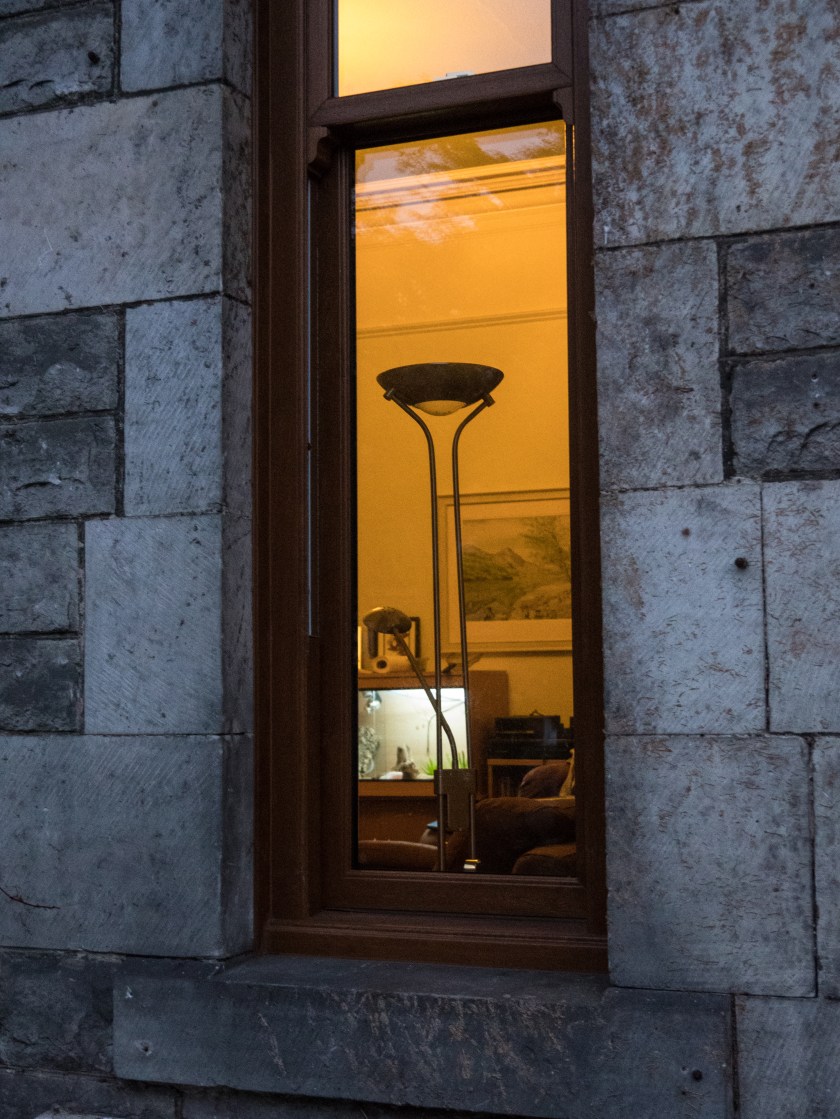
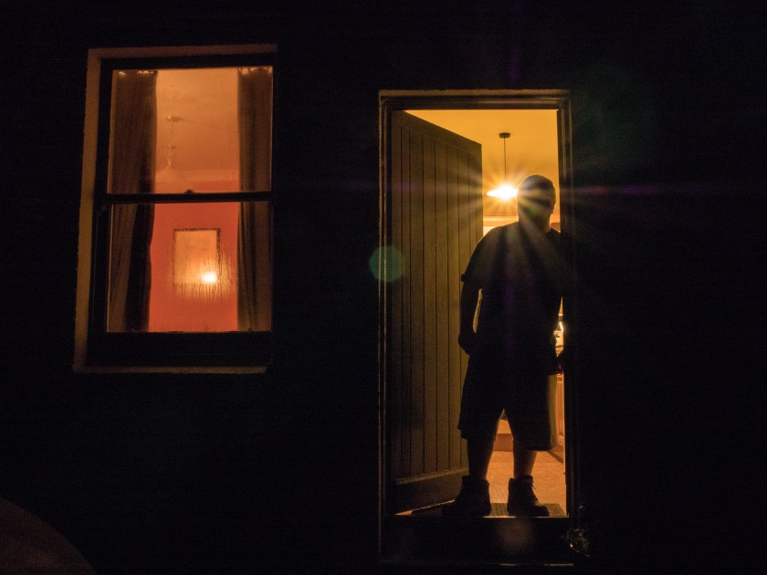
Looking at your final series, I felt they all worked well together except for the final picture. I understand why you included it but the scale is quite different from the other pictures. The other pictures are about the photographer as subject, whereas this final picture is about how the camera frames the view, producing a rectilinear ‘slice’ of a ‘scene’ from the vantage point of the photographer.
On thinking about this further I agree that the final image is ‘out of kilter’ with the other images. I originally put it in because I liked it and I was pleased with the effect – but it is more about the camera than the people – while the rest of the images are definitely about the people. It needs to come out of the series for final presentation.
The prints were of sufficient quality for assessment. They appear a touch lighter than your screen images but this is probably due to the difference in viewing conditions. Backlit always looks a little different than paper. If you wanted to adjust this, I would start by looking at the brightness to which you calibrate your monitor.
I was aware they were a little lighter than the screen, but was not sure which was better, my screen brightness is difficult to adjust, and the room it is in gets a lot of light falling on the screen, so that maybe part of the issue. I do calibrate the screen vis a Spyder 3 – but possibly not often enough, so this is something to watch out for.
Despite your card backed and padded envelopes, the prints still arrived with a bent corner.
Something to watch out for – I previously used a clam shell box for final prints – so need to consider this again.
The research section appears to be going well on your blog. One thing I would suggest is to add dates to the posts as this makes it much easier for me to work out what is new and what isn’t.
Taken on board from now. This makes sense as easier to follow, and updates to a post can be separately dated.
It’s not completely clear from your exhibition write ups if you are attending these independently or as part of group study visits.
All my exhibition visits have been solo (or with family). Need to look for more opportunities for group study visits, so far, by sheer bad luck, all the ones up North have been while I was either away, or at work. However, there is a study group that meets in Glasgow – so that may be a possibility.
A good next step might be to start writing a diary every time you go out and shoot, or whenever you think about photographs. Try to pick out from that what you find interesting and stick with it
Interestingly, I had already started doing this, as I was finding that I was not keeping track of what I was doing, thinking or reading. An extension of this would to add a brief weekly summary to my blog, with key points.
Suggested Reading/Viewing – Parr and Reas
Martin Parr.
I was already aware of the work of Martin Parr and his exploration of Britain in images as well as other areas. I took this opportunity to have a further look at his extensive oeuvre via his website and came across three pieces of work that are particularly relevant to my assignment on the decisive moment.
Milan Fashion Week; here Parr takes images of the crowd’s extensive use of devices, mainly mobile phones, while at the event. Sometimes it is clear that they are photographing the scene, other times taking selfies, other times they are just looking at their phone, maybe texting or using social media. In this group of images, few of the protagonists appear to be engaged with the event, which either says something about the event, or, more likely, about the perceived importance of social media and your engagement with it, and therefore how it often ‘takes over’ peoples time and thought processes.
Too Much Photography: this article from Parr’s blog talks about the present use of photography by just about everyone, everywhere they go. He says, ‘Now mobile phone cameras and digital photography mean that the entire visit is documented. From the moment the tourist enters the site, everyone has to be photographed in front of every feature of note. Now it is almost impossible for me to shoot a photo where someone is NOT taking a picture or posing for one. ……. My theory is that the act of photographing ourselves at tourist sites becomes so important because it makes us feel reassured that we are a part of the recognisable world’ (Martinparr.com, 2012). I tend to agree with his thoughts here, but would extend it to saying that we feel that we are part of the world and that this fact must be recorded, but, as Parr asks – what happens to the images, and who looks at them. I am aware that personally I shoot thousands of ‘useless’ images that don’t contribute in any valued way to the world, or even to my remembrance of it. Less would definitely be more.
The Selfie Stick: again from Parr’s blog, he talks about the ubiquity of the use and availability of selfie sticks to take images of yourself, or the family, in front of tourist attractions. This doesn’t seem to have taken off to the same degree in Scotland (possibly because we are more often holding umbrellas). I think I prefer this trend to the trend of just taking a selfie at arm’s length, which could be anywhere and talks only about ones own self.
Many of the images he shows are quirky, full of humour and with a somewhat sideways take on modern society. The point he makes is enhanced by the use of series of images which clarify visually the trends shown.
Paul Reas.
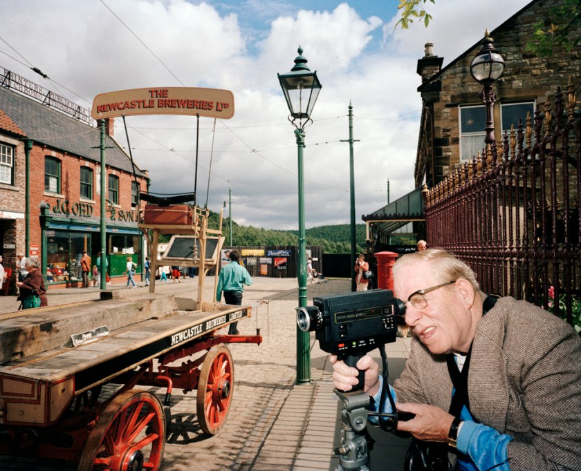
Paul Reas is a new name to me. He is a social documentary photographer who uses colour images to show British culture and is considered to be in the same genre of British photographers as Martin Parr. His book ‘I can Help’ documents the consumer culture, while ‘Flogging a Dead Horse’ (1993)’ presents a nationwide survey of the emergence of the ‘heritage industry’: museums and theme parks such as Beamish Open Air Museum that offered a nostalgic and often commercialised version of the past in the wake of the collapse of heavy manufacturing and industry’ (Shutter Hub, 2013). The image ‘Flogging a Dead Horse, Man with a Movie Camera’ shows a man in a smart outfit looking intently though his camera. It would be interesting to know his thoughts, and whether he had ever worked in the type of industry he was photographing. In an article about the series by The British Council – Visual Arts it is described as ‘The tourist of the nineties, with camcorder and auto-focus camera, expects a ‘hands-on’ experience. But the trouble with Heritage Culture is that the safe inconsequential history it markets doesn’t educate, it only sedates its audience. Heritage is meretricious history that never challenges the present. Consumerist history: history for a disposable income. Like a steam train, it takes you on a pleasant ride to nowhere, and then back to where you started.‘ (Visualarts.britshcouncil.org, 1994).
Reas’s images are gritty and do not feel as slick as those of Parr, they are not as ‘amusing’ but they do get under your skin in the same way, giving an ironic take on the culture we live in and how it is influenced by the need to seek out pleasures and record them, even if those recordings never reach the light of a photograph album.
Self assessment and criticism is an area I find particularly difficult. This is probably not because I am over confident, but because I tend to be very negative about my own work. This makes it difficult to write down the thoughts and also difficult to be objective.
Assessment criteria points
Demonstration of technical and visual skills – Materials, techniques, observational skills, visual awareness, design and compositional skills. (40%)
I think I produced reasonable images for this assignment. I found it hard to keep to the topic, and, because it was a specific idea, some of the images , especially those that didn’t make the final cut, had major flaws, such as depth of field or focus. I was concentrating on what was happening and didn’t always remember to think about the practical issues such as the best camera settings. It would have been helpful to think in advance about the best way to show them, for example, would it be best to have the whole image in focus, or better to just focus on the person taking the image and have the background (their subject) out of focus. I made a considered decision to only have the person on the side of the image and to show the background as a large part as I felt it made the concept more ‘real’.
Quality of outcome – Content, application of knowledge , presentation of work in a coherent manner, discernment, conceptualisation of thoughts, communication of ideas. (20%)
Having got the spark of an idea for this I feel I thought it through, weighing up the possibilities, and logically explaining my thought processes. This was easier to present on-line with the additional images that showed the progression of thoughts. Next time it might be better to add these images into the printed explanatory essay as will as the final chosen images. I feel that I communicated my concept in both the descriptive essay and the images.
Creativity — Imagination, experimentation, invention. (20%)
I experimented with several possibilities for this assignment before settling in the final one. I also experimented with colour versus monochrome. It’s is difficult to see how imagination comes into this – unless it is about imagining the concept in the first place. This was a ‘sideways’ take on the concept of the decisive moment – thinking about other peoples moment and trying to put myself into their place. It has made me think of several other pieces of work that would be interesting to do as a follow up including the work on selfies and possibly asking other people why they were interested in that place/photography at that time (also – what they did with their images ?post them on line,?print them or what. This would open up the possibility of contrasting their thoughts with mine.
Context – Reflection, research, critical thinking. (20%)
My research on this assignment was too limited. It was about the concept of selfies and how they were used – but then I moved away from this as an idea. I am sure there have been other studies on my eventual idea but I am not aware of them, and not sure how/where to access them.
Brief: A series of 6 – 8 photographic prints on the theme of the ‘decisive moment’, which may support the tradition or question the concept.
Thought Process.
After thinking about the decisive moment at length, watching the film on Henri Cartier-Bresson and reading around the subject I spent some considerable time trying to decide how to approach this assignment.
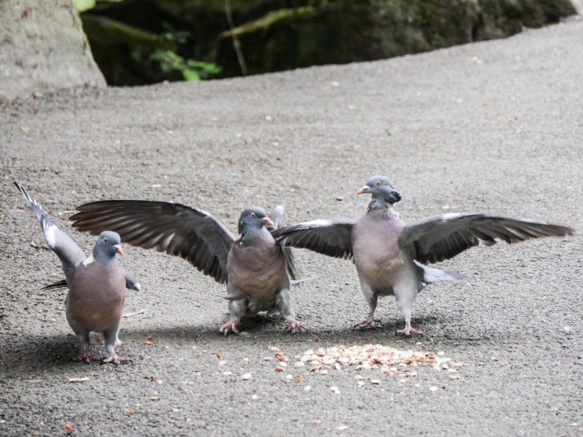
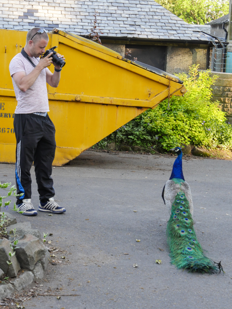
I initially thought about following the concept directly and trying some ‘traditional’ street photography but decided against this, partly because I felt that I risked simply ‘copying’ many of the images already out in this domain, and partly because I felt that I would struggle to find a linking concept. I then thought about taking a series of images of animals and birds when they were at a ‘decisive ‘point, and did start to follow this idea with some fairly interesting (or at least amusing) images of animals in the park.
Pigeons Arguing
While taking these, I took an image, and realised that it was more about the person taking the photograph of the peacock than of the peacock itself, especially as it was not obliging by showing its fan. I felt this was an interesting idea as what I was doing was looking at what other people were finding to photograph – their ‘decisive moment’.
The Man or the Peacock?
Research.
There has been a considerable of interest in people taking photographs recently, but this has been mainly about the incredible incidence of ‘selfies’ taken and posted on social media. A recent statistic quoted in Amateur Photographer suggested that 48% of all photographs taken by 18 to 30-year olds now are selfies (Amateur Photographer, 2017). I am not sure how that statistic was derived, but certainly, if you are watching people on the street self -portraiture appears to be the main subject, and there are clearly an enormous number of such images posted to social media.
In 2013 the Oxford Dictionaries chose ‘selfie’ as their Word of the Year. Oxford University Press then gathered a variety of scholarly reflections on this (OUP blog, 2013). In this article Lynn Schofield Clark from the University of Denver said, ‘Selfies like this are about awareness of our own self-awareness’, Karen Dill-Shackleford said ‘A recent trip to Stonehenge had me cringing as I watched visitors to the site posing for selfies in self-absorbed abandon beside the ancient monument. Did they feel that the intriguing thing about Stonehenge was their own presence there?’ and Robert Arkin said, ‘The selfie (an arm’s length close-up self-portrait) photograph is a way to control others’ images of us, to get out in front of their judgments, to put an image in their heads with purpose and spunk. Others’ judgments are no longer just their own creation, the selfie objectifies the self, influences others’ thoughts. And, since the selfie is one’s own creation, it also affords plausible deniability; it isn’t me, it’s just one ‘me’ that I created for you’.
Cindy Sherman has recently unlocked her Instagram account and shared several ‘selfies’ although these have a particular Sherman twist in that they are distorted. (Sherman, 2017) Farago comments ‘they also point to the gap between Ms. Sherman’s vital, unsettling practice of sideways self-portraiture and the narcissistic practice of selfie snapping’ (Farago, 2017). Clearly the whole field of taking selfies, while it has much in common with all self-portraiture, could be explored at length, both academically and practically, using a combination of my own ‘selfies’ and pictures of others taking images of themselves.
Planning.
I thought about taking photographs of people taking ‘selfies’ and experimented with this, but decided not to explore this further for this assignment as it is possibly a study on the ‘indecisive’ moment rather than the decisive one when the number of selfies taken by any one person is considered. However, this would be an interesting concept to follow up in the future.
Who am I?
My next idea was to take relatively close-up images of the people taking photographs and pair them with images I took of the same subject immediately afterwards. I discarded this approach as the limited number of images asked for in this case would only have allowed for a maximum of four pairs, again this is an idea that it would be worth looking at in the future.
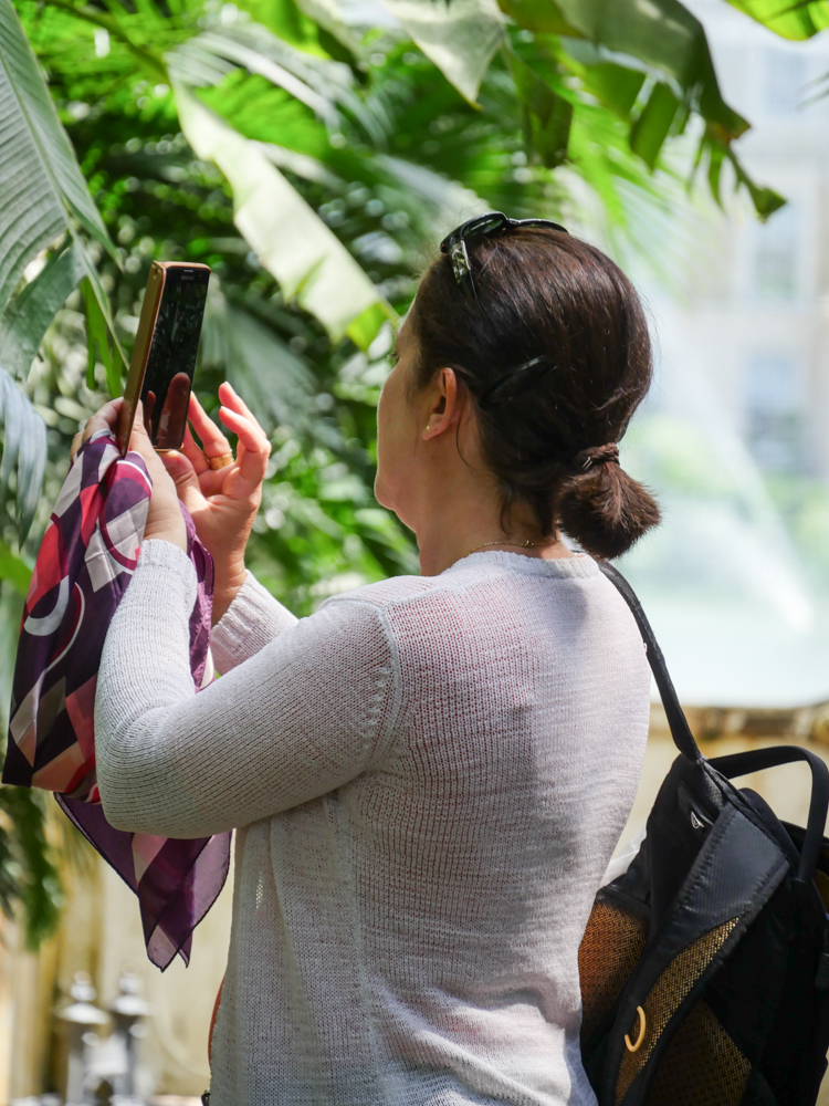
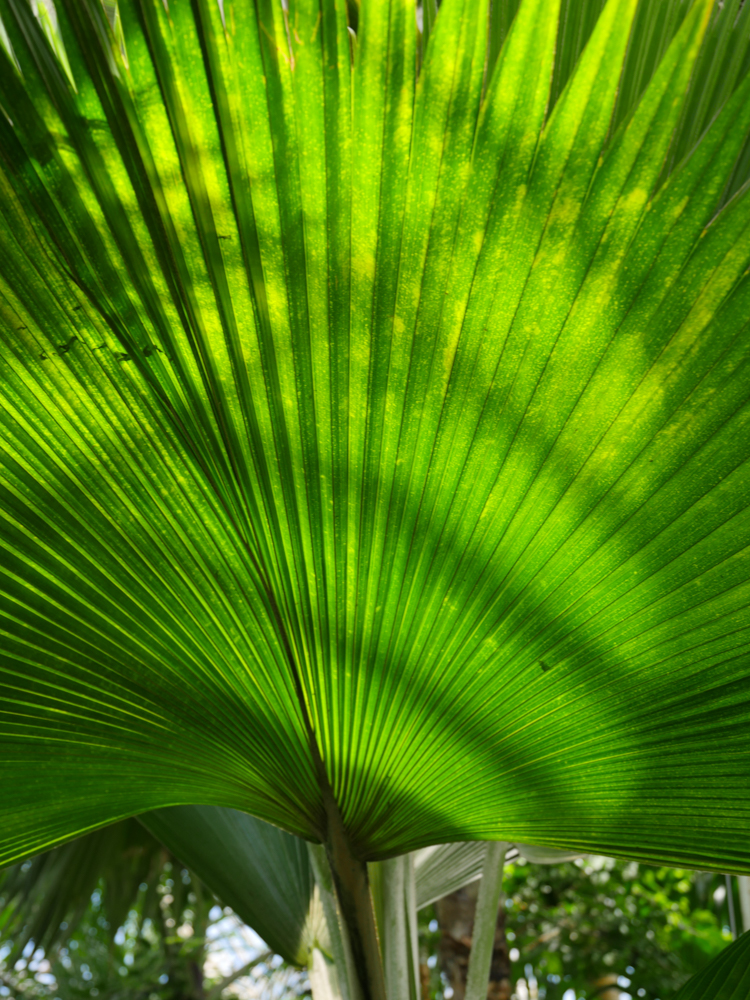
Photographing Palms
Palm Fan
What was done.
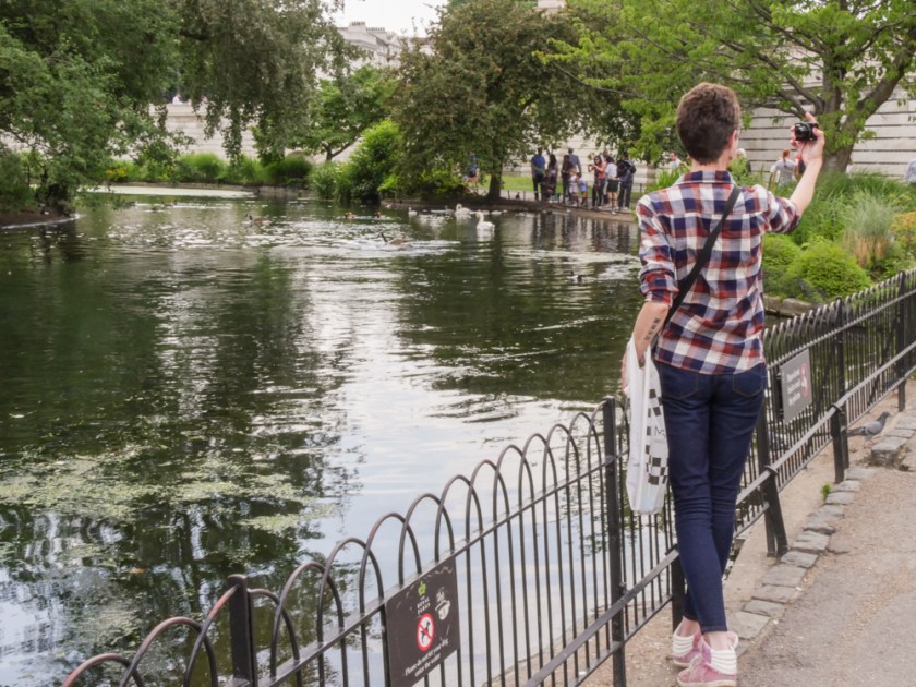
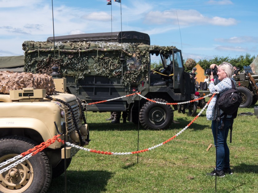
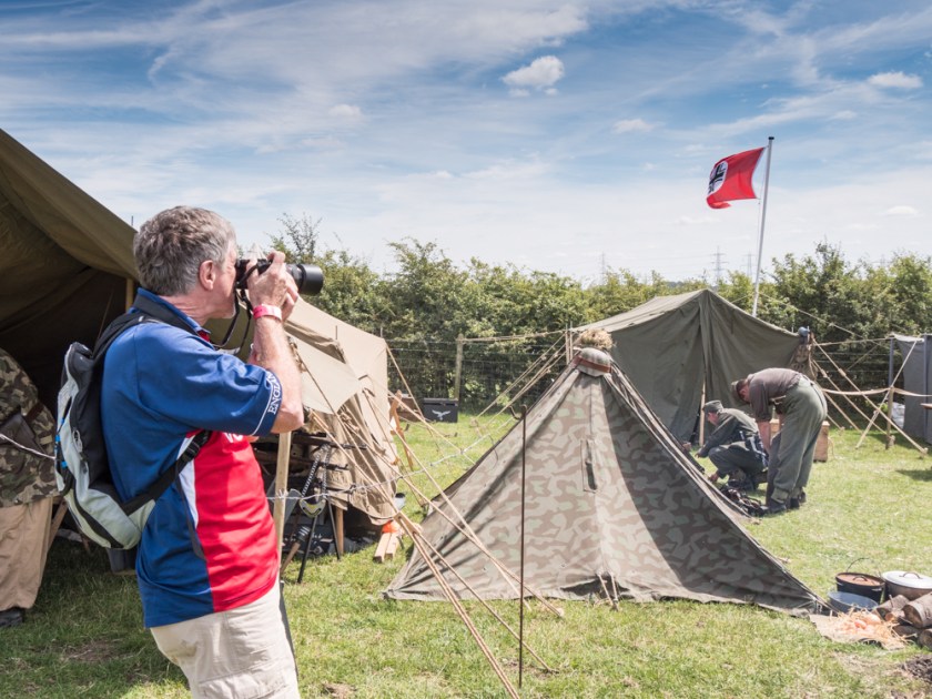
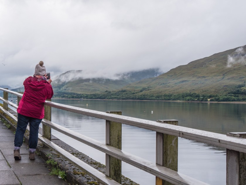
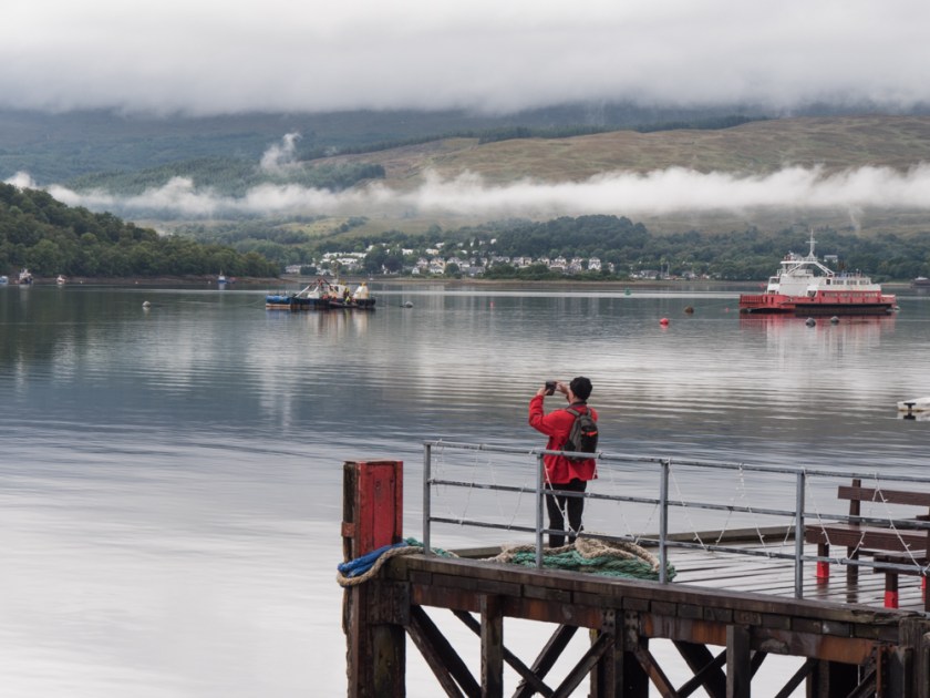
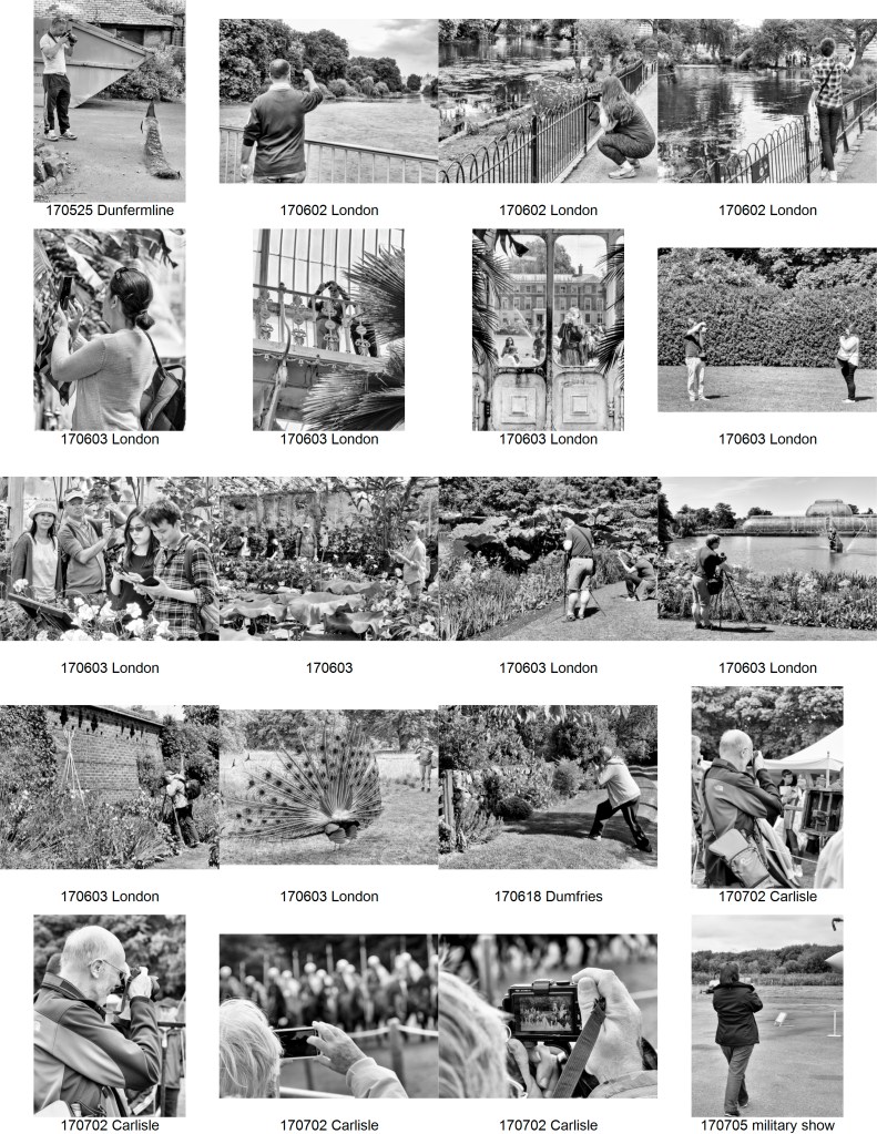
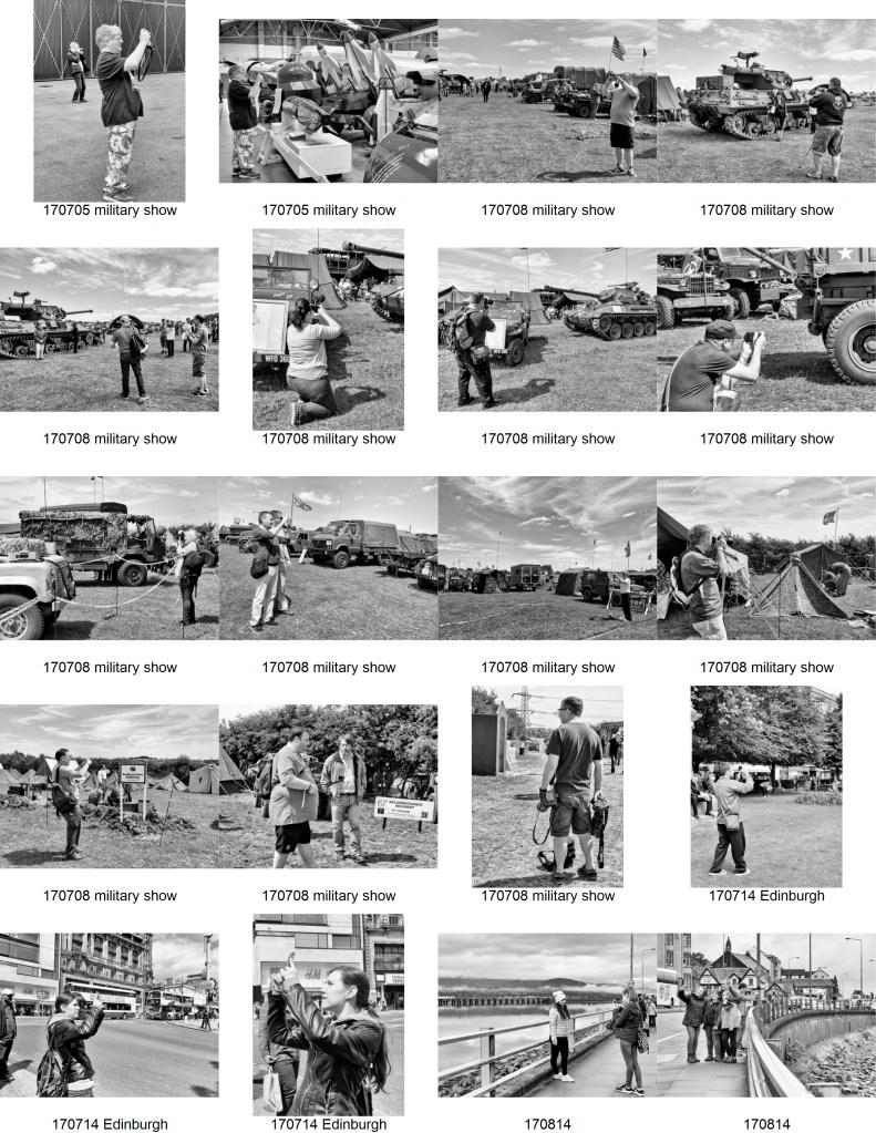
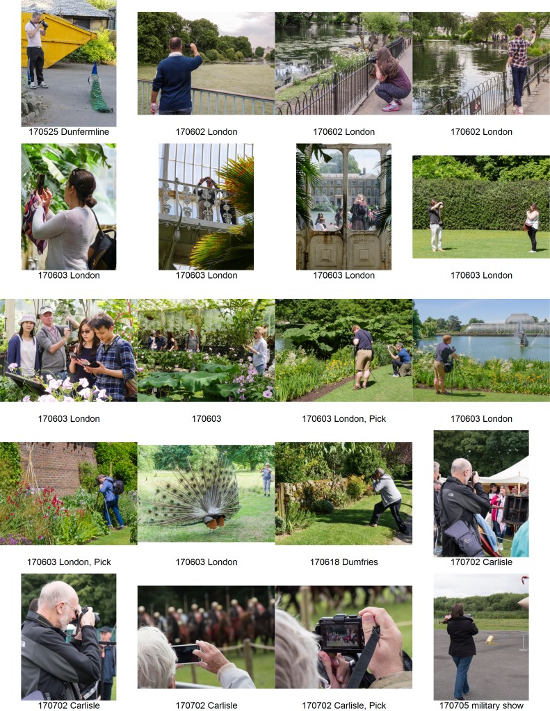
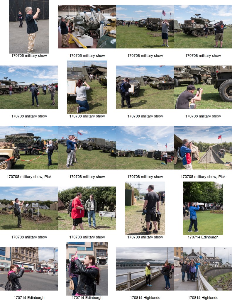
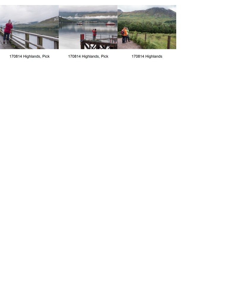
For this series of images, I concentrated on photographs of people taking photographs, not of themselves, but of the world around them. There is a wide variety of situations shown as, although I had enough images in various locations to have concentrated on one of these, such as Kew Botanic Gardens or the Yorkshire Military Experience, I felt the overall theme was better served by diversity, although, the simple fact that I was also there, in that place and at that time, has limited the range to situations that I was also interested in.
All images were taken outside, in daylight and by natural light. I did not use a tripod or any fill flash as I did not want the subject to be aware of any intrusion into their world and none of the images were staged. There were several occasions when the person put their camera or phone down or moved away at the critical moment. I considered limiting the selection to either images taken when the other person was using a camera or when using a phone, but decided against this. The final series of images was taken over several weeks during my summer holidays. As several of these were taken in Scotland, the weather, and therefore the quality of the light, was very variable. The images were in both portrait and landscape format, but I limited the selection to all landscape to support the idea of a series.
The next question to be resolved was how to show the images. I thought about both colour and monochrome and ended up converting all the images to monochrome for comparison, and printing some of each. The monochrome conversion was performed in Silver Efex Pro2, and, unlike my normal monochrome pictures, I used a relatively high key conversion using the same settings for all the images to maintain coherence.
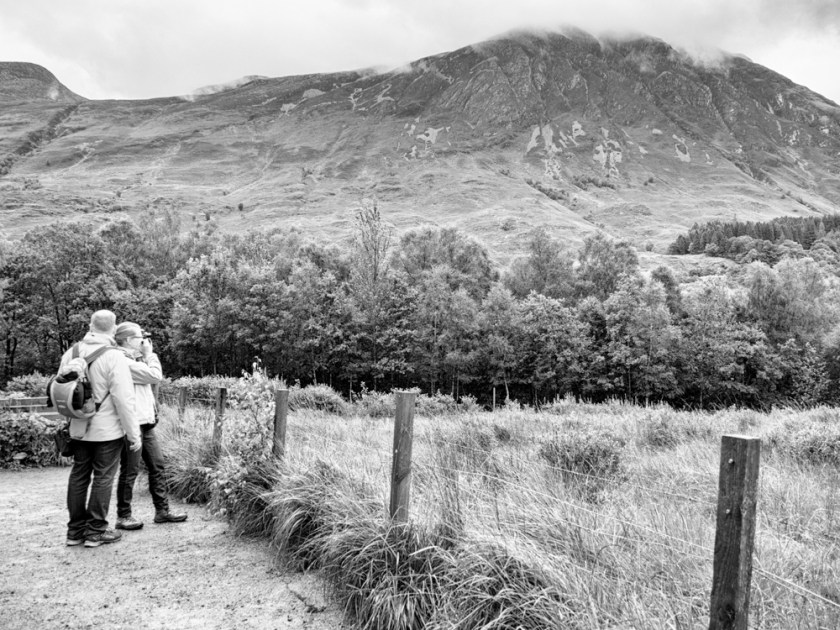
A Wet Day in the Mountains
I eventually decided on keeping to the original colour images as I felt it is likely that the ‘original’ photographs I was basing my images on would be viewed in colour, and therefore colour was truer to the concept of recording the other photographers interests and themes. Clarke says about colour images ‘Colour photographs remain problematic. They are central to the snapshot, but are still invariably rejected by the professional and art photographer who will use colour only in a deliberate and self-conscious way: either to draw attention to the medium, or to imply a statement about the subject’. (Clarke, 1997). In this case I am using colour in the latter sense. The actual image selection was also influenced by the choice of colour as the most effective images in colour were not the same as the most effective ones in monochrome.
The photographs were printed on Perma Jet Oyster paper via a Canon printer.
Final Images:
s
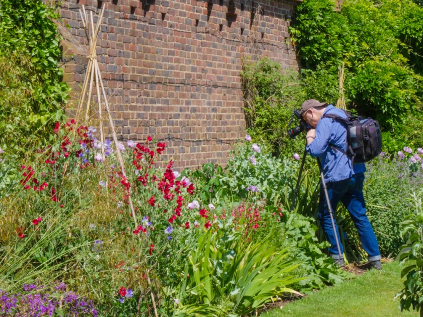
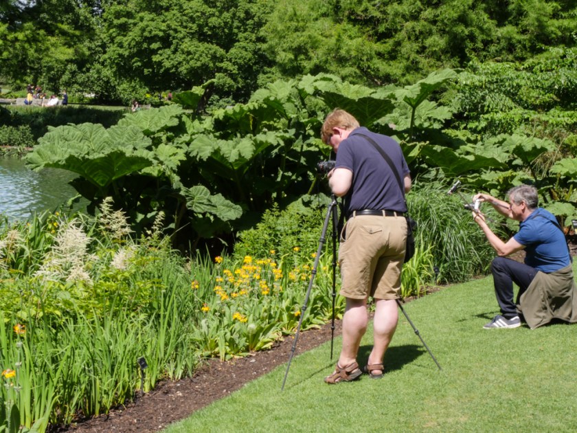
Kew Botanic Gardens – Photographing FlowersKew Botanic Gardens – Two photographers at the LakeYorkshire Military Experience – Photographing vehiclesYorkshire Military Experience – Photographing the CampgroundFort William – Photographing Loch Linnhe in the RainFort William – Photographing the MountainsCarlisle – Hadrian’s Cavalry Charge
I was particularly pleased with the last image as I was standing very close to the photographer in front of me and, by sheer luck, managed to get the horses showing on their camera’s screen just as they were charging towards us.
Contact Sheets.
References
Amateur Photographer (2017). Amateur Photographer, (12 August 2017), p.5.
Clarke, G. (1997). The photograph. Oxford [etc.]: Oxford University Press.
Sherman, C. (2017). cindy sherman (@_cindysherman_) ˖ Instagram photos and videos. [online] Instagram.com. Available at: http://instagram.com/_cindysherman_ [Accessed 18 Aug. 2017].