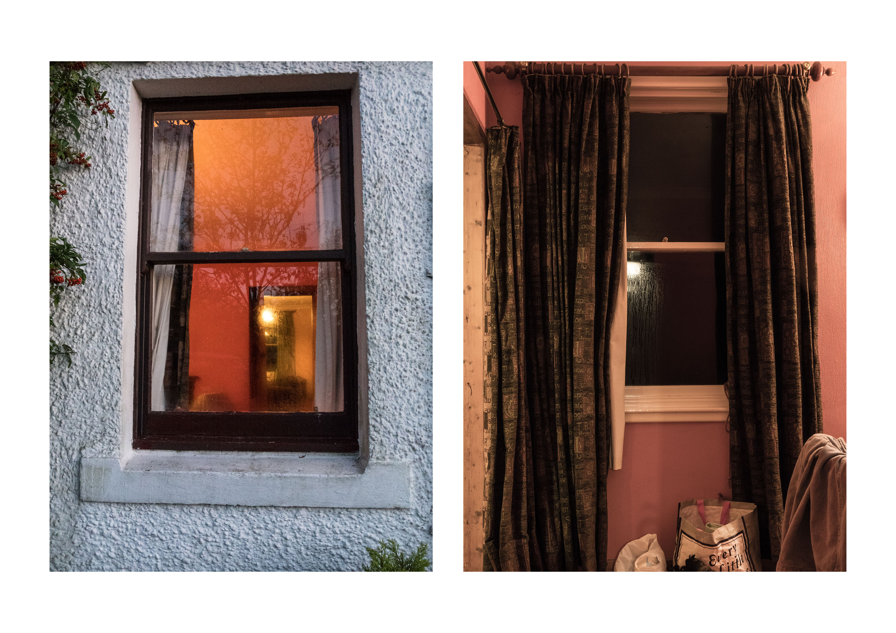
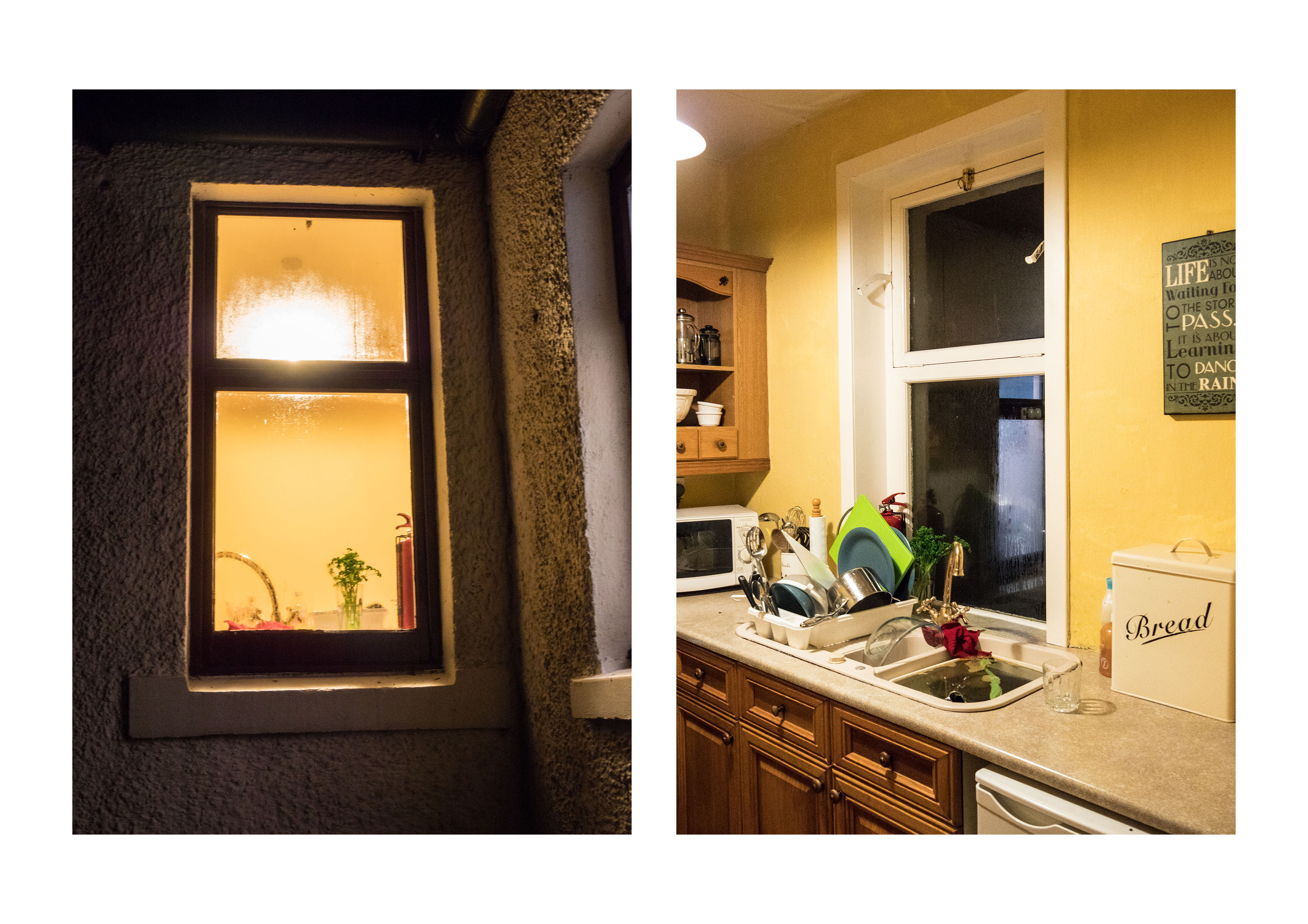
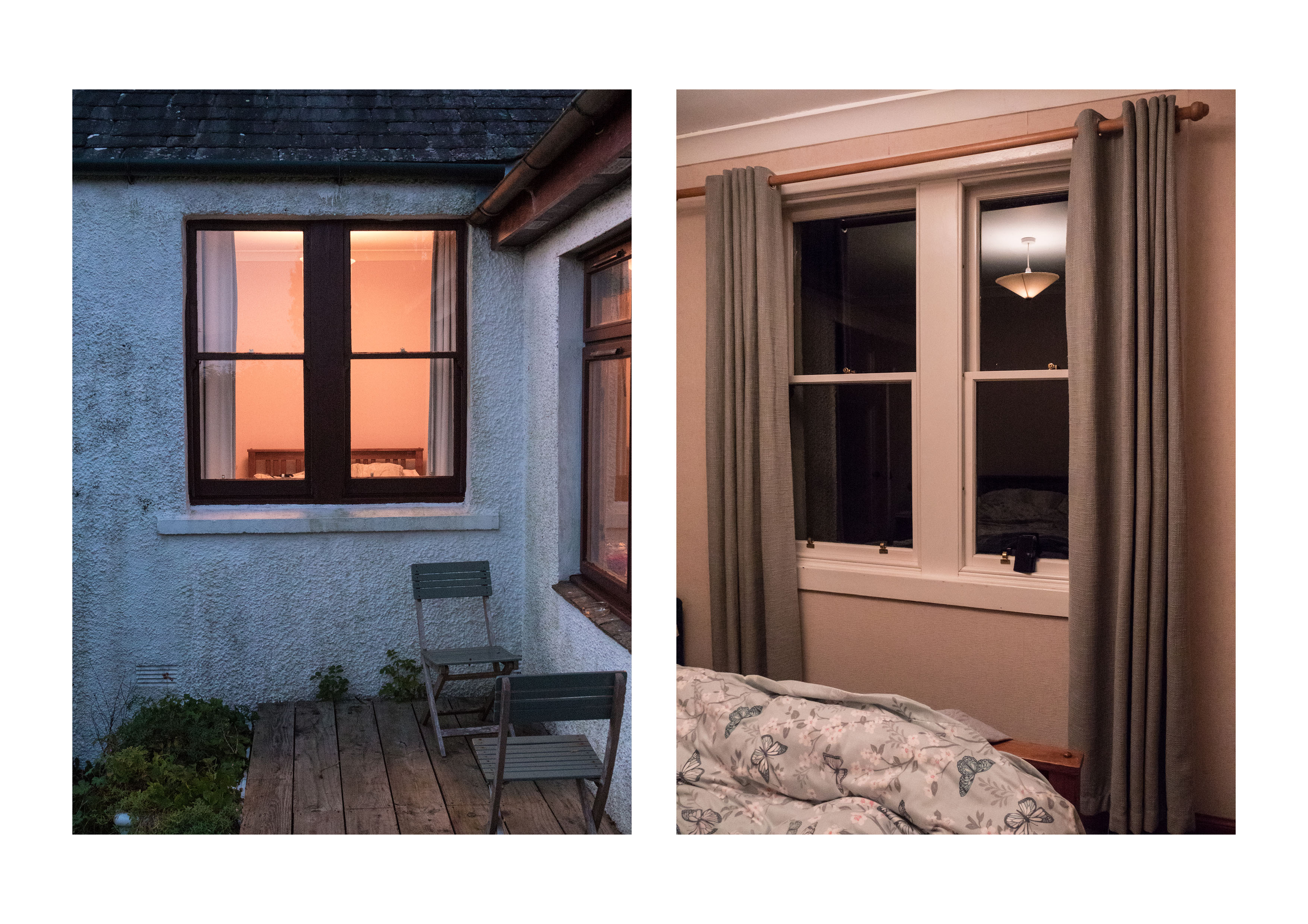
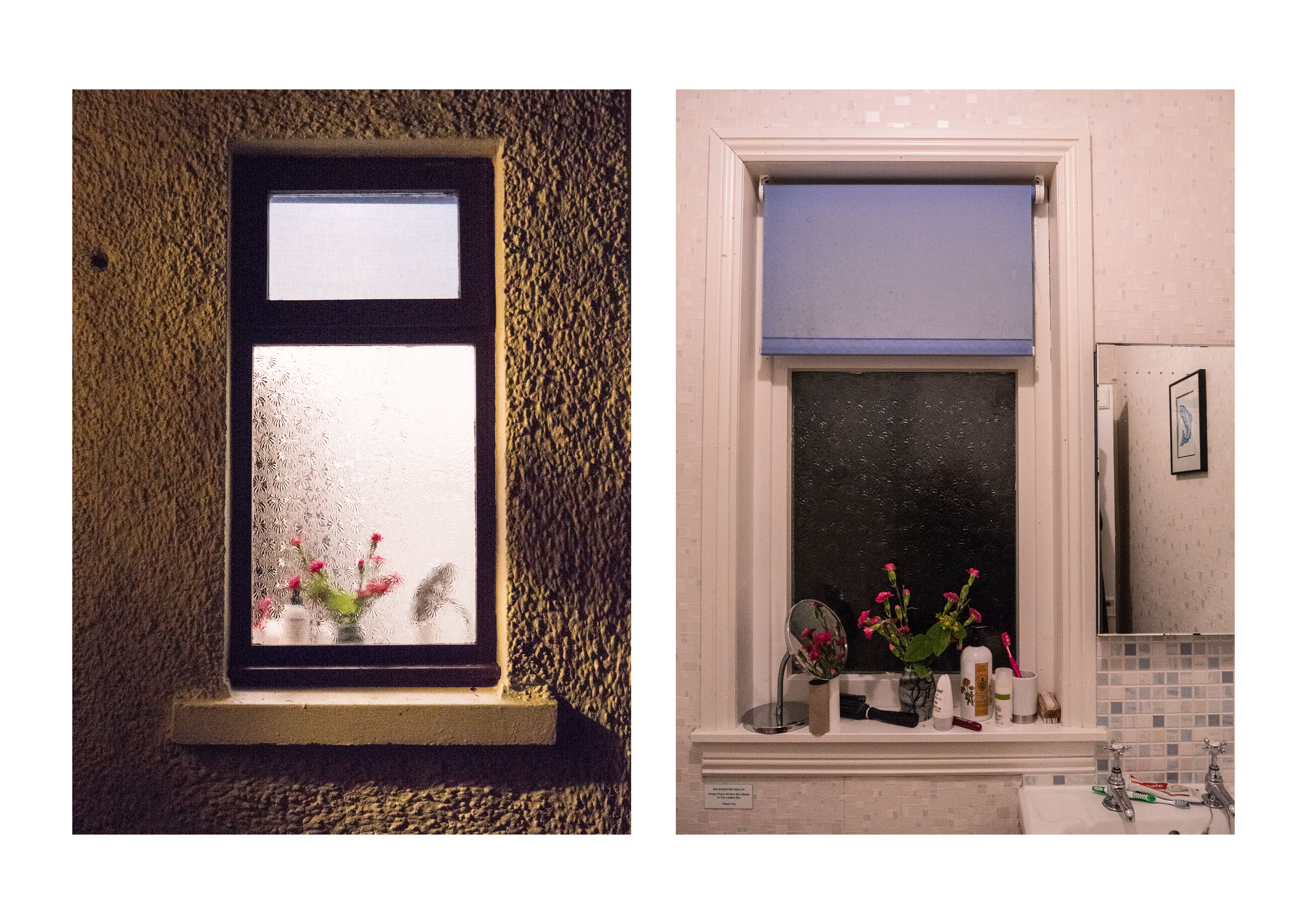
I agree that these are essentially diptychs – so have redone them in this format using photoshop to add as a pair. I have also cut down the number of images so that the pairs all work together. I also have adjusted the colour of the light slightly in one of the pairs to match (as suggested in our conversation). I think the light colour was different because the two bedroom images were taken at different times of day.
Hido’s work as voyeurism
This is something I hadn’t really considered but I agree it is a significant difference in the feeling of the work. I was aiming for the difference between the imagined possibilities of looking from outside versus the real life, with all its scruffy detail inside.
Tripod issues
Already resolved! However it was interesting that even without one , and with a modern camera that taking the images at ISO 64000 gave reasonable results.
‘with permission’
When possible, I like to ask for permission to use other people’s images even though in this context – critiquing the images it is fair usage. My main concern is that others may copy the images on inappropriately. There is an interesting story in the book by Barratt already discussed in this post:
I have been amazed by the number of people who have taken the time to answer my emails, and, on several occasions, enter into discussion about the images.
Being explicit
This assignmentwas specifically done in response to Exercise 4.3 – ‘the beauty of artificial light’
Shizuka Yomomizo is a Japanese photographer based in London who took a series of images where she asked, by means of a note, a group of strangers to allow her to photograph them standing in front of their window. She is being voyeuristic, but with the complicit knowledge of the people involved. There is a meeting of eyes, an awareness by both sides, mediated though two layers of glass, the window and the lens. They meet briefly and then part. There is a choice on both to engage or not.
The Brief: Take one of the exercises on daylight, artificial light or studio light and use it to create a set of between 6 – 10 images with a linking theme.
For this assignment I chose to use artificial light as this is not a field I have explored before and I felt it would be a good test of development of skills. I thought about several possibilities of exploring this.
Street scenes at night:
This gave me the options of more general shots, such as the lit town hall, or more specific ones like the exterior of the local pub.
Gigs:
This definitely was a possibility, as the light is very interesting, all of the above images are as shot on the same night without a change in the white balance.
Car lights at night (road shots with extended times).
Fireworks (wrong time of year).
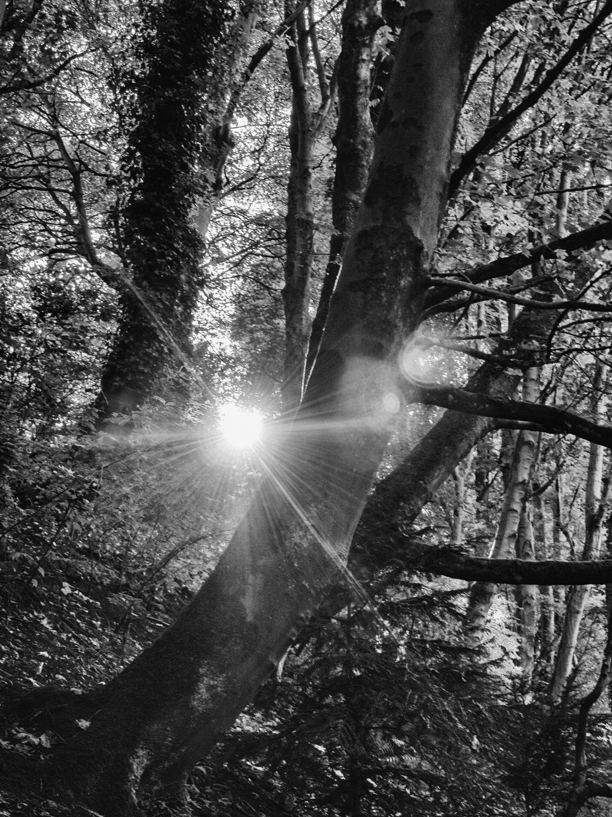
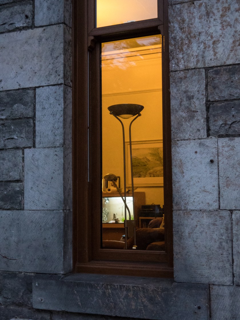
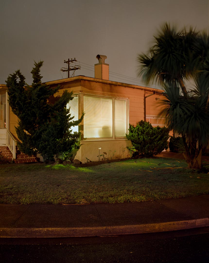
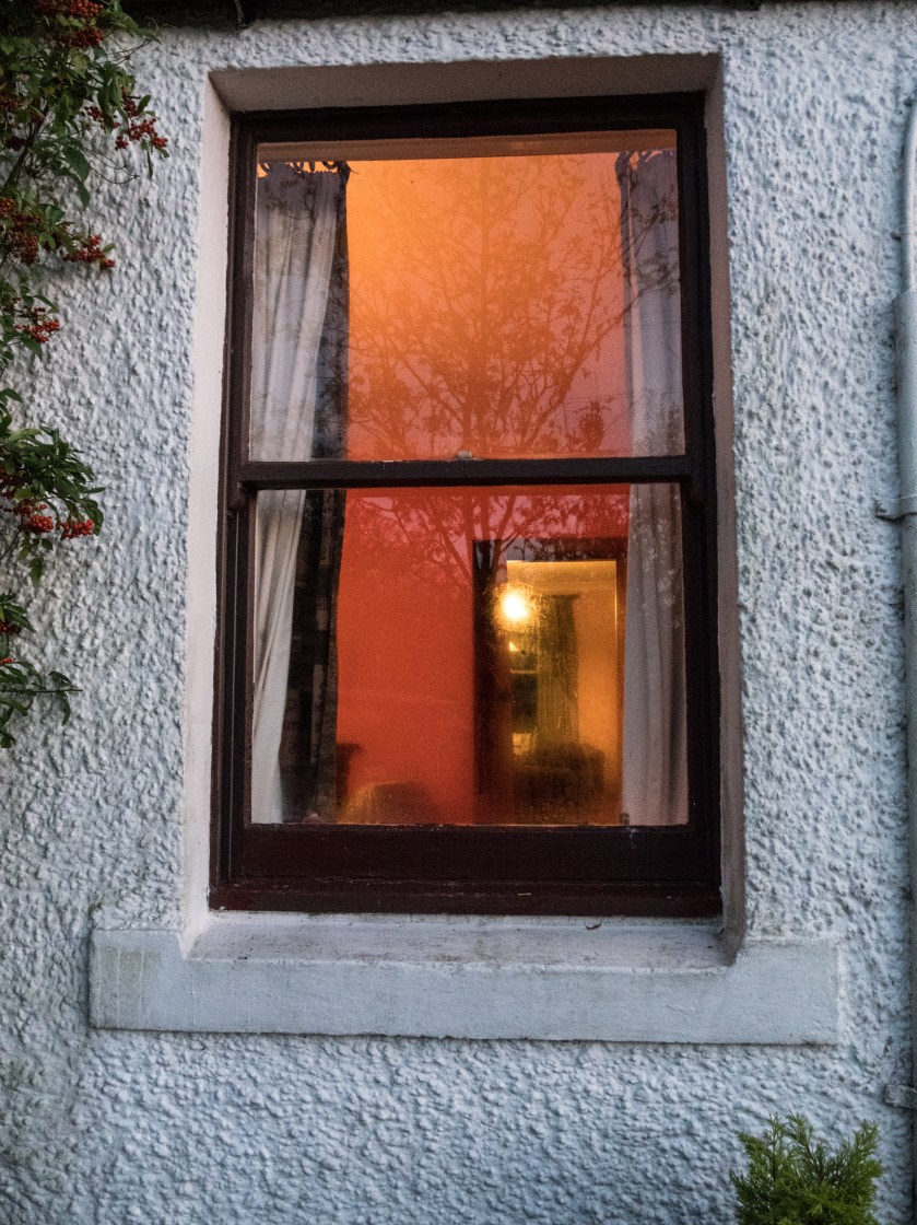
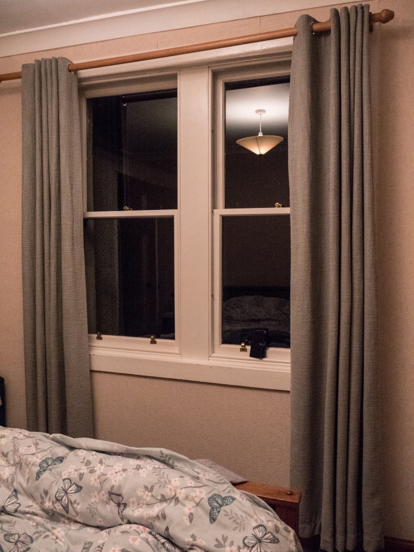
However, I was walking home one evening and this was the view though my window.
I found this an interesting view and decided to explore the concept of looking through the window.
Research:
a. When I started thinking about the concept of lit windows I remembered a painting I had seen at the Glasgow Gallery of Modern Art many years ago. Avril Paton is a Glasgow based artist who painted a series of images of Glasgow tenement flats from the outside, often with lit windows, looking in on the life inside. In these images the light is usually warm and intimate.
b. Rut Blees Luxemburg’s image of tower blocks give a similar feeling, and utilise similar colours, concentrating on golds and browns. Images can be seen in the Guardian article below. ‘Towering Inferno’ is an example of this, but although the colours are warm, the images are massive, and give an overview of the flats, not similar to the more intimate views I was looking for in my series.
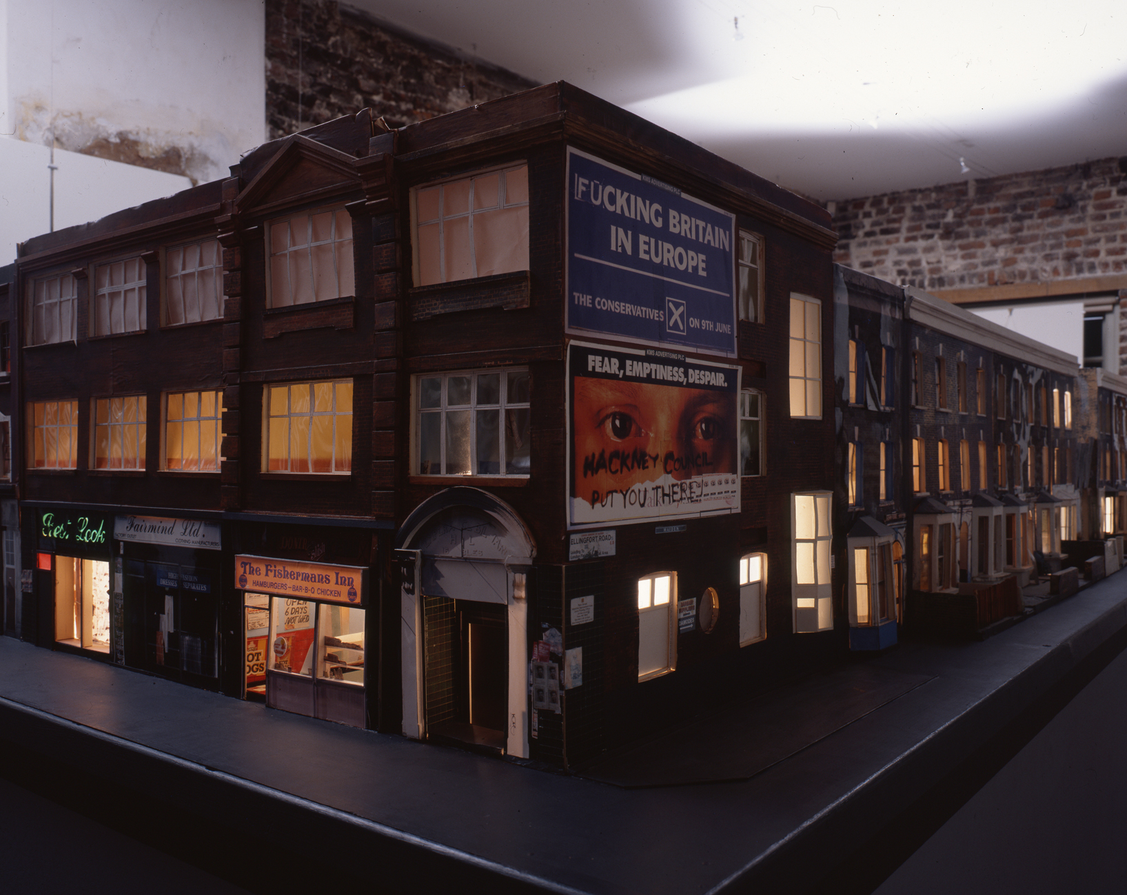
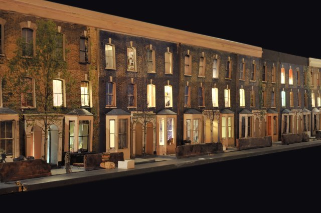
c. Todd Hunter has explored the concept of home at length in several series of works, one of which ‘The Ghetto‘, is a 3D model of the street he lived in, with colour transparencies place within the doors and window, lit from within. You have to walk along the model to look into the rooms.
There is also a series of other images taken within the rooms of people who lived (and often still do) on that street. These images and the display had been taken in response to an article in a local newspaper which described the area as ‘a blot on the landscape‘ (Tomhunter.org, 2017).
d. Todd Hido has also utilised artificial light, taking both outdoor images of houses at night and inside images. Like Tom Hunter, these are not beautiful in the traditional sense, but tell you a lot about the lives of people living in modern America, however these rely on the rooms themselves to tell the story, not the people within the rooms. I felt this was more in line with my idea.
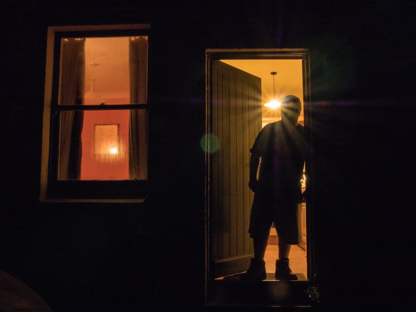
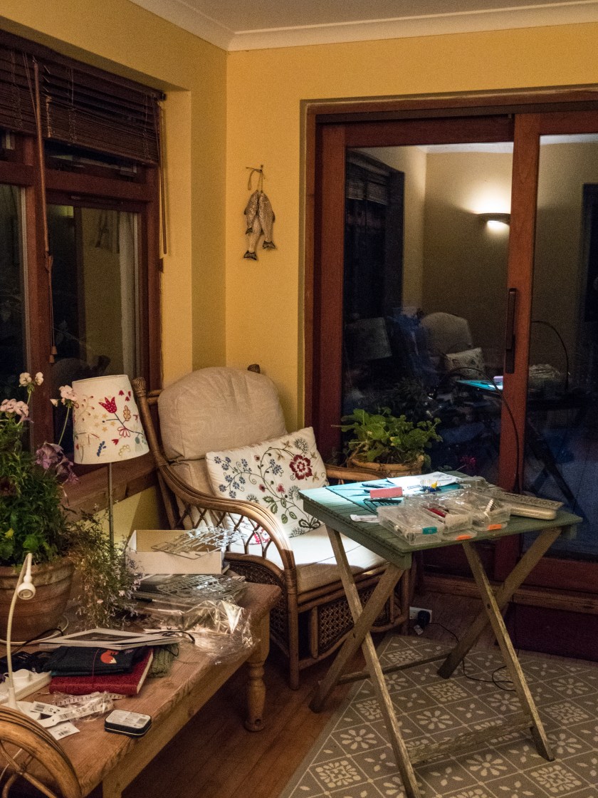
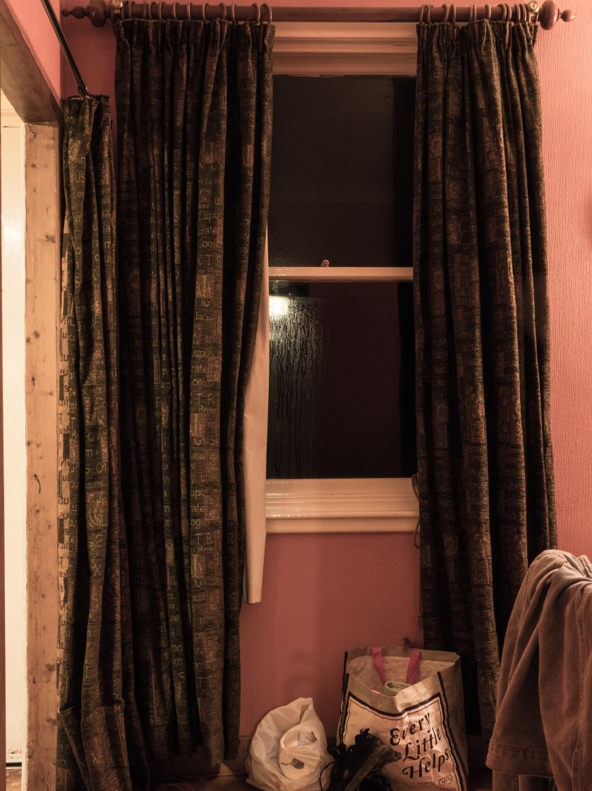
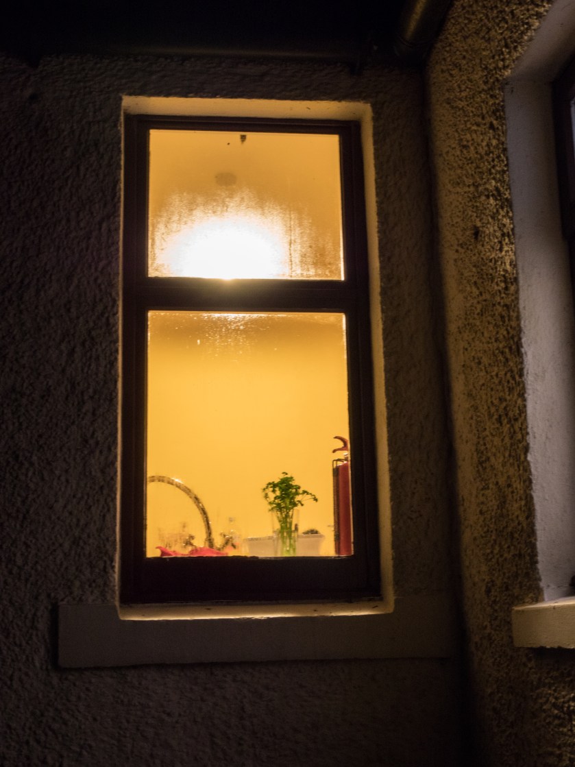
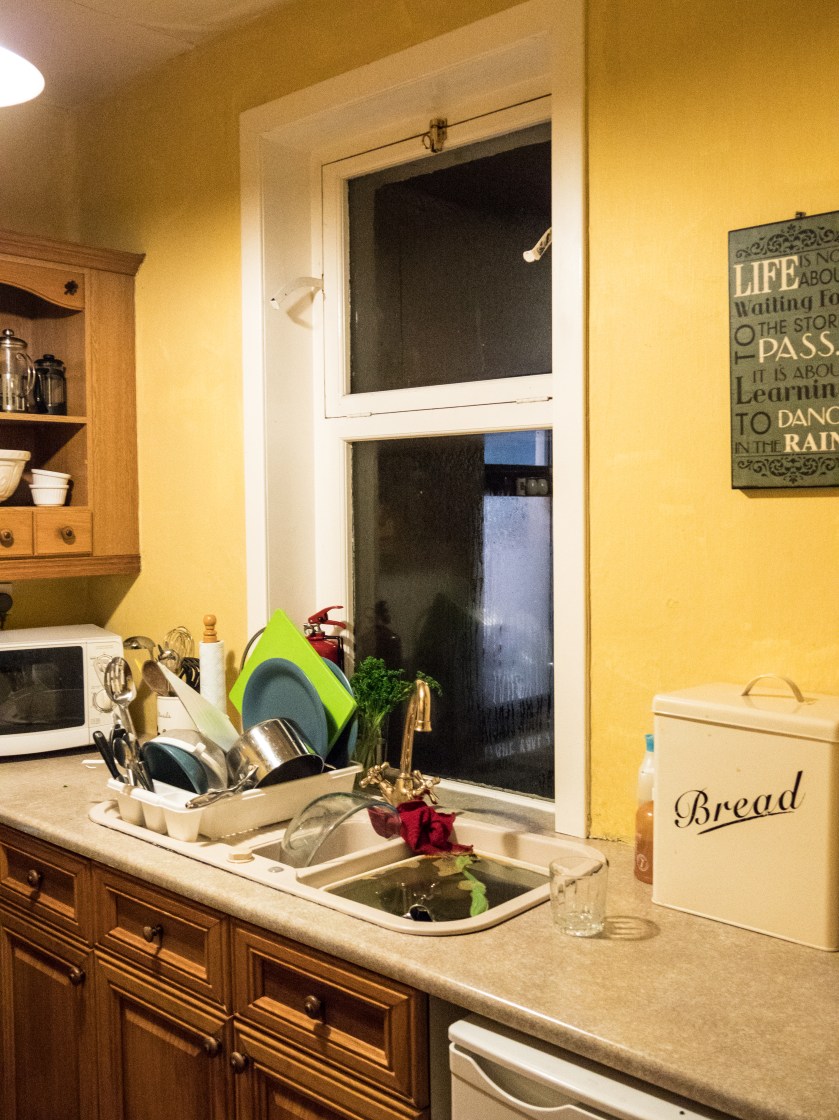
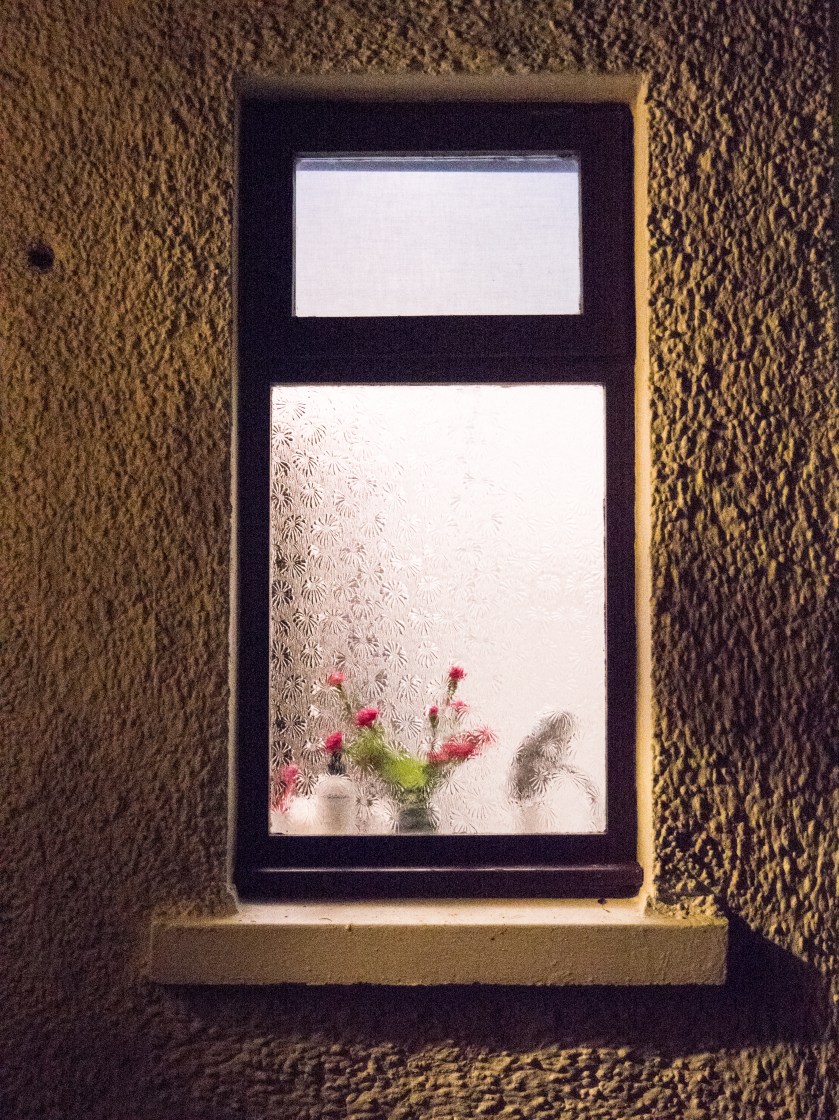
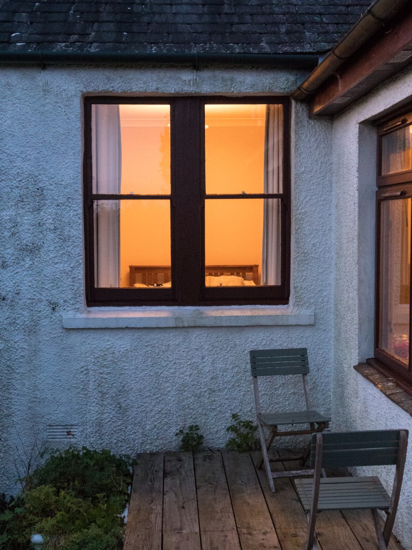
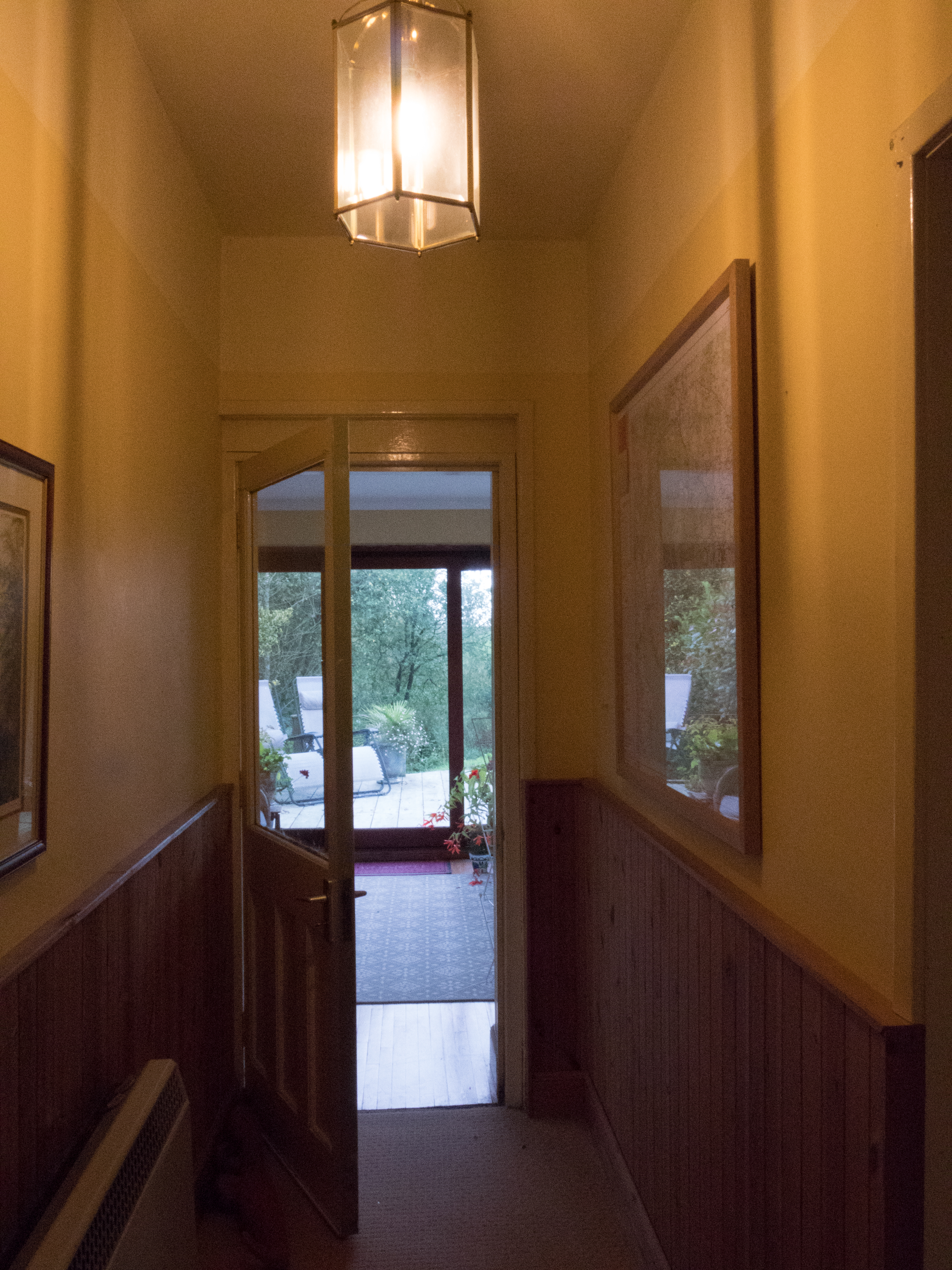
I took a long series of images at a cottage we were staying in in the country in Dumfries and Galloway. It was well away from any town, and the only light in the evening came from the lights in the cottage itself. I took some of the images handheld, with the ISO set to 6400, and the rest of the images using a tripod with the ISO at 800. I used a fully manual mode throughout. I have discovered that using manual settings slows me down and makes me think more about what I am focusing on and which bit of the image I want to have exposed in most.. It was not easy to use the tripod outside as the ground around the cottage is very uneven, and it was tricky to get a stable and straight image, so some of the ‘better’ shots were actually handheld, in spite of the high ISO. A more stable tripod would have helped here.
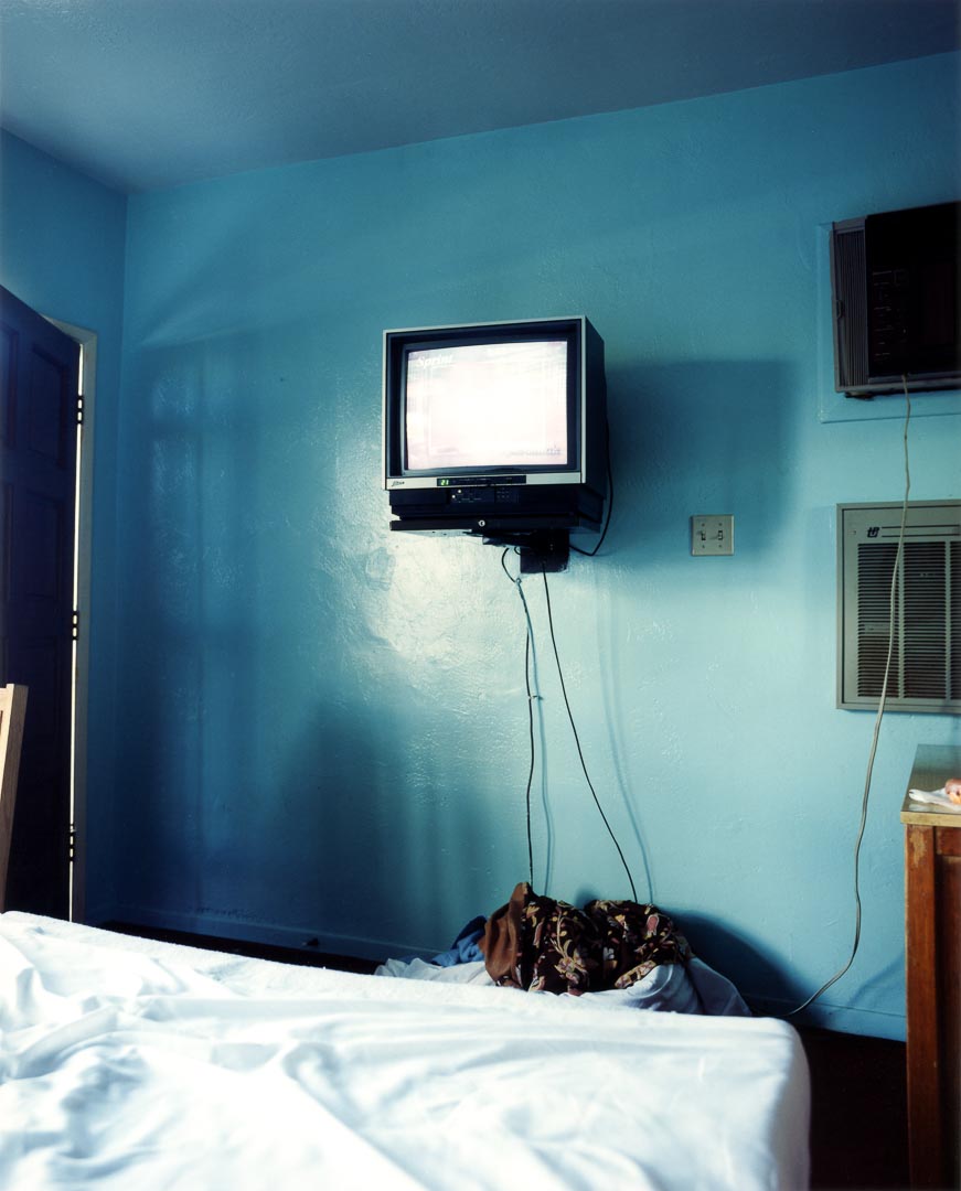
Images were taken from outside, looking at and through the windows, and inside. I did not ‘tidy up’ in advance of taking the images as I was looking to show the contrast between the outside images, where you could imagine almost anything, and the inside reality.
The images were processed in Lightroom CC, with minimal changes. I did not alter the white balance as it feels accurate for the lighting conditions and what I wanted to show.
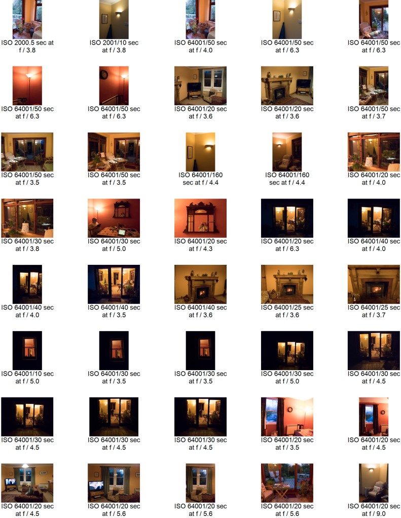
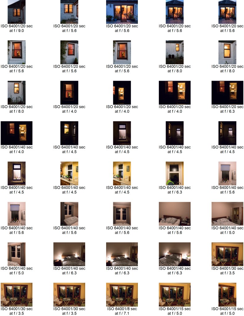
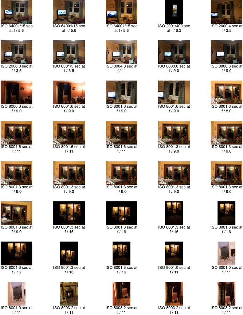
Contact Sheets:
Initial contact sheet for all the images:
Selected images marked with exposure, aperture and ISO:
I spent some time thinking about how, and which images to choose. I was not sure whether to stay with a given orientation or whether to mix between landscape and portrait. Most of them were portrait due to the nature of the windows so I chose to go with these, – but some of the individual images were more pleasing as landscape.
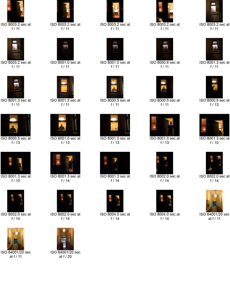
I also took some images that showed a person, and although they were interesting felt that this distracted from the overall idea of the set. The other possibility was pictures taken later in the evening, where the outside of the cottage was effectively black, and only the windows showed. This image combines both those ideas.
Final Images:
Summary:
My idea here was to show the difference between what you see, and therefore can imagine, when looking from outside of a picturesque country cottage to what is actually happening inside the same rooms. Fantasy versus reality. I chose not to show any people in this set of images, leaving them quite stark and factual. Overall, I am fairly pleased with the set. In some of the images the inside light is very bright, and might benefit from more post processing – but the significant contrasts were there, and in this case, I did not wish to ‘play’ with the truth any more than minimally.
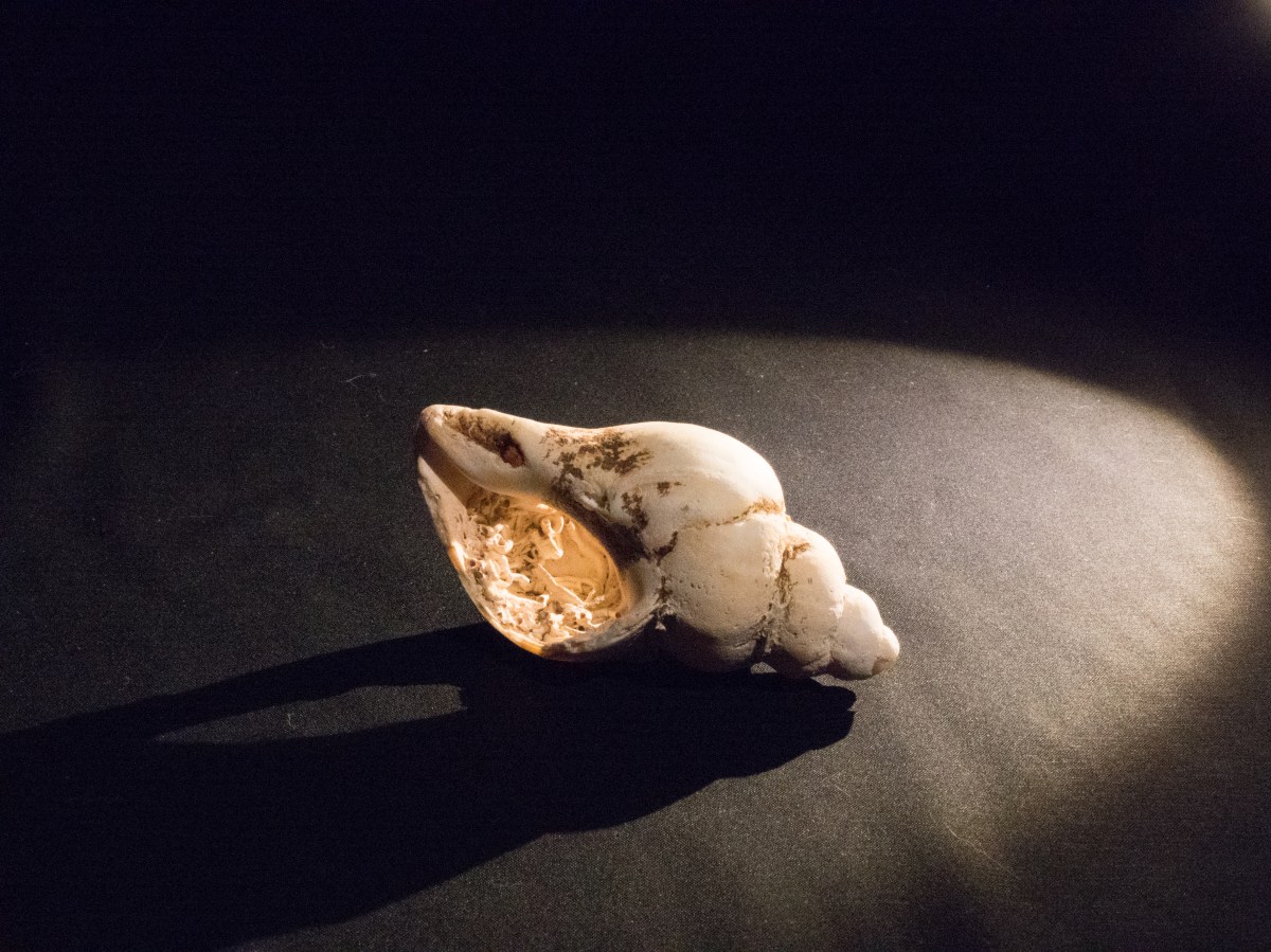
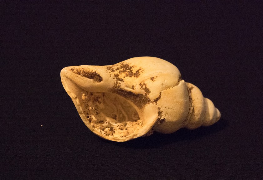
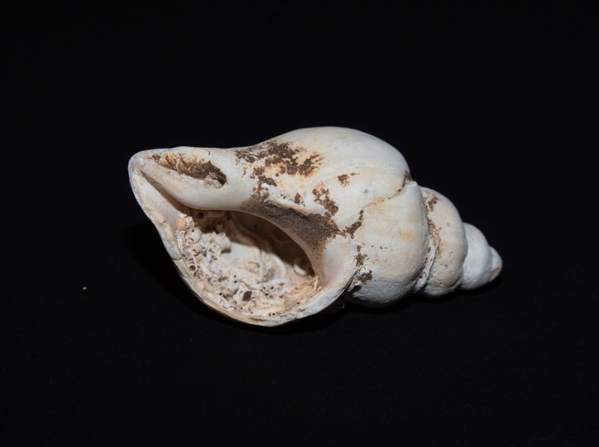
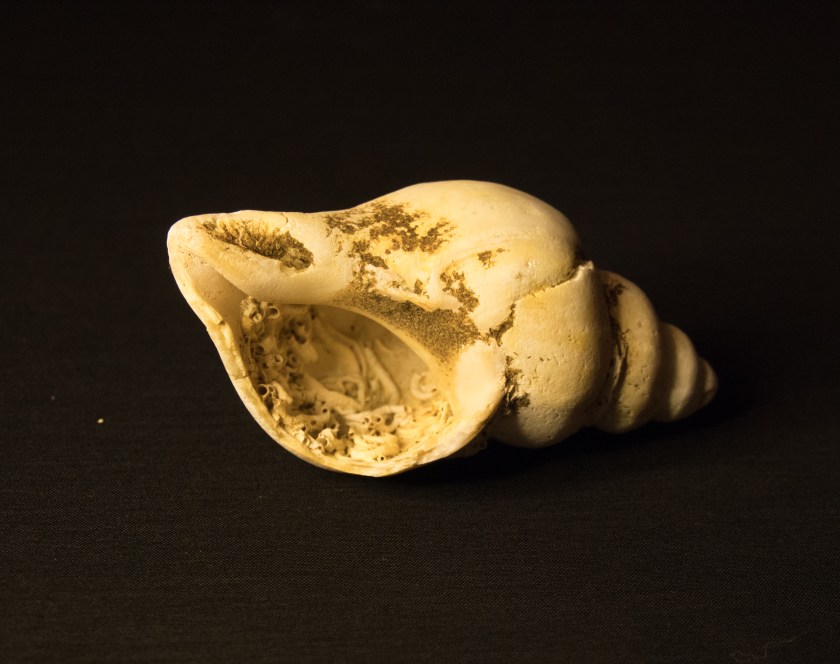
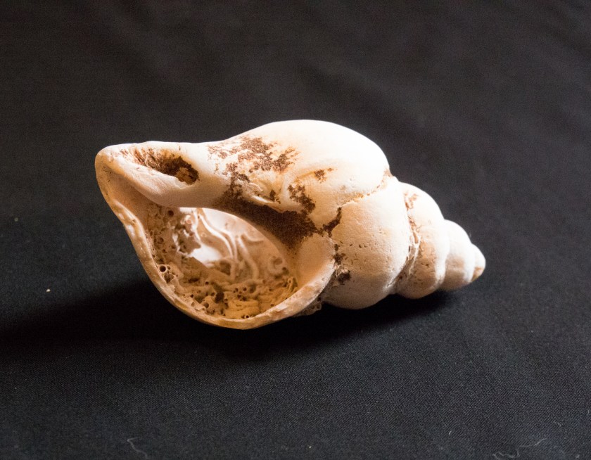
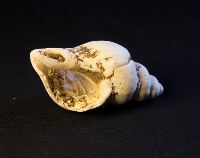
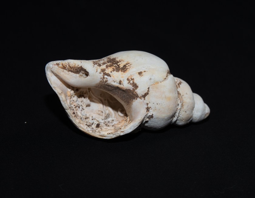
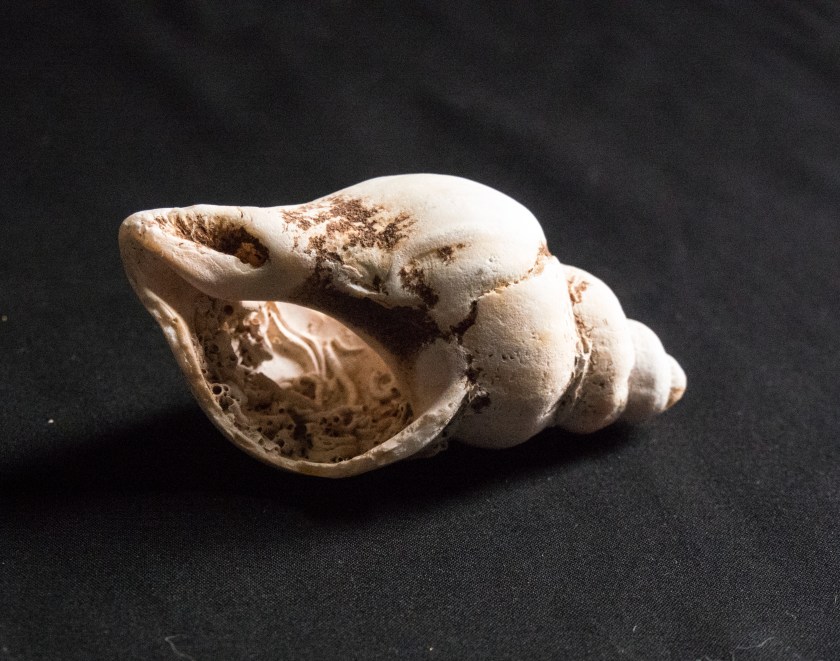
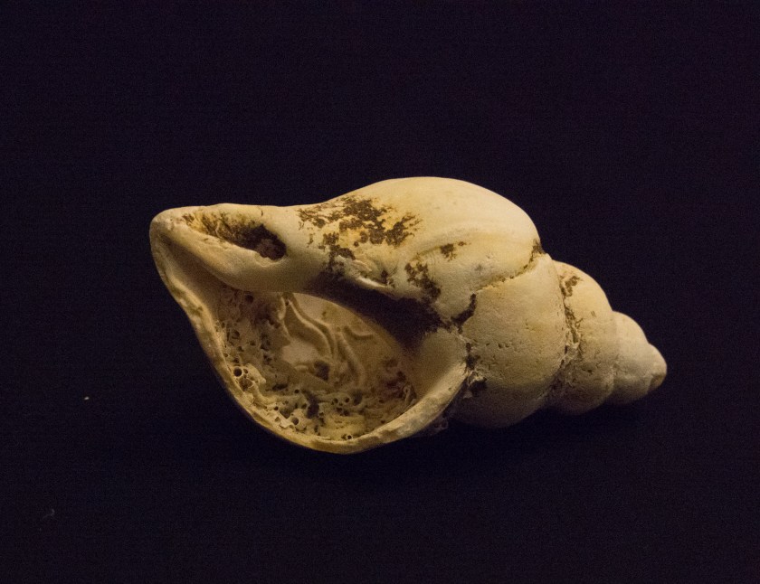
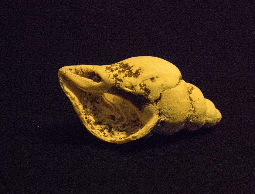
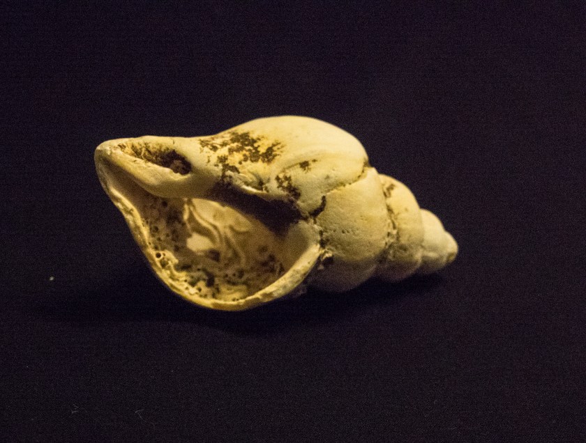
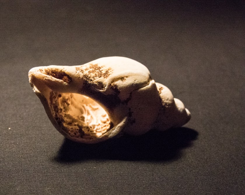
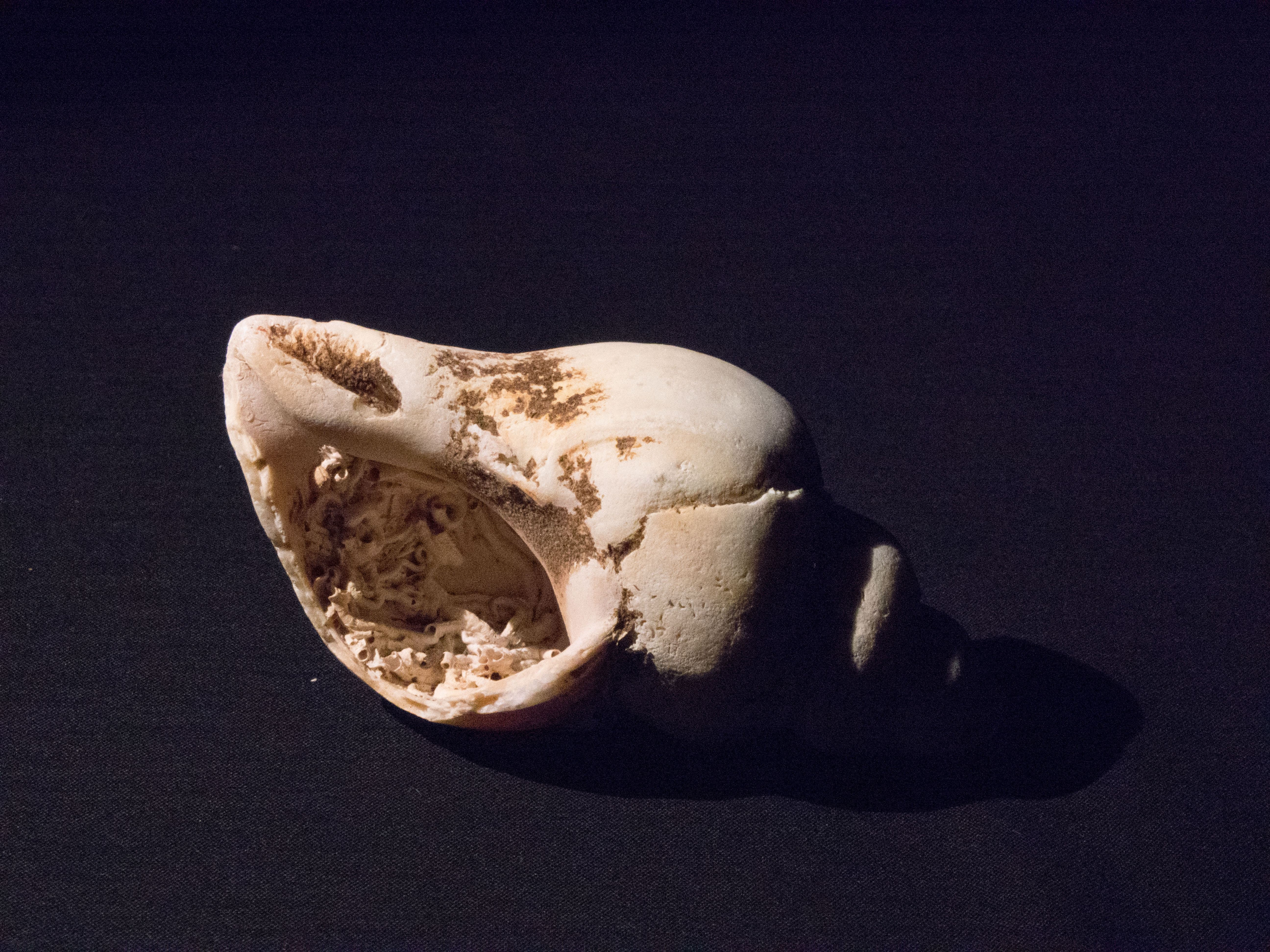
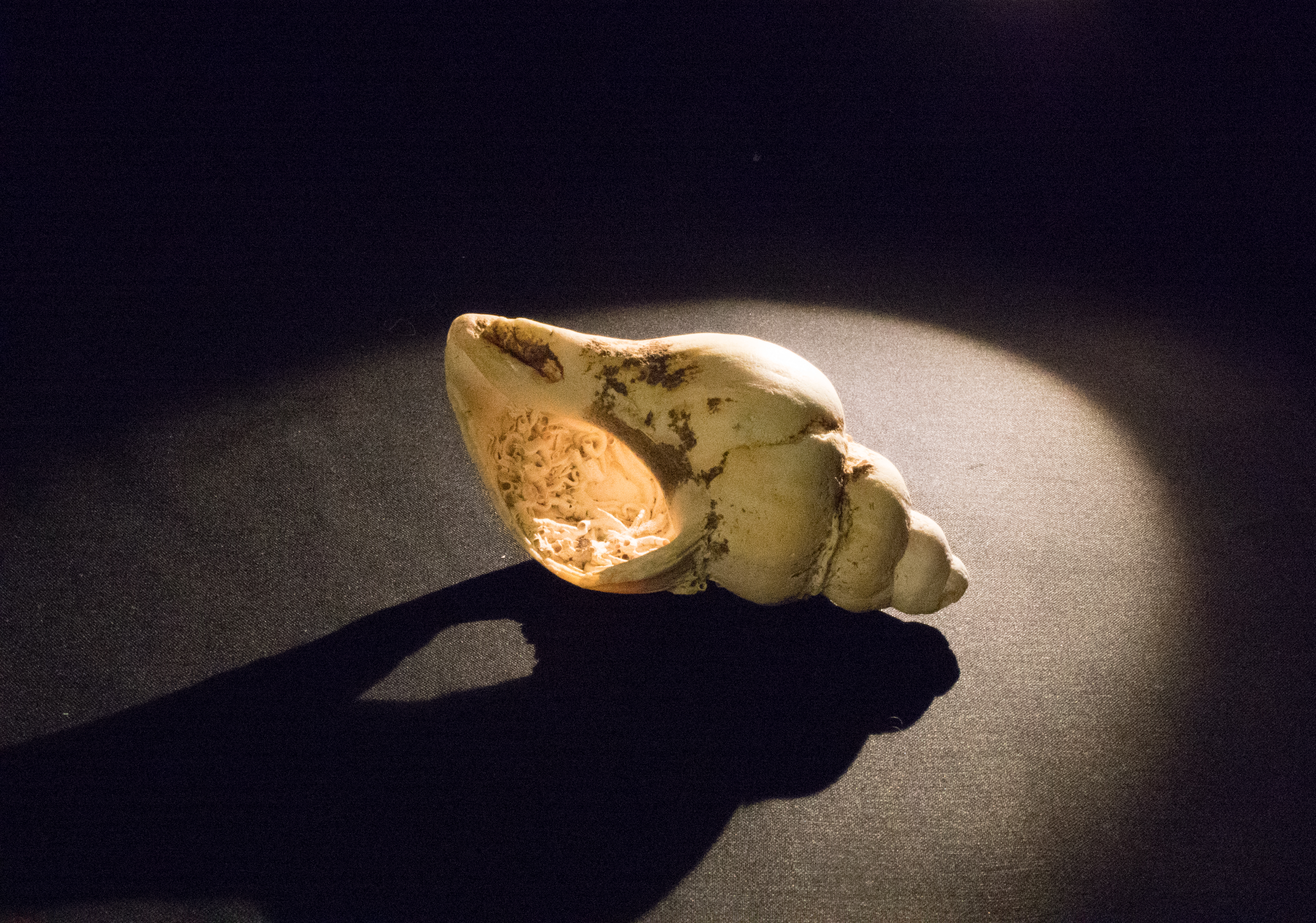
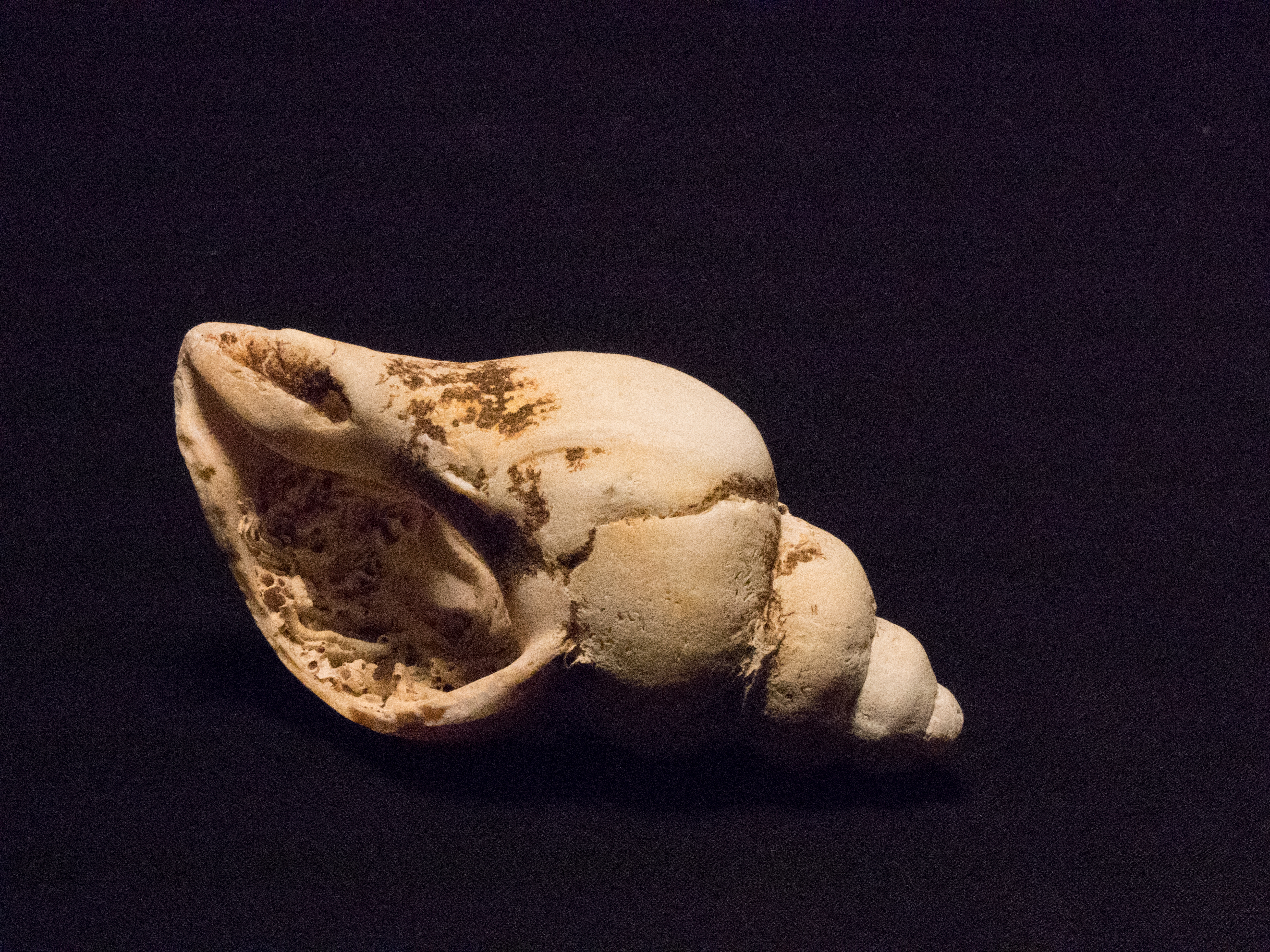
Brief: Use a combination of quality, contrast and direction of light to light an object to reveal its natural form.
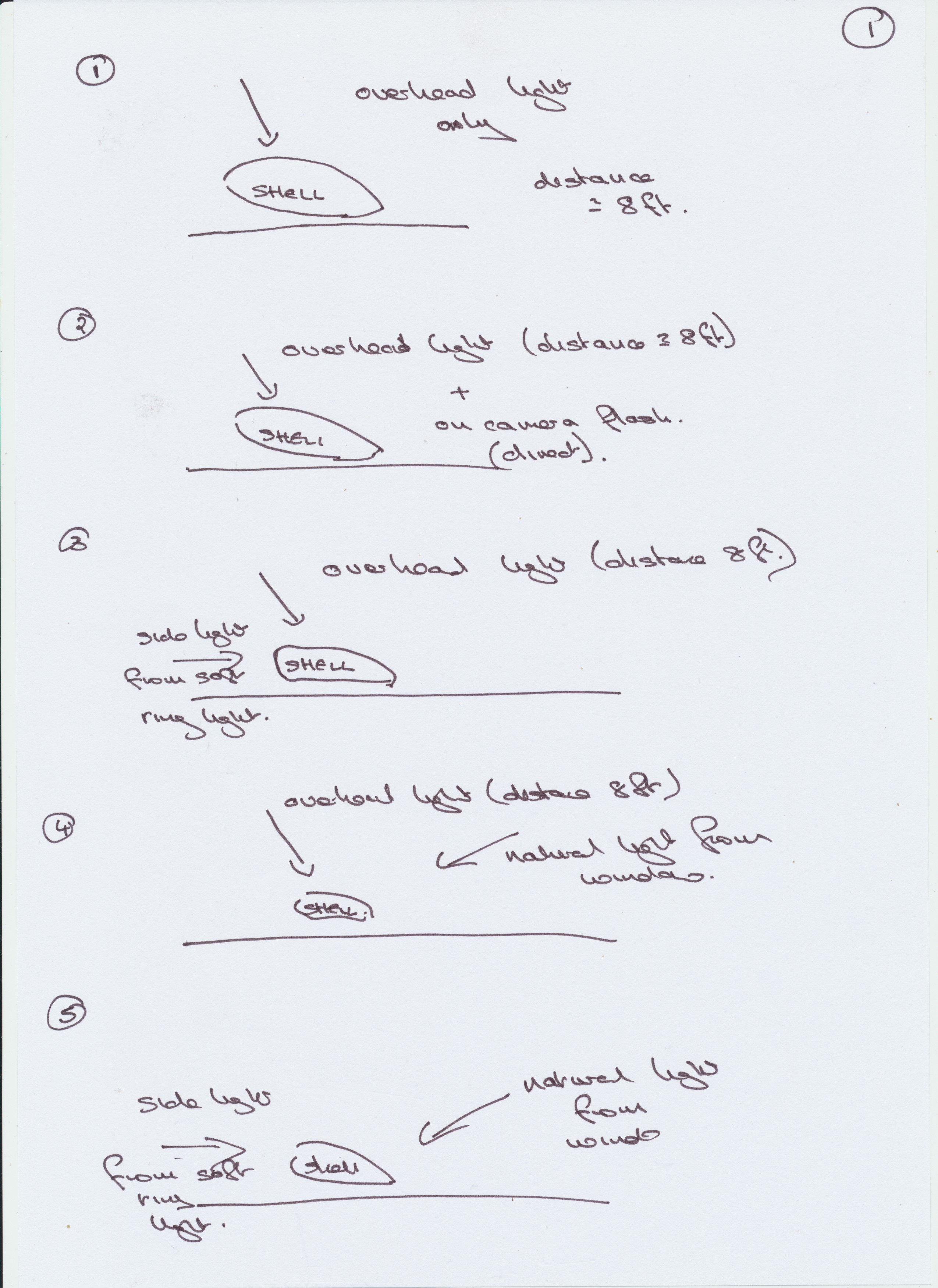
I spent some time experimenting with this. I chose to use a simple and quite weathered shell, placed on a black piece of cloth. I used a variety of lighting:
daylight
overhead artificial light
a soft ring lamp
a hard point lamp
on camera flash
and tried these out in a variety of combinations. The camera was set on a tripod and I used a remote trigger to allow for the increased time. I focused manually, but saw when examining the images that the focus was not always on the most interesting area of the shell. This would be worth revisiting using a greater depth of field.
I ended up with 14 variants on my first trial:
Overhead Light only
Overhead Light + on-camera flash
Overhead Light + side ring light
Overhead Light + natural light
Natural light + side ring right
Natural light + on-camera flash
Natural light only
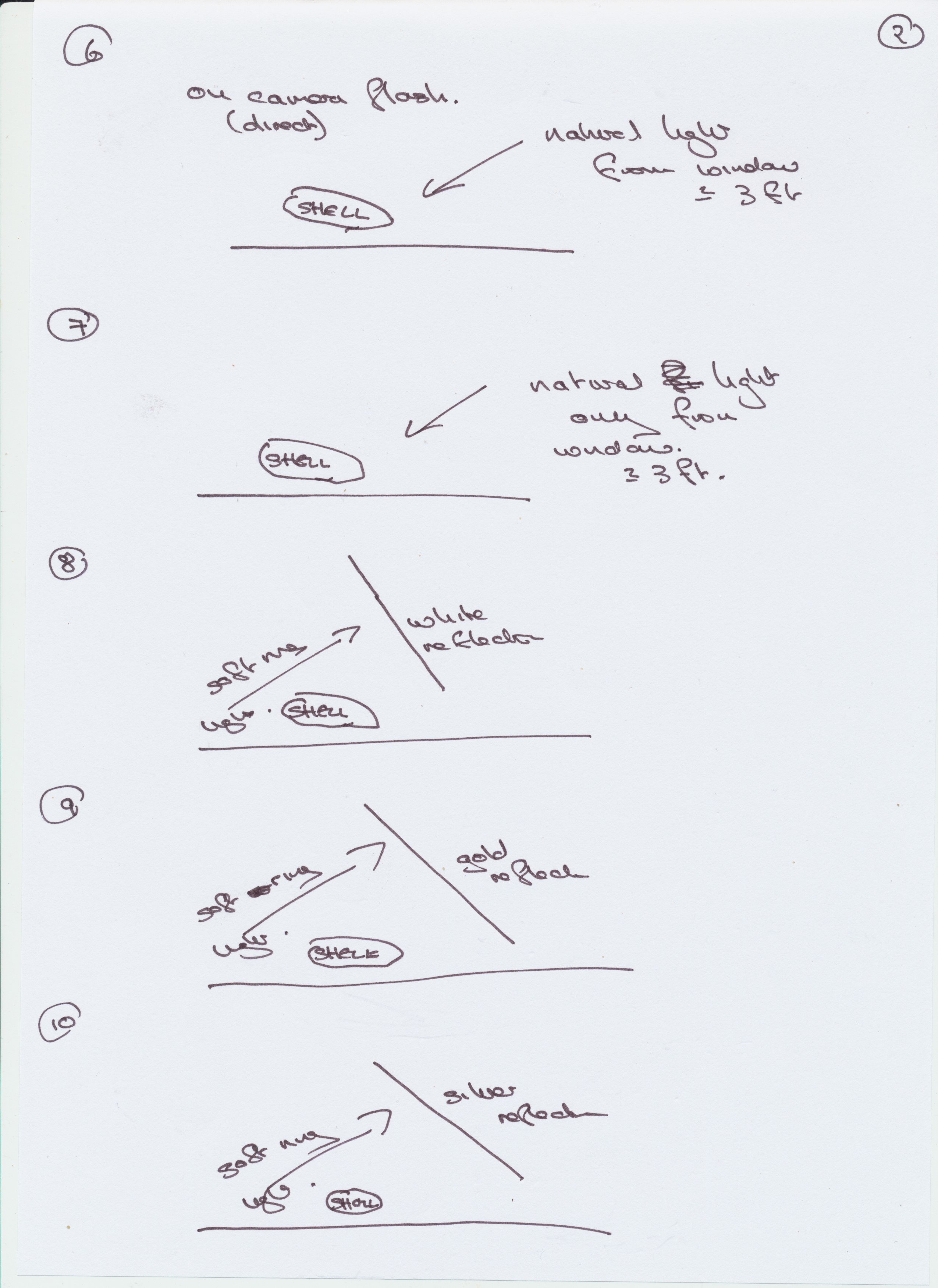
Ring light + white reflector
Ring light + gold reflector
ring light with silver deflector
point light + silver reflector
point light only
point light + silver reflector straight
point light + diffuser
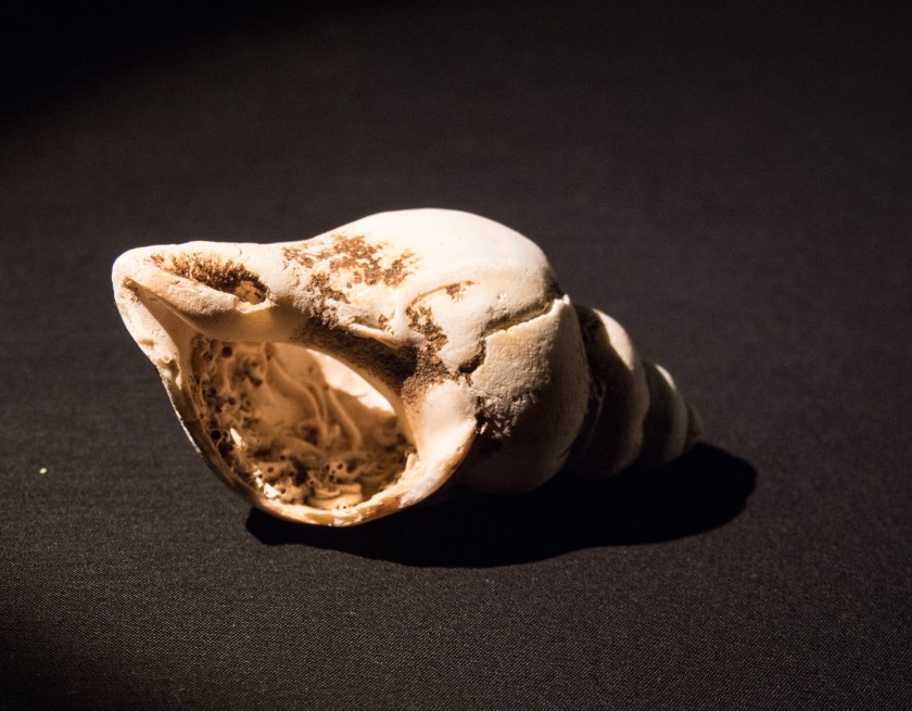
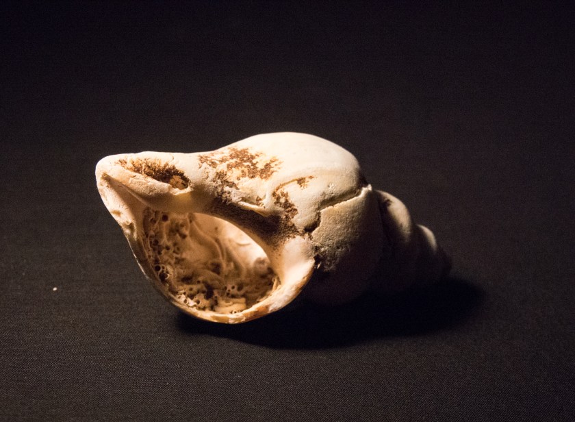
Out of these the ones that I thought most interesting were the ones with the point light, they dis not show as much detail of the whole shell as those with a more intense light such as the natural light with added flash, but seemed to have the potential to give more sense of the shape of the shell – so I went and experimented further. I used mainly a single point light from various angles , and then added in a second softer light to cut down some of the shadow.
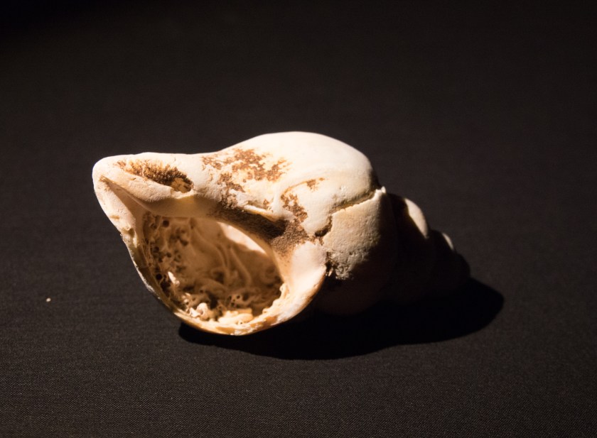
point light from above
2 x point lights from side
point light from behind though shell
Point light from above
My overall favourite image is the top right of these using 2 lights with the inside of the shell lit up, and a slightly softer shadow.
It would be worth experimenting further with flash bounced off a reflector.
The brief: Search for Google images on a subject, then add your own images paying particular attention to the criteria for creativity. (imagination, invention, experimentation and development of a personal voice). Describe how your images are different from the ones in Google search.
I spent some time thinking about a subject for this exercise, looking at peppers (thinking of Weston), landscapes (Fay Godwin), shells (more Weston) and flowers (Carla van de Puttelaar). If you look at the Google screen shots of these 4 subjects they are all remarkably similar. They are pretty, in the case of the landscape sometimes beautiful). They are all colour images – this surprised me. Most of the individual images are on a white background, again this surprised me as it would rarely have been my choice. Everything looks ‘perfect’, no blemishes to be seen. All could be used in advertising pictures , although the advertisement might be very boring.
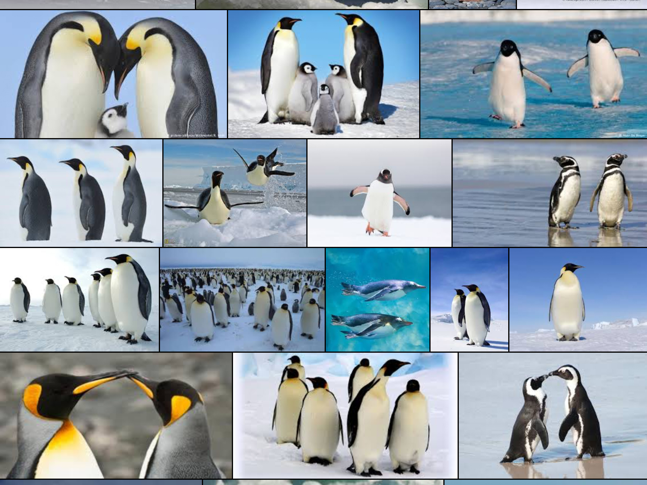
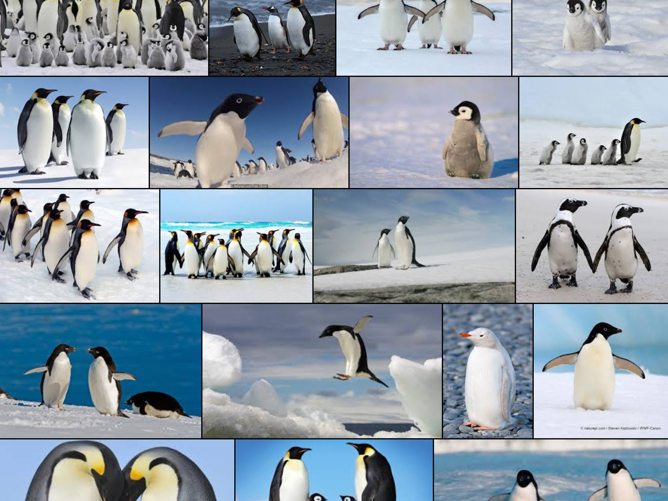
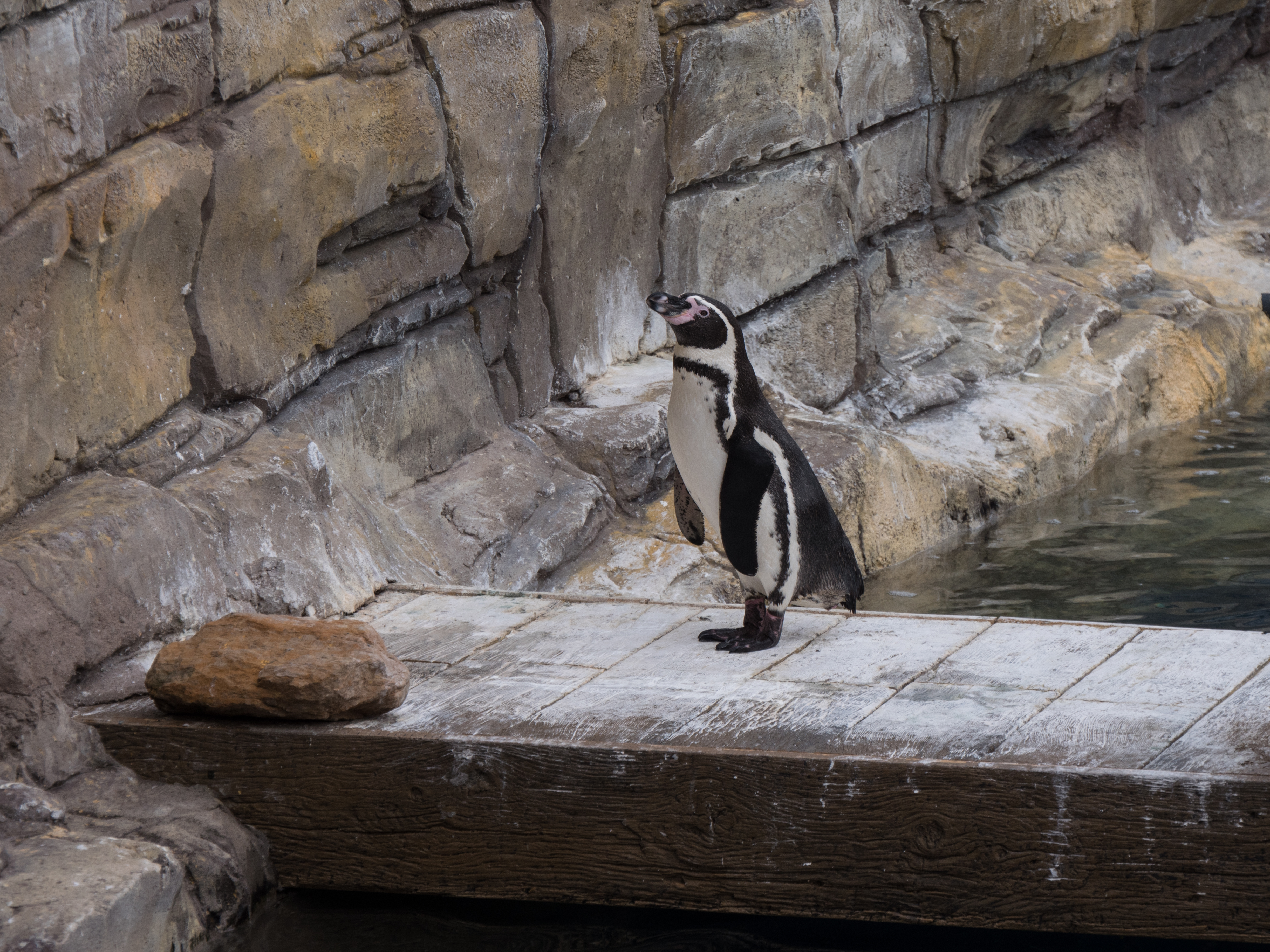
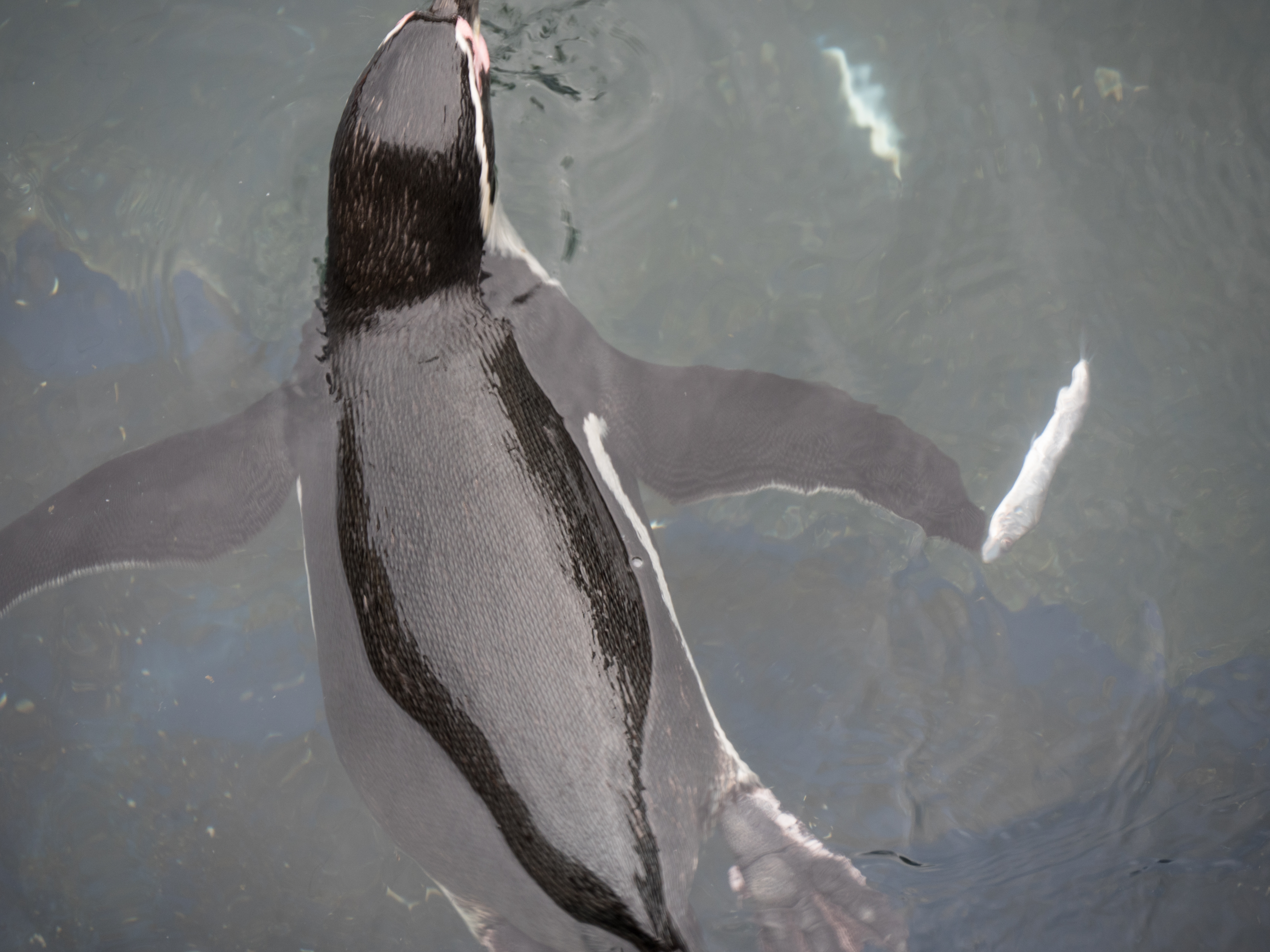
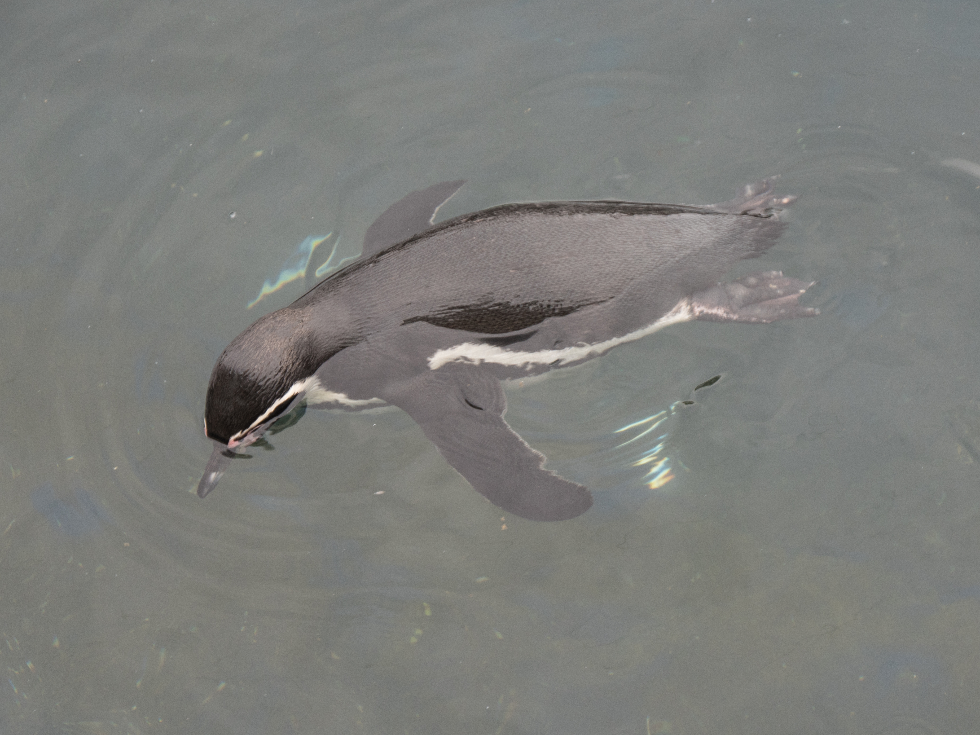
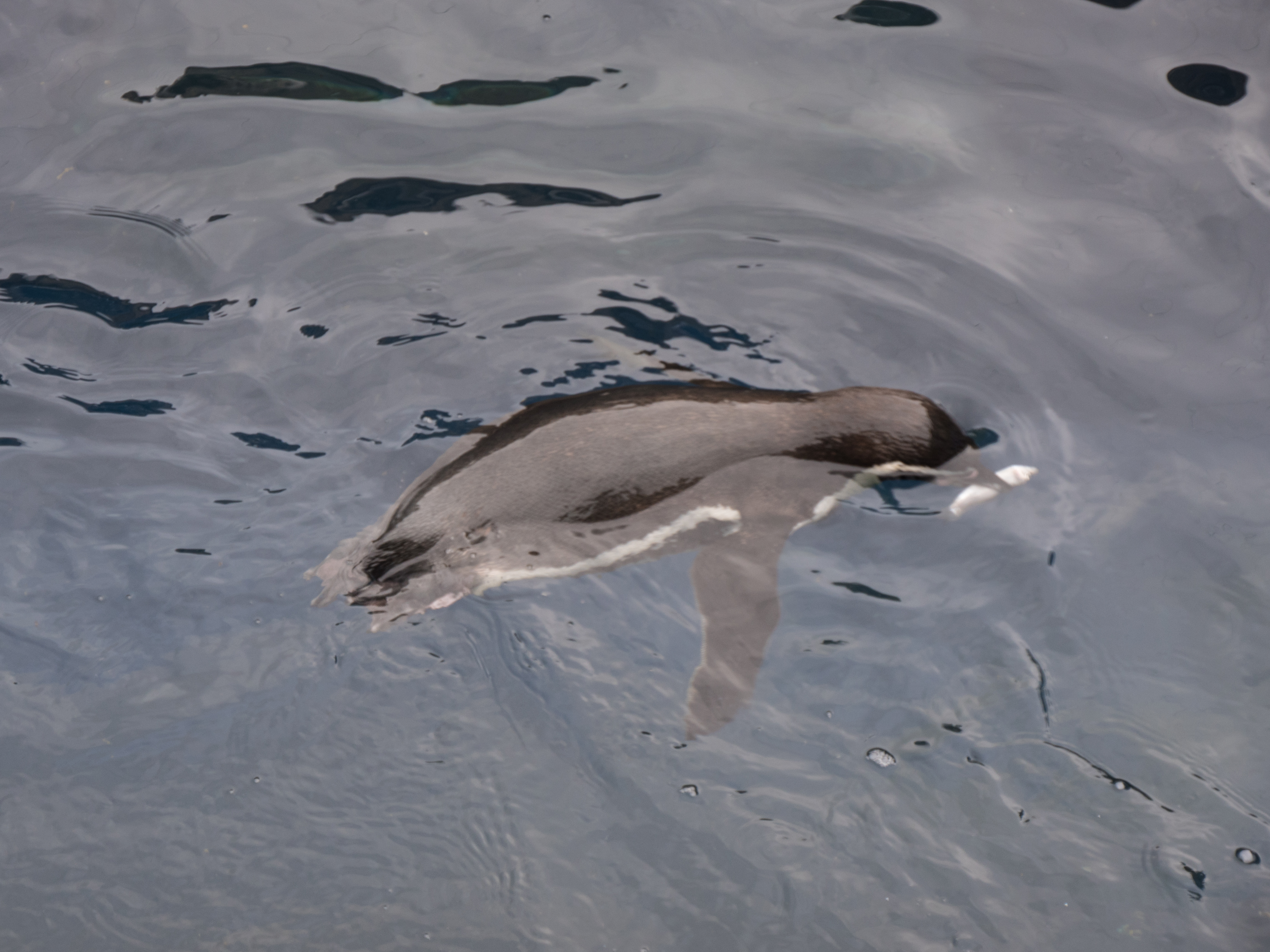
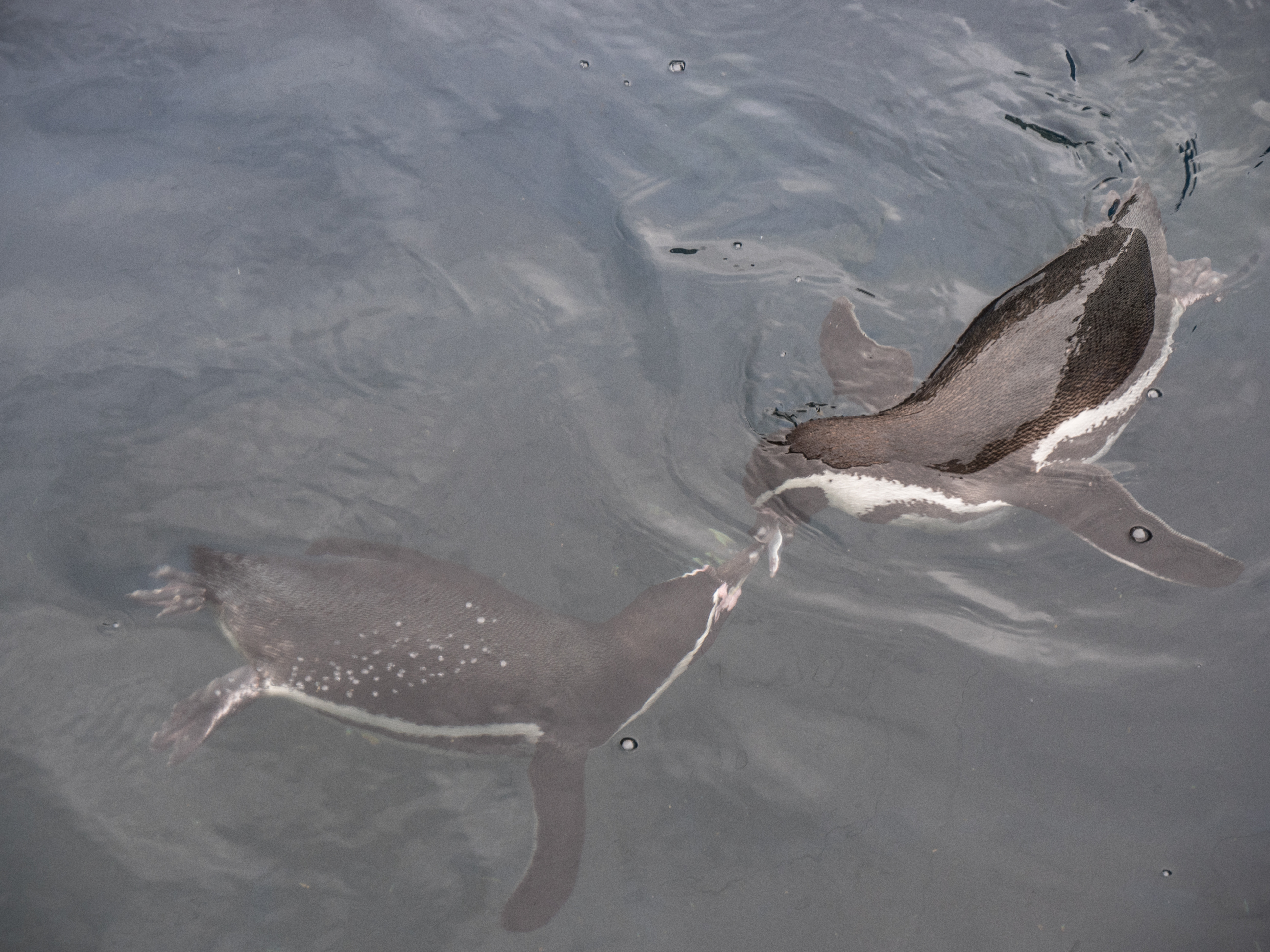
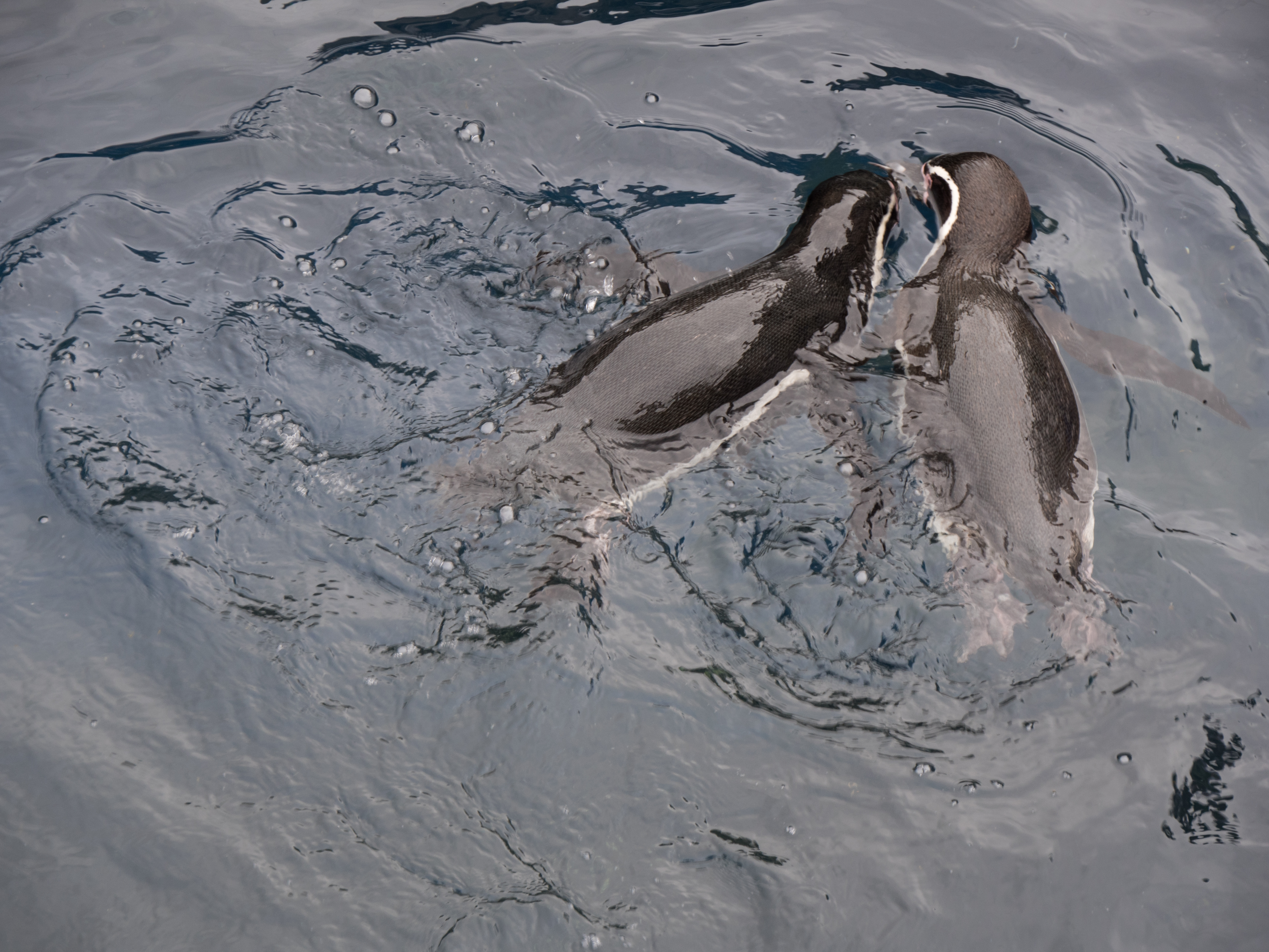
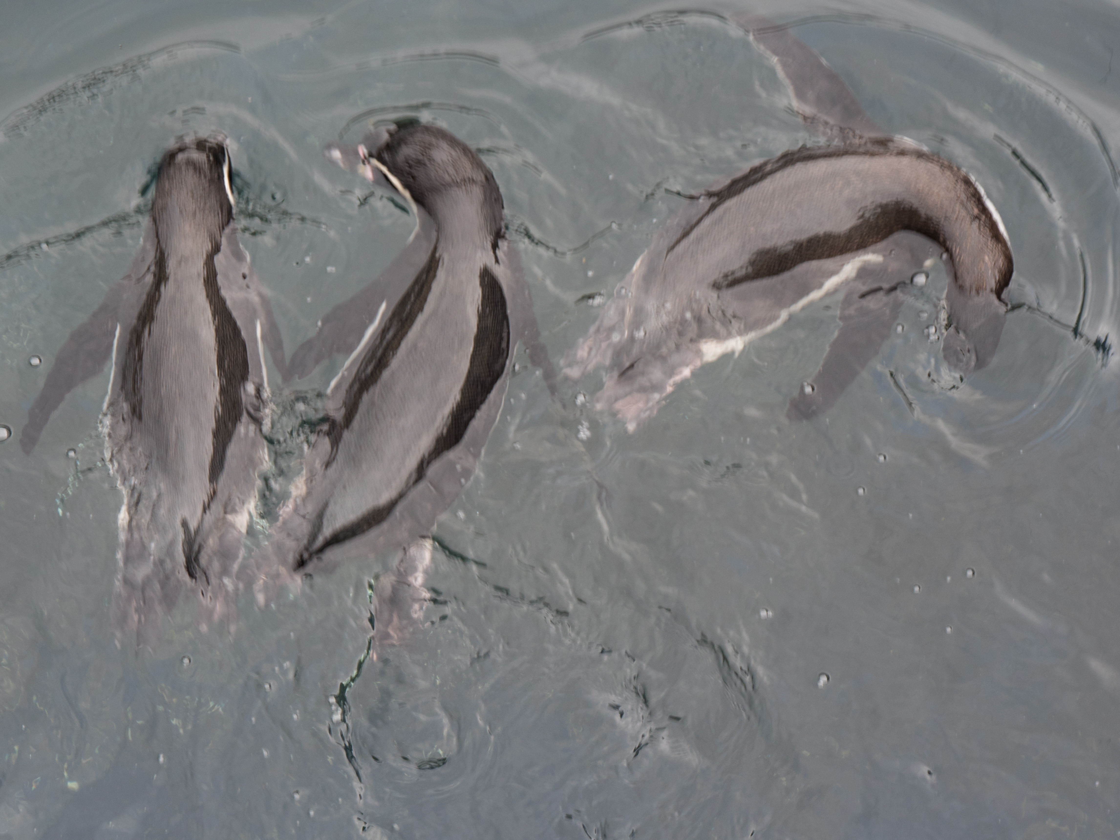
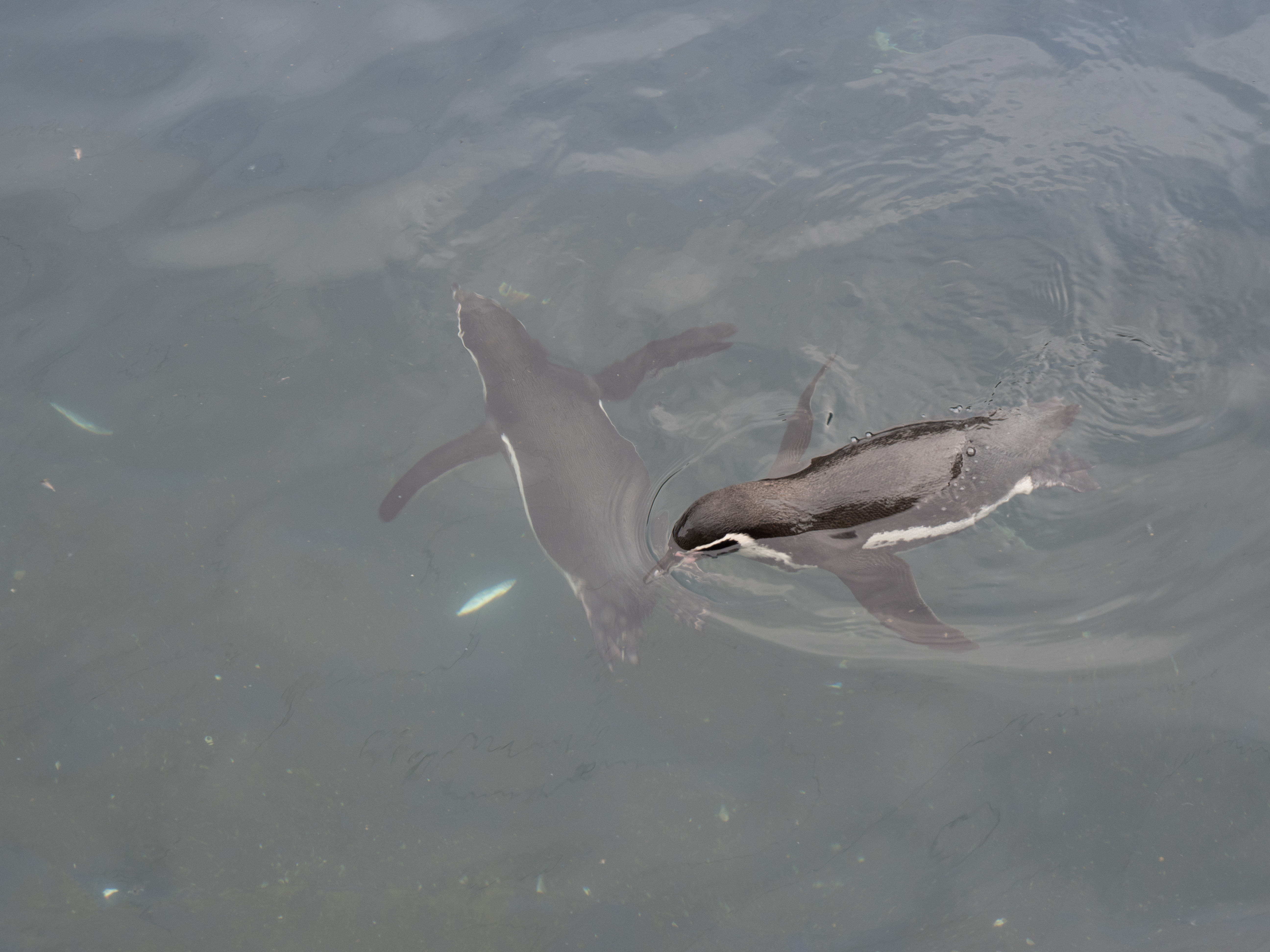
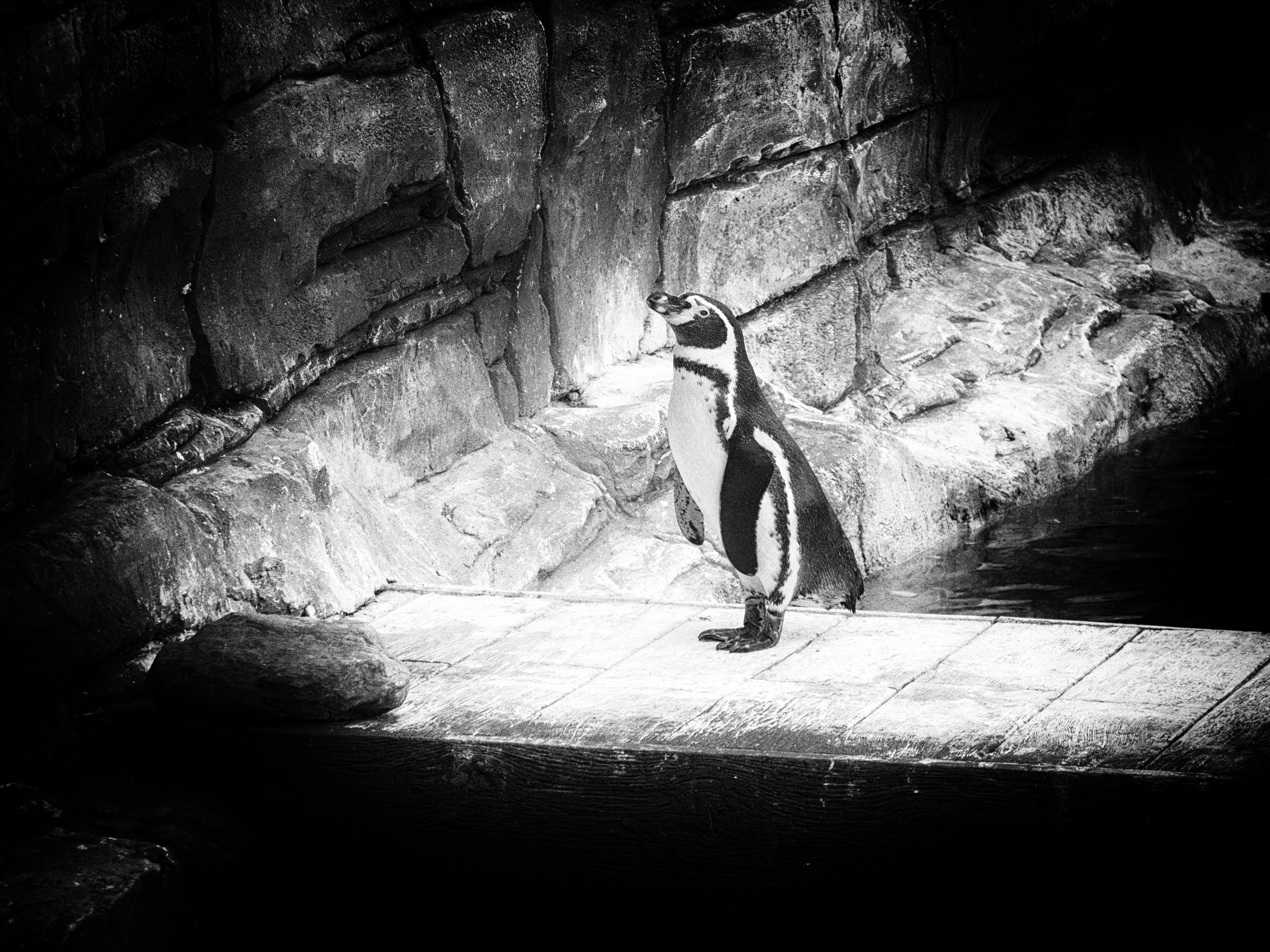
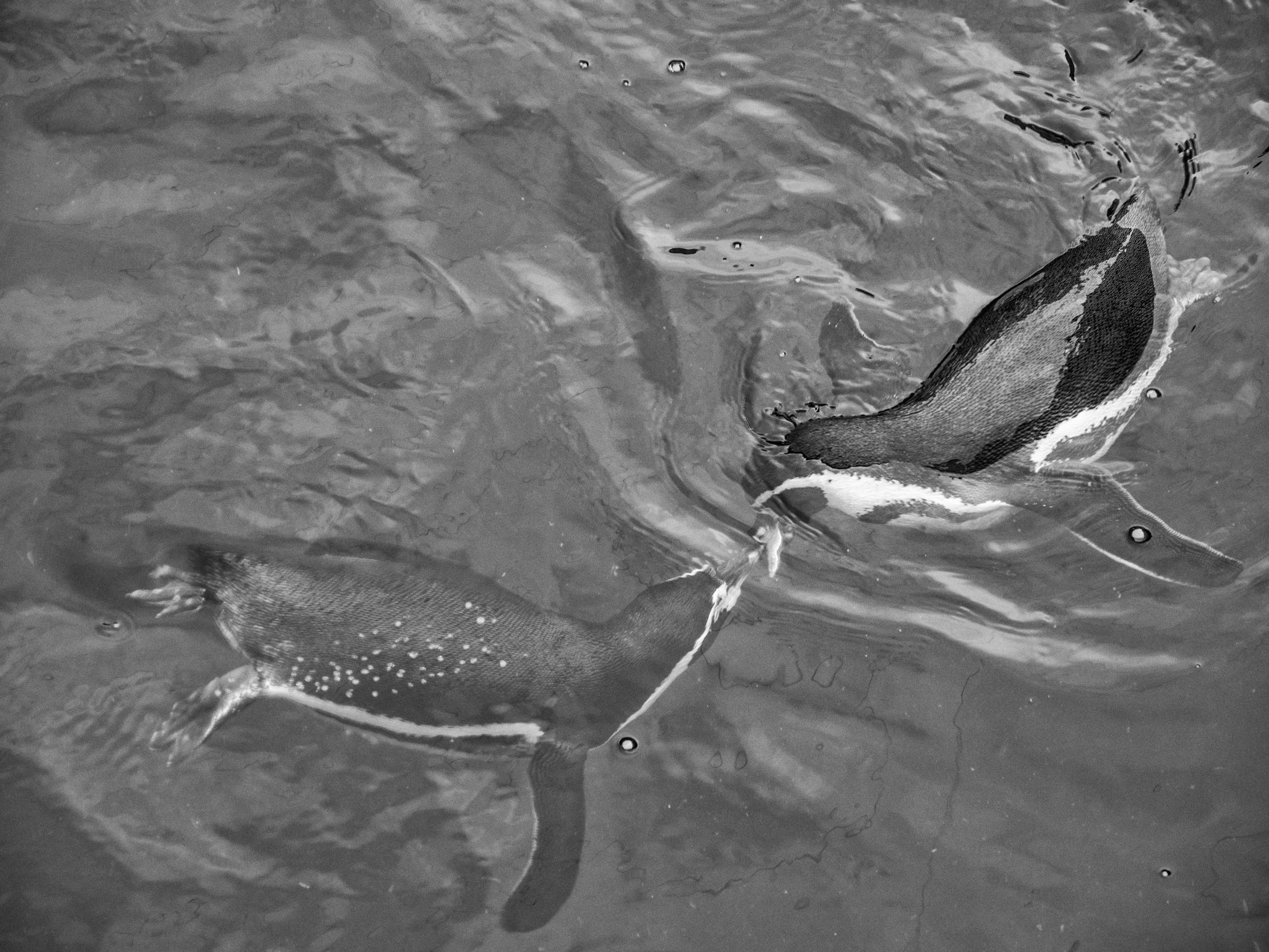
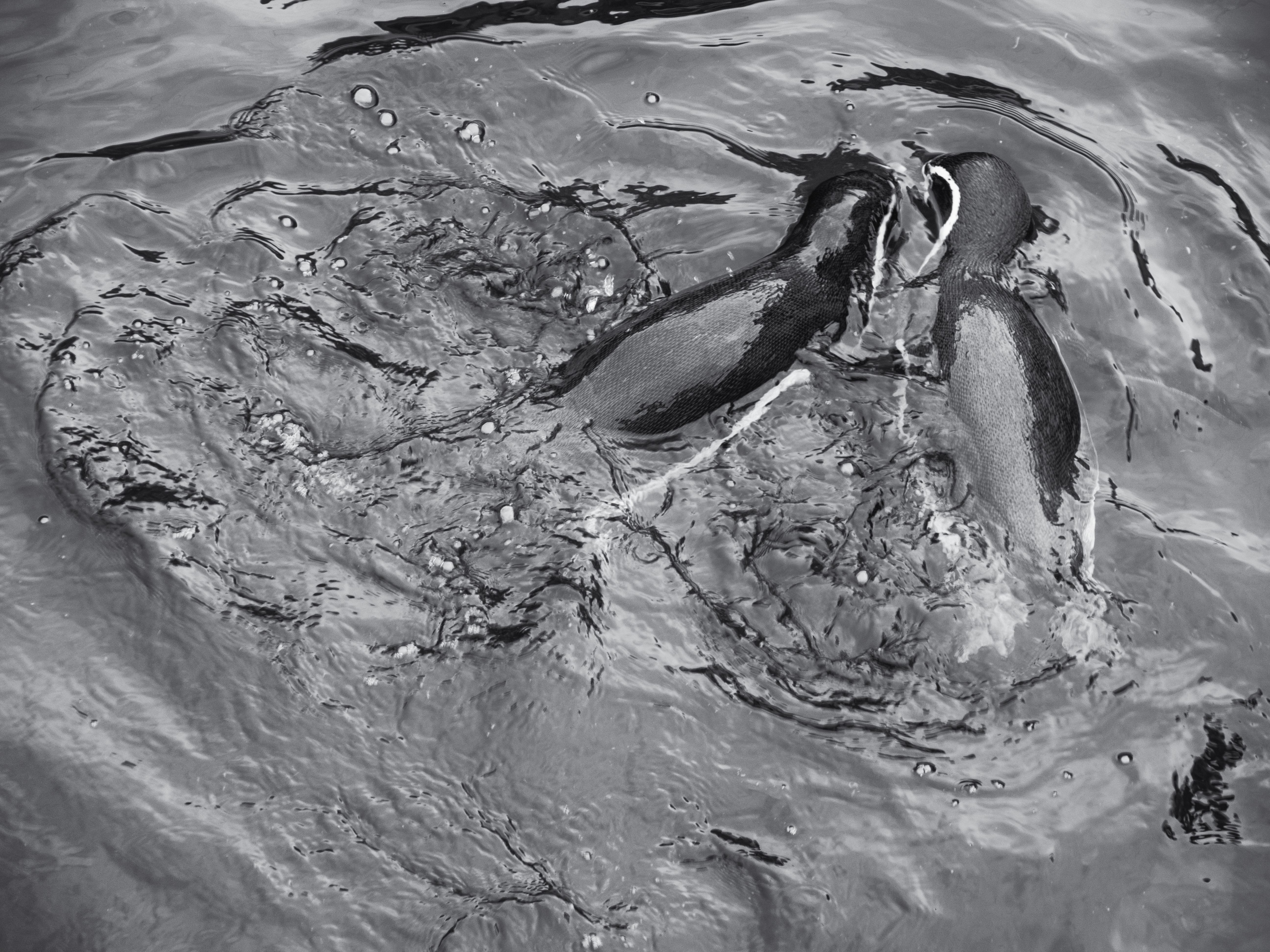
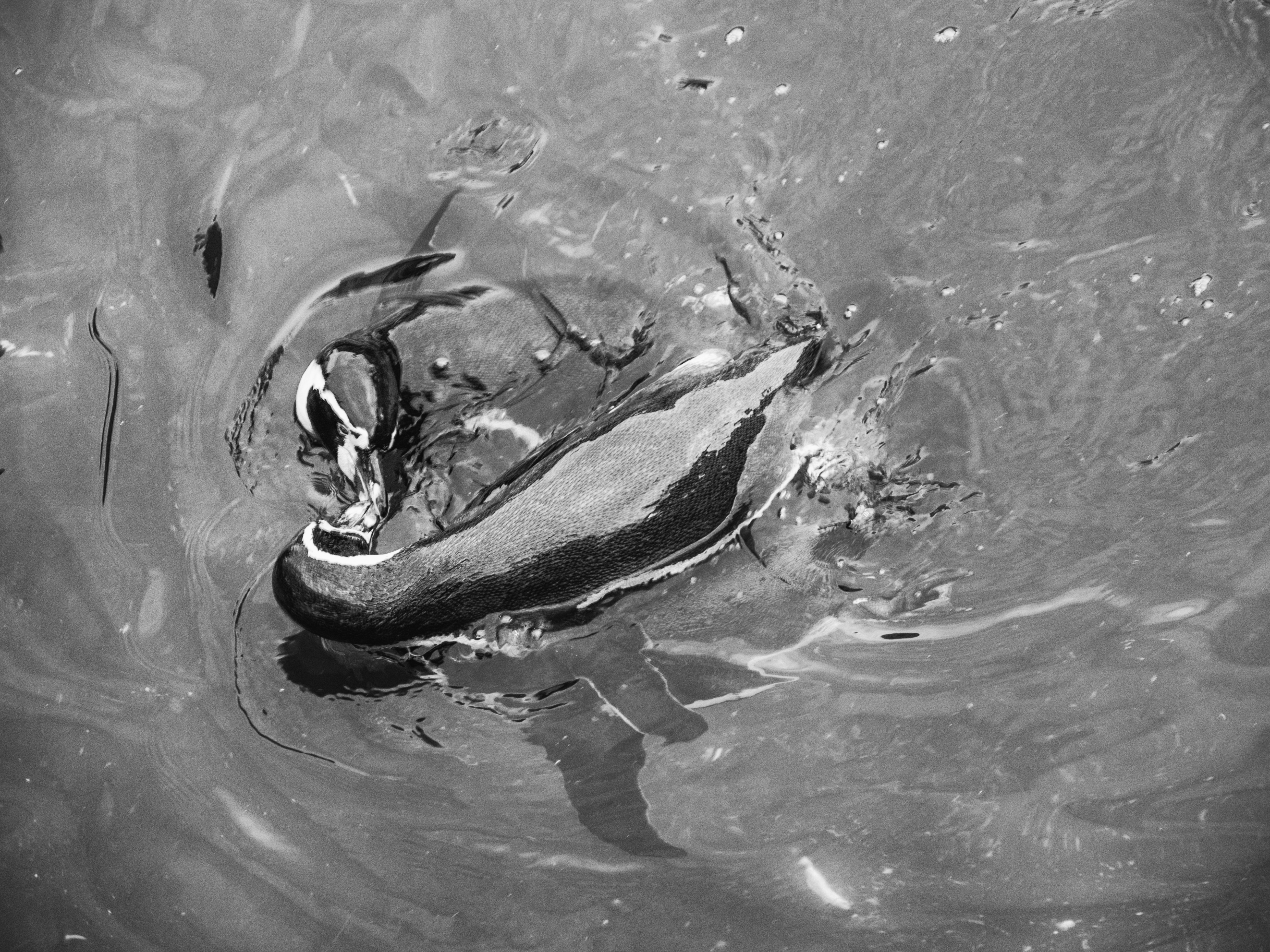
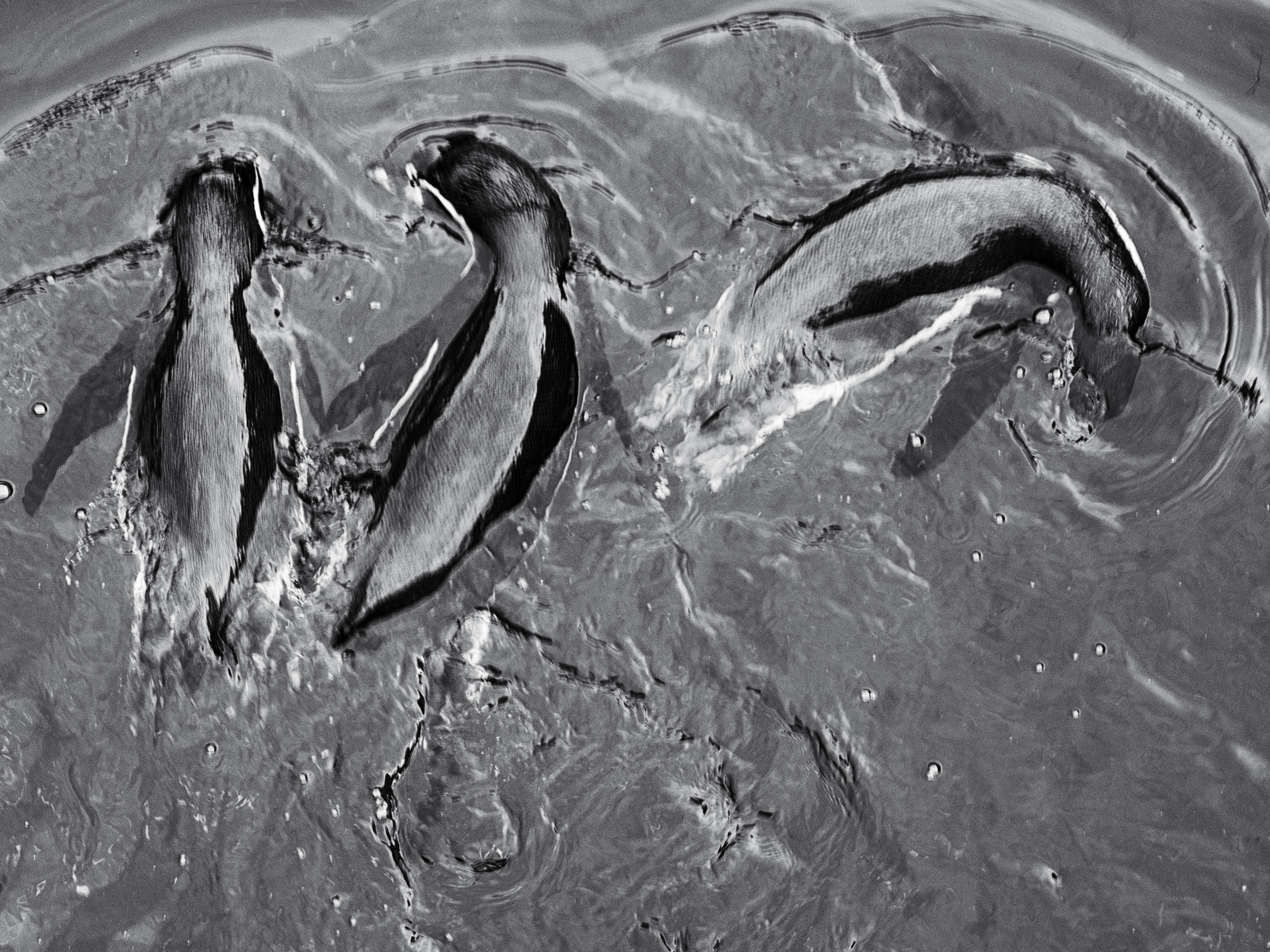
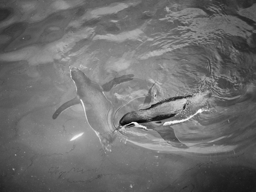
I eventually decided to go down a different route and took pictures of penguins at our local sea-life centre. This was a challenging exercise, partly because they were often moving very fast, partially underwater, and, like often in Scotland, the light was not great.
On looking on Google the images are generally similar in theme to those above. The images are in colour, they are attractive, show the penguins in their natural environment (where few of us will have the luck to see them) and they are resoundingly cute.
I felt that I wanted to show penguins in a different way. Yes, they do spend a lot of time in the snow, and yes they can look very cute, but here, when we most often see them, they are shut in a relatively small pen. Their main environment is water, and I thought it was important to try to show how they related to that.
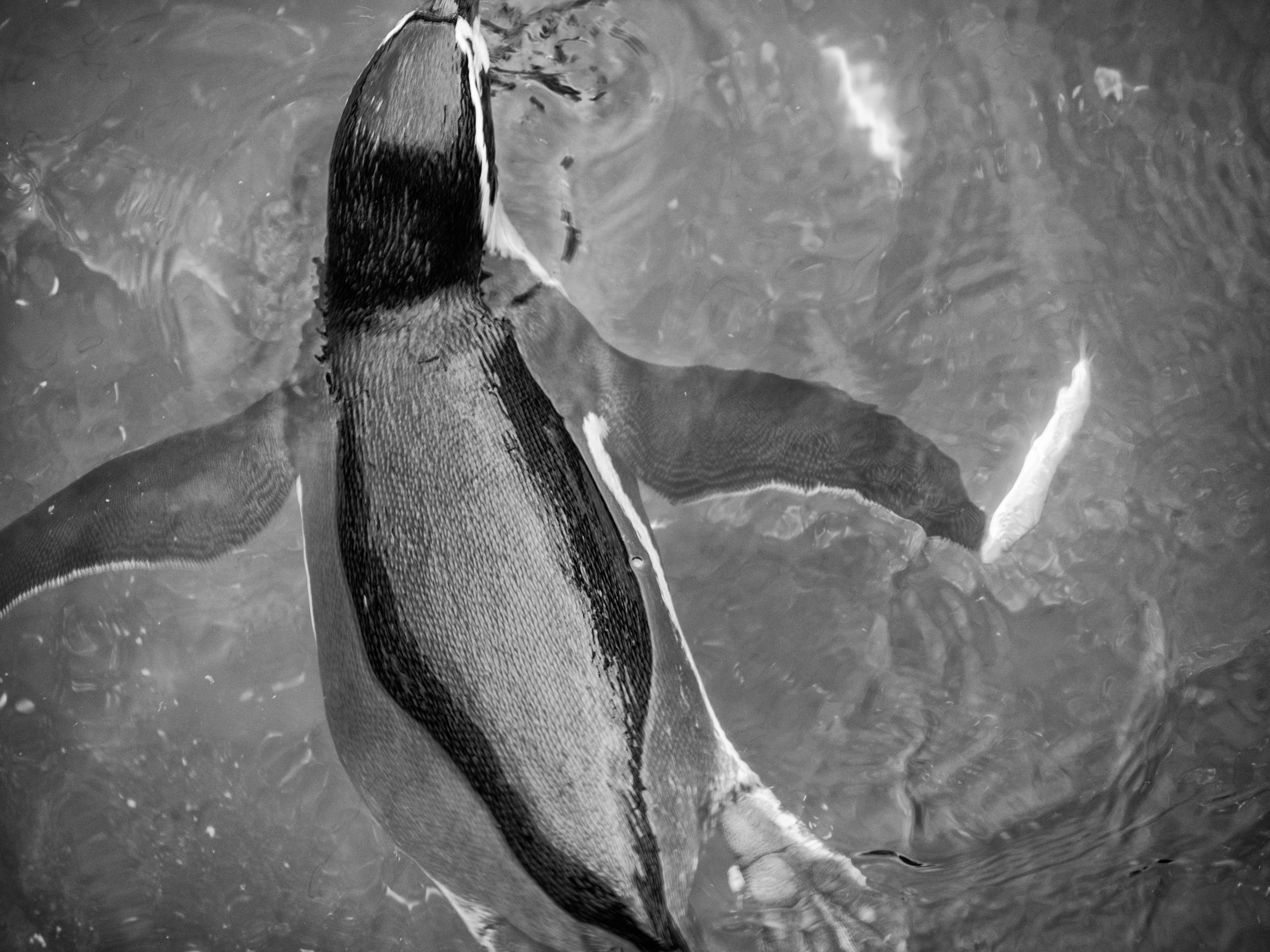
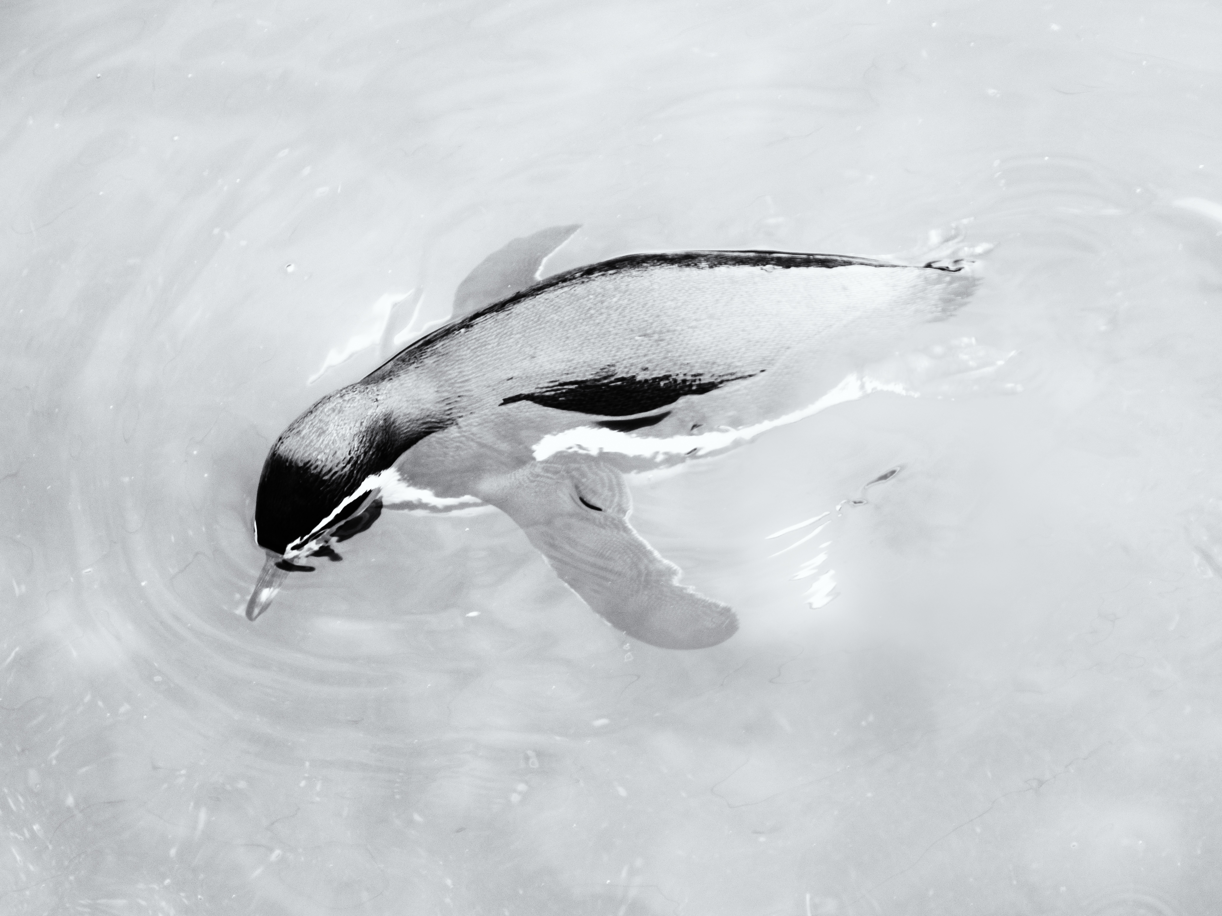
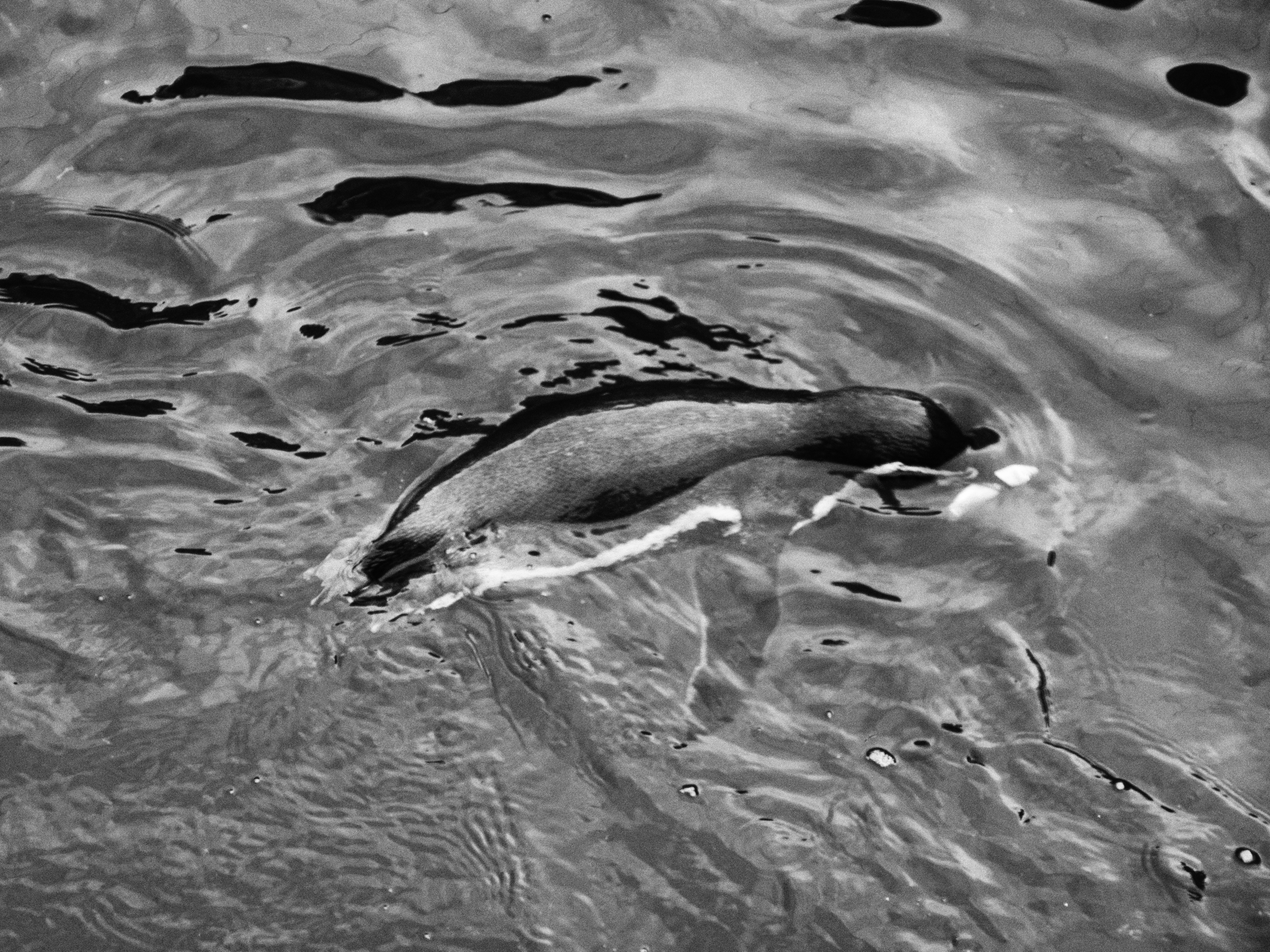
I then changed the images to monochrome in Silver Efex 2, using a variety of processing changes to try and get the watery effect I was after, while still maintaining the essential nature of the penguins.
I was happier with these images as they seemed to show the penguins in their natural habitat, without distraction of colour.
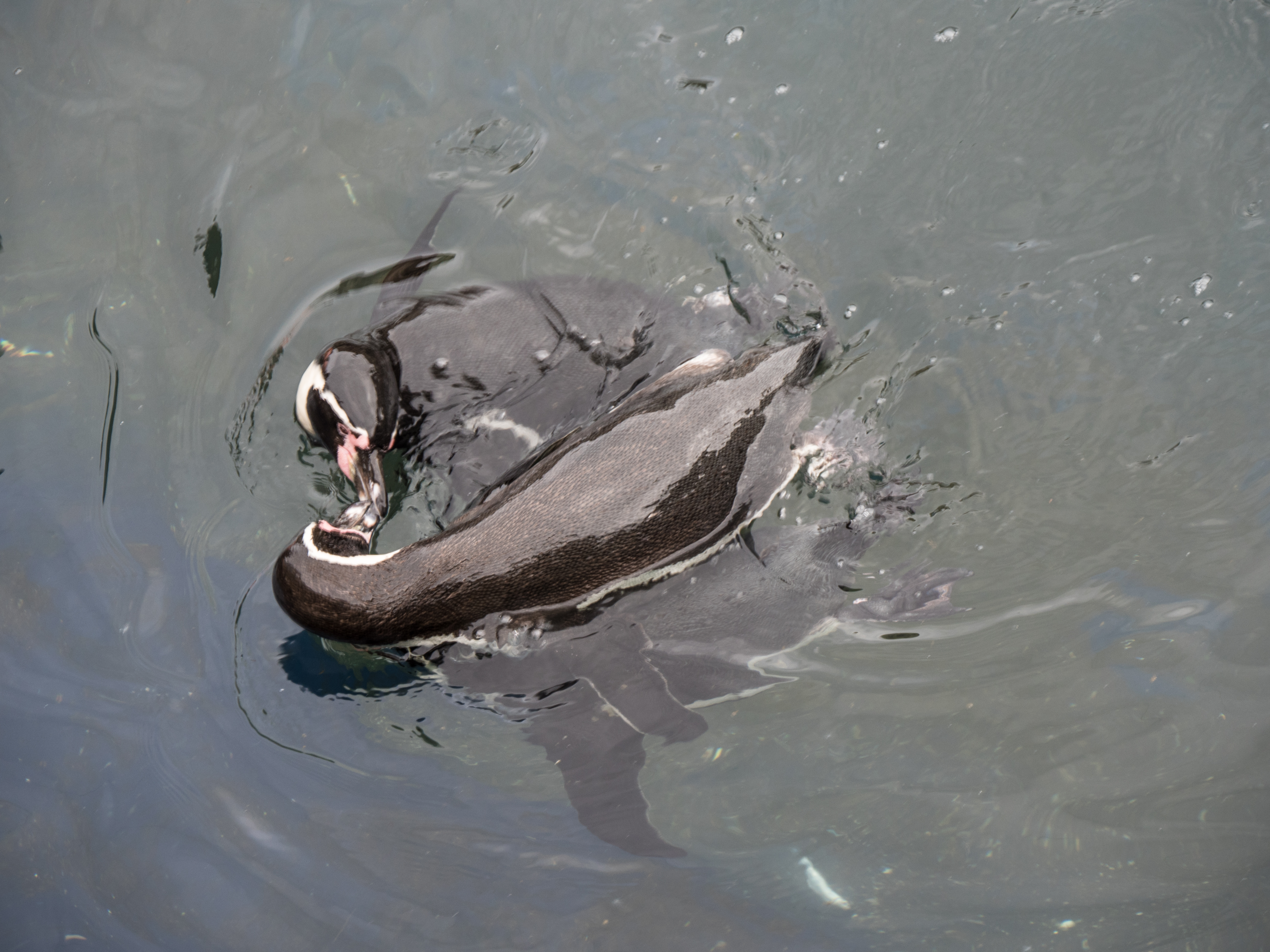
The image I am most pleased with is this one as there is minimal distraction, they are clearly having fun and you can see the outline of the underwater penguin well:
Learning points:
most of the images on line are very similar, and concentrate on the ‘pretty’ and ‘cute’ aspects of photography
This exercise is about thinking and noting the difficulties in getting a ‘new’ vision of anything or anywhere.
This shows a Google screenshot of Mount Fuji – classic images, all very similar
and a Google screen shot of Fuji City – there isstill a focus on the mountain – little of either detail or originality
In the whole series of images by John Davies on Fuji City the mountain is either absent or only minimally present. There is no ‘traditional’ shot with blossom and snow in sight. These are not pretty, but striking and much more evocative of what Fuji City is likely to be like in modern day Japan (Fuji City, 2008). The series by Steele-Perkins on Fuji City is very different, more personal with people and close incidents, e.g. a person struggling to walk in the snow. Again, the mountain is relegated to the background (Steele-Perkins, 2002 ).
If you Google images of Dunfermline (my local town) there is the same effect, most of the images show the Abbey, which while attractive and a tourist destination, tells you very little about the town itself, or the lives of the people there.
So – how do you see something in a unique way? Do you spend a long time looking (as suggested by Haas and Bailey)? Do you let the camera see (Bill Brandt)? This is about developing one’s own style and way of thinking. If I look at most of the images in my collection, they probably do not say much about me and my personal thought process.
There is a further complication if you are looking at many images, such as when studying photography. There is an instinctive temptation to follow what has already been done. When thinking about still life – I automatically think of the peppers and shells photographed by Weston.
References
Davies, J. (2008). Fuji City 2008 – no.608. [online] Johndavies.uk.com. Available at: http://www.johndavies.uk.com/f608.htm [Accessed 15 Oct. 2017].
Steele-Perkins, C. (2002). Fuji. New York: Umbrage.
The brief: Capture ‘the beauty of artificial light’ in a sequence of shots. Use ambient light rather than flash. Describe the difference from the daylight light shots taken for exercise 4.2.
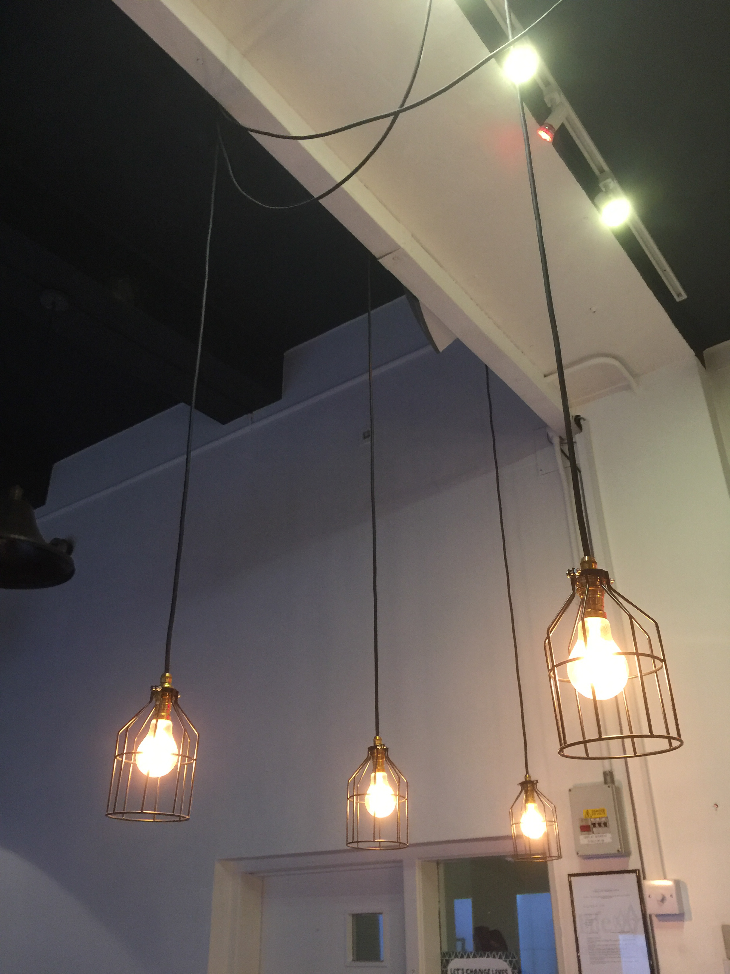
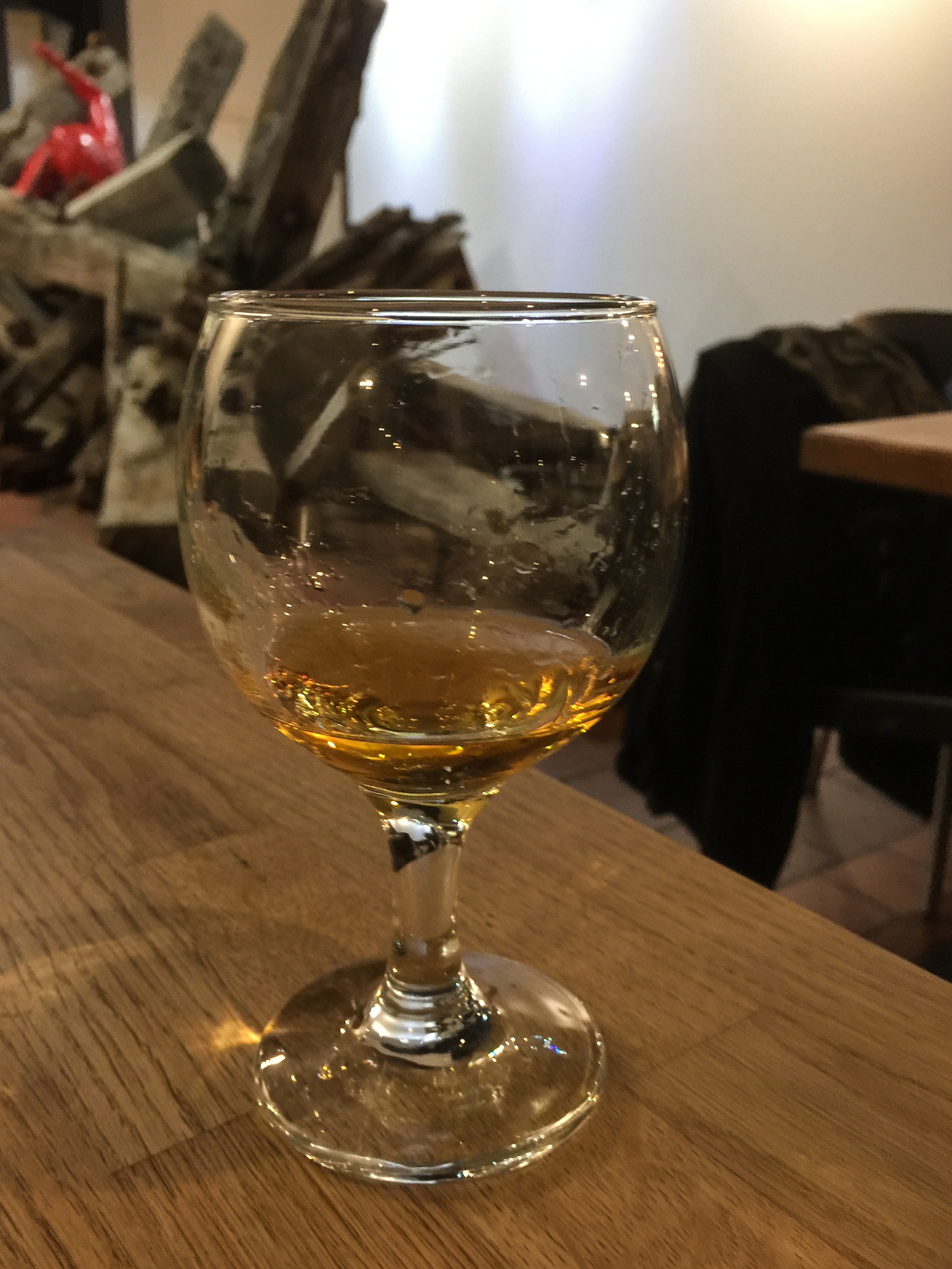
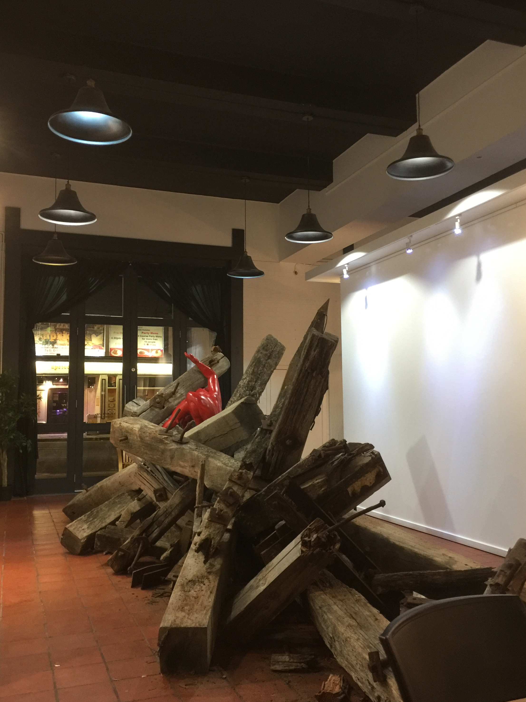
I found this exercise challenging as I rarely take images inside, either by artificial light or flash. The first set of images was taken using an iPhone in a cafe during an evening event. I had no control over the settings in these images, and have not altered the white balance in post-processing. Since taking these I have invested in a ‘pro-camera’ app for my iPhone and am experimenting with that to give me more flexibility in a similar situation in the future. Using the iPhone was needed as the event did not allow for the use of a ‘real’ camera, and trying to use one would have been intrusive, even though I was just taking shots of the ambience.
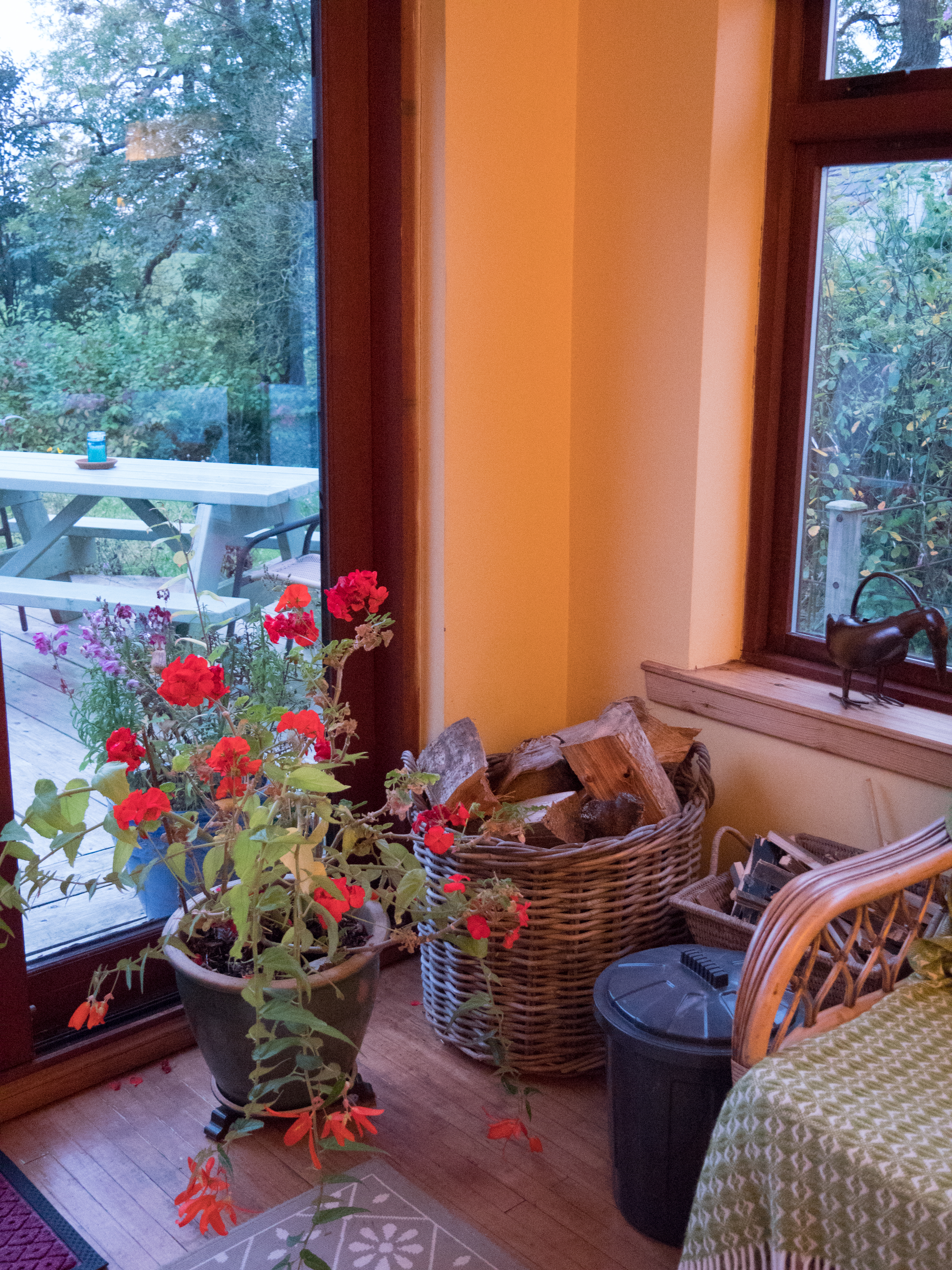
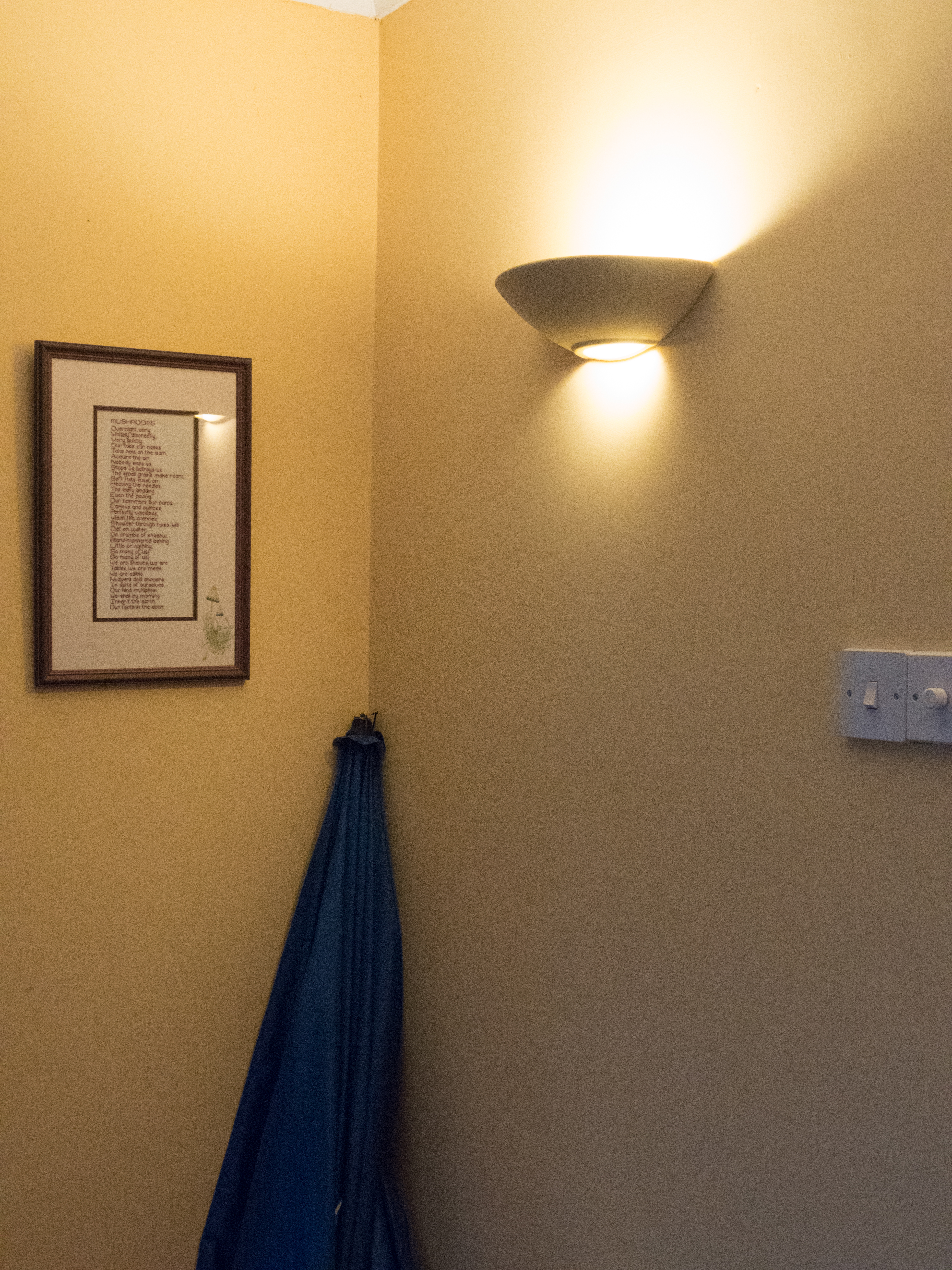
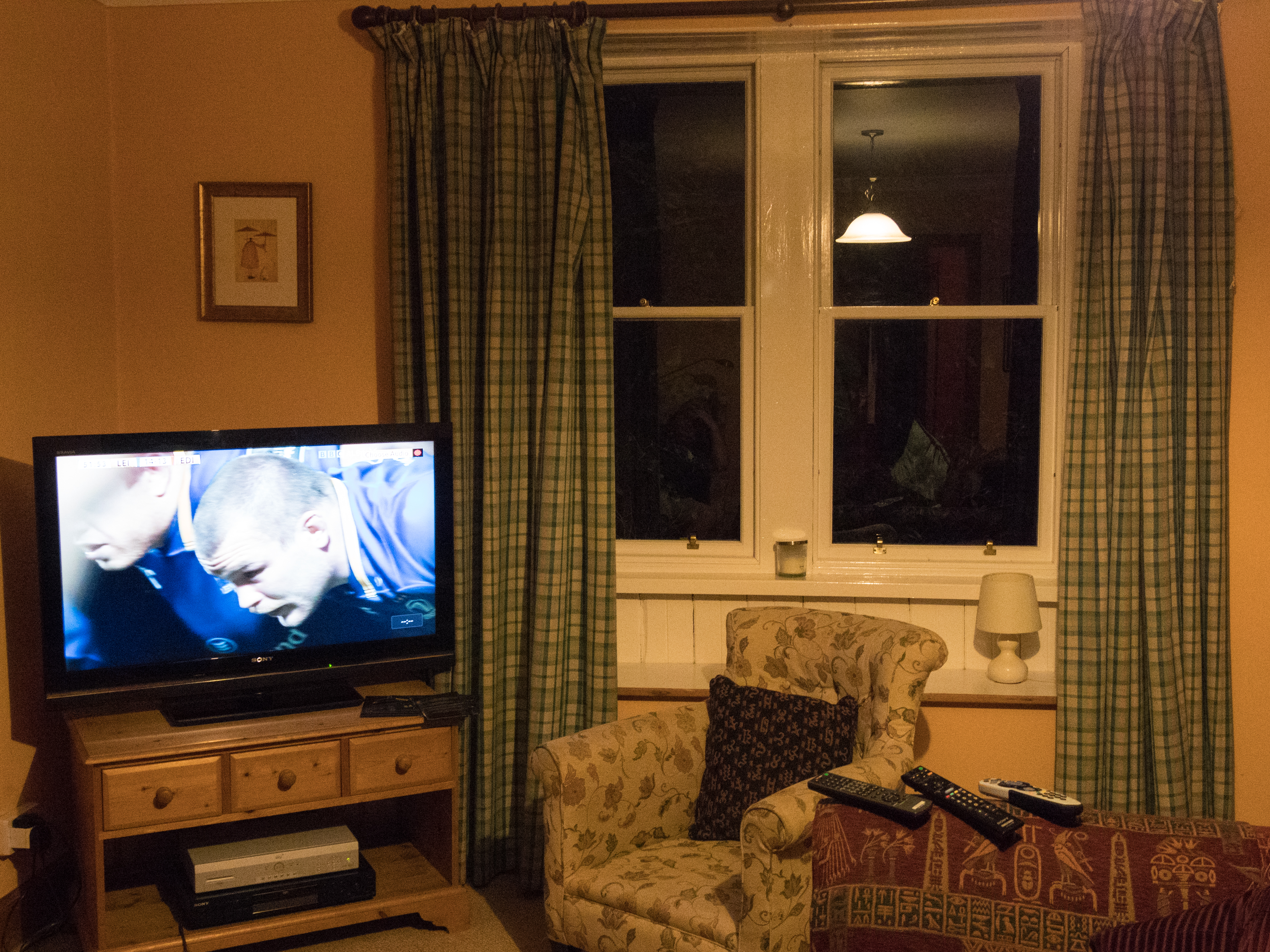
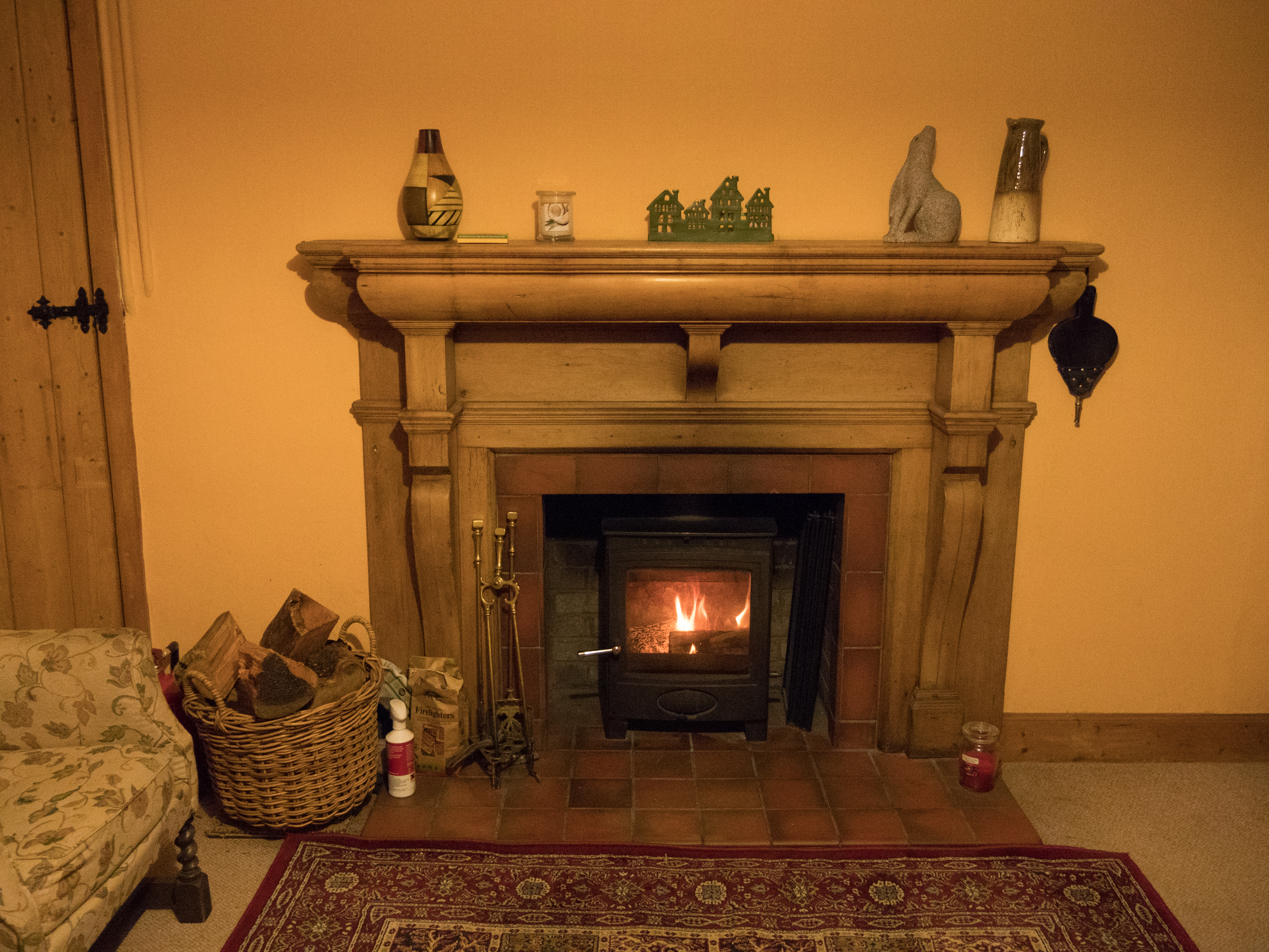
The second set of images was taken in a holiday cottage on my main camera. In this case I used manual made throughout, and altered the white balance to try to replicate the light as I was seeing it. I initially hand-held the camera and then went back and retook some with a tripod. I found that, in spite of the light appearing reasonably bright to my eye, the images needed either a significantly raised ISO (6400 versus my normal 200) or a very long exposure. This set of images is part of a much larger set, as I am considering using them for assignment 4. The first set of 3 images were taken during the day, although as the light was not good (overcast) the internal lights were on.
The next set was taken at night with full artificial light.
The colours between the 3 sets are noticeably different. In the first set, taken with the iPhone the internal software has done a good job of compensating for both the low light levels and the colour of the light, clearly going for a ‘neutral’ effect, but does not replicate the feel of the evening well. The actual light in the room was much warmer. I have attempted to replicate it below in Lightroom, the image on the right is the altered one.
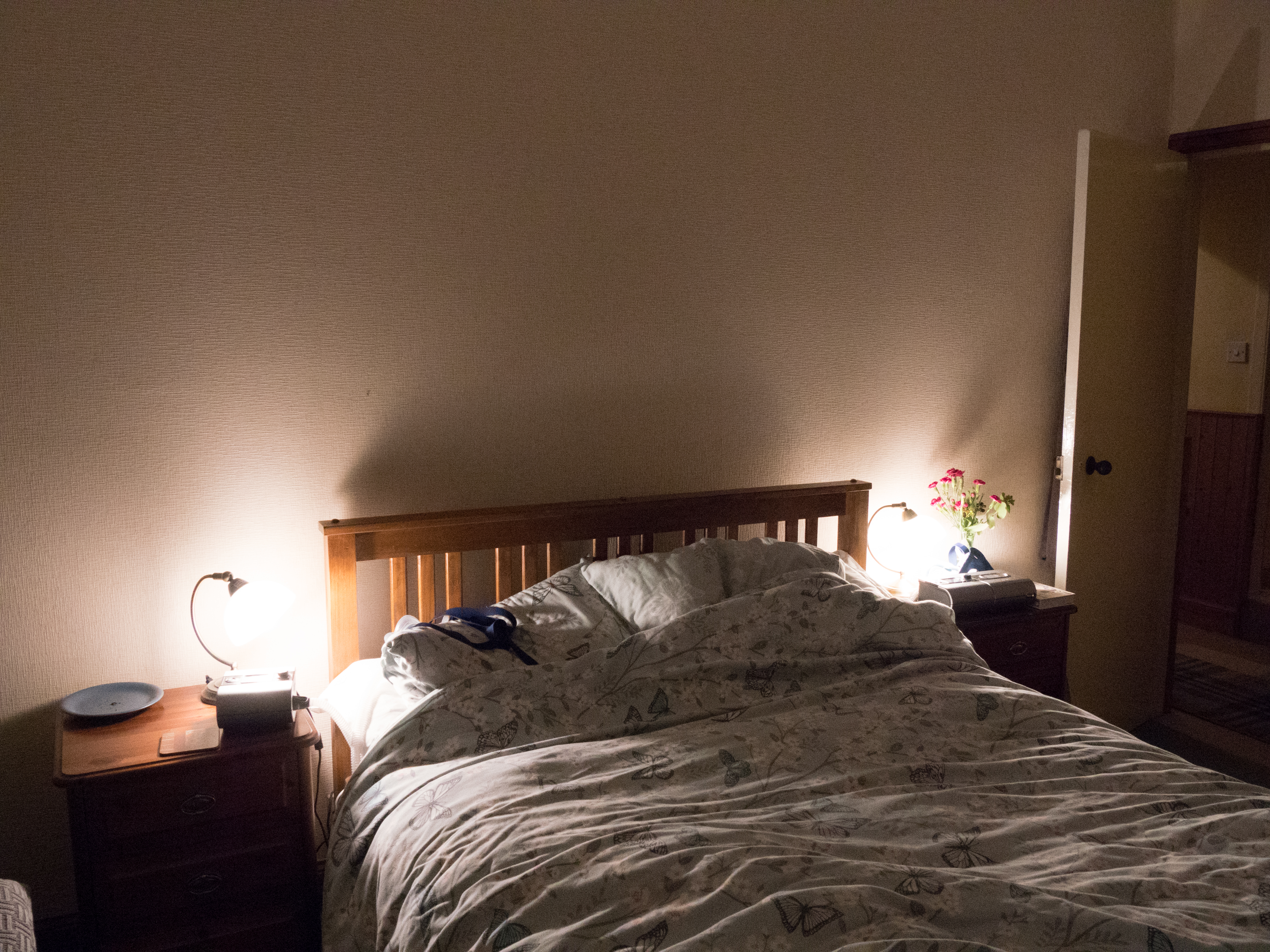
The images in the cottage all have an orange or yellow colour cast, which is accurate for the relatively dim lighting conditions. The exception is the bedroom shot, where the lights were more modern fluorescent lights which gave a blue cast.
Overall, the images are very different from those taken by daylight outside. This might be less noticeable if they were changed to monochrome, and I think the colour gives a good ‘feel’ for the time of day, and the type of place.
Learning points:
be aware of the lighting situation and the colour cast given
iPhone cameras tend to balance colour towards daylight (which may not be either accurate or what is wanted
an apparently ‘bright’ indoor room has much less light than outside, and needs a much longer exposure, or a markedly increased ISO setting.
Images taken by artificial light have a different quality from those taken by natural light, however, that does not mean that they are all similar or that the colour palates or feelings invoked by those images are limited. The four photographers discussed below show a range of images taken at night or in the evening without the use of flash. Google searches of the images give an overview of the colours and contrasts between them.
Rut Blees Luxemburg (born 1967) has taken images at night with a medium format camera. These are very considered images. She says she will wander the streets and only take a few images a month. In the series ‘Leibesleid’ the images are intimate, of small, rarely considered areas, the edge of a street, a corner with writing on a wall, steps going down into water. She says, in an interview with Campany ‘space that allows for a moment of repose…… the quieter things are the more significant the sound’ (Campany, 2006). The images are presented in a book along with writings by Alexander Garcia Düittmann which while not describing the them, rather talk to them as in a conversation with a lover. Luxemburg has also done a further series of images on a much grander scale, also at night, of the city and the tower blocks. An example is the image ‘Towering Inferno’ – a tower block at night looking straight into the windows from another tower. The colour palate of both series is very limited, golden yellows with browns, never quite absolute blacks. They are full of life, even though the people are not present, they have just stepped out of sight. A recent interview for Photoworks says ‘One can also think about the city as a ‘character’ in these photograph, one that’s alluring, open, glowing even… yet also ambiguously wet, slippery and dark.’ (Photoworks, 2017).
A simple google search for her images produced this, showing the limited colour palate and the coherence of her images:
There is a shocking contrast here between the alluring golds and the harsh red and black that was seen in the recent images of the Grenfell Tower fire. Life versus death pointed up by the colours without even the need for the stories.
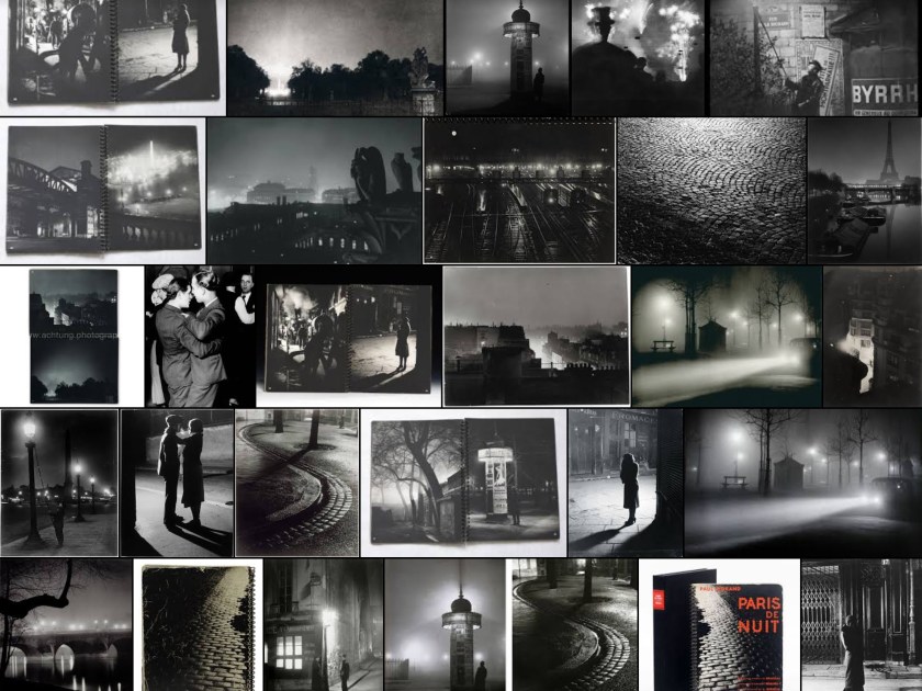
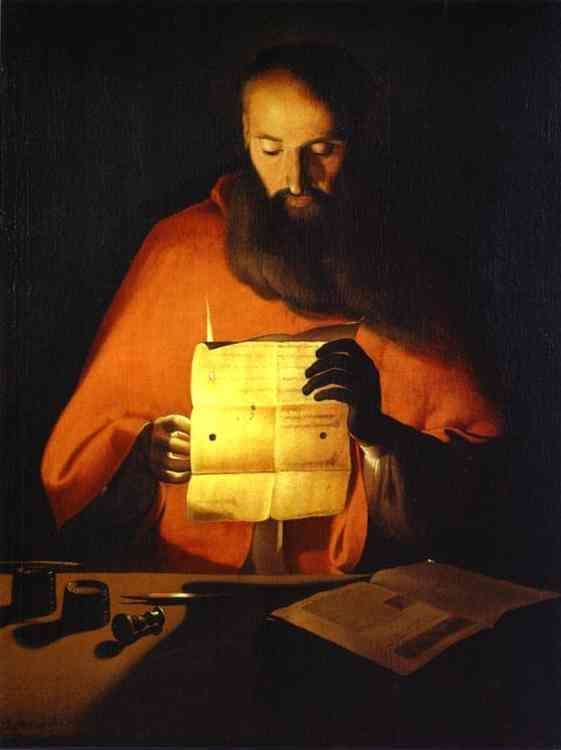
Brassaï (1899 – 1984) was fascinated by night scenes and some of his most famous work is shown in ‘Paris de Nuit’. These are very different, often spacious scenes, not intimate even though they often show people as well as the places. The light is harsh and clean.
He is quoted as being influenced by the painter Georges de la Tour (1593 – 1652), who painted many pictures of people by candlelight. Interestingly de la Tour also mainly used a golden/brown warm colour palate. It would be interesting to know what colours the Brassaï images would have been if he had had the opportunity of using colour rather than black and white.
Georges de la Tour (public domain)
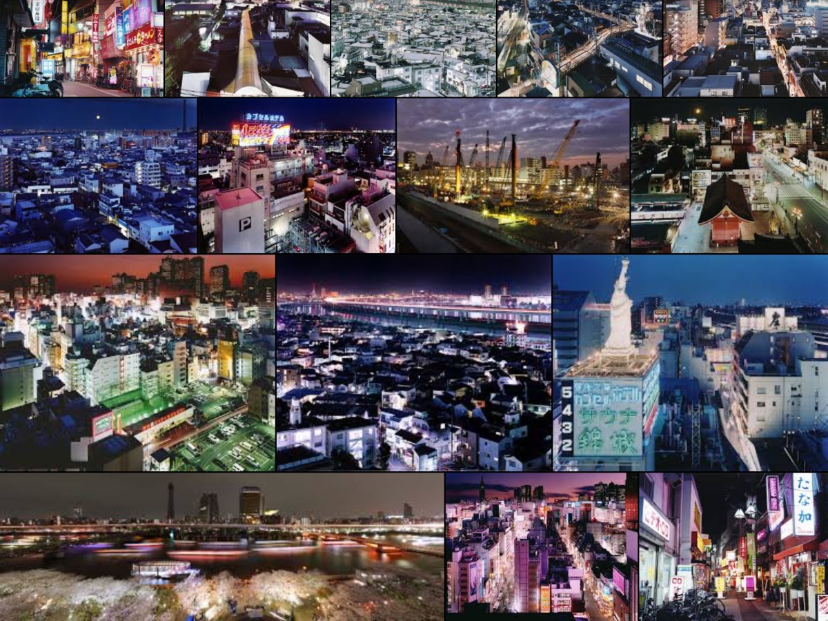
Sato Shintaro’s (born 1980) images of Tokyo ‘Night Life’ are startling in their intensity, using highly saturated colour to show the neon signs and the vibrancy possible in artificial light. All colours are present. The images are fascinating, the city is shown as a place that is busy, alive and challenging but confusing. However, he has also taken a series of images ‘Tokyo Twilight Zone’ with more limited colour palates, red/green, blue/white. These are much softer, calmer, less confusing. It is hard to visualise that they are the same place as the other images.
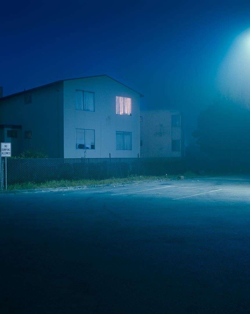
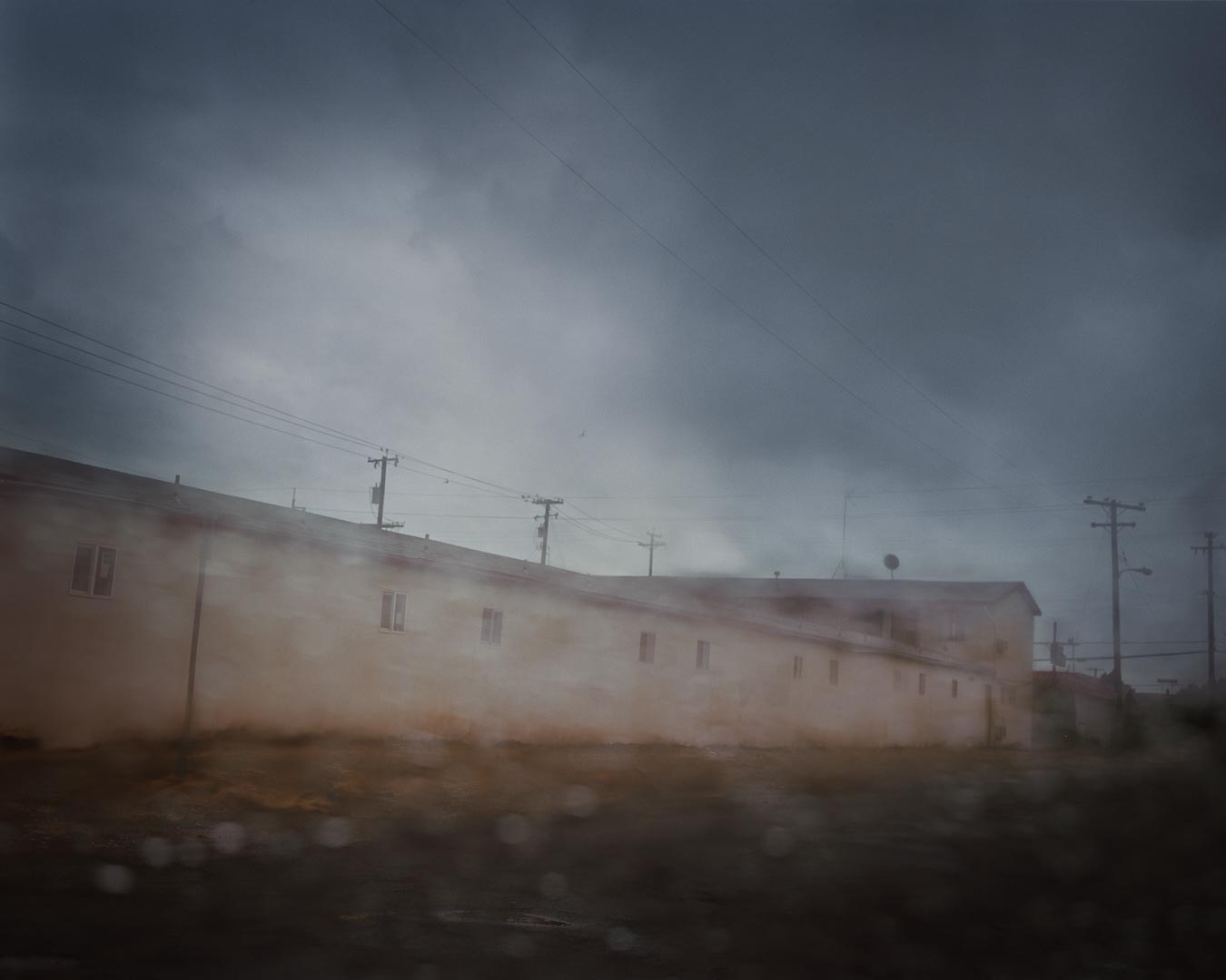
Todd Hido (born 1968) is another photographer who has utilised artificial light in his night images of houses, shown in his book ‘House Hunting’. He describes finding one of the houses ‘I couldn’t even see across the street. I remember coming out of the flatlands and hitting this fog and it was just the most surreal and creepy neighborhood I’d ever seen. It had all the right combinations. I remember seeing that for the first time and just being blown away by it all … that sort of changed everything’ (Berton, 2006). The images of these houses at night have muted colours, greys and browns, mysterious, lacking in detail. They could be anyone’s house and are only identified by numbers not place names, often in a single colour palate. They are not dissimilar to his daytime images shown in ‘A Road Divided’, which are misty, often partially defocused evocative images. His style remains recognisable at all times of day.
Google.co.uk. (2017). brassai paris de nuit – Google Search. [online] Available at: https://www.google.co.uk/search?q=brassai paris de nuit [Accessed 13 Oct. 2017].
Google.co.uk. (2017). rut blees luxemburg liebeslied – Google Search. [online] Available at: https://www.google.co.uk/search?q=rut blees luxemburg liebeslied [Accessed 10 Oct. 2017].
Brief: Take a sequence of shots over a day, getting a good range of times. Examine the quality of light. Add shots to learning log with an explanation and thoughts.
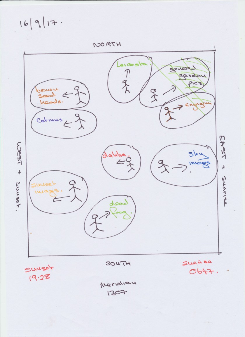
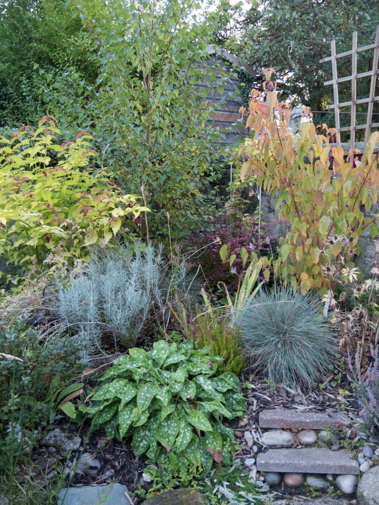
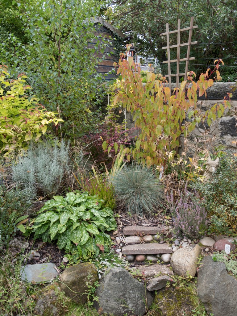
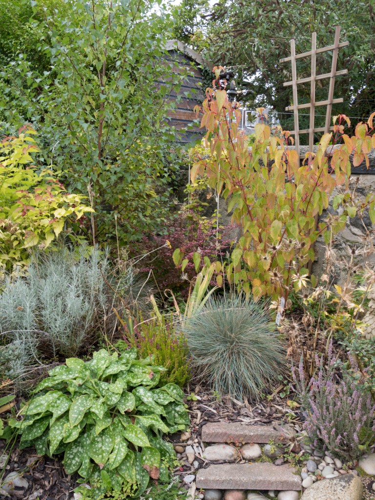
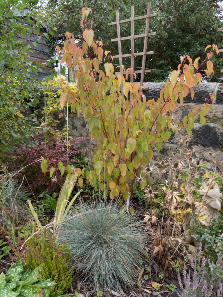
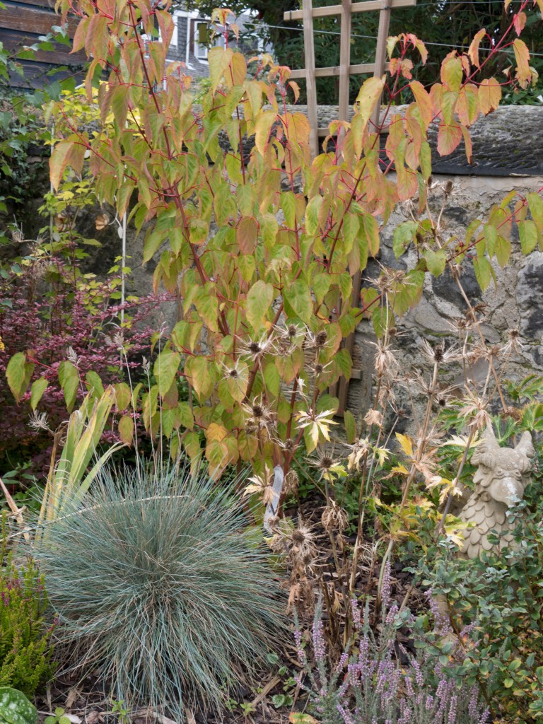
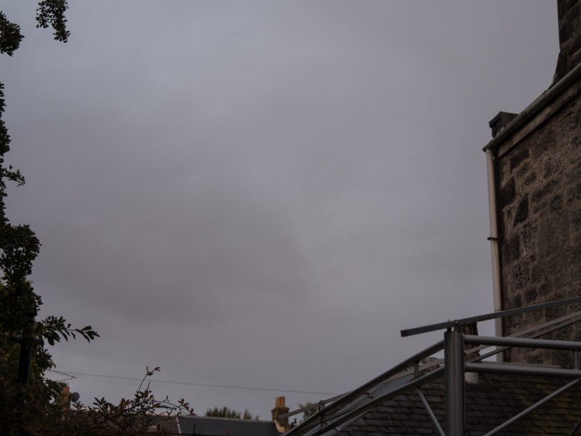
I decided to take the images in my back garden. This was to allow me to take a range of shots over the day from the same viewpoint, and also to look for any areas that were lit up well at any specific time of day. I choose last Saturday when I was in most of the day and initially the day seemed promising, with a good weather forecast and an interesting light. Unfortunately as it developed it clouded over and the majority of the day was heavily overcast, with some rain showers and only a brief, startling, glimpse of sunlight. I decided to take the images at 2 hourly intervals from sunrise to sunset. I had to be out at the midpoint, however, have substituted in images taken today when the weather conditions are very similar. I chose to take images of:
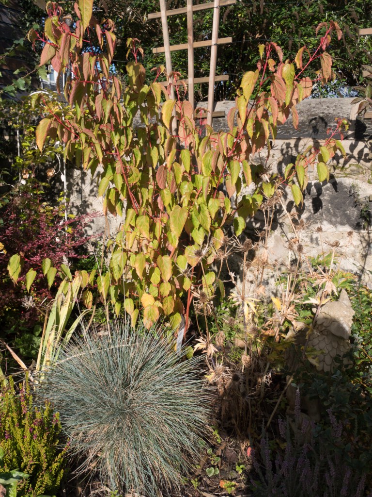
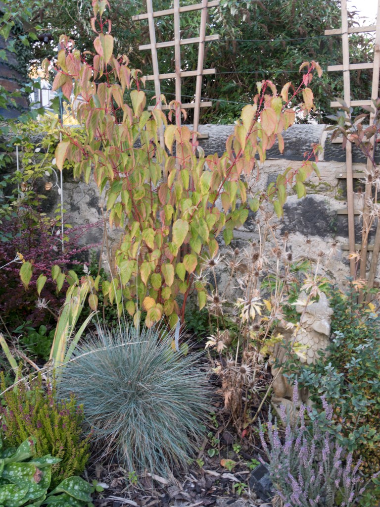
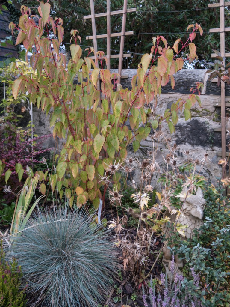
a group of plants in the northeast corner of the garden
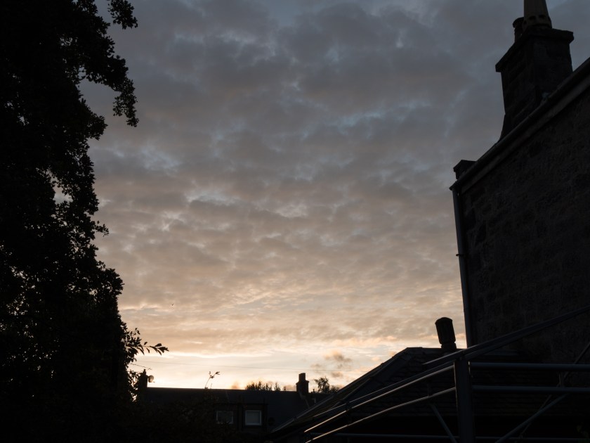
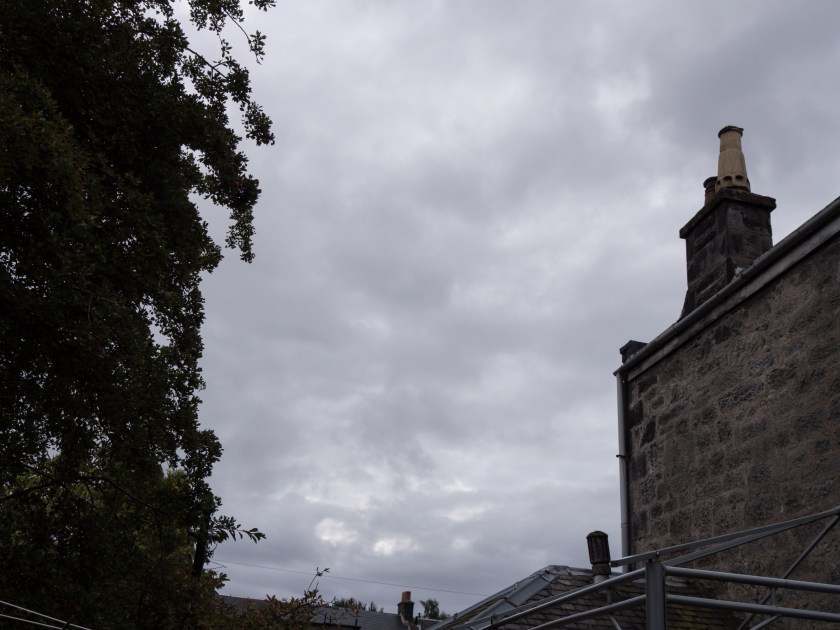
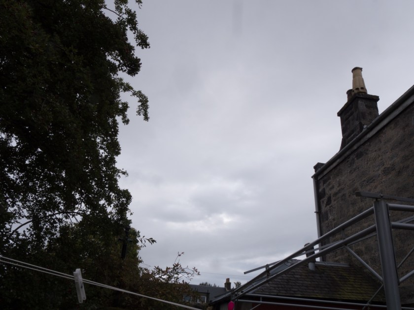
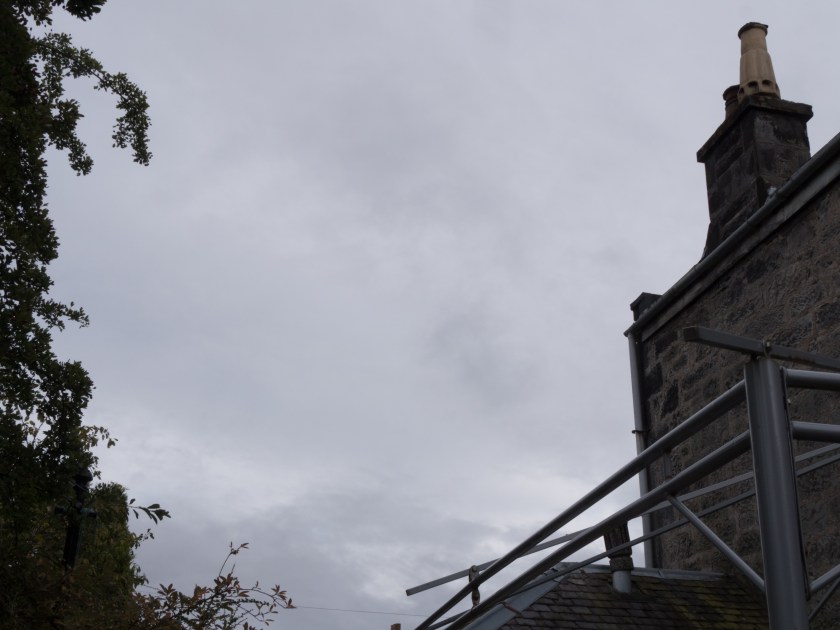
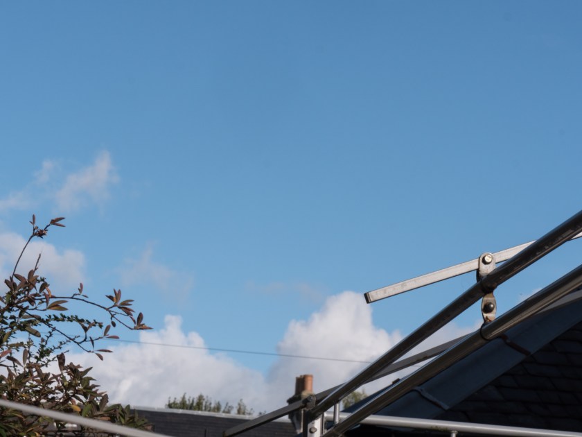
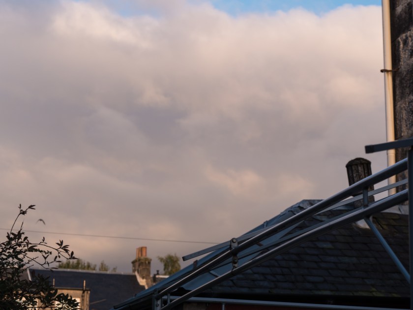
the sky looking towards the east
plants or other areas that showed well in the available light.
Plan of Images with direction of shot marked.
All images were taken with the camera set to manual, with settings based on the internal lightmeter and histogram. I took brief notes throughout the day. In this instance I am posting the images with metadata to show how much the light intensity varied throughout the day. I have not changed the white balance at all in processing.
0700 (Sunrise was at 0647 so I was slightly late):
1/10 sec, f/3.4, ISO 200
taken at 0702
1/160 sec, f/9.0, ISO 200
taken at 0707
The sun was only just coming up. The light was very pale and still quite grey. My eyes interpreted it as a reasonable degree of light, I was seeing in colour, and walking outside easily so I was surprised at the amount I had to open up the camera settings to take the images. If I had been guessing I would have completely underexposed the images. The image of the flower bed is still quite blue in spite of the early hour (no hint of gold yet).
0900:
1/30 sec, f/7.1, ISO 200,
Taken at 0856
1/640 sec, f/7.1, ISO 200,
taken at 0857
1/30 sec, f/8, ISO 200, taken at 0903
1/50 sec, f/6.3, ISO 200, taken at 0901
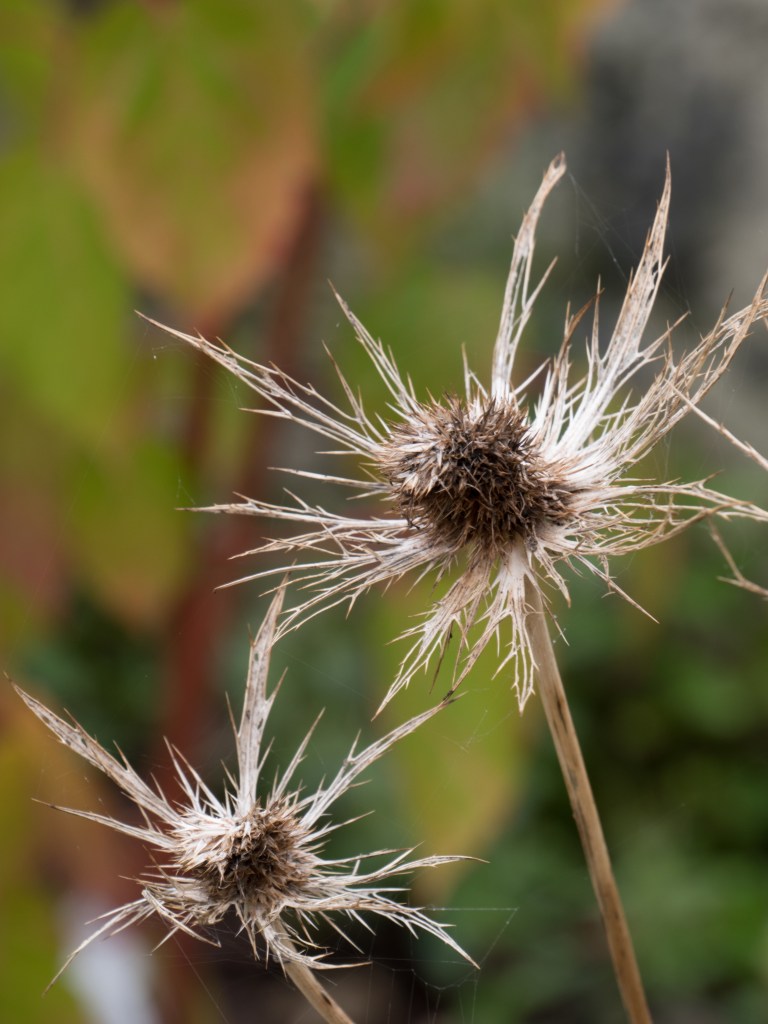
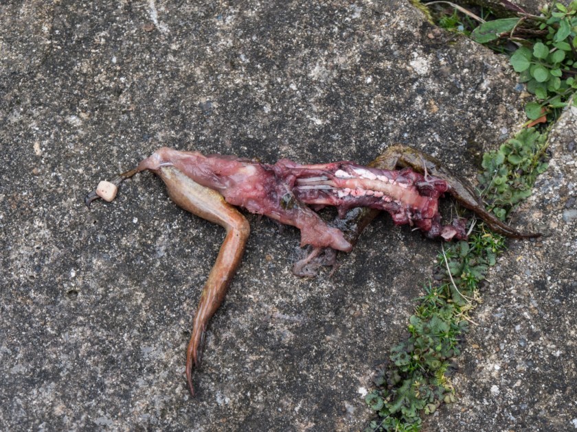
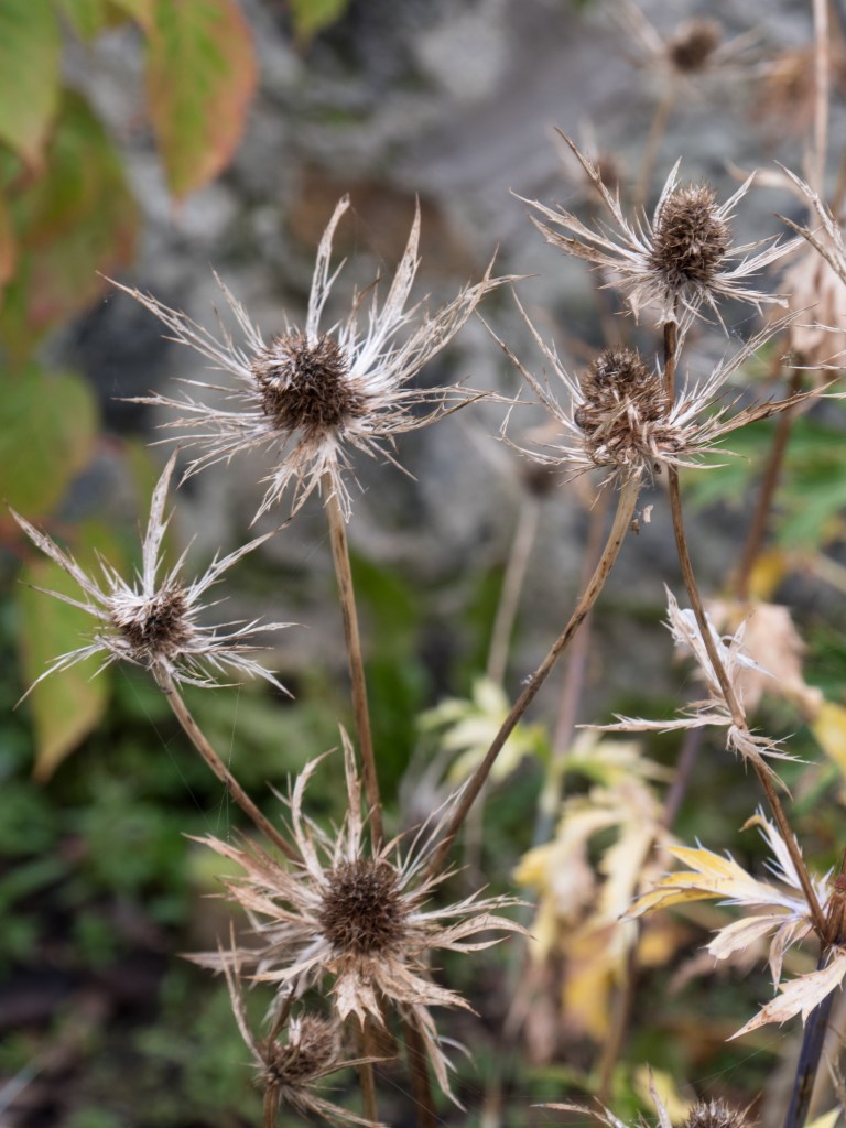
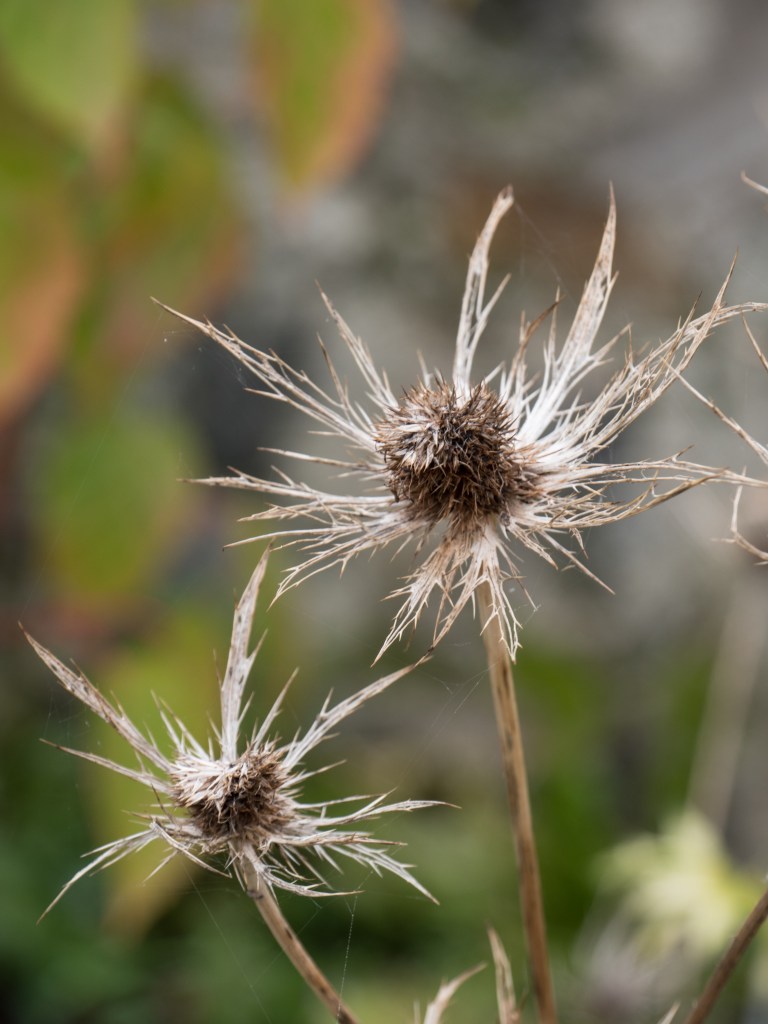
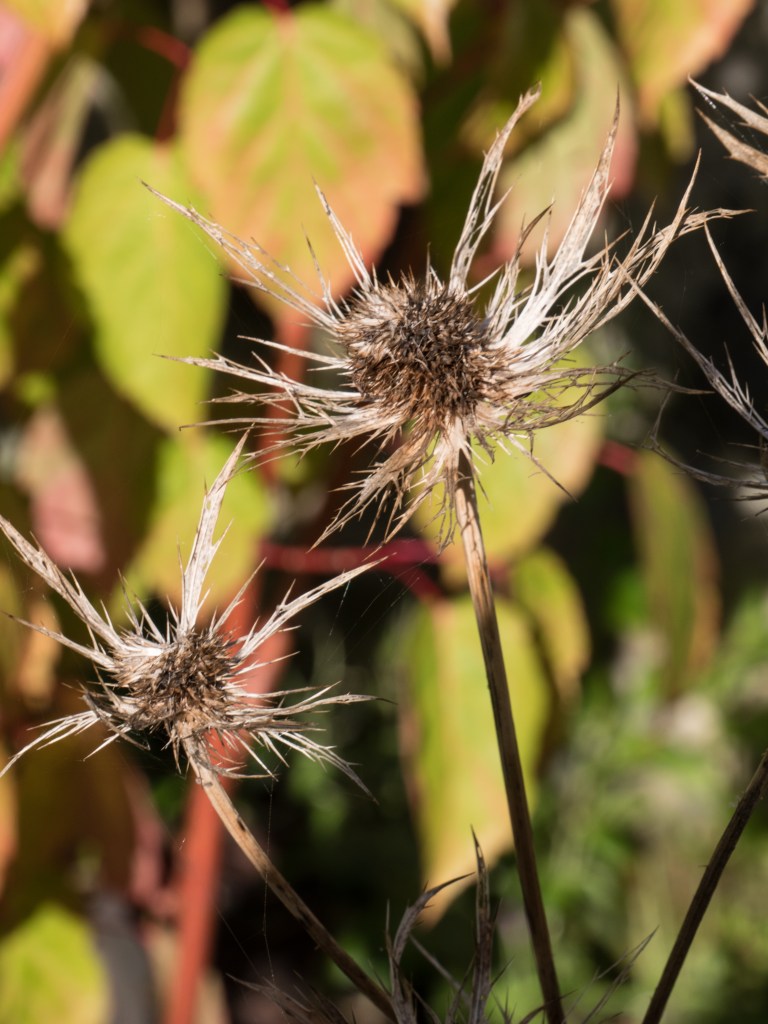
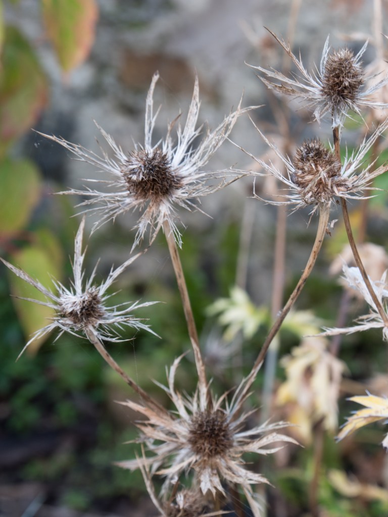
It was now completely clouded over with no shadows at all. The light was very flat, but on looking at the images definitely showing a much warmer tinge than the earlier images. I thought this would give some interesting details images, as not confused by excess shadow. I feel this worked well with the plant (Eryngium). The (slightly gory) dead frog could probably have benefitted from shadow to give a more 3-dimensional effect.
1100:
1/30 sec, f/8, ISO 200, taken at 1103
1/100 sec, f/20, ISO 200, taken at 1104
1/50 sec, f/7.1, ISO 200, taken at 1105
1/50 sec, f/7.1, ISO 200, taken at 1106
The light is now fairly constant, very similar to 2 hours previously according to the camera, although my eyes had thought it was lighter, but grayer. It remains neutral and the flower head close-ups are successful and clear. The two flower images are at an identical exposure even though they were taken at opposite sides of the garden. The light is coming from nearly overhead and is very diffuse because of the dense cloud cover.
1300 (Meridian at 1307, taken 2 days later to fill in the sequence, weather very similar):
1/40 sec, f/9, ISO 200, taken at 1300
1/100 sec, f/18, ISO 200, takem ay 1301
1/40 sec, f/9, ISO200, taken at 1300
1/100 sec, f/7.1, ISO 200, taken at 1302
1/100 sec, f/7.1, ISO 200, Taken at 1302
1/100 sec, f/7.1, ISO 200, Taken at 1302
The sun is now at the meridian, that is, as close to overhead as you get in Scotland in September. It is still very cloudy with a diffuse light. The slightly warm tinge of the earlier images has completely gone. The images look very flat but maintain a good level of detail which is brought out in the monochrome conversion. The bright green leaves (Leicestra) show well, but the red flowers are less sucessful.
1500:
1/50 sec, f/9, ISO 200, taken at 1500
125/ sec, f/18, ISO 200, taken at 1502
1/60 sec, f/5.4, ISO 200, Taken at 1503
1/400 sec, f/5.4, ISO 200, Taken at 1502
Still very cloudy and a diffuse light but the flowers from the corner are needing considerably more exposure than the Dahlia in the centre of the garden where there is no restriction to the light. There was no obvious change to my eye!
1700:
1/160 sec, f/11, ISO 200, taken at 1705
1/160 sec, f/18, ISO200, taken at1707
1/160 sec, f/11, ISO 200, taken ta 1702
And it has suddenly done very sunny (only lasted about 30 minutes). A complete change of light. The light is now quite harsh and very directional. I deliberately left in the shadow of me taking the garden image to show how sharp edged and dense the shadows were. The light is starting to turn more golden again. It has moved around to the west so the Eryngium (spiky flower) is in full sun and difficult to pick out against the background leaves. All the detail of the plants has been blended together by the brightness. This is not a good use of this beautiful light.
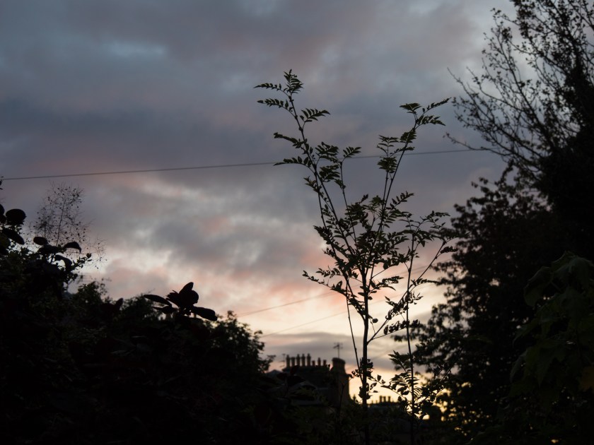
1900:
1/13 sec, f/6.3, ISO 200 , taken at 1859
1/125 sec, f/8, ISO 200, taken at 1901
1/13 sec, f/6.3, ISO 200, taken at 1859
1/31 sec, f/5.4, ISO 200, taken at 1900
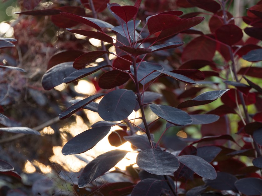
The sun has gone into the clouds again, but is definitely going down. there is a definite redness in the sky. The light is very diffuse, and not as golden on the plants as I would have expected, but gives an interesting effect looking though the leaves of the Cotinus ‘Royal Purple’. There is good detail back in the Eryngium as it is no longer in harsh sunlight.
1930, (sunset at 1928, final set of images of the day):
1/6 sec, f/3.7, ISO 200, taken at 1927
1/40 sec, f/4.4, ISO 200, taken at 1929
1/125 sec, f/4.4, ISO 200, Taken at 1928
The daylight has virtually gone and the settings are very similar to the first ones of the day. The light quality is still diffuse, the golden tinge of earlier has almost gone, Oddly enough the sunset in the west mirrors the sunrise in the east.
Notes as taken on day:
Learning points:
do not rely on the eye, it is a very poor lightmeter.
the diffuse light under the dense cloud cover actually made for some very interesting close-up images as there was no distracting shadow.
the very sunny and harsh light in the afternoon needed a more considered approach. My shadow interfered with the fairly close image, so a more distant one would have been better.
the day followed a clear pattern about the colour of the light, pastel, golden, neutral, golden, pastel.
think about the light and how it will impact on your planned images. Different times of day may suit some types of images better than others.
Light is probably the most important thing when taking an image. You obviously need an image taking device of some sort, but this can be as simple as a piece of photosensitive paper or a pinhole camera, but light is essential. Complete darkness, although almost never present, makes it impossible to see or obtain an image. My father was a professional photographer, taking colour film images for sale for books and magazines long before the days of stock photography. He always used to say that the light you needed depended on what the photo was for. He would often avoid midday sun – too harsh, but might also avoid the evening light as the golden colour cast, while very attractive, was not what he was looking for. This was well before the days of being able to remove a colour cast by digital manipulation.
Sally Mann in an interview with Chinese Photography Magazine said ‘the light in the South is so different from the North, where you have this crisp and clear light. There is no mystery in that light. Everything is revealed in the Northern light. You have to live in the South to understand the difference. In summer, the quality of the air and light are so layered, complex, and mysterious, especially in the late afternoon. I was able to catch the quality of that light in a lot of the photos…….and also the refulgence or the reflection when light and water interact. There is no coating on the lens of my old camera, which permits a much softer and more luminous light. I am less interested in the facts of a picture than in the feelings. The facts don’t have to be absolutely sharp. I can get information across by appealing to viewer’s emotions’ (American Suburb X, 2013). Her images in the Southern Landscape series reflect this philosophy. They are not clear, sharp and flat but you feel you are looking into the images rather than at them. Sometimes only part of the image is visible, the remainder clouded in mist. The focus is variable – leaving you peering though the murk, wondering and imagining what might be there. I find myself blinking in a hope to see more clearly, to try and see what Mann saw on that day, at that particular time, at that moment. My favourite, much desired image, (simply identified by the year 1998) is very simple. A patch of light, surrounded by trees over grass, or possibly water. I keep changing my mind.
A completely different use of light is shown in the images of Schmidt. He said ‘I prefer black and white photography because it guarantees the viewer a maximum amount of neutrality within the limits of the medium. It reduces and neutralizes the coloured world to a finely nuanced range of greys, thus precluding an individual way of seeing (personal colour tastes) by the viewer. This means that the viewer is able to form an objective opinion about the image from a neutral standpoint independent of his subjective colour perception. He is thus not emotionally distracted. In order to achieve a maximum of objectivity and thus create a photograph which possesses credibility and authenticity as a document (factual information), I prefer to work with neutral diffused light, i.e. to produce an image without noticeable shadows. The viewer must allow the objects portrayed in the photograph to take their effect upon him without being distracted by shadows or other mood effects. In this context, it is essential that the viewer should be able to recognize the depicted objects clearly and in relation to each other.’ (American Suburb X, 2010). Schmidt’s images are very different from those of Mann. They are clear, without obvious emotional content, explicitly showing the subject. As he said – you can recognise the subject easily and therefore make your own judgements on the content, rather than trying to interpret Schmidt’s thoughts and feelings. The images are relatively emotion free, (I do not think that any image can ever be completely devoid of emotional reading) and therefore what you see can become very personal. In his obituary for the Guardian, Delahaye said’ His language is a language of precision and his tool is the most simple one: a small, 35mm camera, and a few rolls of films. His pictures look simple at first glance, and their anti-sentimentality, their refusal of all the tricks of the usual seduction, their concision and their clarity, give them great efficiency. They show what they show but they manage to retain an opacity, a mystery, and they become a support for our imagination’ (O’Hagan, 2014).
Atget, much earlier on in the development of photography, was very aware of the effects of light and varied his technique over time, initially using the relatively neutral light at midday to produce images that give information about the ‘facts’ while images from later in his career are very different ‘Atget’s late photographs, however, are frequently marked by subjective light and deep shadows. Often made early in the morning, these pictures—such as Parc de Sceaux—use light and shadow to create a mood rather than to describe a place; they mark the apex of Atget’s formal and expressive investigations of the medium.’ (Nga.gov,2017).
All these examples are of photographers who usually took monochrome images where it is often easier to see changes in light intensity, together with the effect of the direction of the light. A further layer of complexity is added in when using colour as the temperature of the light varies as well as it’s apparent quality. Light in the morning and evening is warmer, and may be very red at sunrise and sunset, while it is a more neutral colour at midday. The following table from Cambridge in Colour (Cambridgeincolour.com,2017) helpfully summarises the effects of light throughout the day.
This exercise took me a lot longer and was much more frustrating than I expected it to be, mostly because of camera issues.
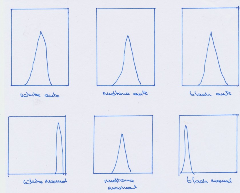
The first set of images were easy to take. I used the ‘intelligent’ auto setting. As my midtone was tan coloured I changed them all to monochrome to make the point more obvious. The images are almost identical except where the camera has picked up minimal differences in shading.
White auto, 1/125, f/5
midtone auto, 1/125, f/4.1
black auto, 1/6, f/4,1
I then went on to the manual pictures. The first problem I had was that my camera had set itself back to auto ISO, so kept making compensations in the ISO. the next issue was that my camera showed the histogram as it thought the scene was, so persisted in keeping it in the middle range even when I changed either exposure or aperture. This left me guessing wildly as to the amount of exposure compensation to use, and I kept getting it wrong. I generally guessed much more than it actually was. I eventually gave up, and found the camera manual and from there found a way to alter what the histogram showed so that it showed what my setting would give. That made it much easier, and it will be left like that. I had rarely used full manual before, and this was not an issue in aperture or shutter modes.
white manual 1/13, f/7.1
midtone manual 1/6, f/14
black manual, 1/13 f/5.0
There is now a very clear difference between the images. What I should have done was looked at either the shutter speed or the aperture in the auto images and kept this identical in the manual images as this would have made the amount of change in the settings clearer. By the time I realised this there was a significant change in the light (the sun had come out) so the settings would have been altered by another factor.
The histograms (once I had altered the camera settings) show a clear difference, as do the ones that show on Lightroom.
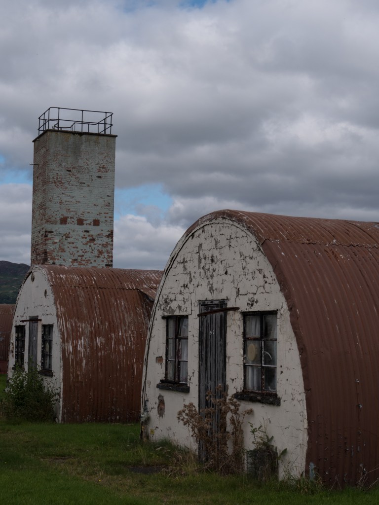
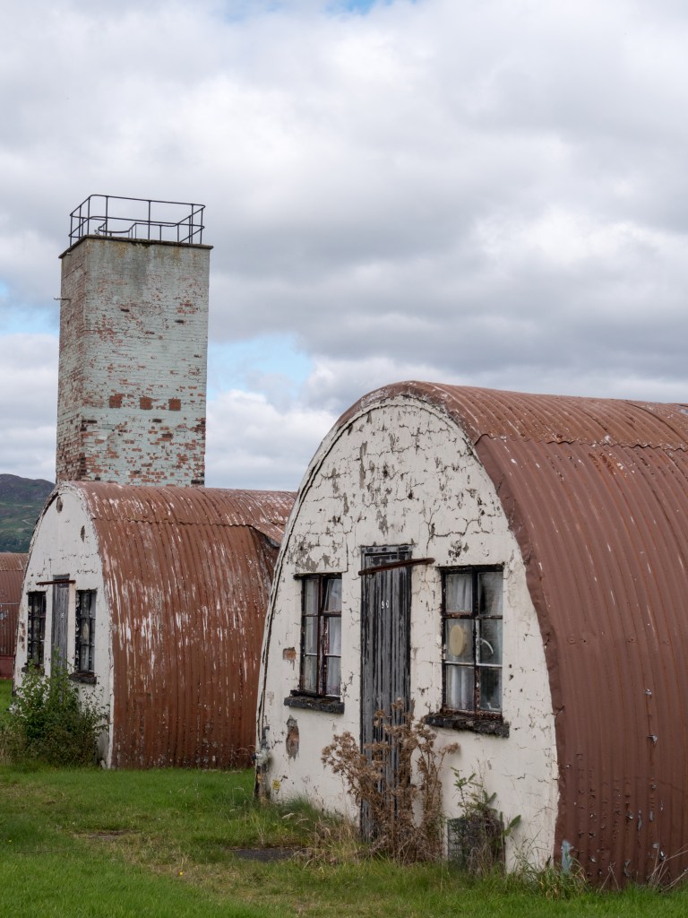
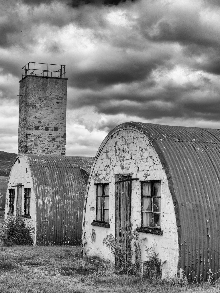
The way a camera automatically measures light is something I was already aware of and was very pertinent to a recent day out. I was at an old prisoner-of-war camp. The day was mainly overcast but bright so there was a lot of very white cloudy sky, and the buildings were mainly dark. I could either expose for the sky, leaving me with too dark ground or vice versa. I opted for a middle way, shooting in RAW, and then altered the images in Lightroom, as even doing that the sky often ended up very white. The range of light was not coped with well by the camera’s meter, and was one of the occasions an incident light meter would have been helpful.
As shot, the camera overcompensated for the light sky and the white (ish ) walls
Altered in Lightroom with the exposure increased and the highlights brought down
Monochrome conversion, to emphasise the sky and the grittyness of the buildings.
This wasn’t my ‘best’ shot of the day but it dramatically demonstrates the problem, and also the changes that can be made in post-processing.
Learning points:
read the camera manual when you are having problems
check the settings are what you think they are, and that they haven’t somehow reverted back to the auto ones
be very aware of the impact that one very bright area can have on the meter, especially if it is in the centre.


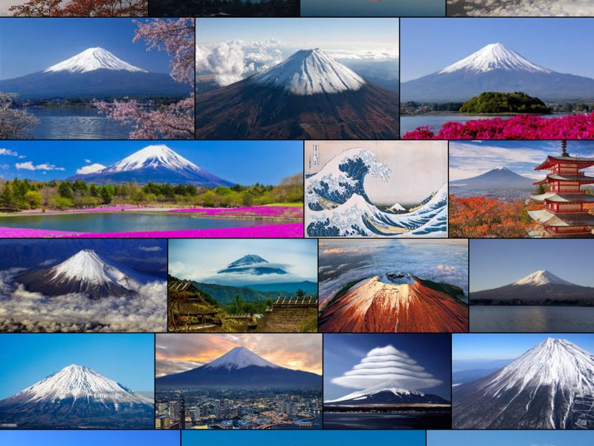 This shows a Google screenshot of Mount Fuji – classic images, all very similar
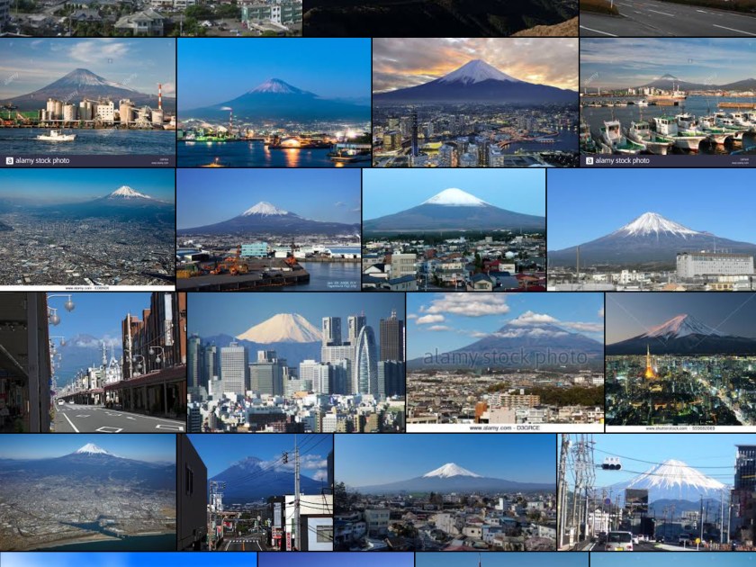 and a Google screen shot of Fuji City – there isstill a focus on the mountain – little of either detail or originality
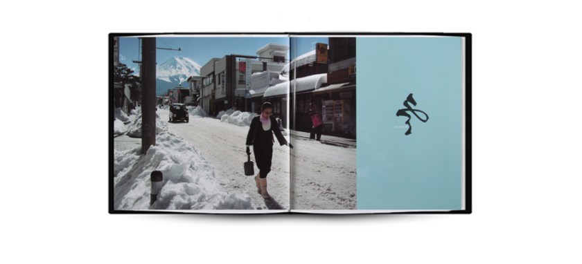


")