A picture contains a story, not always the whole story, but enough clues that you can infer or imagine what the artist was intending. A good story can be read several times, a magical one never looses its appeal.
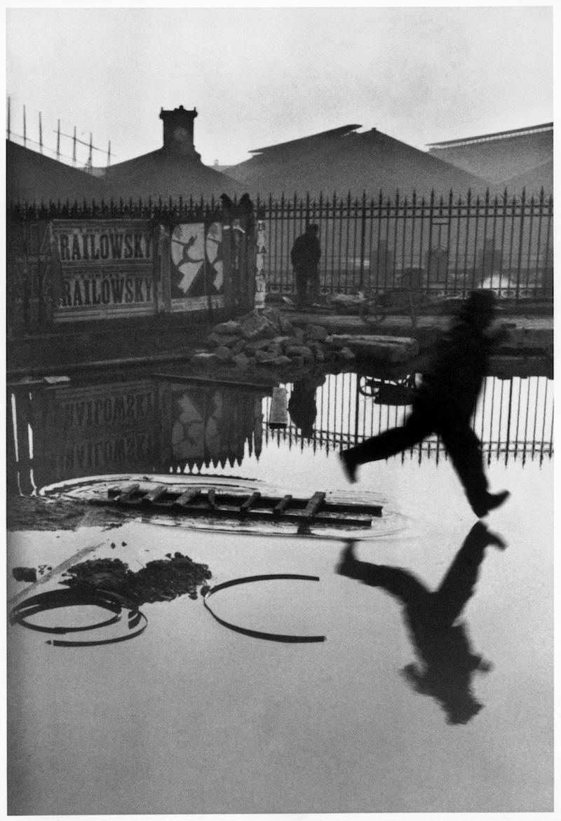
In the Cartier-Bresson image Behind the Gare Saint-Lazare the eye returns repeatedly to the point at which the foot almost, but not quite, touches the reflection below. Is he jumping or running? Where is he going? Is it a man in a hurry – or a boy playing? If you took the same image today was that a female figure? A hundred stories are possible.
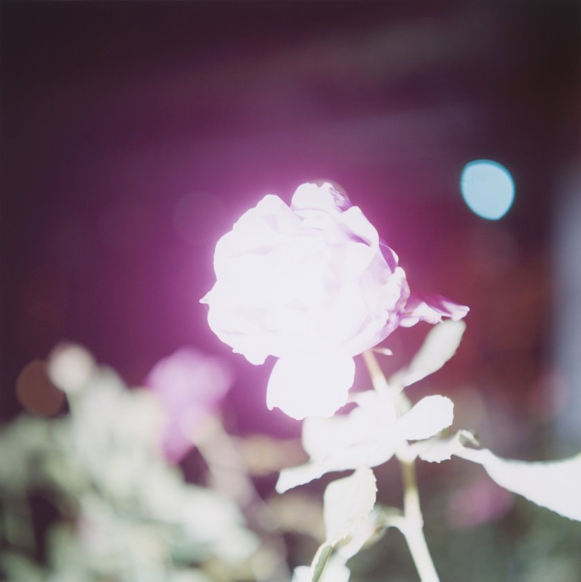
Illuminance – described as an ‘exploration of the extraordinary in the mundane’ (Aperture,2011) or ‘a mix of intimacy and deceptively casual observation’ (O’Hagan, 2011) is a photobook by Rinko Kawauchi. The cover shows a rose bright to the point where all colour and detail is lost, against a vibrant maroon background. It somehow retains the essence of a rose and allows the imagination to recreate any rose, with the luscious scent, and warmth of a garden in a summer evening. Technically, one could consider the image grossly overexposed, but it does not matter. The rose is still there.
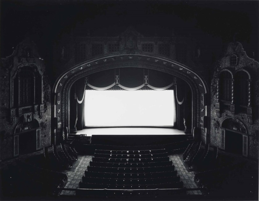
Hiroshima Sugimoto’s theatre images share the same aura of infinite possibilities. What film was playing? Who was watching it? Was I there?
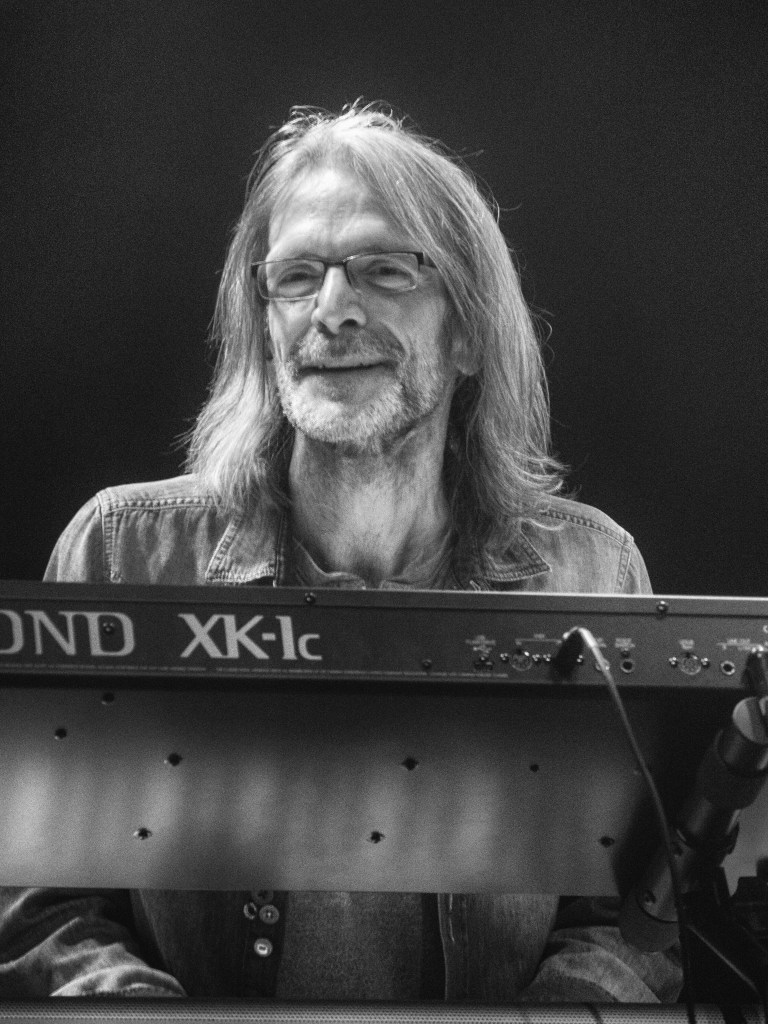
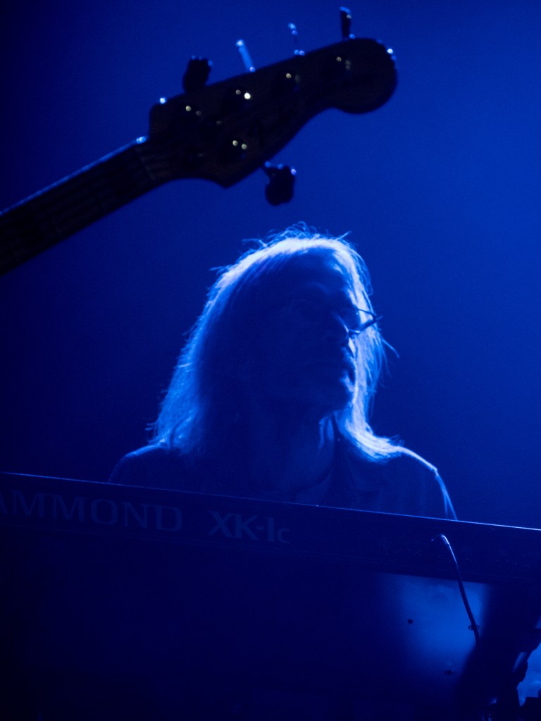
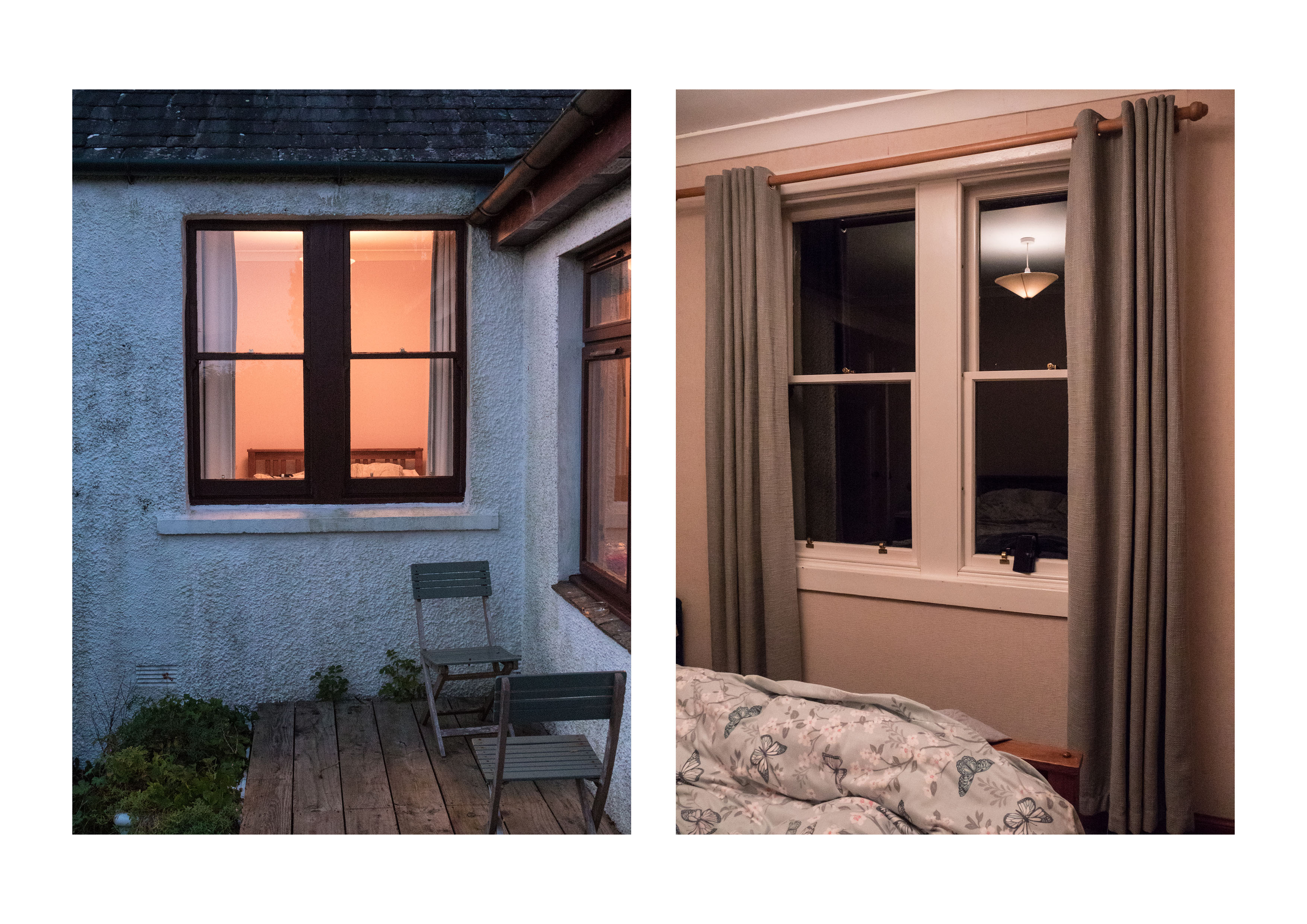
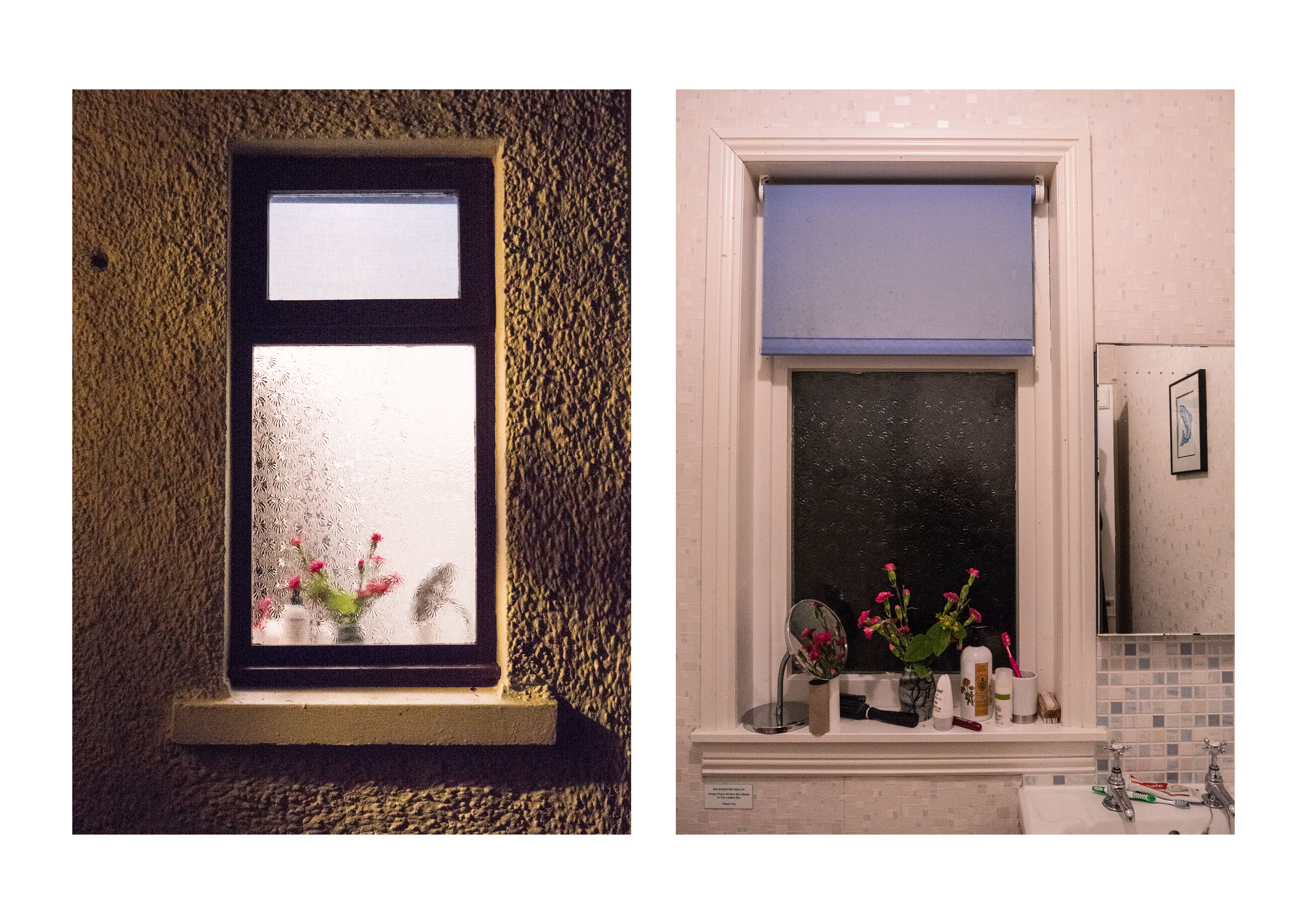
These two images were taken on the same night, at the same gig, of the same person, from the same vantage point. One shows the person as a portrait; the other implies his presence by the outline of light though his hair. The information that I am at a rock gig is conveyed by both – but one gives the detail, the other the feeling. Which is ‘better’? Which carries more information? It depends what you are wanting from the image. I would print the colour one as a reminder of the night, but the monochrome one was wanted by the musician for his personal records.
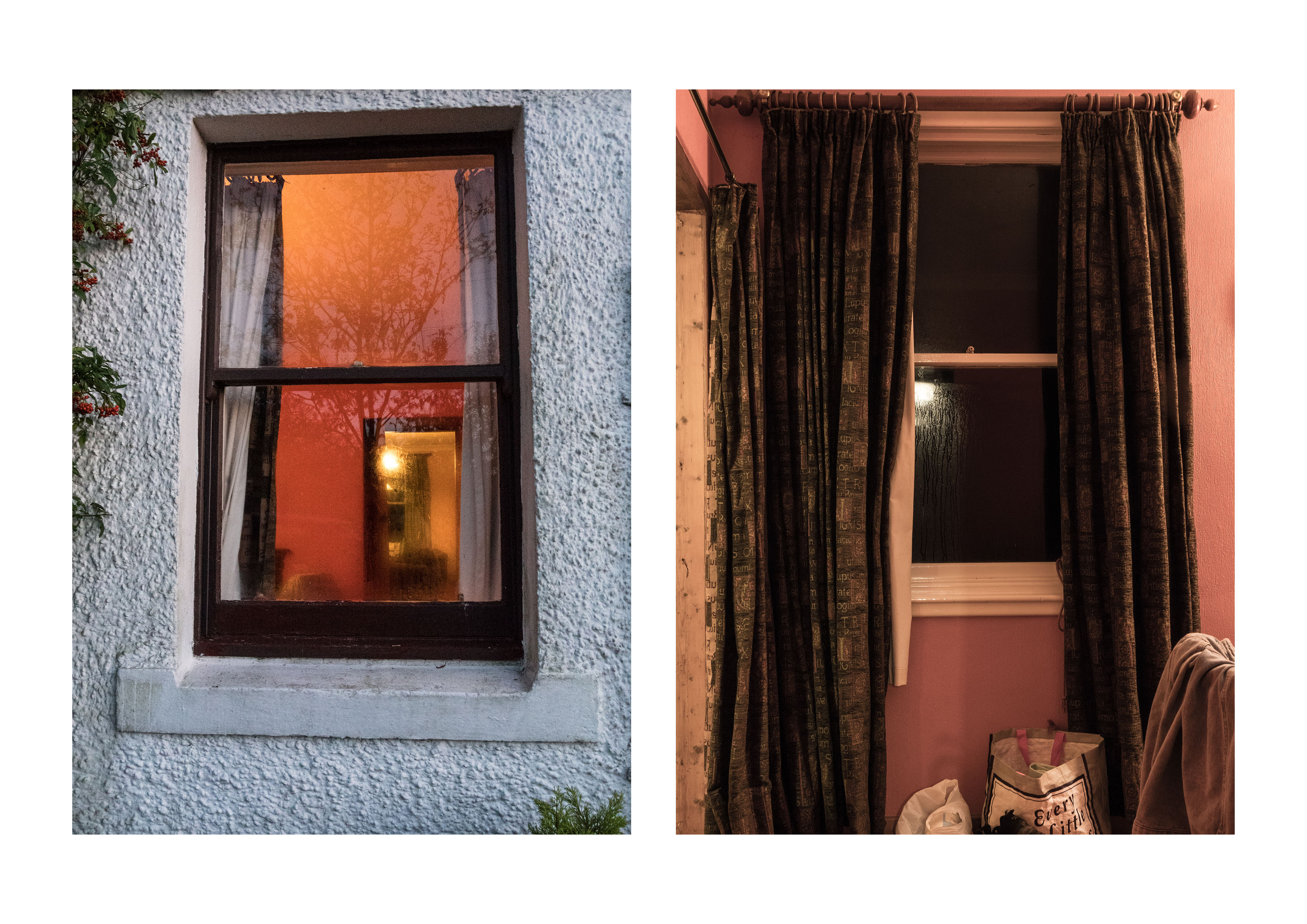
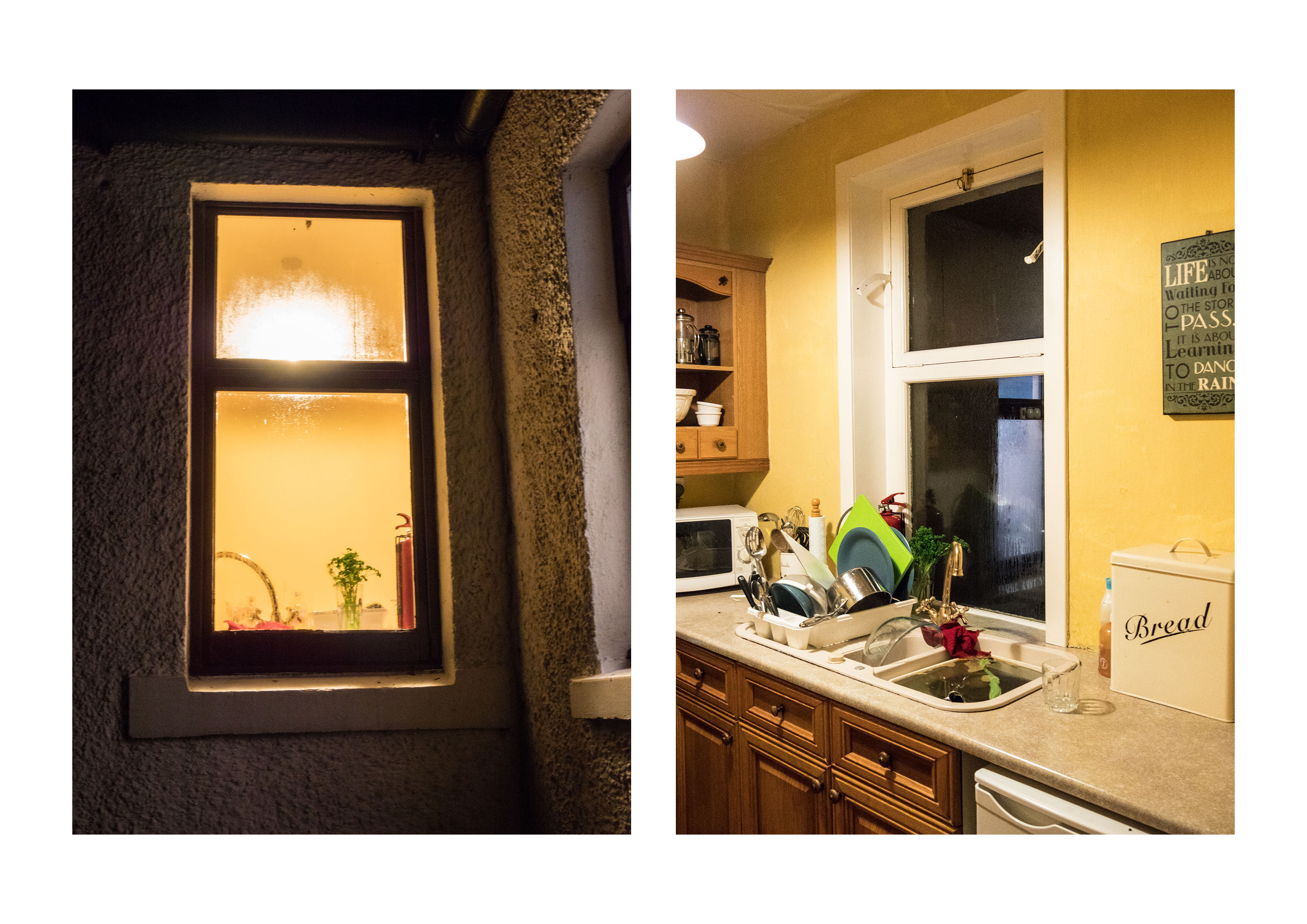
I agree that these are essentially diptychs – so have redone them in this format using photoshop to add as a pair. I have also cut down the number of images so that the pairs all work together. I also have adjusted the colour of the light slightly in one of the pairs to match (as suggested in our conversation). I think the light colour was different because the two bedroom images were taken at different times of day.
Hido’s work as voyeurism
This is something I hadn’t really considered but I agree it is a significant difference in the feeling of the work. I was aiming for the difference between the imagined possibilities of looking from outside versus the real life, with all its scruffy detail inside.
Tripod issues
Already resolved! However it was interesting that even without one , and with a modern camera that taking the images at ISO 64000 gave reasonable results.
‘with permission’
When possible, I like to ask for permission to use other people’s images even though in this context – critiquing the images it is fair usage. My main concern is that others may copy the images on inappropriately. There is an interesting story in the book by Barratt already discussed in this post:
I have been amazed by the number of people who have taken the time to answer my emails, and, on several occasions, enter into discussion about the images.
Being explicit
This assignmentwas specifically done in response to Exercise 4.3 – ‘the beauty of artificial light’
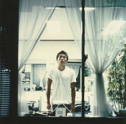
Shizuka Yomomizo is a Japanese photographer based in London who took a series of images where she asked, by means of a note, a group of strangers to allow her to photograph them standing in front of their window. She is being voyeuristic, but with the complicit knowledge of the people involved. There is a meeting of eyes, an awareness by both sides, mediated though two layers of glass, the window and the lens. They meet briefly and then part. There is a choice on both to engage or not.
I was recently in Newcastle and went to four exhibitions on broadly similar themes – the issues of racism, sexism and civil rights.
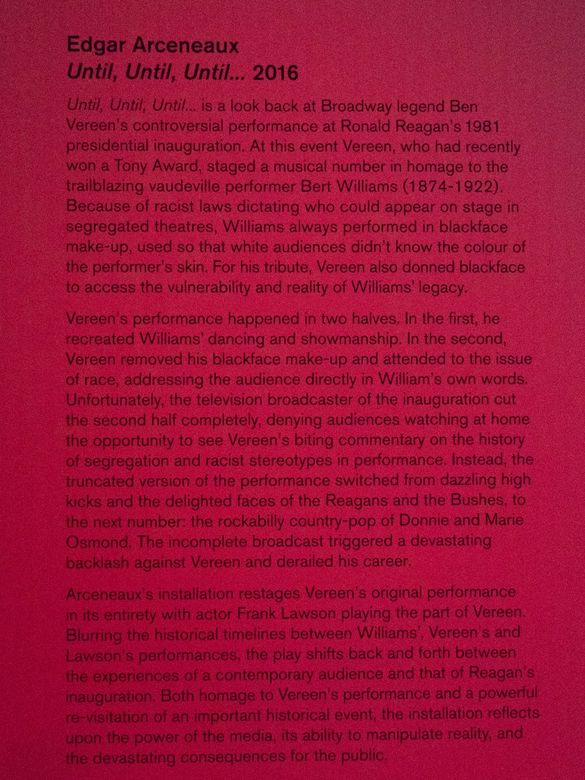
Starless Midnight and Until, Until, Until …. 2016
The Baltic Centre for Contemporary Art.
Starless Midnight is in homage to the work of Martin Luther King in his role as promoter of the Civil Rights movement and points up how, although there has been much progress, there is still so much more to do. Nine artists are featured, all with their personal take on the ongoing issues, and is co-curated by Edgar Arceneaux. His video installation ‘Until, Until, Until …. 2016’ is also shown in the Baltic at present. This installation is a large-scale video presentation on a transparent screen though which you can see another screen showing a fractured vision of the original work. the gallery describes it as:
The scale of the installation – larger than life-size – and the interesting back story make a piece that is difficult to watch without an emotional reaction.
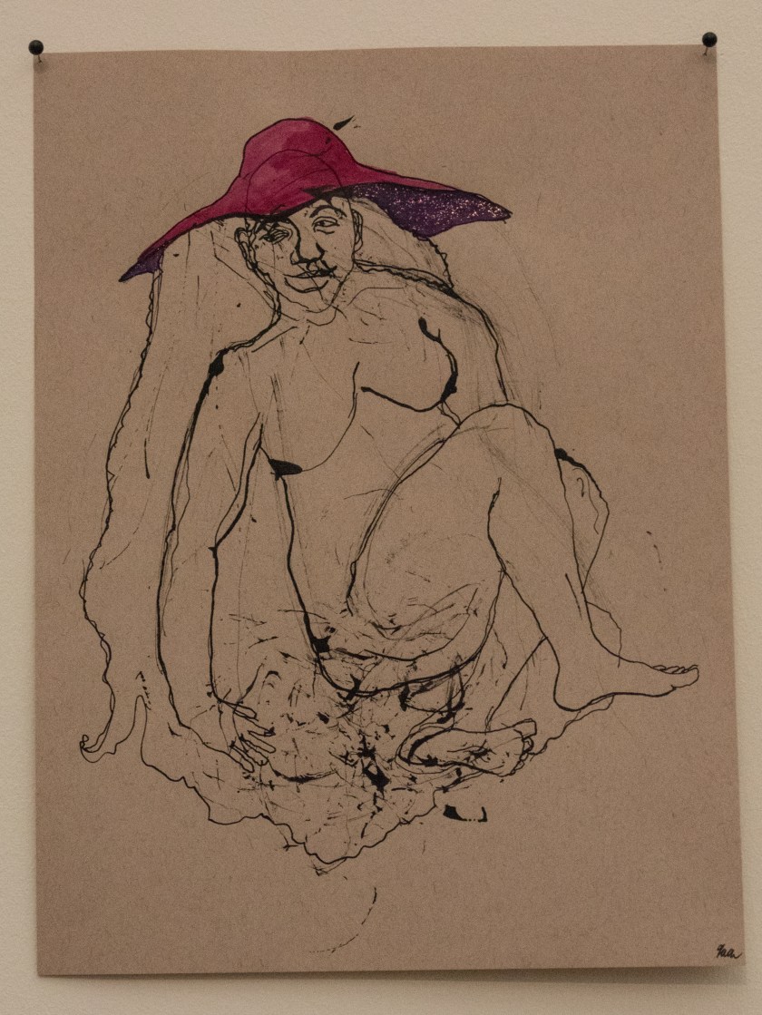
Two parts of the exhibition that I found particularly poignant were the works of Hinkle and the Gallery Tally.
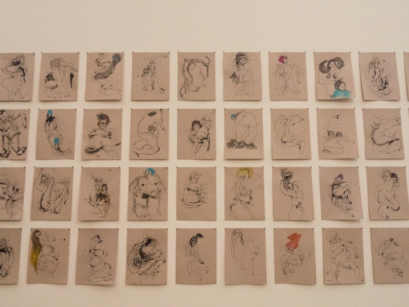
Kenyatta A.C. Hinkle shows a number of drawing from an ongoing series – ‘The Evanesced’ which looks at the multiplicity of Black women who have been erased from history, for instance by trafficking or murder.
These images are shown along a wall, en masse, described as ‘un-portraits’. Unless you examine them carefully all the women look similar. It is easy to miss the fine detail that turn them to individual people. It was easy to miss the individual disappearances too.
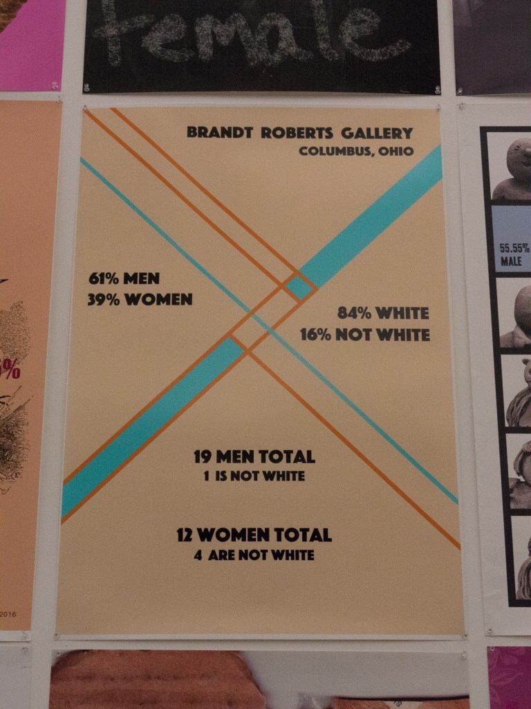
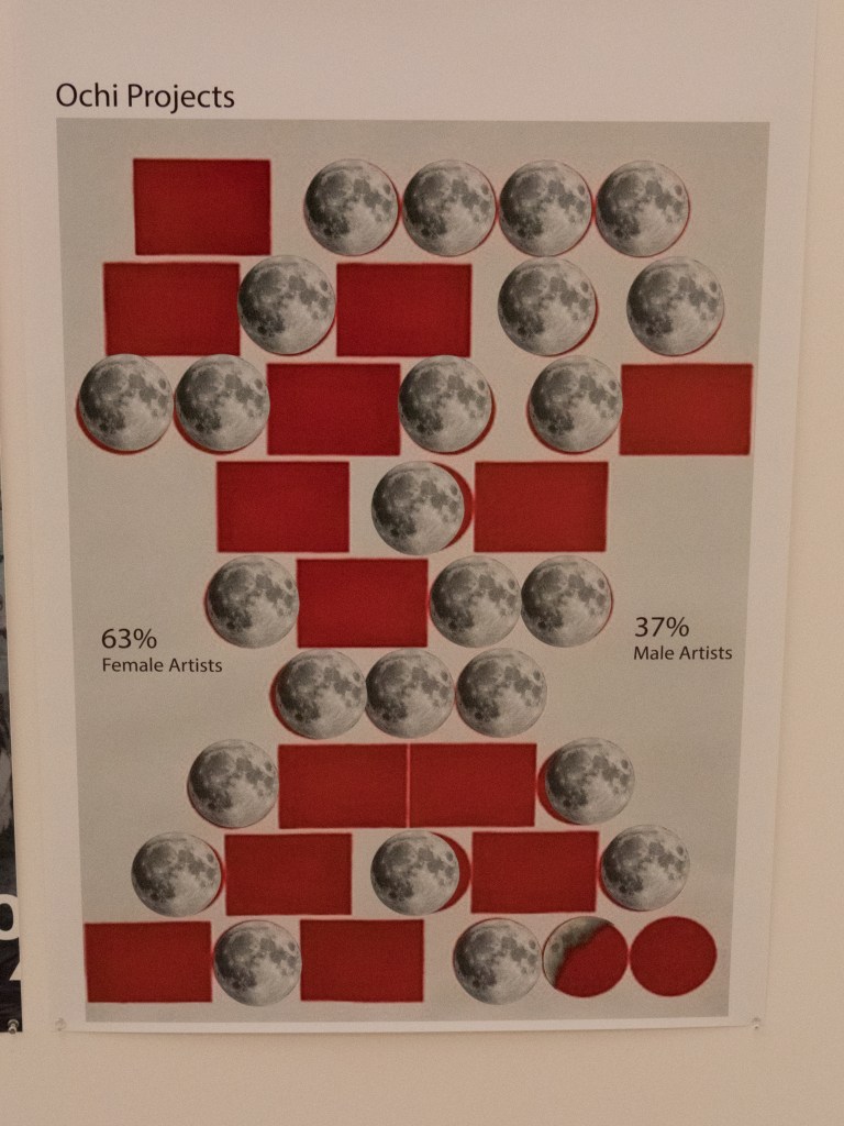
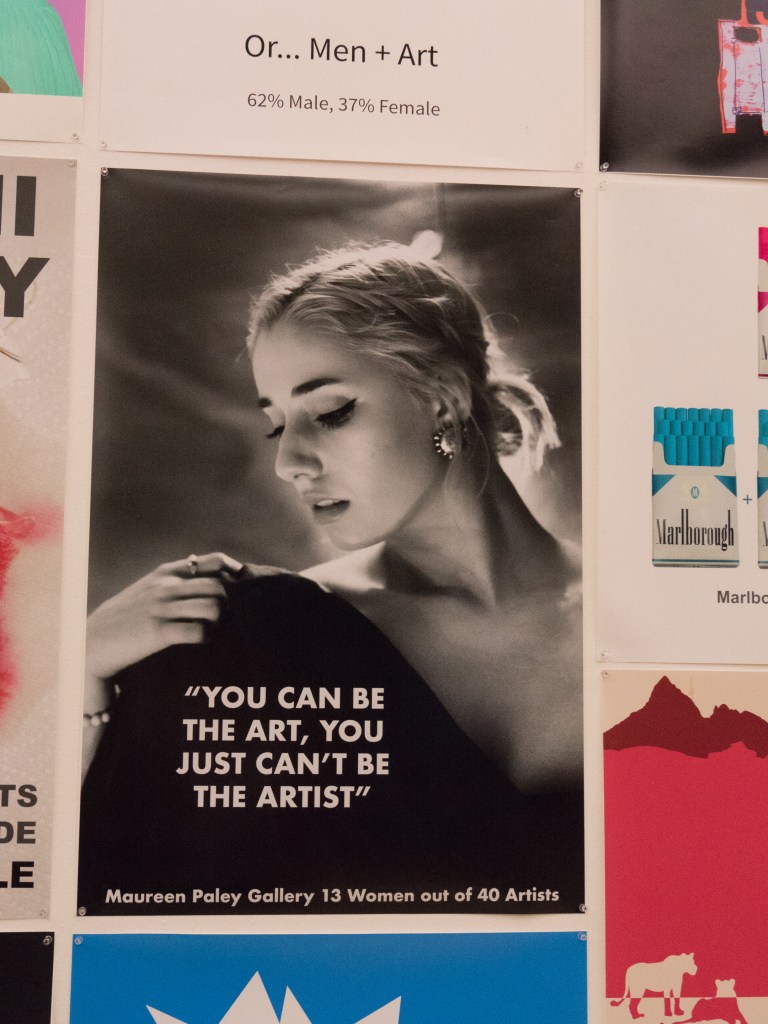
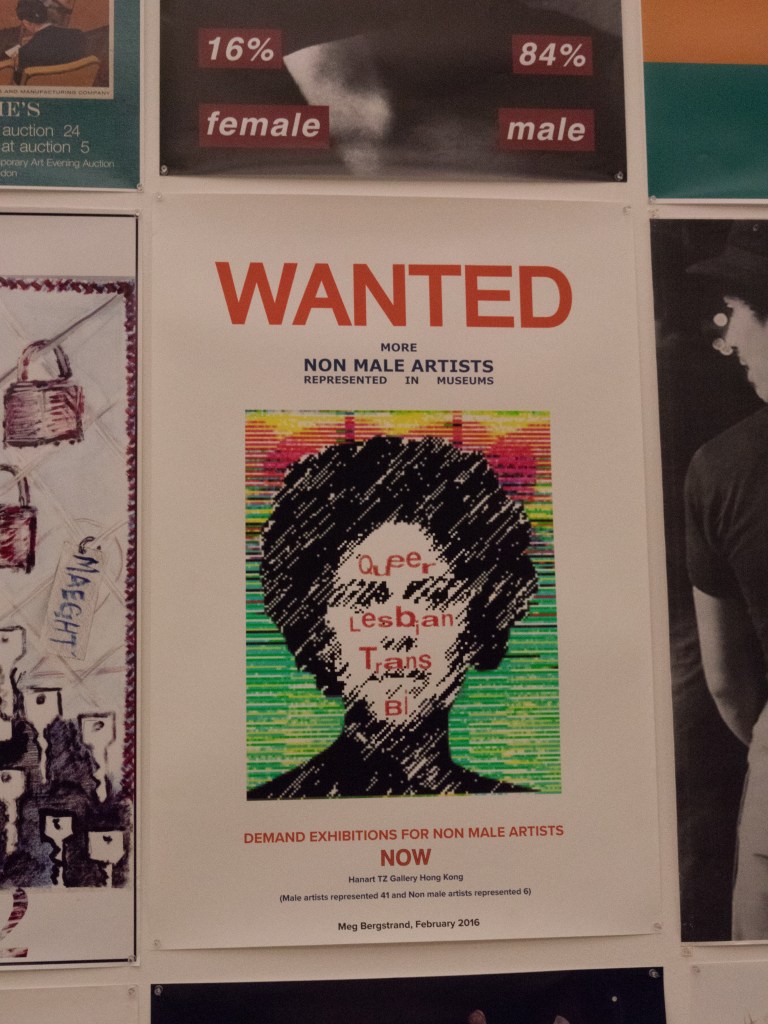
Michol Hebron presents the work from a collaborative project, Gallery Tally, where data is collected in the form of posters to show the representation of women in art galleries and museums. The posters are widely varied, and talk not only about the paucity of women artists on show, but also about the lack of work by other marginalised communities. The work by women photographers has been widely discussed recently for example in ‘Girl on Girl’ (Jansen, 2017) and the ‘Photoworks Annual 22 – Women’ – but it is shocking to realise that there is such a wide-ranging lack of equality ongoing in the wider art field. I only saw one (top right) where there were more females represented than males.
Posters from the Gallery Tally Project – attributions unavailable.
Gordon Parks – A Choice of Weapons and Syd Shelton – Rock Against Racism.
Side Gallery – Newcastle.
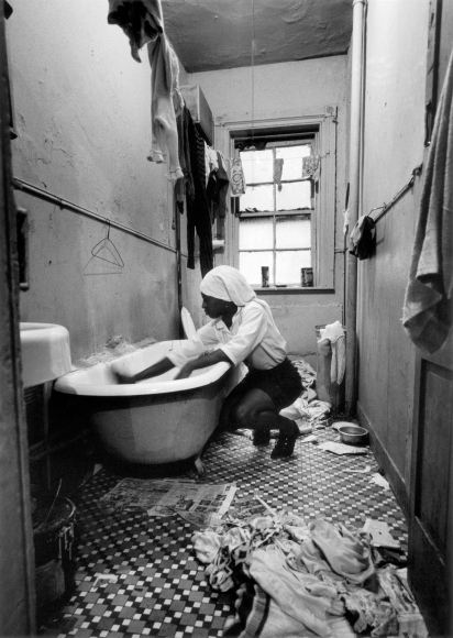
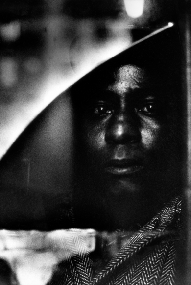
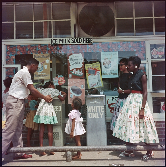
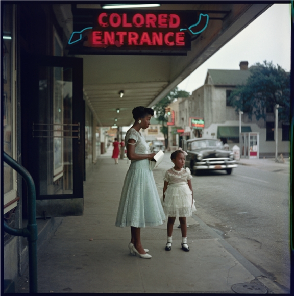
Gordon Parks (1912 – 2006) was an African-American photographer who said, ‘I chose my camera as a weapon against all the things I dislike about America – poverty, racism, discrimination’ (quoted in the exhibition information at the Side Gallery – Amber, 2017). He initially worked for the Farm Security Administration and then went on to become a freelance photographer and film-maker, documenting the difficulties black people faced in the USA. This exhibition shows a selection of his work both in colour and black and white, together with the film on the Fonetenelle family, from Harlem, who lived in extreme poverty. The images are detailed, dark and claustrophobic, leaving nothing to the imagination, even brutal at times. The story is shocking, but similar scenes could be found today.
The coloured images are from a photo-essay published in Life entitled “The Restraints: Open and Hidden” and point up how the lives of black people were segregated from the those of the white Americans. They appear softer, even ‘charming’ until you look closely and read the signs. This is an interesting use of colour photography in an era when most images were still in monochrome. Colour images were only widely used from the 70’s when promoted by photographers such as William Eggleston and Joel Meyerowitz.
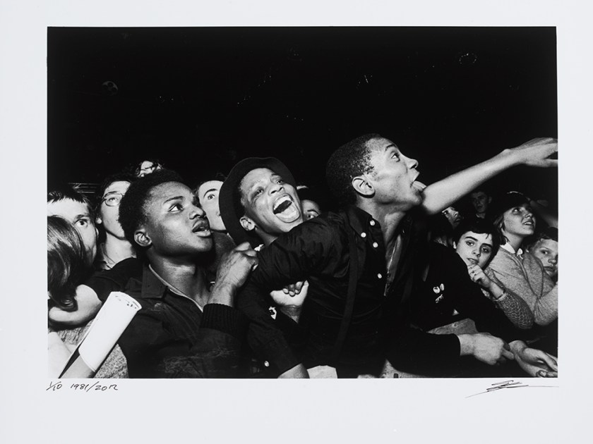
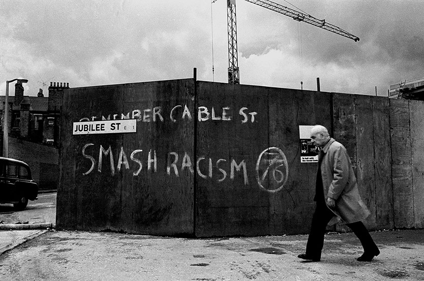
Syd Shelton (born 1947) was one of the prime photographers of the movement Rock Against Racism (RAR), which was developed by a collective of musicians, artists and activists to fight fascism and racism through music. There was a large exhibition shown in London at Autograph APB in 2015 and a small number of the images are shown in the Side Gallery. They are taken two decades on from the images of Gordon Parks but talk about the same issues of black versus white culture and perceived rights, this time in Britain rather than the USA. Shelton used his photography for a similar purpose ‘as a graphic argument …. a subjective witness’ (quoted in the exhibition information at the Side Gallery – Amber, 2017).
Although both the present exhibitions at the Side Gallery talk about the same issues, civil rights, racism and the abuse of power they come from a very different stance. Shelton was born in the UK and studied art at university before going on to become a photographer, working as a photojournalist. His images are from the outside, looking in, mainly of angry young people protesting on behalf of injustice in racism. Gordon Parks came from a poor farming family in the USA, he eventually ended up on the streets and taught himself photography, eventually working with the FSA, before becoming a photojournalist. His images are from the inside, looking out, of the people themselves, and what they were going though at the time.
While both sets of images have a powerful impact Parks’s have a greater degree of empathy and emotion, less factual but more revealing.
happy with these as I got a good position and the light was reasonable
Bad Touch gig in Newcastle
less happy here as the room was very dark and even on ISO 64000 there ended up with a lot of noise – needed a lot of post-processing to give OK images
Images on the beach at Torryburn for the coal coast homage
Some images in Newcastle and Workington of general area
Started photoing objects for long-term project on autism
small things that change your life
Reading:
continuing with Barrett’s book on criticism – finding this very useful as it is making me think about what I am looking at in alternative ways.
BJP – December issue – concentrated on Eastern Bloc then and now
Boris Mikhailov – (Russian photographer – now living in Berlin) – work shown in some detail – very challenging to the eye, certainly not conventionally pretty in any way. Worth exploring further.
Selfie by Will Storr – about the formation of the self in the modern world
Exhibitions seen:
Don McCullin – Artists Rooms at Dumfries
New Contemporaries at the Baltic
Starless Night at the Baltic
Gordon Parks at the Side
Syd Shelton at the Side
Thinking:
how to present A5 – without it being pretty
how do you represent a feeling /sensation in an image?
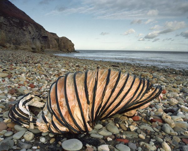
This image is from the series ‘The Coal Coast’ by Sirkka-Liisa Konttinen. It was originally shown at the Baltic Centre for Contemporary Art in 2003, and published in book format as ‘The Coal Coast’. The image is taken on the east coast of England, in Durham, and shows a discarded section of mine duct on the beach, looking remarkably like an enormous snail shell. The rest of the beach is desolate and deserted. The Durham coast has had a long history of coal mining, and for many years the spoil heaps and the rubbish were simply dropped onto the beach, building the surface up several feet above its original level. The coal industry is now finished and the remnants on the beach are slowly being removed by both man and the sea. The broken mine duct stands as a metaphor for the destruction of the environment by man and the loss of a way of life. It is still visible, as it is both large and a good distance from the edge of the sea, however, over time, it too will vanish.
This image immediately reminded me of the similar history of mining along the Fife coast where I live. Much environmental destruction was wrought over the years, however the traces of that are now only visible to those who are aware of the history of the area and know what they are looking at. My image is made as a response partly to the internal context of the image – unexpected things seen on the beach, but mainly to the external context of the history of the area and the effect on the local population and job availability.
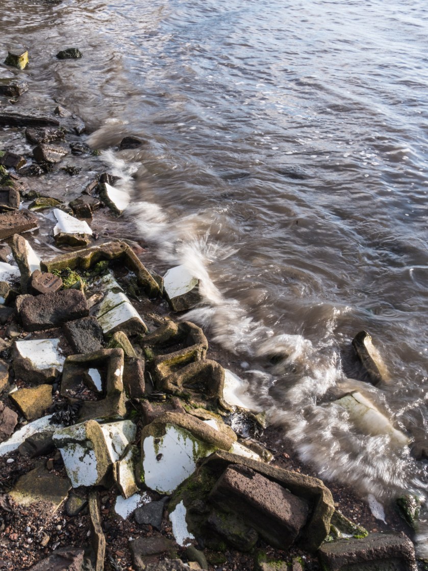
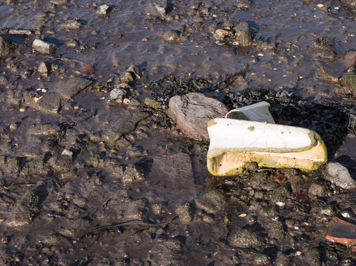
Sanitary-ware remnants, Torryburn Beach at high tide.
This image shows remnants of the broken down mine washrooms, that were left on the beach. The tide is high and gradually working at smoothing and polishing them. Eventually they will also disappear, or simply become unrecognisable. They stand, at present, as a reminder of times past, work lost, and also the loss of many lives in the mines that ran under the sea here.
References:
Konttinen, S. (2003). The Coal Coast. Newcastle upon Tyne: AmberSide.
While thinking about an image to use for Exercise 5.2 (homage) I went back over several of the exhibitions I had visited recently. When looking at the images, one by Sirkka-Liisa Konttinen from the Coal Coast series struck me and I remembered that there is some unusual debris on part of the coast in Fife near Torryburn. Oddly enough, there is the usual beach flotsam and jetsam but there is also a stretch of about 200 metres of coast that is strewn with old bricks and sanitary-ware (broken up large pieces of ceramic sinks). The local mythology – which I haven’t been able to confirm – is that it comes from the destroyed wash-houses of one of the local pits, and was put on the beach at that point to stop erosion. There is no logic to why the erosion should be particularly bad just there, and I suspect the truth is that it was just dumped, although that is odd in itself, as there is no road nearby and the shore is very gradually shelving for at least a hundred metres, so you couldn’t get a boat large enough to bring the rubble in close enough.
I felt that there was a possibility of doing my homage shot on the beach as there are several possible links with the image I was thinking of, so I went back over both the exhibition images as a whole and re-thought about it and the accompanying film which I have discussed in more detail in the blog post below.
Coal mining in Fife has a long tradition, with coal having been dug since the thirteenth century and the Fife coalfields were the largest in Scotland. Many ran under the Forth and were very deep. The nearest pit to this stretch of coast would have been the Valleyfield pit which closed in 1978. There is little surface evidence left of this extensive underground industry except the occasional pit-head and the endless bings (spoil heaps). The last deep coal mine at Longannet, which stretched well under the Firth of Forth was closed in 2002 after flooding. There continue to be ongoing attempts at open-cast mining, which scar the countryside and cause aggressive debate.
I have been to this beach on many occasions, and also to the pit-head further along the coast at the Seafield Colliery however have never taken any images of the debris, so I went back this weekend at high tide, and again at low tide to look at the area and the surrounding coast.
Setting the scene:
The chimney in the distance is part of Longannet power station, which is now disused. At low tide the mud flats stretch out for about a hundred metres, although I would not advise walking on them, as the tide can come in extremely fast, and much of it forms quicksand.
The surrounding flora (winter variants):
There is a wide variety of wildflowers and bushes along the edge of the coast here and they attract thousands of birds, many of which are protected species.
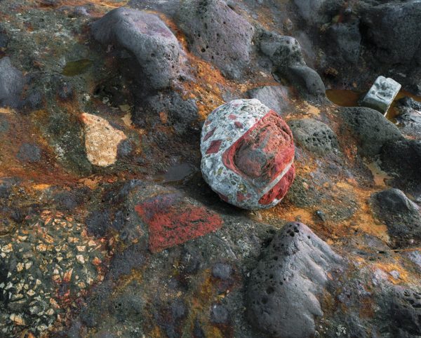
The bricks:
Part of the rubble is made up of bricks that come from the local brickworks and are stamped with the source name: Lochgelly, Bowhill, Hill of Beath, Lochside. More evidence of an industrial past now gone.
The evidence:
It remains a mystery as to how the sanitary-ware reached this spot – and why in such a localised and inaccessible (except by foot) point.
The Coal Coast is a body of work by Sirkka-Liisa Konttinen about the effect of the coal industry on the beaches of Durham. It was initially shown at the Baltic Centre for Contemporary Art in 2003, and developed further along with a film and shown again this year at the Side Gallery in Newcastle.
Sirkka-Liisa Konttinen is a Finnish photographer who has worked in Britain since the 1960s. Her earlier work was all in black and white, mainly on the lives of people in the Newcastle area, however, she branched into colour for this series, using a medium format camera with colour negative film.
The Coal Coast describes the effect the coal mining industry has had on the environment. All the waste from it was simply dumped on the beaches, together with the ballast from the ships and the ash from the coal that had been burnt to provide energy for the operation. This effectively raised the levels of the beaches by several feet. Since the coal mining has stopped there has been an attempt to clean up the beaches, and the effect of removing some of the debris and letting the sea have more access has further removed some of it. Sirkka-Liisa Konttinen says ‘a redeeming thing is that the sea is taking back the man-made intrusion …. Maybe environmentally it will return’ and also describes how these sea changes impacted on her work, in that there were constant changes to the beach, how she would look for the time of day, light and tide combination that would show what she was interested in only, on some occasions, to return, and discover that the items had been washed away.
The images are often bleak: a dead bird, mine rubbish, a shoe half buried in the sand, but full of the most surprising colours, rust red, copper green with the intense blue of the sky. It is clear why she chose to use colour rather than monochrome to show this area. The series acts as a comment on the destructive powers of industry on nature, but also on the regeneration possible. The images themselves are sparse, definitely less is more, and benefit from repeated viewing. Some are reminiscent of the images of famous tourist areas, sea, sand and rock formations, so knowing the background to the images is crucial to understanding them.
The recent exhibition was accompanied by a film made by Sirkka-Liisa Konttinen and the Amber Collective, which is accompanied by music from the New York group So Percussion. It tells the story of a young miner, Billy, who died in the pits and the struggle to get his body out, interspersed with the images from the Coal Coast series and scenes of the moving waves, with sounds of the sea on the beach. It is both heart breaking and beautiful. The story is narrated by a former colleague of Billy, and even at this distance in time, the emotion in his voice is clear. The repeating and echoing music weaves in and out of the rushing of the waves. Overall a cathartic experience.
References:
Konttinen, S. (2003). The Coal Coast. Newcastle upon Tyne: AmberSide.
Song for Billy. (2017). [HD video] Newcastle: Sitka-Luisa Konttinen.
The essay by Terry Barrett discusses the context within which we view images and how this is important to understanding them. He posits three types of context.
The Internal Context: where you look at the actual image and the information given there. This can be considered by the denotations – what is actually there, for example, a car or a bicycle, and the connotations – what is implied – in this case travel or movement. When looking at the internal context you also need to be mindful of the fact that the photographer has chosen that exact framing, and taken the image at that exact time.
The Original Context: where you need to know the history of the image, what has happened before, is the image a copy, has it been taken in homage, what was happening in the world at the time. Barrett talks about the Nick Ut press photo of Vietnamese girl and another example would be the Capa photo of soldiers landing in Normandy. The more that is known or researched about the time, place, historical context and theories of art about that particular period the more that can be understood from any image. It is also helpful to know what was in the photographer’s mind when the image was taken (diary notes, interviews) although memory and distance in time will affect the accuracy of this data.
The External Context: This is where and how the image is shown, together with what information is given alongside it. Barrett describes the fascinating story of the use of the image of people in a café by Doisneau. The same image can illustrate very different stories depending on the attached words or where it is shown, magazine, press article, book, gallery wall. Any accompanying text can give a series of very different meaning to it, so it it imperative to know the text source, the photographer themselves, a curator who is interpreting the image, possibly in a historical context or someone who is using the image in a different context to make a point – possibly political.
When all the contexts are considered it may well change ones understanding of the image itself.
Brief: Find a subject you have empathy with and take a sequence of shots to explore the distance between you. Evaluate by whats in the frame, not by your preconceived ideas.
I started by struggling to think of an idea for this but eventually came up with two:
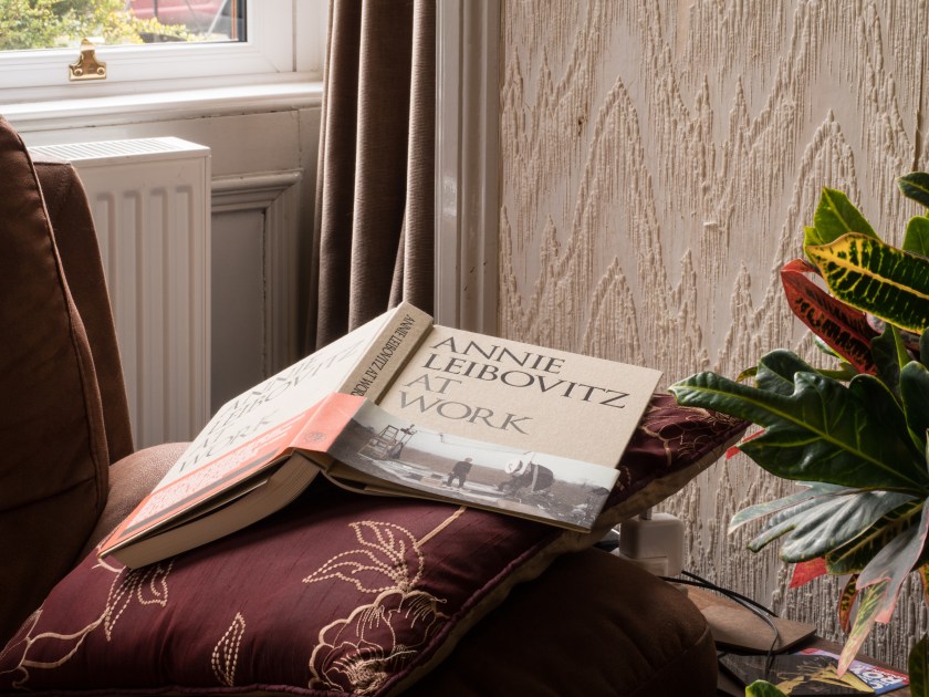
books – and my relationship to them – I read constantly.
the coast – sea and the pebbles that I grew up with.
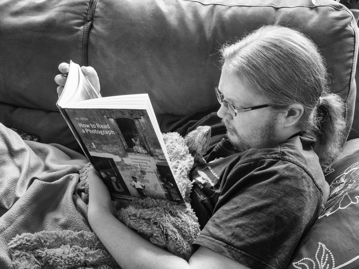
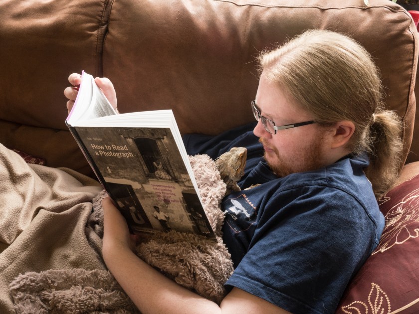
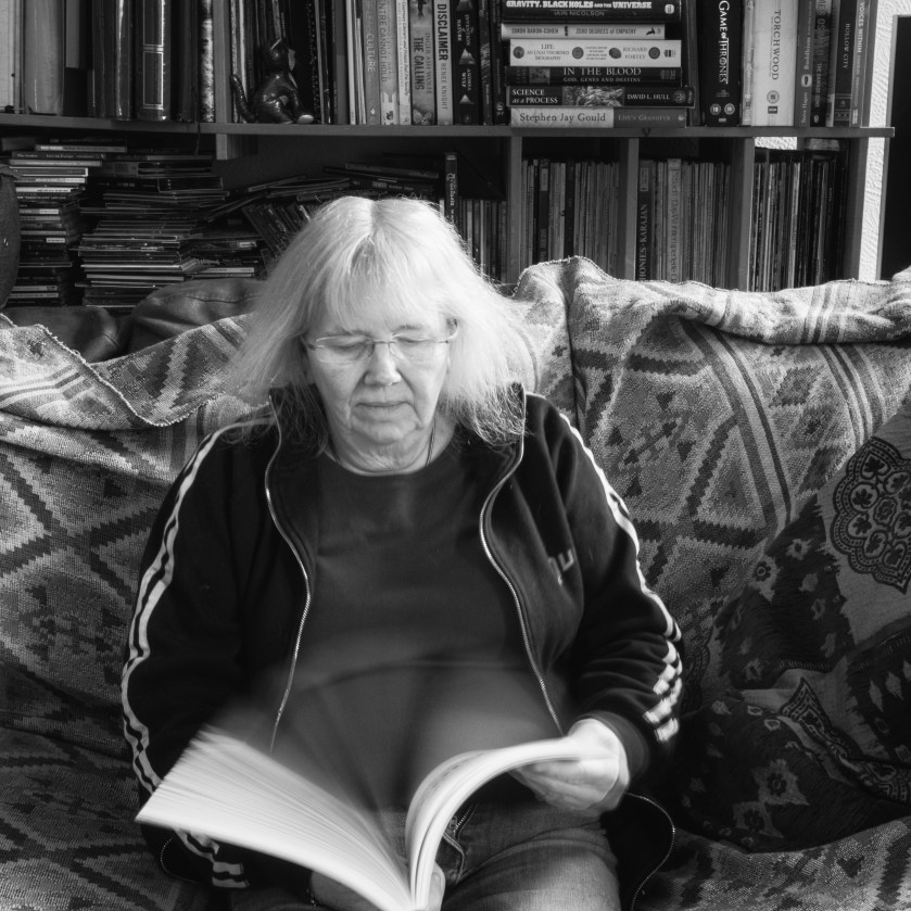
The weather was very dull today and also cold so I started by exploring the theme of books. Our house is full of them, all types and in all stages of preservation. I tried various image ideas and eventually enlisted the aid of my son – who is also a bibliophile – and as long as there are words on the page will read it!
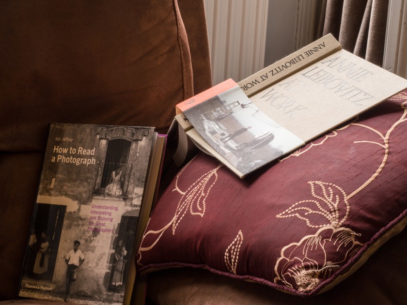
My original images were of the bookshelves, a general bookshelf, some of my photobooks and a closer up image.However I felt these were quite ‘cold’ and didn’t say much about any relationship between me and my books.
I then just picked two books and started to play around with photographing these, both together and separately. I didn’t like the image on the right as it felt much too staged, but the left hand one is often how my books end up when I get distracted while reading, yes, I know it is bad for the spine!
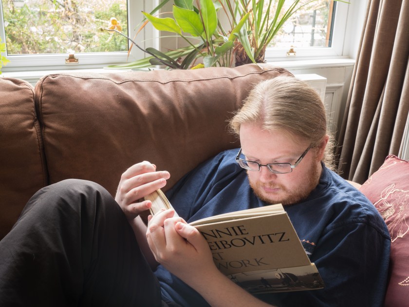
I then thought to experiment with someone reading, so tried a further series of poses, both from close and further away. When I went away to check the focus of the initial images my son had acquired a ‘helper’, we changed the book, for the amusement factor (a little corny’) of taking a photograph of reading a book about reading a photograph.
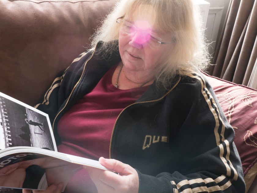
The problem with this set of images is that the mental distance between me and the subject increased again – so I went back for a further think and with much jumping up and down to refocus worked on some images of myself and a book. The image on the left is ‘marred’ by an accident of the sun, which had momentarily come out and reflected in the lens. The light on the book was, however, making it really easy to see the pictures, win or lose – picture versus practicality. I then moved place in the room and looked at close-up images and more distant ones.
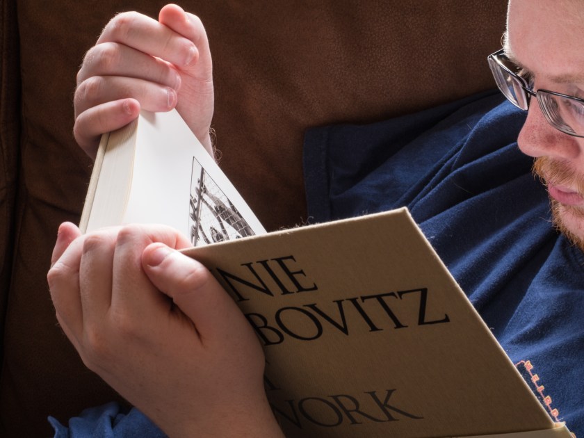
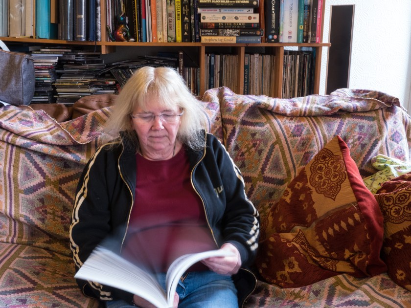
The image I felt was most evocative at the end of it all was this one. I liked the way the blur from the flicking pages echoed my hair, which was exaggerated by the black and white conversion. A completely accidental mirroring, but it catches my relationship with books.
10/11/17
Having carried out and posted this exercise I came across a fascinating article in Photoworks 22 by Sara Knelman, where she talks about her collection of photographs of woman reading, ranging from early black and white images to more modern colour ones. She relates this to the work of Virginia Woolf in a ‘A Room of Ones Own’, and also comments on the considered male feeling the reading was an appropriate pastime for a woman, even though they might not understand what they were reading. She ends by pointing out ‘Part of the beauty and intrigue of these images, then, comes not from the things we can gain from visual cues but from wondering at the imperceptible imaginings of the readers’. (Knelman, 2017) If my family come across this image in the future will they wonder about my thoughts?
Reference:
Knelman,S. (2017). Lady Readers. Photoworks, 22 pp.138-153
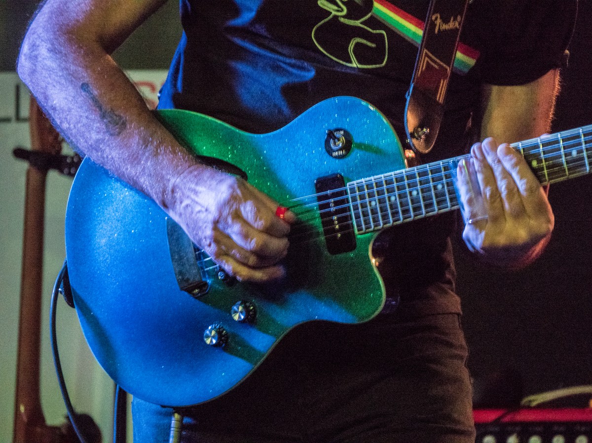
Gigs images at Moody and Maas – moderately successful given that the light was very dim and all had to be handheld
Reading:
Stephen Shore – The Nature of photography – found his way of splitting up looking at images into the physical level, the depictive level and the mental level a helpful way of conceptualizing what I am thinking about with an image
Photoworks 22 – Women – some of this I find too theoretical, too far away from my practice –
but really enjoyed Francesca Catastini – The Modern Spirit is Vivisective,
also the work by Diana Matar – Evidence – talking about the importance of absence.
Thinking:
Still about how to show sensory differences in visual terms.