Thoughts for July

I have been following, with some bemusement, several posts both on the OCA EYV mail thread and on the OCA year 1 Facebook page. There seems to be a small number of very vocal people who are clearly dissatisfied with the thoughts behind the course and the marking system. The problems could be summarised as:

  • I don’t feel I get enough support
  • I don’t like being told what to do
  • I don’t like the type of photography we are being asked to look at – too artsy, not beautiful, too much meaning, not enough meaning!
  • I’m not learning how to make better (read prettier) pictures
  • It’s too hard
  • It’s too much theory

Some of the above are obviously mutually contradictory.

I am not in the above camp – but I do wonder how much these vocal people reflect the general perceptions of a distance learning environment and some of the inevitable difficulties that occur. I have had the dubious advantage of working in a profession where I have always had to do a lot of self-directed study to keep up with any new developments, and was aware how hard this can be before starting the course. I am also studying for personal interest, that’s not to say that a long-term goal of making images that are good enough to attract attention and maybe even sell is out of the question!

I also am very aware that I actually signed up to do an Arts degree (and hope to be able to finish it). In any degree course there is bound to be a lot of ‘theoretical’ work, both reading and writing, and you are going to come across a range of works, some of which you will like and some of which you may hate or despise. I also think that it is likely that my tastes and specific interests will change as I see more different images and also as I read more about the thoughts and aspirations of the individual photographers. Certainly, I have already come across several artists that I would never have found before, and at least one that, on initial viewing, I could not see any value in, but whom I now really appreciate, and go back to.

I admit I am struggling to find enough time to do as much as I would like to. This is partly because I keep getting distracted and would spend an untenable amount of time following side paths, which, while fascinating, does detract from time available from doing the actual course work.

I also keep changing my mind about how to approach some of the assignments. I would probably find a little more hands on guidance or discussion helpful here, and should probably benefit from attending the study days when they are near enough or joining a local (ish) study group. Maybe a way forward would be to get up courage to post some of my images on the appropriate thread on the OCA website to ask for comments.

The issue about tutor support is a significant one. The tutor I have for EYV has not had any contact with me other than responding after my assignments, however that response has been extensive and very helpful, commenting on both my photography and my research, with several suggestions about how to take it further and appropriate links. Interestingly he has given some diametrically opposite advice from the tutor I had some years ago for TAOP. My previous tutor directed that every image should be labelled with all the image data, this one said not, commenting that you would only look at this if the photograph was intrinsically boring! (Although it can be interesting to know how someone else has reached the effect they have achieved).

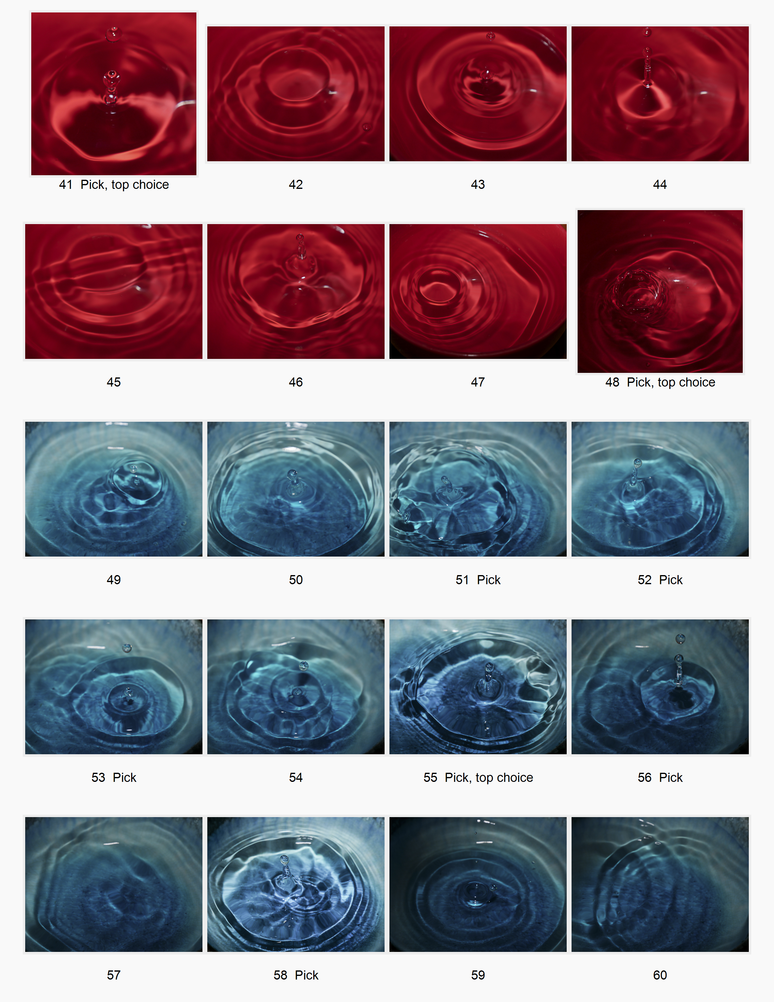
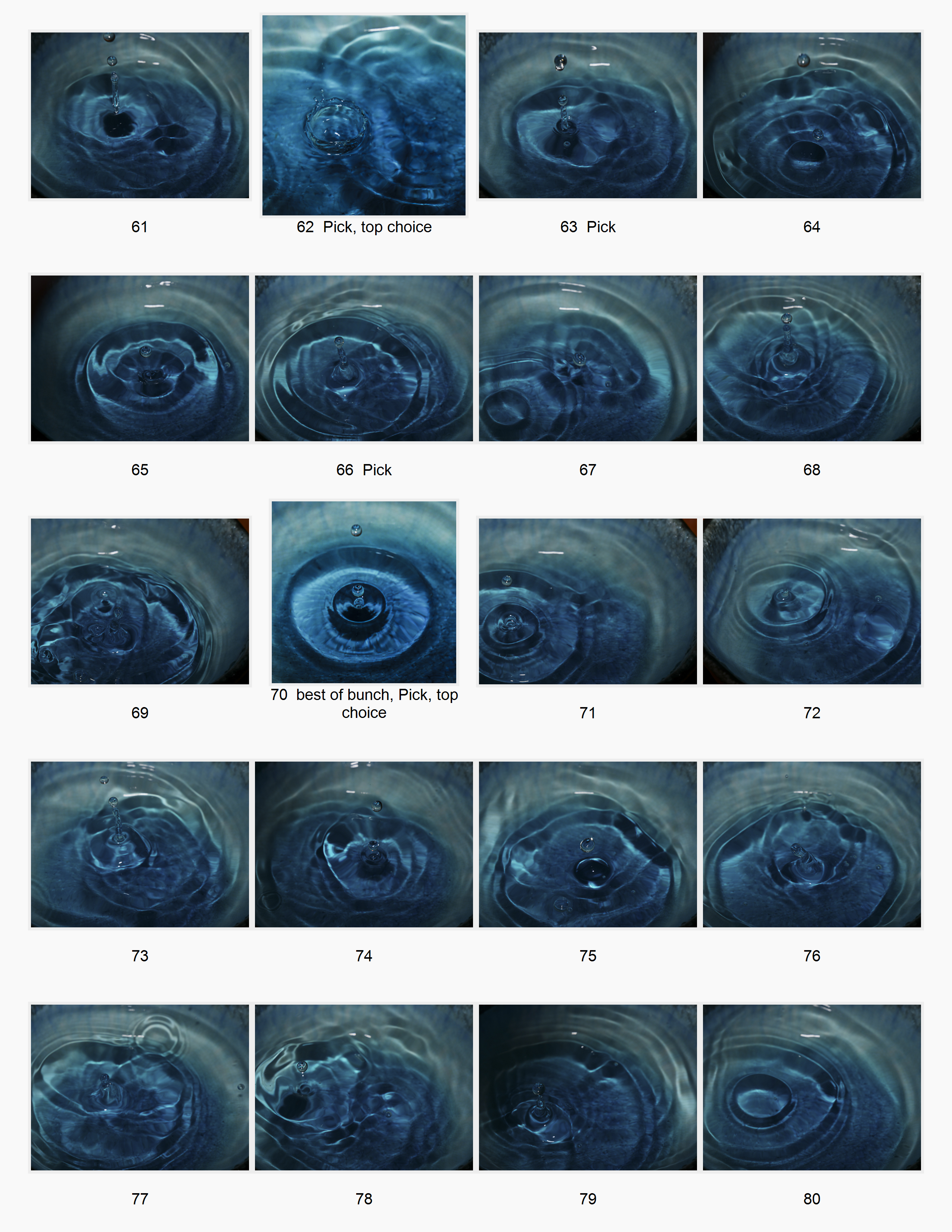
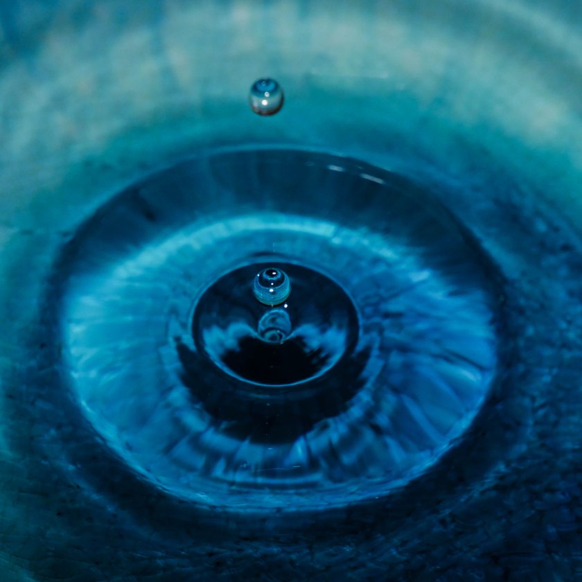
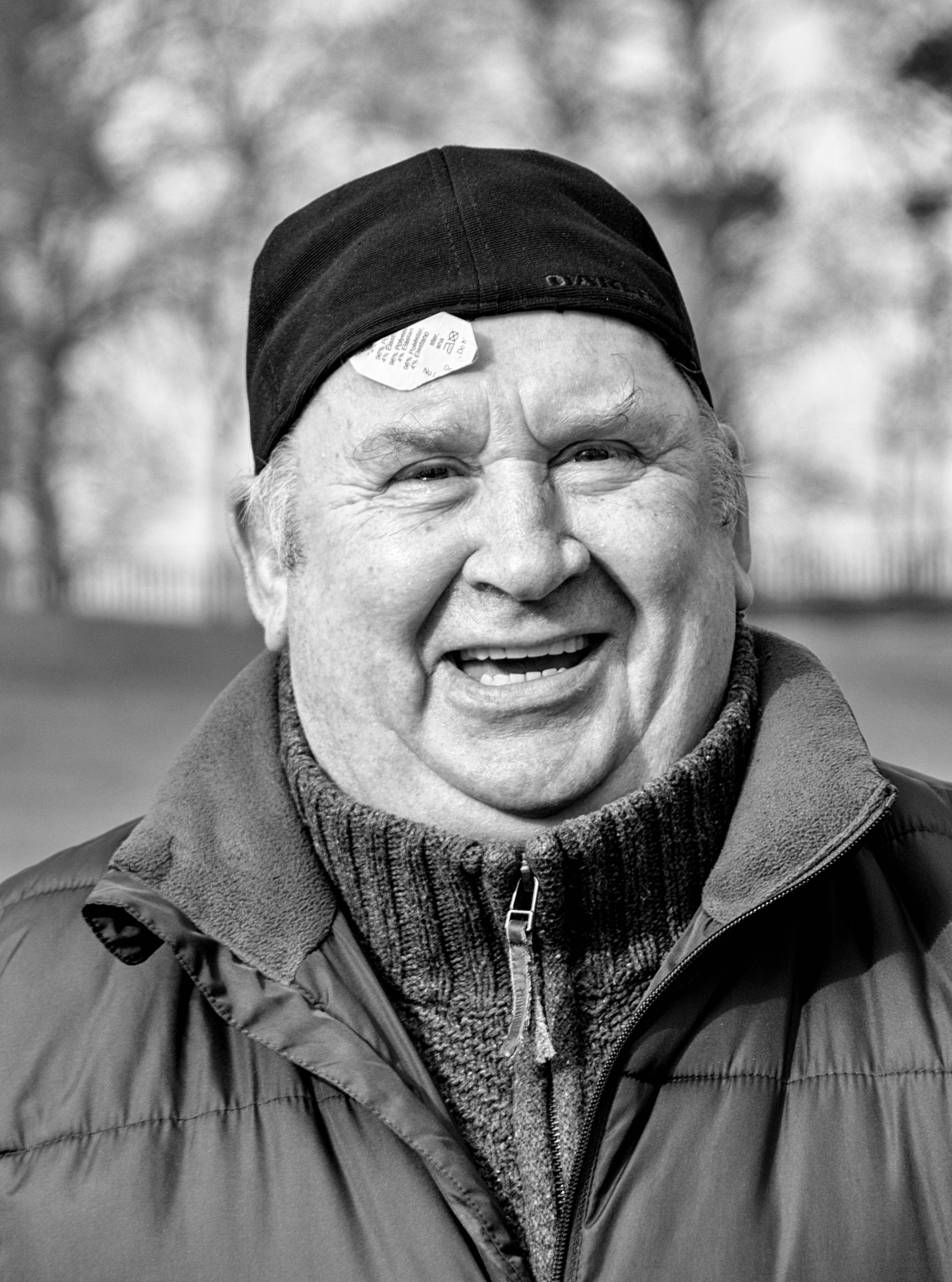
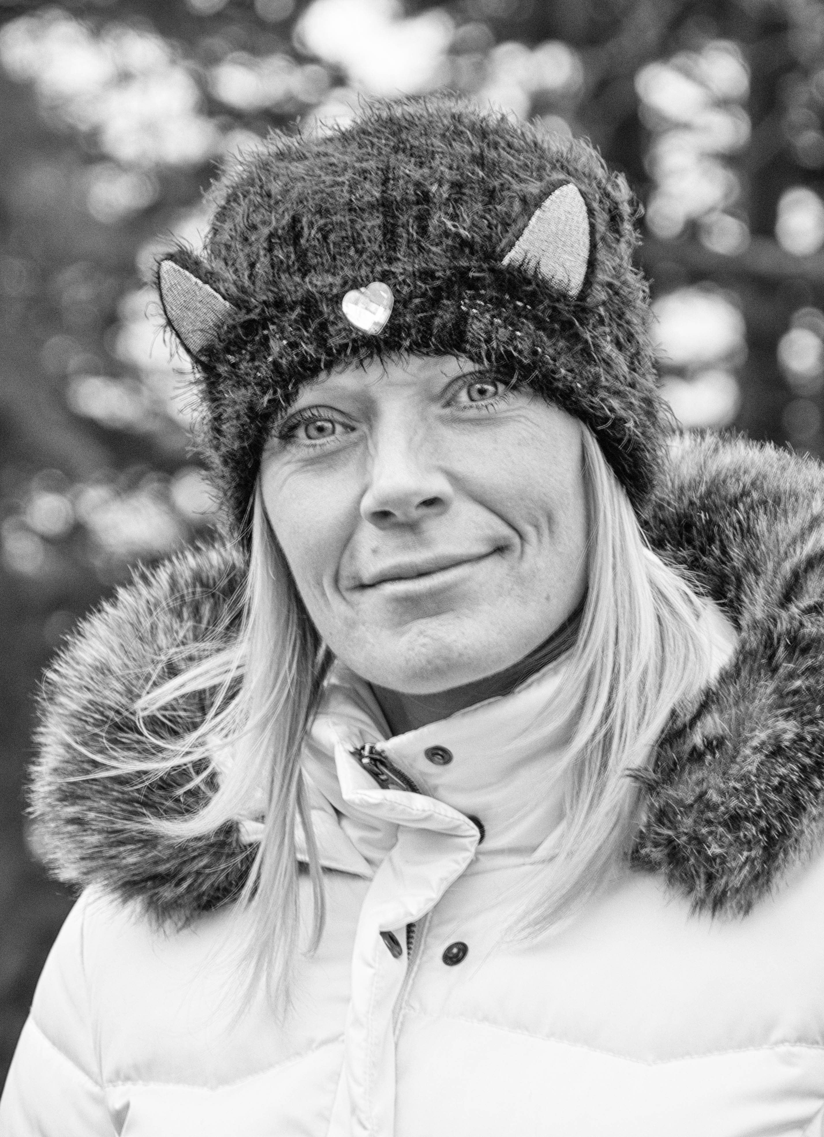
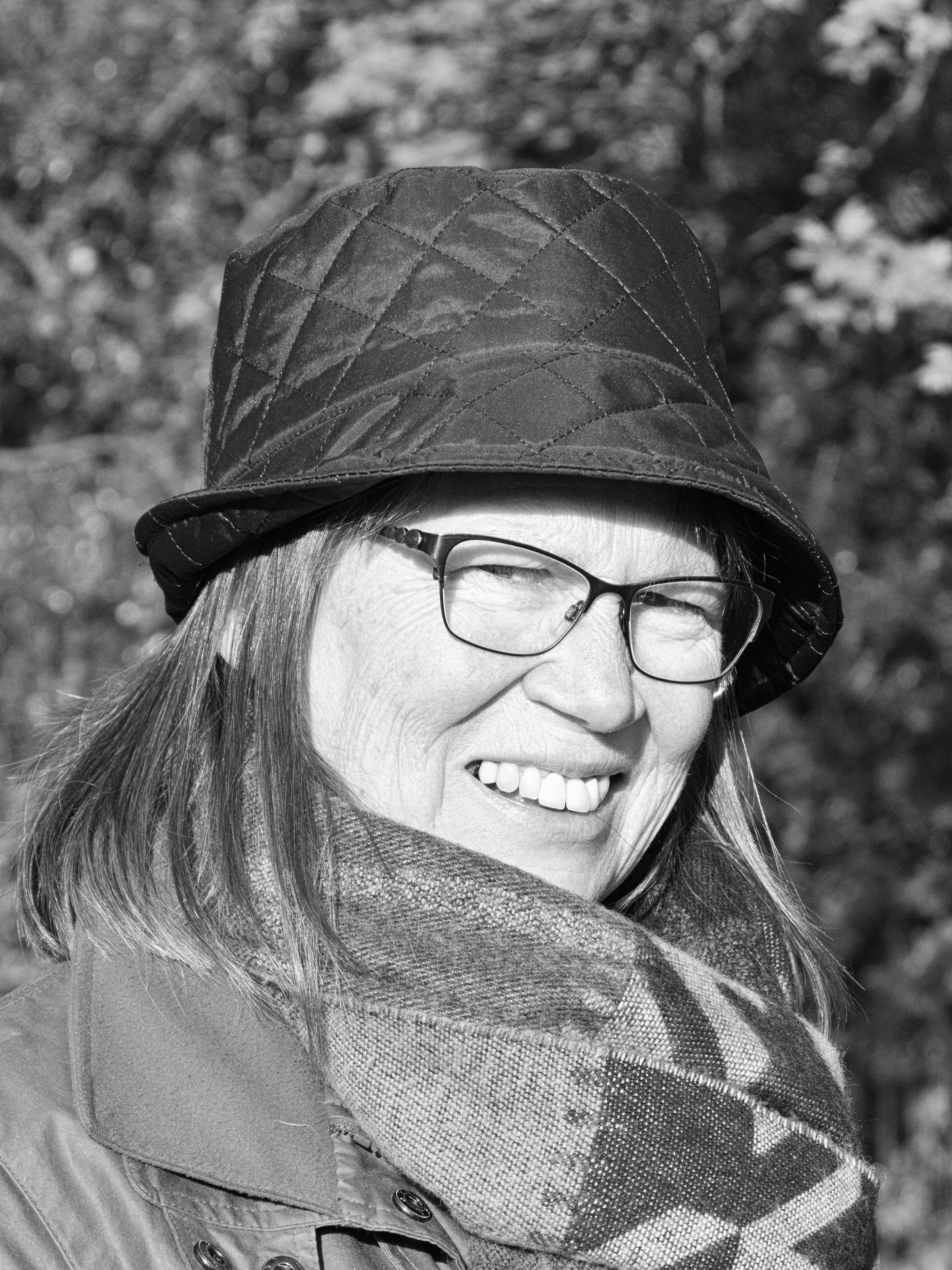
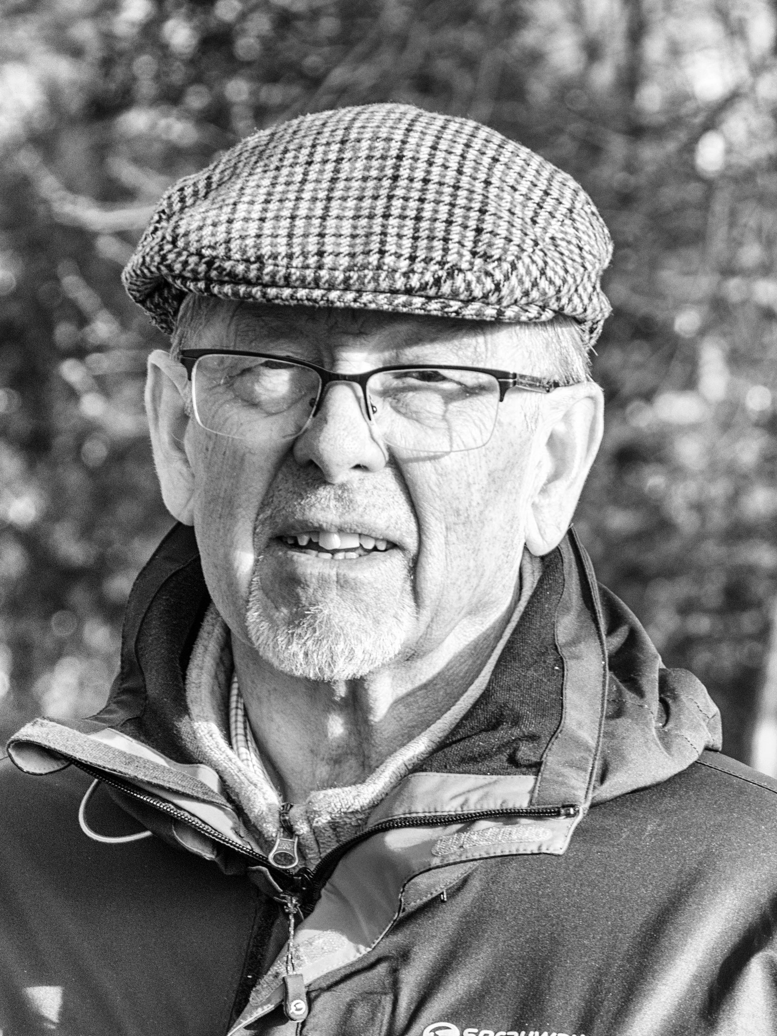
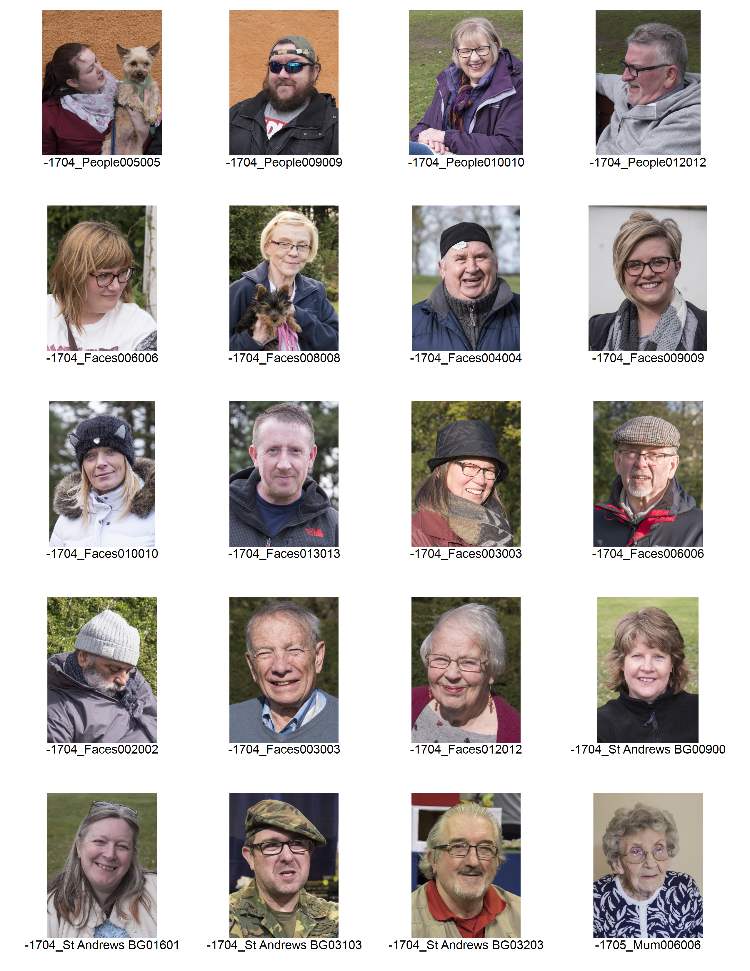
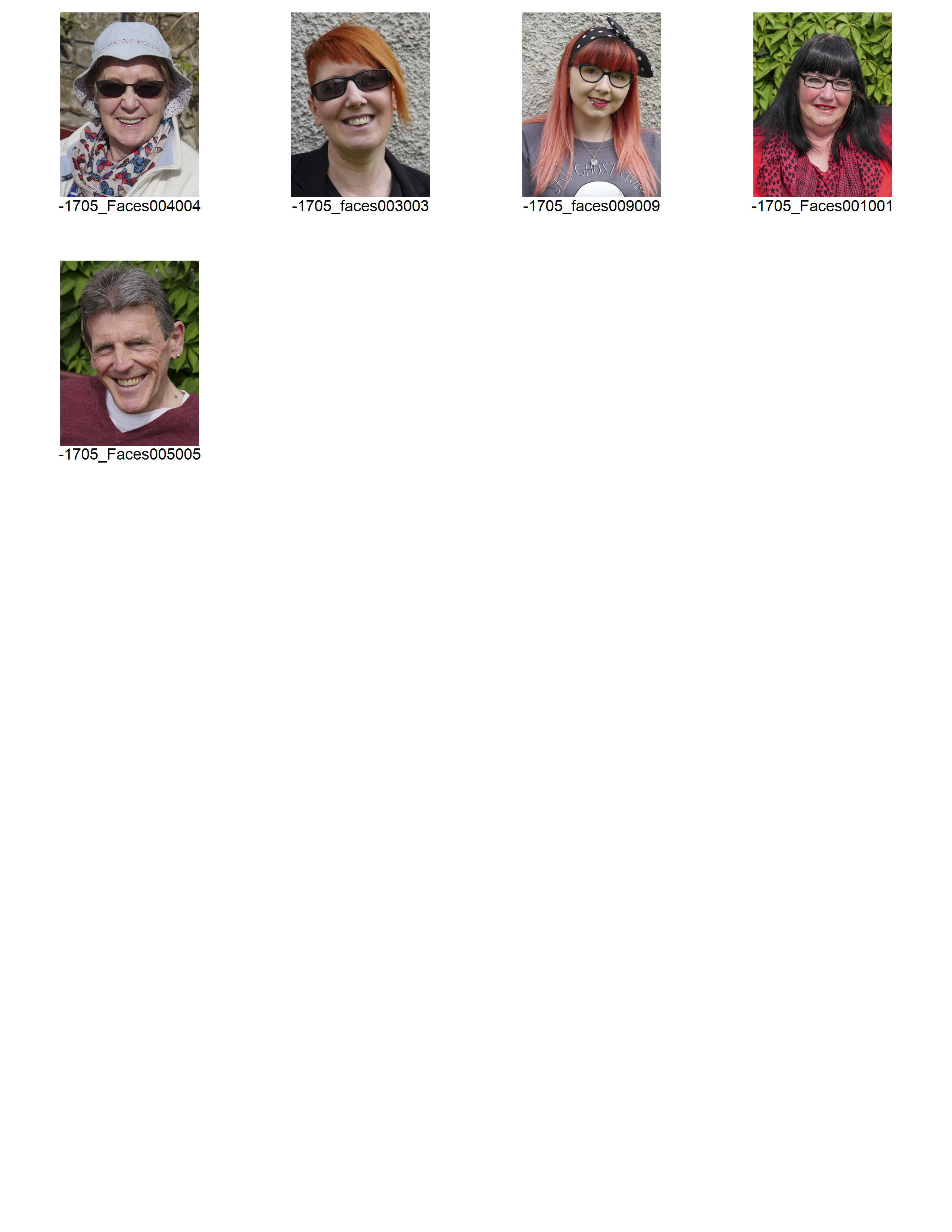
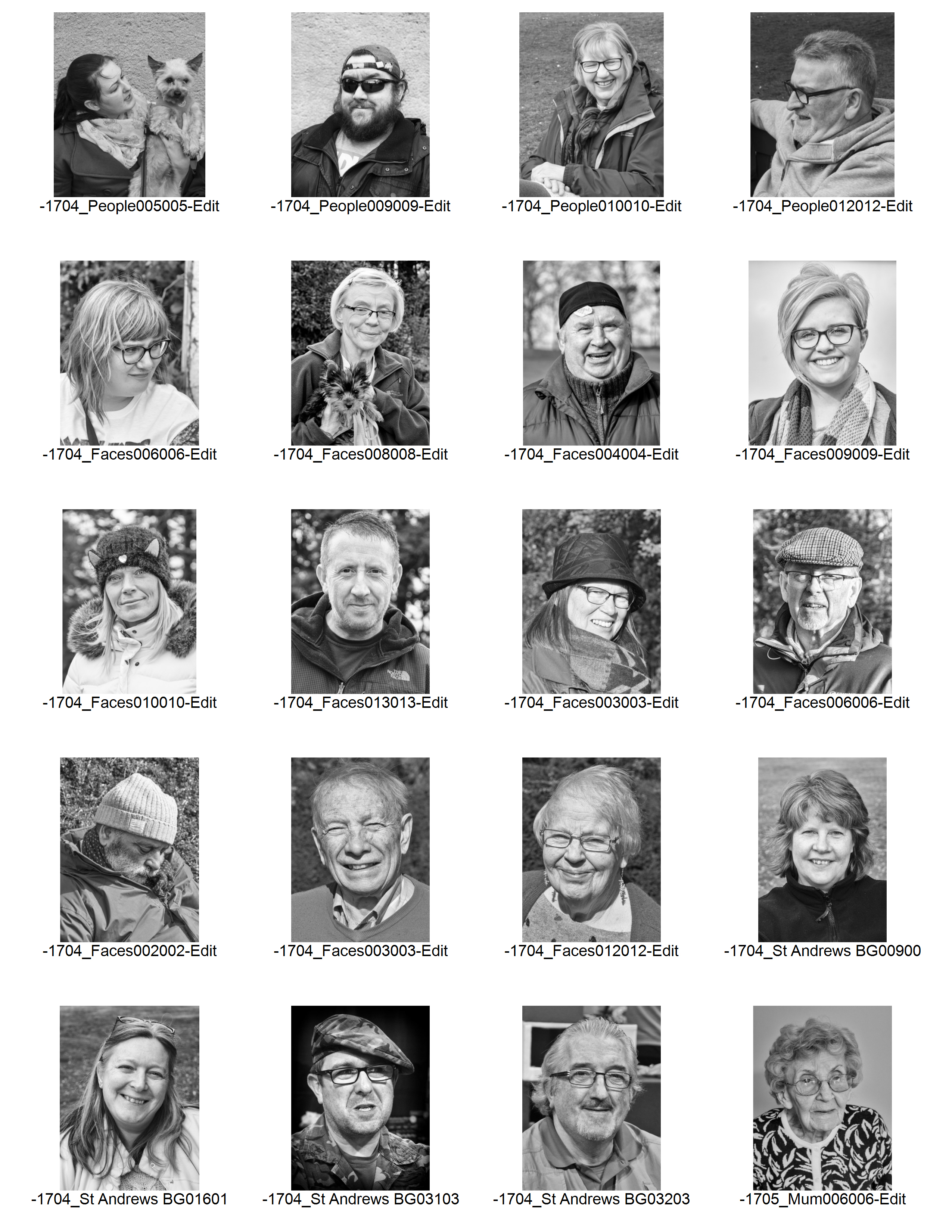
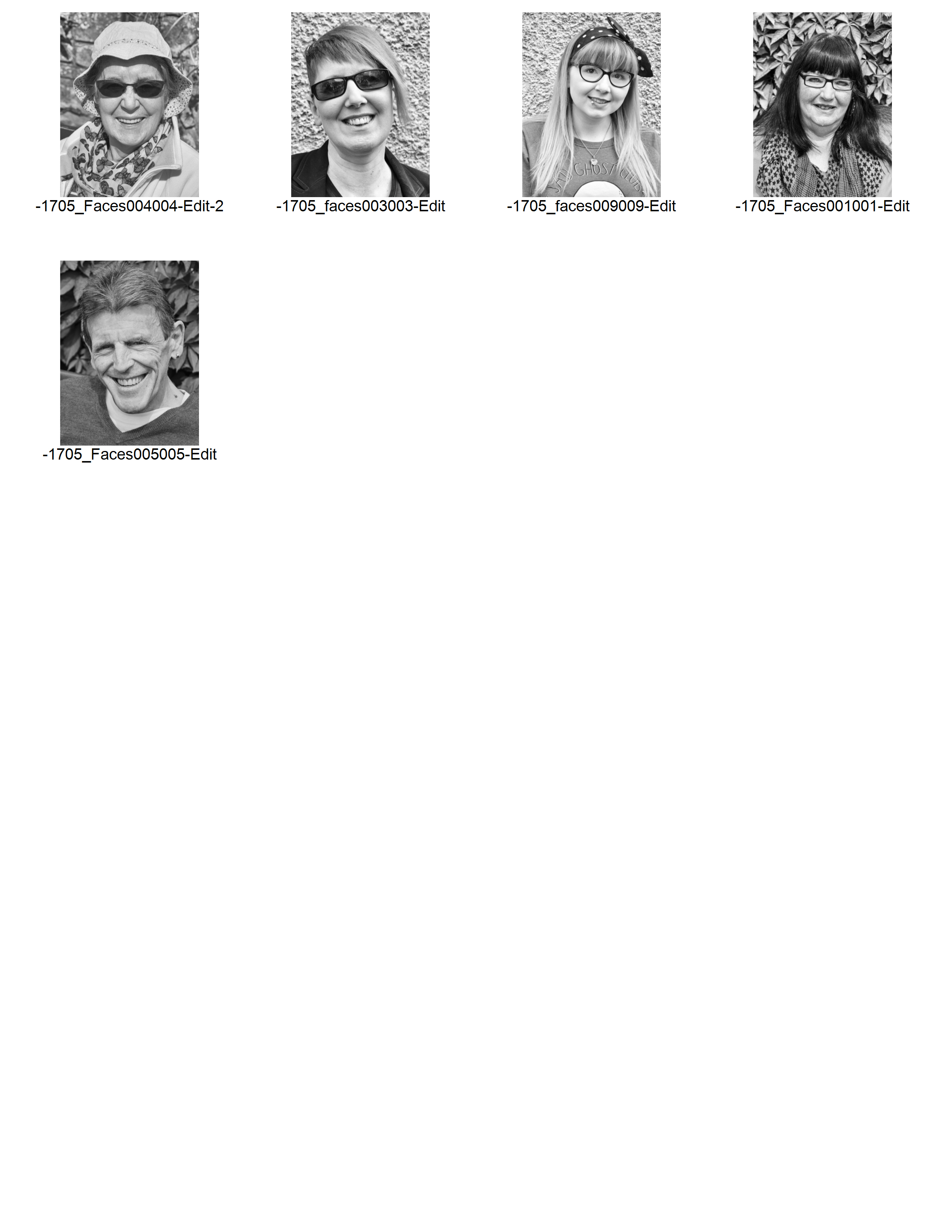
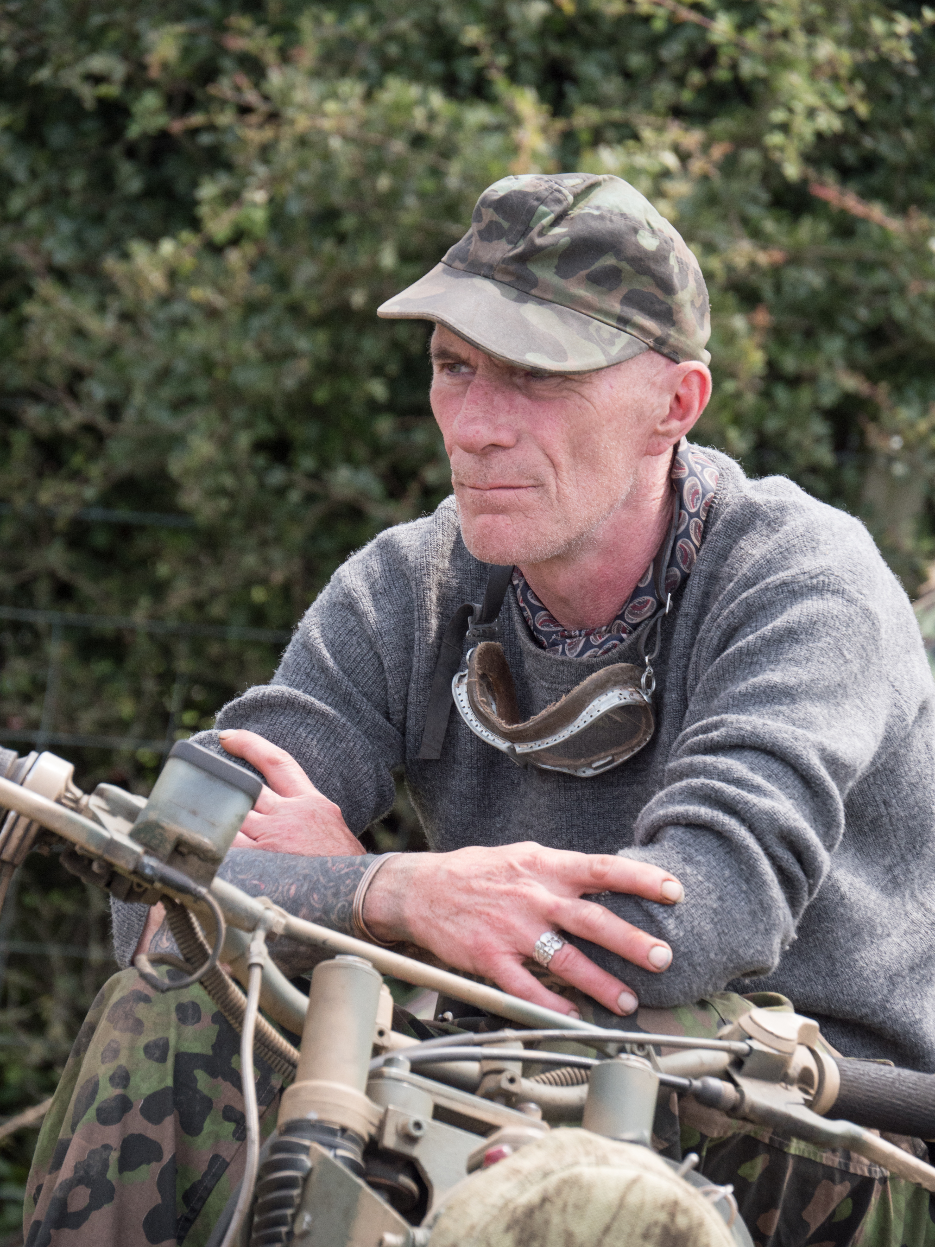
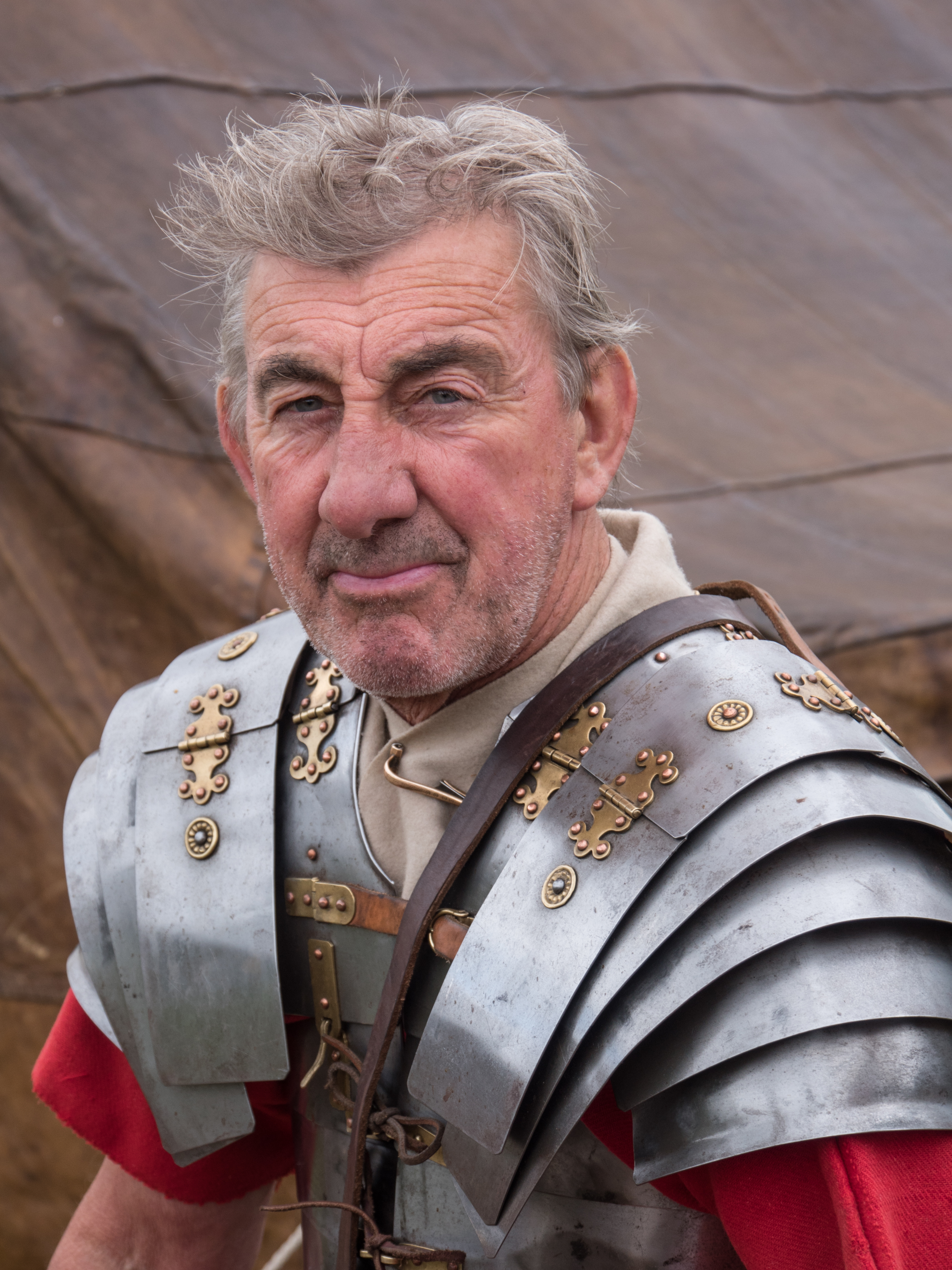
Over the last month I have done a fairly large amount of personal photography that doesn’t directly feed into the course requirements. We have been away on holiday on a tour of Northern England and been to several events to do with the Romans and also to a very large military re-enactment. I have been able to use some of the confidence I developed in taking portraits for assignment 2 to good use here, and have, I think, made more interesting images of these events than I would have previously.

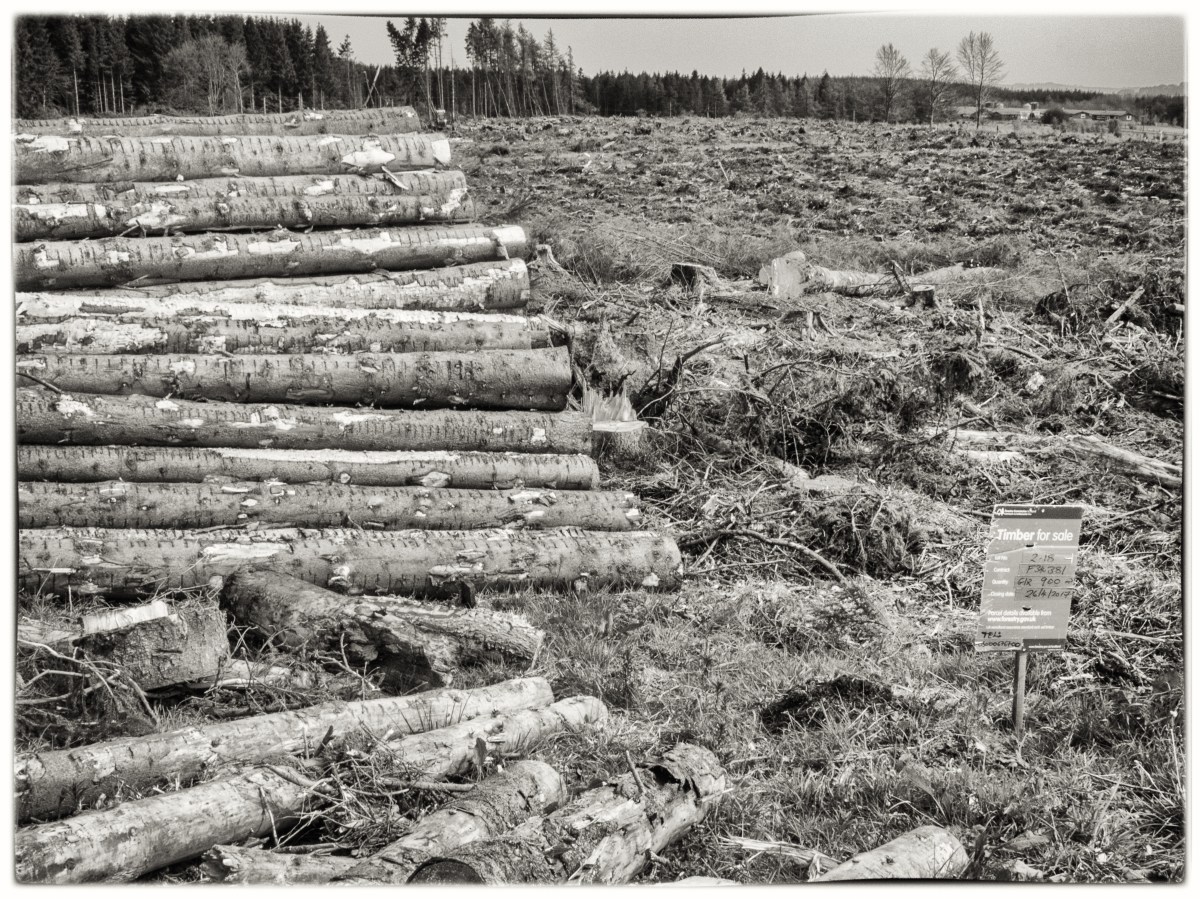
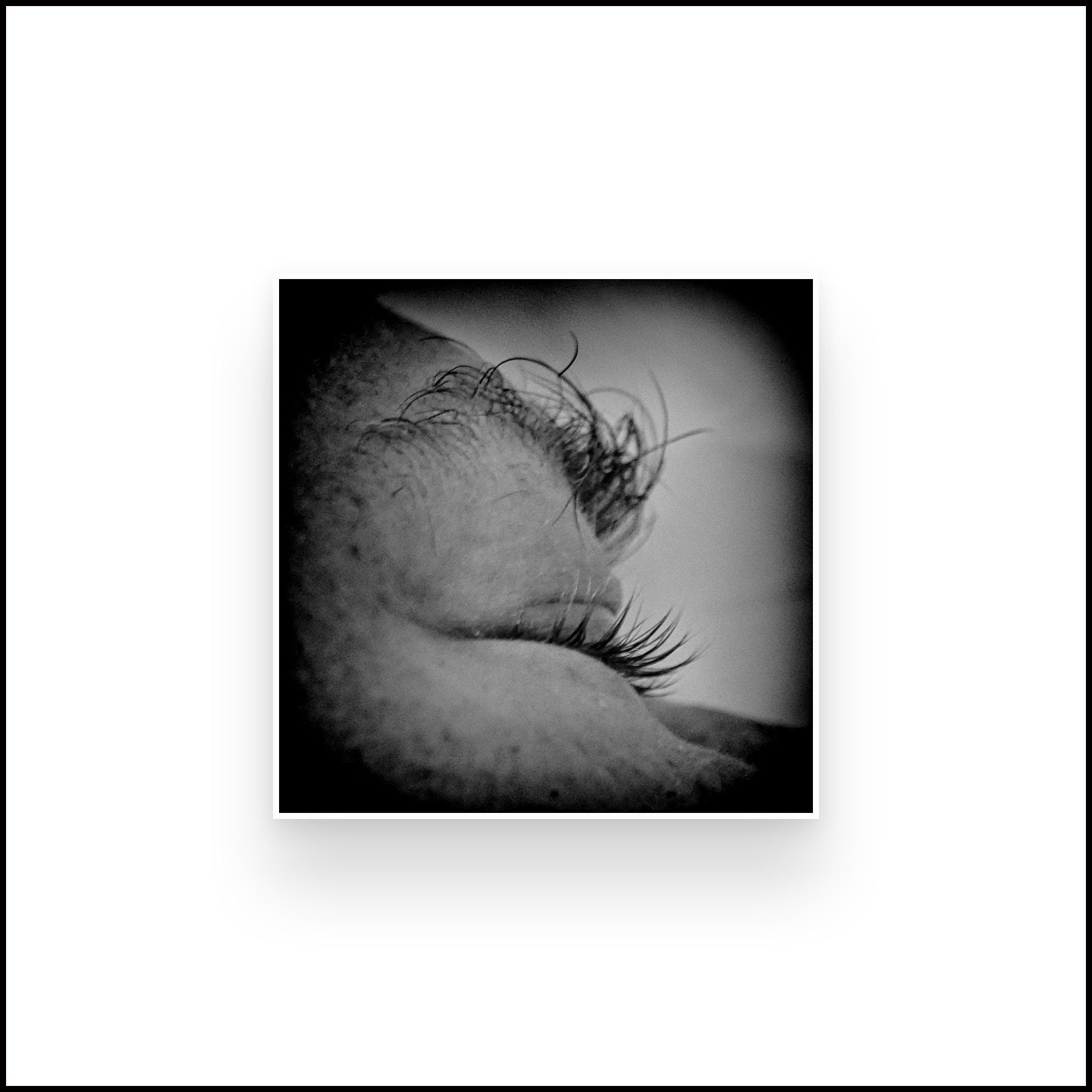
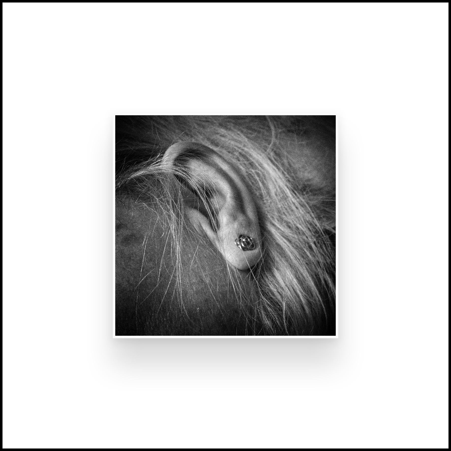
I have also made a small photobook for our wedding anniversary using 3 inch square close-up monochrome images of ears, fingers etc, which I would probably not thought of doing before the course. This is something I may well develop for future work and have wondered about using for the final assignment, my initial plan had to do some images around the environmental impact of the forestry commission and logging in Scotland.

So this is where I am at the moment. Trying not to get too diverted. Considering what to take forward. Generally happy that I am slowly improving.

L’amore de court – Just plain love

A documentary about Henri Cartier-Bresson, made in 2001 when he was 93.

I watched this documentary twice, taking extensive notes (which I will append as PDF’s). The film switches between Cartier-Bresson talking about his thoughts on photography and the thoughts of other creative people talking about their fields, painting, film and music. There is an implied comparison between these different art forms and photography together with suggestions about how they are similar. It is clear throughout the documentary that both the film makers and the other creative people talking had a great affection for Cartier-Bresson and that he has maintained a mischievous nature. He clearly had a wonderful sense of humour which comes over in his photography and also in his conversation with others. All quotes are from the documentary (O’Byrne,2001).

Cartier-Bresson’s main themes are ‘what is important is to look’ and ‘we live in a privileged world’ and therefore that you should make use of that privileged position to show what is important and truthful in life. He talks about luck ‘It’s always luck, nothing else. When you want it, you won’t get it’ and about his feeling that the most important part of a good image is form ‘the basis is geometry …. Intuitively I know where it falls.’

There is a fascinating section by the photographer Klavdij Sluban which shows taking disposable cameras into a prison from youths, talking to them about the basis of composition and then letting them take their own images. There is a marked contrast between the professional and emotive film showing the young men, focusing on small details of their lives such as the food hatch and the images taken on the cheap cameras which shows what the prisoners themselves found important, mainly images of each other, often in groups and often unposed, all the more evocative of their actual lives.

Yvette Bonney says about Cartier-Bresson ‘when others are distracted and unobservant, Henri is on the lookout, ready to react, not even needing to stop’. In contrast, Cartier-Bresson talks about the need for concentration and how, when talking portraits ‘I talk nonsense because people expect you to say something …. I don’t listen to myself, I observe’.

Arihka (a painter) says ‘you have to perceive, not recognise’ and ‘it’s like the sand rearranged by the wind …. You need the wind, in other words, inspiration …. a sensual thing’, and Paolo Beschi (a cellist) says ‘when I start something is released …. like a camera shutter…. something unique is created ‘.

 Parts of the film were poignant, parts funny and all fascinating. A scene of driving though a tunnel to the light reminded me of the theatre images by Sugimoto, but with an intense sense of motion rather than the stillness Sugimoto imparts. It reminded me that all senses are linked, and that although in photography we are mainly using our eyes and looking, an image can also invoke the memory of sound, feeling and the gestalt of a place or a person. A good image needs love.

Reference

O’Byrne, R. (2001). H. Cartier-Bresson: l’amour tout court. [online] Vimeo. Available at: https://vimeo.com/106009378 [Accessed 24 Jul. 2017].


Further Thoughts on Assignment 2

Gill, Dijkstra and Gotts.

As part of his feedback for assignment 2 my tutor suggested I should look at some portrait photographers who work in different ways. Each produces a typology of ‘heads’ (and shoulders!) that you may find interesting. What links these photographers and yourself is the idea of linking the portraits through a common theme.’

I found this very interesting, and could have ended up spending the next several weeks just on this part of an assignment review.

Stephen Gill (born 1971) is widely exhibited, but also produces a series of handmade photobooks on his latest series of images. Field Studies is one of these and is described on the publishing website as ‘serial studies of mundane British scenes and objects including cash points, lost people, the back of advertising billboards and people traveling on the London to Southend train. His visual approach is unique, combining conceptual rigour with enormous sympathy for his human subjects’ (Gill, 2004). This book includes his ‘Audio Portraits’ of people wearing headphones. In these images the people seem totally bound up in their music, looking far away at times, and not always aware of the photographer. The images show a range of ages and races, the only apparent link is the headphones, and the place – a city street. A further series focuses on the shopping trolleys people use, apparently secondary to his use of a trolley after an injury (Gentle Author, 2011). I found these portraits fascinating as they focused on the everyday lives of people you see in the street, not the famous, the great or the good, but the people you meet and probably normally just walk past. He clearly engaged with them and enabled them to relax, or even to ‘chill out’ while taking a portrait that is sympathetic but not full of pathos, and which includes the often drear surroundings.

Rineke Dijkstra (born1959) has just won the 2017 Hasselblad Foundation International Award in Photography. She concentrates on portraiture, often works with series, either of the same person over a prolonged time period or of a specific event in peoples lives. She has photographed bullfighters just out of the ring, adolescents on the cusp of adulthood and a series of images of women just after childbirth, which is one of the most vulnerable points in any woman’s life. Her work is described as deadpan by Cotton ‘The unsentimental approach that Dijkstra makes in her representation of maternity…… visualised the profound shift in the women’s changing relationships to their bodies…… something we might never have observed without such a systematic and detached photographic style’. (Cotton,2014).

Smyth says in the BJPRineke Dijkstra’s photographs and films speak brilliantly to the intricacy of the portrait image: its embodiment in time; its capacity to reveal history; the contingency of the act of exchange between sitter, photographer and spectator; and, ultimately, photography’s revelation of the self.’ (Smyth, 2017)

On describing her 2012 retrospective Time Magazine says ‘Hoping to catch people with their defences down, Dijkstra started to photograph them in the aftermath of some exhausting event. She got women to pose soon after giving birth, usually standing naked while they cradled their new-borns. By 1994 she was also making portraits of Portuguese forcados—amateur bullfighters who enter the ring in unarmed groups to subdue the bulls bare-handed. She photographed them right after they returned from the fight, bloody, scuffed and dented.’ (Lacayo, 2012).

I find her work poignant, it may well be systematic, but it is not detached. She shows life in all its variable glory, ups and downs as well as the spectacular moments.

I also found Andy Gotts who, amongst other images, has produced a series of portraits of BAFTA award winners that was exhibited under the title ‘Behind the Mask’ in 2014.  The images are show the great and good of the acting world who have either won or been nominated for a BAFTA. Gotts says, ‘I have always been a movie buff and getting the opportunity to meet my matinée idols is beyond a dream come true’ (Bafta.org,2013).  Janette Dalley, who worked with him on the exhibition describes ‘a masterclass in minimalist photography’ (Gotts, 2014) and Anna Allalouf, the curator, says ‘it feels profoundly vulnerable to go under the camera’s gaze when you don’t have a ‘role’ …. perhaps the camera has stolen (heaven forbid!) a little piece of one’s soul’ (Gotts, 2014) but goes on to describe how his simple and quiet process does not actually feel invasive.

The images are a mixture of colour and monochrome, chosen, I feel, to reflect the person. Some are contemplative, some brash and some, such as the portrait of Ralph Fiennes, made me initially smile, and then laugh out loud. The two that I found most entrancing were Sir Ian McKellen (Gandalf, among other roles) and Christopher Walken – to me an unfamiliar face, but the portrait makes me feel I might know him. It is this quality of intimacy that drew me to his images. The people are famous and must have been photographed many, many times, but there is a feeling of Gotts reaching out to who, not just what, they are. This is a quality I would like to be able to emulate.

Learning points:

  • Observation not invasion
  • Both colour and monochrome are valuable – but give a different feeling
  • Know and understand your subjects
  • Be gentle (not quite the correct word – but neither is kind).

References

Bafta.org. (2013). BAFTA and Andy Gotts MBE to Exhibit ‘Behind The Mask’ Photography. [online] Available at: http://www.bafta.org/media-centre/press-releases/bafta-and-andy-gotts-mbe-to-exhibit-behind-the-mask-photography [Accessed 21 Jul. 2017].

Cotton, C. (2014). The photograph as contemporary art. London: Thames & Hudson.

Gentle Author (2011). Stephen Gill’s Trolley Portraits | Spitalfields Life. [online] Spitalfieldslife.com. Available at: http://spitalfieldslife.com/2011/10/03/stephen-gills-trolley-portraits/ [Accessed 25 Jun. 2017].

Gill, S. (2004). Hackney Kisses. [online] Stephen Gill. Available at: https://www.nobodybooks.com/product/hackney-kisses-print-edition [Accessed 25 Jun. 2017].

Gotts, A. (2014). Behind the mask. London: British Academy of Film and Television Arts.

Lacayo, R. (2012). Rineke Dijkstra Makes the Awkward Sublime. [online] Time.com. Available at: http://time.com/16182/rineke-dijkstra/ [Accessed 25 Jun. 2017].

Smyth, D. (2017). Rineke Dijkstra wins the 2017 Hasselblad Award. [online] British Journal of Photography. Available at: http://www.bjp-online.com/2017/03/rineke-dijkstra-wins-the-2017-hasselblad-award/ [Accessed 25 Jun. 2017].

Exercise 3.2

Using a method inspired by the example above record a trace of movement within the frame.

I found this exercise both interesting and frustrating. After reading about it I remembered some images of fairground rides I had taken some years ago using a slow shutter speed to show movement and had planned to repeat the exercise and see what happened. Unfortunately, despite it being summer, and visiting a number of events I did not find any fairground attractions. I have three of the original images below to show the effect I was after. The intensity of colour and the movement blur really emphasised the excitement of the fair.


The nearest I got to repeating it was the image of the big wheel below, but it wasn’t really moving fast enough to show a good blur. This would have been more successful if I had been able to take the image at night with blurred lights. This was taken at a shutter speed of 1/8th sec handheld, and even then was very overexposed and had to be significantly modified in Lightroom. A much longer exposure might have worked with the aid of a tripod.

untitled

Another image type I have played with in the past is night shots, either using a long exposure time and relying on the movement of vehicle to give trails of light or by moving the camera and thus causing the light trails artificially. I thought about replicating these but decided to just show some of the original images to give the idea.


I then decided to try to show the rush and thrust of a busy place, using a slow speed to emphasise the movement of the people. I experimented with this on Princes Street in Edinburgh at about lunchtime and also in Waverly Station.


I liked these images as I feel they give an idea of the pushing and hurry of trying to cross a street. Interestingly I found that I was automatically trying to follow the people while they were moving and had several images where the people were sharp but the background blurred, which was not the image I was aiming for.  I really need to go back with a tripod and try and retake these, although it will be difficult to find somewhere to set up a tripod where I can both see the crossing and not be knocked over by the rush of people. These 2 images were taken at 1/15 sec at f/22.

untitled-5

This was taken in Waverly Station, again shows the busyness of the place, but I liked the effect of the woman running, presumably she was risking missing her train, and felt that this image told a strong story. This was taken at 1/20 sec at f/20.

I also experimented with images where the shutter speed was quite fast but I was moving rapidly, in this case on a train, looking out of the window. The initial images were not successful as they tending to show the dirty window rather than the view. Images just looking outside gave a good movement blur – but could have been taken anywhere, or looked as if I was not holding the camera still. The more distant part of the image below does retain relative clarity compared with the actual station, so could be worth experimenting further.


I then used my son, who was almost asleep with his head on the window, and focused on him. This gave an interesting contrast of the in-focus person inside the train compared with the intense sense of movement outside the train and I felt was the most successful of this series of images. Taken at 1/30 sec at f/5.6 the blur will have been exaggerated as I was focusing on the nearer person.

untitled-12.jpg

Learning Points:

  • Movement can be shown in a multiplicity of ways
  •  Just because it’s a single image time doesn’t have to be static
  • Think about the story you are trying to tell

A Durational Space

Capa, Sugimoto and Woodman

PAR121453_Social_Media_Watermark(1)

Robert Capa’s image of a soldier in the Normandy landings is gritty and full of movement blur but is shows a man in a desperate hurry, at risk if life. It also focuses the attention on his face and the determination shown by him. Other images, while fascinating and often actually giving more information about the event, such as this one, do not have the immediacy or drive shown in the most well-known image.

PAR121452_Social_Media_Watermark(1)

Images courtesy of Magnum Photos.

It is difficult to know whether this movement blur was deliberate, done as an accident or simply occurred in the processing, whichever one, it is very effective.

Hiroshi Sugimoto is a Japanese photographer who has experimented extensively with the use of time in his photography. He tends to work producing series of images. He says “the vision comes first……imagine the way I photograph the things…… bringing my camera into a movie theatre……I opened my shutter when the movie begins…… I leave my camera open……when the ending credit shows up I close my shutter…… the interior of the theatre shows in the white light coming out of the screen.     ……the people were in the theatre but they all disappeared…… the movie theatre…… holds the emptiness” (Sugimoto, 2009). The images are eerie and beautiful with the cinema walls illuminated by the light from the screen.

 Sugimoto has also taken a series of images concentrating on light. He found that when he was processing photographs he was plagued with random bouts of static which he calls ‘the demons in the darkroom’ (Sugimoto, 2011). He went on to deliberately generate static electricity and shoot the resultant flashes of light, man-made lightning. He then printed these images at an enormous size to form an exhibition which I was lucky enough to see in Edinburgh several years ago. The images are sharp white on a deep, velvety black, simple in appearance but they draw the eye in and you find yourself following the path of the discharge around the image.

Michael Wesely takes the concept of long duration photography to an extreme, photographing buildings being renovated, such as the Museum of Modern Art in New York, with the camera running for months or still life images of flowers slowly dying. The pictures of the buildings show layers and layers of lines as there is slow progress, they look somewhat like a pen and ink drawing of an artist’s conception of the building, but they appear more ‘real’ and obviously they are. Some of the images can be viewed at:

http://www.graphicine.com/unusually-long-exposure-photographs-by-michael-wesely/ (accessed 24/06/17)

http://itchyi.squarespace.com/thelatest/2010/7/20/the-longest-photographic-exposures-in-history.html (accessed 24/06/17).

Wesely says “”the lines in the sky put our existence, us, our planet into context with the Dance of the Universe, which coexists on an entirely different time scale [from us] …. The moment is fading, all that remains is the permanent overlapping of movements of all kinds, political or personal. The technologies of our times fuel this fire of restless ‘Online-Existence’. One day computers won’t have an on- or off-button anymore. We will always be online.” (Klenke, 2010).

A fascinating variant on this is when he takes long exposure, 5 minutes, images of people In the Museum of Modern Art, New York, looking at the even longer exposure images of the renovation works of the actual building. The people are visible, but look like ghosts.Other images are in colour, some are surprisingly delicate, others, mainly the flowers from ‘Stilleben’ are intensely coloured, almost violent, shocking given that they are showing the death of the flower..

 In the introduction to a recent book, Time Works, Harten describe these as ‘decidedly distinct traces of specific processes …… take on the form of a delicate, diaphanous mist …… like transparent gossamer made up of innumerable moments’ and also ‘what we experience in Michael Wesely’s photographs is the …… transitory visibility of the long since invisible’. (Wesely and Harten, 2010).This is the complete antithesis of the ‘decisive moment’. The images may appear dreamlike, often abstract, but are actually the opposite, time rules as absolute. Time held still.

An alternative view of time is used in the film Chungking Express where the opening scene uses a blurred movement to catch the attention of the viewer. This gives a sense of urgency to the film, and has drawn me in enough that I will watch the rest. The colours are intense, it is difficult at times to make out what you are seeing, and the scene feels immensely pressured, the opposite of the sense stillness captured by Wesely.

Francesca Woodman’s (1958-81) images are highly charged and often, but not always, personal.  Berger defines art as either private or public, but her work spans both, ‘intensely private photographs for public consumption……Woodman regularly appeared naked within the frame, her body contorted, her flesh blurred—at once visible and intangible. Each image feels viscerally revealing of something, or someone, beyond the frame—something public photographs can’t do.’ (Christoph, 2015). Her suicide, age 22, inevitably alters people’s perception of her work, partly by the simple fact that there is a limited oeuvre, not all of which has ever been published, but also because there is a temptation to read everything she has done in that context, rather than as early work of a woman who might, given the time, have gone on in a totally different direction.

Much of her work is monochrome, with stark tonal contrasts, showing images that are partially blurred, a jumping person in apparently derelict room ‘Untitled, Rome, 1977-78’, or showing only part of the person ‘Seven Cloudy Days, Rome 1977-78’. Other images use wildly contrasting juxtapositions of people and items such as in the Eel series, where a blurred person lies next to the sharply focused bowl of eels.

Badger says ‘she clearly sought to escape the strictures of the single image and still, frozen photographic stasis. And in her off-kilter compositions and constant roulades of wispy, swirling flight, she appears to hammer at the boundaries of the photographic frame itself’ and ‘Woodman’s oeuvre seems to have informed by the apparently inconsolable thought (for her) that society’s cards are irrevocably stacked against her sex. That no matter how hard she might try to escape constriction by gender, only in her art could she be free,’. (Badger, 2017. I wonder whether, if she had been working now, her work would have been less ‘constricted’ in this way bur equally how her view has led the way for the wide variety of female photographers today, many of whom take images of women and also how it feeds into the ongoing discussion about whether (or not) females perceive other females differently from male photographers and therefore make images that are fundamentally different. (Jansen, 2017).

In the context of thinking about the impact of blur on the emotional reading of the image it is clear that in Woodman’s work it is crucially important, in a similar way (although in a very different setting) to the Capa image on Normandy Beach. I find her images often disturbing, often beautiful, at times mesmerising and I am left wondering what she might have produced in an unknown future. She was born just after me, into a very different life, but I am unsure if I would have ever understood her and her thought processes.

References

Badger, G. (2017). Gerry Badger  Francesca Woodman. [online] Gerrybadger.com. Available at: http://www.gerrybadger.com/francesca-woodman/ [Accessed 30 Jun. 2017].

Christoph, S. (2015). FRANCESCA WOODMAN. [online] Brooklynrail.org. Available at: http://brooklynrail.org/2015/03/artseen/francesca-woodman-mar15 [Accessed 30 Jun. 2017].

JANSEN, C. (2017). GIRL ON GIRL. [S.l.]: LAURENCE KING PUBLISHING.

Klenke, S. (2010). The Longest Photographic Exposures in History – The Latest – itchy i. [online] Itchyi.squarespace.com. Available at: http://itchyi.squarespace.com/thelatest/2010/7/20/the-longest-photographic-exposures-in-history.html [Accessed 24 Jun. 2017].

Pro.magnumphotos.com. (2017). Magnum Photos. [online] Available at: http://pro.magnumphotos.com/C.aspx?VP3=SearchResult_VPage [Accessed 24 Jun. 2017].

Sugimoto, H. (2009). Contacts vol 2: Hiroshi Sugimoto. [online] YouTube. Available at: https://m.youtube.com/watch?v=mcbEgEv2kUw [Accessed 24 Jun. 2017].

Sugimoto, H. (2011). Hiroshi Sugimoto, Nature of light ; [Izu Photo Museum, Shizuoka, Japan ; October 26, 2009 – March 16, 2010]. Shizuoka, Japan: Izu Photo Museum.

Townsend, C. and Woodman, G. (2016). Francesca Woodman. London: Phaidon.

Wax, R. (2014). Unusually Long Exposure Photographs by Michael Wesely | Graphicine. [online] Graphicine.com. Available at: http://www.graphicine.com/unusually-long-exposure-photographs-by-michael-wesely/ [Accessed 24 Jun. 2017].

Wesely, M. and Harten, J. (2010). Time works. Munchen: Schirmer/Mosel.


Feedback on Assignment 2

Some thoughts and comments.

Blue text is my tutor’s comments, black my replies.

Demonstration of technical and Visual Skills, Quality of Outcome, Demonstration of Creativity

I like that you used your dog as a ‘hook’ to get the subjects to ‘sit’ for you. Everyone has their own method and this is obviously working for you.

The pictures themselves raised a couple of questions. Please remember there aren’t right or wrong answers to these, they are intended to prompt your thinking about your own work. They could form the basis of some useful learning log posts. o Why black and white? You state: “I decided to use a monochrome conversion for the final images as this bought a coherence to the series and evened out the variable backgrounds and lighting conditions.” In what way does black and white bring coherence? What does black and white do that colour might struggle with? What does it not do?

When I looked at the series of images they were very variable in lighting condition as all shot outside. I felt the colour images gave more prominence to the surroundings rather than the face itself, while the monochrome allowed the focus to be on the details of the person. There were also some distracting pieces of colour that I had not managed to avoid in the background as the people were shot were they stood and I did not ask them to move to a potentially better location. However, colour might have emphasised the skin tones of the people or helped to identify their ages.

All of your subjects are smiling and the pictures have the feel of a relaxed but professional portrait shoot. What do the portraits say about these ‘heads’ when shown as a series? Do the smiles affect how the work is viewed as a typology?

The ‘heads’ show a generally happy and content group of people who were prepared to have a ‘bit of fun’ while being photographed by a stranger. They were all taken while out on a walk in a park, so presumably in a relaxed moment. This gives a positive image – but if taken on another day, or in another place, these same people might be more subdued. I did show the images to the people and they were all pleased with how they looked! The smiles portray Scots as a positive group of people – not how they are usually perceived.

How did your choice of focal length and distance to subject affect how your sitter is portrayed? Related to this, how does camera position affect how we as viewers regard the sitter? Traditionally men and women were photographed differently in head shots, women looking up for a more flattering pose and men looking down to reflect power. What do your pictures do to challenge or support these stereotypes.

The images were all taken with me fairly close to the person, and often while I continued to chat to them, this did mean that they were all aware of the photo, no unexpected moments or expressions, therefore no surprises or glimpses of deep contemplation. I tried to take the images at a level with the person to get a feeling of equality. I had not considered differentiating between the pose of men and women, possibly this is showing that the previous stereotypes are less prevalent than in the past. I was not attempting to show power or beauty, but just the person as a person, with no emphasis on gender.

One thing I should point out is your captions. To be blunt, no one cares what camera settings you used. What they will care about though is something about your subjects. Their name perhaps, and where/when the portrait was made. Imagine you walk into a museum in 50 years and you see your portraits hanging on display. Are you interested in what camera settings were used or do you want to engage with the work and find out more about the people photographed? I’ve found a good test for whether pictures are working or not is to ask this question. If technical information is your first stop then the pictures are probably boring. If you want to learn more about the subjects and don’t care about technical considerations then the photographer has succeeded.

This is a very fair point. I only captioned the photos with camera settings because when I was doing TAOP some years ago this is what my tutor at that time wanted me to do. I would never look at technical information unless I was curious about how an image was achieved, and the image would have had to catch my attention first.

Overall I was pleased with the feedback and found it helpful. It has made me think harder about the ‘why’s’ of the images rather than the ‘how’.

Tillmans and Moriyama

Two exhibitions at the Tate Modern.

Wolfgang Tillmans

Wolfgang Tillmans’s exhibition at the Tate Modern is vast, consisting of 14 rooms which have ‘been specially configured by Tillmans as a personal response to the present moment’ (booklet accompanying the exhibition). It shows a range of images from all his work since 2003.  The Tate says in describing it ‘This is Wolfgang Tillmans’s first ever exhibition at Tate Modern and brings together works in an exciting variety of media – photographs, of course, but also video, digital slide projections, publications, curatorial projects and recorded music – all staged by the artist in characteristically innovative style.’ (Tate, 2017) and “He’s not a prophet, but he sees where things might go because he has an eye for the world,” said Chris Dercon, director of the Volksbuhne Berlin and co-curator of Tate Modern’s Wolfgang Tillmans: 2017 show (Smyth, 2017).

I found it overwhelming in the number of images shown and oddly underwhelming in my emotional response to them. My thoughts could be summed up as interesting but cold. Some of the individual images were compelling such as the image of his studio with a portrait of a man hung above all the chaos. An image made by ‘passing monochromatically exposed photographic paper though a dirty photo-developing machine’ (Tate Modern, 2017) was surprisingly reminiscent of an EEG (a tracing of brain waves) – an odd conjunction of patterns, the EEG describing life and thought while the image by Tillmans showing ‘the potential of the photographic processes……to be used as a form of self-expression’ (Tate Modern, 2017).  Other images I found fascinating were some of the portraits such as ‘Anders pulling splinter from his foot, 2005’ and the images of a curled piece of photographic paper ‘paper drop Prinzessinnenstrasse 2014’. The final room dealt with borders and their fluidity, especially the contrast between the simple border between sea and sky versus the shipwreck caused by refugees. In the present moment of shifting borders with Brexit and hardening borders in the USA this is an important political statement, and, of course, much of Tillmans’s work should be looked at in a political context.

In a review for The Guardian Laura Cumming says ‘Tillmans’s eye is empathetic, pensive and patient, but always determinedly indeterminate. He is as far from Cartier-Bresson’s decisive moment as can be. He doesn’t go in for metaphor or simile; he doesn’t try to sum anything up, nail it down or catch it by the tail. He wonders at the beauty of a pear glowing in late afternoon sun as much as viscosity of the plastic bag from which it came. He homes in on the inner seams of discarded jeans. Even when photographing a momentous starry night he can’t help noticing the camera’s own distortions. Not every star in that sky is natural………. The inconsequential is made tangible, permanent.’ (Cumming, 2017) and in a further review by O’Hagen, Tillmans says “For a long time in Britain, “there was a deep suspicion of my work. People saw me as a commercial artist trying to get into the art world, and the work was dismissed as shallow or somehow lightweight. There are still many misconceptions about what I do – that my images are random and everyday, when they are actually neither. They are, in fact, the opposite. They are calls to attentiveness” O’Hagen says ’his photography has been marked by its shifts in style and by his determination to avoid the traditional. His exhibitions can appear wilfully haphazard both in terms of their seemingly unrelated subject matter – portrait next to still life next to abstraction next to landscape – and his eschewal of the accepted norms of the gallery show’ (O’Hagen, 2017).

On Tillmans website http://tillmans.co.uk/book-downloads you can access several catalogues and books of his work that are less expansive and more focused, I found these more accessible, possibly I was suffering from overload in the exhibition.

Daido Moriyama

Moriyama’s images are on show at the Tate Modern as one of the Artists Room Collections, which are travelling collections jointly owned by Tate and the National Galleries of Scotland. There are a relatively small number of images on display which concentrate on his monochrome photographs of the intense life occurring in cities shown as large panels.

Moriyama (born 1938) is famous for his street photography, which show bold and gritty details, often close-up. He has published many photobooks which are very detailed and intense, usually with full-bleed images, these are mainly monochrome however there are several colour images, tending to be cleaner, which punctuate the intensity of the flow. ‘Daido Moriyama’s art is a far, far cry from any formal academic quality…. blurred, blotched and saturated…. his photography becomes an autobiography, a means of expressing personal experiences’ (Remy and Moriyama, 2012). A recent one ‘Daido Tokyo’ focuses on Shinjuku. He says, ‘many pose the question “Why Shinjuku?” ….. I answered on impulse …… the truth is “because it was there” ….. light and shade, obverse and reverse, truth and falsehood: each accompanies the other’ (Moriyama, 2016).

Moriyama explained how he used photography to convey his subjective experience: “By taking photo after photo, I come closer to … the fragmentary nature of the world and my own personal sense of time” ………. Moriyama’s approach included re-photographing images, working without a viewfinder and embracing printing errors. The resulting photographs are blurred, scratched and grainy. By pushing the medium to the limits of legibility Moriyama attempted to go “to the end of photography”. (Moriyama, 2012).

Phaidon’s publication Daido Moriyama gives a series of his images with accompanying explanatory text by Nishii. He quotes Moriyama as saying ‘one of photography’s essential qualities is its amateurism, and another its anonymity’ (Nishii, 2012). The text about each image describes where and when it was taken, and gives some thoughts about what might have been going though Moriyama’s mind, and how the image links in to the style of photography prevalent at the time the image was taken. While these side-notes are fascinating I found that they detracted from the impact of the images as I ended up looking at them from a technical and historical point of view rather than an emotional or aesthetic one. The mass effect of looking at the original photobooks is lost.

I was fascinated by this exhibition as I am interested in Japanese photographers and the marked differences in style from European and American photography although I suspect this is an over-generalisation. Unlike the Tillmans exhibition I found the images full of emotion, warm and sometimes amusing. It felt as though Moriyama was really engaged with his subject, involved rather than simply observing, that he knew the people, in reality as this is street photography, it is likely that many of the images were of strangers.


Comparing the work of two photographers there are multiple similarities: both have a huge oeuvre, both take images of almost anything, from close details of parts of people (I noted very similar images of the back of a man’s neck in the Tillmans exhibition and in Moriyama’s Remix) via more formal portraits to pictures of street rubbish and both produce photobooks as a primary way of showing their work. Tillmans concentrates mainly on colour and Moriyama on monochrome. However, when looking at the images on the same day, and then exploring a wider number of images several days afterward there is a very different feel. Tillmans images seem to be making ‘a point’, often political and usually fascinating while Moriyama’s are simply what he sees, telling an intimate story about a place.

References

Cumming, L. (2017). Wolfgang Tillmans: 2017; Eduardo Paolozzi –  review from the chaos of time. [online] the Guardian. Available at: https://www.theguardian.com/artanddesign/2017/feb/19/wolfgang-tillmans-2017-review-tate-modern-eduardo-paolozzi-whitechapel-gallery [Accessed 12 Jun. 2017].

Moriyama, D. (2012). Daido Moriyama. [online] Tate. Available at: http://www.tate.org.uk/visit/tate-modern/display/media-networks/daido-moriyama [Accessed 12 Jun. 2017].

Moriyama, D. (2016). Daido Tokyo. Paris: Fondation Cartier pour l’art contemporain.

Nishii,K. (2012). Daido Moriyama. New York: Phaidon

O’Hagan, S. (2017). Wolfgang Tillmans: ‘I was hit by a realisation  – all I believed in was threatened’. [online] the Guardian. Available at: https://www.theguardian.com/artanddesign/2017/feb/13/wolfgang-tillmans-photographer-interview-tate-modern [Accessed 12 Jun. 2017].

Remy, P. and Moriyama, D. (2012). Daido Moriyama – remix.: Edition Mennour.

Smyth, D. (2017). Wolfgang Tillmans: 2017 opens at London’s Tate Modern. [online] British Journal of Photography. Available at: http://www.bjp-online.com/2017/02/wolfgang-tillmans-2017-opens-at-londons-tate-modern/ [Accessed 12 Jun. 2017].

Tate Modern (2017). Wolfgang Tillmans, 2017.

Tate. (2017). Wolfgang Tillmans: 2017. [online] Available at: http://www.tate.org.uk/whats-on/tate-modern/exhibition/wolfgang-tillmans-2017 [Accessed 12 Jun. 2017].

Tillmans, W. (2017). home. [online] Tillmans.co.uk. Available at: http://tillmans.co.uk/ [Accessed 12 Jun. 2017].


Exercise 3.1

Brief: Using fast shutter speeds isolate a frozen moment in time.

When I thought about this exercise I came up with several options such as capturing an animals’ movement e.g. a dog in mid leap or a bird in flight.

Leaping Dog

I then thought further and decided to have my own go at emulating the ‘milk drop’ photographs. I found this technically quite challenging. I set the camera to 1/8000 sec, and focused on the surface of water in a bowl. Initially I left the camera to set the aperture, which came out with the largest possible, but I found this cut down the depth of field too much so was not getting the images I was visualising, so changed to a fully manual mode with an aperture of f/9. I used my flash and a tripod to hold the image position stable. My assistant (my son) then slowly dipped water into a bowl while I tried to capture it landing. We had many failed attempts:

  • I mistimed the shot so just caught a ripple or just water
  • Using a white bowl was not very successful, as there was too much reflection from the flash and many of the images were burnt out completely
  • My flash takes longer than I realised to recharge, and needed to be watched to avoid a completely underexposed (black) frame.
  • There was reflection from a nearby window, so we had to move to a different room where I could cover the window

Eventually I got some images I was happy with. I have added contact sheets of a number of the images, marked with the ‘picks’, ‘top choices’ and the final preferred image.

The final image that I chose was:

Frozen Moment

I felt the colours and pattern were interesting. I am aware that the higher drop is not totally sharp but felt it leads the eye to the drop that is just about to land. This was a fascinating exercise to carry out.

Assignment 2

Final Selection:

Contact Sheets of Pre-selection Images:

Think I have picked the images that form into the best set.

Reflection

Where I am now.

Self-Check Against Assignment Criteria:

Demonstration of Technical and Visual Skills:

  • These seem to be improving
  • Need to think more before I press the shutter
  • Check for background as well as foreground

Quality of Outcome:

  • Needs more work
  • Think about what I am trying to show
  • Learning log needs to be detailed but also usable and concise
  • Structure of learning log is Ok I think

Demonstration of Creativity:

  • This is where I struggle
  • Tendency to shoot the same type of image all the time
  • Need to think about outcome more, and what I am trying to achieve (see post Future thought here)

Context:

  • This I am really enjoying
  • Tendency to get side-tracked onto other thought
  • Risk of spending whole time on this aspect of course!
  • Finding language of an arts subject difficult, mainly due to usually having to be very factual at work
  • Need to be prepared to put personal opinion down on paper and defend it