This exercise involves looking at design via analysing the placement and use of single points within the frame.
Part 1: Take 2-3 images with a single point and evaluate the effect of that point.
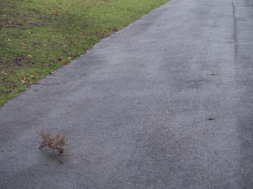
I started this exercise by simply taking a series of images where there was a point object in the picture. At this stage I was not looking to take particularly interesting images, but concentrating on some where the rest of the image was fairly bland so that the relationship of the point within the frame was obvious. In these images the point often became the most important part of the picture. I found that I have tended to take images where the point was in the lower half of the frame, possibly because I was framing the image about the point, not having it ‘accidentally appear. In each case I find my eye is drawn first to the point and then scans the rest of the image. Is this because I know what I am looking for, or is it universal?
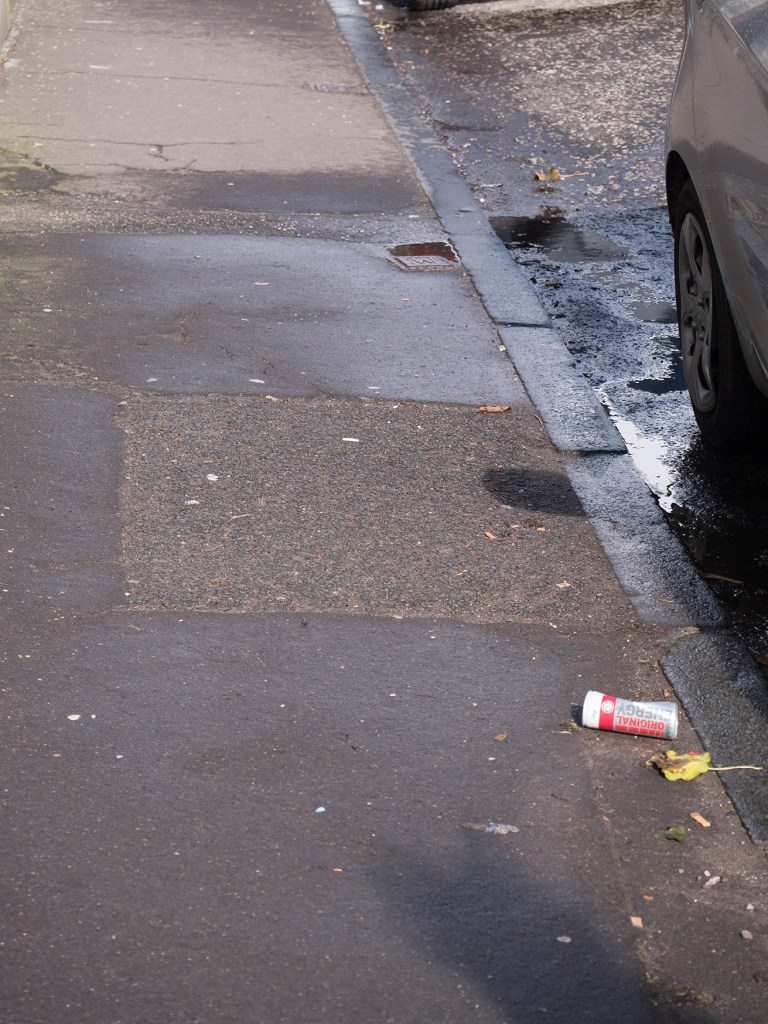
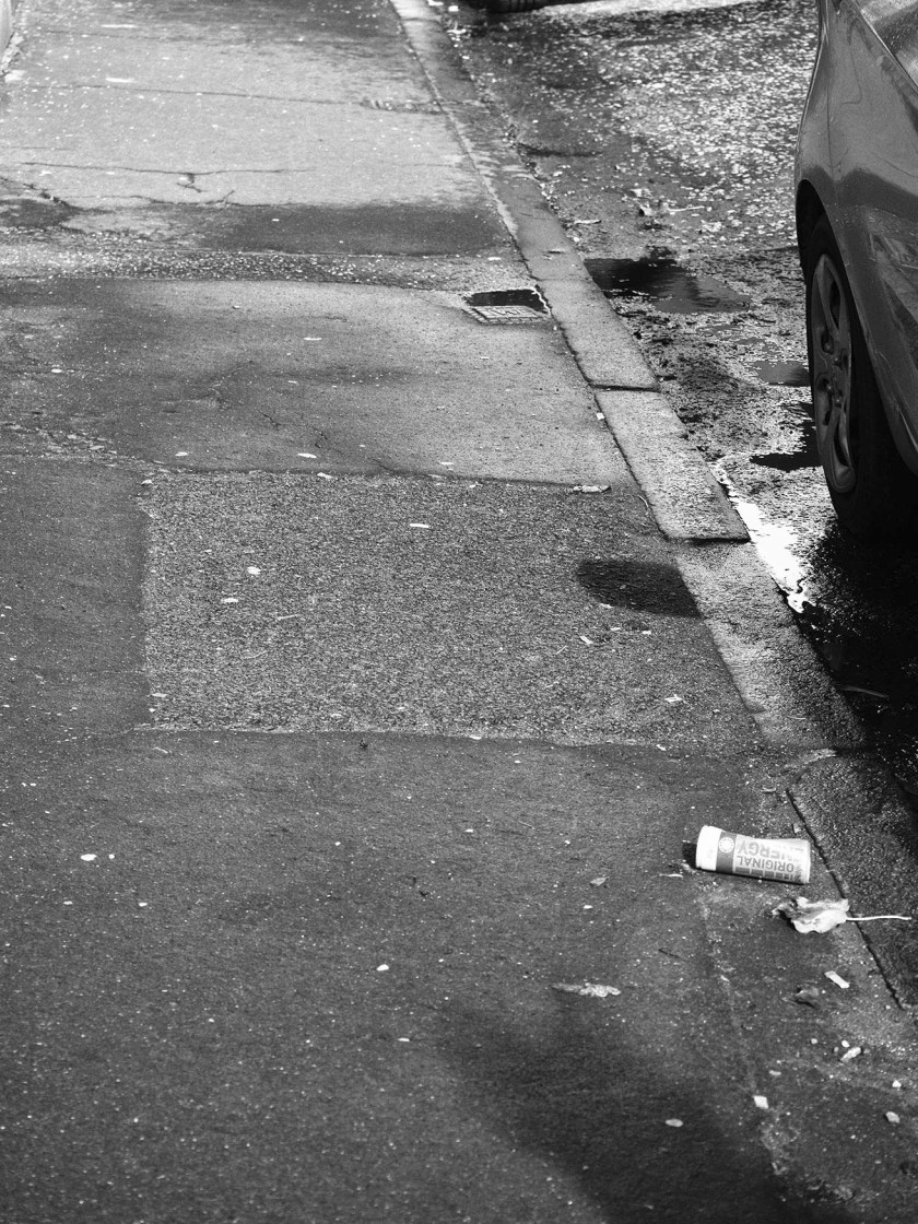
Out of interest I then converted one image to monochrome to see if that altered the impact of the ‘point’. If anything, it made it even more compelling to the eye. The can remains the focus here, but a second ‘point’ object (the drain) in the upper half now also becomes important with the eye travelling along the kerbstones between the two points.
Part 2: Take further pictures that include a point. Look for anywhere the point is not in relation to the frame. Look at how your eye moves around the image.
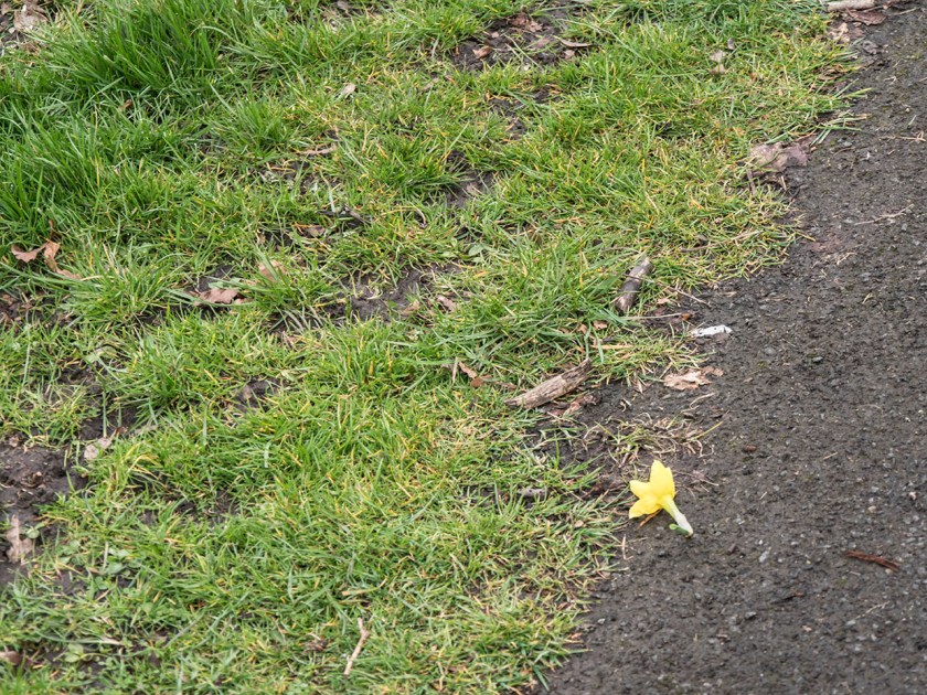
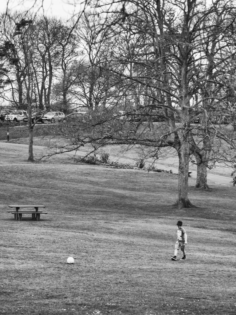
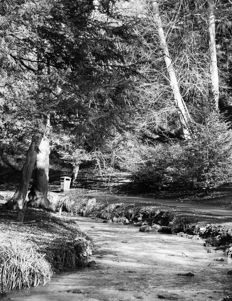
For this part of the exercise I looked though my recent pictures for ones that had a clear ‘point’ somewhere in the frame, and also went out today to deliberately look for others to expand on the theme.
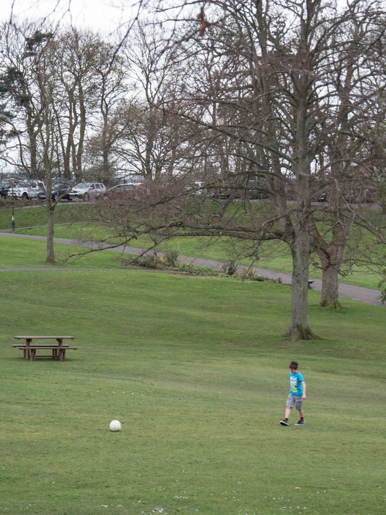
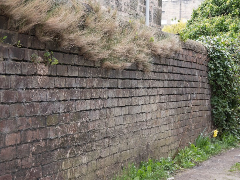
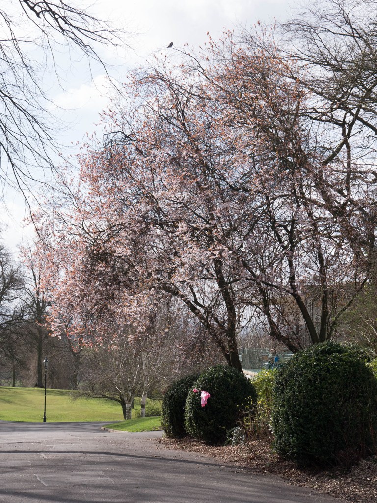
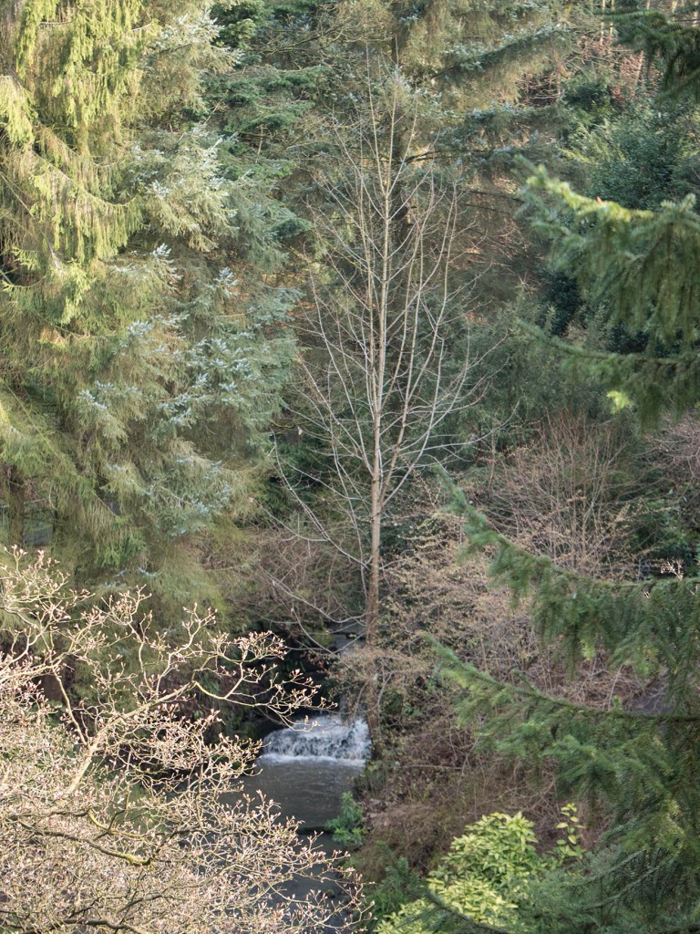
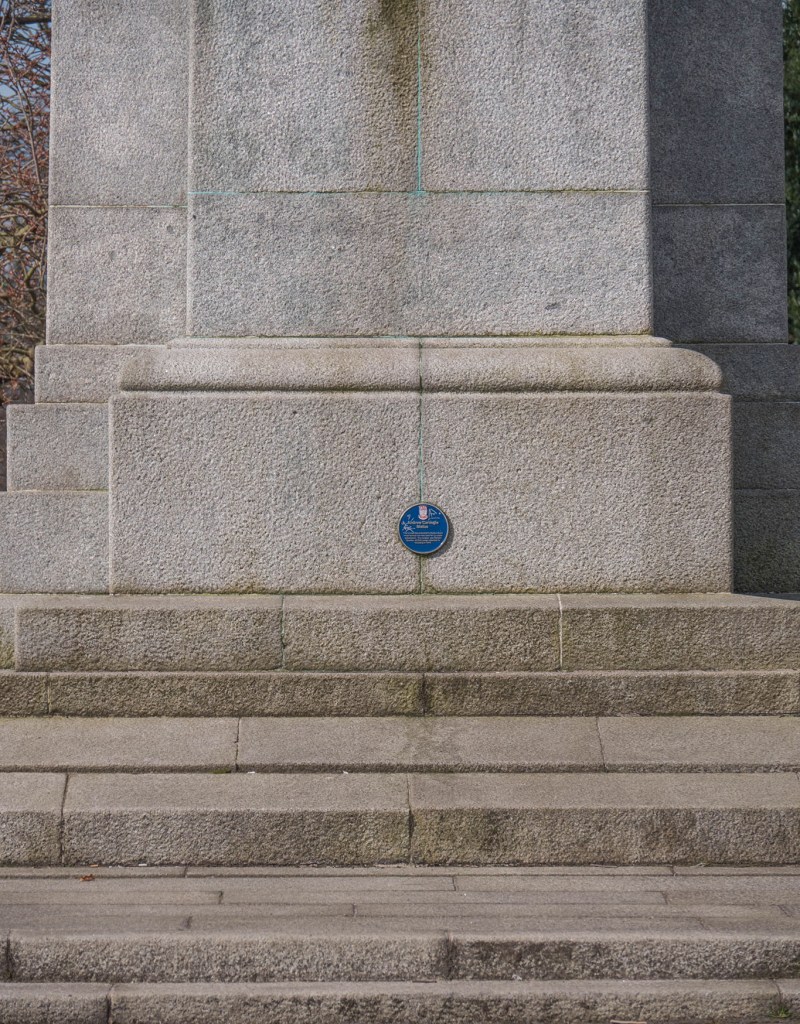
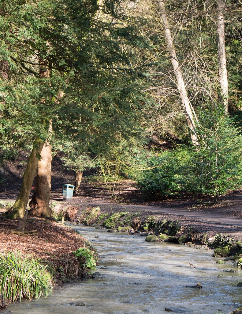
In all of these images the ‘point’ object becomes an important part of the picture, leading the eye around it, or actually explaining the meaning. In all but one images the point is near the edge and either acts as a starting point for your eyes journey (the football and the waterfall), or its termination (the yellow flower and the bin). the image with the point in the centre is, in contrast, very static.
I also tried some of these images in monochrome. The ‘point’ took a very different role when deprived of the additional impact of a sudden burst of colour.
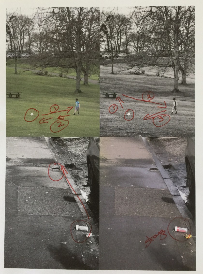
Print at draft quality showing how the eye moves around the page and the difference of effect in monochrome and colour.
Overall I found this a very interesting exercise. I am not convinced I produced any startling pictures (!), but it has made me think more about composition and the role of a point object. This may alter my instant attempts to avoid detritus in pictures and possibly try to actually use it instead.
