09/10/17
Edinburgh Galleries have just had two exhibitions of old photographs.
The National Portrait Gallery is showing ‘A Perfect Chemistry’, the works of Hill and Adamson
https://www.nationalgalleries.org/exhibition/perfect-chemistry-photographs-hill-and-adamson
while the Queens Gallery has ‘Shadows of War’ on Roger Fenton and his Crimea images.
https://www.royalcollection.org.uk/collection/themes/exhibitions/shadows-of-war/the-queens-gallery-palace-of-holyroodhouse
A Perfect Chemistry.
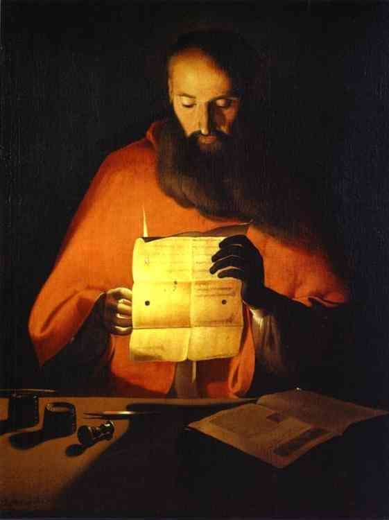
David Octavius Hill (1802 – 1870) and Robert Adamson (1821 – 1848) are one of the most famous couples in photographic history. It all started, as it often does in Scotland, with an argument. In this case an argument within the church. In May 1843 there was a massive schism in the Church of Scotland where 400 ministers broke away to form the Free Church of Scotland, where they could choose their own path and the people had more say. There was a dramatic walk out from the General Assembly and a march though the New Town of Edinburgh which ended with the signing of the Deed of Demission several days later. Hill, who was at that point primarily a landscape painter, watched the march and decided to mark the gravity of the occasion with a painting of all the ministers involved. He started by making oil sketches but rapidly realised that this was an impossible task so looked for an alternative way. At this point he was introduced to Adamson, who was already an expert in the use of the new photographic method – the calotype. And so, it began.
Talbot’s image process, the calotype, was patented in England, but those patent rights did not extend to Scotland, so the Scottish images makers were free to experiment with it, and take large numbers of images. John Adamson, Robert Adamson’s older brother, altered the process to use potassium bromide rather than iodide as a fixative, but also introduced a lengthy washing to the prints. Both Adamsons became highly proficient in the making of calotypes which was shown by the vast number of images eventually produced.
Hill and Adamson did go on to make images of all the ministers which Hill eventually combined into a massive painting. The photographic images are redolent of the times, serious faced men, often leaning on books, looking sombrely out at the world. There are no women in this series as, of course, women could not be ministers in that era. The positioning of the men is at least partly to do with the demands of the calotype process, where, even when the sun was shining, the exposure could take up to several minutes, smiling would have been impossible, but would also have been thought inappropriate for an image of a man of the church.
After taking the images of the ministers, the partnership continued, photographing the great and good of Edinburgh society, by now including women, landscapes, building projects showing Edinburgh old and new and even at least one nude portrait. Many of the images were taken in Greyfriars Cemetery, cemeteries were a popular and romantic destination even then, and many were certainly influenced by the Romantic works of Sir Walter Scott, with people dressing to portray characters from his books. They also took images of military characters, such as drummers and soldiers from the 92nd Gordon Highlanders, which again Hill combined into a massive painting of people under Edinburgh Castle. One of the ventures of the duo was to capture images of the Newhaven fisherfolk, men, women and children. This is probably one of the first examples of photographic typology extant. The images are not snapshots, but carefully composed, often using the tools of the trade as props to allow for the extended time of image taking, but also using stands and clamps to hold people still. These were often taken out of the final image or ‘painted’ over. They had planned to produce a book of these images but this never materialised.

David Octavius Hill and Robert Adamson

David Octavius Hill and Robert Adamson
Images by Hill and Adamson, courtesy of the National Galleries of Scotland.
Their partnership was short, only four years, as Adamson died at 26 and Hill did not continue with the photographic work after his death, returning instead to painting and producing lithographs. However their work had a profound effect on the popularity and use of photography in Scotland, and still remains a massive achievement.
The exhibition was fascinating, accompanied by an audio recording explaining the history of the images and an extensive catalogue (Lyden, 2017). I found the images of the people surprisingly moving given that they had to sit for such a long period and they were clearly staged. They give a real sense of the people and places. The faces are the same as those you see in Edinburgh today, only the dress has changed.
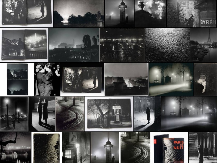
Shadows of War
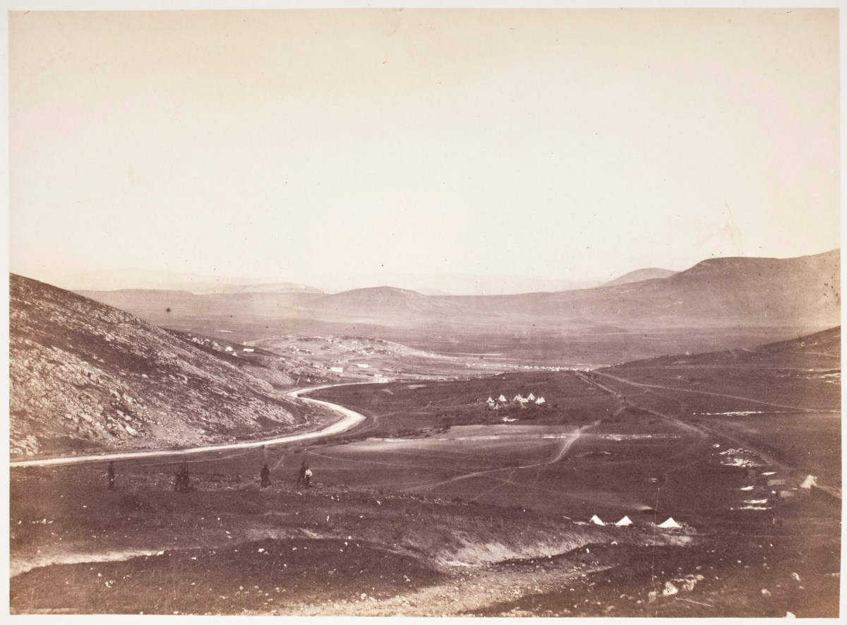
Roger Fenton (1819 – 1869) was a London based photographer who was commissioned to travel to the Crimea to take a series of images of the generals and other important figures there and to bring them back for the artist Thomas Barker to form a large oil painting depicting them all meeting. A meeting that could never have happened in reality. The war in Crimea, known then as the Russian War ran from 1853-55. Fenton travelled there in March 1855, leaving in June 1855 and was neither the first or the last photographer there, however his pictures were well advertised and shown around the country on his return to England and he is considered to be one of the first war photographers. He travelled to the Crimea with two assistants, his portable darkroom (a shed on wheels) and 700 plates which he prepared as needed, and brought back about 360 images.

Roger Fenton
Images by Roger Fenton (public domain)
The exhibition shows many of his images together with others of the Crimean War, including its aftermath and the fall of Sevastopol, by which time Fenton had left the area. As with all photographers of that time many of the issues were staged, and some were ‘touched up’ with details before the final prints were made. He has been criticised as only showing the images that the authorities wanted the public to see, but in reality, many of his images are bleak in the extreme. He shows the chaos of the railways, the squalor of the camps as well as the set piece portraits of the generals that he was commissioned to take. Several are instantly recognisable – ‘The Valley of the Shadow of Death’ with its cannonballs (even if they were placed there) is an iconic picture of a war-torn environment, while his haunting picture ‘Lord Balgonie’ has been suggested to be the first image of a soldier suffering from shell-shock.
Images by Roger Fenton (public domain)
The exhibition is accompanied by a comprehensive book (Fenton, Gordon and Pearson, 2017) with large plates and an historical overview together with an audio soundtrack about the images, this soundtrack is enhanced by Prince Harry talking about his own experiences of war and also by Don McCullin speaking about the difficulties of shooting pictures in those situations and the ethics of what can and what cannot be taken, how sometimes all you can do is bear witness.
At this stage one cannot know how many of his images were truly real, certainly at that time photographs were thought to show the absolute truth, although they could be altered and staged then as much as they can be now. They are possibly less overtly full of death than more recent war images, however they do show the aftermath of battle. It would have been nigh on impossible to take images in the middle of a firefight using collodion plates and long exposures. They are not ‘pretty’ or ‘romantic’ images – a world away from those of Hill and Adamson.
References
Fenton, R., Gordon, S. and Pearson, L. (2017). Shadows of war.
Lyden, A. (2017). A Perfect Chemistry.
Nationalgalleries.org. (2017). A Perfect Chemistry | Photographs by Hill and Adamson. [online] Available at: https://www.nationalgalleries.org/exhibition/perfect-chemistry-photographs-hill-and-adamson [Accessed 30 Sep. 2017].
Shadows of War (2017). Shadows of War: Roger Fentons Photographs of the Crimea, 1855. [online] Royalcollection.org.uk. Available at: https://www.royalcollection.org.uk/collection/themes/exhibitions/shadows-of-war/the-queens-gallery-palace-of-holyroodhouse [Accessed 9 Oct. 2017].


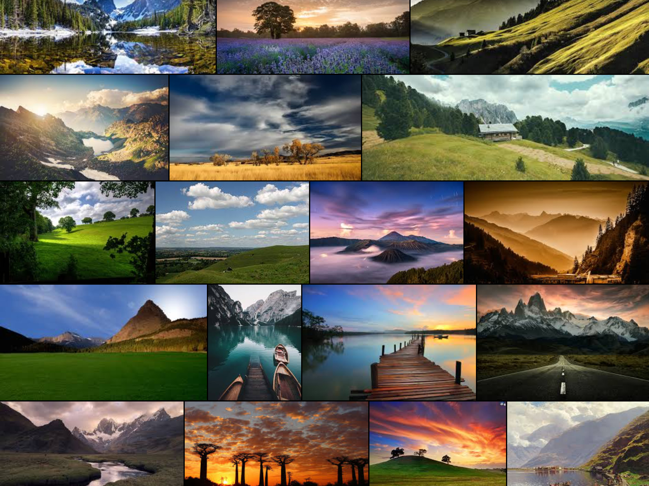


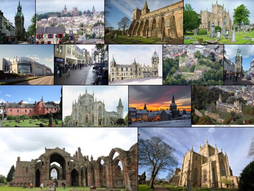
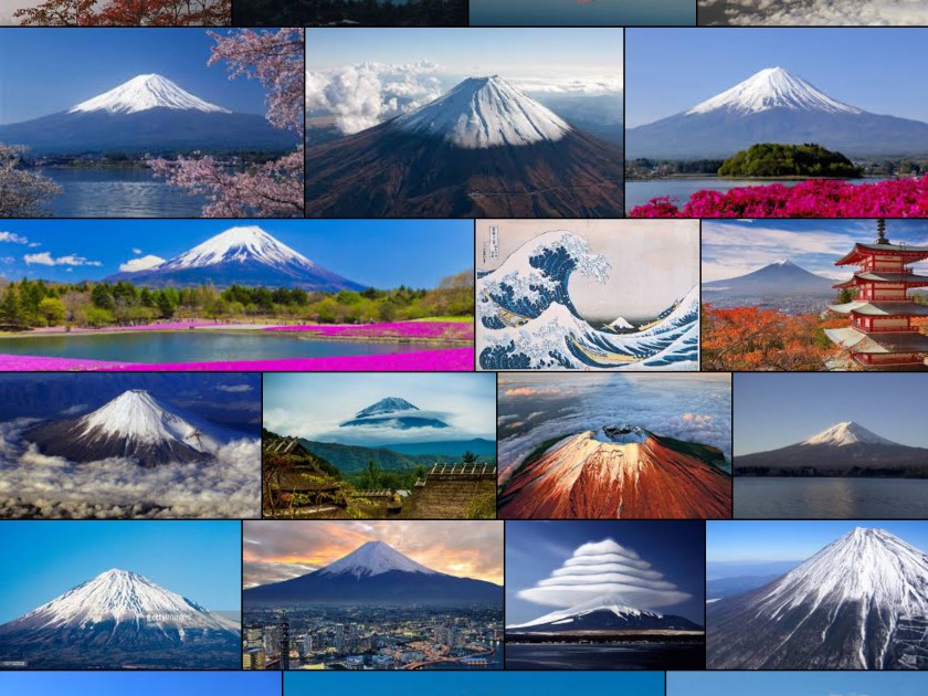 This shows a Google screenshot of Mount Fuji – classic images, all very similar
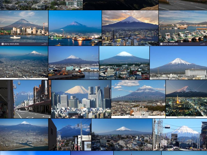 and a Google screen shot of Fuji City – there isstill a focus on the mountain – little of either detail or originality


")


