Work my way though course handbook, looking at each exercise and expanding as required. Importance high as I want to complete the course in a timely fashion.
Personal projects – present ideas
People in the park: looking at people as they walk around, interacting with others, their dogs, phones etc.
Initially looking at more distant shots, maybe using tele lens
Close-ups!
Tree ‘Art’: following up on my interest in nature looking at and contrasting the natural bark /growth patterns of trees with the, often childish or rude, graffiti carved into them.
Intimacy: close-up work
Contrast people, or rather small images of them with detail of possibly buildings, or? plants
People interacting with each other
Looking at photographers work in detail – present possibilities but this list could go on forever.
Dayanita Singh
John MacLean
Keith Arnatt
Walker Evans
Diane Arbus
Reading – again the list could go on forever
Photography as contemporary art – Charlotte Cotton
The Genius of Photography – Gary Badger
Letting go of the Camera – Brooke Jensen
Attend as many exhibitions, both of photography and general art as possible.
This list is much too ambitious, but it gives me a starting point.
To be reviewed monthly to keep a check on progress.
Assignment 1 in and feedback received, very fair comments. I was thinking more about the content rather than the technical side of the images. Need to think better about presentation so that images are seen in the order I envision them, not the order the computer sees (alphabetical).
I have had technical problems with my printer, now I hope sorted, mainly due to not using it for some while. I am also using a new (to me) software program as I have made the step of moving from Elements and Lightroom to Adobe Creative Suite. It’s taking me some concentration to get my head around photoshop, although in practice I am mainly using Lightroom.
I am finding that I risk flitting from one project plan to another, too many possible ideas, and not enough time. I need to make a list of the ideas, then hone them down so that I actually get something workable and worthwhile. I am also getting endlessly distracted by the work of others and again jumping from looking at one set of images to another without really concentrating on one or thinking about how they work and what I can learn from them. I also have far too large a pile a reading to attempt, again I need to slow down and read one book at a time, making annotations as I go so that I can find the source of my ideas or thoughts to review them as required.
I need a plan! One that I can refer to and remind myself where I am and what I want/ need to concentrate on.
This exercise involves looking at design via analysing the placement and use of single points within the frame.
Part 1: Take 2-3 images with a single point and evaluate the effect of that point.
I started this exercise by simply taking a series of images where there was a point object in the picture. At this stage I was not looking to take particularly interesting images, but concentrating on some where the rest of the image was fairly bland so that the relationship of the point within the frame was obvious. In these images the point often became the most important part of the picture. I found that I have tended to take images where the point was in the lower half of the frame, possibly because I was framing the image about the point, not having it ‘accidentally appear. In each case I find my eye is drawn first to the point and then scans the rest of the image. Is this because I know what I am looking for, or is it universal?
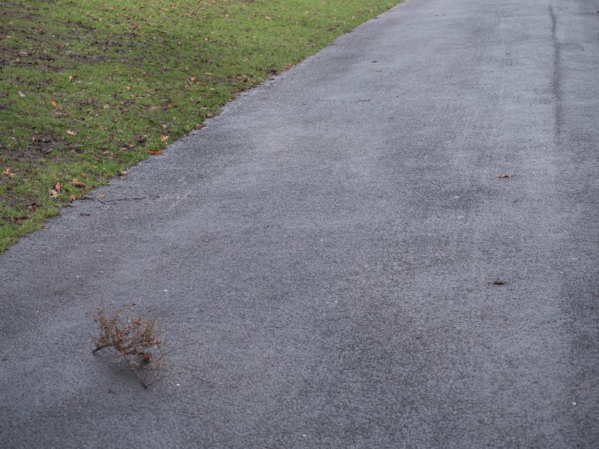
A large branch draws eye toward the small, scarcely visible, pieces of stick (which acts as a point), and helps the eye move up the picture.
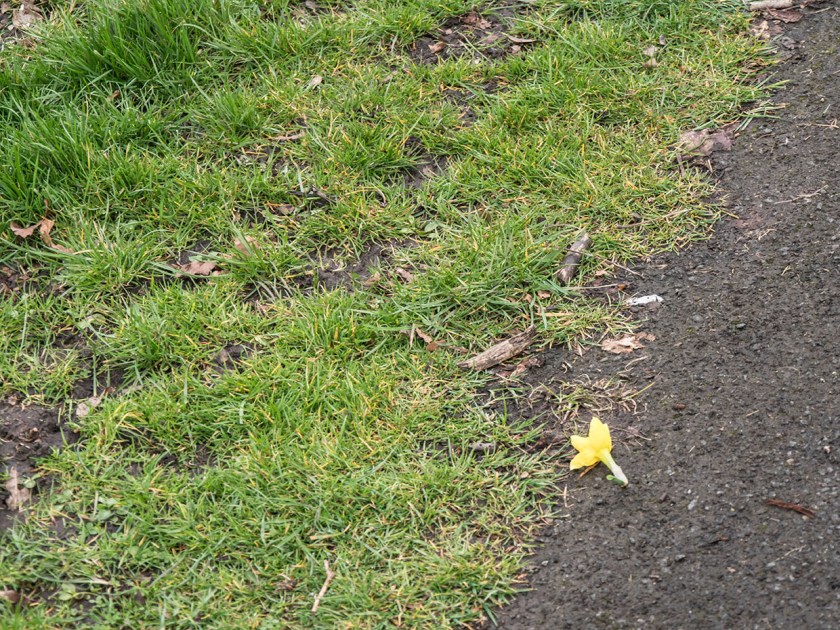
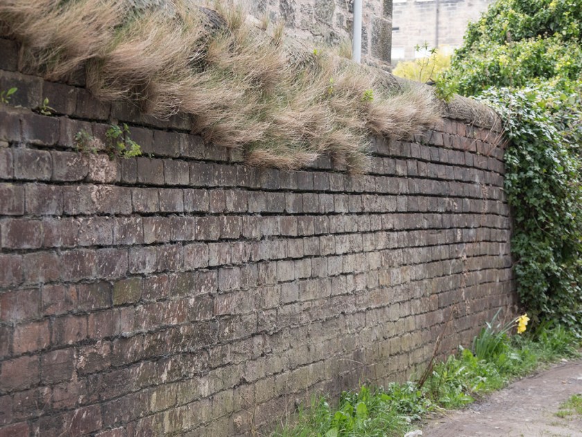
The broken daffodil is the object your eye is immediately drawn to here, partly because of the contrasting colour , but also because of the sharp edges.
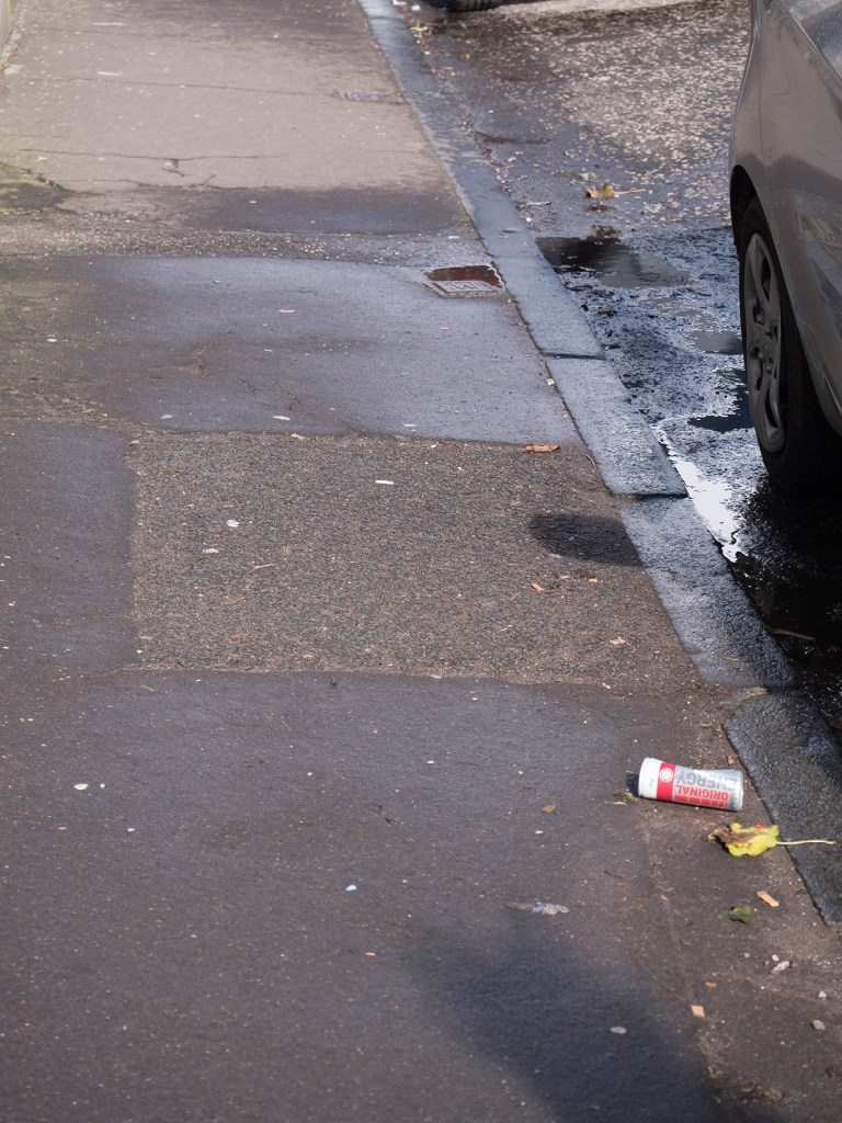
The bright can takes over the image, and becomes central to it, constantly bringing the eye back in.
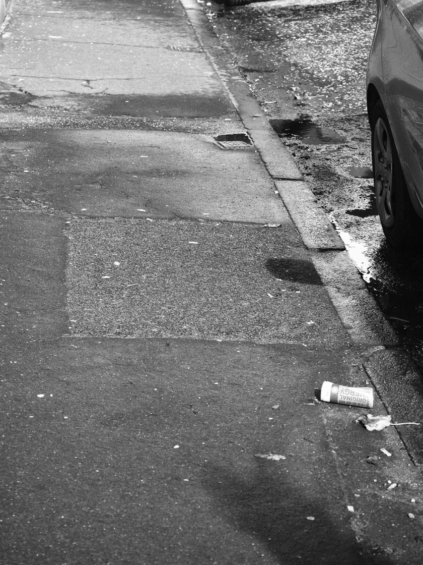
Out of interest I then converted one image to monochrome to see if that altered the impact of the ‘point’. If anything, it made it even more compelling to the eye. The can remains the focus here, but a second ‘point’ object (the drain) in the upper half now also becomes important with the eye travelling along the kerbstones between the two points.
Part 2: Take further pictures that include a point. Look for anywhere the point is not in relation to the frame. Look at how your eye moves around the image.
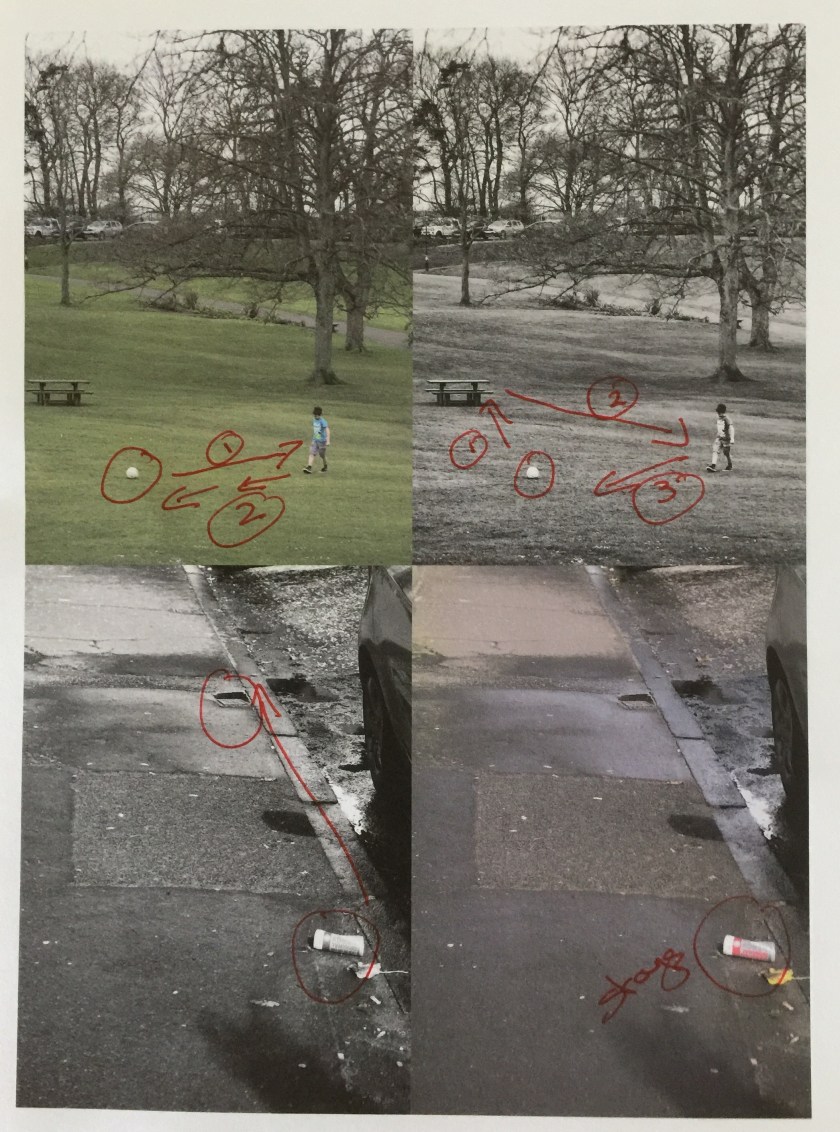
For this part of the exercise I looked though my recent pictures for ones that had a clear ‘point’ somewhere in the frame, and also went out today to deliberately look for others to expand on the theme.
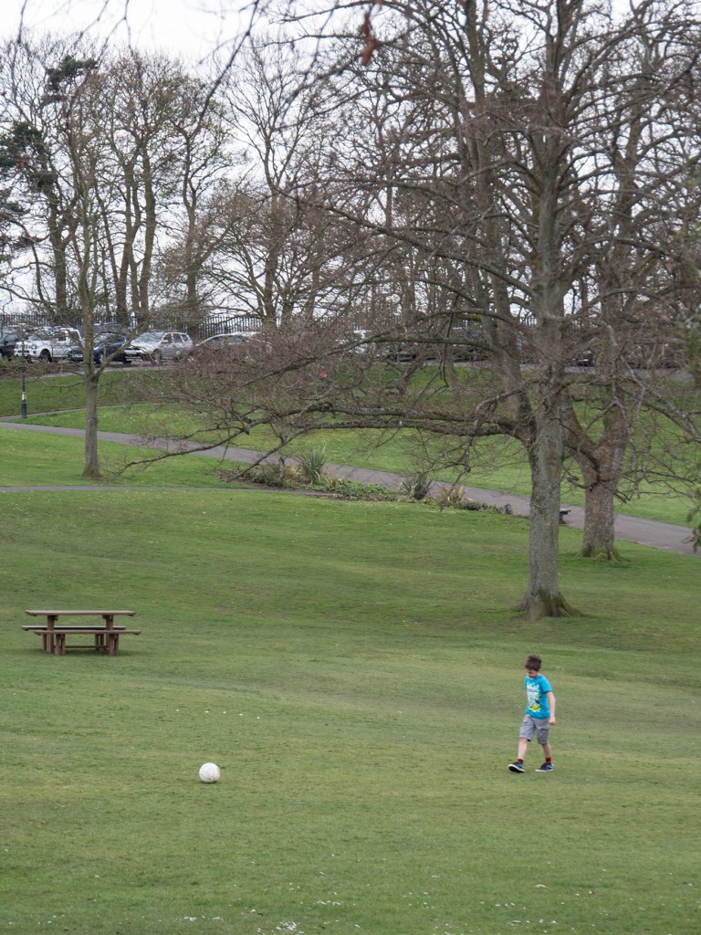
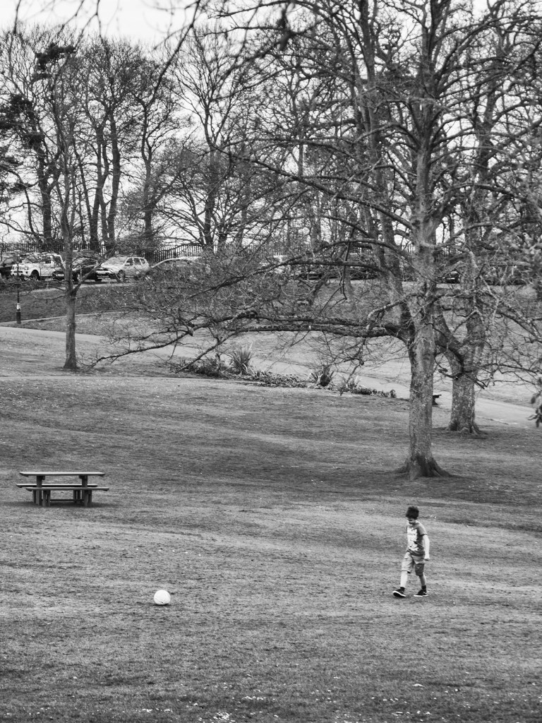
Here the football is the first thing your eye lights on, then moves across to boy and up the path.
The bright flowers act as a ‘full stop’ at the end of the wall
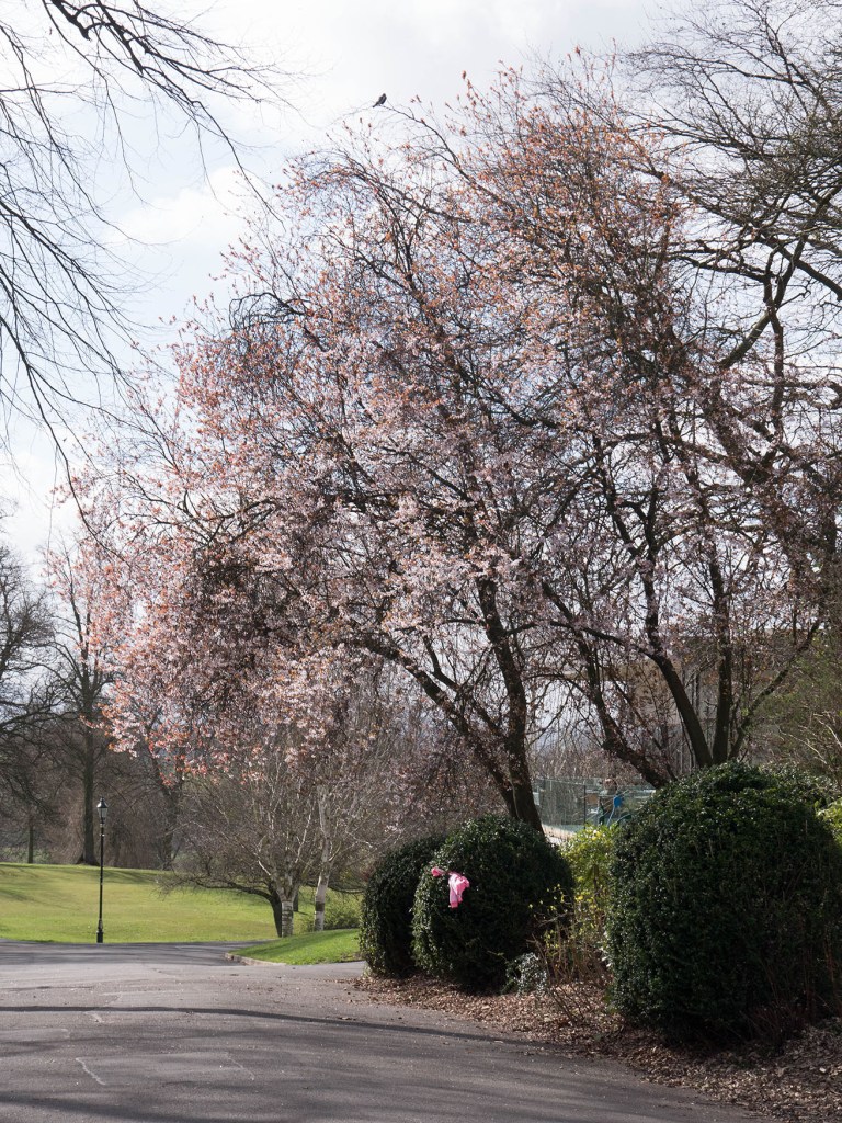
A pink area on bush, on close inspection a mislaid coat. This immediately pulls the eye in , wondering what it is.
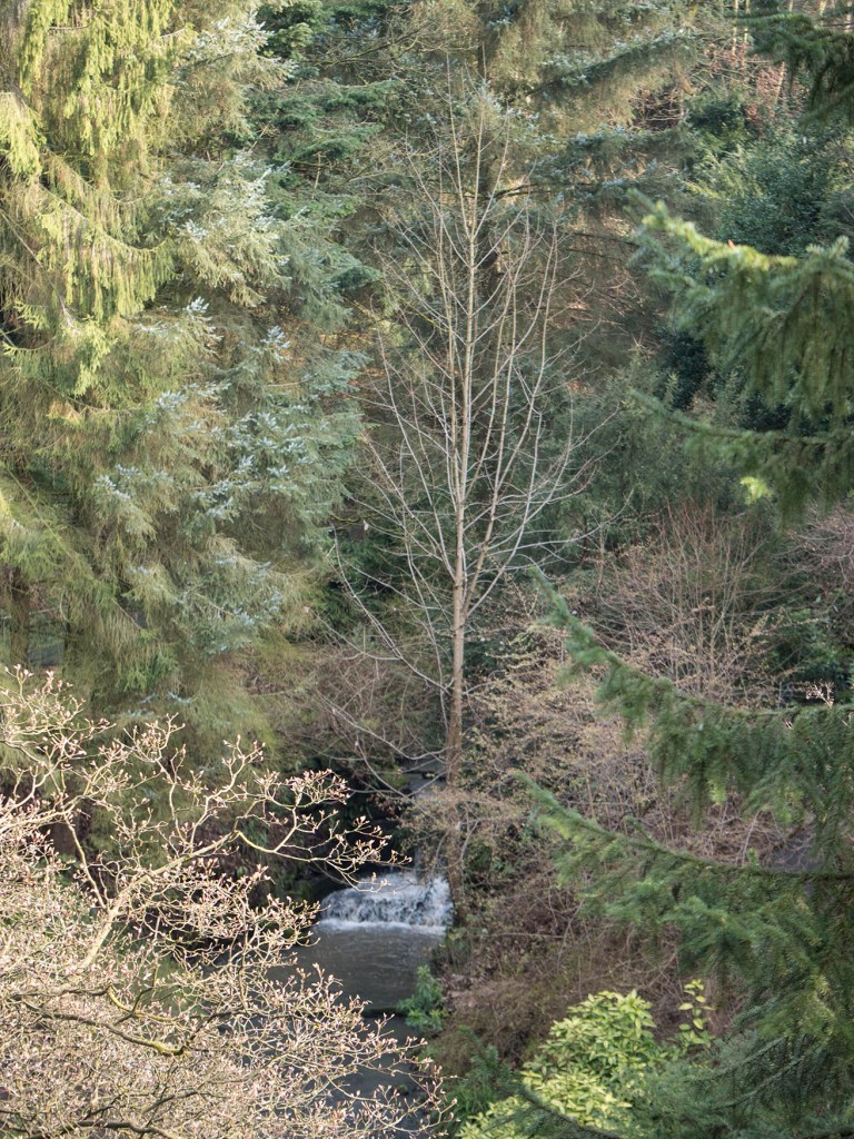
The waterfall at base of tree is probably too big to really count as a point, but, in spite of small size, is the focus of the image.
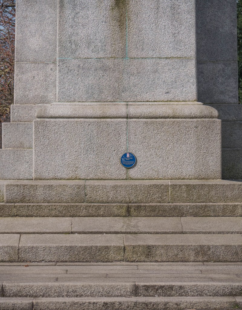
The blue historical plaque, draws the eye because of its colour and central position. However, it does not have a clear relationship to the frame and does not make for a satisfactory image.
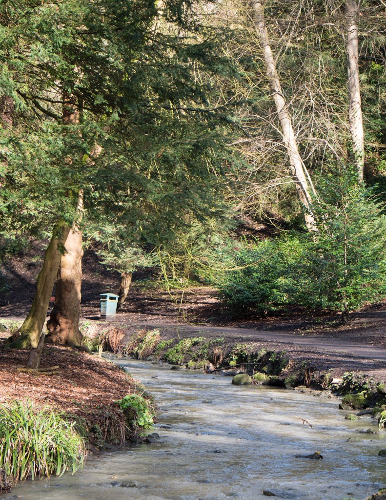
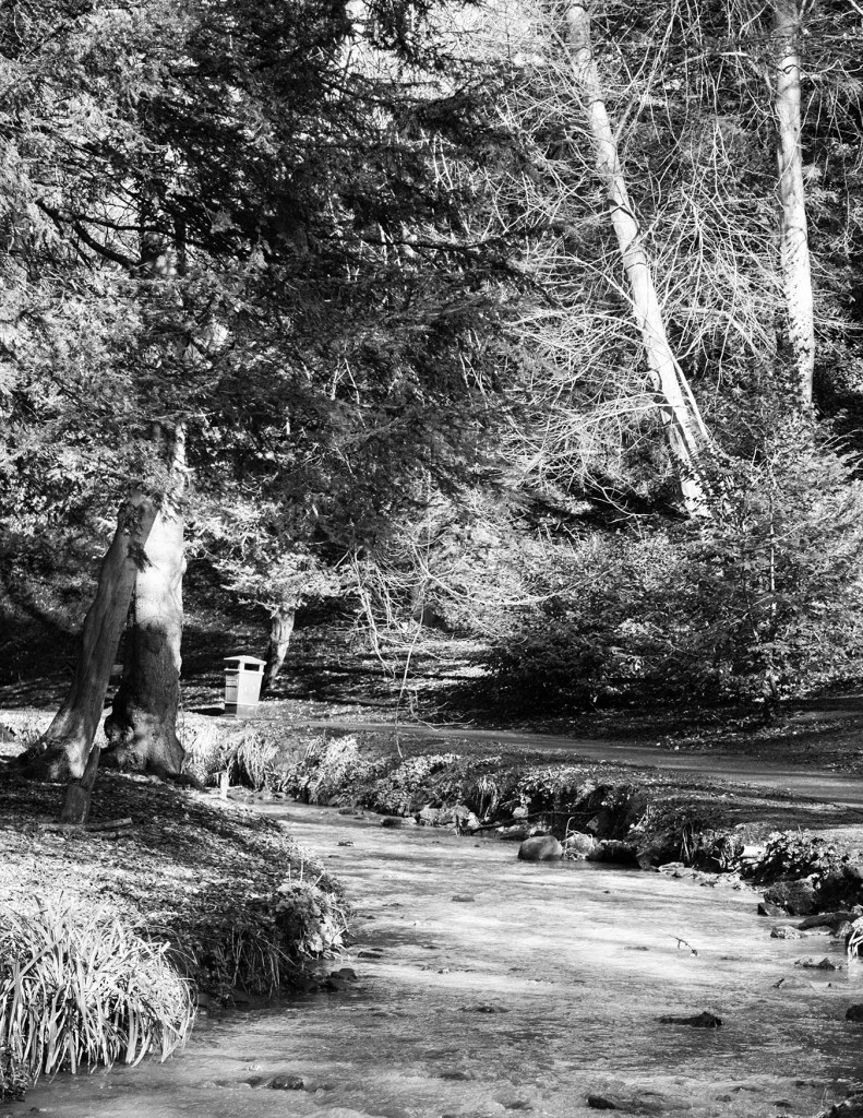
A rubbish bin, possibly not really wanted in the picture, but on closer inspection acts to draw the eye into the frame and up the burn.
In all of these images the ‘point’ object becomes an important part of the picture, leading the eye around it, or actually explaining the meaning. In all but one images the point is near the edge and either acts as a starting point for your eyes journey (the football and the waterfall), or its termination (the yellow flower and the bin). the image with the point in the centre is, in contrast, very static.
I also tried some of these images in monochrome. The ‘point’ took a very different role when deprived of the additional impact of a sudden burst of colour.
In monochrome the ball is less obviously related to what the boy is doing and, although it pulls the eye in, does not make you immediately look to the boy.
In this monochrome the bin remains an essential part of the image, and acts to stop the eyes travel up the scene.
Taking away the colour of the plaque makes it less intrusive, and, to my eye, gives resting spot in the picture.
Print at draft quality showing how the eye moves around the page and the difference of effect in monochrome and colour.
Overall I found this a very interesting exercise. I am not convinced I produced any startling pictures (!), but it has made me think more about composition and the role of a point object. This may alter my instant attempts to avoid detritus in pictures and possibly try to actually use it instead.
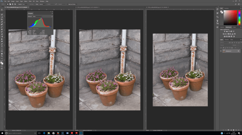
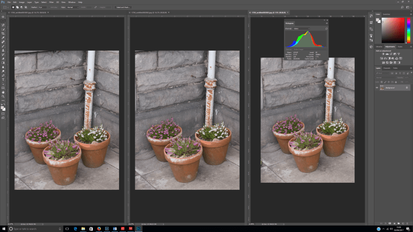
Take 3 exposures from the same place without moving or changing the settings on the camera. Then look closely to examine for any differences and look closely at the histogram.
I deliberately chose a shaded spot in the garden when there was a cloudy sky and minimal wind to minimise external variations. The camera was set to program and the aperture, shutter speed and ISO remained constant (1/100 sec, f/4.7, ISO320). Capture time 03/04/17 at 12:11:13, 12:11:14 and12:11:16.
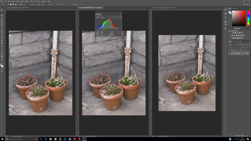
On visual inspection, even when enlarged to 3:1 I could not see any difference between the images, however on looking closely at the histograms there was a slight shift.
The luminosity increased slightly over the 3 images, the median shifting from 125 to 126 to128
The colours shifted from a marginal preponderance of blue to a slight increase in red.
The changes are so small that they needed very close examination of the histogram to be visible, but are present.