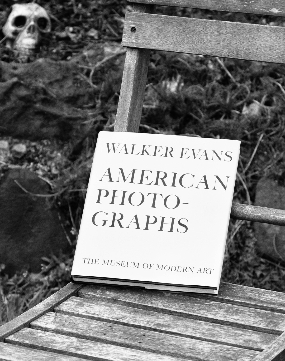
American Photographs
Walker Evans
One of the most well-known photographic exhibitions and subsequent book is American Photographs by Walker Evans. The original exhibition was displayed in the Museum of Modern Art, New York in 1938 and the book (Evans, Kirstein and Meister, 2012) is now on its fifth edition which was produced for the seventy -fifth anniversary of the exhibition in 2012.
In the accompanying essay by Lincoln Kirsten (Kirstein, 1938) Evans’ work is described as ‘straight photography… in the rigorous directness of its way of looking’ and ‘Evans work has…. intention, logic, continuity, climax, sense and perfection’.
The book consists of 87 images divided into two sections. The images are presented without titles, other than lists at the end of each section. There is no obvious order to the images but the original 1938 edition contained the statement – The reproductions presented in this book are intended to be looked at in their given sequence. The images do not show famous buildings, although those that still exist may well now be described as ‘this is the house, church, or view that Evans shot’. The people are also not famous, no actors or film stars, no politicians but are now some very recognisable, such as Image 14 – Alabama Cotton Tennant Farmer Wife. When you look at the images, slowly, in order, the overwhelming thought is ‘this is (was) America, this is (was) the depression, these are the American people’.
Meister (Meister, 2012) discusses the difficulties inherent in making new prints for the book, sourcing appropriate starting images and the use of modern duotone techniques to produce an accurate reflection of the original exhibition. Marth, who notes ‘The book, unlike an exhibition, can become a permanent venue for the photograph.’ (Marth, 2015) takes a more detailed look at this, comparing the technologies involved in all the editions. Evans was heavily involved in the design of the original book, which was then printed using the letterpress halftone process which limits the amount of detail available in the print. Some of the images for the initial edition were reworked by hand to improve the details visible. The present, fifth, edition is very similar to the first edition in size, design and sequencing, and uses a variety of sources including original prints and scanned negatives however the reproductions are ‘far superior in their beauty…. suggests Evans’s original silver prints better than ever before’. (Marth, 2015)
A recent lecture by Zoe Druik (Documentary and the Politics of Authenticity, 2016) talks about the beginning of the documentary movement and its description by Grierson (1892-1972) as ‘the creative treatment of actuality’ and places the work of Walker Evans in this context. She compares his work with the work of photographers and filmmakers of the Mass Observation Group in the United Kingdom who also looked at how ordinary people lived and what their problems were. She also looked at the influence of the work of August Sander and the similarities of his series ‘People of the 20th Century’ with Walkers portraiture, including the use of generic titles and little sentimentality or pathos rather factual representations.
If you consider the role of documentary photography and the present perceived need for objectivity, which was not necessarily originally thought of as important, for example in the film Nanook of the North (Flaherty, 1922), this leads to the present practice of non-alteration of images to show the ‘truth’. This concept is interesting as there is always a choice of which images to show, what is documentation and what is propaganda. This is dependent on the control of the images – state or private, and the historical status- winners or losers. At the beginning of the book American Photographs there is a disclaimer ‘The responsibility for the selection of the pictures used in this book has rested with the author, and the choice has been determined by his opinion: therefore they are presented without sponsorship or connection with the policies, aesthetic or political, of any of the institutions, publications or government agencies for which some of this work has been done’ (Evans, Kirstein and Meister,2012) so Evans was clearly very aware of these issues and the possible readings of his work by a public with a varying degree of photographic literacy.
Overall the book is a fascinating record of America in the Depression, which reminded me that ‘there is a grandeur in this view of life’ (Darwin, 1859).
References
Darwin, C. (1925). The origin of species.
Documentary and the Politics of Authenticity. (2016). [Online video] Vancouver: Vancouver Art Gallery (vanartgallery.bc.ca/videos).
Evans, W. and Kirstein, L. (2012). American photographs. New York: Museum of Modern Art, pp.191 – 200.
Evans, W., Kirstein, L. and Meister, S. (2012). American photographs. New York: Museum of Modern Art, pp.201 -204.
Marth, E. (2015). Eric Marth – Printing American Photographs – Walker Evans. [online] Ahornmagazine.com. Available at: http://www.ahornmagazine.com/issue_9/essay_evans_marth/essay_evans_marth.html [Accessed 15 Apr. 2017].
Nanook of the North. (1922). Flaherty.