Mona Kuhn and Saul Leiter

Shallow Depth of Field in Photography.

Project 2: Lenswork

Mona Kuhn was born in 1969 in Brazil of German parents. She was given her first camera age 12 and has been taking photographs ever since.  She is a well-known photographer whose main interest lies in images of people, often nude. In an interview related to her exhibition Acido Dorado, Kuhn says ‘I see the body as a residence to our emotions, our soul, our inner selves. Gauguin has a wonderful painting titled “Where Do We Come From? What Are We? Where Are We Going?” from 1897. I think it summarises a question we all have, but one that I decided to use as basis to my source of inspiration. I photograph the human in us, without shame, without regret, free and timeless………I start my creative process by imagining colors. I don’t know why, but coloration comes to me first. From there I tie in emotion, then location and last the people’ (Arciniegas, 2014).

David Campany (Campany, 2014) says, when talking about a later body of work – Private ‘At times Mona Kuhn takes the challenge head on, making views of crystal clarity in which light and land are one.  At other times she prefers a wide aperture and a shallow depth of field for her photographs…… Early mornings, early evenings and the moments of respite offered by shadows and sequestered interiors.’

Balthazar
Balthazar © Mona Kuhn

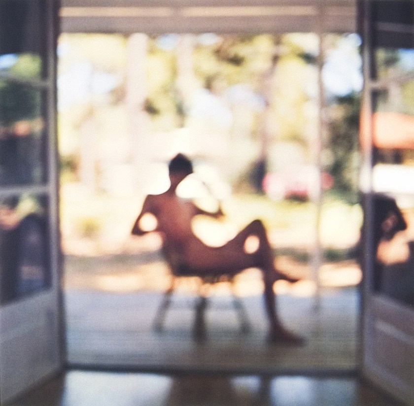
Evidence is a series that portrays nudes taken in a naturist camp in France. There are 55 images, mainly of young, beautiful people (Balthazar) where much, or sometimes all of the image is taken at a shallow depth of field, forcing the eye to initially concentrate on a single person or a small detail. The people are often glancing sideways, looking out of the page or across it. Few seem to be engaged directly with the photographer, but equally they are aware of her, maybe she is not important to them, or, they are so comfortable with her presence they are ignoring her. In describing the images Baldwin says, ‘the overarching accomplishment here is that the photographer has managed to balance complicated layers of relationships, of sitter to sitter, of sitter to self, of model to photographer; ……to establish a complex set of ambiguities played out in an apparently egalitarian, if not an outrightly utopian society.’ (Kuhn and Baldwin, 2007) The images appear to follow the story of a day, from a brilliant, and soft-focus, sunrise though daytime activities to night-time quietude and languor. There is the occasional relief from all the youth and beauty, an old man staring into space (Mon Frere), a room with only a chair in partial focus (An Absence) and these are the images I am drawn to. The images that are completely out of focus (Reflecting) are edgy and uncomfortable, leaving you wondering what is happening, what has happened and what might come next. The story is only partly told. Imagination is free.

Reflecting
Reflecting © Mona Kuhn


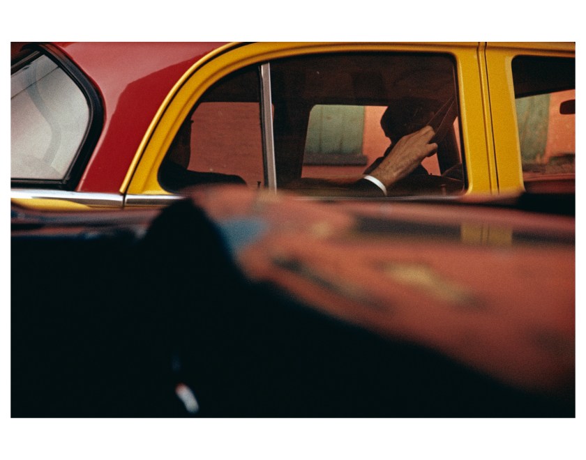
Saul Leiter is another photographer who often uses a shallow depth of field.to draw attention to a specific point such as in Carol Brown (1958 for Harper’s Bazaar) or Walking (c. 1948) and to ‘create great swathes of colour’ (Pill, 2017) for example, Taxi (1957) or Through Boards (1957).

Taxi_Leiter
Taxi © Saul Leiter Estate

In the introduction to Saul Leiter (Leiter and Kozloff, 2008) Kozloff says ‘far from being a traditionalist, he is in the forefront of photographic innovators, daring for his time……..he considers what lies underneath, is off to the side, or gets in the way of his nominal subject………One notices his enjoyment of the downy texture or foamy substance when selected passages are out of focus.’

Andrew Dickson, in a review for the Guardian, said ‘Many photographs hover on the boundaries of abstraction, planes canting towards each other than cavorting away again; often they are riddles that never quite resolve…….Leiter uses mirrors and windows to tease the eye, piling half-glimpsed images on top of each other – the sharp white of a woman’s shawl imprinting itself on to the palm-leaf design of a shop dummy’s dress, or, as in Reflection (1958), a chiming collision of reflected faces caught in glazing. Just as frequently, condensation, rain or snow films and fogs the frame. Often what we most want to see is held tantalisingly out of reach (Dickson, 2016).

Carol Brown_Leiter
Carol Brown © Saul Leiter Estate

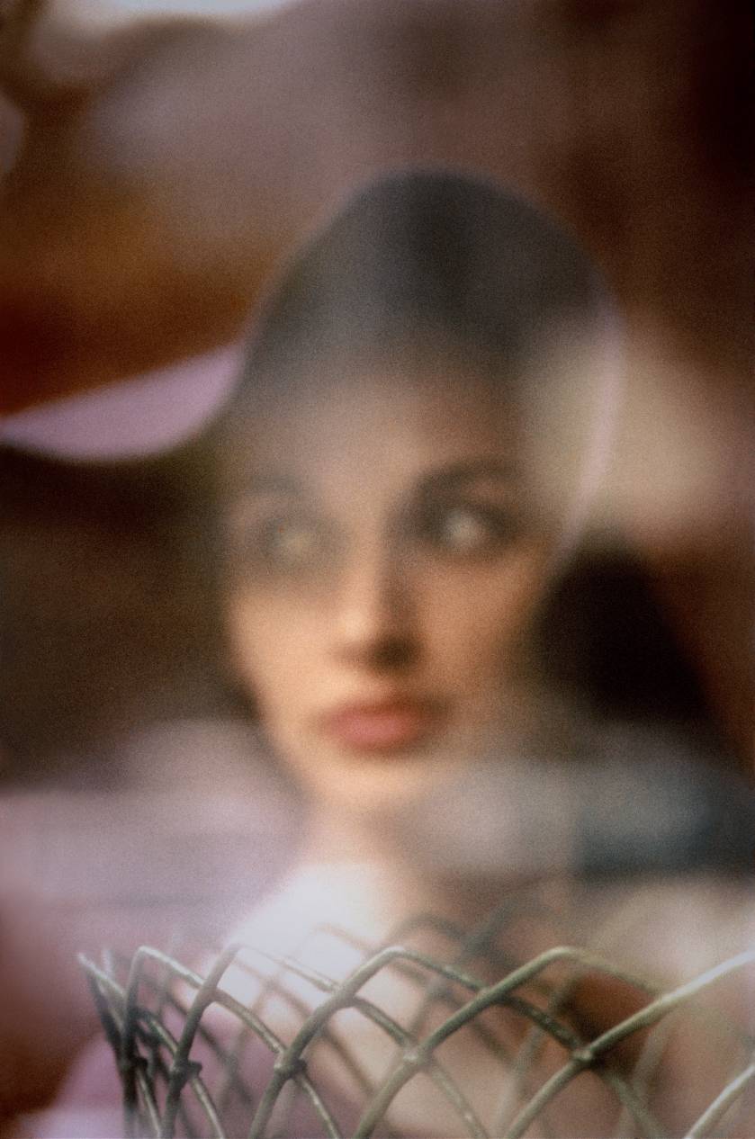
Roberta Smith wrote ‘Mr. Leiter was a photographer less of people than of perception itself. His painter’s instincts served him well in his emphasis on surface, spatial ambiguity and a lush, carefully calibrated palette. But the abstract allure of his work doesn’t rely on soft focus, a persistent, often irritating photographic ploy, or the stark isolation of details, in the manner of Aaron Siskind or early Harry Callahan. Instead, Mr. Leiter captured the passing illusions of everyday life with a precision that might almost seem scientific, if it weren’t so poetically resonant and visually layered.’ (Smith, 2005).

Leiter himself said ‘But I believe there is such a thing as a search for beauty – a delight in the nice things in the world. And I don’t think one should have to apologise for it.” (In No Great Hurry, 13 Lesions in Life from Saul Leiter, 2012).

Leiter’s images are sometimes soft, sometimes acidly clear and always alluring. His early images were black and white but he embraced the use of colour very early on. He was not well-known in his early life and is only recently being lauded. His images draw you in, there is mystery but you are part of it rather than standing outside looking in. These are images that I would hang on my wall and dream over.

Images posted with permission of and thanks to Mona Kuhn and the Saul Leiter Foundation

References:

Arciniegas, T. (2014). An Interview with Mona Kuhn ahead of her London Show at Flowers Gallery. [online] Losarciniegas.blogspot.co.uk. Available at: http://losarciniegas.blogspot.co.uk/2014/11/an-interview-with-mona-kuhn-ahead-of.html [Accessed 13 May 2017].

Campany, D. (2014). MONA KUHN. [online] Monakuhn.com. Available at: http://www.monakuhn.com/pages/view/campany/ [Accessed 13 May 2017].

Dickson, A. (2016). Made in Manhattan: how Saul Leiter found beauty in Gotham’s glass and grime. [online] the Guardian. Available at: https://www.theguardian.com/artanddesign/2016/jan/15/made-in-manhattan-how-saul-leiter-found-beauty-in-gothams-glass-and-grime [Accessed 13 May 2017].

In No Great Hurry, 13 Lesions in Life from Saul Leiter. (2012). [DVD] Tomas Leach

Kuhn, M. and Baldwin, G. (2007). Evidence. Gottingen: Steidl, p.9.

Leiter, S. and Kozloff, M. (2008). Saul Leiter. New York: Thames & Hudson.

Pill, S. (2017). Light, Form and Soul. Black and White, February, pp.38-45.

Smith, R. (2005). Art in Review; Saul Leiter. [online] Query.nytimes.com. Available at: http://query.nytimes.com/gst/fullpage.html?res=9901E3D81330F933A05751C1A9639C8B63 [Accessed 13 May 2017].

Initial Reflections on Part 1

A summary of learning points from Part 1:

  • Have projects/plans in mind when photographing. These can be short, medium or long term, but it helps to keep your focus and interest.
  • There is no harm in repeatedly photo’ing the same area or subject to learn about it, as long as you actually do learn something and not just endlessly repeat the same thoughts e.g. make a series over time.
  • Be aware of lines, both perspective and flat.
  • Think about framing
  • Learn by looking at other people’s images and then reading about them, reviewers may feel the same as you or have a very different viewpoint. Both will be valid.

Thomas Ruff – Jpegs


Thomas Ruff’s photobook Jpeg (Ruff and Simpson, 2009) consists of images that he has both taken and found on the web which he then enlarged which ‘exaggerates the pixel patterns until they become sublime geometric displays of color.’ (David Zwirner Books, 2009)). Ruff says, ‘the Jpeg idea, in which a pixelated square is ugly, but if you present it in the right context it can become beautiful’ (Benedictus, 2009).

Campany discusses Ruff’s work in the context of the history of art and photography.

Found images have been used since 1920’s as a way of making sense of a culture with an unending amount of information.  Campany points out that all images come from archives, some obvious, some less so and that within those archives there are layers of systems from the internet itself, the specific archives that are accessed, the more limited archive of the collector (Ruff) and on down to the archive of the viewer’s memory. These archives are arranged in grids, which with Ruff comes from his preference for working in series, the meaning of the image then comes at least partly from its place in that series.

Campany also discusses that all images seen now are digitised (even those printed in books) and therefore the pixel has replaced the grain of a film. Grain, with its random nature became ‘a sign of the virtuous materiality of the image’ while pixels are ‘grid-like, mechanic and repetitive ….  a technological limit (David Campany 2008). He feels that Ruff images force us to look back and forward between figuration and abstraction leading to pictures with a sense of drama.

In contrast Colberg discusses the meaning or rather the possible lack of meaning behind the images. He says Ruff stands as one of the ‘most creative and inventive photographers of our time’ (jmcolberg.com, 2009). Colberg notes the extreme beauty of the images, especially when printed in book format but feels that the concept of the images relies on the technique, rather than anything else, and notes that Ruff simply describes how they were made starting from lost images of the 9/11 attack. He goes on to say that beauty in and of itself can be appreciated, ‘maybe sometimes, the medium is the message’.

References

Benedictus, L. (2009). Thomas Ruff’s best shot: ‘Pixellated images can be beautiful. I took this in Japan – through a hotel curtain’. [online] the Guardian. Available at: https://www.theguardian.com/artanddesign/2009/jun/11/my-best-shot-thomas-ruff [Accessed 21 Apr. 2017].

David Campany. (2008). Thomas Ruff: Aesthetic of the Pixel – David Campany. [online] Available at: http://davidcampany.com/thomas-ruff-the-aesthetics-of-the-pixel/ [Accessed 21 Apr. 2017].

David Zwirner Books. (2009). David Zwirner Books · Thomas Ruff: jpegs. [online] Available at: https://davidzwirnerbooks.com/product/thomas-ruff-jpegs [Accessed 21 Apr. 2017].

Jmcolberg.com. (2009). Conscientious | Review: jpegs by Thomas Ruff. [online] Available at: http://jmcolberg.com/weblog/2009/04/review_jpegs_by_thomas_ruff/ [Accessed 21 Apr. 2017].

Ruff, T. and Simpson, B. (2009). Jpegs. New York: Aperture.

There is a Grandeur in This View of Life

American Photographs

Walker Evans

One of the most well-known photographic exhibitions and subsequent book is American Photographs by Walker Evans. The original exhibition was displayed in the Museum of Modern Art, New York in 1938 and the book (Evans, Kirstein and Meister, 2012) is now on its fifth edition which was produced for the seventy -fifth anniversary of the exhibition in 2012.

In the accompanying essay by Lincoln Kirsten (Kirstein, 1938) Evans’ work is described as ‘straight photography… in the rigorous directness of its way of looking’ and ‘Evans work has…. intention, logic, continuity, climax, sense and perfection’.

The book consists of 87 images divided into two sections. The images are presented without titles, other than lists at the end of each section. There is no obvious order to the images but the original 1938 edition contained the statement – The reproductions presented in this book are intended to be looked at in their given sequence. The images do not show famous buildings, although those that still exist may well now be described as ‘this is the house, church, or view that Evans shot’. The people are also not famous, no actors or film stars, no politicians but are now some very recognisable, such as Image 14 – Alabama Cotton Tennant Farmer Wife. When you look at the images, slowly, in order, the overwhelming thought is ‘this is (was) America, this is (was) the depression, these are the American people’.

Meister (Meister, 2012) discusses the difficulties inherent in making new prints for the book, sourcing appropriate starting images and the use of modern duotone techniques to produce an accurate reflection of the original exhibition. Marth, who notes ‘The book, unlike an exhibition, can become a permanent venue for the photograph.’ (Marth, 2015) takes a more detailed look at this, comparing the technologies involved in all the editions. Evans was heavily involved in the design of the original book, which was then printed using the letterpress halftone process which limits the amount of detail available in the print. Some of the images for the initial edition were reworked by hand to improve the details visible. The present, fifth, edition is very similar to the first edition in size, design and sequencing, and uses a variety of sources including original prints and scanned negatives however the reproductions are ‘far superior in their beauty…. suggests Evans’s original silver prints better than ever before’. (Marth, 2015)

A recent lecture by Zoe Druik (Documentary and the Politics of Authenticity, 2016) talks about the beginning of the documentary movement and its description by Grierson (1892-1972) as ‘the creative treatment of actuality’ and places the work of Walker Evans in this context. She compares his work with the work of photographers and filmmakers of the Mass Observation Group in the United Kingdom who also looked at how ordinary people lived and what their problems were. She also looked at the influence of the work of August Sander and the similarities of his series ‘People of the 20th Century’ with Walkers portraiture, including the use of generic titles and little sentimentality or pathos rather factual representations.

If you consider the role of documentary photography and the present perceived need for objectivity, which was not necessarily originally thought of as important, for example in the film Nanook of the North (Flaherty, 1922), this  leads to the present practice of non-alteration of images to show the ‘truth’. This concept is interesting as there is always a choice of which images to show, what is documentation and what is propaganda. This is dependent on the control of the images – state or private, and the historical status- winners or losers. At the beginning of the book American Photographs there is a disclaimer ‘The responsibility for the selection of the pictures used in this book has rested with the author, and the choice has been determined by his opinion:  therefore they are presented without sponsorship or connection with the policies, aesthetic or political, of any of the institutions, publications or government agencies for which some of this work has been done’ (Evans, Kirstein and Meister,2012) so Evans was clearly very aware of these issues and the possible readings of his work by a public with a varying degree of photographic literacy.

Overall the book is a fascinating record of America in the Depression, which reminded me that ‘there is a grandeur in this view of life’ (Darwin, 1859).

References

Darwin, C. (1925). The origin of species.

Documentary and the Politics of Authenticity. (2016). [Online video] Vancouver: Vancouver Art Gallery (vanartgallery.bc.ca/videos).

Evans, W. and Kirstein, L. (2012). American photographs. New York: Museum of Modern Art, pp.191 – 200.

Evans, W., Kirstein, L. and Meister, S. (2012). American photographs. New York: Museum of Modern Art, pp.201 -204.

Marth, E. (2015). Eric Marth – Printing American Photographs – Walker Evans. [online] Ahornmagazine.com. Available at: http://www.ahornmagazine.com/issue_9/essay_evans_marth/essay_evans_marth.html [Accessed 15 Apr. 2017].

Nanook of the North. (1922). Flaherty.

Cropping and Framing

Are they two separate things? I think so.

Framing is about choice making, what you choose to take in an image, where the edges are, do you add the whole of something or only part of it. Is the image complete in itself?

All these descisions are best made when the image is taken, although there may be times when you know you will change the image shape – for instance- the picture you visualise is a square format, but your camera only takes rectangles, or you want an very wide panorama, and need to take and join multiple shots. The important bit is that you have framed the image you want in your minds eye.

Cropping is about how you get to what you actually wanted once you have the image, a bit off here, or a bit off there.

But- cropping could be seen as taking an image that only shows part of the whole, part of a head, a suggestion of a window rather than the whole scene.

The definition of cropping from the Collins dictionary is ‘the trimming or masking of unwanted areas from a negative or a print’. – a verb, while framing is ‘the act of a person or a thing that frames’ – a noun. So cropping is something you do to an image, while framing is something that is!


Stills Exhibition April 2017

The Collection Series:

Works from a private photography collection

&

Alan Dimmick’s studio archive, 1977-2017

The exhibition at the Stills Gallery consists of two contrasting halves.

Alan Dimmicks’ images from his studio archive consists of walls of images, 450 photographs of Glasgow life, taken over the last 40 years. People, places, portraits. The backs of people, birds on the shore, close details and broader sweeps. Some appear threatening, some banal, others amusing or sad.

Moira Jeffries says, in an essay that accompanies the exhibition, ‘an accretion of information…. four decades of social history……an accumulation and contingency……. the stories that haven’t been told, the histories that haven’t yet crystallised.’ (Jeffrey, 2017).

Dimmick said ‘It’s really always been people that have interested me most ‘(Albert Drive,2013) and ‘always have your camera with you [obviously] but also realise that images of quite ordinary things can be important in years to come, and keep your negatives neatly filed’ (Radcliffe,2012)

The overwhelming impression is of a snapshot of life, in all the grubby and fascinating details.

 Photographs taken and added with permission of the Stills Gallery, Edinburgh.

The second half of the exhibition is a series of images from the private collection of Scottish photographer Davis Eustace which includes a wide range of photographs from the whole of the 20th century. Images that particularly caught my attention were the Annie Leibovitz portrait of Merce Cunningham, dancer and choreographer, from 1994, a very personal and intense image that contrasted with the Chris Blott image, ‘Farmer’ also from 1994, showing a man looking away to the distance which reminded me of August Sanders portraits of ‘types’ from the People of the 20th century series.

My attention was also caught by three Images of beautiful females by Fabrizio Gianni who said ‘I’ve never been a photographer. I was a fashion photographer. They’re two different things’ (Jamieson, 2015). I considered these in the light of the recent article by Jansen in the British Journal of Photography discussing the different ways of seeing and image making between women taking pictures of women from men’s images of women ‘In the patriarchy in which we live, photography is an expression of power. The photographic act is often viewed as an assertion of masculine dominance’ (Jansen, 2017). Although I agree with Jansen’s premise (and look forward to reading the whole book – Girl on Girl) I found these images wistful and playful rather than orientated for the masculine eye.

Salt Pan by Edward Burtynsky was one of the few colour prints on show. It shows an  aerial view of a land that has been affected and changed by industry, the only sudden flash of colour is manmade, the rest grey, dead, alien. Taken in Gujarat, India in 2016 the series is an indictment on man’s treatment of our world. He says ‘(we) come from nature…. There is an importance to (having) a certain reverence for what nature is because we are connected to it…. If we destroy nature, we destroy ourselves’ (Edwardburtynksy.com, 2017). Cotton, when describing Burtynsky’s work, says ‘Deadpan photography often acts in this fact-stating mode: the personal politics of the photographers come into play in their selection of subject matter and their anticipation of the viewer’s analysis of it, not in any explicit political statement through text or photographic style.’ (Cotton, 2015). The subtle colouring and detail drew me in and I found myself searching out the remaining images of the series.

IND_RANN_04_16
Salt Pan #4 Little Rann of Kutch, Gujarat, India, 2016.

 Edward Burtynsky, courtesy of Flowers Gallery, London

Overall an interesting pairing, contrasting one man’s style and thought processes of image making with carefully chosen images from a single collector. The two men have contrasting styles of photography, Eustace is renowned for portraits of the stars, but also landscape and fashion while Dimmick concentrates on an area, Glasgow, and the city life in all its facets.

Well worth seeing.

References

ALBERT DRIVE. (2013). Alan Dimmick. [online] Available at: http://www.albertdrive.com/alandimmick/ [Accessed 11 Apr. 2017].

Cotton, C. (2015). The photograph as contemporary art. ed. London: Thames & Hudson, pp.86-88.

Edwardburtynsky.com. (2017). EDWARD BURTYNSKY. [online] Available at: http://www.edwardburtynsky.com/ [Accessed 11 Apr. 2017].

Jamieson, T. (2015). Fabrizio Gianni: From assisting Sergio Leone to high fashion photography, via Falkirk. [online] HeraldScotland. Available at: http://www.heraldscotland.com/arts_ents/13211174.Fabrizio_Gianni__From_assisting_Sergio_Leone_to_high_fashion_photography__via_Falkirk/ [Accessed 10 Apr. 2017].

Jansen, C. (2017). I’ll Be Your Mirror. British Journal of Photography, (May), pp.42 – 55.

Jeffrey, M. (2017). Fixing:The Archive of Alan Jeffrey.

Radcliffe, A. (2012). Photographer Alan Dimmick – interview. [online] The List. Available at: https://www.list.co.uk/article/41017-photographer-alan-dimmick-interview/ [Accessed 10 Apr. 2017].

Initial Plan – April 2017

  1. Work my way though course handbook, looking at each exercise and expanding as required. Importance high as I want to complete the course in a timely fashion.
  2. Personal projects – present ideas
    1. People in the park: looking at people as they walk around, interacting with others, their dogs, phones etc.
      1. Initially looking at more distant shots, maybe using tele lens
      2. Close-ups!
    2. Tree ‘Art’: following up on my interest in nature looking at and contrasting the natural bark /growth patterns of trees with the, often childish or rude, graffiti carved into them.
    3. Intimacy: close-up work
      1. Contrast people, or rather small images of them with detail of possibly buildings, or? plants
      2. People interacting with each other
    4. Looking at photographers work in detail – present possibilities but this list could go on forever.
      1. Dayanita Singh
      2. John MacLean
      3. Keith Arnatt
      4. Walker Evans
      5. Diane Arbus
    5. Reading – again the list could go on forever
      1. Photography as contemporary art – Charlotte Cotton
      2. The Genius of Photography – Gary Badger
      3. Letting go of the Camera – Brooke Jensen
    6. Attend as many exhibitions, both of photography and general art as possible.

This list is much too ambitious, but it gives me a starting point.

To be reviewed monthly to keep a check on progress.

Reflections After Assignment 1

Assignment 1 in and feedback received, very fair comments. I was thinking more about the content rather than the technical side of the images. Need to think better about presentation so that images are seen in the order I envision them, not the order the computer sees (alphabetical).

I have had technical problems with my printer, now I hope sorted, mainly due to not using it for some while. I am also using a new (to me) software program as I have made the step of moving from Elements and Lightroom to Adobe Creative Suite. It’s taking me some concentration to get my head around photoshop, although in practice I am mainly using Lightroom.

I am finding that I risk flitting from one project plan to another, too many possible ideas, and not enough time. I need to make a list of the ideas, then hone them down so that I actually get something workable and worthwhile. I am also getting endlessly distracted by the work of others and again jumping from looking at one set of images to another without really concentrating on one or thinking about how they work and what I can learn from them. I also have far too large a pile a reading to attempt, again I need to slow down and read one book at a time, making annotations as I go so that I can find the source of my ideas or thoughts to review them as required.

I need a plan! One that I can refer to and remind myself where I am and what I want/ need to concentrate on.

Square Mile – Initial Analysis

The brief is to use the concept Y Filter Sgwar to look at your surroundings in a new way, producing a set of six to twelve photographs that illustrate this.

I use a Panasonic micro two-thirds camera and for this project I fitted a fixed 45mm focal length lens which equates to a 90mm standard lens. I set the camera to P except for a few images of moving water.

My main interests in photography are landscape, nature and the environment. I rarely take pictures of people other than the mandatory ‘snapshots’ of family events and friends. I had thought of trying to break this mental barrier for this project and considered using the theme of ‘Taking a Dog for a Walk’ but I struggled with the idea of asking strangers to allow me to photograph them, although I could have concentrated on more distance images, or their backs. On reading about Arnatt and his series on ‘Walking a Dog’ I thought that this could, in this context, be considered very derivative.

I gave myself a limit of two weeks photography time and took the camera with me day. This left me with multiple images, many were duplicates, which use of a digital camera has encouraged, unlike in analogue photography when I would have been very aware of the costs and much more considered in my approach.

The images were divisible into several possible themes, ranging from detailed architectural studies, via the environmental impact of rubbish to landscape and nature. The weather was extremely variable, on one day ranging from brilliant sunshine, though grey clouds, a blizzard and back to sunshine. This lead to my final theme – ‘A Day in the Park’.

Beforehand:

‘Blossom’ and ‘Path in the Woods’ are very typical pictures of spring. Ideally the sky would have been blue, and I did consider going back on a better day to retake ‘Blossom’. ‘Crocus’, is the image I am happiest about of this section. I enjoy taking details of nature and I feel the colours typify the concept of spring.

Snowstorm:

These images were taken at the height of the storm while trying to shelter and keep a dry camera. I was trying to show the intensity of the storm and feel I have only been partially successful although ‘Dog’ does show the atmosphere and misery well. The final image is almost a whiteout and I struggled to get the exposure correct while still showing the intensity of the storm.

Aftermath:

This was the most difficult selection to make as I could have simply shown the snow, but it seemed important to also show the flooded burn and the longer-term effect of the intense deluge of snow and its equally sudden melting.

Overall I am content with this set of images, although I am aware that some could have been improved technically. I deliberately avoided altering the images at the post-production stage so this shows an ‘where I am now’ view.